ArkTS-通用事件
- [■ 基础输入事件](#■ 基础输入事件)
-
- [■ 1. onTouch 触摸事件](#■ 1. onTouch 触摸事件)
- [■ 2. onHover 鼠标悬浮](#■ 2. onHover 鼠标悬浮)
- [■ 3. onMouse 鼠标事件](#■ 3. onMouse 鼠标事件)
- [■ 4. onAxisEvent 轴事件](#■ 4. onAxisEvent 轴事件)
- [■ 5. onKeyEvent 按键事件](#■ 5. onKeyEvent 按键事件)
- [■ 6. onDigitalCrown 表冠事件](#■ 6. onDigitalCrown 表冠事件)
- [■ 7. onFocusAxisEvent 焦点轴事件](#■ 7. onFocusAxisEvent 焦点轴事件)
- [■ 交互响应事件](#■ 交互响应事件)
-
- [■ 1. onClick 点击事件](#■ 1. onClick 点击事件)
- [■ 2. 拖拽事件](#■ 2. 拖拽事件)
- [■ 3. 焦点事件](#■ 3. 焦点事件)
- [■ 4. 悬浮事件](#■ 4. 悬浮事件)
- [■ 5. 交互事件分发控制](#■ 5. 交互事件分发控制)
- [■ 6. 组件变化事件-挂载卸载事件](#■ 6. 组件变化事件-挂载卸载事件)
- [■ 7. 组件变化事件](#■ 7. 组件变化事件)
-
- [■ onAreaChange 组件区域变化事件](#■ onAreaChange 组件区域变化事件)
- [■ onSizeChange 组件尺寸变化事件](#■ onSizeChange 组件尺寸变化事件)
- [■ onVisibleAreaChange 组件可见区域变化事件](#■ onVisibleAreaChange 组件可见区域变化事件)
-
- [■ 示例1 (使用onVisibleAreaChange来监听区域变化)](#■ 示例1 (使用onVisibleAreaChange来监听区域变化))
- [■ 示例2 (使用onVisibleAreaApproximateChange来监听区域变化)](#■ 示例2 (使用onVisibleAreaApproximateChange来监听区域变化))
- [■ 设置事件回调](#■ 设置事件回调)
-
- [■ 1. setOnClick](#■ 1. setOnClick)
- [■ 2. setOnTouch](#■ 2. setOnTouch)
- [■ 3. setOnAppear](#■ 3. setOnAppear)
- [■ 4. setOnDisappear](#■ 4. setOnDisappear)
- [■ 5. setOnKeyEvent](#■ 5. setOnKeyEvent)
- [■ 6. setOnFocus](#■ 6. setOnFocus)
- [■ 7. setOnBlur](#■ 7. setOnBlur)
- [■ 8. setOnHover](#■ 8. setOnHover)
- [■ 9. setOnMouse](#■ 9. setOnMouse)
- [■ 10. setOnSizeChange](#■ 10. setOnSizeChange)
- [■ 11. setOnVisibleAreaApproximateChange](#■ 11. setOnVisibleAreaApproximateChange)
- [■ 12. HoverCallback](#■ 12. HoverCallback)
■ 基础输入事件
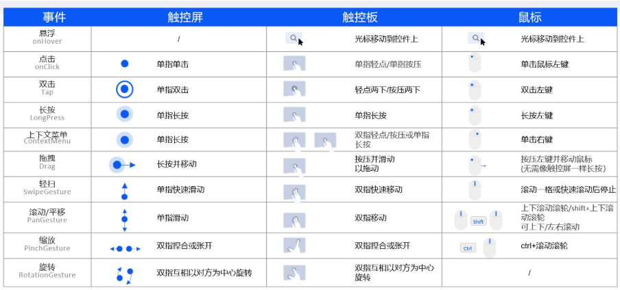
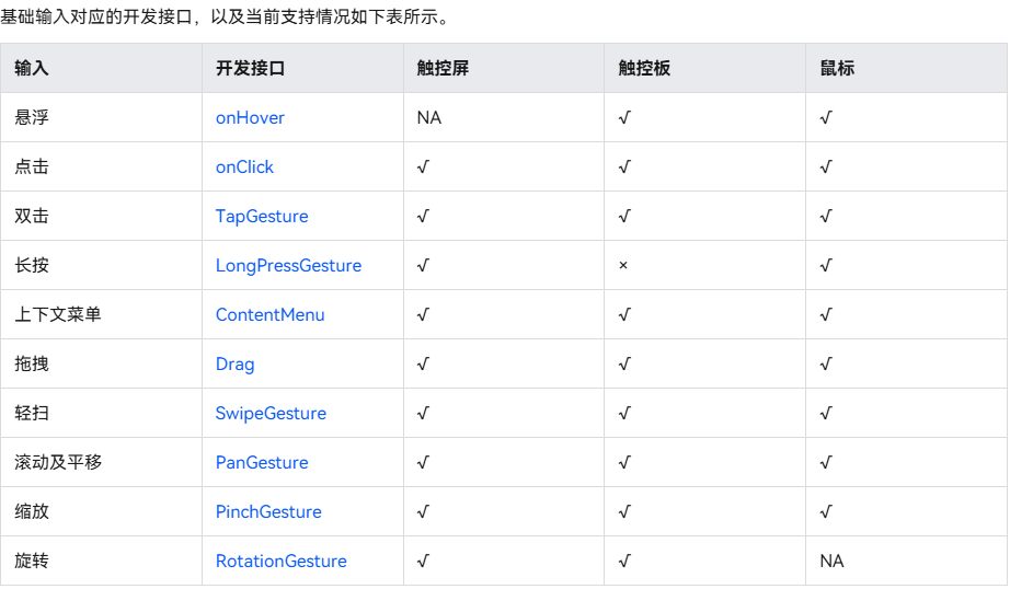
■ 1. onTouch 触摸事件
■ 2. onHover 鼠标悬浮
■ 3. onMouse 鼠标事件
■ 4. onAxisEvent 轴事件
轴事件指组件被鼠标滚轮滚动或触控板双指沿特定方向(轴)滑动时触发的事件。"轴"指二维坐标系中的方向,分为水平(X轴)和垂直(Y轴)。
■ 5. onKeyEvent 按键事件
是指组件与键盘、遥控器等按键设备交互时触发的事件,适用于所有可获焦组件,例如Button。对于默认不可获焦的组件,如Text,Image等,可以将focusable属性设置为true后使用按键事件。
■ 6. onDigitalCrown 表冠事件
■ 7. onFocusAxisEvent 焦点轴事件
■ 交互响应事件
■ 1. onClick 点击事件
点击动作触发该回调。
c
// xxx.ets
@Entry
@Component
struct ClickExample {
  @State text: string = '';

  build() {
    Column() {
      Row({ space: 20 }) {
        Button('Click').width(100).height(40).id('click1')
          .onClick((event?: ClickEvent) => {
            if(event){
              this.text = 'Click Point:' + '\n  windowX:' + event.windowX + '\n  windowY:' + event.windowY
                + '\n  x:' + event.x + '\n  y:' + event.y + '\ntarget:' + '\n  component globalPos:('
                + event.target.area.globalPosition.x + ',' + event.target.area.globalPosition.y + ')\n  width:'
                + event.target.area.width + '\n  height:' + event.target.area.height + '\n  id:'+ event.target.id
                + '\ntargetDisplayId:' + event.targetDisplayId + '\ntimestamp' + event.timestamp;
            }
          }, 20)
        Button('Click').width(200).height(50).id('click2')
          .onClick((event?: ClickEvent) => {
            if(event){
              this.text = 'Click Point:' + '\n  windowX:' + event.windowX + '\n  windowY:' + event.windowY
                + '\n  x:' + event.x + '\n  y:' + event.y + '\ntarget:' + '\n  component globalPos:('
                + event.target.area.globalPosition.x + ',' + event.target.area.globalPosition.y + ')\n  width:'
                + event.target.area.width + '\n  height:' + event.target.area.height + '\n  id:'+ event.target.id
                + '\ntargetDisplayId:' + event.targetDisplayId + '\ntimestamp' + event.timestamp;
            }
          }, 20)
      }.margin(20)

      Text(this.text).margin(15)
    }.width('100%')
  }
}
■ 2. 拖拽事件
拖拽事件是指在用户界面中,当用户拖动某个对象(如文件、控件或元素)时触发的一系列事件。
这些事件允许开发者自定义拖拽行为,实现诸如拖放、调整位置等功能。
| 属性 | 描述 |
|---|---|
| onDragStart | |
| onDragEnter | 拖拽进入组件范围内时,触发回调,当监听了onDrop事件时,此事件才有效。 |
| onDragMove | 拖拽在组件范围内移动时,触发回调,当监听了onDrop事件时,此事件才有效。 |
| onDragLeave | 拖拽离开组件范围内时,触发回调,当监听了onDrop事件时,此事件才有效。 |
| onDrop | |
| onDragEnd | |
| onPreDrag |
■ 3. 焦点事件
当前组件获取焦点时触发的回调。
| 属性 | 描述 |
|---|---|
| onFocus | 焦点事件 |
| onBlur | 失去焦点时触发 |
■ 4. 悬浮事件
| 属性 | 描述 |
|---|---|
| onHover | 鼠标或手写笔进入或退出组件时,触发hover事件。 |
| onPreDrag |
■ 5. 交互事件分发控制
| 属性 | 描述 |
|---|---|
| onTouchIntercept | 自定义事件拦截, 给组件绑定自定义事件拦截回调。 |
| onChildTouchTest | 自定义事件分发, 当前组件通过设置回调,可自定义触摸测试并控制触摸测试中的子节点行为。 |
■ 6. 组件变化事件-挂载卸载事件
| 属性 | 描述 |
|---|---|
| onAttach | 组件挂载到组件树时触发此回调。 |
| onDetach | 组件从组件树卸载时触发此回调。 |
| onAppear | 组件挂载显示后触发此回调。 |
| onDisAppear | 组件从组件树卸载消失时触发此回调。 |
■ 7. 组件变化事件
■ onAreaChange 组件区域变化事件
组件区域变化时触发该回调。仅会响应由布局变化所导致的组件大小、位置发生变化时的回调
c
// xxx.ets
@Entry
@Component
struct AreaExample {
  @State value: string = 'Text'
  @State sizeValue: string = ''

  build() {
    Column() {
      Text(this.value)
        .backgroundColor(Color.Green)
        .margin(30)
        .fontSize(20)
        .onClick(() => {
          this.value = this.value + 'Text'
        })
        .onAreaChange((oldValue: Area, newValue: Area) => {
          console.info(`Ace: on area change, oldValue is ${JSON.stringify(oldValue)} value is ${JSON.stringify(newValue)}`)
          this.sizeValue = JSON.stringify(newValue)
        })
      Text('new area is: \n' + this.sizeValue).margin({ right: 30, left: 30 })
    }
    .width('100%').height('100%').margin({ top: 30 })
  }
}
■ onSizeChange 组件尺寸变化事件
c
// xxx.ets
@Entry
@Component
struct AreaExample {
  @State value: string = 'Text'
  @State sizeValue: string = ''

  build() {
    Column() {
      Text(this.value)
        .backgroundColor(Color.Green)
        .margin(30)
        .fontSize(20)
        .onClick(() => {
          this.value = this.value + 'Text'
        })
        .onSizeChange((oldValue: SizeOptions, newValue: SizeOptions) => {
          console.info(`Ace: on size change, oldValue is ${JSON.stringify(oldValue)} value is ${JSON.stringify(newValue)}`)
          this.sizeValue = JSON.stringify(newValue)
        })
      Text('new area is: \n' + this.sizeValue).margin({ right: 30, left: 30 })
    }
    .width('100%').height('100%').margin({ top: 30 })
  }
}
■ onVisibleAreaChange 组件可见区域变化事件
■ 示例1 (使用onVisibleAreaChange来监听区域变化)
c
// xxx.ets
@Entry
@Component
struct ScrollExample {
  scroller: Scroller = new Scroller()
  private arr: number[] = [0, 1, 2, 3, 4, 5, 6, 7, 8, 9]
  @State testTextStr: string = 'test'
  @State testRowStr: string = 'test'

  build() {
    Column() {
      Column() {
        Text(this.testTextStr)
          .fontSize(20)

        Text(this.testRowStr)
          .fontSize(20)
      }
      .height(100)
      .backgroundColor(Color.Gray)
      .opacity(0.3)

      Scroll(this.scroller) {
        Column() {
          Text("Test Text Visible Change")
            .fontSize(20)
            .height(200)
            .margin({ top: 50, bottom: 20 })
            .backgroundColor(Color.Green)
              // 通过设置ratios为[0.0, 1.0],实现当组件完全显示或完全消失在屏幕中时触发回调。
            .onVisibleAreaChange([0.0, 1.0], (isExpanding: boolean, currentRatio: number) => {
              console.info('Test Text isExpanding: ' + isExpanding + ', currentRatio:' + currentRatio)
              if (isExpanding && currentRatio >= 1.0) {
                console.info('Test Text is fully visible. currentRatio:' + currentRatio)
                this.testTextStr = 'Test Text is fully visible'
              }

              if (!isExpanding && currentRatio <= 0.0) {
                console.info('Test Text is completely invisible.')
                this.testTextStr = 'Test Text is completely invisible'
              }
            })

          Row() {
            Text('Test Row Visible  Change')
              .fontSize(20)
              .margin({ bottom: 20 })

          }
          .height(200)
          .backgroundColor(Color.Yellow)
          .onVisibleAreaChange([0.0, 1.0], (isExpanding: boolean, currentRatio: number) => {
            console.info('Test Row isExpanding:' + isExpanding + ', currentRatio:' + currentRatio)
            if (isExpanding && currentRatio >= 1.0) {
              console.info('Test Row is fully visible.')
              this.testRowStr = 'Test Row is fully visible'
            }

            if (!isExpanding && currentRatio <= 0.0) {
              console.info('Test Row is completely invisible.')
              this.testRowStr = 'Test Row is completely invisible'
            }
          })

          ForEach(this.arr, (item:number) => {
            Text(item.toString())
              .width('90%')
              .height(150)
              .backgroundColor(0xFFFFFF)
              .borderRadius(15)
              .fontSize(16)
              .textAlign(TextAlign.Center)
              .margin({ top: 10 })
          }, (item:number) => (item.toString()))

        }.width('100%')
      }
      .backgroundColor(0x317aff)
      .scrollable(ScrollDirection.Vertical)
      .scrollBar(BarState.On)
      .scrollBarColor(Color.Gray)
      .scrollBarWidth(10)
      .onWillScroll((xOffset: number, yOffset: number, scrollState: ScrollState) => {
        console.info(xOffset + ' ' + yOffset)
      })
      .onScrollEdge((side: Edge) => {
        console.info('To the edge')
      })
      .onScrollStop(() => {
        console.info('Scroll Stop')
      })

    }.width('100%').height('100%').backgroundColor(0xDCDCDC)
  }
}
■ 示例2 (使用onVisibleAreaApproximateChange来监听区域变化)
c
// xxx.ets
@Entry
@Component
struct ScrollExample {
  scroller: Scroller = new Scroller()
  private arr: number[] = [0, 1, 2, 3, 4, 5, 6, 7, 8, 9]
  @State testTextStr: string = 'test'
  @State testRowStr: string = 'test'

  build() {
    Column() {
      Column() {
        Text(this.testTextStr)
          .fontSize(20)

        Text(this.testRowStr)
          .fontSize(20)
      }
      .height(100)
      .backgroundColor(Color.Gray)
      .opacity(0.3)

      Scroll(this.scroller) {
        Column() {
          Text("Test Text Visible Change")
            .fontSize(20)
            .height(200)
            .margin({ top: 50, bottom: 20 })
            .backgroundColor(Color.Green)
              // 通过设置ratios为[0.0, 1.0],实现当组件完全显示或完全消失在屏幕中时触发回调。
            .onVisibleAreaApproximateChange({ratios: [0.0, 1.0], expectedUpdateInterval: 1000}, (isExpanding: boolean, currentRatio: number) => {
              console.info('Test Text isExpanding: ' + isExpanding + ', currentRatio:' + currentRatio)
              if (isExpanding && currentRatio >= 1.0) {
                console.info('Test Text is fully visible. currentRatio:' + currentRatio)
                this.testTextStr = 'Test Text is fully visible'
              }

              if (!isExpanding && currentRatio <= 0.0) {
                console.info('Test Text is completely invisible.')
                this.testTextStr = 'Test Text is completely invisible'
              }
            })

          Row() {
            Text('Test Row Visible  Change')
              .fontSize(20)
              .margin({ bottom: 20 })

          }
          .height(200)
          .backgroundColor(Color.Yellow)
          .onVisibleAreaChange([0.0, 1.0], (isExpanding: boolean, currentRatio: number) => {
            console.info('Test Row isExpanding:' + isExpanding + ', currentRatio:' + currentRatio)
            if (isExpanding && currentRatio >= 1.0) {
              console.info('Test Row is fully visible.')
              this.testRowStr = 'Test Row is fully visible'
            }

            if (!isExpanding && currentRatio <= 0.0) {
              console.info('Test Row is completely invisible.')
              this.testRowStr = 'Test Row is completely invisible'
            }
          })

          ForEach(this.arr, (item:number) => {
            Text(item.toString())
              .width('90%')
              .height(150)
              .backgroundColor(0xFFFFFF)
              .borderRadius(15)
              .fontSize(16)
              .textAlign(TextAlign.Center)
              .margin({ top: 10 })
          }, (item:number) => (item.toString()))

        }.width('100%')
      }
      .backgroundColor(0x317aff)
      .scrollable(ScrollDirection.Vertical)
      .scrollBar(BarState.On)
      .scrollBarColor(Color.Gray)
      .scrollBarWidth(10)
      .onWillScroll((xOffset: number, yOffset: number, scrollState: ScrollState) => {
        console.info(xOffset + ' ' + yOffset)
      })
      .onScrollEdge((side: Edge) => {
        console.info('To the edge')
      })
      .onScrollStop(() => {
        console.info('Scroll Stop')
      })

    }.width('100%').height('100%').backgroundColor(0xDCDCDC)
  }
}