day8_elementPlus
1UI库
半成品用户界面库 带一些交互效果 根据实际页面需求 再组合使用
不同UI库有适配的js语言和扩展库 elementPlus(饿了么团队提供的UI库) vue3的UI库
2ElementPlus安装和配置
ElementPlus vue3的插件 需要安装和配置
https://cn.element-plus.org/zh-CN/ 官网
1执行命令
安装elementPlus js库
pnpm install element-plus
安装elementPlus 图标库
pnpm install @element-plus/icons-vue2做配置(插件必须配置启用)
//引入elementPlus的js库和样式库
import ElementPlus from 'element-plus'
import 'element-plus/dist/index.css'
//启用elementPlus
vue.use(ElementPlus)
3进阶配置
配置中文语言包
vue.use(ElementPlus, {
  locale: zhCn,
})
4完整配置
import { createApp } from 'vue'
import App from './App.vue'
// 如果文件名叫index.js 就可以省略
import router from './router'
//引入elementPlus的js库和样式库
import ElementPlus from 'element-plus'
import 'element-plus/dist/index.css'
//引入中文语言包
import zhCn from 'element-plus/es/locale/lang/zh-cn'
//router是vue的 插件 插件需要多执行一个use命令
//如果与vue没有集成关系 js库叫依赖
const vue = createApp(App)
vue.use(ElementPlus, {
locale: zhCn,
})
//启用router路由
vue.use(router)
//挂载
vue.mount('#app')
3elementPlus常用组件
读取和使用官网步骤
1先看示例
2参考代码 并测试
3如果说明不详细 参考页面底部的文档
3.1基础组件
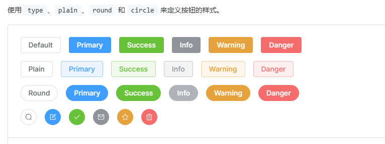
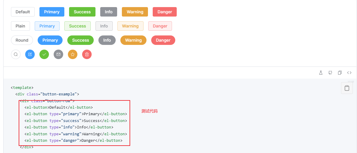
3.1.1 button按钮
<script setup>
import { ref,onMounted } from 'vue'
import {
Check,
Delete,
Edit,
Message,
User,
Share,
ChatRound
} from '@element-plus/icons-vue'
const username = ref('')
const loadStatus = ref(true)
onMounted(()=>{
setTimeout(()=>{
//后端获取用户名
username.value = '张三'
loadStatus.value = false
},1000)
})
</script>
<template>
<!-- 注意: 官网的代码 先分析一下再使用 别完全复制 -->
demo1
<el-button link>Default</el-button>
<el-button disabled type="primary">Primary</el-button>
<el-button text type="success">Success</el-button>
<el-button type="info">Info</el-button>
<el-button type="warning">Warning</el-button>
<el-button type="danger">Danger</el-button>
<hr>
<el-button type="primary" :icon="Edit" circle />
<el-button loading>1233<el-icon><ChatRound /></el-icon>3333</el-button>
<el-button-group>
<el-button loading type="primary" :icon="Edit" />
<el-button type="primary" :icon="Share" />
<el-button type="primary" :icon="Delete" />
</el-button-group>
<hr>
<el-button type="success" :loading="loadStatus">
<el-icon><User /></el-icon> {{username}}
</el-button>
</template>
<style scoped>
</style>注意:
1按钮中如果套图标 图标都需要单独引入
2在vue中使用时 实际使用中经常要搭配vue的{{}} 或者属性绑定一起使用
3参考上边案例 做动态显示用户名的过程
3.1.2 边框和颜色
<script setup>
import { ref } from 'vue'
</script>
<template>
<div class="testDiv"></div>
</template>
<style scoped>
.testDiv {
width: 100px;
height: 100px;
box-shadow: var(--el-box-shadow-dark);
background-color: rgb(184, 130, 48);
}
</style>文档中 把常用的边框样式 线条 阴影样式 给了模板 可以参考模板写自己的样式
颜色中 给出了常用的颜色代码 可以给元素做自定义颜色设置
3.1.3 图标
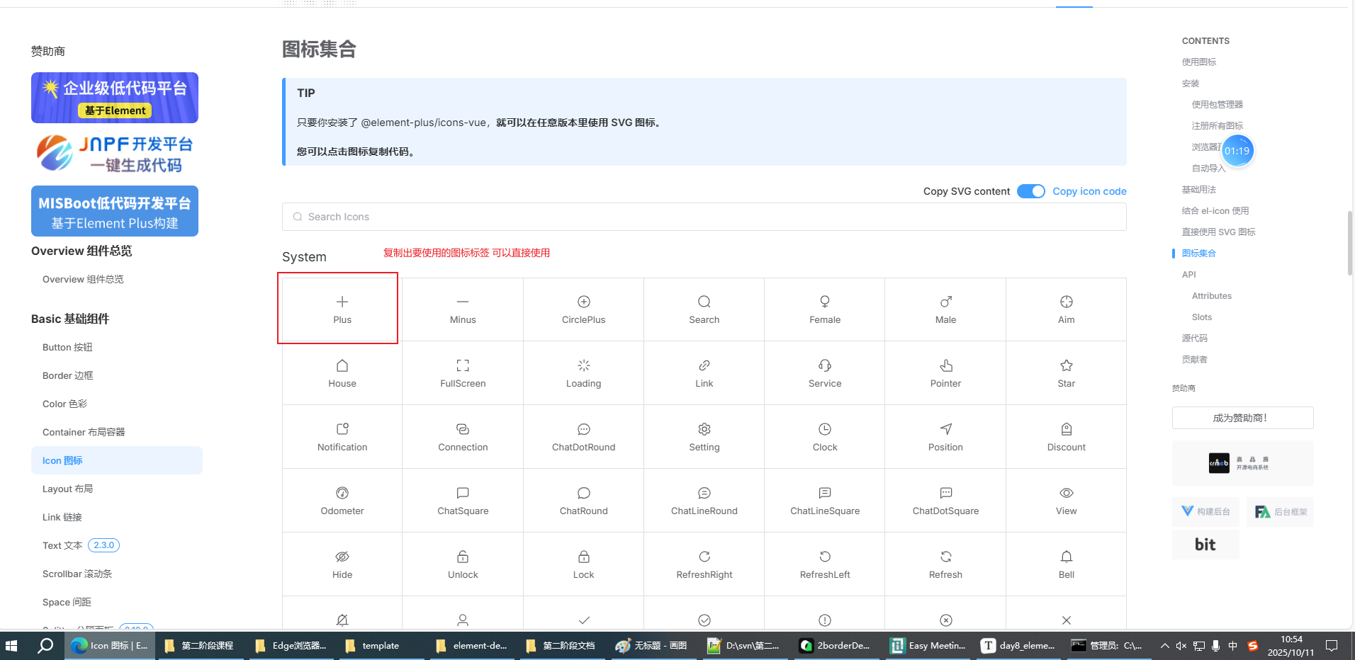
注意:
1.如果图标与其他组件融合使用 只使用图标名
<el-button type="primary" :icon="CirclePlus" circle />2.如果图标不与其他组件融合 当做特殊字体使用(写文字的地方都可以放图标)
<el-icon><CirclePlus /></el-icon>3.图标如果要正常使用 记得引入
import {
  CirclePlus,
} from '@element-plus/icons-vue'
3.1.4 link连接 text文本
el-link 最后变成 a标签 使用方式 与原生a标签类似
el-text 最后变成span 给文字家里标签 可以修饰大小 颜色 禁用状态
<script setup>
import { ref,onMounted } from 'vue'
const linkStatus = ref(false)

const alertType = ref('warning')
/*
'warning'
'danger'
*/
let flag = true

onMounted(()=>{
    setInterval(()=>{
        flag = !flag
        if(flag){
            alertType.value = 'warning'
        }else{
            alertType.value = 'danger'
        }
    },500)
})

</script>

<template>
 <el-link href="https://www.baidu.com/" target="_blank" :disabled="linkStatus">去百度</el-link>
 <hr>
 <el-text :type="alertType" size="large">警告 未满18岁不能点击</el-text>
</template>

<style scoped>

</style>
注意: elementPlus 统一样式
vue 简化语法 减少dom操作
js 处理逻辑关系
3.15布局 布局容器
通过 el-row 和 el-col 组件,类似画table 就可以快速实现布局。
<script setup>
import { ref } from 'vue'
</script>

<template>
 <h1>布局</h1>
 <!-- 通过 el-row 和 el-col 组件,类似画table 就可以快速实现布局。 -->
 <!-- 行 -->
 <el-row>
    <!-- 列 -->
    <el-col :span="24">
      1
    </el-col>
  </el-row>
  <!-- 第二行 -->
  <el-row>
    <el-col :span="12">
      1
    </el-col>
    <el-col :span="12">
      1
    </el-col>
  </el-row>
  <!-- 第三行  :gutter="20"  间隔 -->
   <el-row :gutter="20">
    <el-col :span="8">
      1
    </el-col>
    <el-col :span="8">
      1
    </el-col>
    <el-col :span="8">
        <!-- 混合布局 可以嵌套 每个row 都是按24算  -->
        <el-row>
            <el-col :span="8">
            1
            </el-col>
            <el-col :span="8">
            1
            </el-col>
            <el-col :span="8">
            1
            </el-col>
        </el-row>
    </el-col>
  </el-row>
  <!-- 第四行 offset列偏移 -->
  <el-row>
    <el-col :offset="2" :span="10">
      1
    </el-col>
    <el-col :span="10">
      1
    </el-col>
  </el-row>
  <!-- 第五行 对齐方式 -->
   <el-row justify="center">
        <el-col :span="6">
        1
        </el-col>
        <el-col :span="6">
        1
        </el-col>
        <el-col :span="6">
        1
        </el-col>
    </el-row>
    <!-- 第六行 响应式布局 -->
     <!-- 网页端为什么设计响应式布局 ?
            套浏览器APP 只能访问一个网站

     -->
    <el-row >
        <el-col :xs="12" :sm="4" :md="20" :lg="12">
        1
        </el-col>
        <el-col :xs="12" :sm="20" :md="4" :lg="12">
        1
        </el-col>
    </el-row>
</template>

<style scoped>

</style>
布局容器 做页面整体结构布局
<script setup>
import { ref } from 'vue'
</script>

<template>
    <el-container>
      <el-header>Header</el-header>
      <el-container>
        <el-aside width="200px">Aside</el-aside>
        <el-main>Main</el-main>
      </el-container>
    </el-container>
</template>

<style scoped>
    .el-container {
      height: 100vh;
    }


</style>
<style>
    body{margin: 0;}
</style>
3.2表单组件
3.2.1输入框
基本输入框(默认占满一行)
<script setup>
import { ref } from 'vue'

const text1 = ref('')

</script>

<template>
 <el-input v-model="text1" placeholder="请输入内容" />{{ text1 }}
</template>

<style scoped>

</style>
可以做禁用和一键清空
<script setup>
import { ref } from 'vue'

const text1 = ref('放了点值')
const inputStatus = ref(false)


</script>

<template>
 <el-input v-model="text1" placeholder="请输入内容" :disabled="inputStatus" clearable/>{{ text1 }}
</template>

<style scoped>

</style>
图标和插槽
<script setup>
import { ref } from 'vue'
import {
  Calendar,Search
} from '@element-plus/icons-vue'

const text1 = ref('放了点值')
const text2 = ref('')
const text3 = ref('')
const inputStatus = ref(false)


</script>

<template>
 <el-input v-model="text1" placeholder="请输入内容" :disabled="inputStatus" clearable/>{{ text1 }}
 <hr>
 <el-input v-model="text2" type="password" placeholder="请输入内容" show-password clearable />{{ text2 }}
 <hr>
 <el-input v-model="text3" style="width: 200px;" :prefix-icon="Search" :suffix-icon="Calendar"/>
 <el-input v-model="text3" style="width: 200px;">
    <template #prefix>
      <!-- 有些组件会预设插槽 在特殊位置可以根据情况做自定义编辑 -->
      搜搜<el-icon><Search /></el-icon>

    </template>

    <template #suffix>
        <el-icon><Calendar /></el-icon>
    </template>

 </el-input>
</template>

<style scoped>

</style>
注意:必须是预设了插槽的组件 才能使用
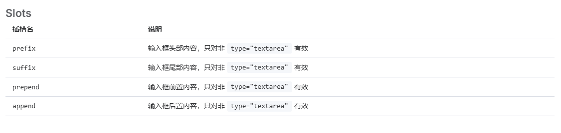
样式不太一样
多行文本 输入长度限制
<script setup>
import { ref } from 'vue'
import {
  Calendar,Search
} from '@element-plus/icons-vue'

const text1 = ref('放了点值')
const text2 = ref('')
const text3 = ref('')
const text4 = ref('')
const textarea = ref('')
const inputStatus = ref(false)


</script>

<template>
 <el-input v-model="text1" placeholder="请输入内容" :disabled="inputStatus" clearable/>{{ text1 }}
 <hr>
 <el-input v-model="text2" type="password" placeholder="请输入内容" show-password clearable />{{ text2 }}
 <hr>
 <el-input v-model="text3" style="width: 200px;" :prefix-icon="Search" :suffix-icon="Calendar"/>
 <el-input v-model="text3" style="width: 200px;">
    <template #prefix>
      <!-- 有些组件会预设插槽 在特殊位置可以根据情况做自定义编辑 -->
      搜搜<el-icon><Search /></el-icon>

    </template>

    <template #suffix>
        <el-icon><Calendar /></el-icon>
    </template>

 </el-input>
 <el-input v-model="text3" style="width: 200px;">
    <template #prepend>
      <!-- 有些组件会预设插槽 在特殊位置可以根据情况做自定义编辑 -->
      搜搜<el-icon><Search /></el-icon>

    </template>

    <template #append>
        <el-icon><Calendar /></el-icon>
    </template>

 </el-input>

 <hr>
   <el-input
    v-model="textarea"
    :rows="2"
    type="textarea"
    placeholder="Please input"
  />

  <hr>
   <el-input
    v-model="text4"
    maxlength="4"
    show-word-limit
    placeholder="Please input"
  />


</template>

<style scoped>

</style>
3.2.2数字输入框
有加减按钮 适合用在修改数量的场景
<script setup>
import { ref } from 'vue'
import {
  Calendar,Search
} from '@element-plus/icons-vue'

const num = ref(1)
const num2 = ref(1)
const input = ref([])

//ts 去掉类型部分 可以转为js
const myChange = (value) => {
  console.log(value)
}

</script>

<template>
    <!-- 有些组件会有内置事件
         change事件 获取到数字框内的值
    -->
    <el-input-number step-strictly :precision="2" :step="0.2" v-model="num" :min="1" :max="10" @change="myChange" />
    <el-input-number v-model="num2">
        <template #decrease-icon>
          <el-icon>
            <Calendar />
          </el-icon>
        </template>
        <template #increase-icon>
          <el-icon>
            <Search />
          </el-icon>
        </template>
      </el-input-number>


    <el-input-tag
        v-model="input"
        placeholder="请输入"
    />  {{ input }}

</template>

<style scoped>

</style>
3.2.3选择框
单选框 多选框(用法类似)
<script setup>
import { ref } from 'vue'

const radio = ref(3)
const checkList = ref([2,3])

</script>

<template>
 <!-- 对类型更严格 需要注意类型匹配
      后端返回数据给前端 给表单元素赋值 需要注意类型匹配

 -->
 <el-radio-group v-model="radio">
    <el-radio :value="3">Option A</el-radio>
    <el-radio :value="6">Option B</el-radio>
    <el-radio :value="9">Option C</el-radio>
  </el-radio-group>{{ radio }}
  <hr>
    <el-checkbox-group v-model="checkList">
        <el-checkbox label="抽烟" :value="1" />
        <el-checkbox label="喝酒" :value="2" />
        <el-checkbox label="烫头" :value="3" />
        <el-checkbox label="说相声" :value="4" disabled />

  </el-checkbox-group>{{ checkList }}
</template>

<style scoped>

</style>
下拉列表(单选/多选)
<script setup>
import { ref } from 'vue'
import {
  FullScreen,Search
} from '@element-plus/icons-vue'

const value = ref('')
const value2 = ref('')
</script>

<template>
    <el-select v-model="value" clearable placeholder="请选择" style="width: 240px">
        <el-option  label="北京" :value="1" />
        <el-option  label="上海" :value="2" disabled/>
        <el-option  label="深圳" :value="3" />
    </el-select>{{ value }}

    <el-select v-model="value2" multiple clearable placeholder="多选" style="width: 240px">
        <el-option  :value="1" ><el-icon><FullScreen /></el-icon> 北京</el-option>
        <el-option   :value="2" >上海</el-option>
        <el-option   :value="3" >深圳</el-option>
    </el-select>{{ value2 }}


</template>

<style scoped>

</style>
3.2.4 进阶选择类
switch 单选的进阶
<script setup>
import { ref } from 'vue'
const value1 = ref('5')
</script>

<template>

    <!-- switch开关
         单选的进化组件
         可以自定义文本
            active-text="是"
            inactive-text="否"
         可以自定义颜色
            style="--el-switch-on-color: #13ce66; --el-switch-off-color: #ff4949"
         可以自定义值
            active-value="1"
            inactive-value="2"
    -->

    <el-switch  v-model="value1"
                inline-prompt
                style="--el-switch-on-color: #13ce66; --el-switch-off-color: #ff4949"
                active-text="是"
                inactive-text="否"
                active-value="1"
                inactive-value="2"

                />
</template>

<style scoped>

</style>
transfer 穿梭框
<script setup>
import { ref } from 'vue'
//这个是自动遍历的选项数组
const optionList = ref([{key:'1',label:'选项1'},{key:'2',label:'选项2'},{key:'3',label:'选项3'}])
//这个是选中值的数组
const value = ref([])
</script>

<template>
    <el-transfer v-model="value" :data="optionList" />
    {{ value }}
</template>

<style scoped>

</style>
级联菜单
注意:级联菜单默认读取的key 是 value label children
如果需要跟后端数组搭配使用 通常需要配置映射关系
const props = {
    label:'name',
    value:'code',
    children:'subArea'
}<script setup>
import { ref,onMounted } from 'vue'
import areaData from '@/myjs/myData.js'
console.log(areaData);
//选中的值
const value = ref([])
//选项数组
//value label children
const options = ref([])
const props = {
label:'name',
value:'code',
children:'subArea'
}
onMounted(()=>{
options.value = areaData
})
</script>
<template>
<el-cascader v-model="value" :props="props" :options="options" />
{{ value }}
</template>
<style scoped>
</style>3.2.5日期选择器
<script setup>
import { ref } from 'vue'

const value1 = ref('')
const value2 = ref([])
</script>

<template>
    <!-- 日期时间选择器
         type="datetime" 日期+时间

         value-format="YYYY-MM-DD HH:mm:ss"  选中值的时间格式
                                             参考Day.js的格式化文档
    -->
 <el-date-picker
        v-model="value1"
        type="datetime"
        placeholder="请选择日期时间"
        value-format="YYYY-MM-DD HH:mm:ss"
      />
      {{ value1 }}
      <hr>
    <el-date-picker
        v-model="value2"
        type="datetimerange"
        range-separator="到"
        start-placeholder="起始日期"
        end-placeholder="结束日期"
        value-format="YYYY-MM-DD HH:mm:ss"
      />
      {{ value2 }}

</template>

<style scoped>

</style>
3.2.6表单对象
表单两个作用
1 提供表单的标准格式
2 做数据统一校验
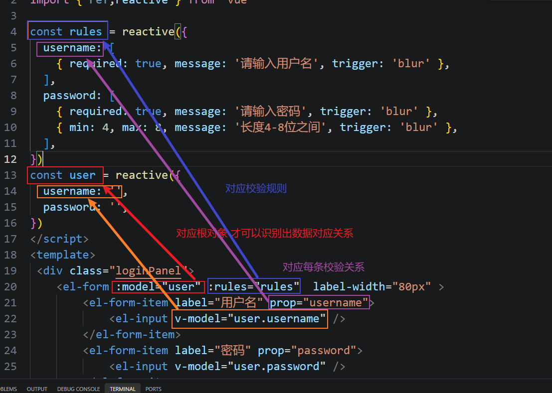
校验数据时的对应关系
表单示例
<script setup>
import { ref,reactive } from 'vue'

const rules = reactive({
  username: [
    { required: true, message: '请输入用户名', trigger: 'blur' },
  ],
  password: [
    { required: true, message: '请输入密码', trigger: 'blur' },
    { min: 4, max: 8, message: '长度4-8位之间', trigger: 'blur' },
  ],
})
const user = reactive({
  username: '',
  password: '',
})

const mySubmit = ()=>{
    // 通过form对象上预设的validate方法,对表单数据进行验证
    loginForm.value.validate((valid)=>{
        console.log(valid);
        //如果验证成功 提交请求
        if(valid){
            console.log("向后端发请求 传用户数据", user)
        }
    })


}
//一键重置
const myReset = ()=>{
    loginForm.value.resetFields()

}

//通过相同的名称 和空ref函数 获取指定ref名称的组件对象
const loginForm = ref()

console.log(loginForm);

</script>
<template>
 <div class="loginPanel">
    <el-form ref="loginForm" :model="user" hide-required-asterisk :rules="rules"  label-width="80px" >
        <el-form-item label="用户名" prop="username">
            <el-input v-model="user.username" />
        </el-form-item>
        <el-form-item label="密码" prop="password">
            <el-input v-model="user.password" />
        </el-form-item>

        <el-form-item>
            <el-button type="primary" @click="mySubmit">登录</el-button>
            <el-button @click="myReset">重置</el-button>
        </el-form-item>
  </el-form>


 </div>
</template>

<style scoped>
    .loginPanel{
        width: 300px;
        height: 300px;
        border: 1px solid lightgrey;
        padding: 30px;
    }
</style>