css的线性渐变主要是在background-image上设置函数linear-gradient
这个函数的参数有(direction,fromcolor,tocolor)
direction是渐变的方向或者角度
方向有to top,to right等,方向表示渐变结束的方向,to top表示从下向上,to right表示从左到右
角度用deg,角度表示渐变结束的方向
fromcolor表示开始的颜色
tocolor表示结束的颜色
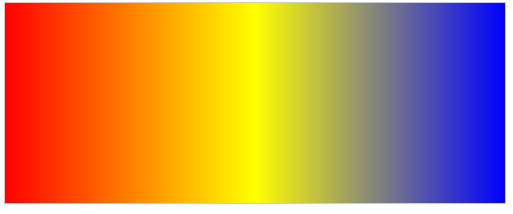
html
<div class="d1"></div>
html
<style>
.d1 {
	width: 500px;
	height: 200px;
	border: 1px solid #ccc;

    background-image: linear-gradient(to right,red,yellow,blue)
}
</style>
上面代码表示设置一个盒子,宽500像素,高200像素,灰色边框
渐变是线性渐变,从左向右,从红渐变到黄,从黄色渐变到蓝
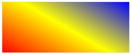
html
<style>
.d1 {
	width: 500px;
	height: 200px;
	border: 1px solid #ccc;

    background-image: linear-gradient(30deg,red,yellow,blue)
}
</style>
这段代码表示沿顺时针方向30度方向渐变,从红到黄,再从黄到蓝
也可以在颜色后面添加数值,用来控制颜色比例,一般浏览器默认渐变是均匀分布,一般第一个颜色,最后一个颜色不写数值,浏览器默认是第一个颜色从0%开始,最后一个颜色在100%结束
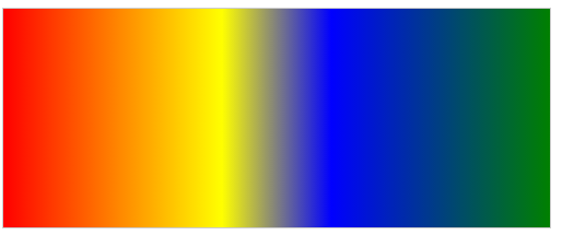
html
<style>
.d1 {
	width: 500px;
	height: 200px;
	border: 1px solid #ccc;

   background-image: linear-gradient(to right,red ,yellow 40%,blue 60%, green)
}
</style>
这段代码表示红色从40%结束,开始黄色渐变,再60%处开始蓝色渐变