动画创建
- 位置:index.html
js
  <div id="app">
      ... 动画内容 ...
  </div>
  <script type="module" src="/src/main.js"></script>
动画消失
当 /src/main.js 加载完毕之后,createApp(App).mount('#app') 会替换掉 #app 内的内容。
js
import { createApp } from 'vue'
import './style.css'
import App from './App.vue'

createApp(App).mount('#app')
完整代码
- index.html
html
<!DOCTYPE html>
<html lang="en">
<head>
<meta charset="UTF-8" />
<link rel="icon" type="image/svg+xml" href="/vite.svg" />
<meta name="viewport" content="width=device-width, initial-scale=1.0" />
<title>我的网站</title>
</head>
<body>
<div id="app">
<style>
* {
/* 初始化 取消页面内外边距 */
margin: 0;
padding: 0;
}
body {
/* 100%窗口高度 */
height: 100vh;
background: linear-gradient(to bottom, #2b5876, #09203f);
/* 弹性布局 水平、垂直居中 */
display: flex;
justify-content: center;
align-items: center;
}
.loading {
width: 200px;
height: 200px;
box-sizing: border-box;
border-radius: 50%;
border-top: 10px solid #63A69F;
/* 相对定位 */
position: relative;
/* 执行动画:动画a1 时长 线性的 无限次播放 */
animation: a1 2s linear infinite;
}
.loading::before,
.loading::after {
content: "";
width: 200px;
height: 200px;
/* 绝对定位 */
position: absolute;
left: 0;
top: -10px;
box-sizing: border-box;
border-radius: 50%;
}
.loading::before {
border-top: 10px solid #F2E1AC;
/* 旋转120度 */
transform: rotate(120deg);
}
.loading::after {
border-top: 10px solid #F2836B;
/* 旋转240度 */
transform: rotate(240deg);
}
.loading span {
/* 绝对定位 */
position: absolute;
width: 200px;
height: 200px;
line-height: 200px;
text-align: center;
color: #fff;
/* 执行动画:动画a2 时长 线性的 无限次播放 */
animation: a2 2s linear infinite;
}
/* 定义动画 */
@keyframes a1 {
to {
transform: rotate(360deg);
}
}
@keyframes a2 {
to {
transform: rotate(-360deg);
}
}
</style>
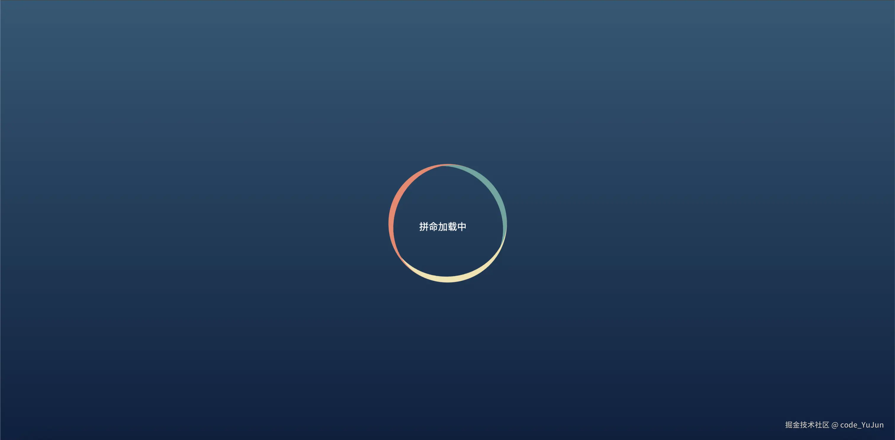
<div class="loading">
<span>拼命加载中</span>
</div>
</div>
<script type="module" src="/src/main.js"></script>
</body>
</html>- main.js
js
import { createApp } from 'vue'
import './style.css'
import App from './App.vue'

createApp(App).mount('#app')
动画效果