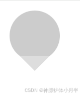
气泡组装
- 气泡可以看做是由圆形和倒三角形组装起来的
- 利用 clip-path 属性,组装两个元素
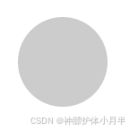
圆形
width: 100px;
height: 100px;
clip-path: circle(50% at 50% 50%);
background: #ccc;
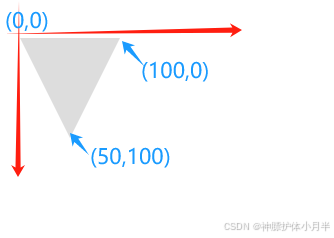
倒三角形
width: 100px;
height: 100px;
clip-path: polygon(0% 0%, 100% 0%, 50% 100%, 0% 0%);
background: #ddd;
组合
<div class="pop">
  <div class="circle"></div>
  <div class="trangle"></div>
</div>
<style lang="scss" scoped>

.pop {
  width: 100px;
  height: 120px;
  position: relative;
  .circle {
    position: absolute;
    top: 0;
    left: 0;
    width: 100px;
    height: 100px;
    clip-path: circle(50% at 50% 50%);
    background: #ccc;
  }
  .trangle {
    position: absolute;
    bottom: 0;
    left: 50%;
    transform: translateX(-50%);
    width: 60px;
    height: 30px;
    clip-path: polygon(0% 0%, 100% 0%, 50% 100%, 0% 0%);
    background: #ddd;
  }
}

</style>
边框效果
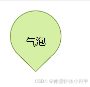
- 用两个气泡叠加。下层气泡的尺寸略大于上层气泡的尺寸,形成边框效果
<template>
  <div class="myPop">
    <div class="backBox">
      <div class="circle"></div>
      <div class="trangle"></div>
    </div>
    <div class="frontBox">
      <div class="circle"></div>
      <div class="trangle"></div>
    </div>
    <div class="msg">气泡</div>
  </div>
</template>
<style lang="scss" scoped>
.myPop {
  width: 102px;
  height: 122px;
  position: relative;
  & > div {
    position: absolute;
    top: 50%;
    left: 50%;
    transform: translate(-50%, -50%);
  }
  .circle {
    position: absolute;
    top: 0;
    left: 0;
    clip-path: circle(50% at 50% 50%);
  }
  .trangle {
    position: absolute;
    bottom: 0;
    left: 50%;
    transform: translateX(-50%);
    clip-path: polygon(0% 0%, 100% 0%, 50% 100%, 0% 0%);
  }
  .backBox {
    width: 102px;
    height: 122px;
    .circle {
      width: 102px;
      height: 102px;
      background: #4e700f;
    }
    .trangle {
      width: 62px;
      height: 30px;
      background: #4e700f;
      clip-path: polygon(0% 0%, 100% 0%, 50% 100%, 0% 0%);
    }
  }
  .frontBox {
    width: 100px;
    height: 120px;
    .circle {
      width: 100px;
      height: 100px;
      background: #d5f0a5;
    }
    .trangle {
      width: 60px;
      height: 30px;
      background: #d5f0a5;
    }
  }
  .msg {
    width: 100%;
    height: 100%;
    font-size: 20px;
    display: flex;
    align-items: center;
    justify-content: center;
  }
}
</style>