目录
QSS
Qt 中 QSS 与前端 CSS 是类似的,都是来对界面进行优化,或者说美化的,虽然 QSS 借鉴了 CSS,学起来有点类型,但实际上还是不同的两个工具
使用 QSS 能够进行界面优化,同样使用 C++ 代码也是可以做到的,如果通过 QSS 设置的样式和通过 C++ 代码设置的样式冲突,则 QSS 优先级更⾼(毕竟这是 Qt 内设计的)
语法
css
选择器 {
属性名: 属性值;
}
案例:修改按钮的字体颜色
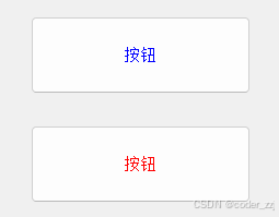
cpp
ui->pushButton->setStyleSheet("QPushButton { color : red ; }");
对哪个按钮进行设置,就只会对设置的按钮进行调整,不会影响到别的按钮;如果想要对 Widget内的所有空间进行统一设置,可以这样进行
cpp
this->setStyleSheet("QWidget { color : green ; }");
也可以修改全局 QApplication 指定控件进行统一设置
cpp
a.setStyleSheet("QPushButton { color: red ;}");
如果这时设置按钮的其它样式,会怎么样呢?
cpp
ui->pushButton->setStyleSheet("QPushButton { font : 50px ;}");可以看到,效果是"叠加"的
如果是样式冲突了呢?
cpp
ui->pushButton->setStyleSheet("QPushButton { color : blue ;}");那就以按钮指定设置的样式为主
以上设置样式时我们是直接通过字符串的形式设置 QSS,简单的好说,如果是 QSS 样式比较复杂,上面的方法就不怎么适用了,有两种解决方法:
方法1:使用 qrc 机制保存创建的 .qss 文件,在该文件中写 QSS 样式,后续通过文件读操作获取 QSS 数据进行设置,达到解耦效果
cpp
QString LoadQSS()
{
QFile f(":/style.qss");
if(!f.open(QFile::ReadOnly))
{
return "";
}
QString data = f.readAll();
f.close();
return data;
}
int main(int argc, char *argv[])
{
QApplication a(argc, argv);
a.setStyleSheet(LoadQSS());
Widget w;
w.show();
return a.exec();
}
//style.qss
QPushButton
{
color : green;
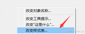
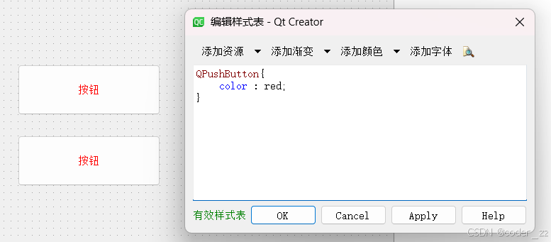
}方法2:使用 ui 的方式自己进行修改样式,支持实时预览
选择器
QSS 选择器有以下几种
| 选择器 | ⽰例 | 说明 |
|---|---|---|
| 全局选择器 | * | 选择所有的 widget |
| 类型选择器 (type selector) | QPushButton | 选择所有的 QPushButton 和其⼦类的控件 |
| 类选择器 (class selector) | .QPushButton | 选择所有的 QPushButton 的控件,不会选择子类 |
| ID 选择器 | #pushButton_2 | 选择 objectName 为 pushButton_2 的控件 |
| 后代选择器 | QDialog QPushButton | 选择 QDialog 的所有后代(⼦控件,孙⼦控件等等) 中的 QPushButton |
| ⼦选择器 | QDialog > QPushButton | 选择 QDialog 的所有⼦控件中的 QPushButton |
| 并集选择器 | #pushbutton,QLineEdit, QComboBox | 选择 pushbutton,QLineEdit,QComboBox 这三种控件 (即接下来的样式会针对这三种控件都⽣效) |
| 属性选择器 | QPushButton flat = "false" | 选择所有 QPushButton 中,属性 flat 为false 的控件 |
cpp
//a.setStyleSheet("QPushButton { color : green ;}");
//a.setStyleSheet("#pushButton { color : green ;}");
a.setStyleSheet("QLabel,#pushButton { color : green ;}");
子控件选择器
有些控件内部包含了多个 "⼦控件",⽐如 QComboBox 的下拉后的⾯板,QSpinBox的上下按钮等,可以通过⼦控件选择器 :: 针对⼦控件进行样式设置
哪些控件拥有哪些⼦控件,参考⽂档 Qt Style Sheets Reference 中 List of Sub-Controls
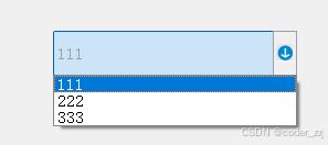
案例:为 QComboBox 的下拉框添加图片
cpp
int main(int argc, char *argv[])
{
    QApplication a(argc, argv);


    a.setStyleSheet("QComboBox::down-arrow { image : url(:/down.png) ;}");

    Widget w;
    w.show();
    return a.exec();
}
伪类选择器
伪类选择器,是根据控件所处的某个状态被选择的:当状态具备时,控件被选中;样式⽣效;当状态不具备时,控件不被选中,样式失效
使⽤ :的⽅式定义伪类选择器
| 伪类选择器 | 说明 |
|---|---|
| :hover | ⿏标放到控件上 |
| :pressed | ⿏标左键按下时 |
| :focus | 获取输⼊焦点时 |
| :enabled | 元素处于可⽤状态时 |
| :checked | 被勾选时 |
| :read-only | 元素为只读状态时 |
更多伪类选择器的详细情况,参考 Qt Style Sheets Reference 的 Pseudo-States
案例:设置按钮文本颜色,初始为红色,鼠标放到控件上显示绿色,鼠标按下显示蓝色
cpp
int main(int argc, char *argv[])
{
    QApplication a(argc, argv);

    QString style = "QPushButton { color : red ;}";
    style += "QPushButton:hover {color : green ;}";
    style += "QPushButton:pressed {color : blue ;}";
    a.setStyleSheet(style);

    Widget w;
    w.show();
    return a.exec();
}
使用事件机制,定义 PushButton 继承 QPushButton,重写相关事件函数也可以做到,但不如上面使用伪类选择器来得方便
样式属性
样式属性这里要介绍盒模型(Box Model),借用的 CSS 的概念
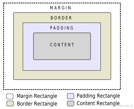
- Content 存放控件文本,图标或者是子控件,比如 房子中的各种家具
- Border 控件的边框,比如 房子外围墙的厚度
- Padding 内边距,Content 与 Border 之间的距离,比如 房子外围墙与家具的距离
- Margin 外边距,边框到控件 geometry 返回的矩形边界的距离,比如 房子与房子之间的距离
相关的一些 QSS 属性
| QSS 属性 | 说明 |
|---|---|
| margin | 设置四个⽅向的外边距,复合属性 |
| padding | 设置四个⽅向的内边距,复合属性 |
| border-style | 设置边框样式 |
| border-width | 边框的粗细 |
| border-color | 边框的颜色 |
| border | 复合属性,相当于 border-style + border-width + border-color 顺序可以自由搭配 |
margin 的四个方向:margin-left,margin-right,margin-top,margin-botton,复合属性
- margin 10 代表上下左右都为 10
- margin 10 20 代表上下为10,左右为20
- margin 10 20 30 60 代表上为10,右为20,下为30,左为60(顺时针方向)
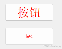
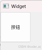
案例:调整按钮样式
cpp
Widget::Widget(QWidget *parent)
: QWidget(parent)
, ui(new Ui::Widget)
{
ui->setupUi(this);
QPushButton* button = new QPushButton("按钮",this);
button->setGeometry(0,0,100,100);
button->setStyleSheet("QPushButton { border : 5px solid red ; margin : 15px ;}");
qDebug()<<button->geometry();
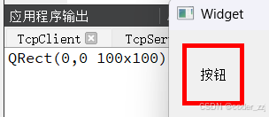
}先前
调整后,虽然看起来变小了,但实际上尺寸并没有发生变化
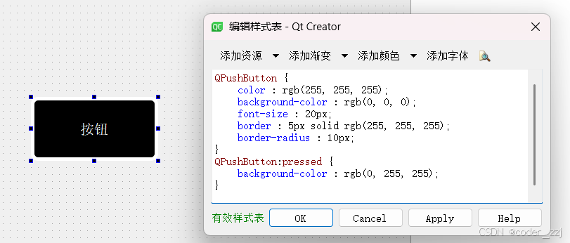
以 ui 的方式设计按钮的样式
cpp
QPushButton {
	color : rgb(255, 255, 255);
	background-color : rgb(0, 0, 0);
	font-size : 20px;
	border : 5px solid rgb(255, 255, 255);
	border-radius : 10px;
}
QPushButton:pressed {
	background-color : rgb(0, 255, 255);
}
复选框
使用以上六种图片,根据复选框的是否点击,是否进入,是否按下来更换图片
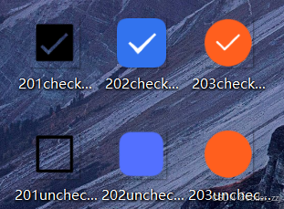
css
QCheckBox {
	font-size: 20px;
}
QCheckBox::indicator {
	width: 20;
	height: 20;
}
QCheckBox::indicator:unchecked{
	image: url(:/201uncheck.png);
}
QCheckBox::indicator:unchecked:hover {
	image: url(:/202uncheck.png);
}
QCheckBox::indicator:unchecked:pressed {
	image: url(:/203uncheck.png);
}

QCheckBox::indicator:checked {
	image: url(:/201check.png);
}
QCheckBox::indicator:checked:hover {
	image: url(:/202check.png);
}
QCheckBox::indicator:checked:pressed {
	image: url(:/203check.png);
}| 要点 | 说明 |
|---|---|
| ::indicator | ⼦控件选择器,也就是打钩的边框 |
| :checked | 伪类选择器. 选中 indicator被选中的状态 |
| :unchecked | 伪类选择器 选中 indicator 未被选中的状态 |
| width | 设置 indicator 宽度 对于普通控件⽆效(普通控件使⽤ geometry ⽅式设定尺⼨) |
| height | 设置⼦控件⾼度 |
| image | 设置⼦控件的图⽚ |
输入框
cpp
QLineEdit {
	font-size: 20px;
	border-radius: 10px;
	border: 3px solid rgb(0, 0, 0);
	color: rgb(0, 0, 0);
	background-color: rgb(190, 190, 190);
	selection-color: rgb(255, 255, 255);
	selection-background-color: rgb(0, 0, 0)
}| 属性 | 说明 |
|---|---|
| border-radius | 设置边框圆⻆ |
| border-style | 设置边框⻛格(宽度 + 粗细 + 颜色) |
| color | 设置⽂字颜⾊ |
| background | 设置背景颜⾊ |
| selection-background-color | 设置选中⽂字的背景颜⾊ |
| selection-color | 设置选中⽂字的⽂本颜⾊ |
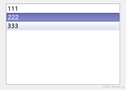
列表框
鼠标悬停在列表中的某一项是一种颜色,点击某一项又是另一种颜色
cpp
QListWidget {
	font-size: 20px;
}
QListWidget::item:hover {
	background-color: rgb(0, 250, 250)
}
QListWidget::item:selected {
	background-color: rgb(0, 179, 179)
}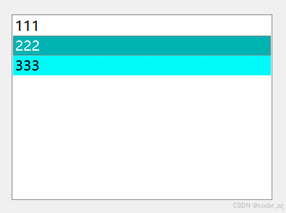
使用 qlineargradient 设置渐变色,共有六个参数
- x1,y1:标注了⼀个起点
- x2,y2:标注了⼀个终点
这两个点描述了⼀个"⽅向",例如:x1:0,y1:0,x2:0,y2:1 就是垂直⽅向从上向下进⾏颜⾊渐变;而最后两个参数 stop 0和 stop 1描述了从开始到结束的颜色渐变过程
cpp
QListView::item:hover {
	background: qlineargradient(x1: 0, y1: 0, x2: 0, y2: 1,stop: 0 #FAFBFE, stop: 1 #DCDEF1);
}
QListView::item:selected {
	border: 1px solid #6a6ea9;
	background: qlineargradient(x1: 0, y1: 0, x2: 0, y2: 1,stop: 0 #6a6ea9, stop: 1 #888dd9);
}
菜单
给菜单栏,菜单项进行美化
css
QMenuBar::item {
	background-color: rgb(0, 255, 255);
	border-radius: 5px;
	margin: 0px 5px;
}
QMenuBar::item:selected {
	background-color: rgb(85, 255, 0);
}
/*设置透明边框*/
QMenu:item {
	border: 3px solid transparent;
}
QMenu:item:selected {
	border: 3px solid red;
}
QMenu:separator {
	height: 3px;
	background-color: green;
	margin: 0px 5px;
}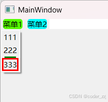
| 要点 | 说明 |
|---|---|
| QMenuBar::item | 选中菜单栏中的元素 |
| QMenuBar::item:selected | 选中菜单来中的被选中的元素 |
| QMenuBar::item:pressed | 选中菜单栏中的⿏标点击的元素 |
| QMenu::item | 选中菜单中的元素 |
| QMenu::item:selected | 选中菜单中的被选中的元素 |
| QMenu::separator | 选中菜单中的分割线 |
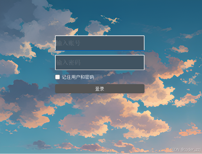
登录界面
使用 QSS 美化用户登录界面,在插入图片这里需要注意,不能直接在主窗口 QWidget 插入图片,Qt 不允许,所以需要先使用 QFrame 控件插入,再插入图片
css
QFrame {
	background-image: url(:/image/3.png);
}
QLineEdit {
	background-color: #405361;
	color: #8d98a1;
	font-size: 20px;
}
QCheckBox {
	color: white;
	background-color: transparent;
}
QPushButton {
	color: white;
	background-color: #555;
	border-radius: 5px;
}
QPushButton:pressed {
	background-color: white;
}
绘图
前面所学的常用控件,都是 Qt 给我们提前画出来的,如果当前控件不满足则要我们自己"画",这就要要求 Qt 给我们提供相关画图 API
核心 API 类
| 类 | 说明 |
|---|---|
| QPainter | "绘画者" 或者 "画家" ⽤来绘图的对象,提供了⼀系列 drawXXX ⽅法,可以允许我们绘制各种图形 |
| QPaintDevice | "画板",描述了 QPainter 把图形画到哪个对象上,像咱们之前⽤过的 QWidget 也 是⼀种 QPaintDevice (QWidget 是 QPaintDevice 的⼦类) |
| QPen | "画笔",描述了 QPainter 画出来的线是什么样的 |
| QBrush | "画刷",描述了 QPainter 填充⼀个区域是什么样的 |
绘图 API 的使⽤,⼀般不会在 QWidget 的构造函数中使⽤,⽽是要放到 paintEvent 事件中,来进行重写,以下情况会触发
- 控件首次创建时,会在 QWidget 上画画;QWidget 没被创建则不起效果
- 控件被遮挡,再解除遮挡
- 窗口最小化,再恢复
- 控件大小发⽣变化时
- 主动调⽤ repaint() 或者 update() ⽅法(这两个方法都是 QWidget 的⽅法)
使用
cpp
void Widget::paintEvent(QPaintEvent *event)
{
(void) event;
// 栈上创建,指明在哪个控件进行画画
QPainter p(this);
// 设置文本样式
QFont f("微软雅黑",26);
p.setFont(f);
// 设置圆形样式
QPen pen;
pen.setColor(QColor("red"));
pen.setWidth(6);
pen.setStyle(Qt::DashLine);
p.setPen(pen);
// 画线
//p.drawLine(20,30,100,30);
//p.drawLine(QPoint(20,30),QPoint(20,100));
// 画矩阵
//p.drawRect(50,50,100,50);
// 画圆形
p.drawEllipse(100,100,80,50);
// 文本 第一个参数:文字最左侧位置,第二个参数:基线位置
//p.drawText(200,100,"hello");
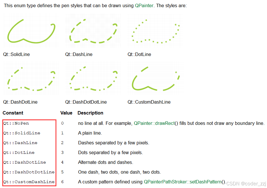
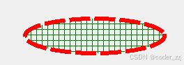
}画笔 QPen 的各种枚举 Style
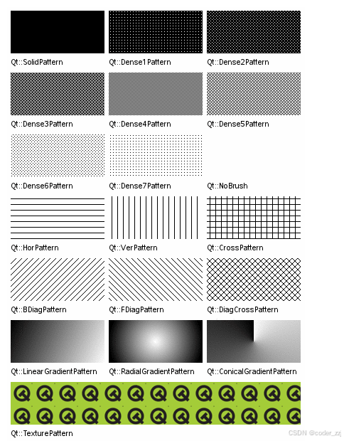
QBrush
画刷 QBrush 用来填充形状内部的样式
cpp
void Widget::paintEvent(QPaintEvent *event)
{
    (void) event;
    // 栈上创建,指明在哪个控件进行画画
    QPainter p(this);
    // 设置圆形样式
    QPen pen;
    pen.setColor(QColor("red"));
    pen.setWidth(6);
    pen.setStyle(Qt::DashLine);
    p.setPen(pen);
    // 使用画刷
    QBrush brush;
    brush.setColor(QColor("green"));
    brush.setStyle(Qt::CrossPattern);
    p.setBrush(brush);
    // 画圆形
    p.drawEllipse(100,100,200,50);
}
QPixmap
使用 QPixmap 来进行来显示图像,除此之外还有三个类似功能的类:QImage,QBitmap和QPicture
cpp
void Widget::paintEvent(QPaintEvent *event)
{
    (void) event;
    // 栈上创建,指明在哪个控件进行画画
    QPainter p(this);
    QPixmap pixmap(":/image/down.png");
    // 缩放图片
    p.drawPixmap(0,0,200,200,pixmap);
    // 正常显示图片
    //p.drawPixmap(0,0,pixmap);
}
旋转图片(后要进行平移)
cpp
void Widget::paintEvent(QPaintEvent *event)
{
    (void) event;
    // 栈上创建,指明在哪个控件进行画画
    QPainter p(this);
    QPixmap pixmap(":/image/down.png");
    // 旋转180度,默认以原点(0,0)为中心
    p.rotate(180);
    // 平移图片,让图片显示(不是正数,则是以旋转后为参照物,往右 x 减,往下 y 减 从而来平移原点)
    p.translate(-500,-600);
    p.drawPixmap(0,0,pixmap);
}
以上便是全部内容,有问题欢迎在评论区指正,感谢观看!