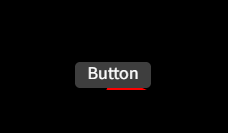
思路:使用伪元素+动画来实现
代码:
html
<!DOCTYPE html>
<html lang="en">

<head>
  <meta charset="UTF-8">
  <meta name="viewport" content="width=device-width, initial-scale=1.0">
  <title>Document</title>
  <style>
    * {
      padding: 0;
      margin: 0;
    }

    body {
      background: #000;
    }

    .wrap {
      width: 400px;
      height: 400px;
      display: flex;
      justify-content: center;
      align-items: center;
    }

    .btn {
      width: 80px;
      height: 30px;
      border-radius: 5px;
      color: #fff;
      text-align: center;
      position: relative;
      overflow: hidden;
    }

    /* 这是需要动画的一个div */
    .btn::before {
      display: inline-block;
      background: red;
      content: '';
      width: 80px;
      height: 80px;
      position: absolute;
      left: 50%;
      top: 50%;
      z-index: -2;
      transform-origin: left top;
      animation: 5s animate 0s infinite;
    }

    /* 这是需要把动画的div隐藏一部分的div*/
    .btn::after {
      display: inline-block;
      background: #3f3f3f;
      border-radius: 5px;
      content: '';
      --w: 2px;
      left: var(--w);
      top: var(--w);
      width: calc(100% - 2 * var(--w));
      height: calc(100% - 2 * var(--w));
      position: absolute;
      z-index: -1;
    }

    @keyframes animate {
      from {
        transform: rotate(0deg)
      }

      to {
        transform: rotate(360deg)
      }
    }
  </style>
  </head>

<body>
  <!-- 写一个按钮的边框在移动的css -->
  <div class="wrap">
    <span class="btn">Button</span>
  </div>
  </body>

</html>