让child元素在parent容器中水平和垂直都居中
方法一:Flex弹性布局
现代浏览器支持度很高,即使子元素高度不确定也能完美实现居中
 	<main>
        <div class="parent">
            <div class="child">我是居中的babycare</div>
        </div>
    </main>
    <style>
        .parent {
            display: flex;
            justify-content: center;
            align-items: center;
            height: 200px;
            border: 1px solid #ccc;
        }
        .child {
            background: red;
        }
    </style>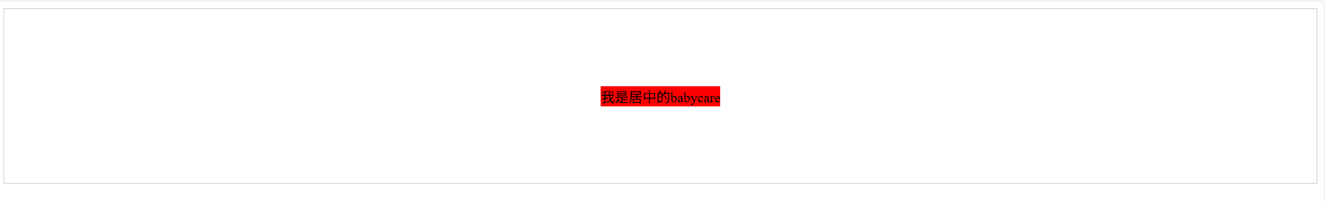
方法二:Grid网格布局
写法简洁,一行代码就能实现,Grid在旧版浏览器中的支持度略低于Flexbox
	<main>
        <div class="parent">
            <div class="child">我是居中的babycare</div>
            <div class="child">我是居中的babycare</div>
        </div>
    </main>
    <style>
        .parent {
            display: grid;
            place-items: center;
            height: 200px;
            border: 1px solid #ccc;
        }
        .child {
            background: red;
        }
        .child:nth-child(2) {
            background-color: pink;
        }
    </style>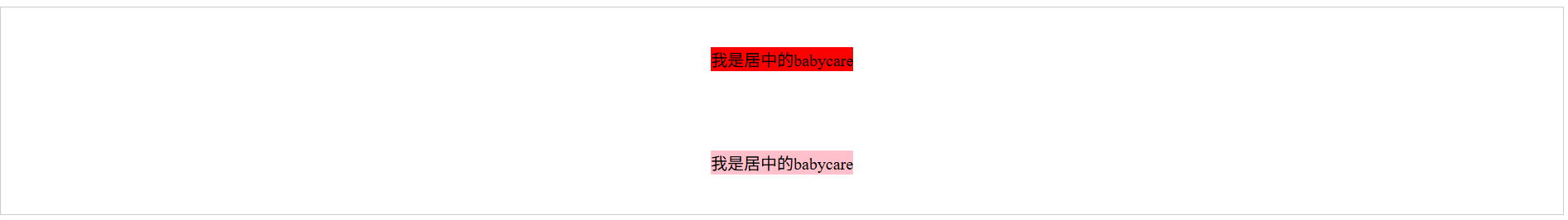
方法三:绝对定位+位移变换
这个地方兼容性很好,支持到IE9以上,最大的优点是不需要知道子元素的宽高
	<main>
        <div class="parent">
            <div class="child">我是居中的babycare</div>
        </div>
    </main>
    <style>
        .parent {
            position: relative;
            height: 200px;
            border: 1px solid #ccc;
        }
        .child {
            position: absolute;
            top: 50%;
            left: 50%;
            transform: translate(-50%, -50%);
            background: red;
        }
    </style>
方法四:绝对定位+自动边距(固定宽高适用)
利用margin:auto在绝对定位下的特点,需要明确的设置子元素的宽度和高度,浏览器自动计算实现居中
 	<main>
        <div class="parent">
            <div class="child">我是居中的babycare</div>
        </div>
    </main>
    <style>
        .parent {
            position: relative;
            height: 200px;
            border: 1px solid #ccc;
        }
        .child {
            position: absolute;
            top: 0;
            left: 0;
            right: 0;
            bottom: 0;
            margin: auto;
            height: 100px;
            width: 200px;
            background: red;
        }
    </style>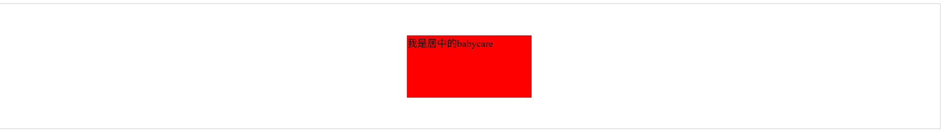
方法五:表格单元格方式(传统但有效)
模拟了表格单元格的行为,verticle-align:middle实现垂直居中,父元素需要设置明确的高度,子元素要设置为inline-block
 	<main>
        <div class="parent">
            <div class="child">我是居中的babycare</div>
        </div>
    </main>
    <style>
        .parent {
            display: table-cell;
            width: 100vw;
            height: 200px;
            vertical-align: middle;
            text-align: center;
            border: 1px solid #ccc;
        }
        .child {
            display: inline-block;
            background: red;
        }
    </style>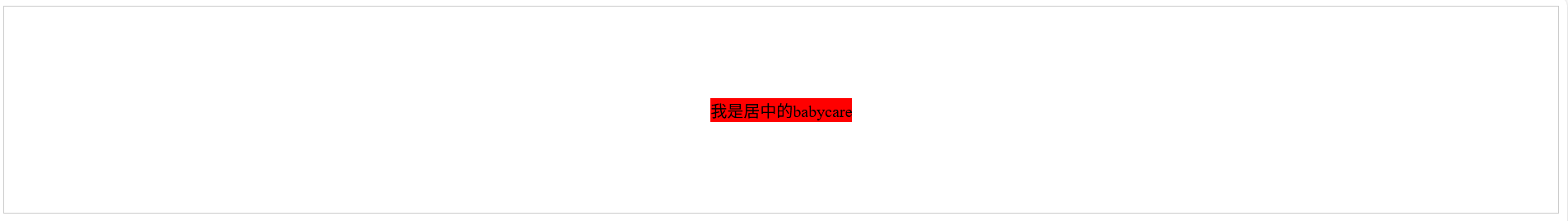
方法六:内联块+伪元素(特殊场景使用)
创建一个全高的伪元素作为参照物,通过verticle-align实现垂直对齐,不能用在flexbox或grid时候可以考虑
	<main>
        <div class="parent">
            <div class="child">我是居中的babycare</div>
        </div>
    </main>
    <style>
        .parent {
            text-align: center;
            height: 200px;
            border: 1px solid #ccc;
        }
        .parent::before {
            content: "";
            display: inline-block;
            height: 100%;
            vertical-align: middle;
        }
        .child {
            display: inline-block;
            vertical-align: middle;
            background: red;
        }
    </style>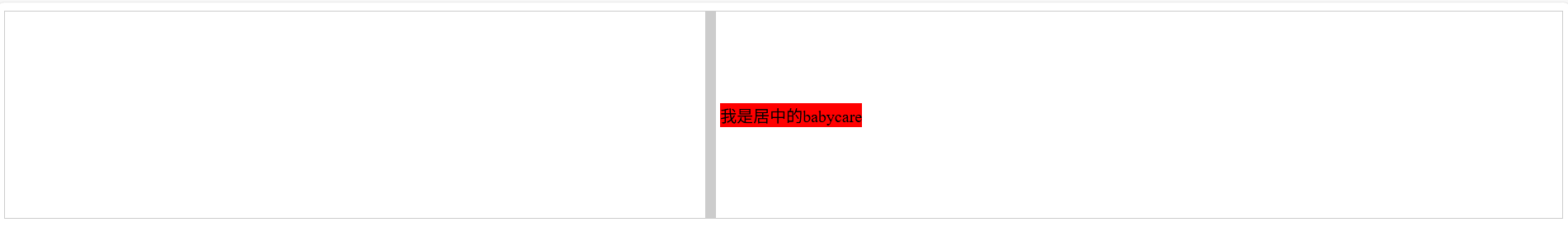
方法七:视口居中(弹框场景)
需要再浏览器窗口中央显示的弹窗,使用position:fixed相对于视口定位,再结合transform实现居中
	 <main>
        <div class="parent">
            <div class="child">我是居中的babycare</div>
        </div>
    </main>
    <style>
        .parent {}
        .child {
            position: fixed;
            top: 50%;
            left: 50%;
            transform: translate(-50%,-50%);
            width: 80%;
            max-width: 600px;
            background: red;
        }
    </style>
方法八:JavaScript动态计算
动态计算出父元素和子元素的offsetWidth 和 offsetHeight,使用position:absolute,给top left赋值