在使用 TDesign Vue Next 组件库开发项目时,我们经常会遇到需要深度定制组件样式的情况。最近在开发材质编辑器功能时,就遇到了一个棘手的问题:t-dialog 组件无法通过样式穿透修改内层样式。
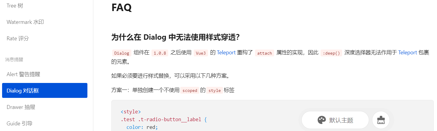
官方链接说明如下:
虽然在该链接中也提到了一些解决方法,但是问题也很多。
本文将分享如何用原生 div 实现一个功能完整的自定义对话框,解决样式定制难题。
问题背景
在材质编辑器项目中,我们需要一个固定尺寸(1024×768px)的对话框,并且要求精确控制内部布局。使用 TDesign 的 t-dialog 组件时,遇到了以下问题:
-
样式穿透失效 :即使使用
:deep()选择器,也无法覆盖 t-dialog 的内层样式 -
padding 不可控:对话框的内边距无法完全移除
-
布局限制:默认的对话框结构限制了自定义布局的灵活性
查看 TDesign 官方文档 后确认,t-dialog 确实不支持样式穿透,官方提供的替代方案也无法满足我们的定制需求。
解决方案:自定义对话框实现
1. 基本结构设计
我们使用两层 div 结构来模拟对话框:
html
<template>
  <!-- 遮罩层 -->
  <div v-if="dialogVisible" class="custom-dialog-mask">
    <!-- 对话框容器 -->
    <div ref="dialogRef" class="custom-dialog-container" :style="dialogStyle">
      <!-- 对话框头部 -->
      <div class="custom-dialog-header" @mousedown="startDrag">
        <span class="dialog-title">材质编辑器</span>
        <button class="close-btn" @click="handleClose">×</button>
      </div>

      <!-- 对话框内容 -->
      <div class="custom-dialog-body">
        <!-- 业务内容 -->
      </div>
    </div>
  </div>
</template>
2. 遮罩层实现与事件屏蔽
遮罩层的核心作用是屏蔽背景交互 并提供视觉隔离:
html
<style scoped>
.custom-dialog-mask {
  position: fixed;
  top: 0;
  left: 0;
  right: 0;
  bottom: 0;
  background-color: rgba(0, 0, 0, 0.5);
  z-index: 1000;
  display: flex;
  justify-content: center;
  align-items: center;
  pointer-events: auto; /* 关键:确保遮罩层捕获所有事件 */
}

.custom-dialog-container {
  position: absolute;
  background-color: #1a1a1a;
  border: 1px solid #444;
  border-radius: 4px;
  box-shadow: 0 4px 20px rgba(0, 0, 0, 0.5);
  overflow: hidden;
  display: flex;
  flex-direction: column;
  pointer-events: auto; /* 关键:确保对话框可以接收交互事件 */
}
</style>
关键技术点:
-
使用
pointer-events: auto确保事件传递正确 -
遮罩层使用
fixed定位覆盖整个视口 -
半透明背景提供视觉层次感
3. 拖拽功能的完整实现
拖拽功能是自定义对话框的核心特性,需要精细的事件处理:
TypeScript
// 对话框拖拽相关状态
const dialogRef = ref<HTMLElement>()
const isDragging = ref(false)
const dragStartPos = ref({ x: 0, y: 0 })
const dialogStartPos = ref({ x: 0, y: 0 })
const dialogPosition = ref({ x: 0, y: 0 })

// 对话框样式
const dialogStyle = computed(() => ({
  width: '1024px',
  height: '768px',
  left: `${dialogPosition.value.x}px`,
  top: `${dialogPosition.value.y}px`
}))

// 开始拖拽
const startDrag = (e: MouseEvent) => {
  if (!dialogRef.value) return

  isDragging.value = true
  dragStartPos.value = {
    x: e.clientX,
    y: e.clientY
  }
  dialogStartPos.value = { ...dialogPosition.value }

  document.addEventListener('mousemove', onDrag)
  document.addEventListener('mouseup', stopDrag)
  e.preventDefault()
  e.stopPropagation()
}

// 拖拽中
const onDrag = (e: MouseEvent) => {
  if (!isDragging.value) return

  const deltaX = e.clientX - dragStartPos.value.x
  const deltaY = e.clientY - dragStartPos.value.y

  const newX = dialogStartPos.value.x + deltaX
  const newY = dialogStartPos.value.y + deltaY

  // 限制对话框在可视区域内
  const maxX = window.innerWidth - 1024
  const maxY = window.innerHeight - 768

  dialogPosition.value = {
    x: Math.max(0, Math.min(newX, maxX)),
    y: Math.max(0, Math.min(newY, maxY))
  }

  e.preventDefault()
  e.stopPropagation()
}

// 停止拖拽
const stopDrag = (e?: MouseEvent) => {
  isDragging.value = false
  document.removeEventListener('mousemove', onDrag)
  document.removeEventListener('mouseup', stopDrag)

  if (e) {
    e.preventDefault()
    e.stopPropagation()
  }
}

// 对话框居中
const centerDialog = () => {
  if (dialogRef.value) {
    const dialogWidth = 1024
    const dialogHeight = 768
    const windowWidth = window.innerWidth
    const windowHeight = window.innerHeight

    dialogPosition.value = {
      x: (windowWidth - dialogWidth) / 2,
      y: (windowHeight - dialogHeight) / 2
    }
  }
}
拖拽实现的关键要点:
-
精确的位置计算:
-
记录拖拽开始时的鼠标位置和对话框位置
-
使用差值计算新位置,避免位置跳跃
-
-
边界限制:
-
计算可视区域边界,防止对话框被拖出屏幕
-
使用
Math.max(0, Math.min(newX, maxX))进行边界约束
-
-
事件管理:
-
在
mousedown时添加全局事件监听 -
在
mouseup时及时移除事件监听,防止内存泄漏 -
使用
stopPropagation()防止事件冒泡干扰
-
-
视觉反馈:
-
头部区域设置
cursor: move提示可拖拽 -
拖拽时改为
cursor: grabbing提供操作反馈
-
4. 完整的样式实现
css
<style scoped>
/* 对话框头部 */
.custom-dialog-header {
  height: 40px;
  background-color: #2d2d2d;
  border-bottom: 1px solid #444;
  color: #e0e0e0;
  display: flex;
  align-items: center;
  justify-content: space-between;
  padding: 0 12px;
  cursor: move;
  user-select: none;
  flex-shrink: 0;
}

.dialog-title {
  font-size: 14px;
  font-weight: 500;
}

.close-btn {
  background: none;
  border: none;
  color: #e0e0e0;
  font-size: 20px;
  width: 24px;
  height: 24px;
  border-radius: 2px;
  cursor: pointer;
  display: flex;
  align-items: center;
  justify-content: center;
  transition: background-color 0.2s;
}

.close-btn:hover {
  background-color: #444;
}

/* 对话框内容 */
.custom-dialog-body {
  flex: 1;
  overflow: hidden;
}

/* 拖拽时的样式反馈 */
.custom-dialog-header:active {
  cursor: grabbing;
}
</style>
优势与收获
相比 t-dialog 的优势
-
完全的样式控制:不再受限于组件库的样式结构
-
精准的尺寸控制:可以精确控制对话框和内部布局的尺寸
-
灵活的事件处理:可以自定义各种交互行为
-
更好的性能:减少不必要的样式计算和组件层次
实现过程中的经验总结
-
事件处理要精细:拖拽功能需要仔细处理事件的生命周期
-
边界检查很重要:确保对话框不会移出可视区域
-
用户体验要考虑:提供视觉反馈,如拖拽光标变化
-
代码组织要清晰:将拖拽逻辑封装成可复用的函数
完整代码示例
以下是整合后的完整组件代码:
html
<template>
  <div v-if="dialogVisible" class="custom-dialog-mask">
    <div
      ref="dialogRef"
      class="custom-dialog-container"
      :style="dialogStyle"
    >
      <div class="custom-dialog-header" @mousedown="startDrag">
        <span class="dialog-title">材质编辑器</span>
        <button class="close-btn" @click="handleClose">×</button>
      </div>

      <div class="custom-dialog-body">
        <!-- 具体的业务内容 -->
        <slot></slot>
      </div>
    </div>
  </div>
</template>

<script setup lang="ts">
import { ref, computed, onMounted, onUnmounted, nextTick, watch } from 'vue'

interface Props {
  visible: boolean
  width?: string
  height?: string
}

const props = withDefaults(defineProps<Props>(), {
  width: '1024px',
  height: '768px'
})

const emit = defineEmits<{
  (e: 'update:visible', value: boolean): void
  (e: 'close'): void
}>()

// 状态管理
const dialogVisible = ref(props.visible)

// 拖拽相关状态
const dialogRef = ref<HTMLElement>()
const isDragging = ref(false)
const dragStartPos = ref({ x: 0, y: 0 })
const dialogStartPos = ref({ x: 0, y: 0 })
const dialogPosition = ref({ x: 0, y: 0 })

// 对话框样式
const dialogStyle = computed(() => ({
  width: props.width,
  height: props.height,
  left: `${dialogPosition.value.x}px`,
  top: `${dialogPosition.value.y}px`
}))

// 监听 visible 变化
watch(() => props.visible, (newVal) => {
  dialogVisible.value = newVal
  if (newVal) {
    nextTick(() => {
      centerDialog()
    })
  }
})

// 居中对话框
const centerDialog = () => {
  if (dialogRef.value) {
    const dialogWidth = parseInt(props.width)
    const dialogHeight = parseInt(props.height)
    const windowWidth = window.innerWidth
    const windowHeight = window.innerHeight

    dialogPosition.value = {
      x: (windowWidth - dialogWidth) / 2,
      y: (windowHeight - dialogHeight) / 2
    }
  }
}

// 拖拽功能
const startDrag = (e: MouseEvent) => {
  if (!dialogRef.value) return

  isDragging.value = true
  dragStartPos.value = { x: e.clientX, y: e.clientY }
  dialogStartPos.value = { ...dialogPosition.value }

  document.addEventListener('mousemove', onDrag)
  document.addEventListener('mouseup', stopDrag)
  e.preventDefault()
  e.stopPropagation()
}

const onDrag = (e: MouseEvent) => {
  if (!isDragging.value) return

  const deltaX = e.clientX - dragStartPos.value.x
  const deltaY = e.clientY - dragStartPos.value.y

  const newX = dialogStartPos.value.x + deltaX
  const newY = dialogStartPos.value.y + deltaY

  const maxX = window.innerWidth - parseInt(props.width)
  const maxY = window.innerHeight - parseInt(props.height)

  dialogPosition.value = {
    x: Math.max(0, Math.min(newX, maxX)),
    y: Math.max(0, Math.min(newY, maxY))
  }

  e.preventDefault()
  e.stopPropagation()
}

const stopDrag = () => {
  isDragging.value = false
  document.removeEventListener('mousemove', onDrag)
  document.removeEventListener('mouseup', stopDrag)
}

// 关闭对话框
const handleClose = () => {
  dialogVisible.value = false
  emit('update:visible', false)
  emit('close')
}

// 生命周期
onMounted(() => {
  if (dialogVisible.value) {
    centerDialog()
  }
  window.addEventListener('resize', centerDialog)
})

onUnmounted(() => {
  stopDrag()
  window.removeEventListener('resize', centerDialog)
})
</script>

<style scoped>
/* 样式同上文 */
</style>
结语
通过这个自定义对话框的实现,我们不仅解决了 TDesign t-dialog 的样式限制问题,还获得了更大的灵活性和控制力。这种方案特别适合需要高度定制化的复杂对话框场景。
当然,这种实现方式也需要更多的代码和维护成本,在简单场景下可能还是使用组件库提供的对话框更合适。但在需要深度定制的场景中,掌握这种自定义实现方法将会是很有价值的技能。