1、关闭坐标轴\边框
👏 python 的 matplotlib 库,关闭坐标轴\边框,如下:
1.1、面向对象:OO-style
👏 关闭全部边框\坐标轴,如下:
ini
# 导入库
import matplotlib.pyplot as plt

# 创建图像窗体,子图对象
fig, ax = plt.subplots(figsize=(3,3))

# 绘制折线图
ax.plot([1, 2, 3, 4], [8, 4, 2, 3])

# 关闭所有边框\坐标轴
ax.axis('off')

# 显示图形:
plt.show()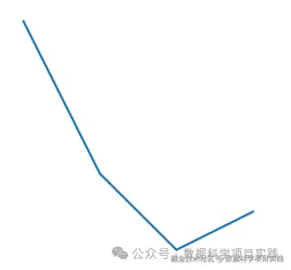
👏 关闭部分边框\坐标轴,如下:
scss
# 导入库
import matplotlib.pyplot as plt

# 创建图像窗体,子图对象
fig, ax = plt.subplots(figsize=(3,3))

# 绘制折线图
ax.plot([1, 2, 3, 4], [8, 4, 2, 3])

# 关闭最上面,右边坐边框
# top\bottom\left\right
ax.spines['top'].set_visible(False)
ax.spines['right'].set_visible(False)

# 显示图形:
plt.show()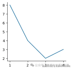
1.2、pyplot 函数
👏 关闭全部边框\坐标轴,如下:
ini
# 导入库
import matplotlib.pyplot as plt

# 创建图像窗体
plt.figure(figsize=(3, 3))

# 绘制折线图
plt.plot([1, 2, 3, 4], [8, 4, 2, 3])

# 关闭所有坐标轴\边框
plt.axis('off')

# 显示图形:
plt.show()
👏 关闭部分边框\坐标轴,如下:
scss
# 导入库
import matplotlib.pyplot as plt

# 创建图像窗体
plt.figure(figsize=(3, 3))

# 绘制折线图
plt.plot([1, 2, 3, 4], [8, 4, 2, 3])

# 关闭左边,下边坐标轴\边框
# top\bottom\left\right
plt.gca().spines['top'].set_visible(False)
plt.gca().spines['right'].set_visible(False)

# plt.gca()获取当前坐标轴对象

# 显示图形:
plt.show()
2、坐标轴\边框颜色
👏 python 的 matplotlib 库,设置坐标轴\边框颜色,如下:
- 将坐标轴\边框颜色设置为白色,同样可以起到隐藏效果
2.1、面向对象:OO-style
scss
# 导入库
import matplotlib.pyplot as plt

# 创建图像窗体,子图对象
fig, ax = plt.subplots(figsize=(3,3))

# 绘制折线图
ax.plot([1, 2, 3, 4], [8, 4, 2, 3])

# 设置边框颜色
# top\bottom\left\right
ax.spines['bottom'].set_color('red')
ax.spines['top'].set_color('white')
ax.spines['right'].set_color('white')

# 显示图形:
plt.show()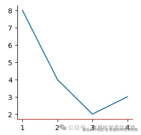
2.1、面向对象:OO-style
scss
# 导入库
import matplotlib.pyplot as plt

# 创建图像窗体
plt.figure(figsize=(3, 3))

# 绘制折线图
plt.plot([1, 2, 3, 4], [8, 4, 2, 3])

# 设置边框颜色
# top\bottom\left\right
plt.gca().spines['bottom'].set_color('red')
plt.gca().spines['top'].set_color('white')
plt.gca().spines['right'].set_color('white')

# 显示图形:
plt.show()
3、坐标轴\边框粗细
👏 python 的 matplotlib 库,设置坐标轴\边框粗细,如下:
3.1、面向对象:OO-style
scss
# 导入库
import matplotlib.pyplot as plt

# 创建图像窗体,子图对象
fig, ax = plt.subplots(figsize=(3,3))

# 绘制折线图
ax.plot([1, 2, 3, 4], [8, 4, 2, 3])

# 设置边框粗细
# top\bottom\left\right
ax.spines['top'].set_linewidth(1)
ax.spines['bottom'].set_linewidth(3)
ax.spines['left'].set_linewidth(3)
ax.spines['right'].set_linewidth(4)

# 显示图形:
plt.show()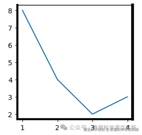
3.2、pyplot 函数
scss
# 导入库
import matplotlib.pyplot as plt

# 创建图像窗体
plt.figure(figsize=(3, 3))

# 绘制折线图
plt.plot([1, 2, 3, 4], [8, 4, 2, 3])

# 设置边框粗细
# top\bottom\left\right
plt.gca().spines['top'].set_linewidth(1)
plt.gca().spines['bottom'].set_linewidth(3)
plt.gca().spines['left'].set_linewidth(3)
plt.gca().spines['right'].set_linewidth(4)

# 显示图形:
plt.show()
4、坐标轴\边框位置
👏 python 的 matplotlib 库,设置坐标轴\边框位置,如下:
👏 设置坐标轴边框位置有三种种方式:
-
1、("axes", 0.5):
-
-
"axes"表示相对于坐标轴定位。
-
0.5是一个比例值,表示将右侧边框定位在相对于坐标轴的 0.5 位置处,即坐标轴范围的中间位置。
-
-
2、("data", 0):
-
-
"data"表示相对于数据定位。
-
0表示将右侧边框定位在数据值为 0 的位置处。
-
-
3、("outward", 5):
-
- "outward":表示向外移动边框。这个参数告诉 matplotlib 将边框向远离图表中心的方向移动。
- -5:是一个数值,表示移动的距离。在这里,负数表示向坐标轴的负方向移动,也就是向左移动(对于垂直边框来说)。如果是正数,就会向坐标轴的正方向移动。
4.1、面向对象:OO-style
scss
# 导入库
import matplotlib.pyplot as plt

# 创建图像窗体,子图对象
fig, ax = plt.subplots(figsize=(3,3))

# 绘制折线图
ax.plot([1, 2, 3, 4], [8, 4, 2, 3])

# 设置边框位置
# top\bottom\left\right
ax.spines["right"].set_position(("outward", -5))
ax.spines["left"].set_position(("data", 2))
ax.spines["top"].set_position(("axes", 0.1))

# 显示图形:
plt.show()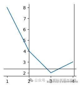
4.2、pyplot 函数
scss
# 导入库
import matplotlib.pyplot as plt

# 创建图像窗体
plt.figure(figsize=(3, 3))

# 绘制折线图
plt.plot([1, 2, 3, 4], [8, 4, 2, 3])

# 设置边框位置
# top\bottom\left\right
plt.gca().spines["right"].set_position(("outward", -5))
plt.gca().spines["left"].set_position(("data", 2))
plt.gca().spines["top"].set_position(("axes", 0.1))

# 显示图形:
plt.show()
👏
plt.gca():获取当前坐标轴对象,可以先将坐标轴对象保存到变量中,再进行操作。如下
scss
# 导入库
import matplotlib.pyplot as plt

# 创建图像窗体
plt.figure(figsize=(3, 3))

# 绘制折线图
plt.plot([1, 2, 3, 4], [8, 4, 2, 3])

# 设置边框位置
# top\bottom\left\right
plt_ax = plt.gca()

plt_ax.spines["right"].set_position(("outward", -5))
plt_ax.spines["left"].set_position(("data", 2))
plt_ax.spines["top"].set_position(("axes", 0.1))

# 显示图形:
plt.show()- 总结 :以上介绍了 python matplotlib 库,设置坐标轴\边框颜色、粗细、位置等操作。更多关于 matplotlib 库操作,请参考:可视化-文档