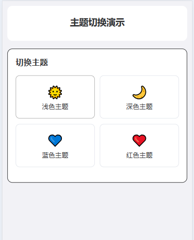
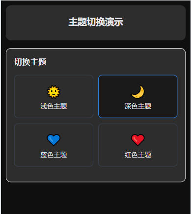
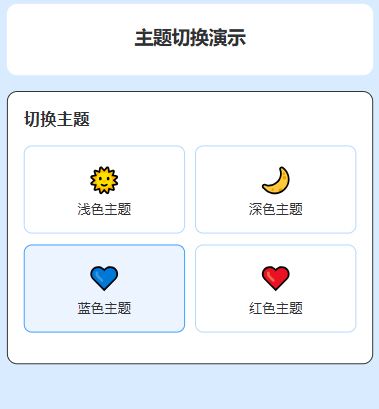
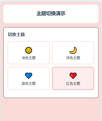
实现效果:
1.需要配置的样式
1.1 设置每个主题对应的颜色, 主题配置映射 $themes:
@/styles/themes/variables.scss
// 主题配置映射
$themes: (
  "light": (
    // 基础颜色
    --color-primary: #2979ff,
    --color-success: #19be6b,
    --color-warning: #ff9900,
    --color-error: #fa3534,
    --color-info: #909399,

    // 背景色
    --bg-color: #ffffff,
    --bg-color-page: #f2f2f6,
    --bg-color-grey: #f7f7f7,
    --bg-color-card: #ffffff,

    // 文字颜色
    --text-color: #303133,
    --text-color-regular: #606266,
    --text-color-secondary: #909399,
    --text-color-placeholder: #c0c4cc,

    // 边框颜色
    --border-color: #e4e7ed,
    --border-color-light: #ebeef5,

    // 阴影
    --box-shadow: 0 2px 12px 0 rgba(0, 0, 0, 0.1),

    // uView主题映射
    --u-primary: #2979ff,
    --u-success: #19be6b,
    --u-warning: #ff9900,
    --u-error: #fa3534
  ),

  "dark": (
    --color-primary: #2b85e4,
    --color-success: #18b566,
    --color-warning: #f29100,
    --color-error: #d63031,
    --color-info: #6b7280,

    --bg-color: #1a1a1a,
    --bg-color-page: #0f0f0f,
    --bg-color-grey: #2d2d2d,
    --bg-color-card: #2d2d2d,

    --text-color: #e5e7eb,
    --text-color-regular: #d1d5db,
    --text-color-secondary: #9ca3af,
    --text-color-placeholder: #6b7280,

    --border-color: #374151,
    --border-color-light: #4b5563,

    --box-shadow: 0 2px 12px 0 rgba(0, 0, 0, 0.6),

    --u-primary: #2b85e4,
    --u-success: #18b566,
    --u-warning: #f29100,
    --u-error: #d63031
  ),

  "blue": (
    --color-primary: #409eff,
    --color-success: #67c23a,
    --color-warning: #e6a23c,
    --color-error: #f56c6c,
    --color-info: #909399,

    --bg-color: #ecf5ff,
    --bg-color-page: #d9ecff,
    --bg-color-grey: #f0f7ff,
    --bg-color-card: #ffffff,

    --text-color: #303133,
    --text-color-regular: #606266,
    --text-color-secondary: #909399,
    --text-color-placeholder: #c0c4cc,

    --border-color: #b3d8ff,
    --border-color-light: #d9ecff,

    --box-shadow: 0 2px 12px 0 rgba(64, 158, 255, 0.1),

    --u-primary: #409eff,
    --u-success: #67c23a,
    --u-warning: #e6a23c,
    --u-error: #f56c6c
  ),

  "red": (
    --color-primary: #e74c3c,
    --color-success: #27ae60,
    --color-warning: #f39c12,
    --color-error: #c0392b,
    --color-info: #95a5a6,

    --bg-color: #fdedec,
    --bg-color-page: #fadbd8,
    --bg-color-grey: #fbefef,
    --bg-color-card: #ffffff,

    --text-color: #2c3e50,
    --text-color-regular: #34495e,
    --text-color-secondary: #7f8c8d,
    --text-color-placeholder: #bdc3c7,

    --border-color: #f5b7b1,
    --border-color-light: #fadbd8,

    --box-shadow: 0 2px 12px 0 rgba(231, 76, 60, 0.1),

    --u-primary: #e74c3c,
    --u-success: #27ae60,
    --u-warning: #f39c12,
    --u-error: #c0392b
  )
);
1.2 混入
@styles/mixins.scss
@import '@/styles/themes/variables.scss';

// 应用主题变量
@mixin apply-theme($theme-name) {
  $theme: map-get($themes, $theme-name);

  @each $key, $value in $theme {
    #{$key}: #{$value};
  }
}

// 主题混入 - 用于在scoped样式中使用主题变量
@mixin theme-property($property, $key, $important: false) {
  @each $theme-name, $theme-map in $themes {
    $value: map-get($theme-map, $key);

    [data-theme="#{$theme-name}"] & {
      @if $important {
        #{$property}: #{$value} !important;
      } @else {
        #{$property}: #{$value};
      }
    }
  }
}

// 快捷混入
@mixin background-color($color, $important: false) {
  @include theme-property(background-color, $color, $important);
}

@mixin color($color, $important: false) {
  @include theme-property(color, $color, $important);
}

@mixin border-color($color, $important: false) {
  @include theme-property(border-color, $color, $important);
}

@mixin fill($color, $important: false) {
  @include theme-property(fill, $color, $important);
}
1.2.1 应用主题变量混入:apply-theme($theme-name)
通过主题名称来应用主题的所有变量。
@mixin apply-theme($theme-name) {
  $theme: map-get($themes, $theme-name); //根据主题名获取对应主题的变量映射

  @each $key, $value in $theme { //循环遍历当前主题的所有变量
    #{$key}: #{$value};// 输出 "变量名: 值"(如 --color-primary: #072046)
  }
}
如何使用:
// 全局样式文件(非 scoped)
@import '@/styles/mixins.scss';

// 给根元素注入 light 主题的所有变量
.page-container[data-theme="light"] {
  @include apply-theme(light); // 输出所有 light 主题的变量(--color-primary: #072046 等)
}

// 注入 dark 主题的所有变量
.page-container[data-theme="dark"] {
  @include apply-theme(dark); // 输出所有 dark 主题的变量
}
1.2.2 主题属性混入:theme-property($property, $key, $important: false)
// 主题混入 - 用于在scoped样式中使用主题变量
@mixin theme-property($property, $key, $important: false) {
  @each $theme-name, $theme-map in $themes {//循环所有主题(light/dark/custom...)
    $value: map-get($theme-map, $key);//获取当前主题下 $key 对应的变量值(如 $key 为 --color-primary 时,light 主题值为 #072046)
    [data-theme="#{$theme-name}"] & {//生成 "主题标识 + 目标选择器" 的样式规则
      @if $important {
        #{$property}: #{$value} !important;
      } @else {
        #{$property}: #{$value};
      }
    }
  }
}
使用:
javascript
.card {
  // 给 .card 的 background-color 适配所有主题
  @include theme-property(background-color, --bg-card);
  // 等同于自动生成:
  // [data-theme="light"] .card { background-color: #ffffff; }
  // [data-theme="dark"] .card { background-color: #1e1e1e; }
  // [data-theme="custom"] .card { background-color: #fff8e1; }
}

.title {
  // 给 .title 的 color 适配所有主题,且加 !important
  @include theme-property(color, --color-text, true);
}
1.2.3 快捷混入(语法糖)
javascript
// 背景色快捷混入
@mixin background-color($color, $important: false) {
  @include theme-property(background-color, $color, $important);
}

// 文字色快捷混入
@mixin color($color, $important: false) {
  @include theme-property(color, $color, $important);
}

// 边框色快捷混入
@mixin border-color($color, $important: false) {
  @include theme-property(border-color, $color, $important);
}

// 填充色(如 SVG fill)快捷混入
@mixin fill($color, $important: false) {
  @include theme-property(fill, $color, $important);
}
简化 theme-property 的使用,避免重复写 theme-property 和 CSS 属性名,提高开发效率。
使用:
javascript
.card {
  // 等价于 @include theme-property(background-color, --bg-card);
  @include background-color(--bg-card);
}

.title {
  // 等价于 @include theme-property(color, --color-text, true);
  @include color(--color-text, true);
}

.theme-option {
  // 等价于 @include theme-property(border-color, --border-color);
  @include border-color(--border-color);
}
1.3 主题样式入口文件,实现多样式作用于根文件。
javascript
@import '@/styles/themes/variables.scss';
@import './mixins.scss';

// 为每个主题生成CSS变量
@each $theme-name, $theme-map in $themes {
  [data-theme="#{$theme-name}"] {
    @include apply-theme($theme-name);

    // 主题特定的全局样式
    background-color: var(--bg-color-page);
    color: var(--text-color);

    // 平滑过渡效果
    transition: background-color 0.3s ease, color 0.3s ease;
  }
}

// 全局主题类
.theme-primary {
  color: var(--color-primary);
}

.theme-bg {
  background-color: var(--bg-color);
}

.theme-card {
  background-color: var(--bg-color-card);
  border-color: var(--border-color-light);
}

.theme-text {
  color: var(--text-color);
}

.theme-text-regular {
  color: var(--text-color-regular);
}

.theme-border {
  border-color: var(--border-color);
}
1.4 pina实现统一管理主题配置、切换逻辑、持久化存储、以及 TabBar 样式同步
javascript
import { defineStore } from 'pinia'
import { ref, computed, watch } from 'vue'

export const useThemeStore = defineStore('theme', () => {
  // 当前主题
  const currentTheme = ref('light')

  // 主题列表
  const themeList = ref([
    {
      name: 'light',
      label: '浅色主题',
      icon: '🌞',
      tabBar: {
        backgroundColor: '#ffffff',
        borderStyle: 'black',
        color: '#999999',
        selectedColor: '#2979ff'
      }
    },
    {
      name: 'dark',
      label: '深色主题',
      icon: '🌙',
      tabBar: {
        backgroundColor: '#1a1a1a',
        borderStyle: 'white',
        color: '#666666',
        selectedColor: '#2b85e4'
      }
    },
    {
      name: 'blue',
      label: '蓝色主题',
      icon: '💙',
      tabBar: {
        backgroundColor: '#ecf5ff',
        borderStyle: 'black',
        color: '#909399',
        selectedColor: '#409eff'
      }
    },
    {
      name: 'red',
      label: '红色主题',
      icon: '❤️',
      tabBar: {
        backgroundColor: '#fdedec',
        borderStyle: 'black',
        color: '#909399',
        selectedColor: '#e74c3c'
      }
    }
  ])

  // 获取当前主题的 TabBar 配置
  const currentTabBarConfig = computed(() => {
	  // 从主题列表中找到当前主题对应的配置
    const theme = themeList.value.find(t => t.name === currentTheme.value)
	// 找不到则返回默认主题(第一个)的 TabBar 配置(容错处理)
    return theme ? theme.tabBar : themeList.value[0].tabBar
  })

  // 切换主题
  const switchTheme = async (themeName) => {
    if (themeList.value.some(theme => theme.name === themeName)) {
		//更新当前主题状态(响应式更新,触发组件重新渲染)
      currentTheme.value = themeName
	  // 应用主题到 DOM(设置 data-theme 属性)
      await applyThemeToDOM(themeName)
	  // 更新 TabBar 样式(同步底部导航栏颜色)
      await updateTabBarStyle()
	  // 保存主题到本地存储(持久化,下次打开APP生效)
      saveThemeToStorage(themeName)
    }
  }

  // 应用主题到 DOM
  const applyThemeToDOM = (themeName) => {
    return new Promise((resolve) => {
		 // 给根元素(html)添加 data-theme 属性,值为当前主题名
      document.documentElement.setAttribute('data-theme', themeName)
      resolve()
    })
  }

  // 更新 TabBar 样式
  const updateTabBarStyle = () => {
    return new Promise((resolve, reject) => {
		// 获取当前主题的 TabBar 配置
      const config = currentTabBarConfig.value

      // 方法1: 使用 uni.setTabBarStyle (小程序官方API)
      if (typeof uni.setTabBarStyle === 'function') {
        uni.setTabBarStyle({
          backgroundColor: config.backgroundColor,
          borderStyle: config.borderStyle,
          color: config.color,
          selectedColor: config.selectedColor,
          success: () => {
            console.log('TabBar 样式更新成功')
            resolve()
          },
          fail: (error) => {
            console.error('TabBar 样式更新失败:', error)
            reject(error)
          }
        })
      } else {
        // 方法2: 自定义 TabBar 方案
        updateCustomTabBar()
        resolve()
      }
    })
  }

  // 更新自定义 TabBar
  const updateCustomTabBar = () => {
    // 触发自定义 TabBar 更新
    if (typeof getApp === 'function') {
      const app = getApp()
      if (app && app.globalData) {
        app.globalData.tabBarTheme = currentTabBarConfig.value
      }
    }

    // 发布主题更新事件
    uni.$emit('themeChanged', {
      theme: currentTheme.value,
      tabBarConfig: currentTabBarConfig.value
    })
  }

  // 保存到本地存储
  const saveThemeToStorage = (themeName) => {
    try {
      uni.setStorageSync('app-theme', themeName)
    } catch (error) {
      console.warn('主题存储失败:', error)
    }
  }

  // 初始化主题
  const initTheme = () => {
    try {
		// 读取本地存储的主题(优先使用用户之前选择的主题)
      const savedTheme = uni.getStorageSync('app-theme')
      if (savedTheme) {
        switchTheme(savedTheme)
        return
      }
      // 本地无存储时,适配系统主题(如手机开启深色模式则用 dark 主题)
      const systemInfo = uni.getSystemInfoSync()
      const systemTheme = systemInfo.theme === 'dark' ? 'dark' : 'light'
      switchTheme(systemTheme)
    } catch (error) {
		// 异常容错(读取失败/无系统主题时,默认用 light 主题)
      console.warn('主题初始化失败:', error)
      switchTheme('light')
    }
  }

  return {
    currentTheme,
    themeList,
    currentTabBarConfig,
    switchTheme,
    initTheme
  }
})
1.5 页面使用
javascript
<template>
	<view class="page-container">
		<!-- 顶部栏 -->
		<view class="header theme-card">
			<text class="title theme-text">主题切换演示</text>
		</view>

		<view class="content">
			<!-- 主题切换 -->
			<view class="card theme-card">
				<text class="card-title theme-text">切换主题</text>
				<view class="theme-selector">
					<view v-for="theme in themeList" :key="theme.name" class="theme-option"
						:class="{ active: selectedThemeName === theme.name }" @click="switchThemeClick(theme)">
						<text class="theme-icon">{{ theme.icon }}</text>
						<text class="theme-label">{{ theme.label }}</text>
					</view>
				</view>
			</view>
		</view>
	</view>
</template>

<script setup>
	import {
		onMounted,
		ref
	} from 'vue'
	import {
		useThemeStore
	} from '@/store/theme.js'
	const {
		themeList,
		switchTheme,
		initTheme,
		currentTheme
	} = useThemeStore()
	const selectedThemeName = ref(currentTheme?.name || '')
	onMounted(() => {
		initTheme()
	})

	const switchThemeClick = (theme) => {
		switchTheme(theme.name)
		selectedThemeName.value = theme.name
	}
</script>

<style lang="scss" scoped>
	.page-container {
		min-height: 100vh;
		padding: 20rpx;

	}

	.header {
		padding: 40rpx 30rpx;
		border-radius: 20rpx;
		margin-bottom: 30rpx;
		text-align: center;

		.title {
			display: block;
			font-size: 36rpx;
			font-weight: bold;
			margin-bottom: 10rpx;
		}

		.subtitle {
			display: block;
			font-size: 28rpx;
		}
	}

	.content {
		display: flex;
		flex-direction: column;
		gap: 30rpx;
	}

	.card {
		padding: 30rpx;
		border-radius: 20rpx;
		border: 1rpx solid;

		.card-title {
			font-size: 32rpx;
			font-weight: bold;
			margin-bottom: 30rpx;
			display: block;
		}
	}

	.theme-selector {
		display: grid;
		grid-template-columns: 1fr 1fr;
		gap: 20rpx;
		margin-bottom: 30rpx;

		.theme-option {
			padding: 30rpx 20rpx;
			border-radius: 16rpx;
			border: 2rpx solid var(--border-color);
			display: flex;
			flex-direction: column;
			align-items: center;
			transition: all 0.3s;

			&.active {
				border-color: var(--color-primary);
				background-color: var(--bg-color);
				color: var(--text-color);
			}

			.theme-icon {
				font-size: 48rpx;
				margin-bottom: 10rpx;
			}

			.theme-label {
				font-size: 26rpx;
				transition: color 0.3s;
			}
		}
	}

	.cycle-btn {
		width: 100%;
	}
</style>
1.6 扩展
关于Sass:
-
变量复用 可通过
$定义变量,存储颜色、尺寸、字体等常用值,便于全局统一管理和修改。比如定义主题色变量后,项目中所有用到该颜色的地方只需引用变量,修改时仅改一处即可。scss
$primary-color: #2979ff; .button { background-color: $primary-color; } -
选择器与属性嵌套 支持选择器嵌套,让样式层级和 HTML 结构保持一致,减少代码冗余;还支持属性嵌套,对于 font、margin 等同命名空间的属性,可简化书写。
scss
// 选择器嵌套 .header { .nav { color: #333; &:hover { // & 指代父选择器.nav color: $primary-color; } } } // 属性嵌套 .text { font: { size: 16px; weight: bold; } } -
混合器(Mixin) 类似 JS 函数,可用
@mixin定义可复用的样式块,还支持传参,能轻松处理兼容性样式、重复样式等场景,通过@include调用。scss
@mixin border-radius($radius: 5px) { border-radius: $radius; -webkit-border-radius: $radius; } .card { @include border-radius(8px); } -
样式继承 用
@extend指令实现选择器间的样式继承,减少重复代码。若不想保留基础选择器,可改用占位符选择器%定义基础样式。scss
%base-btn { padding: 10px 20px; border: none; } .btn-primary { @extend %base-btn; background-color: $primary-color; } -
数学运算 支持对尺寸、百分比等数值进行加减乘除运算,方便动态计算样式值,适配不同布局需求。
scss
$base-width: 1000px; .box { width: $base-width / 2; margin: 10px + 5px; } -
逻辑控制与循环 提供
@if条件判断、@for循环、@each遍历等指令,可动态生成批量样式,比如栅格系统的列样式。scss
// @for循环生成多列样式 @for $i from 1 to 6 { .col-#{$i} { width: 100% / $i; } } -
模块化导入 用
@import导入其他 SCSS 文件,可将变量、混合器、组件样式等拆分到不同文件,实现样式的模块化管理,让项目结构更清晰。scss
@import '@/styles/variables.scss';
@import './mixins.scss';
官网:
 https://sass-lang.com/