写应用最重要的是UI,这里介绍下常用的UI组件、布局概念、约束概念等。 这是Flutter四部曲的最后一篇。
一、Flutter UWidget
1.1 基础类组件
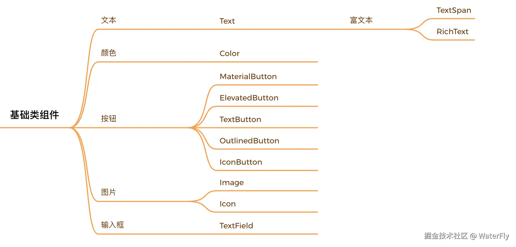
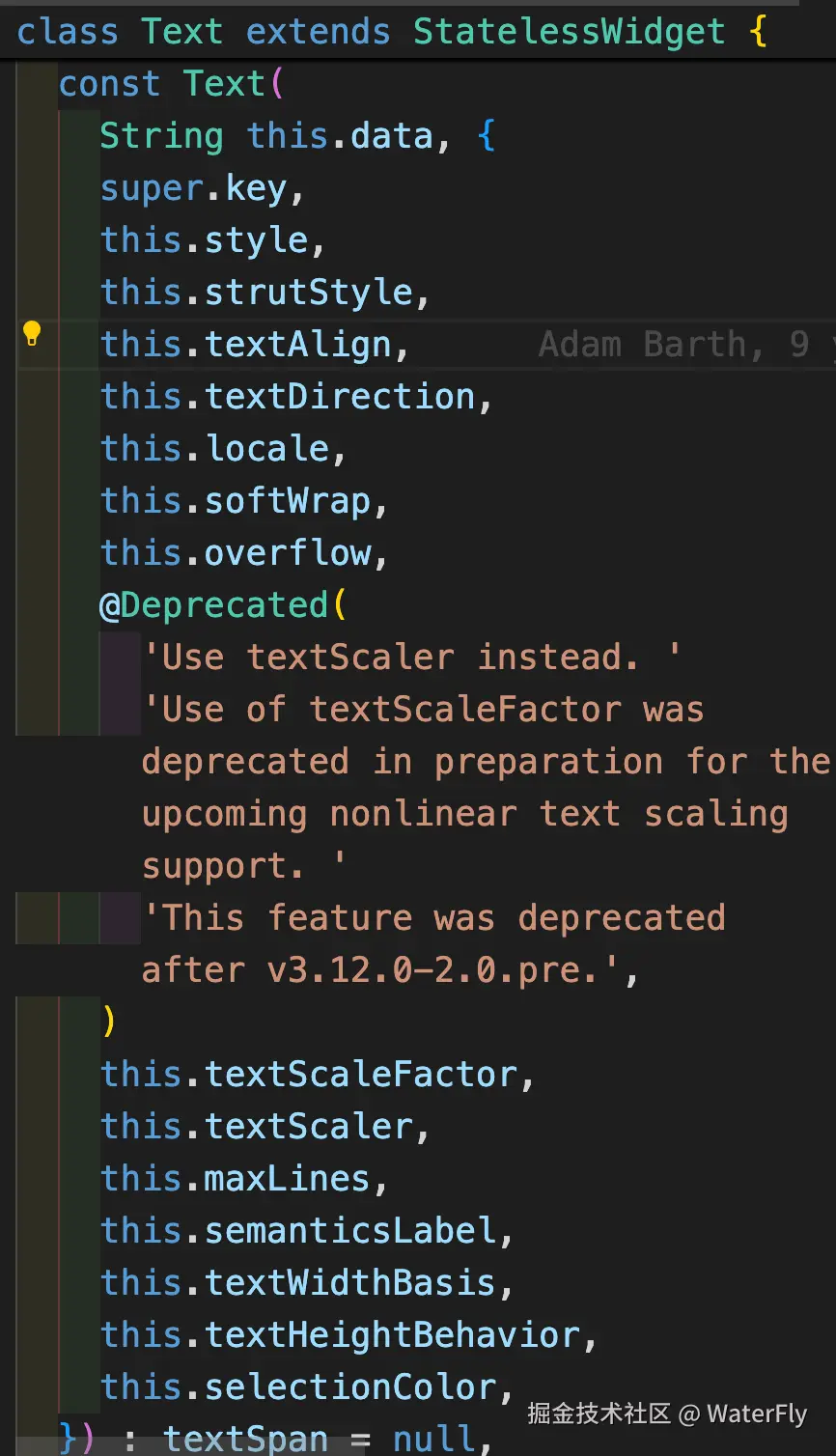
1.1.1 Text
less
  // 计数器,显示变量
  Text(
    '$_counter',
    style: const TextStyle(
      color: Colors.red,
      fontSize: 32,
      fontWeight: FontWeight.bold,
    ),
  ),

  // 富文本 Text.rich、RichText
  const Text.rich(TextSpan(
    text: 'This is a ',
    children: <TextSpan>[
      TextSpan(
        text: 'rich',
        style: TextStyle(
            fontWeight: FontWeight.bold, color: Colors.blue),
      ),
      TextSpan(
          text: ' text example.',
          style: TextStyle(color: Colors.green)),
    ],
)),- Text
- TextStyle

1.1.2 Color
scss
// `FF` for the alpha
const Color(0xFFE4E4E4)

Colors.red
Colors.blue
Colors.green
1.1.3 Button
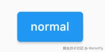
- ElevatedButton,凸起按钮,即"漂浮"按钮,它默认带有阴影和灰色背景。按下后,阴影会变大
less
ElevatedButton(
  child: Text("normal"),
  onPressed: () {},
);
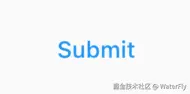
- TextButton,文本按钮,默认背景透明并不带阴影。按下后,会有背景色
less
TextButton(
  child: Text("normal"),
  onPressed: () {},
)
- OutlinedButton,轮廓按钮,默认有一个边框,不带阴影且背景透明。按下后,边框颜色会变亮、同时出现背景和阴影(较弱)
less
OutlinedButton(
  child: Text("normal"),
  onPressed: () {},
)
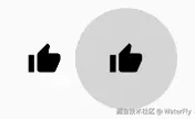
- IconButton,图标按钮,是一个可点击的Icon,不包括文字,默认没有背景,点击后会出现背景
less
IconButton(
  icon: Icon(Icons.thumb_up),
  onPressed: () {},
)
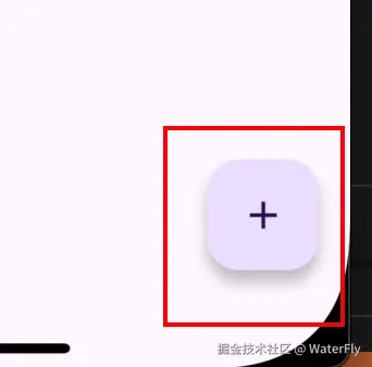
- FloatingActionButton,悬浮按钮,圆形悬浮按钮,用于核心全局操作(如"新建")
less
  FloatingActionButton(
    onPressed: _incrementCounter,
    tooltip: 'Increment',
    child: const Icon(Icons.add),
  ),
| 按钮类型 | 设计特点 | 典型场景 |
|---|---|---|
| ElevatedButton | 凸起阴影+背景色 | 主要操作(提交、确认) |
| TextButton | 扁平无边框 | 次要操作(取消、跳过) |
| OutlinedButton | 边框+无填充 | 中性操作(筛选、导出) |
| IconButton | 纯图标 | 工具栏动作(删除、搜索) |
| FloatingActionButton | 圆形悬浮 | 全局核心功能(新增、刷新) |
1.1.4 Image
注:配置本地图片需要在pubspec.yaml中设置
php
flutter:
  # 配置路径后才能使用
  assets:
    - assets/images/

  // 本地图片
  Image.asset(
    'assets/images/icon_arrow_right.png',
    width: 12,
    height: 14,
  )

  // 网络图片
  Image.network(item.bankLogo!)
1.1.5 Icon
csharp
const Icon(Icons.add)- Icons -- Material Design 3
- Google fonts,查看所有Material icons
1.1.6 TextField
- 参考:输入框及表单
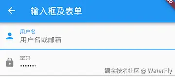
less
Column(
  children: <Widget>[
    TextField(
      autofocus: true,
      decoration: InputDecoration(
        labelText: "用户名",
        hintText: "用户名或邮箱",
        prefixIcon: Icon(Icons.person)
      ),
    ),
    TextField(
      decoration: InputDecoration(
        labelText: "密码",
        hintText: "您的登录密码",
        prefixIcon: Icon(Icons.lock)
      ),
      obscureText: true,
    ),
  ],
);
1.2 容器装饰类组件
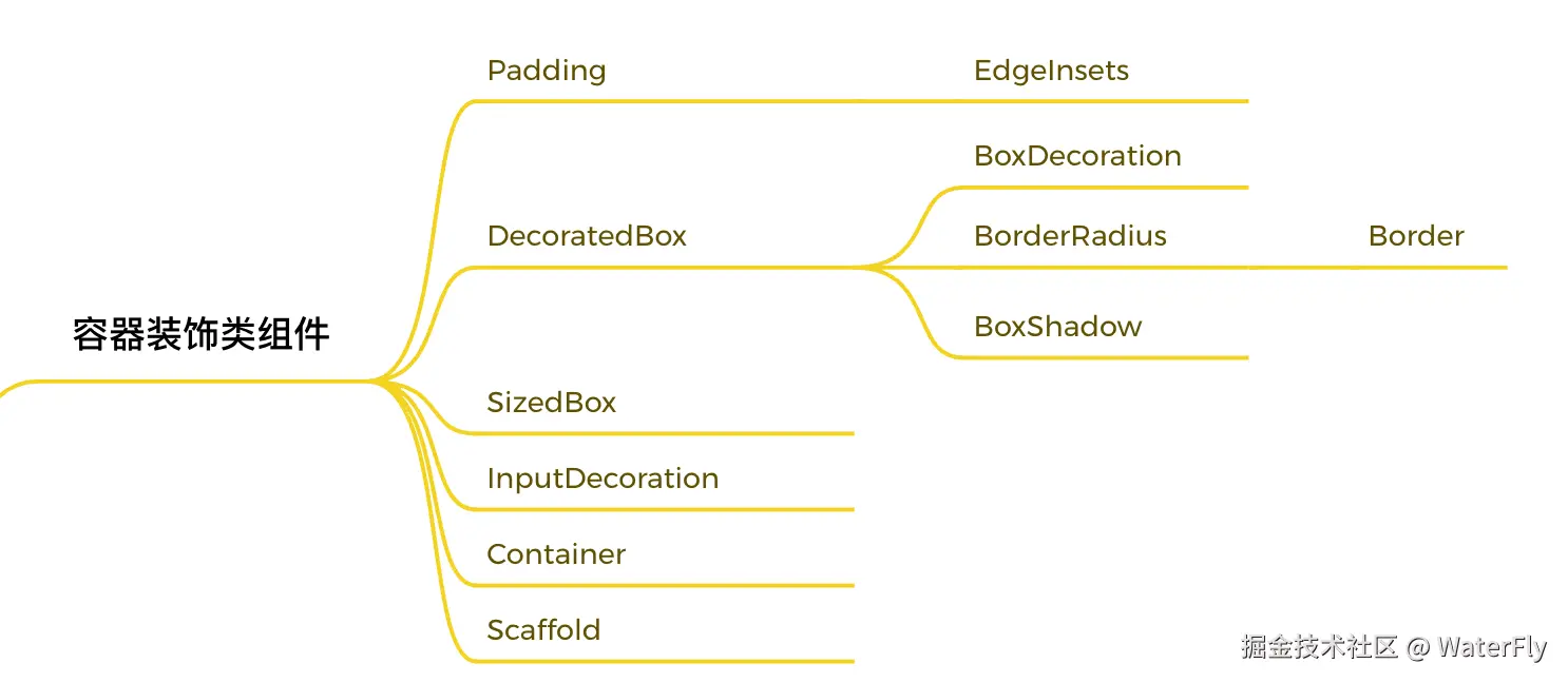
1.2.1 Padding
Padding可以给其子节点添加填充(留白),和边距效果类似。我们在前面很多示例中都已经使用过它了,现在来看看它的定义:
css
Padding({
  ...
  EdgeInsetsGeometry padding,
  Widget child,
})
EdgeInsets
EdgeInsets是EdgeInsetsGeometry的子类,一般直接使用EdgeInsets。
EdgeInsets提供的便捷方法:
- fromLTRB(double left, double top, double right, double bottom):分别指定四个方向的填充。
- all(double value) : 所有方向均使用相同数值的填充。
- only({left, top, right ,bottom }):可以设置具体某个方向的填充(可以同时指定多个方向)。
- symmetric({ vertical, horizontal }):用于设置对称方向的填充,vertical指top和bottom,horizontal指left和right。
Padding示例:
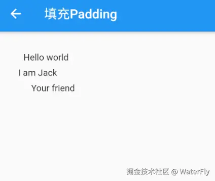
less
class PaddingTestRoute extends StatelessWidget {
  const PaddingTestRoute({Key? key}) : super(key: key);

  @override
  Widget build(BuildContext context) {
    return Padding(
      //上下左右各添加16像素补白
      padding: const EdgeInsets.all(16),
      child: Column(
        //显式指定对齐方式为左对齐,排除对齐干扰
        crossAxisAlignment: CrossAxisAlignment.start,
        mainAxisSize: MainAxisSize.min,
        children: const <Widget>[
          Padding(
            //左边添加8像素补白
            padding: EdgeInsets.only(left: 8),
            child: Text("Hello world"),
          ),
          Padding(
            //上下各添加8像素补白
            padding: EdgeInsets.symmetric(vertical: 8),
            child: Text("I am Jack"),
          ),
          Padding(
            // 分别指定四个方向的补白
            padding: EdgeInsets.fromLTRB(20, 0, 20, 20),
            child: Text("Your friend"),
          )
        ],
      ),
    );
  }
}
1.2.2 DecoratedBox
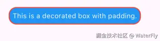
DecoratedBox可以在其子组件绘制前(或后)绘制一些装饰(Decoration),如背景、边框、渐变等。DecoratedBox定义如下:
less
const DecoratedBox({
Decoration decoration,
DecorationPosition position = DecorationPosition.background,
Widget? child
})
BoxDecoration({
Color color, //颜色
DecorationImage image,//图片
BoxBorder border, //边框
BorderRadiusGeometry borderRadius, //圆角
List<BoxShadow> boxShadow, //阴影,可以指定多个
Gradient gradient, //渐变
BlendMode backgroundBlendMode, //背景混合模式
BoxShape shape = BoxShape.rectangle, //形状
})
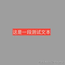
DecoratedBox(
// position: DecorationPosition.foreground,
decoration: BoxDecoration(
color: Colors.blue,
border: Border.all(color: Colors.red, width: 2),
borderRadius: const BorderRadius.all(Radius.circular(16)),
),
child: const Padding(
padding: EdgeInsets.all(8.0),
child: Text(
'This is a decorated box with padding.',
style: TextStyle(color: Colors.white),
),
)),
],
1.2.3 Container
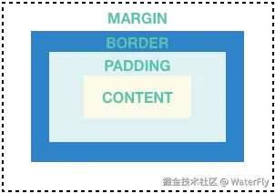
Container是一个组合类容器,它本身不对应具体的RenderObject,它是DecoratedBox、ConstrainedBox、Transform、Padding、Align等组件组合的一个多功能容器,所以我们只需通过一个Container组件可以实现同时需要装饰、变换、限制的场景。下面是Container的定义:
less
Container({
  this.alignment,
  this.padding, //容器内补白,属于decoration的装饰范围
  Color color, // 背景色
  Decoration decoration, // 背景装饰
  Decoration foregroundDecoration, //前景装饰
  double width,//容器的宽度
  double height, //容器的高度
  BoxConstraints constraints, //容器大小的限制条件
  this.margin,//容器外补白,不属于decoration的装饰范围
  this.transform, //变换
  this.child,
  ...
})


Container(
  margin: EdgeInsets.only(top: 50.0, left: 120.0),
  constraints: BoxConstraints.tightFor(width: 200.0, height: 150.0),//卡片大小
  decoration: BoxDecoration(  //背景装饰
    gradient: RadialGradient( //背景径向渐变
      colors: [Colors.red, Colors.orange],
      center: Alignment.topLeft,
      radius: .98,
    ),
    boxShadow: [
      //卡片阴影
      BoxShadow(
        color: Colors.black54,
        offset: Offset(2.0, 2.0),
        blurRadius: 4.0,
      )
    ],
  ),
  transform: Matrix4.rotationZ(.2),//卡片倾斜变换
  alignment: Alignment.center, //卡片内文字居中
  child: Text(
    //卡片文字
    "5.20", style: TextStyle(color: Colors.white, fontSize: 40.0),
  ),
 )
1.2.4 SizedBox
设置宽高
less
  SizedBox(
    width: 50,
    height: 50,
    child: Container(
      margin: const EdgeInsets.only(top: 8.0),
      color: Colors.green,
    ),
  ),
1.2.5 Scaffold
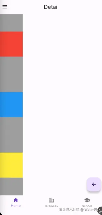
Scaffold 是一个路由页的骨架,我们使用它可以很容易地拼装出一个完整的页面。包含:导航栏、底部导航、悬浮框、抽屉菜单等
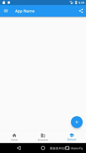
less
class ScaffoldRoute extends StatefulWidget {
@override
_ScaffoldRouteState createState() => _ScaffoldRouteState();
}
class _ScaffoldRouteState extends State<ScaffoldRoute> {
int _selectedIndex = 1;
@override
Widget build(BuildContext context) {
return Scaffold(
appBar: AppBar( //导航栏
title: Text("App Name"),
actions: <Widget>[ //导航栏右侧菜单
IconButton(icon: Icon(Icons.share), onPressed: () {}),
],
),
drawer: MyDrawer(), //抽屉
bottomNavigationBar: BottomNavigationBar( // 底部导航
items: <BottomNavigationBarItem>[
BottomNavigationBarItem(icon: Icon(Icons.home), title: Text('Home')),
BottomNavigationBarItem(icon: Icon(Icons.business), title: Text('Business')),
BottomNavigationBarItem(icon: Icon(Icons.school), title: Text('School')),
],
currentIndex: _selectedIndex,
fixedColor: Colors.blue,
onTap: _onItemTapped,
),
floatingActionButton: FloatingActionButton( //悬浮按钮
child: Icon(Icons.add),
onPressed:_onAdd
),
);
}
void _onItemTapped(int index) {
setState(() {
_selectedIndex = index;
});
}
void _onAdd(){
}
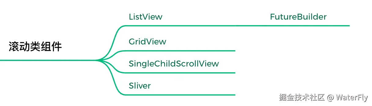
}1.3 滚动类组件
页面滚动需要使用滚动类组件。
1.4.1 SingleChildScrollView
滚动组件,不支持延迟加载模型,内容不超出屏幕太多时使用。
kotlin
SingleChildScrollView({
  this.scrollDirection = Axis.vertical, //滚动方向,默认是垂直方向
  this.reverse = false,
  this.padding,
  bool primary,
  this.physics,
  this.controller,
  this.child,
})
1.4.2 ListVew
ListView是最常用的可滚动组件之一,它可以沿一个方向线性排布所有子组件,并且它也支持列表项懒加载(在需要时才会创建)。
less
// 基本使用
ListView(
  shrinkWrap: true,
  padding: const EdgeInsets.all(20.0),
  children: <Widget>[
    const Text('I'm dedicating every day to you'),
    const Text('Domestic life was never quite my style'),
    const Text('When you smile, you knock me out, I fall apart'),
    const Text('And I thought I was so smart'),
  ],
);

// ListView.builder,ListView.builder适合列表项比较多或者列表项不确定的情况,下面看一下ListView.builder的核心参数列表。

ListView.builder(
  itemCount: 100,
  itemExtent: 50.0, //强制高度为50.0
  itemBuilder: (BuildContext context, int index) {
    return ListTile(title: Text("$index"));
  }
);
1.4.3 GridView
网格布局是一种常见的布局类型,GridView 组件正是实现了网格布局的组件。GridView和ListView的大多数参数都是相同的,它们的含义也都相同的。
less
GridView(
gridDelegate: SliverGridDelegateWithFixedCrossAxisCount(
crossAxisCount: 3, //横轴三个子widget
childAspectRatio: 1.0 //宽高比为1时,子widget
),
children:<Widget>[
Icon(Icons.ac_unit),
Icon(Icons.airport_shuttle),
Icon(Icons.all_inclusive),
Icon(Icons.beach_access),
Icon(Icons.cake),
Icon(Icons.free_breakfast)
]
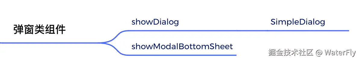
);1.4 弹窗类组件
3.4.1 AlertDialog
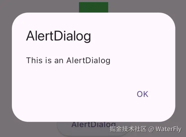
less
  showDialog(
    context: context,
    builder: (context) {
      return AlertDialog(
        title: const Text("AlertDialog"),
        content: const Text("This is an AlertDialog"),
        actions: <Widget>[
          TextButton(
            child: const Text("OK"),
            onPressed: () {
              Navigator.of(context).pop();
            },
          ),
        ],
      );
    },
  );
3.4.2 SimpleDialog
SimpleDialog也是Material组件库提供的对话框,它会展示一个列表,用于列表选择的场景。
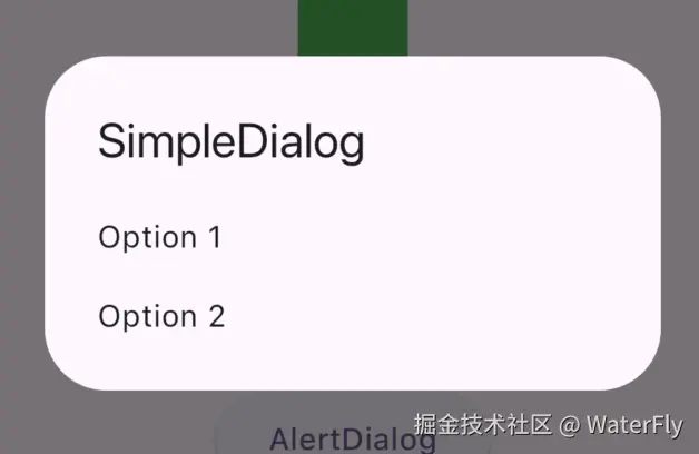
less
  showDialog(
    context: context,
    builder: (context) {
      return SimpleDialog(
        title: const Text("SimpleDialog"),
        children: <Widget>[
          SimpleDialogOption(
            onPressed: () {
              Navigator.of(context).pop();
            },
            child: const Text("Option 1"),
          ),
          SimpleDialogOption(
            onPressed: () {
              Navigator.of(context).pop();
            },
            child: const Text("Option 2"),
          ),
        ],
      );
    },
  );
3.4.3 showModalBottomSheet
底部弹窗
less
  showModalBottomSheet<int>(
    context: context,
    builder: (BuildContext context) {
      return ListView.builder(
        itemCount: 30,
        itemBuilder: (BuildContext context, int index) {
          return ListTile(
            title: Text("$index"),
            onTap: () => Navigator.of(context).pop(index),
          );
        },
      );
    },
  );
二、布局常用Widget

重点阅读:
2.1 布局组件
- Center,居中
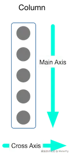
- Row,横向排列,不能换行
- Column,竖向排列,不能换列
- Flex、Expanded,实现 flex: 1的效果,注意Row/Column都集成自Flex

- Wrap,自动换行
- Flow,比较复杂,使用场景较少
- Stack、Postioned,实现绝对布局的效果
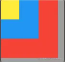
- Align、Alignment,实现对齐和相对定位

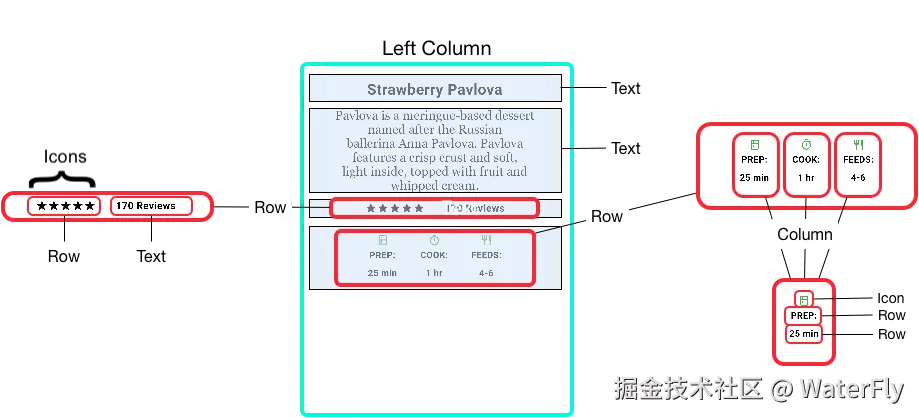
2.1.1 示例1:
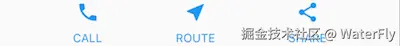
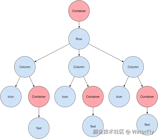
2.1.2 示例2:

2.2 布局约束
重点阅读:深入理解 Flutter 布局约束
2.2.1 约束基本介绍
约束是父组件对子组件的尺寸限制,通过 BoxConstraints 对象定义,包含四个关键属性:
- minWidth / maxWidth :宽度允许的最小/最大值;
- minHeight / maxHeight :高度允许的最小/最大值。
约束类型:
- 严约束(Tight Constraints),minWidth = maxWidth 且 minHeight = maxHeight,子组件必须使用父组件指定的 固定尺寸。
- 松约束(Loose Constraints),minWidth = 0, minHeight = 0,子组件可在最大范围内自由选择尺寸。
有三个核心Widget:
- BoxConstraints,基础约束信息,存放:最大宽度、最小宽度、最大高度、最小高度。
- ConstrainedBox,用于给子组件添加约束信息。
- UnconstrainedBox,子组件不受约束限制。
less
// BoxConstraints
const BoxConstraints({
  this.minWidth = 0.0, //最小宽度
  this.maxWidth = double.infinity, //最大宽度
  this.minHeight = 0.0, //最小高度
  this.maxHeight = double.infinity //最大高度
})

// ConstrainedBox
ConstrainedBox(
  constraints: BoxConstraints(
    minWidth: double.infinity, //宽度尽可能大
    minHeight: 50.0 //最小高度为50像素
  ),
  child: Container(
    height: 5.0,
    child: redBox ,
  ),
)

// ConstrainedBox
ConstrainedBox(
  constraints: BoxConstraints(minWidth: 60.0, minHeight: 100.0),  //父
  child: UnconstrainedBox( //"去除"父级限制
    child: ConstrainedBox(
      constraints: BoxConstraints(minWidth: 90.0, minHeight: 20.0),//子
      child: redBox,
    ),
  )
)
2.2.2 约束的基本原理
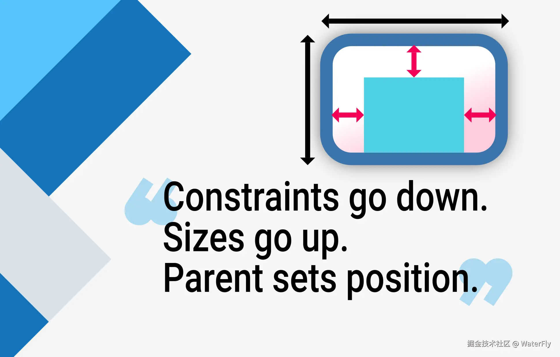
布局过程分为三个阶段:
-
向下传递约束,父组件根据自身约束和布局逻辑,生成子组件的约束并传递。
-
子组件确定尺寸,子组件在约束范围内计算自身尺寸,并向上返回结果(如 Text 根据文字内容计算大小)。
-
父组件定位,父组件根据子组件尺寸和布局规则(如 Row 的水平排列、Stack 的堆叠)确定子组件的坐标。
Flutter容器组件约束类型汇总:
| 容器组件 | 约束类型 | 具体约束行为 | 典型使用场景 |
|---|---|---|---|
| 屏幕(Screen/RenderView) | 紧约束 | 强制最外层组件填满整个屏幕(BoxConstraints.tight(屏幕尺寸)) | 应用根布局,确保内容全屏显示 |
| Scaffold.body | 宽约束 | 水平轴:0, 屏幕宽度 垂直轴:0, 屏幕高度-AppBar高度等(允许子组件自由选择尺寸) | 页面主体内容区域,支持灵活尺寸 |
| Container | 动态约束 | 若设置宽高则施加紧约束; 未设置尺寸时传递父级约束(通常为宽约束) | 自定义尺寸、背景色、边距的容器 |
| Align | 宽约束 | 将父级约束转换为最小值为 0 的宽松约束 (允许子组件自由选择尺寸,不超过父容器范围) | 子组件在父容器内自定义对齐位置 |
| Padding | 宽约束 | 保留父级约束,子组件尺寸限制在父约束 - 内边距范围内1 | 增加内边距 |
| Center | 宽约束 | 将父级紧约束转为最小值为0的宽约束(如 BoxConstraints.loose()) | 子组件居中且可小于父容器 |
| ConstrainedBox | 紧约束 | 强制子组件满足额外的最小/最大宽高限制(与父约束取交集) | 精确控制子组件尺寸范围 |
| SizedBox | 紧约束 | 强制子组件采用指定宽高(忽略父级约束) | 固定尺寸占位或强制子组件尺寸 |
| UnconstrainedBox | 无约束 | 移除父级约束(但自身尺寸仍受父级限制,超出的部分会被裁剪) | 需要子组件完全自主决定尺寸的场景 |
| AspectRatio | 紧约束 | 强制子组件满足特定宽高比(在父级约束范围内计算) | 保持固定宽高比的元素(如方形图片) |
| FractionallySizedBox | 宽约束 | 按比例占用父组件空间(widthFactor/heightFactor控制占比) | 响应式布局(如按钮宽度占父容器70%) |
| ListView/ScrollView | 无界约束 | 垂直轴:0, Infinity 水平轴:0, 屏幕宽度 | 可滚动内容区域 |
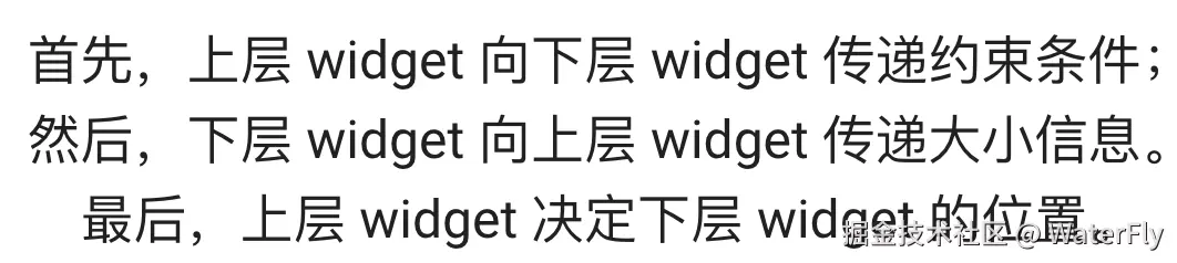
示例1:
scss
Container(color: red)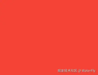
Container 充满了整个屏幕
示例2:
less
Container(width: 100, height: 100, color: red)Container 充满了整个屏幕
示例3:Center
less
Center(child: Container(width: 100, height: 100, color: red))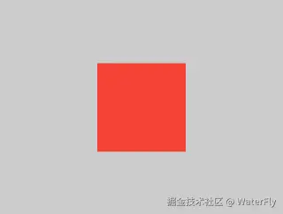
Center 充满了屏幕,Container 变成 100 × 100。
示例4:Align
less
Align(
  alignment: Alignment.bottomRight,
  child: Container(width: 100, height: 100, color: red),
)
Container大小100*100。