直接贴代码把方便,掘金的写代码添加依赖太麻烦了
ts
import styled from 'styled-components';
import { Button } from 'antd';
import { v4 } from 'uuid';
import type { ButtonProps } from 'antd';
import type { SizeType } from 'antd/lib/config-provider/SizeContext';
interface LinearGradientProps {
id: string;
colors: string[];
direction?: 'to right' | 'to left' | 'to top' | 'to bottom' | string | number;
}
function angleToCoordinates(angleDeg: number) {
// 将角度转换为弧度
const angleRad = angleDeg * (Math.PI / 180);
// 计算终点坐标 (起点固定为 [0,0])
// 使用单位圆上的点,长度=1
const x = Math.cos(angleRad);
const y = Math.sin(angleRad);
// 将坐标转换为百分比字符串
// SVG 渐变坐标可以是负数或大于100%
return {
x1: '0%',
y1: '0%',
x2: `${(x * 100).toFixed(2)}%`,
y2: `${(y * 100).toFixed(2)}%`
};
}
const LinearGradientComponent: React.FC<LinearGradientProps> = ({ id, colors, direction = 'to right' }) => {
const getCoordinates = () => {
// 处理数字角度值 (如 150deg)
if (typeof direction === 'number') {
return angleToCoordinates(direction);
}
// 处理字符串角度值 (如 "150deg")
if (typeof direction === 'string' && direction.endsWith('deg')) {
const angle = parseFloat(direction);
if (!isNaN(angle)) {
return angleToCoordinates(angle);
}
}
// 处理关键词方向
switch (direction) {
case 'to right':
return { x1: '0%', y1: '0%', x2: '100%', y2: '0%' };
case 'to left':
return { x1: '100%', y1: '0%', x2: '0%', y2: '0%' };
case 'to top':
return { x1: '0%', y1: '100%', x2: '0%', y2: '0%' };
case 'to bottom':
return { x1: '0%', y1: '0%', x2: '0%', y2: '100%' };
case 'to top right':
return { x1: '0%', y1: '100%', x2: '100%', y2: '0%' };
case 'to bottom left':
return { x1: '100%', y1: '0%', x2: '0%', y2: '100%' };
default:
return { x1: '0%', y1: '0%', x2: '100%', y2: '0%' };
}
};
const { x1, y1, x2, y2 } = useMemo(() => getCoordinates(), [direction]);
return (
<linearGradient id={id} x1={x1} y1={y1} x2={x2} y2={y2}>
{colors.map((color, index) => (
<stop key={index} offset={`${(index / (colors.length - 1)) * 100}%`} stopColor={color} />
))}
</linearGradient>
);
};
type Props = {
linear: string;
hoverIconColor?: string;
} & ButtonProps;
const SvgButton = styled(Button) <{ disabled?: boolean; linear: string; linearid: string }>`
&.ant-btn-variant-outlined:not(:disabled):not(.ant-btn-disabled) {
--ant-button-default-hover-bg: transparent;
background: transparent;
}
width: 100%;
height: 100%;
background: transparent;
border: none;
padding: 0;
cursor: ${({ disabled }) => (disabled ? 'not-allowed' : 'pointer')};
outline: none;
background-clip: text;
color: transparent;
fill: transparent;
background-image: ${({ linear }) => linear};
p {
color: #9980df;
}
svg {
fill: url(#${({ linearid }) => linearid});
}
`;
const SvgButtonWrapper = styled.div<{ size?: SizeType }>`
--ant-control-height: 32px;
--font-size: 14px;
&.button-size-large {
--ant-control-height: 40px;
--font-size: 16px;
}
&.button-size-small {
--ant-control-height: 24px;
--font-size: 12px;
}
display: inline-block;
position: relative;
height: var(--ant-control-height);
width: fit-content;
& > svg {
position: absolute;
z-index: 0;
pointer-events: none;
& > rect {
transition: fill 0.3s;
}
}
&[aria-disabled='false'] {
&:hover {
& > svg > rect:last-child {
fill: transparent;
}
${SvgButton} {
color: #000;
background-clip: unset;
background-image: unset;
p {
color: ${({ theme }) => theme.same};
}
svg {
fill: ${({ theme }) => theme.same};
}
}
}
}
&[aria-disabled='true'] {
opacity: 0.5;
}
`;
function LinearButton({ linear, children, size, disabled, loading, ...buttonProps }: Props) {
const colors = useMemo(
() =>
linear.match(/#(?:[a-f0-9]{3}|[a-f0-9]{6})\b|rgba?\(\s*\d+\s*,\s*\d+\s*,\s*\d+\s*(?:,\s*[\d.]+\s*)?\)/gi) || [],
[linear]
);
const deg = useMemo(() => linear.match(/[0-9]deg/)?.[0] || '', [linear]);
const linearId = useMemo(
() =>
`${v4({
random: Uint8Array.from(linear)
})}`,
[]
);
const buttonRef = useRef<HTMLButtonElement>(null);
const [contentSize, setContentSize] = useState<{ width: number; height: number }>(
buttonRef.current?.getBoundingClientRect() || { width: 100, height: 32 }
);
const handle = useCallback(() => {
if (buttonRef.current) {
setContentSize(buttonRef.current.getBoundingClientRect());
} else {
setTimeout(handle, 100);
}
}, []);
useLayoutEffect(() => {
handle();
}, [children, buttonProps.icon]);
return (
// 使用svg做背景,按钮背景统一透明,避免比例影响、边框锯齿等问题
<SvgButtonWrapper className={`button-size-${size || 'default'}`} aria-disabled={!!disabled}>
<svg
width="100%"
height="100%"
viewBox={`0 0 ${contentSize.width} ${contentSize.height}`}
preserveAspectRatio="none"
>
<defs>
<LinearGradientComponent id={linearId} colors={[...colors]} direction={deg} />
</defs>
{/* 背景边框 */}
<rect
x="1"
y="1"
width={Math.max(contentSize.width - 2, 0)}
height={Math.max(contentSize.height - 2, 0)}
rx={Math.max(contentSize.height / 2, 0)}
ry={Math.max(contentSize.height / 2, 0)}
fill={`url(#${linearId})`}
stroke="none"
/>
{/* 内部填充 */}
<rect
x="2"
y="2"
width={Math.max(contentSize.width - 4, 0)}
height={Math.max(contentSize.height - 4, 0)}
rx={Math.max(contentSize.height / 2 - 2, 0)}
ry={Math.max(contentSize.height / 2 - 2, 0)}
fill={disabled ? '#050505' : '#000'}
stroke="none"
/>
</svg>
{/* 实际可点击的按钮 */}
<SvgButton
ref={buttonRef}
linear={linear}
size={size}
linearid={linearId}
disabled={!!disabled || !!loading}
{...buttonProps}
>
{children}
</SvgButton>
</SvgButtonWrapper>
);
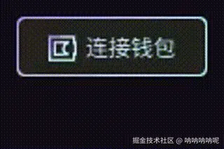
}按钮加渐变边框主要需要解决两个问题
- 不同分辨率下会出现边框消失或视觉不等的情况
- 如何给文本和svg图标加上渐变
所以也尝试过使用border或者渐变背景的方案,最后还是选择svg渲染背景,使用的图标也需要是svg的,hover后的效果根据主题来随便改。容器的大小是通过contentSize计算更新上去的,border默认就是2px,代码上可以写的再整洁一点
效果