目录
[5、Styled Component](#5、Styled Component)
[列表:ScrollView + map()、SetionList、FlatList、VirtualList、FlashList](#列表:ScrollView + map()、SetionList、FlatList、VirtualList、FlashList)
[FlashList 主要特性:](#FlashList 主要特性:)
TextInput、Switch、ActivityIndicator
[React Native Reanimated(推荐)](#React Native Reanimated(推荐))
继ReactNative基础总结(https://blog.csdn.net/qq_50909707/article/details/127788413)后,再次梳理出此文章。
一、路由
参考官方文档:https://docs.expo.dev/tutorial/add-navigation/
1、基于文件的路由框架
官网文档描述:
Expo路由器基础知识
Expo Router 是一个基于文件的路由框架,适用于 React Native 和 Web 应用。它管理屏幕间的导航,并在多个平台上使用相同的组件。要开始使用,我们需要了解以下约定:
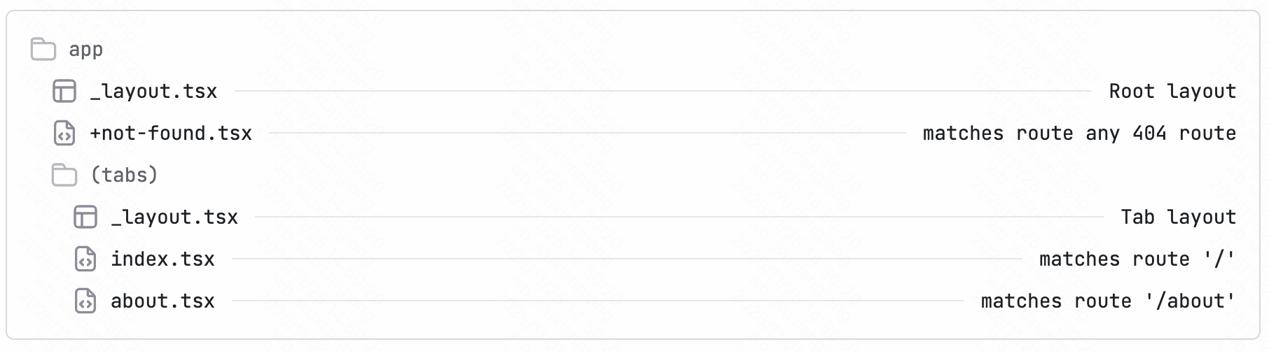
- 应用目录:一个特殊的目录,仅包含路由及其布局。添加到此目录的任何文件都会成为我们原生应用中的一个屏幕,同时也会作为网页显示。
- 根布局:app/_layout.tsx文件。它定义了共享的 UI 元素,例如标题栏和标签栏,以便它们在不同的路由之间保持一致。
- 文件名约定:索引 文件名(例如index.tsx)与其父目录匹配,不添加路径段。例如,app目录中的index.tsx文件与 route匹配。
/ - 路由文件默认导出 React 组件。它可以采用 .router 、
.js.js.jsx、.ts.js 或.tsx.js 扩展名。 - Android、iOS 和网页版共享统一的导航结构。
个人描述:
简单得说,expo将路由通过文件夹进行管理,路由文件都存放在app文件夹下,如图:
通过app文件夹作为基准进行路由,如:
"/app/index" 对应 "/" 这个根路径pathname;"/app/(tabs)/index"对应"/(tabs)"这个tabs目录的index根页面;"/app/about"对应"/about"路径;"/app/(tabs)/explore"对应"/(tabs)/expore"路径,以此类推。
我们可以通过expo提供的路由标签或api来进行调用pathname进行路由跳转。
类似于Web框架Nextjs框架里的路由文件夹管理。
2、路由配置
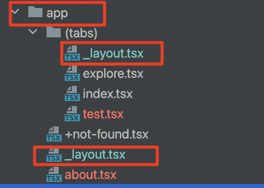
在app文件夹下创建的组件会被expo自动生成对应路由,如:app/test02.tsx文件会生成/test02的路由。
对应路由页面样式和相关参数的配置可以通过以下来实现,需要注意的是,对应路由即使不在_layout文件里配置也会生效,只是在_layout页面可以整体配置对应页面的参数和样式,如:
Stack栈代表着一个路由,name属性与对应层级的文件名称对应,如:about.tsx对应name="about"。
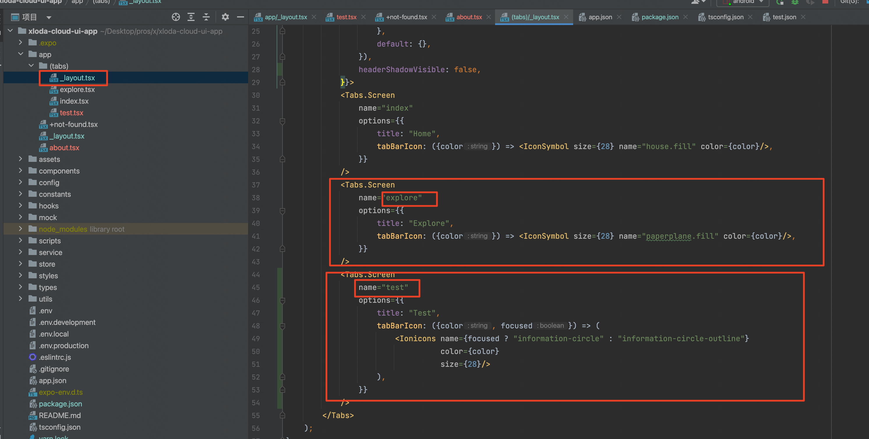
特别地,tab页通过配置Tab.Screen标签的name来进行配置,名称也是对应关系,如图:
通过配置类似标签来实现路由注册。
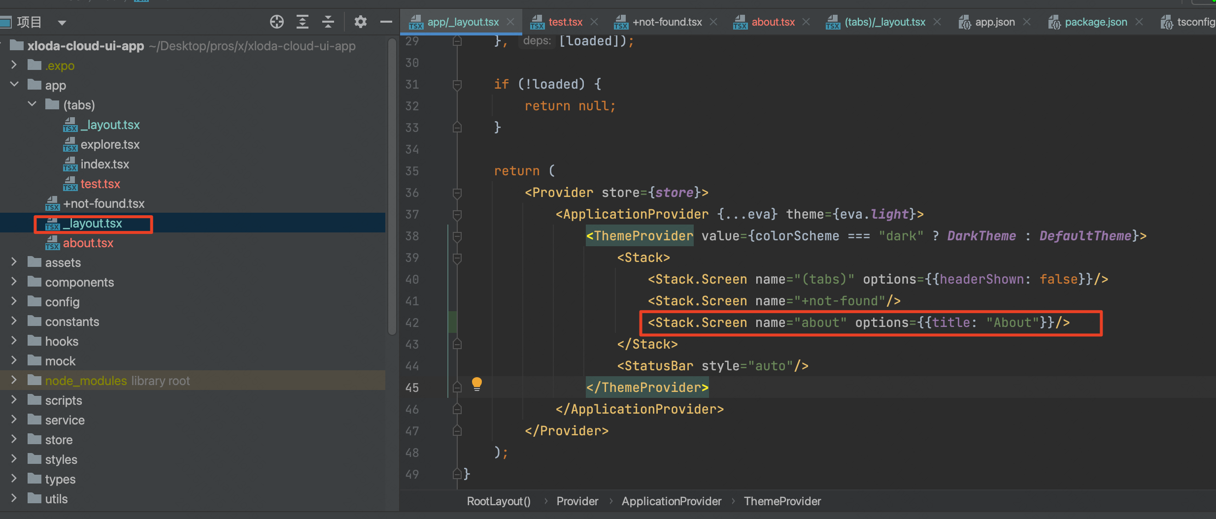
3、_layout文件
这个文件是公共样式和路由配置的核心文件,如全局的公共组件可以在/app/_layout.tsx中进行配置,tab页的公共样式组件可以在/app/(tabs)/_layout.tsx文件中配置。
如:
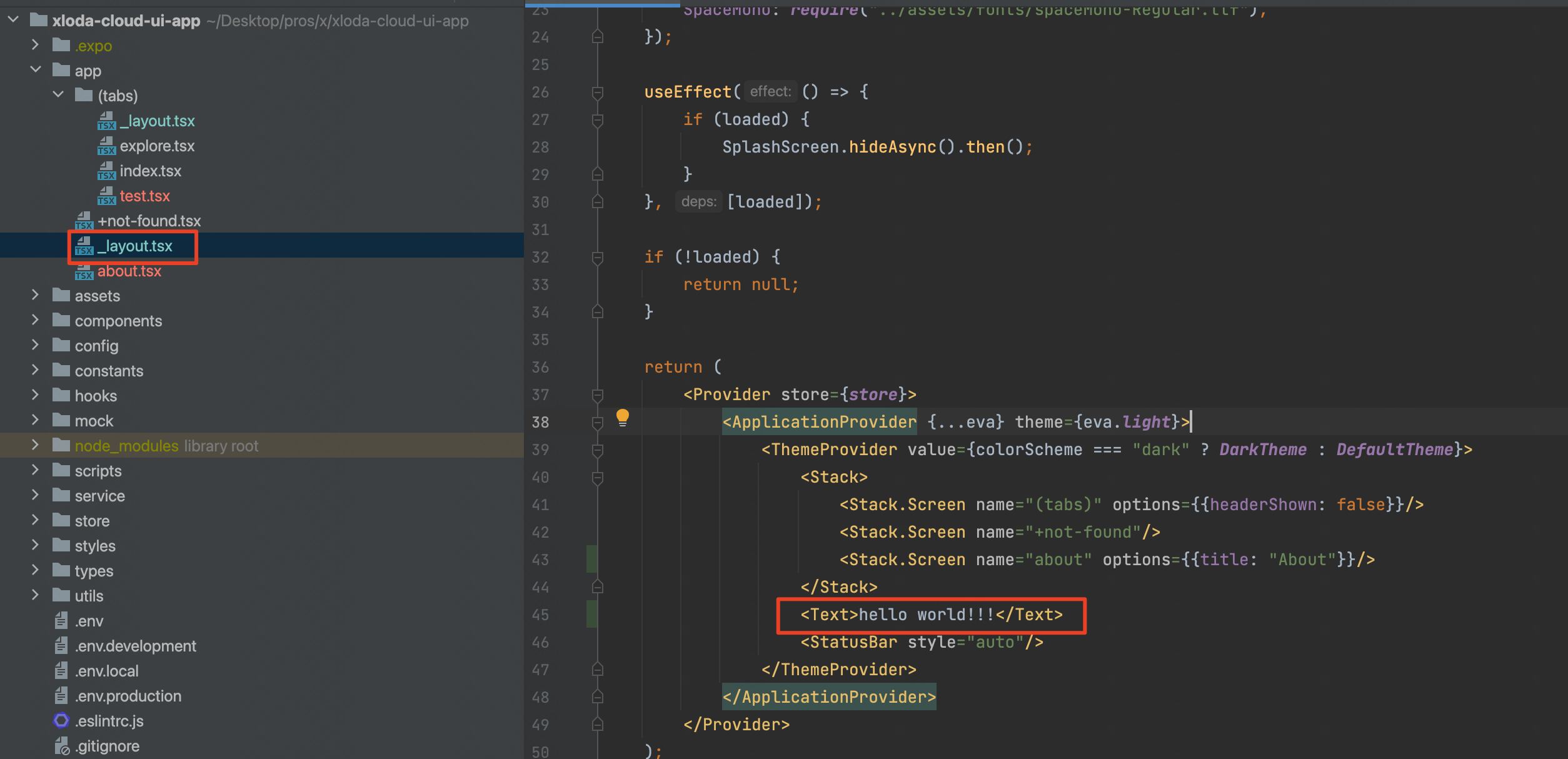
layout会层层递进生效!
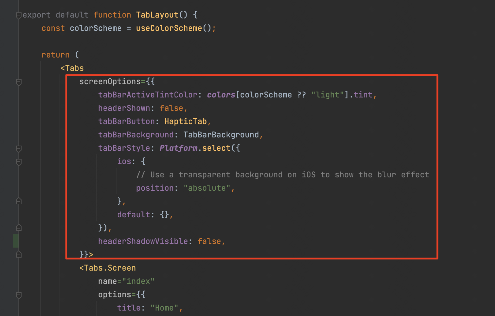
另外,tab页的layout可以在Tabs标签上配置属性以实现tab栏的样式自定义风格,
参考文档:https://docs.expo.dev/tutorial/add-navigation/
二、样式
1、StyleSheet
在reactNative里不能直接使用css等样式管理了,我们需要使用StyleSheet来进行样式设置。
通过StyleSheet.create的静态方法进行设置。标签的style属性可以传入单个对象,也可以是一个样式对象数组,具体参考案例代码。
案例:
javascript
import {View, Text, StyleSheet} from "react-native";

export default function Home() {
    return (
        <View style={styles.container}>
            <Text style={styles.text}>标题</Text>
            <Text style={[styles.text, styles.child]}>内容</Text>
            <Text style={{color: "red"}}>直接设置</Text>
            <Text style={[styles.text, styles.child, {color: "yellow"}]}>混合使用</Text>
        </View>
    );
}

const styles = StyleSheet.create({
    container: {
        padding: 15,
        margin: 10,
    },
    text: {
        fontSize: 18,
        color: "blue",
    },
    child: {
        marginTop: 5,
    }
});
2、注意事项
值得注意的是,在ReactNative中样式默认是不会被子标签继承的。
(1)一般情况,默认不继承:
javascript
<View style={{fontSize: 20, color: 'red'}}>
  <Text>这个文本不会继承字体大小和颜色</Text>
</View>
效果: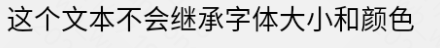
上面的 Text 组件不会自动继承 fontSize 和 color。
特殊情况,文本样式继承:
只有文本相关的样式在 Text 组件内部会部分继承:
javascript
<Text style={{fontSize: 20, color: 'red', fontWeight: 'bold'}}>
  父文本
  <Text>子文本会继承字体样式</Text>
</Text>
效果: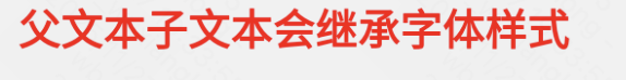
(2) ReactNative默认是flex布局,与web布局的flex有些差别,ReactNative默认的flex-direction是column,而网页中默认的flex布局是row。
(3)样式不加像素单位, 即:不能加px,vh,vw等,但可以是百分比。
(4) StyleSheet不支持类似CSS那样的伪类选择器(Styled-Component可以实现这点)。
3、StyleSheet.create和直接传对象的区别
在 React Native 中,使用 StyleSheet.create 和直接使用对象字面量在功能上都能工作,但它们有一些重要的区别:
(1)关键区别
-
StyleSheet.create会将样式序列化并发送到原生端,提升渲染性能 -
直接使用对象每次渲染都会创建新的对象,可能影响性能
(2)验证和错误提示
StyleSheet.create 会在开发时进行样式验证:
javascript
// 这会给出警告
const styles = StyleSheet.create({
  container: {
    flex: 1,
    invalidProp: 'value', // 无效属性会警告
  },
});

// 直接对象不会验证
const styles = {
  container: {
    flex: 1,
    invalidProp: 'value', // 无警告
  },
};
(3)引用方式
javascript
// StyleSheet.create - 推荐
<View style={styles.container} />

// 直接对象
<View style={styles.container} /> // 看起来一样,但内部处理不同

// 内联对象 - 不推荐(每次渲染都创建新对象)
<View style={{ flex: 1, backgroundColor: '#fff' }} />
(4)动态样式处理
对于动态样式,推荐结合使用:
javascript
const MyComponent = ({ isActive }) => {
  return (
    <View style={[
      styles.container,
      isActive && styles.active, // 条件样式
      { marginTop: 10 } // 动态值
    ]}>
      <Text>内容</Text>
    </View>
  );
};

const styles = StyleSheet.create({
  container: {
    padding: 16,
    backgroundColor: '#f0f0f0',
  },
  active: {
    backgroundColor: '#007AFF',
  },
});
普通场景推荐使用StyleSheet.create
4、样式管理
由于ReactNative的样式都是通过js对象来赋值的,我们可以通过js或ts文件来存储对应的样式,再通过引入样式文件的形式赋值给对应的style属性。
对于容器包裹的命名格式可以进行规范:如下:
javascript
// 通过命名约定来模拟嵌套
const styles = StyleSheet.create({
  container: {
    flex: 1,
    padding: 20,
  },
  'container__header': {
    fontSize: 24,
    fontWeight: 'bold',
  },
  'container__content': {
    marginTop: 10,
  },
  'container__content__text': {
    fontSize: 16,
    color: '#666',
  },
});
对于大型项目或样式需要动态渲染的项目,可考虑使用Styled-Components进行管理。
javascript
import styled from 'styled-components/native';

const Container = styled.View`
  flex: 1;
  padding: 20px;

  .header {
    font-size: 24px;
    font-weight: bold;
  }

  .content {
    margin-top: 10px;

    .text {
      font-size: 16px;
      color: #666;
    }
  }
`;

// 使用
<Container>
  <Text className="header">标题</Text>
  <View className="content">
    <Text className="text">内容</Text>
  </View>
</Container>
5、Styled Component
官方文档:https://styled-components.com/docs
(1)安装依赖
yarn add styled-components(2)简单案例
javascript
import styled from 'styled-components/native';

// 创建样式化的 View 组件
const Container = styled.View`
  flex: 1;
  background-color: #f5f5f5;
  padding: 20px;
`;

// 创建样式化的 Text 组件
const Title = styled.Text`
  font-size: 24px;
  font-weight: bold;
  color: yellow;
  margin-bottom: 10px;
`;

// 创建样式化的 Button 组件
const Button = styled.TouchableOpacity`
  background-color: #007bff;
  padding: 12px 24px;
  border-radius: 8px;
  align-items: center;
`;

const ButtonText = styled.Text`
  color: white;
  font-size: 16px;
  font-weight: 600;
`;

// 使用示例
export default function Home() {
    return (
        <Container>
            <Title>欢迎使用 Styled Components</Title>
            <Button onPress={() => console.log('按钮点击')}>
                <ButtonText>点击我</ButtonText>
            </Button>
        </Container>
    );
}
效果: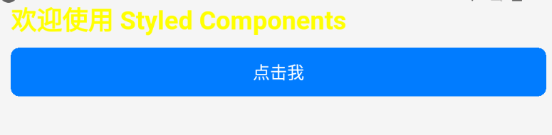
styled.ReactNative里的核心组件名表示选择类别,再赋予样式,类似于web开发中的css的样式设置。
(3)支持所有核心组件
javascript
import styled from 'styled-components/native';

// 所有 React Native 核心组件都支持
const StyledView = styled.View`
  /* 样式 */
`;

const StyledText = styled.Text`
  /* 样式 */
`;

const StyledImage = styled.Image`
  /* 样式 */
`;

const StyledScrollView = styled.ScrollView`
  /* 样式 */
`;

const StyledFlatList = styled.FlatList`
  /* 样式 */
`;

const StyledTextInput = styled.TextInput`
  /* 样式 */
`;

const StyledTouchableOpacity = styled.TouchableOpacity`
  /* 样式 */
`;

const StyledTouchableHighlight = styled.TouchableHighlight`
  /* 样式 */
`;
(4)高级功能-props动态样式
javascript
import styled from "styled-components/native";
import {Text} from "react-native";

// 根据 props 动态改变样式
const DynamicButton = styled.TouchableOpacity`
  background-color: ${(props: any) =>
          props?.primary ? "#007bff" :
                  props?.secondary ? "#6c757d" :
                          props?.success ? "#28a745" :
                                  "#e9ecef"
  };
  padding: ${(props: any) => props?.large ? "16px 32px" : "12px 24px"};
  border-radius: ${(props: any) => props?.round ? "50px" : "8px"};
  opacity: ${(props: any) => props?.disabled ? 0.6 : 1};
`;

// 使用示例
export default function Home() {
    return (
        <>
            <DynamicButton primary>
                <Text>主要按钮</Text>
            </DynamicButton>

            <DynamicButton secondary large>
                <Text>大号次要按钮</Text>
            </DynamicButton>

            <DynamicButton success round disabled>
                <Text>圆形成功按钮</Text>
            </DynamicButton>
        </>
    );
}
效果: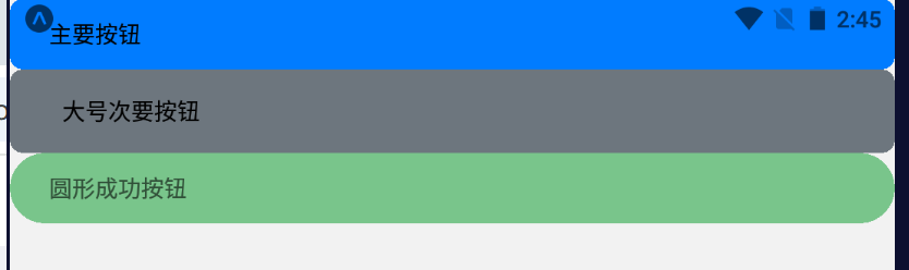
这里可以通过配置组件动态参数来实现样式配置。
(5)高级功能-继承样式
javascript
import styled from 'styled-components/native';

// 基础按钮样式
const BaseButton = styled.TouchableOpacity`
  padding: 12px 24px;
  border-radius: 8px;
  align-items: center;
  justify-content: center;
`;

// 继承基础按钮样式
const PrimaryButton = styled(BaseButton)`
  background-color: #007bff;
`;

const DangerButton = styled(BaseButton)`
  background-color: #dc3545;
`;

const OutlineButton = styled(BaseButton)`
  background-color: transparent;
  border: 2px solid #007bff;
`;
(6)高级功能-主题theme
javascript
// 1. 创建主题
import styled, {ThemeProvider} from "styled-components/native";

const theme = {
    colors: {
        primary: "#007bff",
        secondary: "#6c757d",
        success: "#28a745",
        danger: "#dc3545",
        warning: "#ffc107",
        info: "#17a2b8",
        light: "#f8f9fa",
        dark: "#343a40",
        background: "#f5f5f5",
        text: "#212529",
        white: "#ffffff",
    },
    fonts: {
        regular: "System",
        bold: "System",
        light: "System",
    },
    spacing: {
        xs: 4,
        sm: 8,
        md: 16,
        lg: 24,
        xl: 32,
    },
    borderRadius: {
        sm: 4,
        md: 8,
        lg: 16,
        round: 50,
    }
};

// 2. 在 App 中提供主题
export default function App() {
    return (
        <ThemeProvider theme={theme}>
            <ThemedButton>
                <ThemedText>Theme!!!!</ThemedText>
            </ThemedButton>
        </ThemeProvider>
    );
}

// 3. 在组件中使用主题
const ThemedButton = styled.TouchableOpacity`
  background-color: ${props => props.theme.colors.primary};
  padding: ${props => props.theme.spacing.md}px ${props => props.theme.spacing.lg}px;
  border-radius: ${props => props.theme.borderRadius.md}px;
`;

const ThemedText = styled.Text`
  color: ${props => props.theme.colors.text};
  font-family: ${props => props.theme.fonts.regular};
`;
效果: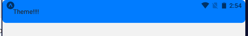
(7)高级功能-使用CSS辅助函数
javascript
import styled, { css } from 'styled-components/native';

// 定义可重用的样式块
const shadowStyle = css`
  shadow-color: #000;
  shadow-offset: 0px 2px;
  shadow-opacity: 0.25;
  shadow-radius: 3.84px;
  elevation: 5;
`;

const flexCenter = css`
  justify-content: center;
  align-items: center;
`;

// 在组件中使用
const Card = styled.View`
  background-color: white;
  border-radius: 12px;
  padding: 16px;
  ${shadowStyle}
  ${props => props.centered && flexCenter}
`;
这就类似于sass、less中的样式继承。
(8)高级功能-媒体查询media(响应式)
javascript
import styled from 'styled-components/native';

// 定义断点
const breakpoints = {
  small: 576,
  medium: 768,
  large: 992,
  xlarge: 1200,
};

// 创建媒体查询辅助函数
const media = Object.keys(breakpoints).reduce((acc, label) => {
  acc[label] = (...args) => css`
    @media (min-width: ${breakpoints[label]}px) {
      ${css(...args)}
    }
  `;
  return acc;
}, {});

// 使用媒体查询
const ResponsiveContainer = styled.View`
  flex: 1;
  padding: 16px;

  ${media.small`
    padding: 20px;
  `}

  ${media.medium`
    padding: 24px;
  `}

  ${media.large`
    padding: 32px;
  `}
`;
类似于web开发中样式在不同尺寸中的响应式控制。
(9)性能优化
1、优先选用性能最好的StyleSheet,其次需要功能高度自定义化可以使用Styled-Component;
2、样组件的位置。
javascript
// 1. 避免在 render 中创建新的样式组件
// ❌ 错误做法(每次渲染都创建新组件)
function BadExample({ color }) {
  const BadStyledText = styled.Text`
    color: ${color};
  `;

  return <BadStyledText>文本</BadStyledText>;
}

// ✅ 正确做法(组件在外部定义)
const GoodStyledText = styled.Text`
  color: ${props => props.color};
`;

function GoodExample({ color }) {
  return <GoodStyledText color={color}>文本</GoodStyledText>;
}

// 2. 使用 useTheme hook(避免 props drilling)
import { useTheme } from 'styled-components/native';

function ThemedComponent() {
  const theme = useTheme();

  return (
    <View style={{ backgroundColor: theme.colors.background }}>
      <Text style={{ color: theme.colors.text }}>使用主题</Text>
    </View>
  );
}
(10)使用ts泛型
javascript
import styled from 'styled-components/native';

// 定义 Props 接口
interface ButtonProps {
  primary?: boolean;
  size?: 'small' | 'medium' | 'large';
  disabled?: boolean;
}

// 使用泛型定义样式组件
const StyledButton = styled.TouchableOpacity<ButtonProps>`
  background-color: ${props => props.primary ? '#007bff' : '#6c757d'};
  padding: ${props => {
    switch (props.size) {
      case 'small': return '8px 16px';
      case 'large': return '16px 32px';
      default: return '12px 24px';
    }
  }};
  opacity: ${props => props.disabled ? 0.6 : 1};
`;
6、transform属性(补充)
在js中书写transform属性和web端书写有些差别,需要书写为如下格式:
javascript
const styles = StyleSheet.create({
    container: {
        flex: 1,
        alignItems: "center",
        justifyContent: "center",
        transform: [
            { translateX: 100 },
            { rotate: '45deg' }
        ] as ViewStyle['transform']
    },
})
加入类型判断以编码ts报红。
此外,还可以结合动画一起实现过渡效果,详情见下面的动画部分总结。
javascript
import { Animated } from 'react-native';

// ✅ 推荐:使用原生驱动
Animated.timing(animatedValue, {
  toValue: 1,
  duration: 300,
  useNativeDriver: true, // 启用原生驱动
}).start();

// 在样式中使用
<Animated.View style={{
  transform: [
    { translateX: animatedValue.interpolate({
      inputRange: [0, 1],
      outputRange: [0, 100]
    })}
  ]
}} />
三、基础组件
1、概览
核心组件和原生组件
参考:https://reactnative.dev/docs/intro-react-native-components
ReactNative中的核心组件经过编译会对应生成app中的原生组件,示例如图:
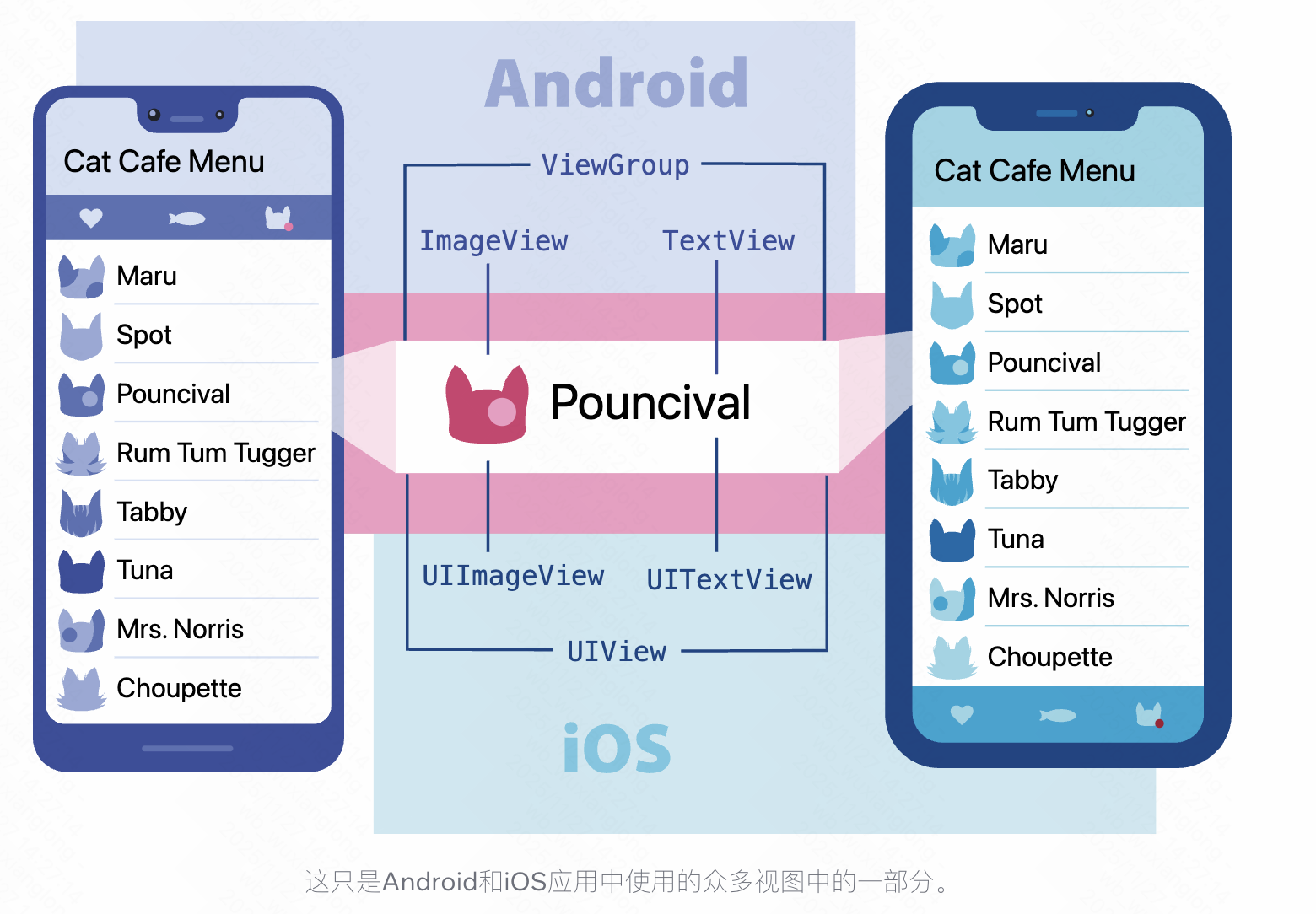
reactNative的核心组件列表:
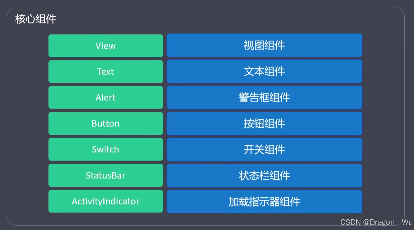
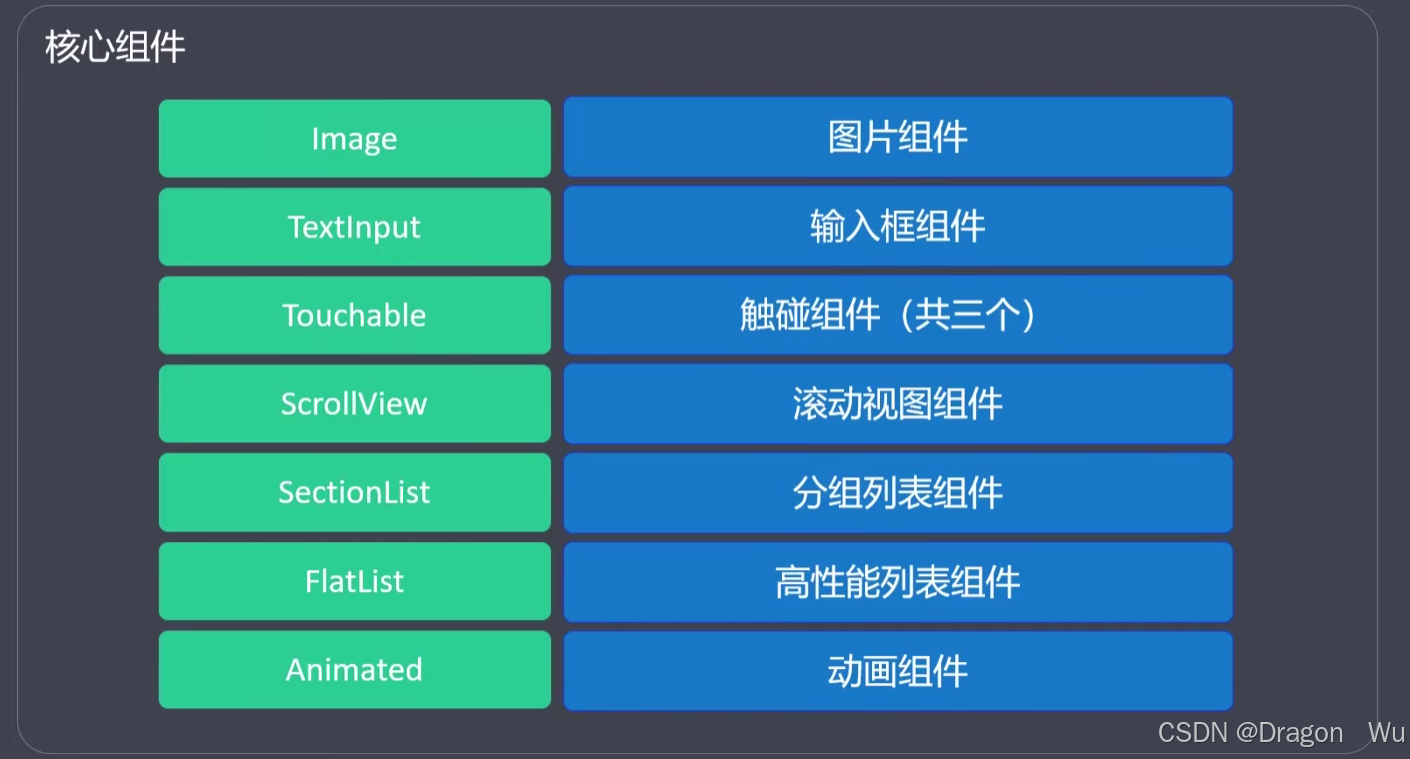
可直接从ReactNative中引入的就是核心组件。
常用组件
以下是一些常用的组件举例。第三方组件需要先下载对应依赖才能使用,可以考虑expo go框架提供的对应组件依赖。后面会介绍expo提供的一些常用组件。
|-------------------|---------------------------------------------|
| 组件名 | 作用 |
| StatusBar | 可以用于修改手机顶部状态栏的显示,hidden=true时隐藏状态栏 |
| Siwtch | 用于控件状态 |
| ActivityIndicator | 加载时的圆形加载条 |
| Touchable | 点击时有样式改变效果,类似于按钮 |
| ScrollView | 可滚动的视图,View是不能滚动的,但这个可以。可设置水平滚动或垂直滚动。可作为导航栏 |
| SafeAreaView | 可以保证视图存于合理的视图区域,可避免某些手机刘海屏对视图的遮挡 |
| SetionList | 可以进行分组的列表 |
| FlatList | 支持水平布局的列表 |
2、核心组件的使用
View、Text、ScrollView
View对应视图,类似web开发中的div标签,同为块级元素,元素独占一行;Text对应文字,类似web开发中的p标签,但不完全像p标签,内嵌时不会换行。Text默认会换行,Text内嵌Text时内部的Text标签不会换行,可以理解为在Text里面时类似于span标签,具体效果见案例。
注意:View标签不能直接写入文字,需内嵌Text标签使用。文字都需使用Text标签包裹。
这两个标签在小程序开发中也有类似的设置,可以对比参考。
代码示例:
javascript
import {View, Text, StyleSheet} from "react-native";

export default function Home() {
    return (
        <View style={styles.container}>
            <View>
                <Text>
                    在Text标签内写文字01
                    <Text>
                        在Text标签内写文字02
                    </Text>
                </Text>
                <Text>
                    在Text标签内写文字03
                </Text>
            </View>
            <View>
                <Text>
                    在Text标签内写文字04
                </Text>
            </View>
        </View>
    );
}

const styles = StyleSheet.create({
    container: {
        flex: 1,
        alignItems: "center",
        justifyContent: "center"
    }
})
效果:可以看到嵌套的Text标签没有换行,兄弟Text标签间出现了换行。

案例二:ScrollView与View
javascript
import {View, StyleSheet, Text, ScrollView} from "react-native";

export default function Home() {
    return (
        <ScrollView style={styles.container}>
            <View style={styles.content}>
                <View>
                    <Text>bottom</Text>
                </View>
            </View>
        </ScrollView>
    );
}

const styles = StyleSheet.create({
    container: {},
    content: {
        width: "100%",
        height: 2000,
        justifyContent: "flex-end"
    }
});
效果: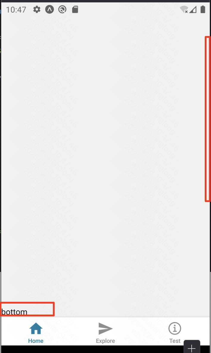 使用ScrollView在页面超出显示区时才能滑动到底部,若将这里的ScrollView的container换成View组件就不能滑动了。
ScrollView与View对比
简单来说:
-
View:是一个静态的、固定大小的矩形区域,用于显示内容(如文字、图片)和响应用户交互。它本身无法处理超出其边界的内容。 -
ScrollView:是一个动态的、可滚动的容器,它内部有一个"视口",可以通过滑动来查看比这个"视口"更大的内容。
为了更好地理解,我们可以用一个比喻:
-
View就像一张 固定大小的相片。- 你只能看到相框内的内容。如果照片本身比相框大,那么超出的部分你就看不到了(被裁剪了)。
-
ScrollView就像一部 智能手机 的屏幕。- 屏幕本身大小是固定的,但你可以在上面查看一张非常长的网页或一张高分辨率的全景照片。通过手指滑动,你可以让屏幕这个"视口"在整张网页或照片上移动,从而浏览全部内容。手机屏幕就是
ScrollView的frame,而整个网页或照片就是它的contentSize。
- 屏幕本身大小是固定的,但你可以在上面查看一张非常长的网页或一张高分辨率的全景照片。通过手指滑动,你可以让屏幕这个"视口"在整张网页或照片上移动,从而浏览全部内容。手机屏幕就是
Alert、Button
在reactNative中也可以直接使用alert函数类似于web开发中的效果,但某些设备可能不识别这个函数无法显示。只能用于简单消息的特定设备测试用。
javascript
alert("hello")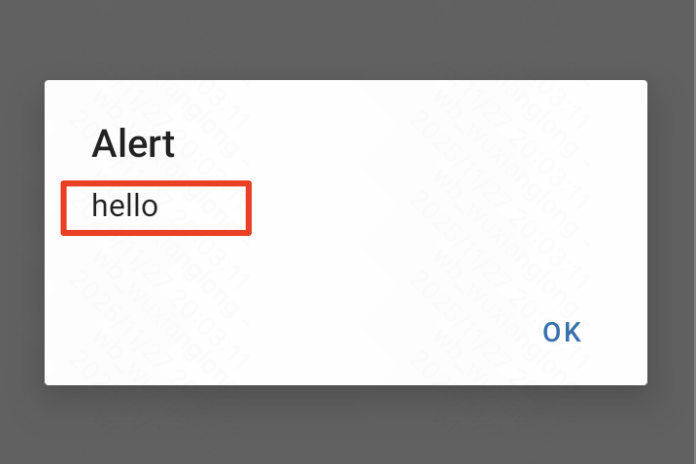
此时,我们需要用到Alert.alert这个api来实现相应的效果。
案例代码:在reactNative中点击事件是onPress而不是web中的onClick。
javascript
import {View, Button, StyleSheet, Alert} from "react-native";

export default function Home() {

    const simpleAlert = () => {
        // 基本用法
        Alert.alert("标题", "消息内容");
    }

    const alertWithButton = () => {
        // 带按钮的 Alert
        Alert.alert(
            "确认删除",
            "您确定要删除这个项目吗?",
            [
                {
                    text: "取消",
                    style: "cancel",
                },
                {
                    text: "删除",
                    onPress: () => console.log("删除操作"),
                    style: "destructive",
                },
            ]
        );
    }

    const alertWithThreeButton = () => {
        // 三个按钮
        Alert.alert(
            "更新提示",
            "有新版本可用",
            [
                {
                    text: "稍后提醒",
                    onPress: () => console.log("稍后提醒"),
                    style: undefined
                },
                {
                    text: "忽略",
                    onPress: () => console.log("忽略"),
                    style: "cancel",
                },
                {
                    text: "立即更新",
                    onPress: () => console.log("立即更新"),
                    style: "default"
                },
            ]
        );
    }

    return (
        <View style={styles.container}>
            <Button title={"基本用法"}
                    color={"red"}
                    onPress={simpleAlert}/>
            <Button title={"两个按钮"}
                    color={"green"}
                    onPress={alertWithButton}/>
            <Button title={"三个按钮"} onPress={alertWithThreeButton}/>
        </View>
    );
}

const styles = StyleSheet.create({
    container: {
        padding: 15,
        margin: 10,
    }
});
效果: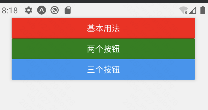
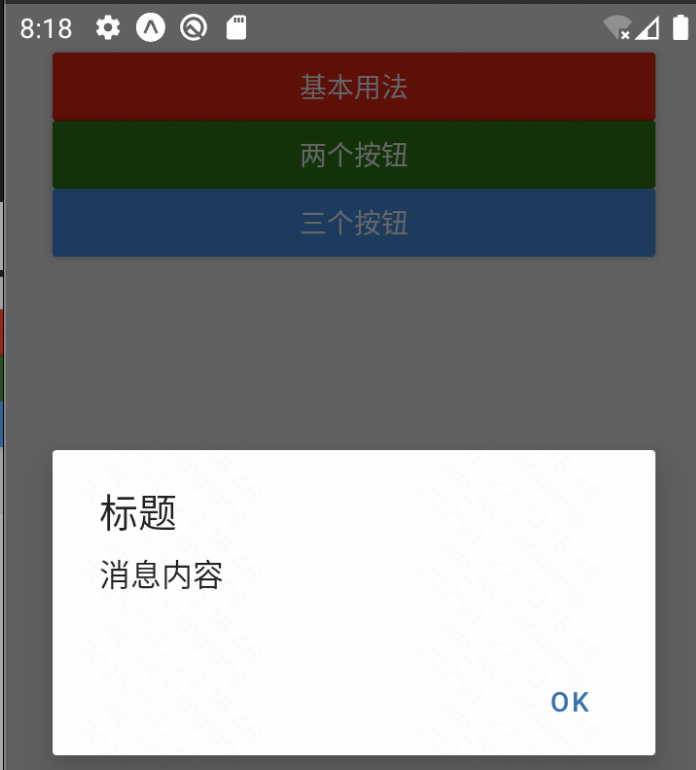
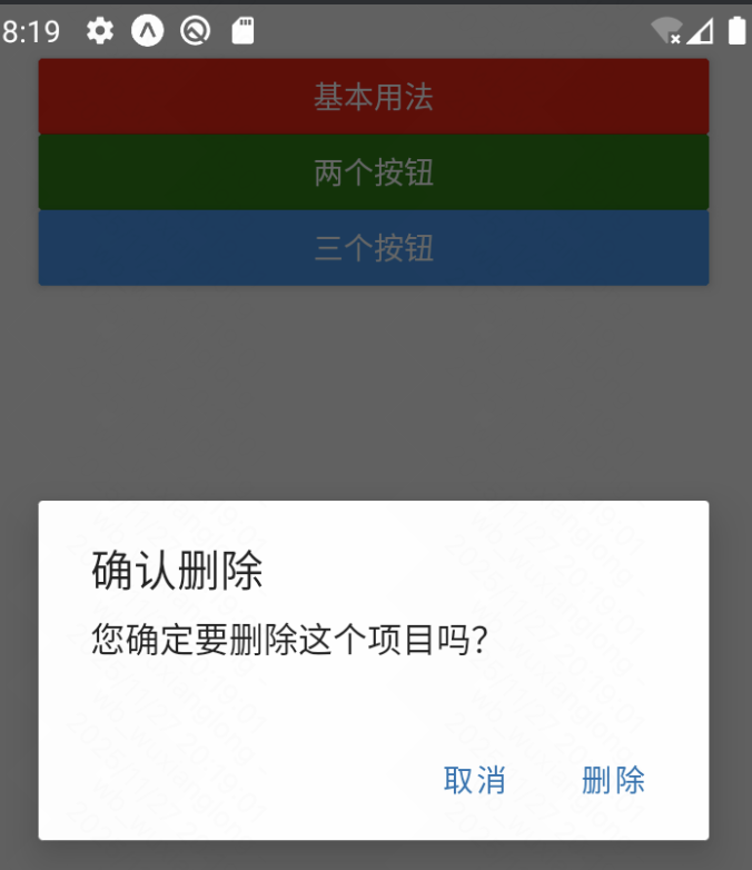
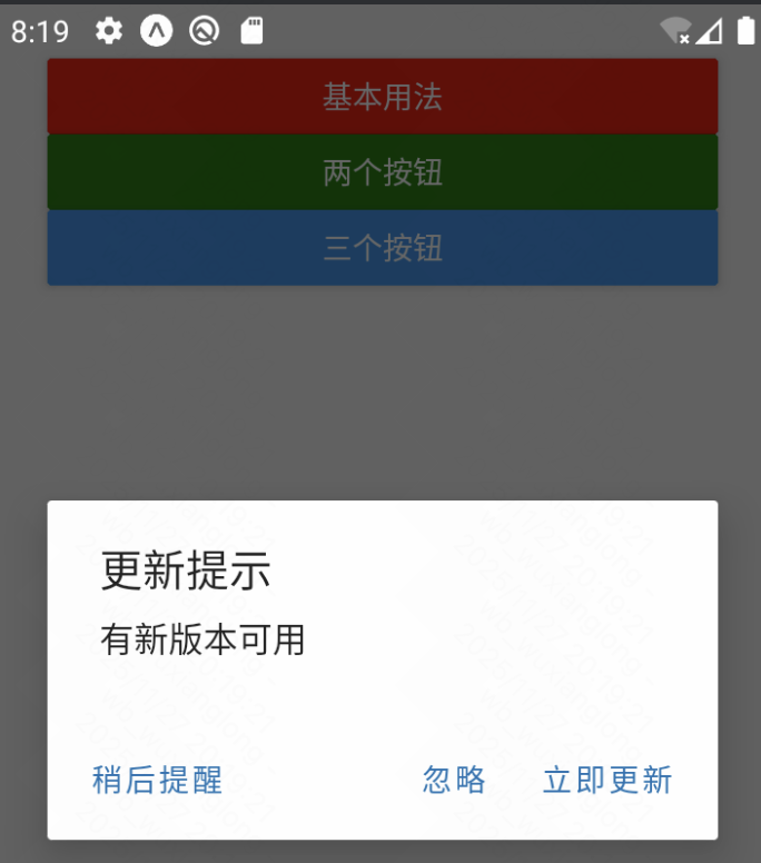
Alert可以设置title,message和button属性,其中button属性又有对应的四个按钮样式设置。
参考:https://reactnative.dev/docs/alert
组件中的Button和web中的不同在于,文字需要设置到title属性中,可以通过设置color来修改按钮颜色。
参考:https://reactnative.dev/docs/button
Touchable、Pressable
两个都是热区组件,用于实现类似Button的点击触发事件的效果。
|---------|----------------|-----------------------------|
| 对比项 | Touchable | Pressable |
| API设计 | 每个变种有特定的行为 | 统一的 API,通过配置实现不同效果 |
| 状态管理 | 内置视觉反馈(如透明度变化) | 需要手动处理按压状态 |
| 功能丰富度 | \ | Pressable 提供更细粒度的控制 |
| 性能 | 较老的实现,可能存在性能问题 | 更优化的性能,更好的内存管理 |
| 平台特性 | \ | Pressable 支持 Android Ripple |
Pressable 提供了更好的性能、更灵活的 API 和更好的类型支持,是 React Native 触摸交互的未来方向。(推荐使用Pressable)
Touchable案例(了解即可):
javascript
import {View, Text, TouchableHighlight, TouchableOpacity, TouchableWithoutFeedback, StyleSheet} from "react-native";

export default function Home() {
    return (
        <View style={styles.container}>
            <TouchableHighlight onPress={() => console.log("触碰高亮显示")}>
                <Text>触碰高亮</Text>
            </TouchableHighlight>
            <TouchableOpacity onPress={() => console.log("触碰透明度变化")}>
                <Text>触碰透明度变化</Text>
            </TouchableOpacity>
            <TouchableWithoutFeedback onPress={() => console.log("触碰无响应")}>
                <Text>触碰无响应</Text>
            </TouchableWithoutFeedback>
        </View>
    );
}

const styles = StyleSheet.create({
    container: {
        flex: 1,
        alignItems: "center",
        justifyContent: "center"
    }
})
Pressable:
参考:https://reactnative.dev/docs/next/pressable
触发事件:
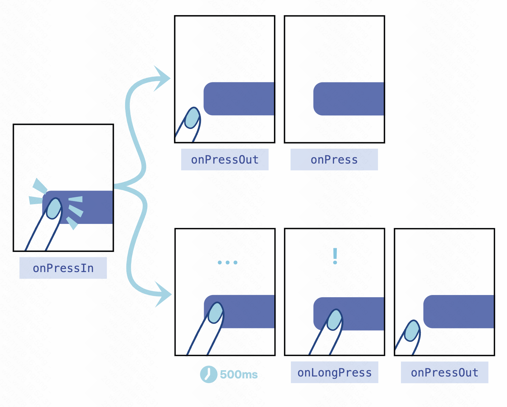
在被包裹的元素上Pressable:
- onPressIn当按下按钮时调用。
- onPressOut当按压手势被取消激活时调用。
按下按钮后onPressIn,将会出现以下两种情况之一:
- 这个人会移开手指,onPressOut然后扣动扳机onPress。
- 如果用户手指停留时间超过 500 毫秒才移开,onLongPress则会触发事件。(onPressOut即使用户移开手指,事件仍然会触发。)
案例:
javascript
import {View, Text, StyleSheet, Pressable, StyleProp, ViewStyle} from "react-native";
import {useState} from "react";

export default function Home() {
    const [pressed, setPressed] = useState(false)

    const pressStyle = {
        opacity: pressed ? 0.5 : 1,
        transform: [{scale: pressed ? 0.95 : 2}]
    }

    return (
        <View style={styles.container}>
            {/* Pressable 的状态处理 */}
            <Pressable
                style={pressStyle as StyleProp<ViewStyle>}
                onPress={() => setPressed(true)}
            >
                <Text>Press me</Text>
            </Pressable>

            {/* android_ripple只在android上有效果,在ios上需使用上面状态改变来实现过渡效果 */}
            <Pressable
                android_ripple={{
                    color: "rgba(0,0,0,0.2)",
                    borderless: false
                }}
            >
                <Text>Android Ripple Effect</Text>
            </Pressable>
        </View>
    );
}

const styles = StyleSheet.create({
    container: {
        flex: 1,
        alignItems: "center",
        justifyContent: "center"
    }
})
Image、ImagePicker
首先是ReactNative提供的Image组件:
参考: https://reactnative.dev/docs/next/images
加载图片的三种方式:1)本地路径;2)图片的URI地址;3)图片的Base64字符串。
这里为什么推荐使用expo-image的Image标签?
由于原生Image标签只在IOS端支持svg图片,在Andriod端上不支持svg,我们需要借助第三方库来解决这个问题。
案例代码:
javascript
import {View, StyleSheet, Image} from "react-native";

const img = require("@/assets/images/react-logo.png");

export default function Home() {
    return (
        <View style={styles.container}>
            <Image style={styles.img} source={img}/>
            <Image style={styles.img} source={require("@/assets/images/react-logo.png")}/>
            <Image style={styles.img} source={{uri: "https://reactnative.dev/img/tiny_logo.png"}}/>
            <Image style={styles.img}
                   source={{
                       uri: "data:image/png;base64,iVBORw0KGgoAAAANSUhEUgAAADMAAAAzCAYAAAA6oTAqAAAAEXRFWHRTb2Z0d2FyZQBwbmdjcnVzaEB1SfMAAABQSURBVGje7dSxCQBACARB+2/ab8BEeQNhFi6WSYzYLYudDQYGBgYGBgYGBgYGBgYGBgZmcvDqYGBgmhivGQYGBgYGBgYGBgYGBgYGBgbmQw+P/eMrC5UTVAAAAABJRU5ErkJggg==",
                   }}
            />
        </View>
    );
}

const styles = StyleSheet.create({
    container: {
        flex: 1,
        alignItems: "center",
        justifyContent: "center"
    },
    img: {
        height: 50,
        width: 50
    }
})
效果:
Expo提供的Image组件:
参考: https://docs.expo.dev/versions/latest/sdk/image/
对应实现上面效果的案例:
javascript
import {View, StyleSheet} from "react-native";
import { Image } from 'expo-image';

const img = require("@/assets/images/react-logo.png");

export default function Home() {
    return (
        <View style={styles.container}>
            <Image style={styles.img} source={img}/>
            <Image style={styles.img} source={require("@/assets/images/react-logo.png")}/>
            <Image style={styles.img} source={{uri: "https://reactnative.dev/img/tiny_logo.png"}}/>
            <Image style={styles.img}
                   source={{
                       uri: "data:image/png;base64,iVBORw0KGgoAAAANSUhEUgAAADMAAAAzCAYAAAA6oTAqAAAAEXRFWHRTb2Z0d2FyZQBwbmdjcnVzaEB1SfMAAABQSURBVGje7dSxCQBACARB+2/ab8BEeQNhFi6WSYzYLYudDQYGBgYGBgYGBgYGBgYGBgZmcvDqYGBgmhivGQYGBgYGBgYGBgYGBgYGBgbmQw+P/eMrC5UTVAAAAABJRU5ErkJggg==",
                   }}
            />
        </View>
    );
}

const styles = StyleSheet.create({
    container: {
        flex: 1,
        alignItems: "center",
        justifyContent: "center"
    },
    img: {
        height: 50,
        width: 50
    }
})
对比ReactNative提供的Image组件和Expo提供的Image组件:
ReactNative提供的:
-
React Native核心组件
-
基础图片显示功能
-
需要手动处理缓存、性能优化
-
对WebP等格式支持有限
Expo提供的:
增强功能:
-
更好的性能:内置内存管理、磁盘缓存
-
更多格式:原生支持WebP、AVIF等
-
高级功能:
-
模糊占位符(blurhash)
-
平滑的图片过渡动画
-
图片预加载
-
更好的错误处理
-
| 特性 | React Native Image | Expo Image |
|---|---|---|
| 缓存控制 | 手动实现 | 自动管理 |
| 图片格式支持 | 基础格式 | WebP, AVIF等 |
| 加载效果 | 有限 | 模糊占位、过渡动画 |
| 性能优化 | 需要自行优化 | 内置优化 |
| 包大小 | 较小 | 稍大 |
| 依赖关系 | 无额外依赖 | 需要Expo环境 |
对比下来显示,Expo项目最好使用Expo提供的Image组件。总之,兼容性好选expo go 的image就对了!
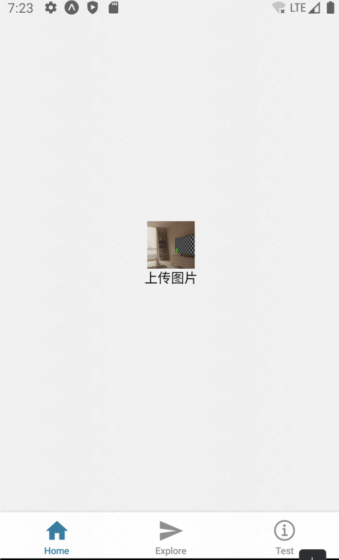
ImagePicker
参考:
javascript
import {View, StyleSheet, Pressable, Text} from "react-native";
import {Image} from "expo-image";
import * as ImagePicker from "expo-image-picker";
import {useState} from "react";
export default function Home() {
const [img, setImg] = useState<string | undefined>()
const pickImageAsync = async () => {
let result = await ImagePicker.launchImageLibraryAsync({
mediaTypes: ["images"],
allowsEditing: true,
quality: 1,
});
if (!result.canceled) {
setImg(result.assets[0].uri);
} else {
alert("You did not select any image.");
}
}
return (
<View style={styles.container}>
<Image style={styles.img} source={{uri: img}}/>
<Pressable onPress={pickImageAsync}>
<Text>上传图片</Text>
</Pressable>
</View>
);
}
const styles = StyleSheet.create({
container: {
flex: 1,
alignItems: "center",
justifyContent: "center"
},
img: {
height: 50,
width: 50
}
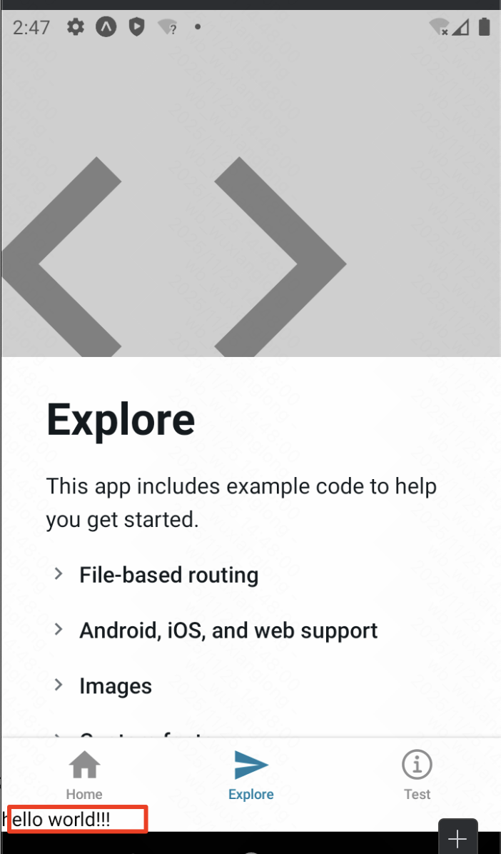
})效果:点击按钮上传手机图片并显示。
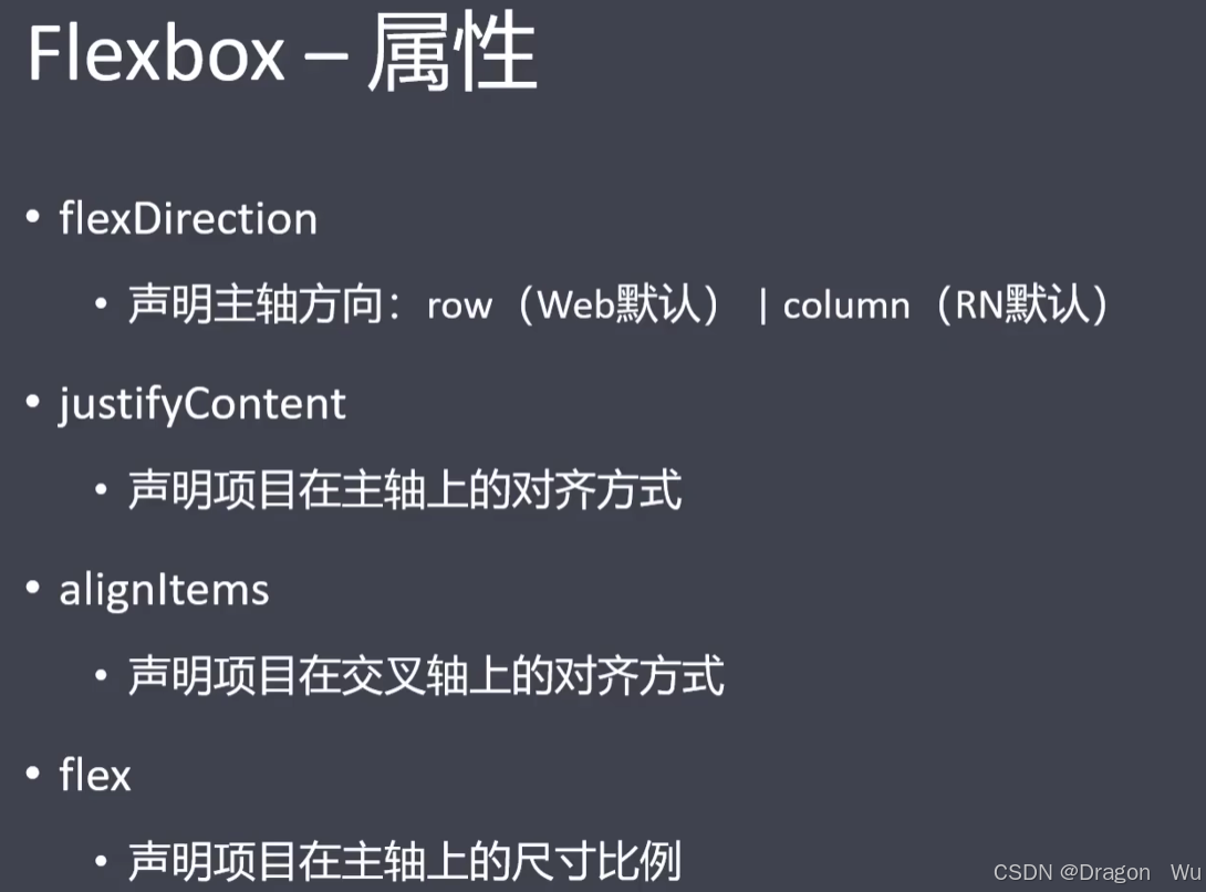
列表:ScrollView + map()、SetionList、FlatList、VirtualList、FlashList
测试数据的代码:
javascript
interface DataType {
    name: string,
    age: number,
    isMale: boolean,
}

const arr: DataType[] = [
    {
        name: "Jack",
        age: 20,
        isMale: true
    },
    {
        name: "Mark",
        age: 21,
        isMale: true
    },
    {
        name: "Alice",
        age: 18,
        isMale: false
    },
    {
        name: "Jack233",
        age: 20,
        isMale: true
    },
    {
        name: "Mark233",
        age: 21,
        isMale: true
    },
    {
        name: "Alice233",
        age: 18,
        isMale: false
    },
    {
        name: "Jack9527",
        age: 20,
        isMale: true
    },
    {
        name: "Mark9527",
        age: 21,
        isMale: true
    },
    {
        name: "Alice9527",
        age: 18,
        isMale: false
    },
]
使用ScrollView+map完成遍历:
javascript
export default function Home() {
    return (
        <ScrollView style={styles.container}>
            <View>
                {
                    arr.map((item: DataType, index: number) => (
                        <View style={styles.item} key={"map-" + index}>
                            <Text>{item.name}</Text>
                            <Text>{item.age}岁</Text>
                            <Text>{item.isMale ? "男" : "女"}</Text>
                        </View>
                    ))
                }
            </View>
        </ScrollView>
    );
}

const styles = StyleSheet.create({
    container: {},
    item: {
        marginVertical: 10,
        backgroundColor: "gray"
    }
})
效果: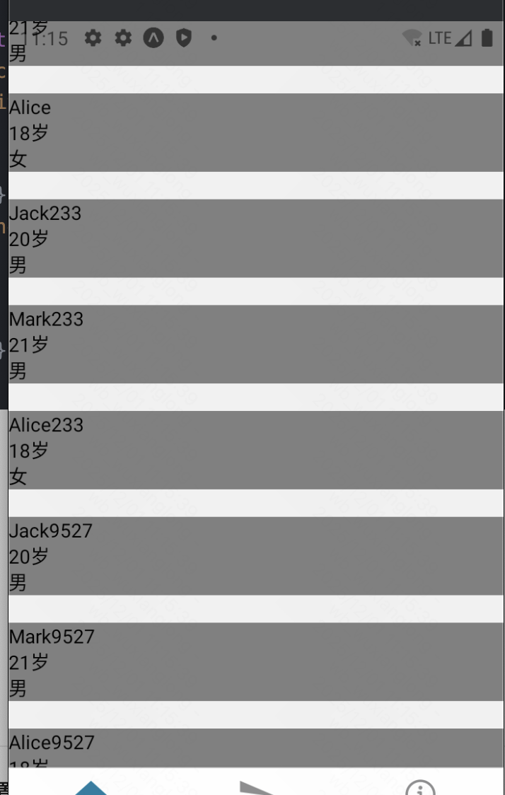
使用SectionList完成分组遍历:
注意,SectionList、FlatList不能用ScrollView作为父容器包裹,因为SectionList已自带来ScrollView属性。
javascript
export default function Home() {
    return (
        <View style={styles.container}>
            <SectionList
                sections={[
                    {
                        title: "group01",
                        data: arr
                    },
                    {
                        title: "group02",
                        data: arr
                    },
                    {
                        title: "group03",
                        data: arr
                    }]}
                keyExtractor={(item: DataType, index: number) => item.name + index}
                renderSectionHeader={({section}) => (
                    <Text style={styles.header}>{section.title}</Text>
                )}
                renderItem={({item}) => (
                    <View style={styles.item}>
                        <Text>{item.name}</Text>
                        <Text>{item.age}岁</Text>
                        <Text>{item.isMale ? "男" : "女"}</Text>
                    </View>
                )}/>
        </View>
    );
}

const styles = StyleSheet.create({
    container: {},
    item: {
        marginVertical: 10,
        backgroundColor: "gray"
    },
    header: {
        color: "blue",
        fontSize: 20,
        fontWeight: 600
    }
})
效果: 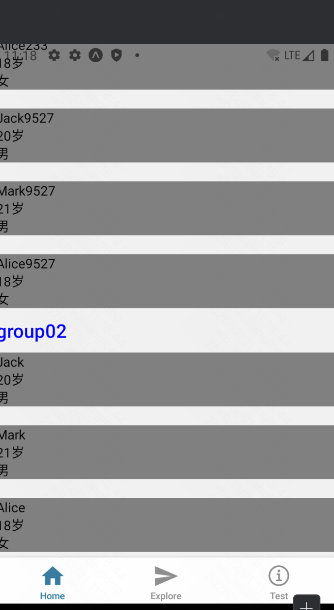
分组显示成功,sectionList有4个关键属性需要配置,
sections: 对应分组的数据;
keyExtractor: 对应item项的key;
renderSectionHeader: 渲染分组title的组件
renderItem: 渲染分组item项的组件,类似于map中item项渲染。
参考:https://reactnative.dev/docs/sectionlist
使用FlatList案例(最常用的列表,推荐使用):
javascript
export default function Home() {
    return (
        <View style={styles.container}>
            <FlatList
                data={arr}
                keyExtractor={(item: DataType, index: number) => item.name + index}
                renderItem={({item}) => (
                    <View style={styles.item}>
                        <Text>{item.name}</Text>
                        <Text>{item.age}岁</Text>
                        <Text>{item.isMale ? "男" : "女"}</Text>
                    </View>
                )}/>
        </View>
    );
}
3个关键属性:
data: 对应列表;
keyExtractor: 对应item项的key;
renderItem: 渲染分组item项的组件,类似于map中item项渲染。
参考:https://reactnative.dev/docs/flatlist
VirtualizedList(一般不用再去调这个底层实现):
参考:https://reactnative.cn/docs/virtualizedlist
FlatList和SectionList的底层实现。FlatList 和 SectionList 使用起来更方便,同时也有相对更详细的文档。一般来说,仅当想获得比 FlatList 更高的灵活性(比如说在使用 immutable data 而不是 普通数组)的时候,你才应该考虑使用 VirtualizedList。
Vritualization 通过维护一个有限的渲染窗口(其中包含可见的元素),并将渲染窗口之外的元素全部用合适的定长空白空间代替的方式,极大的改善了内存消耗以及在有大量数据情况下的使用性能。这个渲染窗口能响应滚动行为。当一个元素离可视区太远时,它就有一个较低优先级;否则就获得一个较高的优先级。渲染窗口通过这种方式逐步渲染其中的元素(在进行了任何交互之后),以尽量减少出现空白区域的可能性。
使用FlashList遍历超大列表:
参考:https://shopify.github.io/flash-list/#install
https://docs.expo.dev/versions/latest/sdk/flash-list/
此为第三方组件,使用需先安装:
javascript
npx expo install @shopify/flash-listFlashList 由 Shopify 开发,针对大规模数据列表进行了极致优化。它不仅保留了 FlatList 的 API 设计,还提升了渲染速度,适用于超大数据集的高性能渲染。
FlashList 主要特性:
- 优化渲染,速度提升 10 倍
- 流畅滚动,内存占用更低
- API 兼容
FlatList,迁移成本低
案例:
javascript
import React from "react";
import { View, Text, StatusBar } from "react-native";
import { FlashList } from "@shopify/flash-list";

const DATA = [
  {
    title: "First Item",
  },
  {
    title: "Second Item",
  },
];

const MyList = () => {
  return (
    <FlashList
      data={DATA}
      renderItem={({ item }) => <Text>{item.title}</Text>}
    />
  );
};
选择指南
📊 决策流程图
数据量少 (< 50项) → ScrollView
    ↓
数据量大 → 需要分组? → 是 → SectionList
    ↓
    否 → 性能要求极高? → 是 → FlashList
    ↓
    否 → FlatList(默认选择)
🎯 详细选择标准
| 组件 | 数据量 | 性能 | 功能 | 复杂度 |
|---|---|---|---|---|
| ScrollView | < 50项 | 差(无虚拟化) | 基础 | 简单 |
| FlatList | 任意 | 优秀 | 丰富 | 中等 |
| SectionList | 任意 | 优秀 | 分组+丰富 | 较高 |
| FlashList | 超大 | 极佳 | 丰富 | 中等 |
💡 实用建议
-
默认选择 FlatList - 适用于80%的场景
-
数据分组用 SectionList - 通讯录、分类商品
-
短列表用 ScrollView - 设置页面、简单表单
-
性能瓶颈用 FlashList - 社交媒体feed、大型数据集
TextInput、Switch、ActivityIndicator
参考:https://reactnative.dev/docs/textinput
https://reactnative.dev/docs/switch
https://reactnative.dev/docs/activityindicator
javascript
import {View, StyleSheet, ActivityIndicator, TextInput, Switch} from "react-native";
import {useState} from "react";

export default function Home() {

    const [value, setValue] = useState("")
    const [loading, setLoading] = useState(true)
    const onChangeTxt = (e: string) => {
        console.log(e)
        setValue(e)
    }
    const onChangeSwitch = (e: boolean) => {
        console.log(e)
        setLoading(prev => !prev)
    }

    return (
        <View style={styles.container}>
            <TextInput
                style={styles.input}
                onChangeText={onChangeTxt}
                value={value}
                placeholder={"请输入"}
            />
            <Switch
                trackColor={{false: "red", true: "green"}}  // 设置滑槽颜色
                thumbColor={"blue"}                         // 设置圆点颜色
                value={loading}
                onValueChange={onChangeSwitch}
            />
            <ActivityIndicator
                color="purple"
                animating={loading}
                size="large"/>
        </View>
    );
}

const styles = StyleSheet.create({
    container: {
        flex: 1,
        alignItems: "center",
        justifyContent: "center"
    },
    input: {
        borderWidth: 1,
        borderColor: "black",
        width: 200,
        height: 50
    }
})
效果: 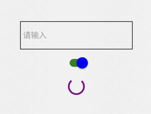
Modal模态框
参考: https://reactnative.dev/docs/modal
可以考虑直接使用UI库,样式更佳。
javascript
import React, {useState} from 'react';
import {Alert, Modal, StyleSheet, Text, Pressable, View} from 'react-native';
import {SafeAreaView, SafeAreaProvider} from 'react-native-safe-area-context';

const App = () => {
    const [modalVisible, setModalVisible] = useState(false);
    return (
        <SafeAreaProvider>
            <SafeAreaView style={styles.centeredView}>
                <Modal
                    animationType="slide"
                    transparent={true}
                    visible={modalVisible}
                    onRequestClose={() => {
                        Alert.alert('Modal has been closed.');
                        setModalVisible(!modalVisible);
                    }}>
                    <View style={styles.centeredView}>
                        <View style={styles.modalView}>
                            <Text style={styles.modalText}>Hello World!</Text>
                            <Pressable
                                style={[styles.button, styles.buttonClose]}
                                onPress={() => setModalVisible(!modalVisible)}>
                                <Text style={styles.textStyle}>Hide Modal</Text>
                            </Pressable>
                        </View>
                    </View>
                </Modal>
                <Pressable
                    style={[styles.button, styles.buttonOpen]}
                    onPress={() => setModalVisible(true)}>
                    <Text style={styles.textStyle}>Show Modal</Text>
                </Pressable>
            </SafeAreaView>
        </SafeAreaProvider>
    );
};

const styles = StyleSheet.create({
    centeredView: {
        flex: 1,
        justifyContent: 'center',
        alignItems: 'center',
    },
    modalView: {
        margin: 20,
        backgroundColor: 'white',
        borderRadius: 20,
        padding: 35,
        alignItems: 'center',
        shadowColor: '#000',
        shadowOffset: {
            width: 0,
            height: 2,
        },
        shadowOpacity: 0.25,
        shadowRadius: 4,
        elevation: 5,
    },
    button: {
        borderRadius: 20,
        padding: 10,
        elevation: 2,
    },
    buttonOpen: {
        backgroundColor: '#F194FF',
    },
    buttonClose: {
        backgroundColor: '#2196F3',
    },
    textStyle: {
        color: 'white',
        fontWeight: 'bold',
        textAlign: 'center',
    },
    modalText: {
        marginBottom: 15,
        textAlign: 'center',
    },
});

export default App;
效果:
3、全局组件配置
(1)状态栏
由于这里使用了expo框架,我们直接使用expo提供的StatusBar来进行演示。一般在_layout里全局共享一个StatusBar即可。
参考:https://docs.expo.dev/versions/latest/sdk/status-bar/#api
https://docs.expo.dev/develop/user-interface/system-bars/
javascript
import {View} from "react-native";
import {StatusBar} from "expo-status-bar";

export default function Home() {
    return (
        <View>
            <StatusBar
                style={"auto"}      // 默认值为auto。例如:如果您的应用处于深色模式,则样式将为"light"。
                hidden={false}      // 是否隐藏状态栏
                animated={true}     // 如果状态栏属性更改之间的过渡需要动画效果
            />
        </View>
    );
}
效果: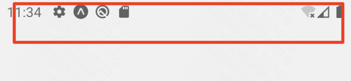
(2)安全区域
某些设备上线显示可能是刘海屏,普通的显示页面可能被遮挡
参考:https://docs.expo.dev/versions/latest/sdk/safe-area-context/
如图: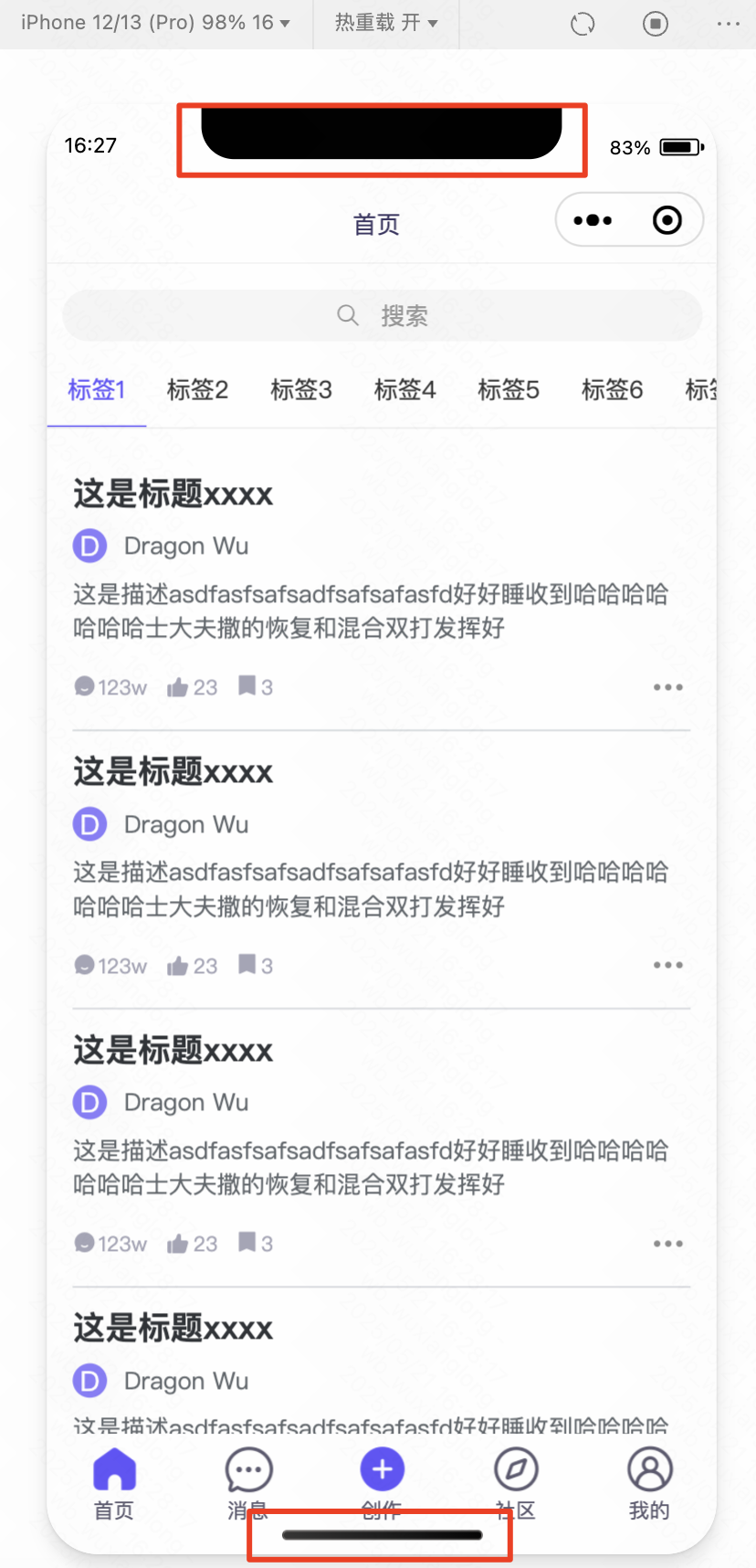 ,使用安全区域后可以使区域不被遮挡。
在expo框架中,有以下api可以进行使用:
javascript
import {
  SafeAreaView,
  SafeAreaProvider,
  SafeAreaInsetsContext,
  useSafeAreaInsets,
} from 'react-native-safe-area-context';
SafeAreaView:
如果你在视图上设置了自己的内边距,它将添加到安全区域的内边距中。
javascript
import { SafeAreaView } from 'react-native-safe-area-context';

function SomeComponent() {
  return (
    <SafeAreaView>
      <View />
    </SafeAreaView>
  );
}
useSafeAreaInsets():
使用挂钩可以直接接触到安全区域的嵌件。这是一种更高级的使用方式,其性能可能不如SafeAreaView旋转设备。
javascript
import { useSafeAreaInsets } from 'react-native-safe-area-context';

function HookComponent() {
  const insets = useSafeAreaInsets();

  return <View style={{ paddingTop: insets.top }} />;
}
context:
要使用安全区域上下文,需要SafeAreaProvider在应用程序根组件中添加。
javascript
import { SafeAreaProvider } from 'react-native-safe-area-context';

function App() {
  return <SafeAreaProvider>...</SafeAreaProvider>;
}然后,可以使用useSafeAreaInsets()hook 和消费者 API 来访问插入数据:
优化:
如果可以,请使用它SafeAreaView。它是原生实现的,因此旋转设备时,异步桥接不会产生延迟。(推荐使用SafeAreaView)
(3)启动动画
参考:https://docs.expo.dev/develop/user-interface/splash-screen-and-app-icon/#splash-screen
配置app.json里的插件即可:值得注意的是,该效果要导出再安装后才能看到效果,测试环境不能直接看到效果。
javascript
 "plugins": [
      "expo-router",
      [
        "expo-splash-screen",
        {
          "image": "./assets/images/splash-icon.png",
          "imageWidth": 200,
          "resizeMode": "contain",
          "backgroundColor": "#ffffff"
        }
      ]
    ],
不过,这样设置只能设置启动的图片,并不能设置加载效果或炫酷的动画效果。若需要设置进入时的加载过渡效果页面,可以考虑中全局_layout中设置loading状态。
(4)应用图标
参考:https://docs.expo.dev/develop/user-interface/splash-screen-and-app-icon/#app-icon
配置app.json的icon属性:
javascript
{
  "icon": "./assets/images/icon.png"
}
4、动画
原生Animated
app端不能像web端一样通过css端transition等实现过渡动画效果,对此,app端的解决方案是使用Animated。
参考:https://reactnative.cn/docs/next/animated
Animated库旨在使动画变得流畅,强大并易于构建和维护。Animated侧重于输入和输出之间的声明性关系,以及两者之间的可配置变换,此外还提供了简单的 start/stop方法来控制基于时间的动画执行。
创建动画最基本的工作流程是先创建一个 Animated.Value ,将它连接到动画组件的一个或多个样式属性,然后使用Animated.timing()通过动画效果展示数据的变化:
注:不要直接修改动画值!你可以用useRef Hook来返回一个可修改的 ref 引用。ref 对象的
current属性在初始化时被赋予给定的动画值,且在组件的生命周期内保存不被销毁。
组件必须经过特殊的处理才能用于动画。
React Native中有四个组件是可以直接使用动画的,分别是Animated.View、Animated.Text、Animated.ScrollView、Animated.Image。
创建动画步骤:
1)创建初始值:Animated.Value() 单个值 、Animated.ValueXY() 向量值 ;
2)将初始值绑定在动画组件上:
一般将其绑定到某个样式属性上,例如opacity、translate等;
3)通过动画类型API,一帧一帧地更改初始值。
Animated提供了三种动画类型。每种动画类型都提供了特定的函数曲线,用于控制动画值从初始值变化到最终值的变化过程:
- Animated.decay()以指定的初始速度开始变化,然后变化速度越来越慢直至停下。
- Animated.spring()提供了一个基础的弹簧物理模型.
- Animated.timing()使用easing 函数让数值随时间动起来。(类似ease-in-out)
案例:
javascript
import {StyleSheet, View, Animated, Alert, Pressable, Text} from "react-native";
import {useRef} from "react";

export default function Home() {
    // 1、创建ref初始值
    const refCurrent = useRef(new Animated.Value(0)).current
    const spin = refCurrent.interpolate({
        inputRange: [0, 1],
        outputRange: ["0deg", "360deg"]
    });

    const go = () => {
        Animated.timing(refCurrent, {       // 2、选择淡入淡出过渡的函数
            toValue: 45,             // 改变到哪个值
            duration: 2000,         // 过渡时间,毫秒
            useNativeDriver: true,  // 启用原生方式渲染动画(执行效率更高)
        }).start(() => {
            Alert.alert(
                "value已改变,过渡完毕!"
            )
        })
    }

    const back = () => {
        Animated.spring(refCurrent, {
            toValue: 0,             // 目标值
            friction: 5,            // 摩擦力,控制反弹
            tension: 40,            // 张力,控制速度
            useNativeDriver: true,  // 使用原生驱动提高性能
        }).start()
    }

    return (<View style={styles.container}>
        <Animated.View style={[
            styles.card,
            {
                transform: [{rotate: spin}] as any
            }
        ]}>
            <Text>旋转效果</Text>
        </Animated.View>
        <Animated.View style={{
            backgroundColor: "gray",
            width: 200,
            height: 200,
            marginTop: 20,
            opacity: refCurrent
        }}>
            <Animated.Text style={{
                // 3、 绑定动态值到样式上
                color: refCurrent === 1 ? "yellow" : "red"
            }}>
                动画效果
            </Animated.Text>
        </Animated.View>
        <View>
            <Pressable onPress={go}>
                <Text>逐渐改变</Text>
            </Pressable>
            <Pressable onPress={back}>
                <Text>弹走</Text>
            </Pressable>
        </View>
    </View>)
}

const styles = StyleSheet.create({
    container: {
        flex: 1,
        alignItems: "center",
        justifyContent: "center",
    },
    card: {
        width: 100,
        height: 100,
        backgroundColor: "blue",
        alignItems: "center",
        justifyContent: "center"
    }
})
效果:点击会实现过渡动画效果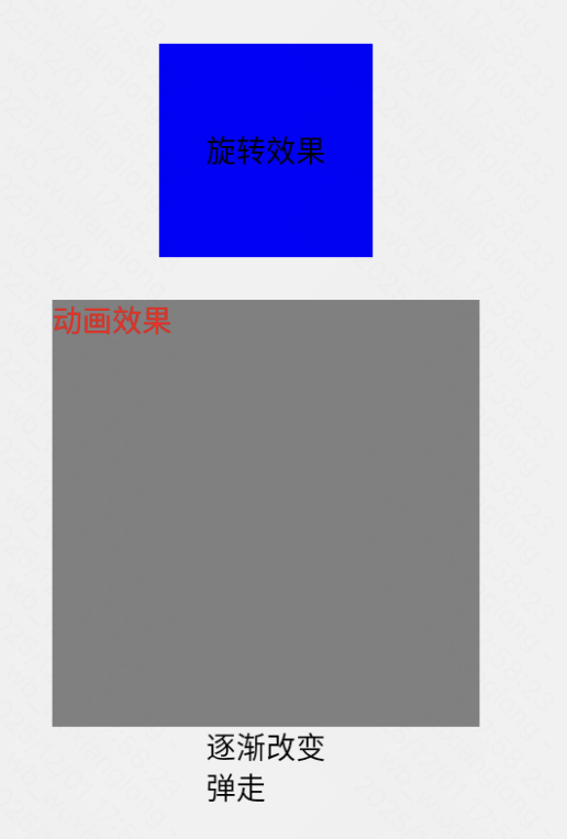
这里有用到这个方法:
interpolate()函数允许输入范围映射到不同的输出范围。默认情况下,它将推断超出给定范围的曲线,但也可以限制输出值。它默认使用线性插值,但也支持缓动功能。
React Native Reanimated(推荐)
Reanimated 2+ 提供更强大的性能,支持手势驱动的动画。
一个提供 API 的库,可以大大简化创建流畅、强大且易于维护的动画的过程。
参考:
https://docs.expo.dev/versions/latest/sdk/reanimated/
https://docs.swmansion.com/react-native-reanimated/docs/fundamentals/your-first-animation
动画过渡效果参考:
https://docs.swmansion.com/react-native-reanimated/docs/fundamentals/customizing-animation
案例:
javascript
import Animated, {useSharedValue, withSpring} from "react-native-reanimated";
import {Button, View} from "react-native";

export default function App() {
    // 1、创建共享值
    const width = useSharedValue(100);

    const handlePress = () => {
        // 2、使用过渡函数包裹值的变更
        width.value = withSpring(width.value + 50);
    };

    return (
        <View style={{flex: 1, alignItems: "center", justifyContent: "center"}}>
            <Animated.View
                style={{
                    // 3、传入值
                    width,
                    height: 100,
                    backgroundColor: "violet",
                    marginBottom: 20
                }}
            />
            <Button onPress={handlePress} title="Click me"/>
        </View>
    );
}
效果: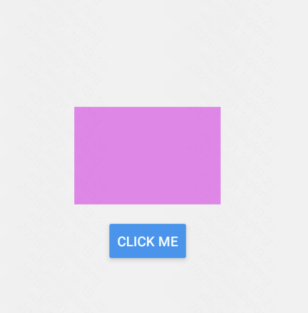 点击出现过渡变长。
这种方法明显更好管理样式,且简单方便调用,更多过渡效果参考官方文档。
4、第三方常用组件
(1)WebView
参考:https://docs.expo.dev/versions/latest/sdk/webview/
安装依赖:
npx expo install react-native-webview案例:
javascript
import {WebView} from "react-native-webview";
import Constants from "expo-constants";
import {StyleSheet} from "react-native";

export default function App() {
    return (
        <WebView
            style={styles.container}
            source={{uri: "https//example.com"}}
        />
    );
}

const styles = StyleSheet.create({
    container: {
        flex: 1,
        marginTop: Constants.statusBarHeight,
    },
});
效果:
网页被嵌入了app中,对于一些混合型应用,在不追求底层性能的情况下非常推荐使用。
(2)截图功能
参考:https://docs.expo.dev/versions/latest/sdk/captureRef/
使用方法:
1)安装依赖:
javascript
npx expo install react-native-view-shot2)引入,并包裹需要截图的Dom对象
javascript
import ViewShot from "react-native-view-shot";

 <ViewShot ref={viewShotRef} style={styles.container}>
      <Target/>
</ViewShot>- 绑定对应ViewShot的ref对象
javascript
const viewShotRef = useRef<ViewShot | null>(null)4)调用ref对象的capture方法进行截图
javascript
const uri = await viewShotRef.current?.capture?.();案例:
javascript
import {Button, StyleSheet, Text, View} from "react-native";
import {Image} from "expo-image";
import ViewShot from "react-native-view-shot";
import {useRef, useState} from "react";

const placeHolder = require("@/assets/images/test.png");

export default function App() {

    const viewShotRef = useRef<ViewShot | null>(null)
    const [img, setImg] = useState<string | undefined>()
    const [count, setCount] = useState(0)

    const save = async () => {
        try {
            const uri = await viewShotRef.current?.capture?.();
            if (uri) {
                setImg(await uri)
                setCount(prev => prev + 1)
            }
            console.log("图片URI:", uri);
            // 可以保存到相册或分享
        } catch (error) {
            console.error("截图失败:", error);
        }
    }

    return (
        <ViewShot ref={viewShotRef} style={styles.container}>
            <Image style={styles.img} source={img ? {uri: img} : placeHolder}/>
            <View style={styles.cover}>
                <Text style={styles.text}>这是count: {count}!!!</Text>
            </View>
            <Button title={"保存"} onPress={save}/>
        </ViewShot>
    );
}

const styles = StyleSheet.create({
    container: {
        flex: 1,
        justifyContent: "center",
        alignItems: "center",
    },
    img: {
        width: 200,
        height: 200,
        borderRadius: 8,
        marginBottom: 10
    },
    cover: {
        position: "absolute",
    },
    text: {
        textAlign: "center",
        color: "white",
        fontSize: 32
    }
});
效果: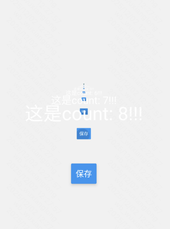 点击截图以后就会保存图片并重新渲染截图。
(3)手势
expo集成:react-native-gesture-handler - Expo文档
官方文档:Installation | React Native Gesture Handler
使用手势可以结合动画实现联动效果,详情见官方文档。
首先安装依赖:
javascript
npx expo install react-native-gesture-handler案例代码,测试其中的Tap敲击手势,当组件被敲击时触发相应逻辑:
javascript
import {TouchableOpacity, Text, StyleSheet} from "react-native";
import {Gesture, GestureDetector, GestureHandlerRootView} from "react-native-gesture-handler";

// 使用示例
export default function Home() {

    const gesture = Gesture.Tap()
        .onBegin(() => {
            console.log("tap begin")
        })
        .onEnd(() => {
            console.log("tap end")
        })

    return (
        <GestureHandlerRootView style={styles.container}>
            <GestureDetector gesture={gesture}>
                <TouchableOpacity style={styles.button}>
                    <Text style={styles.text}>按钮</Text>
                </TouchableOpacity>
            </GestureDetector>
        </GestureHandlerRootView>
    );
}

const styles = StyleSheet.create({
    container: {
        flex: 1,
        alignItems: "center",
        justifyContent: "center"
    },
    button: {
        backgroundColor: "blue"
    },
    text: {
        color: "white"
    }
})
注意:在使用GestureDetector前,需要用GestureHandlerRootView包裹需要使用手势的页面结点。
5、小图标
(1)Expo项目自带的
更多expo自带的iconfont查询:@expo/vector-icons@15.0.3
javascript
import { View, StyleSheet } from 'react-native';
import Ionicons from '@expo/vector-icons/Ionicons';

export default function App() {
  return (
    <View style={styles.container}>
      <Ionicons name="checkmark-circle" size={32} color="green" />
    </View>
  );
}

const styles = StyleSheet.create({
  container: {
    flex: 1,
    justifyContent: 'center',
    alignItems: 'center',
  },
});
(2)自定义阿里Iconfont
阿里云下载.ttf文件的步骤这里不再复述。
配置app.json
javascript
{
  "expo": {
    "extra": {
      "iconFont": {
        "family": "iconfont",
        "file": "./assets/fonts/iconfont.ttf"
      }
    }
  }
}
创建IconFont组件
案例代码如下:
javascript
import React from 'react';
import { Text, StyleSheet } from 'react-native';
import { useFonts } from 'expo-font';

// 从 iconfont.css 中提取的 Unicode 编码
const iconMap = {
    'test': '\ue62f',
    // 添加更多图标...
};

const IconFont = ({ name, size = 24, color = '#000', style, ...props }) => {
    const [fontsLoaded] = useFonts({
        'iconfont': require('../assets/icons/iconfont.ttf'),
    });

    if (!fontsLoaded) {
        return null;
    }

    return (
        <Text
            style={[
                styles.icon,
                { fontFamily: 'iconfont', fontSize: size, color },
                style,
            ]}
            {...props}
        >
            {iconMap[name] || '\ue62f'}
        </Text>
    );
};

const styles = StyleSheet.create({
    icon: {
        fontFamily: 'iconfont',
    },
});

export default IconFont;
调用组件案例:
javascript
import {View, StyleSheet} from "react-native";
import IconFont from "@/components/IconFont";

// 使用示例
export default function Home() {
    return (<View style={styles.container}>
        <IconFont name="test" size={30} color="#34C759"/>
    </View>)
}

const styles = StyleSheet.create({
    container: {
        flex: 1,
        alignItems: "center",
        justifyContent: "center"
    }
})
效果:
注意:这里的unicode编码是css文件里对应的,需要使用/u前缀,如:\ue62f
6、精选UI库
推荐:ReactNative Paper
官方文档:入门指南 |React Native Paper
(1)安装依赖
expo项目一般安装第一个就行了
javascript
yarn add react-native-paper如果使用 Expo 的特定版本,可能需要安装额外依赖
javascript
yarn add react-native-safe-area-context
yarn add react-native-vector-icons
(2)包裹入口文件
javascript
import * as React from 'react';
import { PaperProvider } from 'react-native-paper';
import App from './src/App';

export default function Main() {
  return (
    <PaperProvider>
      <App />
    </PaperProvider>
  );
}
(3)也可配置主题
javascript
import * as React from 'react';
import {
  MD3LightTheme as DefaultTheme,
  PaperProvider,
} from 'react-native-paper';
import App from './src/App';

const theme = {
  ...DefaultTheme,
  // Specify custom property
  myOwnProperty: true,
  // Specify custom property in nested object
  colors: {
    ...DefaultTheme.colors,
    myOwnColor: '#BADA55',
  },
};

export default function Main() {
  return (
    <PaperProvider theme={theme}>
      <App />
    </PaperProvider>
  );
}
(4)测试集成效果
javascript
import * as React from 'react';
import { Appbar } from 'react-native-paper';
import { Platform } from 'react-native';

const MORE_ICON = Platform.OS === 'ios' ? 'dots-horizontal' : 'dots-vertical';

const MyComponent = () => (
    <Appbar.Header>
        <Appbar.Header>
            <Appbar.BackAction onPress={() => {}} />
        </Appbar.Header>
    </Appbar.Header>
);

export default MyComponent;
效果: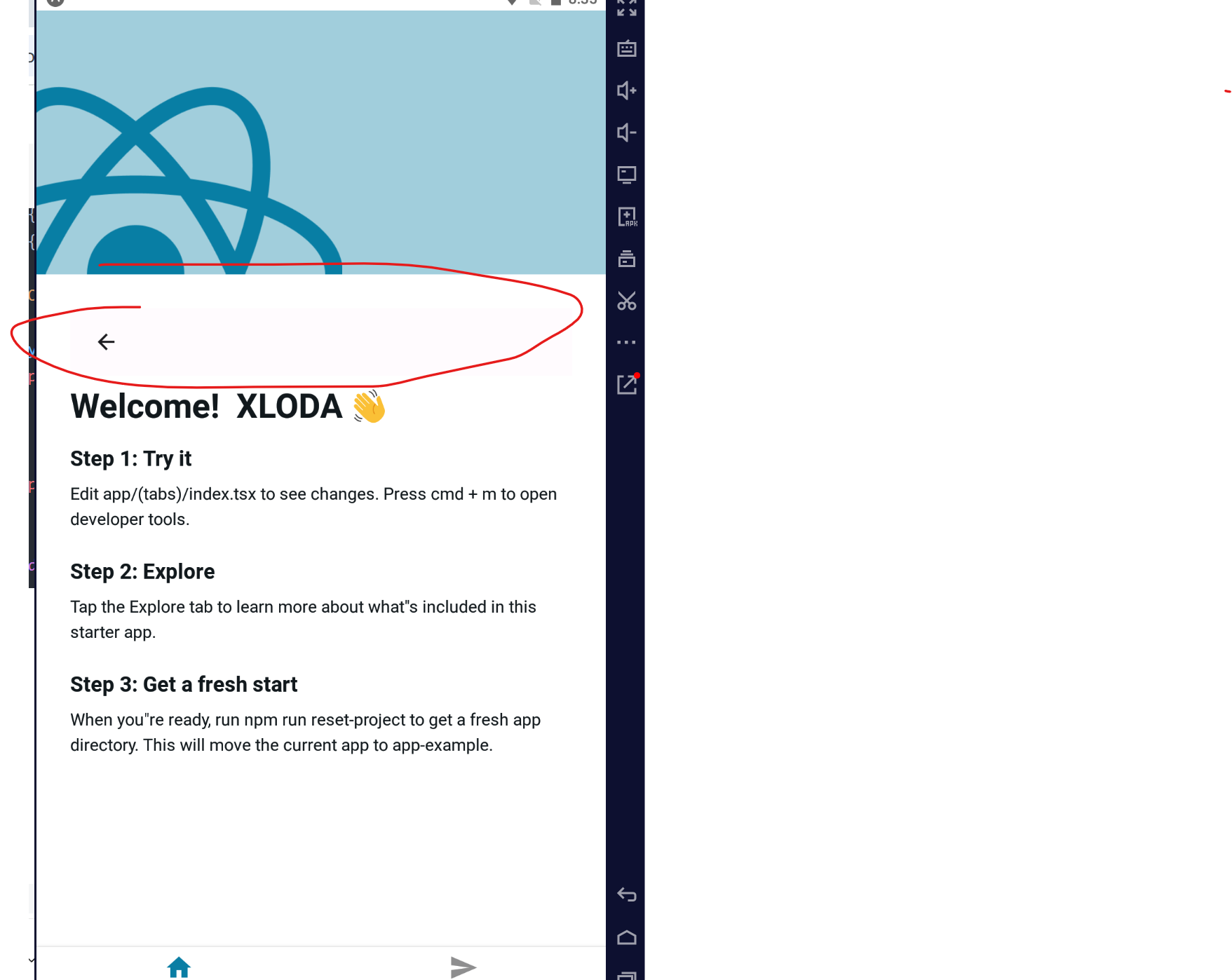
集成成功!
总结到此,后续补充!