ink 是一个使用 react 编写界面的库。我编写了方便学习 ink 的网站 ink learn 。
如果在使用的过程中有任何需求或 bug ,可以通过: github.com/wutiange/in... 进行反馈。
1. Text
tsx
export default function App() {
    return (
        <>
            <Text color={'green'}>I am green</Text>
            <Text color={'black'} backgroundColor={'white'}>I am black on white</Text>
            <Text color={'#fff'}>I am white</Text>
            <Text bold>I am bold</Text>
            <Text underline>I am underline</Text>
            <Text strikethrough>I am strikethrough</Text>
            <Text inverse>I am inversed</Text>
        </>
    );
}
这是文字相关的设置,包括字体颜色,背景颜色,加粗等等。
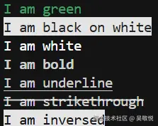
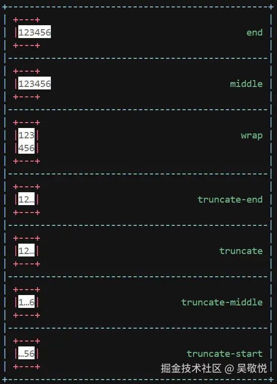
color文字颜色,可以是英文单词,也可以是十六进制的颜色值,只能输入#rgb或#rrggbb,还可以设置rgb(255, 0, 255);backgroundColor背景颜色,颜色值跟color相同;bold是否加粗;underline是否有下划线;strikethrough是否有删除线;inversecolor是否反转,也就是颜色是否变成背景色;wrap换行策略
2. Box
Box 主要控制宽高/内外边距/边框等等。
- 宽高
tsx
const Example = () => (
    <>
        <Box width={4} borderStyle="classic">
            <Text>X</Text>
        </Box>

        <Box height={4} borderStyle="classic">
            <Text>X</Text>
        </Box>
    </>
);
其效果如下:
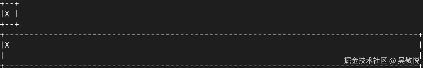
可以看到加上边框总共宽度和高度是 4 。宽度不指定的情况下是整个终端的宽度。
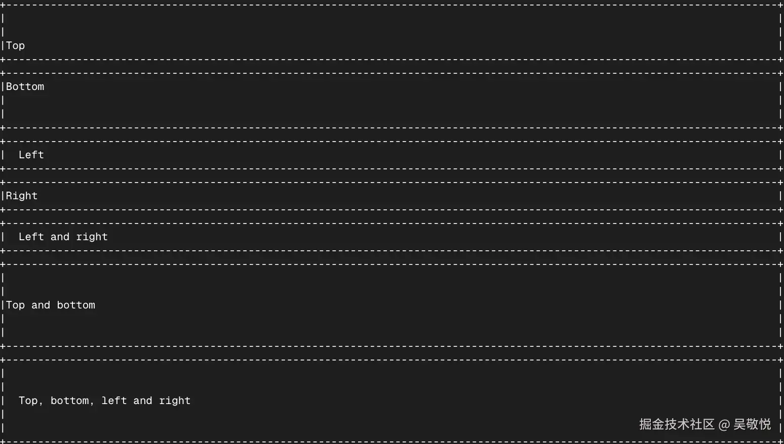
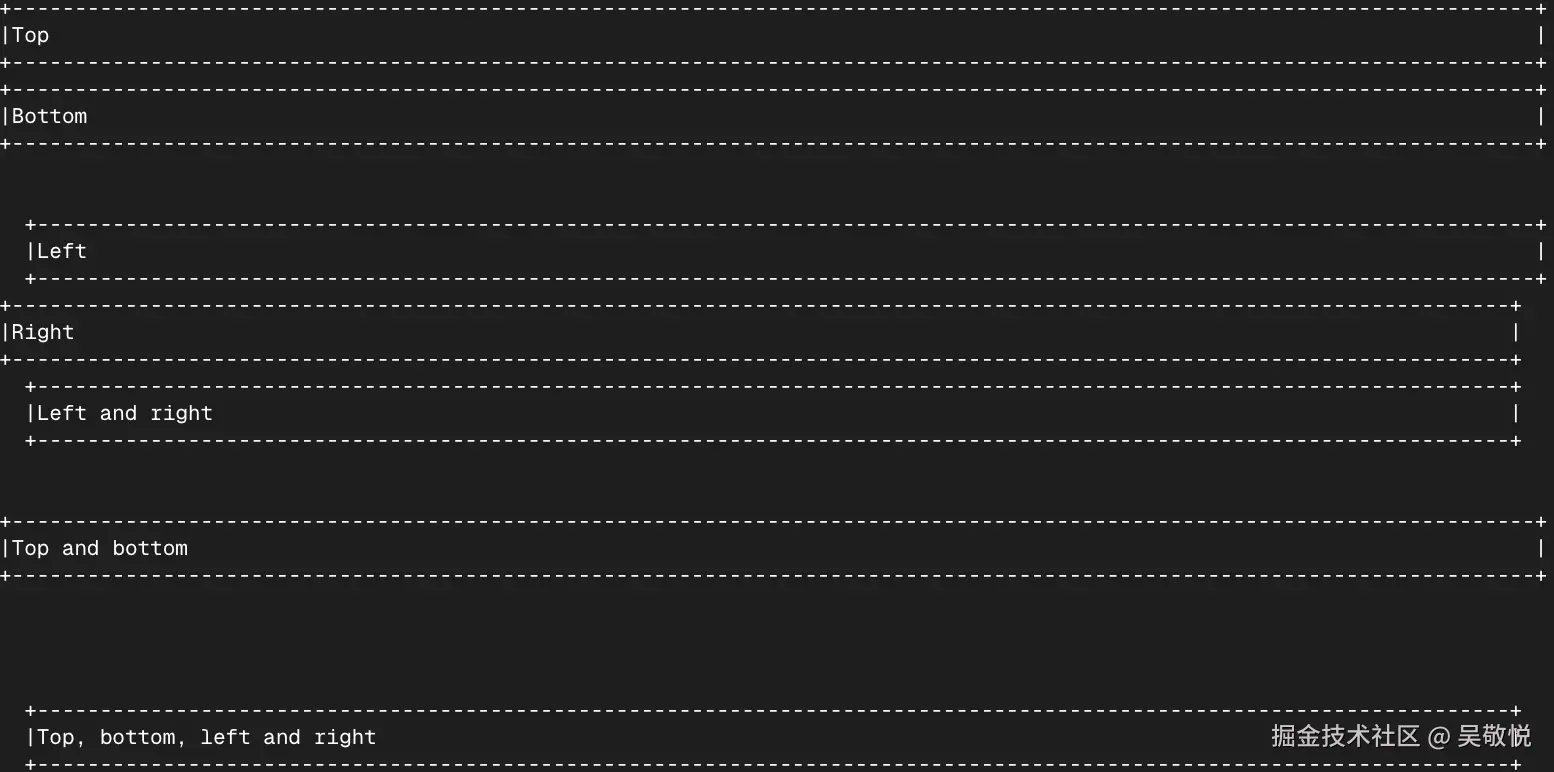
- 内边距
tsx
const Example = () => (
    <>
        <Box paddingTop={2} borderStyle="classic"><Text>Top</Text></Box>
        <Box paddingBottom={2} borderStyle="classic"><Text>Bottom</Text></Box>
        <Box paddingLeft={2} borderStyle="classic"><Text>Left</Text></Box>
        <Box paddingRight={2} borderStyle="classic"><Text>Right</Text></Box>
        <Box paddingX={2} borderStyle="classic"><Text>Left and right</Text></Box>
        <Box paddingY={2} borderStyle="classic"><Text>Top and bottom</Text></Box>
        <Box padding={2} borderStyle="classic"><Text>Top, bottom, left and right</Text></Box>
    </>
);
其效果为:
- 外边距
tsx
const Example = () => (
    <>
        <Box marginTop={2} borderStyle="classic"><Text>Top</Text></Box>
        <Box marginBottom={2} borderStyle="classic"><Text>Bottom</Text></Box>
        <Box marginLeft={2} borderStyle="classic"><Text>Left</Text></Box>
        <Box marginRight={2} borderStyle="classic"><Text>Right</Text></Box>
        <Box marginX={2} borderStyle="classic"><Text>Left and right</Text></Box>
        <Box marginY={2} borderStyle="classic"><Text>Top and bottom</Text></Box>
        <Box margin={2} borderStyle="classic"><Text>Top, bottom, left and right</Text></Box>
    </>
);
其效果为:
- 布局
ink 默认是采用 Yoga 进行布局的,默认是水平排列( display 只有两个值 flex 和 none ):
tsx
<Box>
  <Text>A</Text>
  <Text>B</Text>
  <Text>C</Text>
</Box>
其效果为:

我们可以利用 gap 属性来调整它们之间的距离。
tsx
<Box gap={2}>
  <Text>A</Text>
  <Text>B</Text>
  <Text>C</Text>
</Box>
其效果:

布局相关的属性同样也是支持的,比如:flexGrow, flexShrink, flexBasis, flexDirection, flexWrap, alignItems, alignSelf, justifyContent 。
- 边框
tsx
const Example = () => (
    <>
        <Box flexDirection="column">
            <Box>
                <Box borderStyle="single" marginRight={2}>
                        <Text>single</Text>
                </Box>
                <Box borderStyle="double" marginRight={2}>
                        <Text>double</Text>
                </Box>
                <Box borderStyle="round" marginRight={2}>
                        <Text>round</Text>
                </Box>
                <Box borderStyle="bold">
                        <Text>bold</Text>
                </Box>
            </Box>
            <Box marginTop={1}>
                <Box borderStyle="singleDouble" marginRight={2}>
                        <Text>singleDouble</Text>
                </Box>
                <Box borderStyle="doubleSingle" marginRight={2}>
                        <Text>doubleSingle</Text>
                </Box>
                <Box borderStyle="classic">
                        <Text>classic</Text>
                </Box>
            </Box>
        </Box>

        <Box
            borderStyle={{
                    topLeft: '↘',
                    top: '↓',
                    topRight: '↙',
                    left: '→',
                    bottomLeft: '↗',
                    bottom: '↑',
                    bottomRight: '↖',
                    right: '←'
            }}
        >
            <Text>Custom</Text>
        </Box>
    </>
);
其效果:
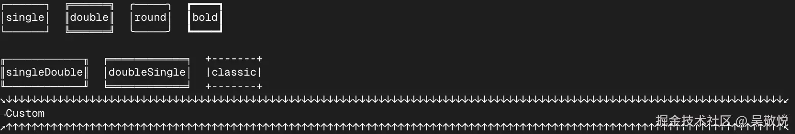
也可以给边框设置颜色,也可以不显示某一边的边框。
- 背景颜色
我在我的电脑上测试发现是不起作用的。
3. Newline
用于在文本中插入一行或多行换行符,必须在 Text 组件内部使用。
tsx
<Text>
  <Text color="green">Hello</Text>
  <Newline />
  <Text color="red">World</Text>
</Text>
其效果为:

4. Spacer
这个用于占位的,相当于 <div style="flex: 1" /> 。
tsx
<>
  <Box>
    <Text>Left</Text>
    <Spacer />
    <Text>Right</Text>
  </Box>

  <Box flexDirection="column" height={10}>
    <Text>Top</Text>
    <Spacer />
    <Text>Bottom</Text>
  </Box>
</>
其效果为:
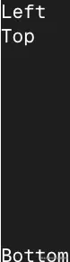
在 web 中还可以使用 marginTop: auto 代替,只不过 ink 目前我看到不支持。
5. Static
用于避免重复渲染的,如果我们使用 .map 的方式,那么每一次渲染列表中的每一个都会重复再次渲染,但是使用 Static 就不会。
tsx
import React, {useState, useEffect} from 'react';
import {render, Static, Box, Text} from 'ink';

const Example = () => {
    const [tests, setTests] = useState([]);

    useEffect(() => {
        let completedTests = 0;
        let timer;

        const run = () => {
            // Fake 10 completed tests
            if (completedTests++ < 10) {
                setTests(previousTests => [
                    ...previousTests,
                    {
                        id: previousTests.length,
                        title: `Test #${previousTests.length + 1}`
                    }
                ]);

                timer = setTimeout(run, 100);
            }
        };

        run();

        return () => {
            clearTimeout(timer);
        };
    }, []);

    return (
        <>
            {/* This part will be rendered once to the terminal */}
            <Static items={tests}>
                    {test => (
                            <Box key={test.id}>
                                    <Text color="green">✔ {test.title}</Text>
                            </Box>
                    )}
            </Static>

            {/* This part keeps updating as state changes */}
            <Box marginTop={1}>
                    <Text dimColor>Completed tests: {tests.length}</Text>
            </Box>
        </>
    );
};

render(<Example />);
其效果是每个 100ms 就会出现一个新的项。
使用 Static ,当 Test #1 渲染,下次列表改变了也不会重新渲染这个数据。可以封装组件打印日志来验证。
6. Transform
用于在输出到终端之前经过这个进行转换。
tsx
const Example = () => (
    <Transform transform={output => output.toUpperCase()}>
        <Text>Hello World</Text>
    </Transform>
);
其效果为:

7. useInput
用户接收用户的输入。
tsx
import React, {useState} from 'react';
import {render, Box, Text, useInput} from 'ink';

const UserInput = () => {
    const [message, setMessage] = useState('按箭头键或按 "q" 试试');

    useInput((input, key) => {
        if (input === 'q') {
                setMessage('收到 "q",这里通常会调用 exit() 结束程序');
                return;
        }

        if (key.leftArrow) {
                setMessage('← Left arrow pressed');
        } else if (key.rightArrow) {
                setMessage('→ Right arrow pressed');
        } else if (key.upArrow) {
                setMessage('↑ Up arrow pressed');
        } else if (key.downArrow) {
                setMessage('↓ Down arrow pressed');
        } else if (key.return) {
                setMessage('⏎ Enter pressed');
        }
    });

    return (
        <Box flexDirection="column">
            <Text color="green">{message}</Text>
            <Text dimColor>按方向键、Enter 或 "q" 观察上面的提示变化</Text>
        </Box>
    );
};

render(<UserInput />);
其中像字母这些通过 input 来拿到,而像 esc , return 等等通过 key 来取到。其中 key 可以取到的值有:
- leftArrow 左
- rightArrow 右
- upArrow 上
- downArrow 下
- return Enter 键
- escape Esc 键
- ctrl Ctrl 键
- tab
- backspace
- delete
- pageUp
- pageDown
- meta
其他的就到网站进行学习,里面是交互的,可以一边修改代码一边看效果,学习起来更加轻松。