📅 我们继续 50 个小项目挑战!------ BackgroundSlider 组件
仓库地址:https://gitee.com/hhm-hhm/50days50projects.git
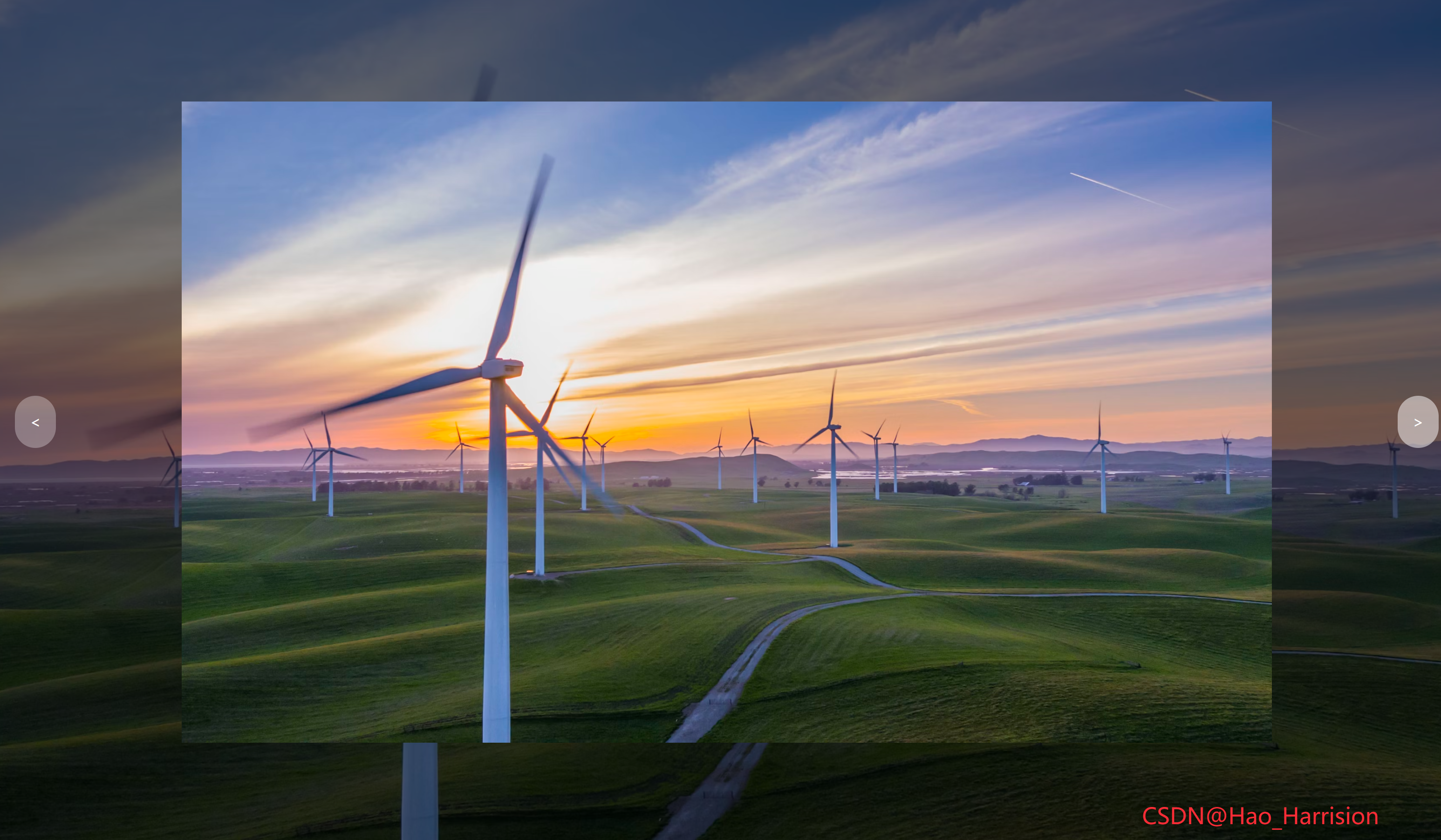
构建一个全屏、背景模糊变暗、中间高亮显示的图片轮播组件。用户可以通过左右按钮切换图片,并带有缩放动画效果。
🌀 组件目标
- 展示一组全屏背景图
- 每张图中央有"高亮"展示区域
- 支持左右按钮切换图片
- 添加缩放动画提升视觉体验
- 使用 TailwindCSS 快速构建现代 UI 界面
🔧 BackgroundSlider.tsx组件实现
TypeScript
import React, { useState, useEffect } from 'react'
interface ImageItem {
id: number
className: string
}
const BackgroundSlider: React.FC = () => {
const [currentIndex, setCurrentIndex] = useState(0)
const [isAnimating, setIsAnimating] = useState(false)
const imageList: ImageItem[] = [
{
id: 1,
className:
'bg-[url(https://images.unsplash.com/photo-1495467033336-2effd8753d51?ixlib=rb-1.2.1&ixid=eyJhcHBfaWQiOjEyMDd9&auto=format&fit=crop&w=2100&q=80)]',
},
{
id: 2,
className:
'bg-[url(https://images.unsplash.com/photo-1522735338363-cc7313be0ae0?ixlib=rb-1.2.1&ixid=eyJhcHBfaWQiOjEyMDd9&auto=format&fit=crop&w=2689&q=80)]',
},
{
id: 3,
className:
'bg-[url(https://images.unsplash.com/photo-1559087867-ce4c91325525?ixlib=rb-1.2.1&ixid=eyJhcHBfaWQiOjEyMDd9&auto=format&fit=crop&w=2100&q=80)]',
},
]
const nextImage = () => {
setIsAnimating(true)
setCurrentIndex((prev) => (prev + 1) % imageList.length)
}
const prevImage = () => {
setIsAnimating(true)
setCurrentIndex((prev) => (prev - 1 + imageList.length) % imageList.length)
}
// 监听 transitionend 事件(通过副作用模拟)
useEffect(() => {
const handleTransitionEnd = () => {
setIsAnimating(false)
}
// 注意:由于 Tailwind 的 transform 是内联 style 控制,我们无法直接监听 DOM 元素的 transitionend,
// 所以这里用一个简单延迟代替(或可绑定 ref 到具体元素并 addEventListener)
const timer = setTimeout(handleTransitionEnd, 500) // 与 duration-500 一致
return () => clearTimeout(timer)
}, [currentIndex])
return (
<div className="relative h-screen overflow-hidden text-white">
{/* 背景图片变暗效果 */}
<div
className={`absolute inset-0 origin-center bg-cover bg-center brightness-50 transition-transform duration-500 ease-in-out ${
imageList[currentIndex].className
}`}
style={{
transform: isAnimating ? 'scale(1.2)' : 'scale(1)',
}}
/>
{/* 中间亮框 */}
<div className="absolute inset-0 flex items-center justify-center">
<div
className={`relative h-3/4 w-3/4 bg-cover bg-center brightness-100 ${
imageList[currentIndex].className
}`}
/>
</div>
{/* 切换按钮 */}
<button
onClick={prevImage}
className="absolute top-1/2 left-4 -translate-y-1/2 rounded-full bg-white/30 p-4 text-white transition-all hover:bg-white/50"
aria-label="Previous image">
<
</button>
<button
onClick={nextImage}
className="absolute top-1/2 right-4 -translate-y-1/2 rounded-full bg-white/30 p-4 text-white transition-all hover:bg-white/50"
aria-label="Next image">
>
</button>
<div className="fixed right-20 bottom-5 text-2xl text-red-500">CSDN@Hao_Harrision</div>
</div>
)
}
export default BackgroundSlider🔧 转换说明
| 功能/概念 | Vue 3 (Composition API) 示例代码 | React (TS + Hooks) 示例代码 |
|---|---|---|
| 状态管理 | 使用 ref 来定义响应式变量,如 currentIndex 和 isAnimating |
使用 useState 来定义组件的状态,例如 const [currentIndex, setCurrentIndex] = useState(0) |
| 模板渲染 | <template> 标签内的 HTML 结构 |
JSX 语法,直接在 return 中使用 HTML 类似的结构 |
| 类名动态绑定 | 使用 :class 动态绑定类名 |
在 JSX 中通过字符串模板或条件运算符来实现 |
| 内联样式动态绑定 | 使用 :style 动态应用样式 |
JSX 中通过对象形式的 style 属性来动态应用样式 |
| 事件处理 | 使用 @click 简写进行事件监听 |
使用 onClick 等属性直接绑定事件处理器 |
| 生命周期钩子/副作用 | 使用 onMounted, watch, 或者组合式 API 进行逻辑处理 |
使用 useEffect 钩子处理副作用和模拟生命周期行为 |
| 循环/列表渲染 | 使用 v-for 指令遍历数组 |
使用 .map() 方法遍历数组并返回 JSX 元素 |
| 计算属性 | 可以通过 computed 创建依赖其他响应式数据的计算结果 |
直接在需要的地方使用 JavaScript 表达式,或者使用 useMemo |
| 方法定义 | 定义在 setup 函数内部的方法 |
在函数组件内部直接定义方法,或者使用 useCallback 来优化性能 |
| 过渡/动画 | 使用 Vue 的 <transition> 组件与 @transitionend 监听器 |
使用 setTimeout 模拟,或通过 ref 获取 DOM 节点添加事件监听器 |
🎨 TailwindCSS 样式重点讲解
| 类名 | 作用 |
|---|---|
h-screen, overflow-hidden |
全屏高度并隐藏溢出内容 |
absolute inset-0 |
铺满整个父容器 |
bg-cover, bg-center |
图片自适应铺满并居中 |
brightness-50, brightness-100 |
调整明暗对比度 |
origin-center |
设置缩放中心点 |
transition-transform duration-500 ease-in-out |
添加平滑的缩放动画 |
flex items-center justify-center |
居中布局 |
hover:bg-white/50 |
鼠标悬停改变透明度 |
rounded-full |
圆形按钮样式 |
| [🎯 TailwindCSS 样式说明] |
这些 Tailwind 工具类帮助我们快速构建了一个极具视觉冲击力的全屏轮播组件。
🦌 路由组件 + 常量定义
router/index.tsx中 children数组中添加子路由
TypeScript
{
    path: '/',
    element: <App />,
    children: [
       ...
       {
                path: '/BackgroundSlider',
                lazy: () =>
                    import('@/projects/BackgroundSlider.tsx').then((mod) => ({
                        Component: mod.default,
                    })),
            },
    ],
 },
constants/index.tsx 添加组件预览常量
TypeScript
import demo18Img from '@/assets/pic-demo/demo-18.png'
省略部分....
export const projectList: ProjectItem[] = [
    省略部分....
     {
        id: 18,
        title: 'BackgroundSlider',
        image: demo18Img,
        link: 'BackgroundSlider',
    },
🚀 小结
这个卡片涵盖了React的响应式系统、动画控制、按钮交互以及 TailwindCSS 的强大样式能力。它非常适合用于网站主页、作品集展示、产品介绍等需要突出视觉表现的场景。
-
你可以进一步扩展的功能包括:
-
自动播放功能(定时切换)
-
添加底部导航圆点指示器
-
支持键盘左右键切换
-
支持移动端滑动手势切换
-
支持主题切换(暗色/亮色)
📅 明日预告: 我们将完成ThemeClock组件,非常简约的始终组件可以切换主题以及显示时间。🚀
原文链接:https://blog.csdn.net/qq_44808710/article/details/148906507
每天造一个轮子,码力暴涨不是梦!🚀