欢迎加入开源鸿蒙跨平台社区:https://openharmonycrossplatform.csdn.net
🎯 欢迎来到 Flutter for OpenHarmony 社区!本文将深入讲解 Flutter 中 DecoratedBox 装饰盒子组件的使用方法,带你从基础到精通,掌握这一强大的视觉装饰组件。
一、DecoratedBox 组件概述
在用户界面设计中,装饰是提升视觉效果的重要手段。通过装饰,我们可以为组件添加背景颜色、渐变效果、边框、阴影、圆角等多种视觉元素。Flutter 提供了 DecoratedBox 组件,让开发者能够灵活地为子组件添加各种装饰效果。
📋 DecoratedBox 组件特点
| 特点 | 说明 |
|---|---|
| 轻量级 | 只负责装饰,不包含其他布局功能 |
| 灵活配置 | 通过 BoxDecoration 实现丰富的装饰效果 |
| 位置控制 | 可以控制装饰绘制在背景或前景 |
| 形状支持 | 支持矩形、圆形等多种形状 |
| 动画支持 | 可以与动画组件配合实现动态效果 |
什么是装饰?
装饰是指添加在组件背景上的视觉效果,包括:
- 颜色填充:纯色背景,最基础的装饰效果
- 渐变效果:线性渐变、径向渐变、扫描渐变
- 边框:统一边框或四边不同的边框样式
- 阴影:盒阴影效果,增加立体感
- 圆角:圆角矩形或圆形
- 背景图片:网络图片或本地图片作为背景
DecoratedBox 与 Container 的区别
Container 内部使用了 DecoratedBox 来实现装饰功能,但 Container 还包含了其他功能:
| 特性 | DecoratedBox | Container |
|---|---|---|
| 装饰功能 | 有 | 有 |
| 内边距 | 无 | 有 |
| 外边距 | 无 | 有 |
| 宽高设置 | 无 | 有 |
| 对齐方式 | 无 | 有 |
| 适用场景 | 只需要装饰 | 需要多种容器功能 |
💡 使用场景:DecoratedBox 适合只需要装饰效果而不需要其他容器功能的场景,更加轻量级。如果需要同时设置内边距、外边距、宽高等,建议使用 Container。
二、DecoratedBox 基础用法
DecoratedBox 的使用非常简单,只需要提供 decoration 参数和子组件。让我们从最基础的用法开始学习。
2.1 最简单的 DecoratedBox
最基础的 DecoratedBox 只需要设置 decoration 参数和 child 子组件:
dart
DecoratedBox(
  decoration: BoxDecoration(
    color: Colors.blue,
  ),
  child: const SizedBox(
    width: 200,
    height: 100,
    child: Center(
      child: Text(
        'DecoratedBox',
        style: TextStyle(color: Colors.white),
      ),
    ),
  ),
)
代码解析:
decoration:装饰配置,使用 BoxDecoration 类BoxDecoration(color: Colors.blue):设置蓝色背景child:要添加装饰的子组件
2.2 position 参数详解
DecoratedBox 提供了 position 参数来控制装饰的绘制位置:
dart
// 背景装饰(默认)
DecoratedBox(
  position: DecorationPosition.background,
  decoration: BoxDecoration(color: Colors.blue),
  child: const Text('背景装饰'),
)

// 前景装饰
DecoratedBox(
  position: DecorationPosition.foreground,
  decoration: BoxDecoration(color: Colors.blue.withOpacity(0.3)),
  child: const Text('前景装饰'),
)
position 参数说明:
| 值 | 效果 | 说明 |
|---|---|---|
| DecorationPosition.background | 背景装饰 | 装饰绘制在子组件后面(默认) |
| DecorationPosition.foreground | 前景装饰 | 装饰绘制在子组件前面 |
2.3 完整示例
下面是一个完整的可运行示例,展示了 DecoratedBox 的基础用法:
dart
class DecoratedBoxBasicExample extends StatelessWidget {
  const DecoratedBoxBasicExample({super.key});

  @override
  Widget build(BuildContext context) {
    return Scaffold(
      appBar: AppBar(title: const Text('DecoratedBox 基础示例')),
      body: Center(
        child: Column(
          mainAxisAlignment: MainAxisAlignment.center,
          children: [
            DecoratedBox(
              decoration: BoxDecoration(
                color: Colors.blue,
                borderRadius: BorderRadius.circular(12),
              ),
              child: const SizedBox(
                width: 200,
                height: 80,
                child: Center(
                  child: Text(
                    '蓝色圆角盒子',
                    style: TextStyle(color: Colors.white, fontSize: 16),
                  ),
                ),
              ),
            ),
            const SizedBox(height: 24),
            DecoratedBox(
              decoration: BoxDecoration(
                gradient: LinearGradient(
                  colors: [Colors.blue, Colors.purple],
                ),
                borderRadius: BorderRadius.circular(12),
              ),
              child: const SizedBox(
                width: 200,
                height: 80,
                child: Center(
                  child: Text(
                    '渐变盒子',
                    style: TextStyle(color: Colors.white, fontSize: 16),
                  ),
                ),
              ),
            ),
          ],
        ),
      ),
    );
  }
}
三、BoxDecoration 详解
BoxDecoration 是 DecoratedBox 最常用的装饰类,提供了丰富的装饰选项。掌握 BoxDecoration 是使用 DecoratedBox 的关键。
3.1 color - 颜色填充
最简单的装饰是纯色填充:
dart
BoxDecoration(
  color: Colors.blue,
)
颜色填充是装饰的基础,可以与其他装饰效果组合使用。
3.2 gradient - 渐变效果
BoxDecoration 支持三种渐变类型,每种都有其独特的视觉效果:
线性渐变(LinearGradient):
dart
BoxDecoration(
  gradient: LinearGradient(
    begin: Alignment.topLeft,
    end: Alignment.bottomRight,
    colors: [Colors.blue, Colors.purple],
  ),
)
径向渐变(RadialGradient):
dart
BoxDecoration(
  gradient: RadialGradient(
    center: Alignment.center,
    radius: 0.5,
    colors: [Colors.yellow, Colors.orange, Colors.red],
  ),
)
扫描渐变(SweepGradient):
dart
BoxDecoration(
  gradient: SweepGradient(
    center: Alignment.center,
    colors: [Colors.red, Colors.yellow, Colors.green, Colors.blue, Colors.red],
  ),
)
渐变类型对比:
| 渐变类型 | 效果 | 适用场景 |
|---|---|---|
| LinearGradient | 沿直线方向渐变 | 按钮、卡片背景 |
| RadialGradient | 从中心向外渐变 | 圆形元素、聚光效果 |
| SweepGradient | 围绕中心旋转渐变 | 进度环、仪表盘 |
3.3 border - 边框
BoxDecoration 支持设置边框,可以统一设置或分别设置四边:
统一边框:
dart
BoxDecoration(
  border: Border.all(
    color: Colors.blue,
    width: 2,
  ),
)
分别设置四边:
dart
BoxDecoration(
  border: Border(
    top: BorderSide(color: Colors.red, width: 2),
    right: BorderSide(color: Colors.green, width: 2),
    bottom: BorderSide(color: Colors.blue, width: 2),
    left: BorderSide(color: Colors.yellow, width: 2),
  ),
)
3.4 borderRadius - 圆角
BoxDecoration 支持设置圆角,可以统一设置或分别设置四个角:
统一圆角:
dart
BoxDecoration(
  borderRadius: BorderRadius.circular(16),
)
分别设置四个角:
dart
BoxDecoration(
  borderRadius: BorderRadius.only(
    topLeft: Radius.circular(16),
    topRight: Radius.circular(8),
    bottomLeft: Radius.circular(8),
    bottomRight: Radius.circular(16),
  ),
)
3.5 boxShadow - 阴影
BoxDecoration 支持添加阴影效果,增加立体感:
dart
BoxDecoration(
  color: Colors.white,
  boxShadow: [
    BoxShadow(
      color: Colors.black.withOpacity(0.2),
      blurRadius: 10,
      spreadRadius: 2,
      offset: const Offset(0, 4),
    ),
  ],
)
阴影参数详解:
| 参数 | 说明 |
|---|---|
| color | 阴影颜色,通常使用半透明黑色 |
| blurRadius | 模糊半径,值越大阴影越模糊 |
| spreadRadius | 扩展半径,正值扩大阴影,负值缩小 |
| offset | 阴影偏移,Offset(x, y) 表示水平和垂直偏移 |
3.6 shape - 形状
BoxDecoration 支持设置装饰的形状:
dart
// 矩形(默认)
BoxDecoration(
  shape: BoxShape.rectangle,
)

// 圆形
BoxDecoration(
  shape: BoxShape.circle,
  color: Colors.blue,
)
形状选项:
| 形状 | 说明 |
|---|---|
| BoxShape.rectangle | 矩形(默认) |
| BoxShape.circle | 圆形 |
3.7 image - 背景图片
BoxDecoration 支持设置背景图片:
dart
BoxDecoration(
  image: DecorationImage(
    image: NetworkImage('https://picsum.photos/200'),
    fit: BoxFit.cover,
  ),
)
📊 BoxDecoration 属性速查表
| 属性 | 类型 | 说明 |
|---|---|---|
| color | Color? | 背景颜色 |
| gradient | Gradient? | 渐变效果 |
| border | Border? | 边框 |
| borderRadius | BorderRadiusGeometry? | 圆角 |
| boxShadow | List<BoxShadow>? |
阴影列表 |
| shape | BoxShape | 形状(矩形或圆形) |
| image | DecorationImage? | 背景图片 |
| backgroundBlendMode | BlendMode? | 混合模式 |
四、DecoratedBox 实际应用场景
DecoratedBox 在实际开发中有着广泛的应用,让我们通过具体示例来学习。
4.1 渐变按钮
使用 DecoratedBox 创建渐变效果的按钮:
dart
class GradientButtonExample extends StatelessWidget {
  const GradientButtonExample({super.key});

  @override
  Widget build(BuildContext context) {
    return Scaffold(
      appBar: AppBar(title: const Text('渐变按钮示例')),
      body: Center(
        child: Column(
          mainAxisAlignment: MainAxisAlignment.center,
          children: [
            _buildGradientButton(
              [Colors.blue, Colors.purple],
              '蓝紫渐变',
            ),
            const SizedBox(height: 16),
            _buildGradientButton(
              [Colors.orange, Colors.pink],
              '橙粉渐变',
            ),
            const SizedBox(height: 16),
            _buildGradientButton(
              [Colors.green, Colors.teal],
              '绿青渐变',
            ),
          ],
        ),
      ),
    );
  }

  Widget _buildGradientButton(List<Color> colors, String text) {
    return DecoratedBox(
      decoration: BoxDecoration(
        gradient: LinearGradient(colors: colors),
        borderRadius: BorderRadius.circular(24),
        boxShadow: [
          BoxShadow(
            color: colors.last.withOpacity(0.4),
            blurRadius: 8,
            offset: const Offset(0, 4),
          ),
        ],
      ),
      child: ElevatedButton(
        style: ElevatedButton.styleFrom(
          backgroundColor: Colors.transparent,
          shadowColor: Colors.transparent,
          padding: const EdgeInsets.symmetric(horizontal: 32, vertical: 16),
        ),
        onPressed: () {},
        child: Text(
          text,
          style: const TextStyle(
            color: Colors.white,
            fontSize: 16,
            fontWeight: FontWeight.bold,
          ),
        ),
      ),
    );
  }
}
4.2 卡片效果
使用 DecoratedBox 创建带阴影的卡片:
dart
class CardExample extends StatelessWidget {
  const CardExample({super.key});

  @override
  Widget build(BuildContext context) {
    return Scaffold(
      appBar: AppBar(title: const Text('卡片效果示例')),
      body: Padding(
        padding: const EdgeInsets.all(16),
        child: Column(
          children: [
            _buildCard(
              Icons.article,
              '文章标题',
              '这是一篇文章的描述内容,展示了卡片效果。',
              Colors.blue,
            ),
            const SizedBox(height: 16),
            _buildCard(
              Icons.image,
              '图片标题',
              '这是一张图片的描述内容,展示了卡片效果。',
              Colors.green,
            ),
          ],
        ),
      ),
    );
  }

  Widget _buildCard(IconData icon, String title, String desc, Color color) {
    return DecoratedBox(
      decoration: BoxDecoration(
        color: Colors.white,
        borderRadius: BorderRadius.circular(12),
        boxShadow: [
          BoxShadow(
            color: Colors.black.withOpacity(0.1),
            blurRadius: 10,
            spreadRadius: 2,
            offset: const Offset(0, 4),
          ),
        ],
      ),
      child: Padding(
        padding: const EdgeInsets.all(16),
        child: Row(
          children: [
            Container(
              width: 48,
              height: 48,
              decoration: BoxDecoration(
                color: color.withOpacity(0.1),
                borderRadius: BorderRadius.circular(12),
              ),
              child: Icon(icon, color: color),
            ),
            const SizedBox(width: 16),
            Expanded(
              child: Column(
                crossAxisAlignment: CrossAxisAlignment.start,
                children: [
                  Text(
                    title,
                    style: const TextStyle(
                      fontSize: 16,
                      fontWeight: FontWeight.bold,
                    ),
                  ),
                  const SizedBox(height: 4),
                  Text(
                    desc,
                    style: TextStyle(
                      fontSize: 14,
                      color: Colors.grey[600],
                    ),
                  ),
                ],
              ),
            ),
          ],
        ),
      ),
    );
  }
}
4.3 标签样式
使用 DecoratedBox 创建标签效果:
dart
class TagExample extends StatelessWidget {
  const TagExample({super.key});

  @override
  Widget build(BuildContext context) {
    return Scaffold(
      appBar: AppBar(title: const Text('标签样式示例')),
      body: Padding(
        padding: const EdgeInsets.all(16),
        child: Wrap(
          spacing: 8,
          runSpacing: 8,
          children: [
            _buildTag('Flutter', Colors.blue),
            _buildTag('Dart', Colors.green),
            _buildTag('OpenHarmony', Colors.orange),
            _buildTag('Widget', Colors.purple),
            _buildTag('Material', Colors.teal),
            _buildTag('Cupertino', Colors.red),
          ],
        ),
      ),
    );
  }

  Widget _buildTag(String text, Color color) {
    return DecoratedBox(
      decoration: BoxDecoration(
        color: color.withOpacity(0.1),
        borderRadius: BorderRadius.circular(16),
        border: Border.all(color: color.withOpacity(0.5)),
      ),
      child: Padding(
        padding: const EdgeInsets.symmetric(horizontal: 12, vertical: 6),
        child: Text(
          text,
          style: TextStyle(
            color: color,
            fontSize: 14,
            fontWeight: FontWeight.w500,
          ),
        ),
      ),
    );
  }
}
4.4 头像边框
使用 DecoratedBox 创建带头框的头像:
dart
class AvatarExample extends StatelessWidget {
  const AvatarExample({super.key});

  @override
  Widget build(BuildContext context) {
    return Scaffold(
      appBar: AppBar(title: const Text('头像边框示例')),
      body: Center(
        child: Row(
          mainAxisAlignment: MainAxisAlignment.spaceEvenly,
          children: [
            _buildAvatar(Colors.blue, 3),
            _buildAvatar(Colors.green, 4),
            _buildAvatar(Colors.orange, 5),
          ],
        ),
      ),
    );
  }

  Widget _buildAvatar(Color borderColor, double borderWidth) {
    return DecoratedBox(
      decoration: BoxDecoration(
        shape: BoxShape.circle,
        border: Border.all(
          color: borderColor,
          width: borderWidth,
        ),
        boxShadow: [
          BoxShadow(
            color: borderColor.withOpacity(0.3),
            blurRadius: 8,
            offset: const Offset(0, 4),
          ),
        ],
      ),
      child: const CircleAvatar(
        radius: 30,
        backgroundImage: NetworkImage('https://picsum.photos/60'),
      ),
    );
  }
}
4.5 输入框装饰
使用 DecoratedBox 创建装饰性输入框:
dart
class InputExample extends StatelessWidget {
  const InputExample({super.key});

  @override
  Widget build(BuildContext context) {
    return Scaffold(
      appBar: AppBar(title: const Text('输入框装饰示例')),
      body: Padding(
        padding: const EdgeInsets.all(16),
        child: Column(
          children: [
            _buildInputField('请输入用户名', Icons.person),
            const SizedBox(height: 16),
            _buildInputField('请输入密码', Icons.lock),
            const SizedBox(height: 16),
            _buildInputField('请输入邮箱', Icons.email),
          ],
        ),
      ),
    );
  }

  Widget _buildInputField(String hint, IconData icon) {
    return DecoratedBox(
      decoration: BoxDecoration(
        color: Colors.grey[100],
        borderRadius: BorderRadius.circular(12),
        border: Border.all(color: Colors.grey[300]!),
      ),
      child: Padding(
        padding: const EdgeInsets.symmetric(horizontal: 16),
        child: Row(
          children: [
            Icon(icon, color: Colors.grey[600]),
            const SizedBox(width: 12),
            Expanded(
              child: TextField(
                decoration: InputDecoration(
                  border: InputBorder.none,
                  hintText: hint,
                ),
              ),
            ),
          ],
        ),
      ),
    );
  }
}
五、ShapeDecoration 详解
除了 BoxDecoration,Flutter 还提供了 ShapeDecoration,它允许使用自定义形状进行装饰。
5.1 ShapeDecoration 基本用法
dart
DecoratedBox(
  decoration: ShapeDecoration(
    color: Colors.blue,
    shape: RoundedRectangleBorder(
      borderRadius: BorderRadius.circular(16),
    ),
  ),
  child: const SizedBox(
    width: 200,
    height: 100,
    child: Center(child: Text('ShapeDecoration')),
  ),
)
5.2 预设形状
Flutter 提供了多种预设形状:
| 形状 | 说明 |
|---|---|
| RoundedRectangleBorder | 圆角矩形 |
| CircleBorder | 圆形 |
| StadiumBorder | 体育场形状(两端半圆) |
| BeveledRectangleBorder | 斜角矩形 |
| ContinuousRectangleBorder | 连续圆角矩形 |
5.3 带边框的形状
dart
ShapeDecoration(
  color: Colors.blue,
  shape: RoundedRectangleBorder(
    borderRadius: BorderRadius.circular(16),
    side: BorderSide(color: Colors.red, width: 2),
  ),
)
六、DecoratedBox 动画效果
DecoratedBox 可以与动画组件配合,实现动态装饰效果。
6.1 使用 AnimatedContainer
AnimatedContainer 可以自动处理装饰的动画过渡:
dart
class AnimatedDecoratedBoxExample extends StatefulWidget {
  const AnimatedDecoratedBoxExample({super.key});

  @override
  State<AnimatedDecoratedBoxExample> createState() => _AnimatedDecoratedBoxExampleState();
}

class _AnimatedDecoratedBoxExampleState extends State<AnimatedDecoratedBoxExample> {
  bool _isActive = false;

  @override
  Widget build(BuildContext context) {
    return Scaffold(
      appBar: AppBar(title: const Text('动画装饰示例')),
      body: Center(
        child: Column(
          mainAxisAlignment: MainAxisAlignment.center,
          children: [
            AnimatedContainer(
              duration: const Duration(milliseconds: 300),
              decoration: BoxDecoration(
                gradient: LinearGradient(
                  colors: _isActive
                      ? [Colors.blue, Colors.purple]
                      : [Colors.grey, Colors.grey[400]!],
                ),
                borderRadius: BorderRadius.circular(_isActive ? 24 : 8),
                boxShadow: _isActive
                    ? [
                        BoxShadow(
                          color: Colors.purple.withOpacity(0.4),
                          blurRadius: 12,
                          offset: const Offset(0, 6),
                        ),
                      ]
                    : [],
              ),
              child: const SizedBox(
                width: 200,
                height: 100,
                child: Center(
                  child: Text(
                    '动画装饰',
                    style: TextStyle(
                      color: Colors.white,
                      fontSize: 18,
                      fontWeight: FontWeight.bold,
                    ),
                  ),
                ),
              ),
            ),
            const SizedBox(height: 32),
            ElevatedButton(
              onPressed: () {
                setState(() {
                  _isActive = !_isActive;
                });
              },
              child: Text(_isActive ? '停用' : '激活'),
            ),
          ],
        ),
      ),
    );
  }
}
6.2 渐变动画效果
使用 AnimationController 创建动态渐变效果:
dart
class AnimatedGradientBox extends StatefulWidget {
  const AnimatedGradientBox({super.key});

  @override
  State<AnimatedGradientBox> createState() => _AnimatedGradientBoxState();
}

class _AnimatedGradientBoxState extends State<AnimatedGradientBox>
    with SingleTickerProviderStateMixin {
  late AnimationController _controller;

  @override
  void initState() {
    super.initState();
    _controller = AnimationController(
      duration: const Duration(seconds: 3),
      vsync: this,
    )..repeat();
  }

  @override
  void dispose() {
    _controller.dispose();
    super.dispose();
  }

  @override
  Widget build(BuildContext context) {
    return AnimatedBuilder(
      animation: _controller,
      builder: (context, child) {
        return DecoratedBox(
          decoration: BoxDecoration(
            gradient: LinearGradient(
              begin: Alignment.topLeft,
              end: Alignment.bottomRight,
              colors: [
                Color.lerp(Colors.blue, Colors.purple, _controller.value)!,
                Color.lerp(Colors.purple, Colors.pink, _controller.value)!,
              ],
            ),
            borderRadius: BorderRadius.circular(16),
          ),
          child: const SizedBox(
            width: 200,
            height: 100,
            child: Center(
              child: Text(
                '渐变动画',
                style: TextStyle(color: Colors.white, fontSize: 18),
              ),
            ),
          ),
        );
      },
    );
  }
}
七、DecoratedBox 与其他装饰方式的对比
Flutter 中有多种添加装饰的方式,了解它们的区别可以帮助我们选择最合适的方法。
7.1 DecoratedBox vs Container
dart
// 方式一:使用 DecoratedBox
DecoratedBox(
  decoration: BoxDecoration(color: Colors.blue),
  child: SizedBox(width: 100, height: 100),
)

// 方式二:使用 Container
Container(
  width: 100,
  height: 100,
  decoration: BoxDecoration(color: Colors.blue),
)
区别:
| 特性 | DecoratedBox | Container |
|---|---|---|
| 装饰功能 | 有 | 有 |
| 布局功能 | 无 | 有(宽高、内边距、外边距等) |
| 性能 | 更轻量 | 稍重(包含更多功能) |
| 适用场景 | 只需要装饰 | 需要装饰和布局 |
7.2 DecoratedBox vs Material
dart
// 方式一:使用 DecoratedBox
DecoratedBox(
  decoration: BoxDecoration(
    color: Colors.white,
    borderRadius: BorderRadius.circular(8),
    boxShadow: [BoxShadow(color: Colors.black12, blurRadius: 4)],
  ),
  child: child,
)

// 方式二:使用 Material
Material(
  elevation: 4,
  borderRadius: BorderRadius.circular(8),
  child: child,
)
区别:
| 特性 | DecoratedBox | Material |
|---|---|---|
| 阴影控制 | 手动配置 | 自动计算(elevation) |
| Material 设计 | 不遵循 | 遵循 Material 设计规范 |
| 灵活性 | 高 | 中 |
| 适用场景 | 自定义装饰 | Material 风格组件 |
八、性能考虑
DecoratedBox 组件虽然功能强大,但在某些情况下需要注意性能优化。
8.1 性能优化建议
- 避免过度使用阴影:阴影计算较为消耗性能
- 复用 BoxDecoration:如果多个组件使用相同装饰,可以复用 BoxDecoration 对象
- 使用 const 构造函数:对于静态装饰,使用 const 可以提高性能
- 避免频繁重建:如果装饰需要频繁变化,考虑使用 AnimatedContainer
8.2 何时使用 DecoratedBox
推荐使用:
- 只需要装饰效果,不需要布局功能
- 需要自定义复杂的装饰效果
- 需要更精细的装饰控制
不推荐使用:
- 需要同时设置内边距、外边距(用 Container)
- 只需要简单的背景颜色(用 ColoredBox)
- 需要 Material 设计风格(用 Material)
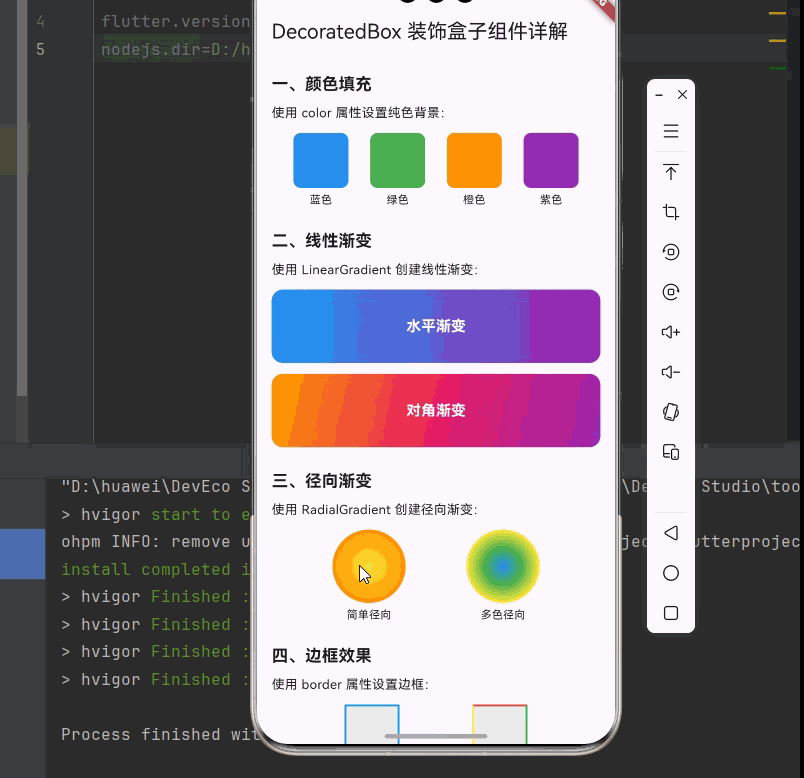
九、完整代码示例
下面是一个完整的、可以直接运行的 main.dart 文件,展示了 DecoratedBox 组件的各种用法:
dart
import 'package:flutter/material.dart';
void main() {
runApp(const MyApp());
}
class MyApp extends StatelessWidget {
const MyApp({super.key});
@override
Widget build(BuildContext context) {
return MaterialApp(
title: 'DecoratedBox 组件示例',
theme: ThemeData(
primarySwatch: Colors.blue,
useMaterial3: true,
),
home: const DecoratedBoxDemoPage(),
);
}
}
class DecoratedBoxDemoPage extends StatelessWidget {
const DecoratedBoxDemoPage({super.key});
@override
Widget build(BuildContext context) {
return Scaffold(
appBar: AppBar(
title: const Text('DecoratedBox 装饰盒子组件详解'),
),
body: SingleChildScrollView(
padding: const EdgeInsets.all(16),
child: Column(
crossAxisAlignment: CrossAxisAlignment.start,
children: [
_buildSection('一、颜色填充', [
const Text('使用 color 属性设置纯色背景:'),
const SizedBox(height: 12),
Row(
mainAxisAlignment: MainAxisAlignment.spaceEvenly,
children: [
_buildColorBox(Colors.blue, '蓝色'),
_buildColorBox(Colors.green, '绿色'),
_buildColorBox(Colors.orange, '橙色'),
_buildColorBox(Colors.purple, '紫色'),
],
),
]),
const SizedBox(height: 24),
_buildSection('二、线性渐变', [
const Text('使用 LinearGradient 创建线性渐变:'),
const SizedBox(height: 12),
Column(
children: [
_buildGradientBox(
LinearGradient(
colors: [Colors.blue, Colors.purple],
),
'水平渐变',
),
const SizedBox(height: 12),
_buildGradientBox(
LinearGradient(
begin: Alignment.topLeft,
end: Alignment.bottomRight,
colors: [Colors.orange, Colors.pink, Colors.purple],
),
'对角渐变',
),
],
),
]),
const SizedBox(height: 24),
_buildSection('三、径向渐变', [
const Text('使用 RadialGradient 创建径向渐变:'),
const SizedBox(height: 12),
Row(
mainAxisAlignment: MainAxisAlignment.spaceEvenly,
children: [
_buildRadialGradientBox(
[Colors.yellow, Colors.orange],
'简单径向',
),
_buildRadialGradientBox(
[Colors.blue, Colors.green, Colors.yellow],
'多色径向',
),
],
),
]),
const SizedBox(height: 24),
_buildSection('四、边框效果', [
const Text('使用 border 属性设置边框:'),
const SizedBox(height: 12),
Row(
mainAxisAlignment: MainAxisAlignment.spaceEvenly,
children: [
_buildBorderBox(
Border.all(color: Colors.blue, width: 2),
'统一边框',
),
_buildBorderBox(
Border(
top: const BorderSide(color: Colors.red, width: 2),
right: const BorderSide(color: Colors.green, width: 2),
bottom: const BorderSide(color: Colors.blue, width: 2),
left: const BorderSide(color: Colors.yellow, width: 2),
),
'四边不同',
),
],
),
]),
const SizedBox(height: 24),
_buildSection('五、圆角效果', [
const Text('使用 borderRadius 属性设置圆角:'),
const SizedBox(height: 12),
Row(
mainAxisAlignment: MainAxisAlignment.spaceEvenly,
children: [
_buildRoundedBox(0, '无圆角'),
_buildRoundedBox(8, '小圆角'),
_buildRoundedBox(16, '中圆角'),
_buildRoundedBox(24, '大圆角'),
],
),
]),
const SizedBox(height: 24),
_buildSection('六、阴影效果', [
const Text('使用 boxShadow 属性添加阴影:'),
const SizedBox(height: 12),
Row(
mainAxisAlignment: MainAxisAlignment.spaceEvenly,
children: [
_buildShadowBox(2, 4, '轻微阴影'),
_buildShadowBox(8, 8, '中等阴影'),
_buildShadowBox(16, 12, '强烈阴影'),
],
),
]),
const SizedBox(height: 24),
_buildSection('七、圆形装饰', [
const Text('使用 shape: BoxShape.circle 创建圆形:'),
const SizedBox(height: 12),
Row(
mainAxisAlignment: MainAxisAlignment.spaceEvenly,
children: [
_buildCircleBox(Colors.blue, '蓝色圆形'),
_buildCircleBox(Colors.green, '绿色圆形'),
_buildCircleBox(Colors.orange, '橙色圆形'),
],
),
]),
const SizedBox(height: 24),
_buildSection('八、组合效果', [
const Text('组合多种装饰效果:'),
const SizedBox(height: 12),
DecoratedBox(
decoration: BoxDecoration(
gradient: LinearGradient(
colors: [Colors.blue[400]!, Colors.purple[400]!],
),
borderRadius: BorderRadius.circular(16),
boxShadow: [
BoxShadow(
color: Colors.black.withOpacity(0.2),
blurRadius: 10,
offset: const Offset(0, 4),
),
],
),
child: const SizedBox(
width: double.infinity,
height: 100,
child: Center(
child: Text(
'渐变 + 圆角 + 阴影',
style: TextStyle(
color: Colors.white,
fontSize: 18,
fontWeight: FontWeight.bold,
),
),
),
),
),
]),
const SizedBox(height: 24),
_buildSection('九、标签样式', [
const Text('创建常见的标签效果:'),
const SizedBox(height: 12),
Wrap(
spacing: 8,
runSpacing: 8,
children: [
_buildTag('Flutter', Colors.blue),
_buildTag('Dart', Colors.green),
_buildTag('OpenHarmony', Colors.orange),
_buildTag('Widget', Colors.purple),
_buildTag('Material', Colors.teal),
],
),
]),
const SizedBox(height: 24),
_buildSection('十、卡片效果', [
const Text('创建带阴影的卡片:'),
const SizedBox(height: 12),
DecoratedBox(
decoration: BoxDecoration(
color: Colors.white,
borderRadius: BorderRadius.circular(12),
boxShadow: [
BoxShadow(
color: Colors.black.withOpacity(0.1),
blurRadius: 10,
spreadRadius: 2,
offset: const Offset(0, 4),
),
],
),
child: Padding(
padding: const EdgeInsets.all(16),
child: Row(
children: [
Container(
width: 48,
height: 48,
decoration: BoxDecoration(
color: Colors.blue[100],
borderRadius: BorderRadius.circular(12),
),
child: const Icon(Icons.article, color: Colors.blue),
),
const SizedBox(width: 12),
const Expanded(
child: Column(
crossAxisAlignment: CrossAxisAlignment.start,
children: [
Text(
'卡片标题',
style: TextStyle(
fontSize: 16,
fontWeight: FontWeight.bold,
),
),
SizedBox(height: 4),
Text(
'这是卡片的描述内容,展示了如何使用 DecoratedBox 创建卡片效果。',
style: TextStyle(
fontSize: 14,
color: Colors.grey,
),
),
],
),
),
],
),
),
),
]),
const SizedBox(height: 32),
],
),
),
);
}
Widget _buildSection(String title, List<Widget> children) {
return Column(
crossAxisAlignment: CrossAxisAlignment.start,
children: [
Text(
title,
style: const TextStyle(
fontSize: 18,
fontWeight: FontWeight.bold,
),
),
const SizedBox(height: 8),
...children,
],
);
}
Widget _buildColorBox(Color color, String label) {
return Column(
mainAxisSize: MainAxisSize.min,
children: [
DecoratedBox(
decoration: BoxDecoration(
color: color,
borderRadius: BorderRadius.circular(8),
),
child: const SizedBox(width: 60, height: 60),
),
const SizedBox(height: 4),
Text(label, style: const TextStyle(fontSize: 12)),
],
);
}
Widget _buildGradientBox(Gradient gradient, String label) {
return DecoratedBox(
decoration: BoxDecoration(
gradient: gradient,
borderRadius: BorderRadius.circular(12),
),
child: SizedBox(
width: double.infinity,
height: 80,
child: Center(
child: Text(
label,
style: const TextStyle(
color: Colors.white,
fontSize: 16,
fontWeight: FontWeight.bold,
),
),
),
),
);
}
Widget _buildRadialGradientBox(List<Color> colors, String label) {
return Column(
mainAxisSize: MainAxisSize.min,
children: [
DecoratedBox(
decoration: BoxDecoration(
shape: BoxShape.circle,
gradient: RadialGradient(colors: colors),
),
child: const SizedBox(width: 80, height: 80),
),
const SizedBox(height: 4),
Text(label, style: const TextStyle(fontSize: 12)),
],
);
}
Widget _buildBorderBox(Border border, String label) {
return Column(
mainAxisSize: MainAxisSize.min,
children: [
DecoratedBox(
decoration: BoxDecoration(
color: Colors.grey[200],
border: border,
),
child: const SizedBox(width: 60, height: 60),
),
const SizedBox(height: 4),
Text(label, style: const TextStyle(fontSize: 12)),
],
);
}
Widget _buildRoundedBox(double radius, String label) {
return Column(
mainAxisSize: MainAxisSize.min,
children: [
DecoratedBox(
decoration: BoxDecoration(
color: Colors.blue,
borderRadius: BorderRadius.circular(radius),
),
child: const SizedBox(width: 50, height: 50),
),
const SizedBox(height: 4),
Text(label, style: const TextStyle(fontSize: 12)),
],
);
}
Widget _buildShadowBox(double blur, double spread, String label) {
return Column(
children: [
DecoratedBox(
decoration: BoxDecoration(
color: Colors.white,
borderRadius: BorderRadius.circular(8),
boxShadow: [
BoxShadow(
color: Colors.black.withOpacity(0.2),
blurRadius: blur,
spreadRadius: spread,
offset: const Offset(0, 4),
),
],
),
child: const SizedBox(width: 60, height: 60),
),
const SizedBox(height: 4),
Text(label, style: const TextStyle(fontSize: 12)),
],
);
}
Widget _buildCircleBox(Color color, String label) {
return Column(
mainAxisSize: MainAxisSize.min,
children: [
DecoratedBox(
decoration: BoxDecoration(
color: color,
shape: BoxShape.circle,
),
child: const SizedBox(width: 60, height: 60),
),
const SizedBox(height: 4),
Text(label, style: const TextStyle(fontSize: 12)),
],
);
}
Widget _buildTag(String text, Color color) {
return DecoratedBox(
decoration: BoxDecoration(
color: color.withOpacity(0.1),
borderRadius: BorderRadius.circular(16),
border: Border.all(color: color.withOpacity(0.5)),
),
child: Padding(
padding: const EdgeInsets.symmetric(horizontal: 12, vertical: 6),
child: Text(
text,
style: TextStyle(
color: color,
fontSize: 14,
fontWeight: FontWeight.w500,
),
),
),
);
}
}十、总结
DecoratedBox 是 Flutter 中一个强大而灵活的装饰组件,通过本文的学习,我们掌握了以下内容:
📝 知识点回顾
- DecoratedBox 基础:了解 DecoratedBox 的基本用法和 position 参数
- BoxDecoration 详解:掌握颜色、渐变、边框、圆角、阴影等装饰属性
- ShapeDecoration:学习使用自定义形状进行装饰
- 实际应用场景:渐变按钮、卡片效果、标签样式、头像边框等
- 动画效果:使用 AnimatedContainer 实现装饰动画
- 性能优化:了解 DecoratedBox 的性能考虑和最佳实践
🎯 最佳实践
- 根据需求选择 DecoratedBox 或 Container
- 复用 BoxDecoration 对象以提高性能
- 使用 AnimatedContainer 处理装饰动画
- 避免过度使用复杂的阴影效果