欢迎加入开源鸿蒙跨平台社区:https://openharmonycrossplatform.csdn.net
🎯 欢迎来到 Flutter for OpenHarmony 社区!本文将深入讲解 Flutter 中 Flexible 弹性布局组件的使用方法,带你从基础到精通,掌握这一核心布局组件。
一、Flexible 组件概述
在响应式布局设计中,弹性布局是一种非常重要的布局方式。通过弹性布局,子组件可以根据父容器的可用空间自动调整大小,实现不同屏幕尺寸的适配。Flutter 提供了 Flexible 组件,让开发者能够轻松创建弹性布局效果。
📋 Flexible 组件特点
| 特点 | 说明 |
|---|---|
| 弹性空间分配 | 子组件可以按比例分配剩余空间 |
| 灵活的适配模式 | 支持 loose、tight 等多种适配模式 |
| 与 Expanded 的关系 | Expanded 是 Flexible 的一个特例 |
| 方向支持 | 可在 Row 和 Column 中使用 |
什么是弹性布局?
弹性布局是一种响应式布局方式,具有以下特点:
- 自动调整大小:子组件根据可用空间自动调整
- 比例分配:可以按比例分配剩余空间
- 灵活适配:适配不同屏幕尺寸和方向
- 嵌套支持:可以多层嵌套实现复杂布局
Flexible 与 Expanded 的区别
Flexible 和 Expanded 都用于弹性布局,但它们有重要区别:
| 特性 | Flexible | Expanded |
|---|---|---|
| 空间分配 | 可以小于可用空间 | 必须填满可用空间 |
| 子组件大小 | 可以保持原始大小 | 强制填满分配空间 |
| fit 参数 | 支持 loose 和 tight | 固定为 tight |
| 使用场景 | 需要灵活调整大小 | 需要填满剩余空间 |
简单来说:
- Expanded:强制子组件填满分配的空间
- Flexible:允许子组件根据内容大小灵活调整
💡 使用场景:Flexible 适合需要子组件保持原始大小或灵活调整的场景,Expanded 适合需要子组件填满剩余空间的场景。
二、Flexible 基础用法
Flexible 的使用非常简单,只需要将其包裹在子组件外面,并设置相应的参数。让我们从最基础的用法开始学习。
2.1 最简单的 Flexible
最基础的 Flexible 只需要提供 child 子组件:
dart
Row(
  children: [
    Flexible(
      child: Container(
        color: Colors.red,
        height: 100,
      ),
    ),
    Flexible(
      child: Container(
        color: Colors.green,
        height: 100,
      ),
    ),
    Flexible(
      child: Container(
        color: Colors.blue,
        height: 100,
      ),
    ),
  ],
)
代码解析:
- 三个 Flexible 子组件会平均分配 Row 的可用空间
- 每个子组件各占 1/3 的宽度
- 默认情况下,flex 值为 1
2.2 flex 参数详解
flex 参数用于控制子组件分配空间的比例:
dart
Row(
  children: [
    Flexible(
      flex: 1,
      child: Container(color: Colors.red, height: 100),
    ),
    Flexible(
      flex: 2,
      child: Container(color: Colors.green, height: 100),
    ),
    Flexible(
      flex: 1,
      child: Container(color: Colors.blue, height: 100),
    ),
  ],
)
flex 参数说明:
| flex 值 | 分配比例 | 说明 |
|---|---|---|
| flex: 1 | 1/4 | 占总空间的 25% |
| flex: 2 | 2/4 | 占总空间的 50% |
| flex: 1 | 1/4 | 占总空间的 25% |
2.3 fit 参数详解
fit 参数控制子组件如何适配分配的空间:
dart
// loose 模式:子组件可以小于分配空间
Flexible(
  fit: FlexFit.loose,
  child: Container(width: 50, color: Colors.red),
)

// tight 模式:子组件必须填满分配空间
Flexible(
  fit: FlexFit.tight,
  child: Container(color: Colors.green),
)
FlexFit 值说明:
| 值 | 效果 | 说明 |
|---|---|---|
| FlexFit.loose | 宽松适配 | 子组件可以小于分配的空间 |
| FlexFit.tight | 紧凑适配 | 子组件必须填满分配的空间 |
2.4 完整示例
下面是一个完整的可运行示例,展示了 Flexible 的基础用法:
dart
class FlexibleBasicExample extends StatelessWidget {
  const FlexibleBasicExample({super.key});

  @override
  Widget build(BuildContext context) {
    return Scaffold(
      appBar: AppBar(title: const Text('Flexible 基础示例')),
      body: Padding(
        padding: const EdgeInsets.all(16),
        child: Column(
          children: [
            const Text('平均分配空间:'),
            const SizedBox(height: 8),
            SizedBox(
              height: 60,
              child: Row(
                children: [
                  Flexible(
                    child: Container(
                      color: Colors.red[300],
                      child: const Center(child: Text('1:1:1')),
                    ),
                  ),
                  Flexible(
                    child: Container(
                      color: Colors.green[300],
                      child: const Center(child: Text('1:1:1')),
                    ),
                  ),
                  Flexible(
                    child: Container(
                      color: Colors.blue[300],
                      child: const Center(child: Text('1:1:1')),
                    ),
                  ),
                ],
              ),
            ),
            const SizedBox(height: 24),
            const Text('按比例分配空间:'),
            const SizedBox(height: 8),
            SizedBox(
              height: 60,
              child: Row(
                children: [
                  Flexible(
                    flex: 1,
                    child: Container(
                      color: Colors.red[300],
                      child: const Center(child: Text('flex:1')),
                    ),
                  ),
                  Flexible(
                    flex: 2,
                    child: Container(
                      color: Colors.green[300],
                      child: const Center(child: Text('flex:2')),
                    ),
                  ),
                  Flexible(
                    flex: 3,
                    child: Container(
                      color: Colors.blue[300],
                      child: const Center(child: Text('flex:3')),
                    ),
                  ),
                ],
              ),
            ),
          ],
        ),
      ),
    );
  }
}
三、Flexible 与 Expanded 的对比
Flexible 和 Expanded 是 Flutter 中两个重要的弹性布局组件,理解它们的区别对于正确使用非常重要。
3.1 等价关系
以下两种写法是等价的:
dart
// 使用 Expanded
Expanded(
  child: Container(...),
)

// 使用 Flexible + tight
Flexible(
  fit: FlexFit.tight,
  child: Container(...),
)
3.2 实际对比示例
dart
Row(
  children: [
    // Flexible - 子组件保持原始大小
    Flexible(
      fit: FlexFit.loose,
      child: Container(
        width: 50,  // 保持 50 宽度
        color: Colors.red,
        child: const Text('Flexible'),
      ),
    ),
    // Expanded - 子组件填满分配空间
    Expanded(
      child: Container(
        color: Colors.green,
        child: const Text('Expanded'),
      ),
    ),
  ],
)
对比说明:
| 组件 | 行为 | 效果 |
|---|---|---|
| Flexible (loose) | 保持原始大小 | 子组件宽度为 50 |
| Expanded | 填满剩余空间 | 子组件填满所有剩余空间 |
3.3 选择建议
使用 Flexible 的场景:
- 子组件需要保持原始大小
- 子组件大小可能根据内容变化
- 需要更精细的空间控制
使用 Expanded 的场景:
- 子组件需要填满剩余空间
- 创建等宽或等高的布局
- 简单的空间分配需求
四、flex 比例详解
flex 参数是 Flexible 的核心,理解 flex 的工作原理对于创建复杂布局非常重要。
4.1 相同比例分配
当所有子组件的 flex 值相同时,它们会平均分配空间:
dart
Row(
  children: [
    Flexible(flex: 1, child: Container(color: Colors.red)),
    Flexible(flex: 1, child: Container(color: Colors.green)),
    Flexible(flex: 1, child: Container(color: Colors.blue)),
  ],
)
每个子组件各占 1/3 的空间。
4.2 不同比例分配
不同的 flex 值会按比例分配空间:
dart
Row(
  children: [
    Flexible(flex: 1, child: Container(color: Colors.red)),    // 1/6
    Flexible(flex: 2, child: Container(color: Colors.green)),  // 2/6
    Flexible(flex: 3, child: Container(color: Colors.blue)),   // 3/6
  ],
)
4.3 与固定大小组件混合
Flexible 可以与固定大小的组件混合使用:
dart
Row(
  children: [
    Container(width: 100, color: Colors.grey),      // 固定宽度
    Flexible(flex: 1, child: Container(color: Colors.green)),  // 弹性
    Container(width: 100, color: Colors.grey),     // 固定宽度
  ],
)
计算规则:
- 先计算固定大小组件占用的空间
- 剩余空间按 flex 比例分配给 Flexible 组件
五、Column 中的 Flexible
Flexible 在 Column 中的用法与 Row 类似,只是方向变为垂直。
5.1 垂直布局
dart
Column(
  children: [
    Flexible(
      flex: 1,
      child: Container(color: Colors.red),
    ),
    Flexible(
      flex: 2,
      child: Container(color: Colors.green),
    ),
    Flexible(
      flex: 1,
      child: Container(color: Colors.blue),
    ),
  ],
)
5.2 固定头部和底部
这是一个常见的布局模式,头部和底部固定高度,中间内容自适应:
dart
Column(
  children: [
    Container(
      height: 60,
      color: Colors.blue,
      child: const Center(child: Text('头部')),
    ),
    Expanded(
      child: Container(
        color: Colors.grey[100],
        child: const Center(child: Text('内容区域')),
      ),
    ),
    Container(
      height: 60,
      color: Colors.green,
      child: const Center(child: Text('底部')),
    ),
  ],
)
六、Flexible 实际应用场景
Flexible 在实际开发中有着广泛的应用,让我们通过具体示例来学习。
6.1 三栏布局
dart
class ThreeColumnLayout extends StatelessWidget {
  const ThreeColumnLayout({super.key});

  @override
  Widget build(BuildContext context) {
    return Scaffold(
      appBar: AppBar(title: const Text('三栏布局')),
      body: Row(
        children: [
          Flexible(
            flex: 1,
            child: Container(
              color: Colors.blue[100],
              child: ListView(
                children: List.generate(
                  10,
                  (i) => ListTile(title: Text('左侧 $i')),
                ),
              ),
            ),
          ),
          Flexible(
            flex: 2,
            child: Container(
              color: Colors.grey[100],
              child: const Center(child: Text('主内容区')),
            ),
          ),
          Flexible(
            flex: 1,
            child: Container(
              color: Colors.green[100],
              child: ListView(
                children: List.generate(
                  10,
                  (i) => ListTile(title: Text('右侧 $i')),
                ),
              ),
            ),
          ),
        ],
      ),
    );
  }
}
6.2 表单布局
dart
class FormLayout extends StatelessWidget {
  const FormLayout({super.key});

  @override
  Widget build(BuildContext context) {
    return Scaffold(
      appBar: AppBar(title: const Text('表单布局')),
      body: Padding(
        padding: const EdgeInsets.all(16),
        child: Column(
          children: [
            Row(
              children: [
                const SizedBox(width: 80, child: Text('用户名:')),
                Expanded(
                  child: TextField(
                    decoration: const InputDecoration(
                      hintText: '请输入用户名',
                      border: OutlineInputBorder(),
                    ),
                  ),
                ),
              ],
            ),
            const SizedBox(height: 16),
            Row(
              children: [
                const SizedBox(width: 80, child: Text('密码:')),
                Expanded(
                  child: TextField(
                    obscureText: true,
                    decoration: const InputDecoration(
                      hintText: '请输入密码',
                      border: OutlineInputBorder(),
                    ),
                  ),
                ),
              ],
            ),
          ],
        ),
      ),
    );
  }
}
6.3 底部按钮栏
dart
class BottomButtonBar extends StatelessWidget {
  const BottomButtonBar({super.key});

  @override
  Widget build(BuildContext context) {
    return Scaffold(
      appBar: AppBar(title: const Text('底部按钮栏')),
      body: Column(
        children: [
          const Expanded(
            child: Center(child: Text('内容区域')),
          ),
          Padding(
            padding: const EdgeInsets.all(16),
            child: Row(
              children: [
                Expanded(
                  child: OutlinedButton(
                    onPressed: () {},
                    child: const Text('取消'),
                  ),
                ),
                const SizedBox(width: 16),
                Expanded(
                  child: ElevatedButton(
                    onPressed: () {},
                    child: const Text('确定'),
                  ),
                ),
              ],
            ),
          ),
        ],
      ),
    );
  }
}
6.4 响应式卡片
dart
class ResponsiveCard extends StatelessWidget {
  const ResponsiveCard({super.key});

  @override
  Widget build(BuildContext context) {
    return Scaffold(
      appBar: AppBar(title: const Text('响应式卡片')),
      body: Padding(
        padding: const EdgeInsets.all(16),
        child: LayoutBuilder(
          builder: (context, constraints) {
            final isWide = constraints.maxWidth > 600;
            return Flex(
              direction: isWide ? Axis.horizontal : Axis.vertical,
              children: [
                Flexible(
                  flex: isWide ? 1 : 0,
                  child: Container(
                    height: isWide ? null : 150,
                    color: Colors.blue[100],
                    child: const Center(child: Text('图片区域')),
                  ),
                ),
                Flexible(
                  flex: isWide ? 2 : 1,
                  child: const Padding(
                    padding: EdgeInsets.all(16),
                    child: Column(
                      crossAxisAlignment: CrossAxisAlignment.start,
                      children: [
                        Text(
                          '标题',
                          style: TextStyle(
                            fontSize: 18,
                            fontWeight: FontWeight.bold,
                          ),
                        ),
                        SizedBox(height: 8),
                        Text('这是卡片的描述内容,展示了响应式布局的效果。'),
                      ],
                    ),
                  ),
                ),
              ],
            );
          },
        ),
      ),
    );
  }
}
6.5 标签栏
dart
class TabBarExample extends StatelessWidget {
  const TabBarExample({super.key});

  @override
  Widget build(BuildContext context) {
    return Scaffold(
      appBar: AppBar(title: const Text('标签栏')),
      body: Column(
        children: [
          Container(
            height: 48,
            color: Colors.grey[200],
            child: Row(
              children: [
                Expanded(
                  child: TextButton(
                    onPressed: () {},
                    child: const Text('首页'),
                  ),
                ),
                Expanded(
                  child: TextButton(
                    onPressed: () {},
                    child: const Text('分类'),
                  ),
                ),
                Expanded(
                  child: TextButton(
                    onPressed: () {},
                    child: const Text('购物车'),
                  ),
                ),
                Expanded(
                  child: TextButton(
                    onPressed: () {},
                    child: const Text('我的'),
                  ),
                ),
              ],
            ),
          ),
          const Expanded(
            child: Center(child: Text('内容区域')),
          ),
        ],
      ),
    );
  }
}
七、嵌套使用
Flexible 可以嵌套使用,实现复杂的布局效果。
7.1 嵌套示例
dart
Column(
  children: [
    Flexible(
      flex: 1,
      child: Row(
        children: [
          Flexible(
            flex: 1,
            child: Container(color: Colors.red),
          ),
          Flexible(
            flex: 1,
            child: Container(color: Colors.green),
          ),
        ],
      ),
    ),
    Flexible(
      flex: 1,
      child: Row(
        children: [
          Flexible(
            flex: 2,
            child: Container(color: Colors.blue),
          ),
          Flexible(
            flex: 1,
            child: Container(color: Colors.yellow),
          ),
        ],
      ),
    ),
  ],
)
7.2 复杂布局示例
dart
class ComplexLayout extends StatelessWidget {
  const ComplexLayout({super.key});

  @override
  Widget build(BuildContext context) {
    return Scaffold(
      body: Column(
        children: [
          Container(
            height: 56,
            color: Colors.blue,
            child: const Center(child: Text('AppBar')),
          ),
          Expanded(
            child: Row(
              children: [
                Container(
                  width: 200,
                  color: Colors.grey[200],
                  child: const Center(child: Text('侧边栏')),
                ),
                Expanded(
                  child: Column(
                    children: [
                      Expanded(
                        child: Container(
                          color: Colors.white,
                          child: const Center(child: Text('主内容区')),
                        ),
                      ),
                      Container(
                        height: 60,
                        color: Colors.grey[100],
                        child: const Center(child: Text('底部栏')),
                      ),
                    ],
                  ),
                ),
              ],
            ),
          ),
        ],
      ),
    );
  }
}
八、性能考虑
Flexible 组件虽然功能强大,但在某些情况下需要注意性能优化。
8.1 性能优化建议
- 避免过度嵌套:过多的嵌套会增加布局计算复杂度
- 合理使用 flex:简单的比例分配比复杂的计算更高效
- 使用 const 构造函数:对于静态子组件,使用 const 可以提高性能
- 避免频繁重建:如果布局需要频繁变化,考虑使用 AnimatedSize
8.2 何时使用 Flexible
推荐使用:
- 需要响应式布局
- 需要按比例分配空间
- 需要创建自适应界面
不推荐使用:
- 固定大小的布局(使用 SizedBox)
- 简单的居中布局(使用 Center)
- 绝对定位布局(使用 Stack + Positioned)
九、完整代码示例
下面是一个完整的、可以直接运行的 main.dart 文件,展示了 Flexible 组件的各种用法:
dart
import 'package:flutter/material.dart';
void main() {
runApp(const MyApp());
}
class MyApp extends StatelessWidget {
const MyApp({super.key});
@override
Widget build(BuildContext context) {
return MaterialApp(
title: 'Flexible 组件示例',
theme: ThemeData(
primarySwatch: Colors.blue,
useMaterial3: true,
),
home: const FlexibleDemoPage(),
);
}
}
class FlexibleDemoPage extends StatelessWidget {
const FlexibleDemoPage({super.key});
@override
Widget build(BuildContext context) {
return Scaffold(
appBar: AppBar(
title: const Text('Flexible 弹性布局组件详解'),
),
body: SingleChildScrollView(
padding: const EdgeInsets.all(16),
child: Column(
crossAxisAlignment: CrossAxisAlignment.start,
children: [
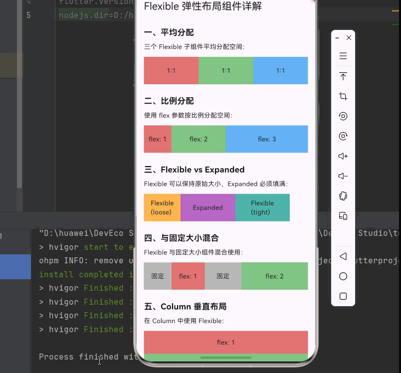
_buildSection('一、平均分配', [
const Text('三个 Flexible 子组件平均分配空间:'),
const SizedBox(height: 12),
SizedBox(
height: 60,
child: Row(
children: [
Flexible(
child: Container(
color: Colors.red[300],
child: const Center(child: Text('1:1')),
),
),
Flexible(
child: Container(
color: Colors.green[300],
child: const Center(child: Text('1:1')),
),
),
Flexible(
child: Container(
color: Colors.blue[300],
child: const Center(child: Text('1:1')),
),
),
],
),
),
]),
const SizedBox(height: 24),
_buildSection('二、比例分配', [
const Text('使用 flex 参数按比例分配空间:'),
const SizedBox(height: 12),
SizedBox(
height: 60,
child: Row(
children: [
Flexible(
flex: 1,
child: Container(
color: Colors.red[300],
child: const Center(child: Text('flex: 1')),
),
),
Flexible(
flex: 2,
child: Container(
color: Colors.green[300],
child: const Center(child: Text('flex: 2')),
),
),
Flexible(
flex: 3,
child: Container(
color: Colors.blue[300],
child: const Center(child: Text('flex: 3')),
),
),
],
),
),
]),
const SizedBox(height: 24),
_buildSection('三、Flexible vs Expanded', [
const Text('Flexible 可以保持原始大小,Expanded 必须填满:'),
const SizedBox(height: 12),
SizedBox(
height: 60,
child: Row(
children: [
Flexible(
fit: FlexFit.loose,
child: Container(
width: 80,
color: Colors.orange[300],
child: const Center(child: Text('Flexible\n(loose)')),
),
),
Expanded(
child: Container(
color: Colors.purple[300],
child: const Center(child: Text('Expanded')),
),
),
Flexible(
fit: FlexFit.tight,
child: Container(
color: Colors.teal[300],
child: const Center(child: Text('Flexible\n(tight)')),
),
),
],
),
),
]),
const SizedBox(height: 24),
_buildSection('四、与固定大小混合', [
const Text('Flexible 与固定大小组件混合使用:'),
const SizedBox(height: 12),
SizedBox(
height: 60,
child: Row(
children: [
Container(
width: 60,
color: Colors.grey[400],
child: const Center(child: Text('固定')),
),
Flexible(
flex: 1,
child: Container(
color: Colors.red[300],
child: const Center(child: Text('flex: 1')),
),
),
Container(
width: 80,
color: Colors.grey[400],
child: const Center(child: Text('固定')),
),
Flexible(
flex: 2,
child: Container(
color: Colors.green[300],
child: const Center(child: Text('flex: 2')),
),
),
],
),
),
]),
const SizedBox(height: 24),
_buildSection('五、Column 垂直布局', [
const Text('在 Column 中使用 Flexible:'),
const SizedBox(height: 12),
SizedBox(
height: 200,
child: Column(
children: [
Flexible(
flex: 1,
child: Container(
width: double.infinity,
color: Colors.red[300],
child: const Center(child: Text('flex: 1')),
),
),
Flexible(
flex: 2,
child: Container(
width: double.infinity,
color: Colors.green[300],
child: const Center(child: Text('flex: 2')),
),
),
Flexible(
flex: 1,
child: Container(
width: double.infinity,
color: Colors.blue[300],
child: const Center(child: Text('flex: 1')),
),
),
],
),
),
]),
const SizedBox(height: 24),
_buildSection('六、固定头部底部', [
const Text('头部和底部固定,中间内容自适应:'),
const SizedBox(height: 12),
SizedBox(
height: 200,
child: Column(
children: [
Container(
height: 40,
color: Colors.blue[400],
child: const Center(
child: Text('头部', style: TextStyle(color: Colors.white)),
),
),
Expanded(
child: Container(
width: double.infinity,
color: Colors.grey[100],
child: const Center(child: Text('内容区域(Expanded)')),
),
),
Container(
height: 40,
color: Colors.green[400],
child: const Center(
child: Text('底部', style: TextStyle(color: Colors.white)),
),
),
],
),
),
]),
const SizedBox(height: 24),
_buildSection('七、表单布局', [
const Text('标签固定宽度,输入框自适应:'),
const SizedBox(height: 12),
Container(
padding: const EdgeInsets.all(16),
decoration: BoxDecoration(
color: Colors.grey[50],
borderRadius: BorderRadius.circular(8),
),
child: Column(
children: [
Row(
children: [
const SizedBox(width: 80, child: Text('用户名:')),
Expanded(
child: TextField(
decoration: InputDecoration(
hintText: '请输入用户名',
border: const OutlineInputBorder(),
contentPadding: const EdgeInsets.symmetric(
horizontal: 12,
vertical: 8,
),
),
),
),
],
),
const SizedBox(height: 12),
Row(
children: [
const SizedBox(width: 80, child: Text('密码:')),
Expanded(
child: TextField(
obscureText: true,
decoration: InputDecoration(
hintText: '请输入密码',
border: const OutlineInputBorder(),
contentPadding: const EdgeInsets.symmetric(
horizontal: 12,
vertical: 8,
),
),
),
),
],
),
],
),
),
]),
const SizedBox(height: 24),
_buildSection('八、底部按钮栏', [
const Text('两个按钮平均分配宽度:'),
const SizedBox(height: 12),
Row(
children: [
Expanded(
child: OutlinedButton(
onPressed: () {},
child: const Text('取消'),
),
),
const SizedBox(width: 16),
Expanded(
child: ElevatedButton(
onPressed: () {},
child: const Text('确定'),
),
),
],
),
]),
const SizedBox(height: 24),
_buildSection('九、嵌套布局', [
const Text('Flexible 嵌套使用:'),
const SizedBox(height: 12),
SizedBox(
height: 200,
child: Column(
children: [
Flexible(
flex: 1,
child: Row(
children: [
Flexible(
flex: 1,
child: Container(color: Colors.red[300]),
),
Flexible(
flex: 1,
child: Container(color: Colors.green[300]),
),
],
),
),
Flexible(
flex: 1,
child: Row(
children: [
Flexible(
flex: 2,
child: Container(color: Colors.blue[300]),
),
Flexible(
flex: 1,
child: Container(color: Colors.yellow[300]),
),
],
),
),
],
),
),
]),
const SizedBox(height: 24),
_buildSection('十、标签栏', [
const Text('等宽标签按钮:'),
const SizedBox(height: 12),
Container(
height: 48,
decoration: BoxDecoration(
color: Colors.grey[200],
borderRadius: BorderRadius.circular(8),
),
child: Row(
children: [
Expanded(
child: TextButton(
onPressed: () {},
child: const Text('首页'),
),
),
Expanded(
child: TextButton(
onPressed: () {},
child: const Text('分类'),
),
),
Expanded(
child: TextButton(
onPressed: () {},
child: const Text('购物车'),
),
),
Expanded(
child: TextButton(
onPressed: () {},
child: const Text('我的'),
),
),
],
),
),
]),
const SizedBox(height: 32),
],
),
),
);
}
Widget _buildSection(String title, List<Widget> children) {
return Column(
crossAxisAlignment: CrossAxisAlignment.start,
children: [
Text(
title,
style: const TextStyle(
fontSize: 18,
fontWeight: FontWeight.bold,
),
),
const SizedBox(height: 8),
...children,
],
);
}
}十、总结
Flexible 是 Flutter 中一个核心的布局组件,通过本文的学习,我们掌握了以下内容:
📝 知识点回顾
- Flexible 基础:了解 Flexible 的基本用法和参数
- flex 参数:掌握按比例分配空间的方法
- fit 参数:理解 loose 和 tight 两种适配模式
- 与 Expanded 的对比:区分两种弹性布局组件的使用场景
- 实际应用场景:三栏布局、表单布局、底部按钮栏等
- 嵌套使用:实现复杂的布局效果
🎯 最佳实践
- 根据需求选择 Flexible 或 Expanded
- 合理设置 flex 比例值
- 避免过度嵌套影响性能
- 使用 LayoutBuilder 实现响应式布局