欢迎加入开源鸿蒙跨平台社区:https://openharmonycrossplatform.csdn.net
🎯 欢迎来到 Flutter for OpenHarmony 社区!本文将深入讲解 Flutter 中 Positioned 定位组件的使用方法,带你从基础到精通,掌握这一强大的绝对定位组件。
一、Positioned 组件概述
在布局设计中,有时我们需要将组件放置在特定的位置,而不是按照常规的流式布局排列。Flutter 提供了 Positioned 组件,它可以在 Stack 中实现绝对定位,让子组件精确地放置在指定的位置。这种定位方式非常适合创建叠加效果、悬浮按钮、角标、徽章等需要精确位置控制的场景。
📋 Positioned 组件特点
| 特点 | 说明 |
|---|---|
| 绝对定位 | 可以精确控制子组件的位置 |
| 灵活边距 | 支持 top、bottom、left、right 四个方向 |
| 尺寸控制 | 可以同时设置宽高和位置 |
| 填充模式 | 支持填充 Stack 的特定区域 |
| 动画支持 | 可配合 AnimatedPositioned 实现动画 |
Positioned 与其他定位方式的区别
| 方式 | 定位类型 | 适用场景 |
|---|---|---|
| Positioned | 绝对定位 | Stack 中精确位置控制 |
| Align | 相对定位 | 基于父容器的比例定位 |
| Center | 居中定位 | 简单的居中效果 |
| Padding | 内边距 | 基于边距的偏移 |
| Margin | 外边距 | 组件外部的间距 |
Positioned 的定位原理
Positioned 通过设置四个边(top、bottom、left、right)来确定子组件的位置和大小:
- top:距离 Stack 顶部的距离
- bottom:距离 Stack 底部的距离
- left:距离 Stack 左边的距离
- right:距离 Stack 右边的距离
💡 使用场景:Positioned 广泛应用于角标徽章、悬浮按钮、图片标注、地图标记、进度条指示器、卡片角标等需要精确位置控制的场景。
二、Positioned 基础用法
Positioned 必须作为 Stack 的子组件使用,让我们从最基础的用法开始学习。
2.1 最简单的 Positioned
最基础的 Positioned 只需要设置一个或多个边距参数:
dart
Stack(
  children: [
    Container(color: Colors.blue[100]),
    Positioned(
      top: 20,
      left: 20,
      child: Container(
        width: 100,
        height: 100,
        color: Colors.red,
      ),
    ),
  ],
)
代码解析:
top: 20:距离 Stack 顶部 20 像素left: 20:距离 Stack 左边 20 像素child:要定位的子组件
2.2 边距参数详解
Positioned 支持四个边距参数,可以灵活组合:
| 参数 | 类型 | 说明 |
|---|---|---|
| top | double? | 距离顶部的距离 |
| bottom | double? | 距离底部的距离 |
| left | double? | 距离左边的距离 |
| right | double? | 距离右边的距离 |
参数组合效果:
| 组合 | 效果 |
|---|---|
| top + left | 从左上角定位 |
| top + right | 从右上角定位 |
| bottom + left | 从左下角定位 |
| bottom + right | 从右下角定位 |
| left + right | 水平填充(宽度由左右边距决定) |
| top + bottom | 垂直填充(高度由上下边距决定) |
2.3 完整示例
下面是一个完整的可运行示例,展示了 Positioned 的基础用法:
dart
class PositionedBasicExample extends StatelessWidget {
  const PositionedBasicExample({super.key});

  @override
  Widget build(BuildContext context) {
    return Scaffold(
      appBar: AppBar(title: const Text('Positioned 基础示例')),
      body: Padding(
        padding: const EdgeInsets.all(16),
        child: Stack(
          children: [
            Container(
              decoration: BoxDecoration(
                color: Colors.grey[200],
                borderRadius: BorderRadius.circular(12),
              ),
            ),
            Positioned(
              top: 20,
              left: 20,
              child: _buildBox('左上', Colors.red),
            ),
            Positioned(
              top: 20,
              right: 20,
              child: _buildBox('右上', Colors.green),
            ),
            Positioned(
              bottom: 20,
              left: 20,
              child: _buildBox('左下', Colors.blue),
            ),
            Positioned(
              bottom: 20,
              right: 20,
              child: _buildBox('右下', Colors.orange),
            ),
          ],
        ),
      ),
    );
  }

  Widget _buildBox(String label, Color color) {
    return Container(
      padding: const EdgeInsets.all(12),
      decoration: BoxDecoration(
        color: color,
        borderRadius: BorderRadius.circular(8),
      ),
      child: Text(
        label,
        style: const TextStyle(color: Colors.white, fontWeight: FontWeight.bold),
      ),
    );
  }
}
三、Positioned 核心属性详解
让我们深入了解 Positioned 的各个属性及其使用方式。
3.1 top 和 bottom - 垂直定位
top 和 bottom 控制子组件的垂直位置:
dart
// 只设置 top - 从顶部定位
Positioned(
  top: 20,
  child: Container(width: 100, height: 50, color: Colors.red),
)

// 只设置 bottom - 从底部定位
Positioned(
  bottom: 20,
  child: Container(width: 100, height: 50, color: Colors.green),
)

// 同时设置 top 和 bottom - 垂直填充
Positioned(
  top: 20,
  bottom: 20,
  child: Container(width: 100, color: Colors.blue),
)
3.2 left 和 right - 水平定位
left 和 right 控制子组件的水平位置:
dart
// 只设置 left - 从左边定位
Positioned(
  left: 20,
  child: Container(width: 100, height: 50, color: Colors.red),
)

// 只设置 right - 从右边定位
Positioned(
  right: 20,
  child: Container(width: 100, height: 50, color: Colors.green),
)

// 同时设置 left 和 right - 水平填充
Positioned(
  left: 20,
  right: 20,
  child: Container(height: 50, color: Colors.blue),
)
3.3 width 和 height - 尺寸控制
Positioned 还支持直接设置子组件的宽高:
dart
Positioned(
  top: 20,
  left: 20,
  width: 100,
  height: 100,
  child: Container(color: Colors.purple),
)
注意事项:
- 设置
left和right时,不要同时设置width - 设置
top和bottom时,不要同时设置height - 如果同时设置会报错
3.4 Positioned.fill - 填充模式
Positioned.fill 是一个便捷构造函数,相当于设置所有四个边距为 0:
dart
// 使用 Positioned.fill
Positioned.fill(
  child: Container(color: Colors.blue.withOpacity(0.3)),
)

// 等价于
Positioned(
  top: 0,
  bottom: 0,
  left: 0,
  right: 0,
  child: Container(color: Colors.blue.withOpacity(0.3)),
)
3.5 Positioned.fromRect - 矩形定位
Positioned.fromRect 通过 Rect 对象来定位:
dart
Positioned.fromRect(
  rect: const Rect.fromLTWH(20, 20, 100, 100),
  child: Container(color: Colors.green),
)
3.6 Positioned.fromRelativeRect - 相对定位
Positioned.fromRelativeRect 使用相对坐标定位:
dart
Positioned.fromRelativeRect(
  rect: RelativeRect.fromLTRB(20, 20, 20, 20),
  child: Container(color: Colors.orange),
)
📊 Positioned 构造函数速查表
| 构造函数 | 说明 |
|---|---|
| Positioned() | 基础构造,设置边距 |
| Positioned.fill() | 填充整个 Stack |
| Positioned.fromRect() | 使用 Rect 定位 |
| Positioned.fromRelativeRect() | 使用 RelativeRect 定位 |
四、Positioned 实际应用场景
Positioned 在实际开发中有着广泛的应用,让我们通过具体示例来学习。
4.1 角标徽章
使用 Positioned 创建角标徽章:
dart
class BadgeExample extends StatelessWidget {
  const BadgeExample({super.key});

  @override
  Widget build(BuildContext context) {
    return Scaffold(
      appBar: AppBar(title: const Text('角标徽章示例')),
      body: Padding(
        padding: const EdgeInsets.all(16),
        child: Row(
          mainAxisAlignment: MainAxisAlignment.spaceEvenly,
          children: [
            _buildBadgeIcon(Icons.shopping_cart, '购物车', 3),
            _buildBadgeIcon(Icons.notifications, '通知', 99),
            _buildBadgeIcon(Icons.message, '消息', 0),
          ],
        ),
      ),
    );
  }

  Widget _buildBadgeIcon(IconData icon, String label, int count) {
    return Column(
      mainAxisSize: MainAxisSize.min,
      children: [
        SizedBox(
          width: 56,
          height: 56,
          child: Stack(
            children: [
              Container(
                decoration: BoxDecoration(
                  color: Colors.grey[200],
                  shape: BoxShape.circle,
                ),
                child: Icon(icon, size: 28),
              ),
              if (count > 0)
                Positioned(
                  right: 0,
                  top: 0,
                  child: Container(
                    padding: const EdgeInsets.symmetric(horizontal: 6, vertical: 2),
                    decoration: BoxDecoration(
                      color: Colors.red,
                      borderRadius: BorderRadius.circular(12),
                    ),
                    constraints: const BoxConstraints(minWidth: 18),
                    child: Text(
                      count > 99 ? '99+' : '$count',
                      textAlign: TextAlign.center,
                      style: const TextStyle(
                        color: Colors.white,
                        fontSize: 11,
                        fontWeight: FontWeight.bold,
                      ),
                    ),
                  ),
                ),
            ],
          ),
        ),
        const SizedBox(height: 8),
        Text(label, style: const TextStyle(fontSize: 12)),
      ],
    );
  }
}
4.2 悬浮按钮
使用 Positioned 创建悬浮按钮:
dart
class FloatingButtonExample extends StatelessWidget {
  const FloatingButtonExample({super.key});

  @override
  Widget build(BuildContext context) {
    return Scaffold(
      appBar: AppBar(title: const Text('悬浮按钮示例')),
      body: Stack(
        children: [
          ListView.builder(
            padding: const EdgeInsets.all(16),
            itemCount: 20,
            itemBuilder: (context, index) {
              return Card(
                margin: const EdgeInsets.only(bottom: 12),
                child: ListTile(
                  title: Text('列表项 ${index + 1}'),
                  subtitle: const Text('这是列表项的描述内容'),
                ),
              );
            },
          ),
          Positioned(
            right: 16,
            bottom: 16,
            child: FloatingActionButton(
              onPressed: () {},
              child: const Icon(Icons.add),
            ),
          ),
        ],
      ),
    );
  }
}
4.3 图片标注
使用 Positioned 创建图片标注:
dart
class ImageAnnotationExample extends StatelessWidget {
  const ImageAnnotationExample({super.key});

  @override
  Widget build(BuildContext context) {
    return Scaffold(
      appBar: AppBar(title: const Text('图片标注示例')),
      body: Padding(
        padding: const EdgeInsets.all(16),
        child: Column(
          children: [
            SizedBox(
              height: 250,
              child: Stack(
                children: [
                  Container(
                    width: double.infinity,
                    decoration: BoxDecoration(
                      color: Colors.blue[100],
                      borderRadius: BorderRadius.circular(12),
                    ),
                    child: const Center(
                      child: Icon(Icons.image, size: 80, color: Colors.blue),
                    ),
                  ),
                  Positioned(
                    top: 30,
                    left: 40,
                    child: _buildAnnotation('人物'),
                  ),
                  Positioned(
                    top: 80,
                    right: 60,
                    child: _buildAnnotation('建筑'),
                  ),
                  Positioned(
                    bottom: 50,
                    left: 80,
                    child: _buildAnnotation('风景'),
                  ),
                ],
              ),
            ),
          ],
        ),
      ),
    );
  }

  Widget _buildAnnotation(String label) {
    return Container(
      padding: const EdgeInsets.symmetric(horizontal: 8, vertical: 4),
      decoration: BoxDecoration(
        color: Colors.red,
        borderRadius: BorderRadius.circular(4),
      ),
      child: Text(
        label,
        style: const TextStyle(color: Colors.white, fontSize: 12),
      ),
    );
  }
}
4.4 进度指示器
使用 Positioned 创建自定义进度指示器:
dart
class ProgressIndicatorExample extends StatelessWidget {
  const ProgressIndicatorExample({super.key});

  @override
  Widget build(BuildContext context) {
    return Scaffold(
      appBar: AppBar(title: const Text('进度指示器示例')),
      body: Padding(
        padding: const EdgeInsets.all(16),
        child: Column(
          children: [
            _buildProgressBar(0.3, '30%'),
            const SizedBox(height: 24),
            _buildProgressBar(0.6, '60%'),
            const SizedBox(height: 24),
            _buildProgressBar(0.9, '90%'),
          ],
        ),
      ),
    );
  }

  Widget _buildProgressBar(double progress, String label) {
    return Column(
      crossAxisAlignment: CrossAxisAlignment.start,
      children: [
        Text(label, style: const TextStyle(fontWeight: FontWeight.bold)),
        const SizedBox(height: 8),
        SizedBox(
          height: 24,
          child: Stack(
            children: [
              Container(
                decoration: BoxDecoration(
                  color: Colors.grey[200],
                  borderRadius: BorderRadius.circular(12),
                ),
              ),
              Positioned(
                left: 0,
                top: 0,
                bottom: 0,
                child: FractionallySizedBox(
                  widthFactor: progress,
                  child: Container(
                    decoration: BoxDecoration(
                      color: Colors.blue,
                      borderRadius: BorderRadius.circular(12),
                    ),
                  ),
                ),
              ),
              Positioned.fill(
                child: Center(
                  child: Text(
                    '${(progress * 100).toInt()}%',
                    style: const TextStyle(
                      color: Colors.white,
                      fontWeight: FontWeight.bold,
                    ),
                  ),
                ),
              ),
            ],
          ),
        ),
      ],
    );
  }
}
4.5 卡片角标
使用 Positioned 创建卡片角标:
dart
class CardCornerExample extends StatelessWidget {
  const CardCornerExample({super.key});

  @override
  Widget build(BuildContext context) {
    return Scaffold(
      appBar: AppBar(title: const Text('卡片角标示例')),
      body: Padding(
        padding: const EdgeInsets.all(16),
        child: Column(
          children: [
            _buildCornerCard('新品上市', Colors.red, '新'),
            const SizedBox(height: 16),
            _buildCornerCard('限时特惠', Colors.orange, '热'),
            const SizedBox(height: 16),
            _buildCornerCard('会员专享', Colors.purple, 'VIP'),
          ],
        ),
      ),
    );
  }

  Widget _buildCornerCard(String title, Color color, String badge) {
    return SizedBox(
      height: 100,
      child: Stack(
        children: [
          Card(
            child: Padding(
              padding: const EdgeInsets.all(16),
              child: Row(
                children: [
                  Container(
                    width: 60,
                    height: 60,
                    decoration: BoxDecoration(
                      color: color.withOpacity(0.2),
                      borderRadius: BorderRadius.circular(8),
                    ),
                    child: Icon(Icons.shopping_bag, color: color),
                  ),
                  const SizedBox(width: 16),
                  Expanded(
                    child: Column(
                      crossAxisAlignment: CrossAxisAlignment.start,
                      mainAxisAlignment: MainAxisAlignment.center,
                      children: [
                        Text(
                          title,
                          style: const TextStyle(
                            fontSize: 16,
                            fontWeight: FontWeight.bold,
                          ),
                        ),
                        const SizedBox(height: 4),
                        const Text(
                          '点击查看详情',
                          style: TextStyle(color: Colors.grey),
                        ),
                      ],
                    ),
                  ),
                ],
              ),
            ),
          ),
          Positioned(
            top: 0,
            right: 0,
            child: Container(
              padding: const EdgeInsets.symmetric(horizontal: 12, vertical: 4),
              decoration: BoxDecoration(
                color: color,
                borderRadius: const BorderRadius.only(
                  topRight: Radius.circular(8),
                  bottomLeft: Radius.circular(12),
                ),
              ),
              child: Text(
                badge,
                style: const TextStyle(
                  color: Colors.white,
                  fontSize: 12,
                  fontWeight: FontWeight.bold,
                ),
              ),
            ),
          ),
        ],
      ),
    );
  }
}
4.6 底部操作栏
使用 Positioned 创建底部操作栏:
dart
class BottomActionBarExample extends StatelessWidget {
  const BottomActionBarExample({super.key});

  @override
  Widget build(BuildContext context) {
    return Scaffold(
      appBar: AppBar(title: const Text('底部操作栏示例')),
      body: Stack(
        children: [
          ListView.builder(
            padding: const EdgeInsets.all(16),
            itemCount: 15,
            itemBuilder: (context, index) {
              return Card(
                margin: const EdgeInsets.only(bottom: 12),
                child: ListTile(
                  leading: const CircleAvatar(child: Icon(Icons.article)),
                  title: Text('文章 ${index + 1}'),
                  subtitle: const Text('这是文章的简介内容'),
                ),
              );
            },
          ),
          Positioned(
            left: 0,
            right: 0,
            bottom: 0,
            child: Container(
              padding: const EdgeInsets.all(16),
              decoration: BoxDecoration(
                color: Colors.white,
                boxShadow: [
                  BoxShadow(
                    color: Colors.black.withOpacity(0.1),
                    blurRadius: 8,
                    offset: const Offset(0, -2),
                  ),
                ],
              ),
              child: Row(
                children: [
                  Expanded(
                    child: OutlinedButton(
                      onPressed: () {},
                      child: const Text('取消'),
                    ),
                  ),
                  const SizedBox(width: 16),
                  Expanded(
                    child: ElevatedButton(
                      onPressed: () {},
                      child: const Text('确认'),
                    ),
                  ),
                ],
              ),
            ),
          ),
        ],
      ),
    );
  }
}
五、AnimatedPositioned 动画定位
Flutter 提供了 AnimatedPositioned 组件,可以在位置变化时自动执行动画。
5.1 基本用法
dart
class AnimatedPositionedExample extends StatefulWidget {
  const AnimatedPositionedExample({super.key});

  @override
  State<AnimatedPositionedExample> createState() => _AnimatedPositionedExampleState();
}

class _AnimatedPositionedExampleState extends State<AnimatedPositionedExample> {
  bool _isMoved = false;

  @override
  Widget build(BuildContext context) {
    return Scaffold(
      appBar: AppBar(title: const Text('AnimatedPositioned 示例')),
      body: Padding(
        padding: const EdgeInsets.all(16),
        child: Column(
          children: [
            Expanded(
              child: Stack(
                children: [
                  Container(
                    decoration: BoxDecoration(
                      color: Colors.grey[200],
                      borderRadius: BorderRadius.circular(12),
                    ),
                  ),
                  AnimatedPositioned(
                    duration: const Duration(milliseconds: 300),
                    curve: Curves.easeInOut,
                    top: _isMoved ? 100 : 20,
                    left: _isMoved ? 100 : 20,
                    child: Container(
                      width: 80,
                      height: 80,
                      decoration: BoxDecoration(
                        color: Colors.blue,
                        borderRadius: BorderRadius.circular(8),
                      ),
                    ),
                  ),
                ],
              ),
            ),
            const SizedBox(height: 16),
            ElevatedButton(
              onPressed: () {
                setState(() {
                  _isMoved = !_isMoved;
                });
              },
              child: Text(_isMoved ? '移回原位' : '移动位置'),
            ),
          ],
        ),
      ),
    );
  }
}
5.2 动画属性
| 属性 | 说明 |
|---|---|
| duration | 动画持续时间 |
| curve | 动画曲线 |
| onEnd | 动画结束回调 |
六、Positioned 与其他组件结合
Positioned 可以与其他组件结合使用,实现更复杂的效果。
6.1 与 GestureDetector 结合
dart
Stack(
  children: [
    Container(color: Colors.grey[200]),
    Positioned(
      top: positionY,
      left: positionX,
      child: GestureDetector(
        onPanUpdate: (details) {
          setState(() {
            positionX += details.delta.dx;
            positionY += details.delta.dy;
          });
        },
        child: Container(
          width: 60,
          height: 60,
          color: Colors.blue,
          child: const Center(child: Text('拖动')),
        ),
      ),
    ),
  ],
)
6.2 与 LayoutBuilder 结合
dart
LayoutBuilder(
  builder: (context, constraints) {
    return Stack(
      children: [
        Container(color: Colors.grey[200]),
        Positioned(
          left: constraints.maxWidth / 2 - 50,
          top: constraints.maxHeight / 2 - 50,
          child: Container(
            width: 100,
            height: 100,
            color: Colors.blue,
          ),
        ),
      ],
    );
  },
)
七、性能考虑
Positioned 组件虽然功能强大,但在某些情况下需要注意性能优化。
7.1 性能优化建议
- 避免频繁更新位置:频繁调用 setState 更新位置会影响性能
- 使用 AnimatedPositioned:需要动画时使用 AnimatedPositioned 而不是手动实现
- 合理使用 Positioned.fill:填充场景使用 Positioned.fill 更高效
- 避免过多叠加层:Stack 中的子组件过多会影响性能
7.2 何时使用 Positioned
推荐使用:
- 需要精确控制组件位置
- 创建叠加效果
- 实现角标、徽章等
- 悬浮按钮
不推荐使用:
- 简单的居中布局(使用 Center 或 Align)
- 常规的流式布局(使用 Row、Column)
- 需要响应式定位(使用 Align)
八、完整代码示例
下面是一个完整的、可以直接运行的 main.dart 文件,展示了 Positioned 组件的各种用法:
dart
import 'package:flutter/material.dart';
void main() {
runApp(const MyApp());
}
class MyApp extends StatelessWidget {
const MyApp({super.key});
@override
Widget build(BuildContext context) {
return MaterialApp(
title: 'Positioned 组件示例',
theme: ThemeData(
primarySwatch: Colors.blue,
useMaterial3: true,
),
home: const PositionedDemoPage(),
);
}
}
class PositionedDemoPage extends StatefulWidget {
const PositionedDemoPage({super.key});
@override
State<PositionedDemoPage> createState() => _PositionedDemoPageState();
}
class _PositionedDemoPageState extends State<PositionedDemoPage> {
int _currentIndex = 0;
@override
Widget build(BuildContext context) {
return Scaffold(
appBar: AppBar(
title: const Text('Positioned 定位组件详解'),
),
body: Column(
children: [
_buildTabBar(),
Expanded(
child: IndexedStack(
index: _currentIndex,
children: [
_buildBasicDemo(),
_buildBadgeDemo(),
_buildFloatingDemo(),
],
),
),
],
),
);
}
Widget _buildTabBar() {
return Container(
decoration: BoxDecoration(
color: Colors.white,
boxShadow: [
BoxShadow(
color: Colors.black.withOpacity(0.1),
blurRadius: 4,
offset: const Offset(0, 2),
),
],
),
child: Row(
children: [
_buildTab('基础定位', 0),
_buildTab('角标徽章', 1),
_buildTab('悬浮按钮', 2),
],
),
);
}
Widget _buildTab(String title, int index) {
return Expanded(
child: GestureDetector(
onTap: () {
setState(() {
_currentIndex = index;
});
},
child: Container(
padding: const EdgeInsets.symmetric(vertical: 16),
decoration: BoxDecoration(
border: Border(
bottom: BorderSide(
color: _currentIndex == index ? Colors.blue : Colors.transparent,
width: 2,
),
),
),
child: Text(
title,
textAlign: TextAlign.center,
style: TextStyle(
color: _currentIndex == index ? Colors.blue : Colors.grey,
fontWeight: _currentIndex == index ? FontWeight.bold : FontWeight.normal,
),
),
),
),
);
}
Widget _buildBasicDemo() {
return SingleChildScrollView(
padding: const EdgeInsets.all(16),
child: Column(
crossAxisAlignment: CrossAxisAlignment.start,
children: [
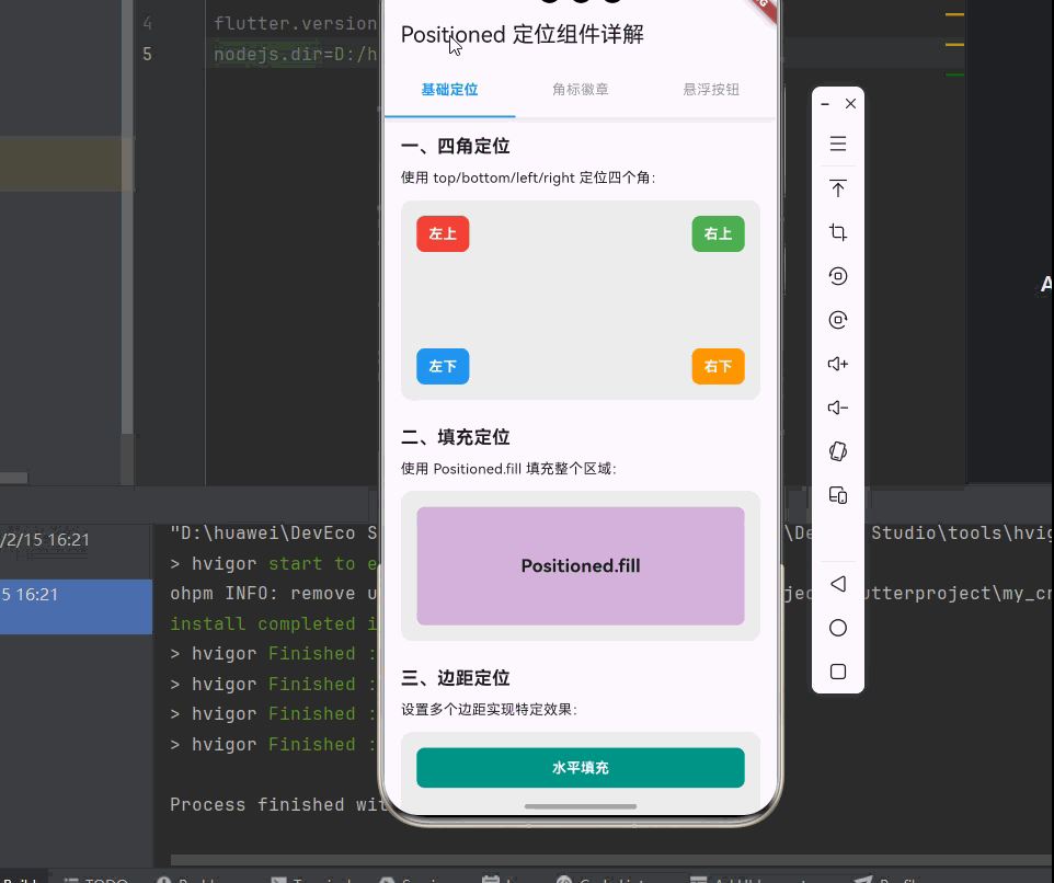
_buildSection('一、四角定位', [
const Text('使用 top/bottom/left/right 定位四个角:'),
const SizedBox(height: 12),
SizedBox(
height: 200,
child: Stack(
children: [
Container(
decoration: BoxDecoration(
color: Colors.grey[200],
borderRadius: BorderRadius.circular(12),
),
),
Positioned(
top: 16,
left: 16,
child: _buildPositionedBox('左上', Colors.red),
),
Positioned(
top: 16,
right: 16,
child: _buildPositionedBox('右上', Colors.green),
),
Positioned(
bottom: 16,
left: 16,
child: _buildPositionedBox('左下', Colors.blue),
),
Positioned(
bottom: 16,
right: 16,
child: _buildPositionedBox('右下', Colors.orange),
),
],
),
),
]),
const SizedBox(height: 24),
_buildSection('二、填充定位', [
const Text('使用 Positioned.fill 填充整个区域:'),
const SizedBox(height: 12),
SizedBox(
height: 150,
child: Stack(
children: [
Container(
decoration: BoxDecoration(
color: Colors.grey[200],
borderRadius: BorderRadius.circular(12),
),
),
Positioned.fill(
child: Container(
margin: const EdgeInsets.all(16),
decoration: BoxDecoration(
color: Colors.purple.withOpacity(0.3),
borderRadius: BorderRadius.circular(8),
),
child: const Center(
child: Text(
'Positioned.fill',
style: TextStyle(fontSize: 18, fontWeight: FontWeight.bold),
),
),
),
),
],
),
),
]),
const SizedBox(height: 24),
_buildSection('三、边距定位', [
const Text('设置多个边距实现特定效果:'),
const SizedBox(height: 12),
SizedBox(
height: 150,
child: Stack(
children: [
Container(
decoration: BoxDecoration(
color: Colors.grey[200],
borderRadius: BorderRadius.circular(12),
),
),
Positioned(
left: 16,
right: 16,
top: 16,
child: Container(
height: 40,
decoration: BoxDecoration(
color: Colors.teal,
borderRadius: BorderRadius.circular(8),
),
child: const Center(
child: Text(
'水平填充',
style: TextStyle(color: Colors.white, fontWeight: FontWeight.bold),
),
),
),
),
Positioned(
left: 16,
right: 16,
bottom: 16,
child: Container(
height: 40,
decoration: BoxDecoration(
color: Colors.pink,
borderRadius: BorderRadius.circular(8),
),
child: const Center(
child: Text(
'水平填充',
style: TextStyle(color: Colors.white, fontWeight: FontWeight.bold),
),
),
),
),
],
),
),
]),
],
),
);
}
Widget _buildBadgeDemo() {
return SingleChildScrollView(
padding: const EdgeInsets.all(16),
child: Column(
crossAxisAlignment: CrossAxisAlignment.start,
children: [
_buildSection('角标徽章示例', [
const Text('常见的角标徽章效果:'),
const SizedBox(height: 16),
Row(
mainAxisAlignment: MainAxisAlignment.spaceEvenly,
children: [
_buildBadgeIcon(Icons.shopping_cart, '购物车', 3),
_buildBadgeIcon(Icons.notifications, '通知', 99),
_buildBadgeIcon(Icons.message, '消息', 0),
_buildBadgeIcon(Icons.email, '邮件', 5),
],
),
]),
const SizedBox(height: 24),
_buildSection('卡片角标', [
const Text('商品卡片的促销角标:'),
const SizedBox(height: 12),
_buildCornerCard('限时特惠商品', Colors.red, '热卖'),
const SizedBox(height: 12),
_buildCornerCard('新品首发', Colors.orange, '新品'),
const SizedBox(height: 12),
_buildCornerCard('会员专享', Colors.purple, 'VIP'),
]),
],
),
);
}
Widget _buildFloatingDemo() {
return Stack(
children: [
ListView.builder(
padding: const EdgeInsets.all(16),
itemCount: 20,
itemBuilder: (context, index) {
return Card(
margin: const EdgeInsets.only(bottom: 12),
child: ListTile(
leading: CircleAvatar(
backgroundColor: Colors.primaries[index % Colors.primaries.length],
child: Text('${index + 1}'),
),
title: Text('列表项 ${index + 1}'),
subtitle: const Text('这是列表项的描述内容'),
trailing: const Icon(Icons.arrow_forward_ios, size: 16),
),
);
},
),
Positioned(
right: 16,
bottom: 16,
child: Column(
mainAxisSize: MainAxisSize.min,
children: [
FloatingActionButton(
heroTag: 'add',
mini: true,
onPressed: () {},
child: const Icon(Icons.add),
),
const SizedBox(height: 8),
FloatingActionButton(
heroTag: 'edit',
mini: true,
onPressed: () {},
child: const Icon(Icons.edit),
),
],
),
),
],
);
}
Widget _buildSection(String title, List<Widget> children) {
return Column(
crossAxisAlignment: CrossAxisAlignment.start,
children: [
Text(
title,
style: const TextStyle(
fontSize: 18,
fontWeight: FontWeight.bold,
),
),
const SizedBox(height: 8),
...children,
],
);
}
Widget _buildPositionedBox(String label, Color color) {
return Container(
padding: const EdgeInsets.symmetric(horizontal: 12, vertical: 8),
decoration: BoxDecoration(
color: color,
borderRadius: BorderRadius.circular(8),
),
child: Text(
label,
style: const TextStyle(color: Colors.white, fontWeight: FontWeight.bold),
),
);
}
Widget _buildBadgeIcon(IconData icon, String label, int count) {
return Column(
mainAxisSize: MainAxisSize.min,
children: [
SizedBox(
width: 56,
height: 56,
child: Stack(
children: [
Container(
decoration: BoxDecoration(
color: Colors.grey[200],
shape: BoxShape.circle,
),
child: Center(child: Icon(icon, size: 28)),
),
if (count > 0)
Positioned(
right: 0,
top: 0,
child: Container(
padding: const EdgeInsets.symmetric(horizontal: 6, vertical: 2),
decoration: BoxDecoration(
color: Colors.red,
borderRadius: BorderRadius.circular(12),
),
constraints: const BoxConstraints(minWidth: 18),
child: Text(
count > 99 ? '99+' : '$count',
textAlign: TextAlign.center,
style: const TextStyle(
color: Colors.white,
fontSize: 11,
fontWeight: FontWeight.bold,
),
),
),
),
],
),
),
const SizedBox(height: 8),
Text(label, style: const TextStyle(fontSize: 12)),
],
);
}
Widget _buildCornerCard(String title, Color color, String badge) {
return SizedBox(
height: 80,
child: Stack(
children: [
Card(
child: Padding(
padding: const EdgeInsets.all(16),
child: Row(
children: [
Container(
width: 48,
height: 48,
decoration: BoxDecoration(
color: color.withOpacity(0.2),
borderRadius: BorderRadius.circular(8),
),
child: Icon(Icons.shopping_bag, color: color),
),
const SizedBox(width: 16),
Expanded(
child: Text(
title,
style: const TextStyle(fontSize: 16, fontWeight: FontWeight.bold),
),
),
const Icon(Icons.arrow_forward_ios, size: 16),
],
),
),
),
Positioned(
top: 0,
right: 0,
child: Container(
padding: const EdgeInsets.symmetric(horizontal: 12, vertical: 4),
decoration: BoxDecoration(
color: color,
borderRadius: const BorderRadius.only(
topRight: Radius.circular(8),
bottomLeft: Radius.circular(12),
),
),
child: Text(
badge,
style: const TextStyle(
color: Colors.white,
fontSize: 12,
fontWeight: FontWeight.bold,
),
),
),
),
],
),
);
}
}九、总结
Positioned 是 Flutter 中一个强大的绝对定位组件,通过本文的学习,我们掌握了以下内容:
📝 知识点回顾
- Positioned 基础:了解 Positioned 的基本用法和边距参数
- 核心属性:掌握 top、bottom、left、right、width、height 等属性
- 便捷构造函数:学习 Positioned.fill、Positioned.fromRect 等
- 实际应用场景:角标徽章、悬浮按钮、图片标注、进度指示器等
- AnimatedPositioned:学习如何实现位置动画效果
- 性能优化:了解 Positioned 的性能考虑和最佳实践
🎯 最佳实践
- 合理使用边距参数组合实现精确定位
- 使用 Positioned.fill 简化填充代码
- 配合 AnimatedPositioned 实现平滑动画
- 避免过多叠加层影响性能