欢迎加入开源鸿蒙跨平台社区:https://openharmonycrossplatform.csdn.net
🎯 欢迎来到 Flutter for OpenHarmony 社区!本文将深入讲解 Flutter 中 flutter_slidable 列表滑动操作组件的使用方法,带你全面掌握侧滑删除、滑动操作菜单等功能。
一、flutter_slidable 组件概述
在移动应用开发中,列表项的侧滑操作是一种非常常见的交互模式。flutter_slidable 是一个功能强大的 Flutter 插件,用于实现列表项的侧滑操作,如侧滑删除、侧滑标记、侧滑归档等。该插件完全使用 Dart 语言实现,不依赖任何原生平台代码,因此可以无缝运行在 OpenHarmony 平台上。
📋 flutter_slidable 组件特点
| 特点 | 说明 |
|---|---|
| 纯 Dart 实现 | 无需原生平台适配,跨平台一致性高 |
| 多种动画效果 | 支持 Scroll、Drawer、Behind、Stretch 等动画 |
| 双向滑动 | 支持从左侧或右侧滑动显示操作菜单 |
| 自定义操作 | 支持自定义操作按钮、图标、颜色等 |
| 滑动监听 | 支持监听滑动状态和滑动比例 |
| 组操作 | 支持多个操作按钮组合显示 |
| 手势控制 | 支持控制滑动灵敏度、阈值等参数 |
| 通知回调 | 支持滑动开始、结束、取消等事件回调 |
滑动动画类型
flutter_slidable 提供了多种滑动动画效果:
| 动画类型 | 说明 |
|---|---|
| ScrollMotion | 操作按钮跟随滑动滚动显示(默认) |
| DrawerMotion | 操作按钮从边缘滑出,类似抽屉效果 |
| BehindMotion | 操作按钮固定在背后,滑动时逐渐显示 |
| StretchMotion | 操作按钮随滑动拉伸变形 |
💡 使用场景:邮件列表侧滑删除/归档、待办事项侧滑完成/删除、聊天列表侧滑置顶/删除、购物车侧滑移除商品等。
二、OpenHarmony 平台适配说明
2.1 兼容性信息
flutter_slidable 是纯 Dart 实现的插件,无需任何原生平台适配,可以直接在 OpenHarmony 平台上使用。
| 特性 | 说明 |
|---|---|
| 原生适配需求 | 无需适配 |
| 支持版本 | 所有 Flutter 版本 |
| 依赖来源 | pub.dev 官方版本 |
| OpenHarmony 支持 | ✅ 完全支持 |
2.2 为什么不需要适配?
flutter_slidable 完全基于 Flutter 的手势识别和动画系统实现,不依赖任何平台特定的原生代码。这种纯 Dart 实现的插件具有以下优势:
- 跨平台一致性:在所有平台上表现完全一致
- 维护成本低:无需为每个平台单独维护原生代码
- 更新及时:跟随 Flutter 版本更新,无兼容性问题
- 性能优秀:直接使用 Flutter 引擎渲染,性能流畅
三、项目配置与安装
3.1 添加依赖配置
在项目的 pubspec.yaml 文件中添加 flutter_slidable 依赖:
yaml
dependencies:
  flutter:
    sdk: flutter

  # 添加 flutter_slidable 依赖
  flutter_slidable: ^3.1.1
3.2 下载依赖
配置完成后,执行以下命令下载依赖:
bash
flutter pub get3.3 权限配置
由于 flutter_slidable 是纯 Dart 实现,不需要配置任何权限。
四、flutter_slidable 基础用法
4.1 导入库
在使用 flutter_slidable 之前,需要先导入库:
dart
import 'package:flutter_slidable/flutter_slidable.dart';4.2 基本结构
Slidable 组件的基本结构包含以下部分:
dart
Slidable(
  key: ValueKey(index),
  startActionPane: ActionPane(
    motion: ScrollMotion(),
    children: [
      SlidableAction(
        onPressed: (context) {},
        backgroundColor: Colors.blue,
        icon: Icons.share,
        label: '分享',
      ),
    ],
  ),
  endActionPane: ActionPane(
    motion: ScrollMotion(),
    children: [
      SlidableAction(
        onPressed: (context) {},
        backgroundColor: Colors.red,
        icon: Icons.delete,
        label: '删除',
      ),
    ],
  ),
  child: ListTile(
    title: Text('列表项'),
  ),
)
4.3 核心组件说明
ActionPane(操作面板)
ActionPane 用于定义滑动后显示的操作按钮区域:
dart
ActionPane({
  Key? key,
  required Widget motion,        // 滑动动画类型
  double? extentRatio,           // 操作区域占比(默认 0.25)
  List<Widget> children = const [], // 操作按钮列表
  DismissibleActionPane? dismissible, // 滑动删除配置
})
SlidableAction(操作按钮)
SlidableAction 用于定义单个操作按钮:
dart
SlidableAction({
  Key? key,
  required void Function(BuildContext)? onPressed, // 点击回调
  Color? backgroundColor,         // 背景颜色
  Color? foregroundColor,         // 前景颜色(图标和文字)
  IconData? icon,                 // 图标
  String? label,                  // 文字标签
  bool autoClose = true,          // 点击后是否自动关闭
  double? spacing,                // 图标和文字间距
  EdgeInsets? padding,            // 内边距
})
4.4 滑动方向
startActionPane:从左向右滑动时显示的操作面板endActionPane:从右向左滑动时显示的操作面板
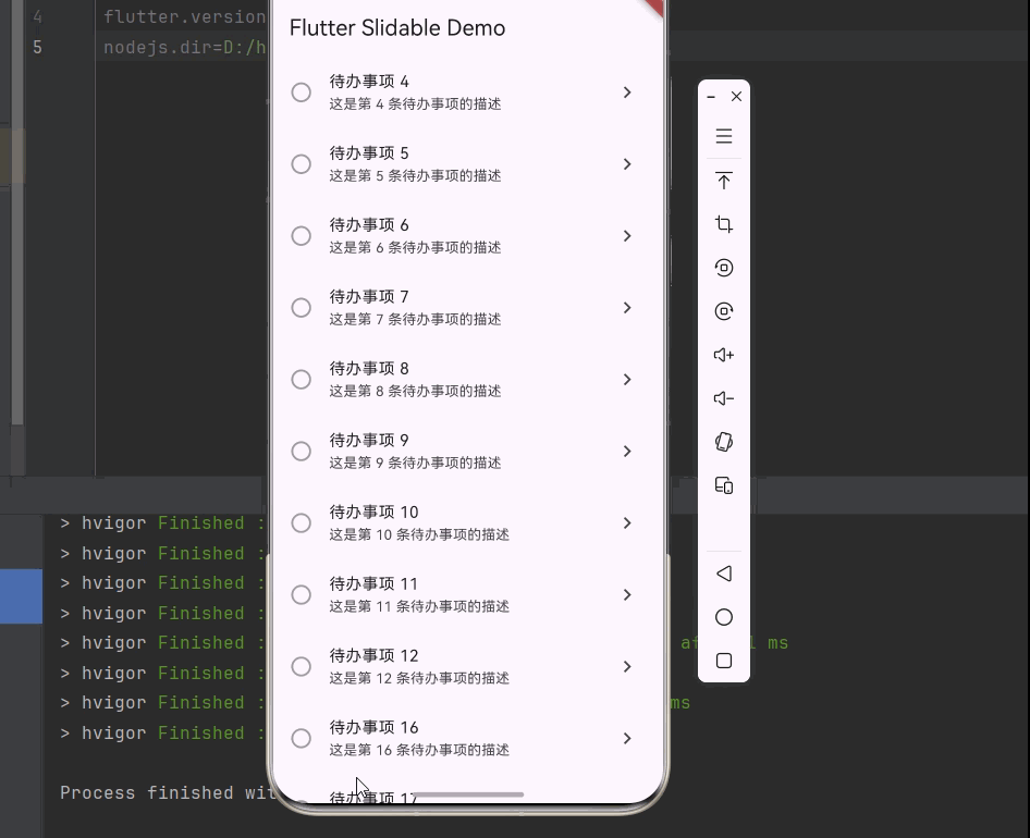
五、完整示例:侧滑操作列表
下面是一个完整的示例,展示如何实现一个带有侧滑删除、编辑、归档功能的列表:
dart
import 'package:flutter/material.dart';
import 'package:flutter_slidable/flutter_slidable.dart';

void main() {
  runApp(const MyApp());
}

class MyApp extends StatelessWidget {
  const MyApp({super.key});

  @override
  Widget build(BuildContext context) {
    return MaterialApp(
      title: 'Flutter Slidable Demo',
      theme: ThemeData(
        primarySwatch: Colors.blue,
        useMaterial3: true,
      ),
      home: const HomePage(),
    );
  }
}

class HomePage extends StatefulWidget {
  const HomePage({super.key});

  @override
  State<HomePage> createState() => _HomePageState();
}

class _HomePageState extends State<HomePage> {
  final List<TodoItem> _items = List.generate(
    20,
    (index) => TodoItem(
      id: index,
      title: '待办事项 ${index + 1}',
      subtitle: '这是第 ${index + 1} 条待办事项的描述',
      isCompleted: false,
    ),
  );

  void _deleteItem(int index) {
    setState(() {
      _items.removeAt(index);
    });
    ScaffoldMessenger.of(context).showSnackBar(
      const SnackBar(content: Text('已删除')),
    );
  }

  void _archiveItem(int index) {
    setState(() {
      _items.removeAt(index);
    });
    ScaffoldMessenger.of(context).showSnackBar(
      const SnackBar(content: Text('已归档')),
    );
  }

  void _editItem(int index) {
    showDialog(
      context: context,
      builder: (context) => AlertDialog(
        title: const Text('编辑'),
        content: Text('编辑: ${_items[index].title}'),
        actions: [
          TextButton(
            onPressed: () => Navigator.pop(context),
            child: const Text('取消'),
          ),
          TextButton(
            onPressed: () => Navigator.pop(context),
            child: const Text('保存'),
          ),
        ],
      ),
    );
  }

  void _toggleComplete(int index) {
    setState(() {
      _items[index].isCompleted = !_items[index].isCompleted;
    });
  }

  @override
  Widget build(BuildContext context) {
    return Scaffold(
      appBar: AppBar(
        title: const Text('Flutter Slidable Demo'),
      ),
      body: ListView.builder(
        itemCount: _items.length,
        itemBuilder: (context, index) {
          final item = _items[index];
          return Slidable(
            key: ValueKey(item.id),
            startActionPane: ActionPane(
              motion: const DrawerMotion(),
              children: [
                SlidableAction(
                  onPressed: (_) => _editItem(index),
                  backgroundColor: Colors.blue,
                  foregroundColor: Colors.white,
                  icon: Icons.edit,
                  label: '编辑',
                ),
                SlidableAction(
                  onPressed: (_) => _archiveItem(index),
                  backgroundColor: Colors.orange,
                  foregroundColor: Colors.white,
                  icon: Icons.archive,
                  label: '归档',
                ),
              ],
            ),
            endActionPane: ActionPane(
              motion: const ScrollMotion(),
              dismissible: DismissiblePane(
                onDismissed: () => _deleteItem(index),
              ),
              children: [
                SlidableAction(
                  onPressed: (_) => _toggleComplete(index),
                  backgroundColor: Colors.green,
                  foregroundColor: Colors.white,
                  icon: item.isCompleted ? Icons.undo : Icons.check,
                  label: item.isCompleted ? '撤销' : '完成',
                ),
                SlidableAction(
                  onPressed: (_) => _deleteItem(index),
                  backgroundColor: Colors.red,
                  foregroundColor: Colors.white,
                  icon: Icons.delete,
                  label: '删除',
                ),
              ],
            ),
            child: ListTile(
              leading: Icon(
                item.isCompleted ? Icons.check_circle : Icons.circle_outlined,
                color: item.isCompleted ? Colors.green : Colors.grey,
              ),
              title: Text(
                item.title,
                style: TextStyle(
                  decoration: item.isCompleted ? TextDecoration.lineThrough : null,
                ),
              ),
              subtitle: Text(item.subtitle),
              trailing: const Icon(Icons.chevron_right),
            ),
          );
        },
      ),
    );
  }
}

class TodoItem {
  final int id;
  final String title;
  final String subtitle;
  bool isCompleted;

  TodoItem({
    required this.id,
    required this.title,
    required this.subtitle,
    this.isCompleted = false,
  });
}
六、高级用法
6.1 滑动删除(Dismissible)
使用 DismissiblePane 实现滑动直接删除:
dart
endActionPane: ActionPane(
  motion: const ScrollMotion(),
  dismissible: DismissiblePane(
    onDismissed: () {
      _deleteItem(index);
    },
    confirmDismiss: () async {
      return await showDialog(
        context: context,
        builder: (context) => AlertDialog(
          title: const Text('确认删除'),
          content: const Text('确定要删除此项吗?'),
          actions: [
            TextButton(
              onPressed: () => Navigator.pop(context, false),
              child: const Text('取消'),
            ),
            TextButton(
              onPressed: () => Navigator.pop(context, true),
              child: const Text('删除'),
            ),
          ],
        ),
      );
    },
  ),
  children: [
    SlidableAction(
      onPressed: (_) => _deleteItem(index),
      backgroundColor: Colors.red,
      icon: Icons.delete,
      label: '删除',
    ),
  ],
)
6.2 自定义滑动动画
使用不同的 Motion 实现不同的滑动效果:
dart
Slidable(
  startActionPane: ActionPane(
    motion: const DrawerMotion(),
    children: [...],
  ),
  endActionPane: ActionPane(
    motion: const BehindMotion(),
    children: [...],
  ),
  child: ListTile(...),
)动画效果对比:
| Motion | 效果描述 |
|---|---|
| ScrollMotion | 操作按钮跟随手指滚动,从边缘逐渐出现 |
| DrawerMotion | 操作按钮从边缘滑出,类似抽屉展开 |
| BehindMotion | 操作按钮固定在背后,滑动时逐渐露出 |
| StretchMotion | 操作按钮随滑动拉伸,有弹性效果 |
6.3 控制滑动比例
通过 extentRatio 控制操作区域占比:
dart
ActionPane(
  motion: const ScrollMotion(),
  extentRatio: 0.3,
  children: [
    SlidableAction(...),
  ],
)
6.4 使用 SlidableController
通过 SlidableController 控制滑动状态:
dart
class _MyWidgetState extends State<MyWidget> {
  final SlidableController _controller = SlidableController();

  void _openSlidable() {
    _controller.openEndActionPane();
  }

  void _closeSlidable() {
    _controller.close();
  }

  @override
  Widget build(BuildContext context) {
    return Column(
      children: [
        ElevatedButton(
          onPressed: _openSlidable,
          child: const Text('打开'),
        ),
        Slidable(
          controller: _controller,
          endActionPane: ActionPane(
            motion: const ScrollMotion(),
            children: [
              SlidableAction(
                onPressed: (_) {},
                backgroundColor: Colors.red,
                icon: Icons.delete,
                label: '删除',
              ),
            ],
          ),
          child: const ListTile(title: Text('滑动项')),
        ),
      ],
    );
  }
}
6.5 监听滑动状态
使用回调函数监听滑动状态变化:
dart
Slidable(
  onSlideAnimationChange: (animation) {
    print('滑动动画变化: ${animation.value}');
  },
  onSlideIsOpenChange: (isOpen) {
    print('滑动状态: ${isOpen ? "打开" : "关闭"}');
  },
  endActionPane: ActionPane(
    motion: const ScrollMotion(),
    children: [...],
  ),
  child: ListTile(...),
)
6.6 自定义操作按钮
使用自定义 Widget 作为操作按钮:
dart
ActionPane(
  motion: const ScrollMotion(),
  children: [
    Expanded(
      child: Container(
        color: Colors.purple,
        child: const Column(
          mainAxisAlignment: MainAxisAlignment.center,
          children: [
            Icon(Icons.star, color: Colors.white),
            Text('收藏', style: TextStyle(color: Colors.white)),
          ],
        ),
      ),
    ),
    Expanded(
      child: Container(
        color: Colors.teal,
        child: const Column(
          mainAxisAlignment: MainAxisAlignment.center,
          children: [
            Icon(Icons.bookmark, color: Colors.white),
            Text('书签', style: TextStyle(color: Colors.white)),
          ],
        ),
      ),
    ),
  ],
)
七、常见问题与解决方案
7.1 滑动与其他手势冲突
问题:Slidable 与其他手势(如点击、长按)冲突。
解决方案 :使用 GestureDetector 包裹 Slidable 的 child,并正确处理手势:
dart
Slidable(
  child: GestureDetector(
    onTap: () {
      // 处理点击
    },
    onLongPress: () {
      // 处理长按
    },
    child: ListTile(...),
  ),
)
7.2 列表项删除后状态异常
问题:删除列表项后,其他项的滑动状态异常。
解决方案:确保每个 Slidable 使用唯一的 key:
dart
Slidable(
  key: ValueKey(item.id), // 使用唯一标识
  ...
)
7.3 滑动不流畅
问题:滑动动画卡顿或不流畅。
解决方案:
- 避免在 Slidable child 中使用过于复杂的 Widget
- 使用
const构造函数优化性能 - 避免在滑动回调中执行耗时操作
八、最佳实践
8.1 合理设计操作按钮
操作按钮数量不宜过多,建议控制在 2-3 个:
dart
ActionPane(
  motion: const ScrollMotion(),
  children: [
    SlidableAction(onPressed: _, backgroundColor: Colors.blue, icon: Icons.edit, label: '编辑'),
    SlidableAction(onPressed: _, backgroundColor: Colors.red, icon: Icons.delete, label: '删除'),
  ],
)
8.2 使用语义化颜色
为不同操作使用语义化的颜色:
| 操作类型 | 推荐颜色 | 说明 |
|---|---|---|
| 删除 | 红色 | 危险操作 |
| 编辑 | 蓝色 | 常规操作 |
| 完成 | 绿色 | 正面操作 |
| 归档 | 橙色 | 次要操作 |
| 分享 | 紫色 | 社交操作 |
8.3 提供撤销功能
删除操作后提供撤销选项:
dart
void _deleteWithUndo(int index) {
  final item = _items.removeAt(index);
  setState(() {});

  ScaffoldMessenger.of(context).showSnackBar(
    SnackBar(
      content: const Text('已删除'),
      action: SnackBarAction(
        label: '撤销',
        onPressed: () {
          setState(() {
            _items.insert(index, item);
          });
        },
      ),
    ),
  );
}
8.4 配合其他组件使用
Slidable 可以与其他列表组件配合使用:
dart
ListView.separated(
  itemCount: items.length,
  separatorBuilder: (context, index) => const Divider(),
  itemBuilder: (context, index) {
    return Slidable(...);
  },
)
九、总结
flutter_slidable 是一个功能强大且易于使用的 Flutter 插件,用于实现列表项的侧滑操作。由于它是纯 Dart 实现,无需任何原生平台适配,可以直接在 OpenHarmony 平台上使用,具有跨平台一致性高、维护成本低等优势。
通过本文的学习,你应该已经掌握了:
- flutter_slidable 的基本使用方法
- 如何实现侧滑删除、编辑、归档等功能
- 如何使用不同的滑动动画效果
- 如何自定义操作按钮和滑动行为
- 如何处理滑动状态和事件回调
在实际开发中,合理使用 flutter_slidable 可以显著提升应用的交互体验,特别是在邮件、待办事项、聊天列表等场景中,侧滑操作已成为用户习惯的交互方式。