前言:
文字、图片、图标是 Flutter 界面最基础也最核心的视觉构成元素,几乎所有 Flutter 应用的 UI 都由这三类元素组合而成:
- 基础交互载体 :文字 传递核心信息(按钮文案、页面内容、提示语),图片 强化视觉表达(商品图、头像、背景),图标简化操作认知(返回、收藏、设置);
- 用户体验核心:这三类元素的样式、加载方式、适配逻辑直接决定用户对 App 的第一印象,比如文字溢出截断、图片加载卡顿、图标显示异常都会严重降低体验;
- 性能优化关键 :图片的加载策略、文字的渲染方式、图标的资源配置是 Flutter 性能优化的高频场景(如图片缓存、矢量图标替代位图);
- 跨平台一致性基础 :掌握这三类元素的跨平台适配(如字体、图片路径、图标库兼容),是实现多端 UI 统一的核心前提。
掌握这三类元素的使用和优化,结合第一讲的布局,就掌握了 Flutter 界面开发的 80% 基础能力,恭喜你,只需要耐心的拼接积木,你可以完成任何的布局。
一、底层原理结构图
Flutter 中文字/图片/图标的底层渲染逻辑:
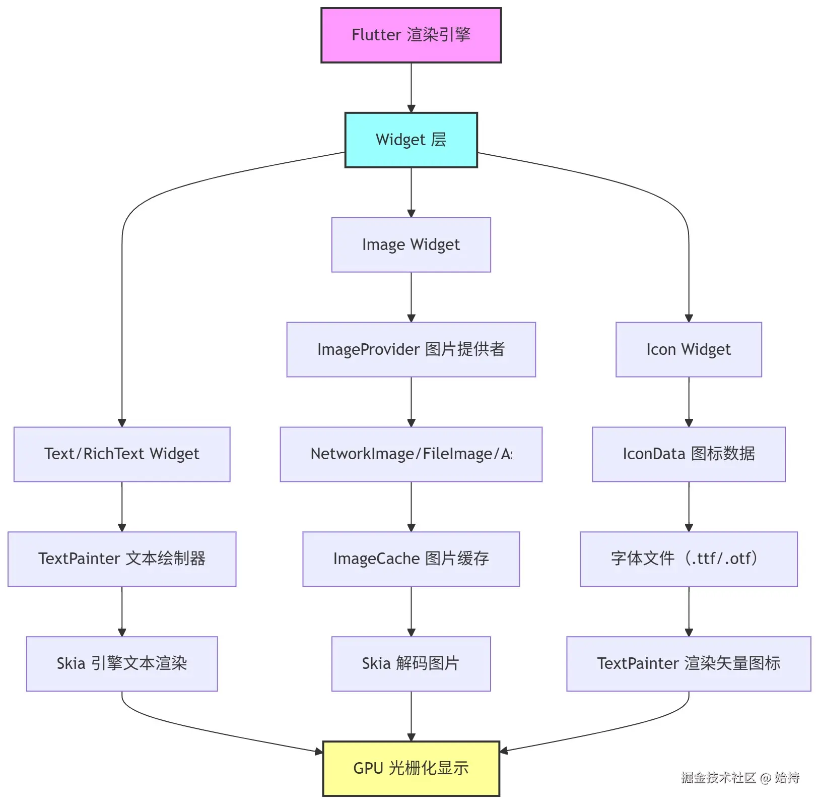
- 统一渲染链路 :文字、图标最终都通过
TextPainter渲染,图片则经解码后由 Skia 引擎统一提交 GPU 显示 - 分层设计:Widget 层仅负责配置(如文字样式、图片路径),真正的渲染逻辑在 Painter/ImageProvider 层(这一切都是框架已经封装好的,我们不用考虑)
- 缓存优化 :图片默认走
ImageCache缓存,避免重复网络请求/文件读取
二、核心知识点
1. Text 文本
核心功能
样式配置、对齐、溢出处理、换行控制。
| 功能分类 | 属性名 | 常用取值 / 说明 |
|---|---|---|
| 基础样式 | fontSize | 14.0、16.0、18.0(数字,单位是逻辑像素) |
| color | Colors.black、Colors.blue、Color (0xFF333333)(颜色值) | |
| fontWeight | FontWeight.normal(常规)、FontWeight.bold(粗体) | |
| height | 1.2、1.5、2.0(行高,相对于字体大小的倍数) | |
| decoration | TextDecoration.none(无装饰)、underline(下划线)、lineThrough(删除线) | |
| 文本对齐 | textAlign | TextAlign.left(左)、center(居中)、right(右)、justify(两端对齐) |
| 溢出处理 | maxLines | 1、2、3(限制显示的最大行数) |
| overflow | TextOverflow.ellipsis(省略号)、clip(裁剪)、fade(渐变消失) | |
| 换行控制 | softWrap | true(自动换行,默认)、false(强制不换行) |
| textScaleFactor | 1.0(默认)、1.2(文字放大 20%)(适配系统字体缩放) |
逻辑像素是用来适配不同屏幕,以达到显示一致的。
练习
组件在MaterialApp(home:Scaffold(body:处)),一般除了自己新开项目,这两行是用不到的。
csharp
import 'package:flutter/material.dart';

void main() {
  runApp(const MyApp());
}

class MyApp extends StatelessWidget {
  const MyApp({super.key});

  @override
  Widget build(BuildContext context) {
    return MaterialApp(
      home: Scaffold(
        appBar: AppBar(title: const Text('基础视觉元素练习')),
        body: const Center(
          child: Text('Hello, Flutter!'),
        ),
      ),
    );
  }
}
替换Body即可
less
import 'package:flutter/material.dart';
class TextDemo extends StatelessWidget {
const TextDemo({super.key});
@override
Widget build(BuildContext context) {
return Scaffold(
appBar: AppBar(title: const Text("Text 演示")),
body: Padding(
padding: const EdgeInsets.all(16.0),
child: Column(
crossAxisAlignment: CrossAxisAlignment.start,
children: [
// 基础样式
Text(
"基础文本样式",
style: TextStyle(
fontSize: 20,
color: Colors.blue,
fontWeight: FontWeight.bold,
fontStyle: FontStyle.italic,
decoration: TextDecoration.underline, // 下划线
decorationColor: Colors.red,
decorationStyle: TextDecorationStyle.dashed,
),
),
const SizedBox(height: 16),
// 对齐 + 换行
Container(
width: 200,
height: 100,
color: Colors.grey[100],
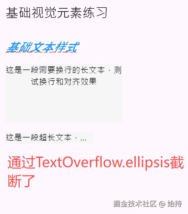
child: const Text(
"这是一段需要换行的长文本,测试换行和对齐效果",
textAlign: TextAlign.center, // 居中对齐
softWrap: true, // 允许换行(默认true)
),
),
const SizedBox(height: 16),
// 溢出处理
Container(
width: 150,
color: Colors.grey[100],
child: const Text(
"这是一段超长文本,测试溢出截断效果",
overflow: TextOverflow.ellipsis, // 溢出显示省略号
maxLines: 1, // 最多1行
),
),
],
),
),
);
}
}
注意事项
softWrap: false时,overflow配置失效(文本会强制单行超出容器);maxLines需配合overflow使用,否则超出行数的文本会被直接截断;- 中文字体需单独配置(默认字体可能不支持部分中文样式,需在 pubspec.yaml 引入自定义字体);
TextStyle中的属性若未设置,会继承父级DefaultTextStyle的样式。
2. RichText + TextSpan 富文本
核心功能
同一段文本中实现不同样式(如部分文字变色、加链接、点击事件)。
| 组件 / 功能分类 | 属性名 | 作用 | 常用取值 / 示例 |
|---|---|---|---|
| RichText(容器) | textAlign | 控制整个富文本的水平对齐 | TextAlign.left/center/right |
| overflow | 文本溢出时的处理方式(需配合 maxLines) | TextOverflow.ellipsis(省略号)/clip(裁剪) | |
| maxLines | 限制富文本显示的最大行数 | 1、2、3 | |
| softWrap | 是否自动换行 | true(默认)/false | |
| text | 核心参数,接收 TextSpan 组合体 | TextSpan(children: ...) | |
| TextSpan(文本片段) | text | 当前片段的文字内容 | "普通文字"、"点击跳转" |
| style | 当前片段的样式(独立于其他片段) | TextStyle(color: Colors.red, fontSize: 16, fontWeight: FontWeight.bold) | |
| recognizer | 点击事件(需导入 gestures.dart) | TapGestureRecognizer ()..onTap = () { 执行点击逻辑 } | |
| children | 嵌套子 TextSpan(实现多段样式拼接) | TextSpan(...), TextSpan(...) |
练习
less
class RichTextDemo extends StatelessWidget {
const RichTextDemo({super.key});
@override
Widget build(BuildContext context) {
return Scaffold(
appBar: AppBar(title: const Text("富文本演示")),
body: Padding(
padding: const EdgeInsets.all(16.0),
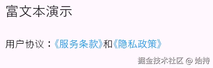
child: RichText(
text: TextSpan(
// 基础样式(未单独配置的 span 继承此样式)
style: const TextStyle(fontSize: 16, color: Colors.black),
children: [
const TextSpan(text: "用户协议:"),
TextSpan(
text: "《服务条款》",
style: const TextStyle(color: Colors.blue),
// 点击事件
recognizer: TapGestureRecognizer()
..onTap = () {
ScaffoldMessenger.of(context).showSnackBar(
const SnackBar(content: Text("点击了服务条款")),
);
},
),
const TextSpan(text: "和"),
TextSpan(
text: "《隐私政策》",
style: const TextStyle(color: Colors.blue),
recognizer: TapGestureRecognizer()
..onTap = () {
ScaffoldMessenger.of(context).showSnackBar(
const SnackBar(content: Text("点击了隐私政策")),
);
},
),
],
),
),
),
);
}
}
- 使用
TapGestureRecognizer需手动管理生命周期(或使用GestureDetector包裹),避免内存泄漏; TextSpan无上下文,无法直接使用Theme.of(context),需提前传递样式;- 富文本无法直接使用
maxLines,需通过TextPainter手动计算行数。
3. Image 图片加载
核心功能
本地资源/网络图片加载、缩放模式(fit)、缓存控制。
| 功能分类 | 属性 / 构造方法 | 作用 | 常用取值 / 示例 |
|---|---|---|---|
| 加载方式 | Image.asset() | 加载本地资源图片(需在 pubspec.yaml 配置 assets) | Image.asset("images/avatar.png") |
| Image.network() | 加载网络图片 | Image.network("xxx.com/avatar.png") | |
| 缩放模式(fit) | fit | 控制图片在容器内的缩放 / 填充方式(核心属性) | BoxFit.contain(适应容器,保留比例)、BoxFit.cover(覆盖容器,裁剪超出部分)、BoxFit.fill(拉伸填满,不保留比例)、BoxFit.fitWidth(宽度适配) |
| 缓存控制 | cacheWidth/cacheHeight | 缓存时指定图片宽高(减小内存占用) | cacheWidth: 200, cacheHeight: 200(单位:像素) |
| cacheExtent | 预加载缓存范围(滚动场景) | 默认 250.0,可设 0 关闭预加载 | |
| 其他核心配置 | width/height | 设置图片显示宽高 | width: 100, height: 100 |
| colorFilter | 图片颜色滤镜(如置灰) | ColorFilter.mode(Colors.grey, BlendMode.color) | |
| errorBuilder | 图片加载失败时的占位组件 | errorBuilder: (ctx, err, stack) => Icon(Icons.error) | |
| loadingBuilder | 图片加载中占位组件(网络图片) | 自定义加载中骨架屏 |
练习
less
class ImageDemo extends StatelessWidget {
const ImageDemo({super.key});
@override
Widget build(BuildContext context) {
return Scaffold(
appBar: AppBar(title: const Text("图片演示")),
body: Padding(
padding: const EdgeInsets.all(16.0),
// GridView是用来做网格布局的,自动排成N列
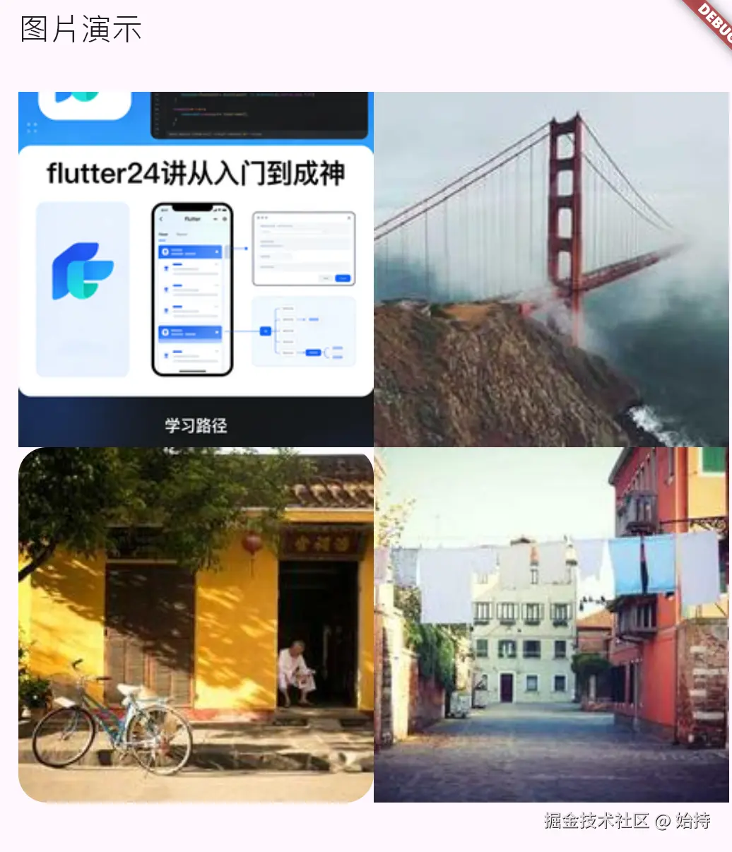
child: GridView.count(
crossAxisCount: 2,
children: [
// 本地资源图片(需在 pubspec.yaml 配置 assets)
Container(
color: Colors.grey[100],
child: Image.asset(
"assets/images/avatar.png", // 本地路径
fit: BoxFit.cover, // 覆盖容器(保持比例,裁剪超出部分)
width: 150,
height: 150,
// 加载错误占位
errorBuilder: (context, error, stackTrace) {
return const Icon(Icons.error, color: Colors.red, size: 40);
},
),
),
// 网络图片
Container(
color: Colors.grey[100],
child: Image.network(
"https://picsum.photos/200/200", // 测试网络图片
fit: BoxFit.contain, // 适应容器(保持比例,不裁剪)
width: 150,
height: 150,
// 加载中占位
loadingBuilder: (context, child, loadingProgress) {
if (loadingProgress == null) return child;
return const Center(child: CircularProgressIndicator());
},
),
),
// 圆角图片(ClipRRect 包裹)
ClipRRect(
borderRadius: BorderRadius.circular(20),
child: Image.network(
"https://picsum.photos/200/200?random=1",
fit: BoxFit.cover,
width: 150,
height: 150,
),
),
// 填充模式(fill)
Container(
color: Colors.grey[100],
child: Image.network(
"https://picsum.photos/200/200?random=2",
fit: BoxFit.fill, // 填充容器(可能拉伸变形)
width: 150,
height: 150,
),
),
],
),
),
);
}
}
-
本地图片需在
pubspec.yaml配置assets路径(注意缩进):-
创建这个目录的位置在项目文件夹,与lib同目录,注意
yamlflutter: assets: - assets/images/ -
-
fit模式选择:BoxFit.cover:保持比例,覆盖容器(常用作头像/背景)BoxFit.contain:保持比例,适应容器(不裁剪)BoxFit.fill:拉伸填充(易变形,慎用)
-
大图片需设置
cacheWidth/cacheHeight减少内存占用,避免 OOM -
网络图片加载失败需处理
errorBuilder,提升用户体验。 -
ClipRRect是 Flutter 中裁剪圆角的核心组件 ,能裁剪所有子组件的溢出部分(解决Container圆角的局限性),包裹Image可用作圆角图
4. Icon 图标与资源配置
核心功能
系统图标、自定义字体图标使用,资源配置。
| 功能分类 | 实现方式 / 属性 | 作用 | 常用取值 / 示例 |
|---|---|---|---|
| 系统图标 | Icon () 构造方法 | 使用 Flutter 内置 Material 图标库 | Icon(Icons.home)、Icon(Icons.search, size: 24) |
| size | 图标尺寸 | 20.0、24.0、32.0(逻辑像素) | |
| color | 图标颜色 | Colors.black、Color(0xFF0088FF) | |
| weight | 图标粗细(Flutter 3.16+) | 400(常规)、700(粗体) | |
| 自定义字体图标 | pubspec.yaml 配置 | 引入自定义字体图标文件(.ttf/.otf) | fonts: - family: MyIcons fonts: - asset: fonts/MyIcons.ttf |
| IconData() | 定义自定义图标对应的 Unicode 码 | IconData(0xe600, fontFamily: 'MyIcons') | |
| Icon () 加载 | 使用自定义字体图标 | Icon(IconData(0xe600, fontFamily: 'MyIcons'), color: Colors.red) |
练习
步骤1:配置自定义图标(以阿里图标库为例)
www.iconfont.cn/collections...
www.iconfont.cn/fonts/detai...
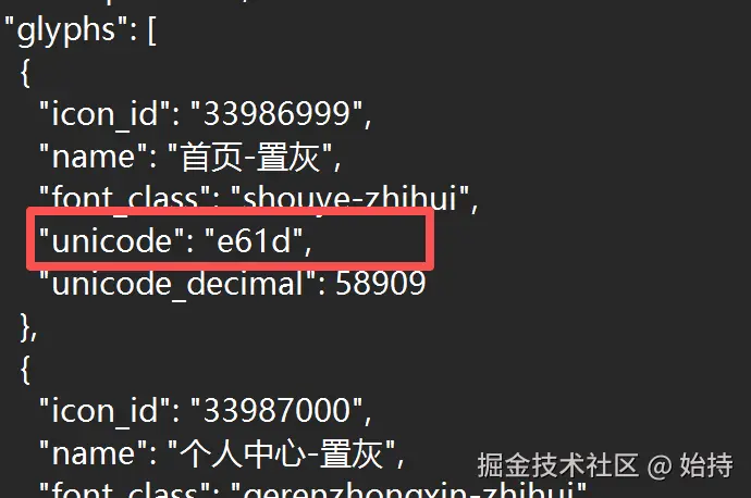
-
下载图标字体文件(.ttf),放入
assets/fonts/目录; -
在
pubspec.yaml配置:yamlflutter: fonts: - family: MyIcons # 自定义字体名 fonts: - asset: assets/fonts/MyIcons.ttf
注意family和fonts都是第三方文件确定的内容,复制过来就行,没有family的自己命名。
IconData定义时,图标unicode码在前面加上0x即可(如果是阿里的)。
步骤2:使用图标
less
class IconDemo extends StatelessWidget {
  const IconDemo({super.key});

  // 自定义图标数据
  static const IconData custom_shopping = IconData(
    0xe601, // 图标unicode码
    fontFamily: 'MyIcons',
    matchTextDirection: true,
  );

  @override
  Widget build(BuildContext context) {
    return Scaffold(
      appBar: AppBar(title: const Text("图标演示")),
      body: Padding(
        padding: const EdgeInsets.all(16.0),
        child: Row(
          mainAxisAlignment: MainAxisAlignment.spaceAround,
          children: [
            // 系统图标
            const Icon(
              Icons.home,
              size: 40,
              color: Colors.blue,
            ),
            // 系统图标 + 颜色渐变
            ShaderMask(
              shaderCallback: (Rect bounds) {
                return const LinearGradient(
                  colors: [Colors.red, Colors.orange],
                ).createShader(bounds);
              },
              child: const Icon(
                Icons.favorite,
                size: 40,
                color: Colors.white, // 需设为白色才能显示渐变
              ),
            ),
            // 自定义图标
            Icon(
              custom_shopping,
              size: 40,
              color: Colors.green,
            ),
          ],
        ),
      ),
    );
  }
}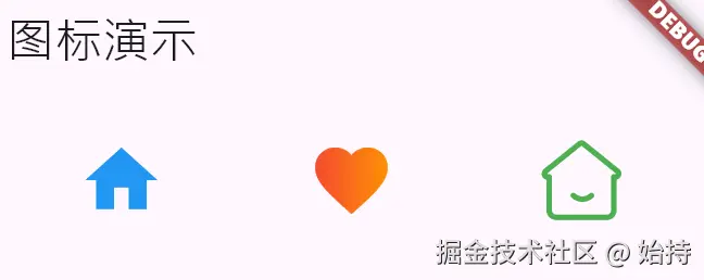
注意事项
- 系统图标
Icons无需配置,直接使用 - 自定义图标需确保
fontFamily与pubspec.yaml配置一致 - 图标本质是字体,可通过
ShaderMask实现渐变效果,ShaderMask是给子组件 "贴渐变 / 着色蒙版" 的组件,shaderCallback生成渐变规则,blendMode控制蒙版和子组件的融合方式; - 避免使用过多位图图标,优先选择矢量字体图标(体积小、缩放不失真)
- SVG 图标推荐用
flutter_svg库:SvgPicture.asset("icons/home.svg")
三、应用场景
结合第一讲所学,这两讲合在一起,UI的界面组合下已经能够完成80%了。
-
案例:个人资料卡片
lessimport 'package:flutter/gestures.dart'; import 'package:flutter/material.dart'; void main() => runApp(const MaterialApp( home: ProfileCardDemo(), )); class ProfileCardDemo extends StatelessWidget { const ProfileCardDemo({super.key}); @override Widget build(BuildContext context) { return Scaffold( appBar: AppBar( title: const Text("个人资料卡(综合示例)"), centerTitle: true, ), body: Center( child: Container( width: 320, padding: const EdgeInsets.all(16), margin: const EdgeInsets.symmetric(vertical: 20), decoration: BoxDecoration( color: Colors.white, borderRadius: BorderRadius.circular(12), boxShadow: const [ BoxShadow(color: Colors.black12, blurRadius: 4, offset: Offset(0, 2)) ], ), child: Column( mainAxisSize: MainAxisSize.min, crossAxisAlignment: CrossAxisAlignment.start, children: [ // 1. 头像(Image)+ 昵称(Text)+ 认证图标(Icon) Row( children: [ // 圆形头像(Image + ClipRRect) ClipRRect( borderRadius: BorderRadius.circular(30), child: Image.network( "https://picsum.photos/60/60", // 测试图片地址 width: 60, height: 60, fit: BoxFit.cover, // 图片加载失败/加载中处理 loadingBuilder: (ctx, child, progress) { if (progress == null) return child; return const CircularProgressIndicator( strokeWidth: 2, valueColor: AlwaysStoppedAnimation(Colors.blue), ); }, errorBuilder: (ctx, err, stack) => const Icon( Icons.person, size: 60, color: Colors.grey, ), ), ), const SizedBox(width: 12), Expanded( child: Column( crossAxisAlignment: CrossAxisAlignment.start, children: [ // 昵称(Text 样式配置) const Text( "始持", style: TextStyle( fontSize: 18, fontWeight: FontWeight.bold, color: Color(0xFF333333), ), maxLines: 1, overflow: TextOverflow.ellipsis, ), const SizedBox(height: 4), // 认证标签(Icon + Text 组合) Row( children: const [ Icon( Icons.verified, size: 14, color: Colors.blueAccent, ), SizedBox(width: 4), Text( "官方认证布道者", style: TextStyle( fontSize: 12, color: Color(0xFF666666), height: 1.2, ), ), ], ), ], ), ), ], ), const SizedBox(height: 16), const Divider(height: 1, color: Colors.black12), const SizedBox(height: 16), // 2. 个人简介(RichText + TextSpan 富文本,包含可点击文字) const Text( "个人简介", style: TextStyle( fontSize: 14, fontWeight: FontWeight.w500, color: Color(0xFF333333), ), ), const SizedBox(height: 8), RichText( text: TextSpan( style: const TextStyle( fontSize: 14, color: Color(0xFF666666), height: 1.4, ), children: [ const TextSpan(text: "程序架构师,专注"), // 可点击的高亮文字 TextSpan( text: "大数据、后端架构 ", style: const TextStyle( color: Colors.blueAccent, fontWeight: FontWeight.w500, ), recognizer: TapGestureRecognizer() ..onTap = () { ScaffoldMessenger.of(context).showSnackBar( const SnackBar(content: Text("你只需要知道架构原理,剩下就是学会指挥的艺术")), ); }, ), const TextSpan(text: " 喜欢开发一切喜欢的东西,不限于 "), // 另一处可点击文字 TextSpan( text: "软件、硬件", style: const TextStyle( color: Colors.blueAccent, fontWeight: FontWeight.w500, ), recognizer: TapGestureRecognizer() ..onTap = () { ScaffoldMessenger.of(context).showSnackBar( const SnackBar(content: Text("AI时代,技术平权,无不可做之事")), ); }, ), const TextSpan(text: "Flutter开发也是沿途的风景,欢迎交流~"), ], ), maxLines: 3, overflow: TextOverflow.ellipsis, ), const SizedBox(height: 16), // 3. 数据统计(Icon + Text 组合) Row( mainAxisAlignment: MainAxisAlignment.spaceAround, children: [ // 作品数 Column( children: const [ Icon( Icons.article, size: 20, color: Color(0xFF999999), ), SizedBox(height: 4), Text( "28 篇", style: TextStyle( fontSize: 14, color: Color(0xFF333333), fontWeight: FontWeight.w500, ), ), Text( "技术文章", style: TextStyle( fontSize: 12, color: Color(0xFF999999), ), ), ], ), // 粉丝数 Column( children: const [ Icon( Icons.people, size: 20, color: Color(0xFF999999), ), SizedBox(height: 4), Text( "1.2k", style: TextStyle( fontSize: 14, color: Color(0xFF333333), fontWeight: FontWeight.w500, ), ), Text( "粉丝", style: TextStyle( fontSize: 12, color: Color(0xFF999999), ), ), ], ), // 获赞数 Column( children: const [ Icon( Icons.favorite_border, size: 20, color: Color(0xFF999999), ), SizedBox(height: 4), Text( "896", style: TextStyle( fontSize: 14, color: Color(0xFF333333), fontWeight: FontWeight.w500, ), ), Text( "获赞", style: TextStyle( fontSize: 12, color: Color(0xFF999999), ), ), ], ), ], ), ], ), ), ), ); } }

| 组件 / 功能 | 应用场景 & 关键知识点 |
|---|---|
| Text | 1. 昵称 / 标签 / 统计数字:配置 fontSize、fontWeight、color 等样式 2. 溢出处理:maxLines + overflow: ellipsis |
| RichText+TextSpan | 1. 富文本简介:不同文字样式区分(普通文字 + 高亮可点击文字) 2. 点击事件:TapGestureRecognizer + onTap 3. 全局溢出控制 |
| Image | 1. 圆形头像:Image.network + ClipRRect 圆角裁剪 2. 容错处理:loadingBuilder(加载中)+ errorBuilder(加载失败) 3. 缩放:fit: BoxFit.cover |
| Icon | 1. 认证 / 统计图标:系统 Icon 配置 size、color 2. 组合使用:Icon + Text 搭配实现标签 / 统计项 |
Text 是基础文字展示,重点关注样式配置和溢出处理;
RichText+TextSpan 解决 "同段文字多样式 / 可点击" 需求,是富文本的核心组合;
Image 需做好加载容错(loading/error)和样式裁剪(ClipRRect);
Icon 常与 Text 组合使用,通过 size/color 适配整体视觉风格。