文章目录
-
- [一、核心 API 速览](#一、核心 API 速览)
-
- [1.1 `bindPopup` 方法](#1.1
bindPopup方法) - [1.2 `PopupOptions`(基础文本气泡)](#1.2
PopupOptions(基础文本气泡)) - [1.3 `CustomPopupOptions`(自定义内容气泡)](#1.3
CustomPopupOptions(自定义内容气泡))
- [1.1 `bindPopup` 方法](#1.1
- 二、完整代码示例与详解
-
- 示例详解
-
- [1. 基础文本气泡](#1. 基础文本气泡)
- [2. 自定义样式气泡](#2. 自定义样式气泡)
- [3. 自定义内容气泡](#3. 自定义内容气泡)
- [4. 自定义动效气泡](#4. 自定义动效气泡)
- [5. 退出事件拦截气泡](#5. 退出事件拦截气泡)
- [6. 渐变描边气泡(API 20+)](#6. 渐变描边气泡(API 20+))
- 总结
Popup 是 ArkUI 提供的通用属性,用于为组件绑定弹出式气泡,支持文本提示、自定义内容、样式定制、动效配置等能力,从 API version 7 开始支持,是实现用户引导、操作提示、详情展示等场景的核心组件。
核心特性
- 双模式支持 :基础文本气泡(
PopupOptions)与自定义内容气泡(CustomPopupOptions)。 - 丰富样式定制:支持箭头、圆角、阴影、背景色、描边渐变等全方位样式配置。
- 交互与动效:支持显隐动效、退出事件拦截、状态监听等交互能力。
- 版本兼容:高版本 API(如 API 12+ 动效、API 20+ 渐变描边)均有兼容说明。
一、核心 API 速览
1.1 bindPopup 方法
为组件绑定 Popup 气泡,是使用 Popup 的核心入口。
typescript
bindPopup(show: boolean, popup: PopupOptions | CustomPopupOptions): T| 参数名 | 类型 | 必填 | 说明 |
|---|---|---|---|
show |
boolean |
是 | 气泡显隐状态,true 显示,false 隐藏。注意 :不能在页面构建中直接设为 true,需等待页面构建完成。 |
popup |
PopupOptions | CustomPopupOptions |
是 | 气泡配置参数,区分基础文本模式和自定义内容模式。 |
1.2 PopupOptions(基础文本气泡)
用于配置仅展示文本和按钮的基础气泡,核心参数如下:
| 参数名 | 类型 | 说明 | 最低 API 版本 |
|---|---|---|---|
message |
string |
气泡文本内容(必填)。 | 7 |
placement |
Placement |
气泡显示位置,默认 Placement.Bottom。 |
10 |
primaryButton |
{value: string, action: () => void} |
主按钮配置。 | 7 |
secondaryButton |
{value: string, action: () => void} |
辅助按钮配置。 | 7 |
messageOptions |
PopupMessageOptions |
文本样式配置(颜色、字体等)。 | 10 |
enableArrow |
boolean |
是否显示箭头,默认 true。 |
10 |
arrowWidth / arrowHeight |
Dimension |
箭头宽度/高度。 | 11 |
popupColor |
ResourceColor |
气泡背景色。 | 11 |
radius |
Dimension |
气泡圆角半径。 | 11 |
shadow |
ShadowOptions | ShadowStyle |
气泡阴影。 | 11 |
transition |
TransitionEffect |
显隐动效配置。 | 12 |
onWillDismiss |
boolean | Callback<DismissPopupAction> |
退出事件拦截。 | 12 |
outlineLinearGradient / borderLinearGradient |
PopupBorderLinearGradient |
内外描边渐变。 | 20 |
1.3 CustomPopupOptions(自定义内容气泡)
用于通过 @Builder 自定义气泡内容,核心参数如下:
| 参数名 | 类型 | 说明 | 最低 API 版本 |
|---|---|---|---|
builder |
CustomBuilder |
自定义内容构造器(必填),用 @Builder 装饰。 |
8 |
placement |
Placement |
气泡显示位置,默认 Placement.Bottom。 |
8 |
popupColor |
ResourceColor |
气泡背景色。 | 8 |
enableArrow |
boolean |
是否显示箭头,默认 true。 |
8 |
autoCancel |
boolean |
点击外部是否自动关闭,默认 true。 |
8 |
mask |
boolean | {color: ResourceColor} |
遮罩层配置。 | 10 |
二、完整代码示例与详解
以下代码基于官方文档扩展,覆盖 6 大核心场景,可直接复制运行。
typescript
@Entry
@Component
struct PopupFullExample {
// ************************* 气泡显隐状态变量 *************************
@State basePopupShow: boolean = false; // 基础文本气泡
@State stylePopupShow: boolean = false; // 自定义样式气泡
@State customPopupShow: boolean = false; // 自定义内容气泡
@State transitionPopupShow: boolean = false; // 自定义动效气泡
@State interceptPopupShow: boolean = false; // 退出事件拦截气泡
@State gradientPopupShow: boolean = false; // 渐变描边气泡(API20+)
// ************************* 自定义气泡内容构造器 *************************
@Builder
customPopupBuilder() {
Column({ space: 12 }) {
Row({ space: 8 }) {
// 示例图标,使用系统公共图标,也可替换为 $r('app.media.xxx')
Image($r('sys.media.ohos_ic_public_albums'))
.width(24)
.height(24)
.objectFit(ImageFit.Contain)
Text('自定义气泡标题')
.fontSize(16)
.fontWeight(FontWeight.Medium)
.fontColor('#181818')
}
.width('100%')
.justifyContent(FlexAlign.Start)
Text('这是通过CustomPopupOptions实现的自定义内容气泡,支持任意布局组件,可自由定制宽高、样式、交互')
.fontSize(14)
.fontColor('#666666')
.maxLines(2)
.width('100%')
Row({ space: 10 }) {
Button('取消')
.width(80)
.height(32)
.fontSize(14)
.backgroundColor('#F5F5F5')
.fontColor('#333333')
.onClick(() => {
this.customPopupShow = false;
})
Button('确认')
.width(80)
.height(32)
.fontSize(14)
.backgroundColor('#007DFF')
.fontColor(Color.White)
.onClick(() => {
this.customPopupShow = false;
console.info('自定义气泡确认按钮点击');
})
}
.width('100%')
.justifyContent(FlexAlign.End)
}
.width(280)
.padding(16)
}
build() {
Scroll() {
Column({ space: 20 }) {
// ************************* 示例1:基础文本气泡 *************************
Button('基础文本气泡')
.width('90%')
.height(48)
.fontSize(16)
.onClick(() => {
this.basePopupShow = !this.basePopupShow;
})
.bindPopup(this.basePopupShow, {
message: '这是基础Popup气泡,支持主副按钮、状态监听、位置定制',
placement: Placement.Top,
targetSpace: 12,
enableArrow: true,
mask: false,
autoCancel: true,
keyboardAvoidMode: KeyboardAvoidMode.DEFAULT,
primaryButton: {
value: '确认',
action: () => {
this.basePopupShow = false;
}
},
secondaryButton: {
value: '取消',
action: () => {
this.basePopupShow = false;
}
},
onStateChange: (event) => {
if (!event.isVisible) {
this.basePopupShow = false;
}
}
})
// ************************* 示例2:自定义样式气泡 *************************
Button('自定义样式气泡')
.width('90%')
.height(48)
.fontSize(16)
.onClick(() => {
this.stylePopupShow = !this.stylePopupShow;
})
.bindPopup(this.stylePopupShow, {
message: '自定义样式气泡,可定制箭头、圆角、阴影、背景、文本样式',
placement: Placement.Bottom,
messageOptions: {
textColor: Color.White,
font: {
size: 14,
weight: FontWeight.Medium
}
},
enableArrow: true,
arrowWidth: 20,
arrowHeight: 10,
arrowPointPosition: ArrowPointPosition.CENTER,
width: 260,
radius: 16,
popupColor: '#007DFF',
backgroundBlurStyle: BlurStyle.NONE,
shadow: ShadowStyle.OUTER_DEFAULT_LG,
onStateChange: (event) => {
if (!event.isVisible) {
this.stylePopupShow = false;
}
}
})
// ************************* 示例3:自定义内容气泡 *************************
Button('自定义内容气泡')
.width('90%')
.height(48)
.fontSize(16)
.onClick(() => {
this.customPopupShow = !this.customPopupShow;
})
.bindPopup(this.customPopupShow, {
builder: this.customPopupBuilder,
placement: Placement.Right,
enableArrow: true,
mask: { color: '#33000000' },
popupColor: Color.White,
autoCancel: false,
targetSpace: 10,
onStateChange: (event) => {
if (!event.isVisible) {
this.customPopupShow = false;
}
}
})
// ************************* 示例4:自定义动效气泡 *************************
Button('自定义动效气泡')
.width('90%')
.height(48)
.fontSize(16)
.onClick(() => {
this.transitionPopupShow = !this.transitionPopupShow;
})
.bindPopup(this.transitionPopupShow, {
message: '自定义显隐动效气泡,支持透明度、平移、缩放等组合动效',
placement: Placement.Top,
width: 240,
transition: TransitionEffect.asymmetric(
TransitionEffect.OPACITY
.animation({ duration: 600, curve: Curve.EaseInOut })
.combine(TransitionEffect.translate({ x: 0, y: -20 })),
TransitionEffect.scale({ x: 0.5, y: 0.5 })
.animation({ duration: 400, curve: Curve.EaseIn })
.combine(TransitionEffect.OPACITY)
),
onStateChange: (event) => {
if (!event.isVisible) {
this.transitionPopupShow = false;
}
}
})
// ************************* 示例5:退出事件拦截气泡 *************************
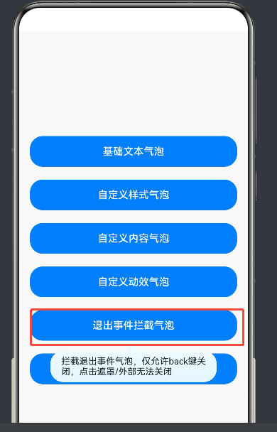
Button('退出事件拦截气泡')
.width('90%')
.height(48)
.fontSize(16)
.onClick(() => {
this.interceptPopupShow = true;
})
.bindPopup(this.interceptPopupShow, {
message: '拦截退出事件气泡,仅允许back键关闭,点击遮罩/外部无法关闭',
placement: Placement.Bottom,
width: 260,
enableArrow: true,
mask: true,
onWillDismiss: (dismissPopupAction) => {
console.info(`气泡关闭原因Code:${dismissPopupAction.reason}`);
// 0 对应 DismissReason.PRESS_BACK (Back键/侧滑)
// 1 对应 TOUCH_OUTSIDE (点击遮罩)
if (dismissPopupAction.reason === 0) {
dismissPopupAction.dismiss();
this.interceptPopupShow = false;
}
},
onStateChange: (event) => {
if (!event.isVisible) {
this.interceptPopupShow = false;
}
}
})
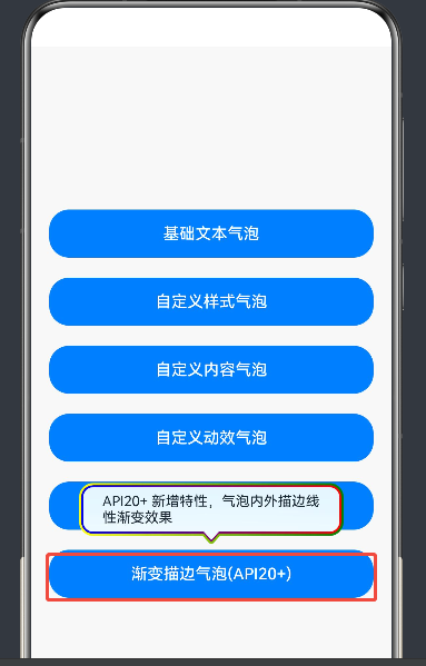
// ************************* 示例6:渐变描边气泡 *************************
Button('渐变描边气泡(API20+)')
.width('90%')
.height(48)
.fontSize(16)
.onClick(() => {
this.gradientPopupShow = !this.gradientPopupShow;
})
.bindPopup(this.gradientPopupShow, {
message: 'API20+ 新增特性,气泡内外描边线性渐变效果',
placement: Placement.Top,
width: 260,
radius: 12,
outlineWidth: 2,
outlineLinearGradient: {
direction: GradientDirection.Right,
colors: [[Color.Yellow, 0.0], [Color.Green, 1.0]]
},
borderWidth: 2,
borderLinearGradient: {
direction: GradientDirection.Left,
colors: [[Color.Red, 0.0], [Color.Blue, 1.0]]
},
onStateChange: (event) => {
if (!event.isVisible) {
this.gradientPopupShow = false;
}
}
})
}
.width('100%')
.padding({ top: 50, bottom: 50 })
.alignItems(HorizontalAlign.Center)
}
.width('100%')
.height('100%')
.backgroundColor('#F8F8F8')
}
}运行结果如图:
示例详解
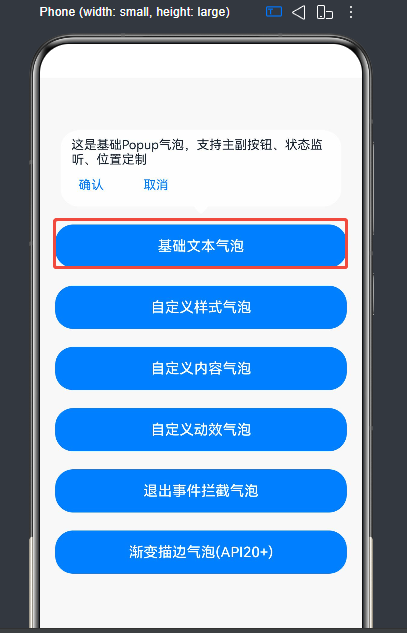
1. 基础文本气泡
展示最基础的文本提示气泡,包含主副按钮、位置配置、状态监听。
- 核心配置 :
message(文本内容)、primaryButton/secondaryButton(按钮)、onStateChange(显隐监听)。 - 关键逻辑 :通过
onStateChange同步状态变量,避免变量与气泡显隐不一致。
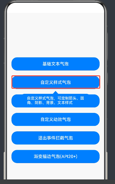
2. 自定义样式气泡
全方位定制气泡外观,包括文本样式、箭头、圆角、背景色、阴影。
- 核心配置 :
messageOptions(文本样式)、arrowWidth/arrowHeight(箭头尺寸)、popupColor(背景色)、shadow(阴影)。 - 适配说明 :
backgroundBlurStyle: BlurStyle.NONE用于关闭默认模糊背景,突出自定义背景色。
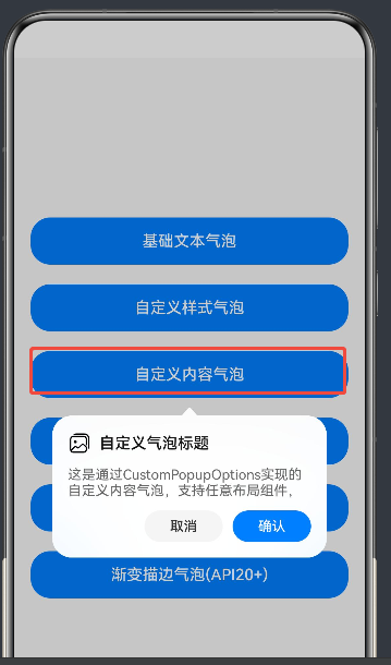
3. 自定义内容气泡
通过 @Builder 构造器完全自定义气泡内容,支持图片、文本、按钮等任意布局。
- 核心配置 :
builder(自定义构造器)、autoCancel: false(禁止点击外部关闭)。 - 避坑说明 :
builder下的第一层容器组件不支持使用position属性,否则会导致气泡不显示。
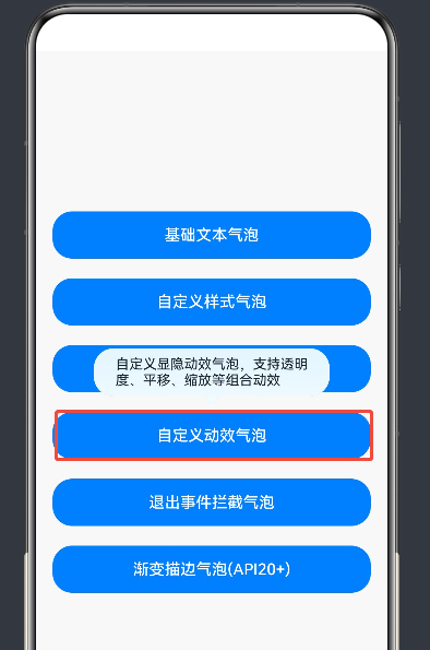
4. 自定义动效气泡
通过 TransitionEffect 定制气泡的显示和退出动效,支持不对称动效。
- 核心配置 :
transition(动效配置),使用asymmetric分别定义显示和退出动效。 - 动效组合 :通过
combine组合透明度、平移、缩放等动效,实现丰富的视觉效果。
5. 退出事件拦截气泡
通过 onWillDismiss 拦截气泡退出事件,仅允许特定方式(如 Back 键)关闭气泡。
- 核心配置 :
onWillDismiss(拦截回调),通过reason判断关闭原因(0为 Back 键,1为点击遮罩)。 - 关键逻辑 :仅在
reason === 0时调用dismiss(),否则拦截退出。
6. 渐变描边气泡(API 20+)
利用 API 20+ 新特性,为气泡添加内外描边的线性渐变效果。
- 核心配置 :
outlineWidth/borderWidth(描边宽度)、outlineLinearGradient/borderLinearGradient(渐变配置)。 - 版本兼容:需在 HarmonyOS 5.0.0.200+ 版本设备上运行,低版本可注释对应代码。
总结
Popup 气泡组件是 HarmonyOS ArkUI 中实现用户交互提示的核心工具,通过 PopupOptions 和 CustomPopupOptions 可覆盖从简单文本到复杂自定义内容的全场景需求。本文结合官方文档与完整代码,详细讲解了其核心 API、样式定制、动效配置、事件拦截等能力,并提供了实用的避坑指南,帮助开发者快速上手并高效使用 Popup 组件。
如果这篇文章对你有帮助,欢迎点赞、收藏、关注,你的支持是持续创作的动力!