如何做出无论屏幕宽高比如何都不会变形的大屏样式?

答案就在下方。
1. 宽度自适应之rem
App.vue页面如下设置,所有页面均挂载到App.vue之下,可共用rem设置
bash
mounted() {
  window.onresize = this.rem()
},
methods: {
  rem(){
    const ClientWidth = document.documentElement.clientWidth
    // (屏幕宽度 ÷ 设计稿宽度) * 根元素文字大小
    const current = (ClientWidth / 1920) * 100
    document.documentElement.style.fontSize = current+ 'px'
  },
}
设置后对内容横向尺寸使用rem,比如 width:120px 要转为 width:1.2rem,font-size: 14px要转为 font-size: .14rem;
2. 高度自适应之vh
因为UI离职导致上面的设计稿丢失,暂时使用下面这张做讲解
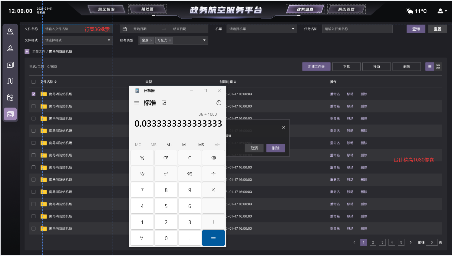
根据设计稿计算高度占比,使用vh为单位,比如36px的高度在1080高度的设计稿中可写为 height:3.33vh
3. 内容区块计算calc弹性布局
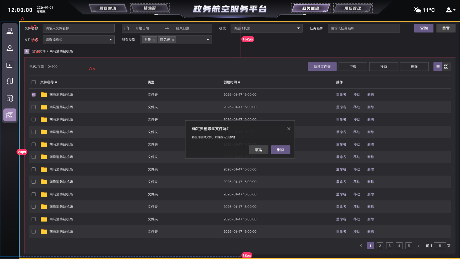
A1本身为一个弹性容器 使用百分百高度,内部A2、A3、A4均采用vh计算行高和空隙,A5的高度为A1-(A2+A3+A4+空隙)
这样A5就作为内部弹性容器占满剩余空间
bash
height: calc(100% - 16.1vh);同样的,类似的宽度calc也要这么计算
bash
width: calc(100% - 1.24rem);使用该方法前需要在App.vue中全局设置css,可以更精准地计算
bash
html {
  font-size: 0.12rem;
  box-sizing: border-box;
}
*, *:before, *:after {
  box-sizing: inherit;
}
4. 内容元素使用%继承宽高
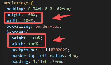
设置父盒子宽高后,如果内部没有分层,子元素一律建议使用百分比继承宽高
5. 元素向外宽泛高度,并使用flex布局结合
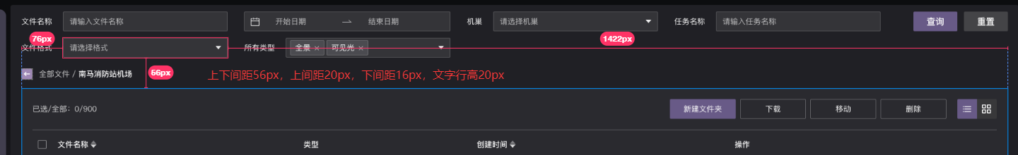
如图,文字本身行高20px,上间距20px,下间距16px,一般采用本身行高+上下间距各16px作为总行高,再让元素集体居中
如:
bash
height:4.8vh; // 52÷1080
display:flex;
align-items: center;
margin-top:0.37vh; // 4÷1080
6. 组件样式穿透改高度
bash
::v-deep .el-input--medium .el-input__inner,
::v-deep .el-range-editor--medium.el-input__inner,
::v-deep .el-range-editor--small.el-input__inner,
::v-deep .el-input.is-disabled .el-input__inner {
  height: 3.3vh !important;
  line-height: 3.3vh !important;
}
组件源码一律使用px,提供的api也只能需修改px数值,所以需要多此一举。
方法5可以一定程度上弥补组件缺陷。
7. 监听图表容器,弹性自适应宽高
bash
mounted() {
const chartDom1 = this.$refs.chart1;
this.myChart1 = echarts.init(chartDom1);
const chartDom2 = this.$refs.chart2;
this.myChart2 = echarts.init(chartDom2);
const chartDom3 = this.$refs.chart3;
this.myChart3 = echarts.init(chartDom3);
const chartDom4 = this.$refs.chart4;
this.myChart4 = echarts.init(chartDom4);
window.addEventListener("resize", this.handleResize);
this.$nextTick(() => {
this.initData();
});
},
beforeDestroy() {
window.removeEventListener("resize", this.handleResize);
},
methods: {
handleResize() {
if (this.myChart1) this.myChart1.resize();
if (this.myChart2) this.myChart2.resize();
if (this.myChart3) this.myChart3.resize();
if (this.myChart4) this.myChart4.resize();
},
handleDispose() {
if (this.myChart1) this.myChart1.dispose();
if (this.myChart2) this.myChart2.dispose();
if (this.myChart3) this.myChart3.dispose();
if (this.myChart4) this.myChart4.dispose();
this.myChart1 = null;
this.myChart2 = null;
this.myChart3 = null;
this.myChart4 = null;
},
initData() {
achievementsStatistics({}).then((res) => {
if (res.code == 200 && res.data) {
// ...
this.$nextTick(() => {
this.initEcharts1();
});
}
})
},
initEcharts1() {
// ...
option && this.myChart1.setOption(option);
}
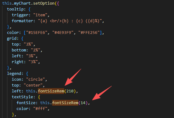
}8. 图表字体自适应
页面添加如下方法:
bash
fontSizeRem(size) {
  const clientWidth = document.documentElement.clientWidth;
  let fontSize = clientWidth / 1920; //设计稿宽度
  return size * fontSize;
},
位移和文字大小便可使用该方法转化为自适应大小
注意:
字体样式使用rem并不能完全掌控其高度,需要结合方法5令其高度影响不到别的元素。
字体不建议使用行高去撑开高度。