参考资料
哔哩哔哩:3小时前端入门教程(HTML+CSS+JS)。
CSS简介
CSS全称为Cascading Style Sheets,中文名"层叠样式表"。
是用于定义网页样式和布局样式的表语言。
CSS由选择器、属性和属性值组成。
CSS三种导入方式:
内联样式(Inline Styles):写在标签后style属性中。
内部样式表(Internal Stylesheet):在html的head标签内部定义style。
外部样式表(External Stylesheet):外部.css文件。
内联样式>内部样式表>外部样式表,会覆盖掉优先级低的样式。
CSS选择器
选择器允许你针对特定元素或一组元素定义样式。
元素选择器,直接引用元素本身。
类选择器,用'.'表示。
ID选择器,用'#'表示。
通用选择器,用'*'表示。
子元素选择器,用".父元素/类/ID > .子元素/类/ID"表示。
后代选择器/包含选择器,用".父元素 子元素"表示。
并集选择器/相邻元素选择器,用"a+b+c"表示。
伪类选择器,用"什么:hover"等表示,还有很多别的伪类。
上代码。
html
<!DOCTYPE html>
<html lang="en">
    <head>
        <meta charset="UTF-8" />
        <meta name="viewport" content="width=device-width, initial-scale=1.0">
        <title>CSS选择器</title>
        <style>
            /* 通用选择器 */
            * {
                font-family: "KaiTi";
            }
            /* 元素选择器 */
            h2 {
                color: aqua;
            }
            /* 类名选择器 */
            .nailong {
                background-color: yellow;
                color: blueviolet;
            }
            /* ID选择器 */
            #nailong {
                font-size: 30px;
                color: bisque;
            }
            p {
                font-size: 20px;
            }

            /* 子元素选择器 */
            /*.father > .p{
                color: yellowgreen;
            }如果保留这段,不留下面的.son,那么颜色都是橘色,因为ID>类>元素*/
            .father > .son{
                color: yellowgreen;
            }
            /* 后代选择器 */
            .father p{
                color: orange;
            }
            /* 相邻元素选择器 */
            h3 + h2 + p {
                background-color: red;
            }
            /* 伪类选择器 */
            .baojinbi:hover {
                color: yellowgreen;
                background-color: blueviolet;
            }
        </style>
    </head>
    <body>
        <h1>选择器示例</h1>
        <h2>这是一个元素选择器</h2>
        <h3 class="nailong">这是一个类选择器</h3>
        <h4 id="nailong">这是一个ID选择器</h4>
        <p>通用选择器让所有字体都变成了楷体</p>

        <div class="father">
            <p class="son">这是一个子元素选择器</p>
            <div>
                <p class="grandson">这是一个后代选择器</p>
            </div>
        </div>

        <p>这是一个普通p标签</p>
        <h3>这是一个相邻兄弟选择器事例</h3>
        <h2>把这个隔开就不会被附魔</h2>
        <p>现在这个p标签被"附魔"了</p>

        <h3 class="baojinbi">鼠标放到上面有惊喜</h3>
    </body>
</html>
CSS常用属性
常用属性在这个网页上都能找到:
而且一百多个网页不可能学得完,见几个学几个差不多得了。
然后演示了一下font有很多属性:font-size、font-family等,可以统一写在一起,称之为复合属性。
font: bolder 50px "KaiTi"
接着,看到三类元素:
块元素block:占据整行的宽度。<div>标签是一个经典的例子。
行内元素inline:不占据整行,只占据本身内容所需要的宽度。也就是说width、height等都对它失效。<span>标签是一个经典的例子。
行内块元素inline-block:水平方向上排列,但是可以设置块级元素的属性。也就是说width、height等都对它有效。<img>标签是一个经典的例子。
这三种元素使可以相互转换的,用到display属性即可。
盒子模型
下图来自视频。
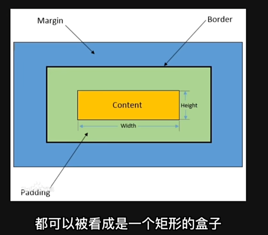
margin border padding width height content六个......单词?
|--------------|-------------------------|
| 属性名 | 说明 |
| 内容(content) | 盒子包含的实际内容,包括文本、图片等。 |
| 内边距(padding) | 围绕在内容的内部,是内容与边框之间的空间。 |
| 边框(border) | 围绕在内边距的外部,是盒子的边界。 |
| 外边距(Margin) | 围绕在边框的外部,是盒子与其他元素之间的空间。 |
练习代码
html
<!DOCTYPE html>
<html lang="en">
<head>
<meta charset="UTF-8" />
<meta name="viewport" content="width=device-width, initial-scale=1.0">
<title>CSS选择器</title>
<style>
.demo {
background-color: aqua;
display: inline-block;
border: 10px solid yellowgreen;
font-size: 32px;
font-family: "KaiTi";
padding: 50px;
margin: 100px;
}
.border-demo {
background-color: yellow;
width: 500px;
height: 300px;
border-style: solid dashed dotted double;
border-width: 3px 6px 9px 12px;
border-color: red;
/*border-left: 10px solid red;*/
}
</style>
</head>
<body>
<div class="demo">我爱玩原神</div>
<div class="border-demo">《原神》是由米哈游自主研发的一款全新开放世界冒险游戏。游戏发生在一个被称作"提瓦特"的幻想世界,在这里,被神选中的人将被授予"神之眼",导引元素之力。你将扮演一位名为"旅行者"的神秘角色,在自由的旅行中邂逅性格各异、能力独特的同伴们,和他们一起击败强敌,找回失散的亲人------同时,逐步发掘"原神"的真相。</div>
</div>
</body>
</html>网页布局方式
标准流(普通流、文档流):网页按照元素的书写顺序依次排列
浮动
定位
Flexbox和Grid(自适应布局)
浮动
创建浮动框,将某个元素移动到一边,直到移动到左边缘或者右边缘。
选择器{
float: left/right/none;
}
浮动三大特性:脱离标准流、一行显示顶部对齐、具备行内块元素属性。
现在举例:父元素包裹着子元素,而子元素是一个左浮动,一个右浮动。
如果父元素不设置高度,那么会导致边框无法包裹两个盒子。这个叫"父元素坍塌"。
解决父元素坍塌的方法:
1.overflow:hidden
2.伪元素清除法
html
<!DOCTYPE html>
<html lang="en">
    <head>
        <meta charset="UTF-8" />
        <meta name="viewport" content="width=device-width, initial-scale=1.0">
        <title>CSS选择器</title>
        <style>
            .father{
                background-color: aquamarine;
                /*height: 150px;*/
                border: 3px solid brown;
                /*overflow:hidden;*/
            }
            .father::after{
                content: "";/*创建一个空的伪元素*/
                display: table;/*使之成为一个块级元素*/
                clear: both;/*清除左右浮动*/
            }

            .left-son{
                width: 100px;
                height: 100px;
                background-color: yellow;
                float:left;
            }
            .right-son{
                width:100px;
                height:100px;
                background-color:yellowgreen;
                float:right;
            }
        </style>
    </head>
    <body>
        <div class="father">
            <div class="left-son">左护法</div>
            <div class="right-son">右护法</div>
        </div>
        <p>这是一段文本</p>
    </body>
</html>
定位
相对定位:相对于元素在文档流的位置进行定位。
绝对定位:相对于其最近的已定位祖先元素进行定位,不占据文档流。
固定定位:相对于浏览器窗口进行定位。不占据文档流,固定在屏幕上的位置,不随移动而移动。
html
<!DOCTYPE html>
<html lang="en">
    <head>
        <meta charset="UTF-8" />
        <meta name="viewport" content="width=device-width, initial-scale=1.0">
        <title>CSS选择器</title>
        <style>
            .box1 {
                width: 500px;
                height: 500px;
                background-color: aqua;
            }
            .box2 {
                width: 600px;
                height: 600px;
                background-color: yellow;
            }
            .normal {
                width: 100px;
                height: 100px;
                background-color: blueviolet;
            }
            .box-relative {
                width:100px;
                height:100px;
                background-color: pink;
                position:relative;
                left:150px;
                top:30px;
            }
            .box-absolute {
                width:100px;
                height:100px;
                background-color: pink;
                position:absolute;
                left:150px;
                /*top:450px;*/
            }
            .box-fixed {
                width:200px;
                height:200px;
                background-color: chocolate;
                position: fixed;
                right:0;
                top:300px;
                font-size: 32px;
                font-family: "KaiTi";
                display: flex;
                align-items: center;
                justify-content: center;
            }
        </style>
    </head>
    <body>
        <h1>相对定位</h1>
        <div class="box1">
            <div class="normal"></div>
            <div class="box-relative"></div>
            <div class="normal"></div>
        </div>
        <h1>绝对定位</h1>
        <div class="box2">
            <div class="normal"></div>
            <div class="box-absolute"></div>
            <div class="normal"></div>
        </div>
        <h1>还有高手------固定定位</h1>
        <div class="box-fixed">广告位招租</div>
    </body>
</html>