一个基于 Vue 2 和 Ant Design Vue 1.x 的可视化组件装修工具,支持拖拽排序、属性编辑和实时预览。
功能特性
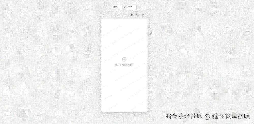
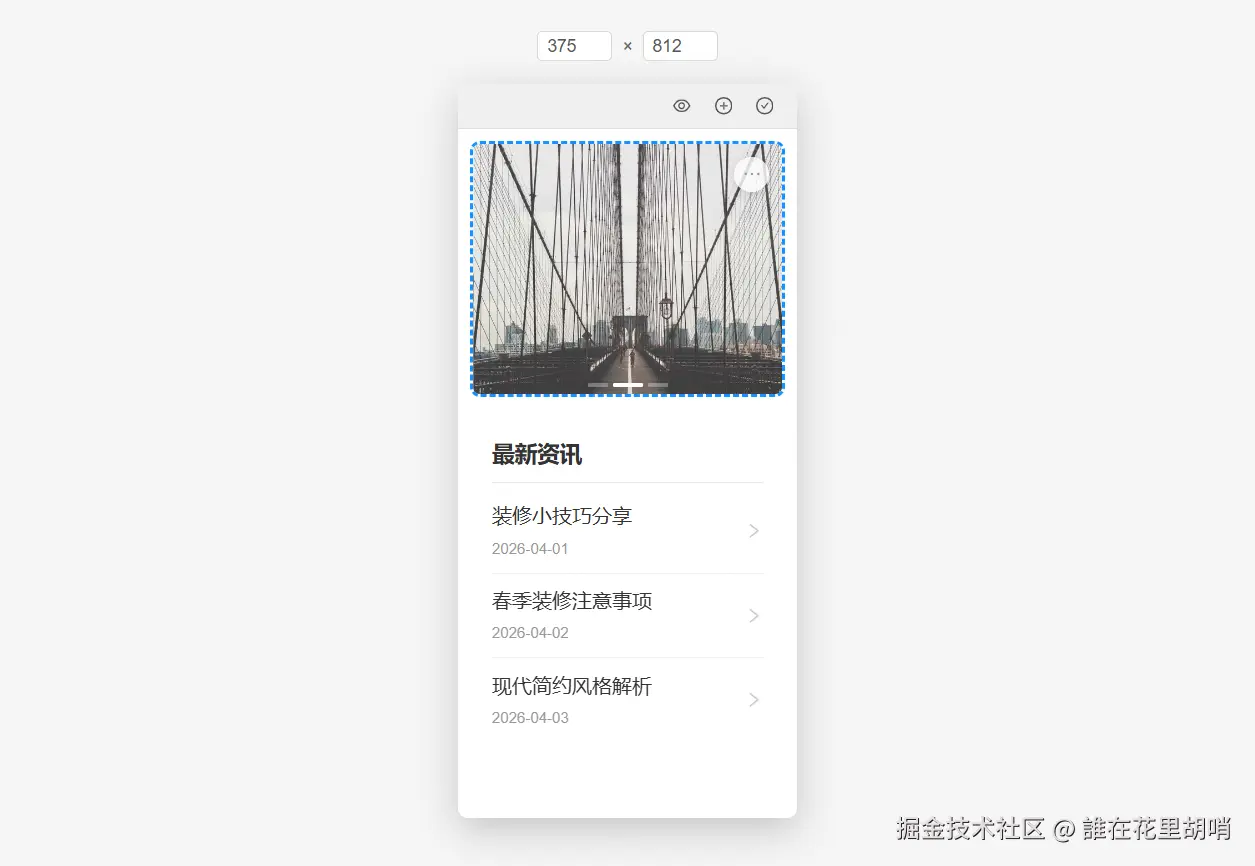
- 📱 移动端预览:支持自定义尺寸的移动端预览界面
- 🎨 组件编辑:实时编辑组件属性,所见即所得
- 📦 组件库:可扩展的组件库系统
- 🎯 拖拽排序:支持组件的拖拽排序功能
- 🔧 尺寸调整:可自定义预览区域尺寸,保持等比例缩放
技术栈
- Vue 2
- Ant Design Vue 1.x
- vuedraggable
目录结构
bash
src/
├── components/
│   └── DecorationBuilder/          # 装修工具主目录
│       ├── bases/                  # 基础组件
│       │   ├── Editor/             # 属性编辑器
│       │   ├── Preview/            # 移动端预览组件
│       │   │   ├── components/     # 预览组件的子组件
│       │   │   │   ├── BrowserToolbar/ # 浏览器工具栏
│       │   │   │   └── SizeEditor/     # 尺寸编辑器
│       │   └── Selector/           # 组件选择器
│       ├── config/                 # 配置文件
│       │   ├── componentTypes.js   # 组件类型定义
│       │   └── settings.js         # 全局设置
│       ├── widgets/                # 自定义组件
│       │   ├── Banner/             # 轮播图组件
│       │   ├── News/               # 新闻列表组件
│       │   └── index.js            # 组件注册表
│       └── index.vue               # 装修工具主入口
└── utils/
    ├── componentUtils.js           # 组件相关工具函数
    └── index.js                    # 通用工具函数
graph TD
A[DecorationBuilder] --> B[bases]
A --> C[config]
A --> D[widgets]
A --> E[index.vue]
B --> F[Editor]
B --> G[Preview]
B --> H[Selector]
G --> I[components]
I --> J[BrowserToolbar]
I --> K[SizeEditor]
C --> L[componentTypes.js]
C --> M[settings.js]
D --> N[Banner]
D --> O[News]
D --> P[index.js]
核心组件说明
1. DecorationBuilder (主入口)
- 文件:
src/components/DecorationBuilder/index.vue - 功能:整合预览、编辑器和选择器组件,管理组件数据和交互逻辑
2. Preview (预览组件)
- 文件:
src/components/DecorationBuilder/bases/Preview/index.vue - 功能:展示移动端预览界面,支持组件拖拽排序
- 子组件:
- BrowserToolbar:浏览器工具栏,包含预览、添加组件、发布等功能
- SizeEditor:尺寸编辑器,用于调整预览区域大小
3. Editor (属性编辑器)
- 文件:
src/components/DecorationBuilder/bases/Editor/index.vue - 功能:动态加载组件编辑器,允许编辑组件属性
4. Selector (组件选择器)
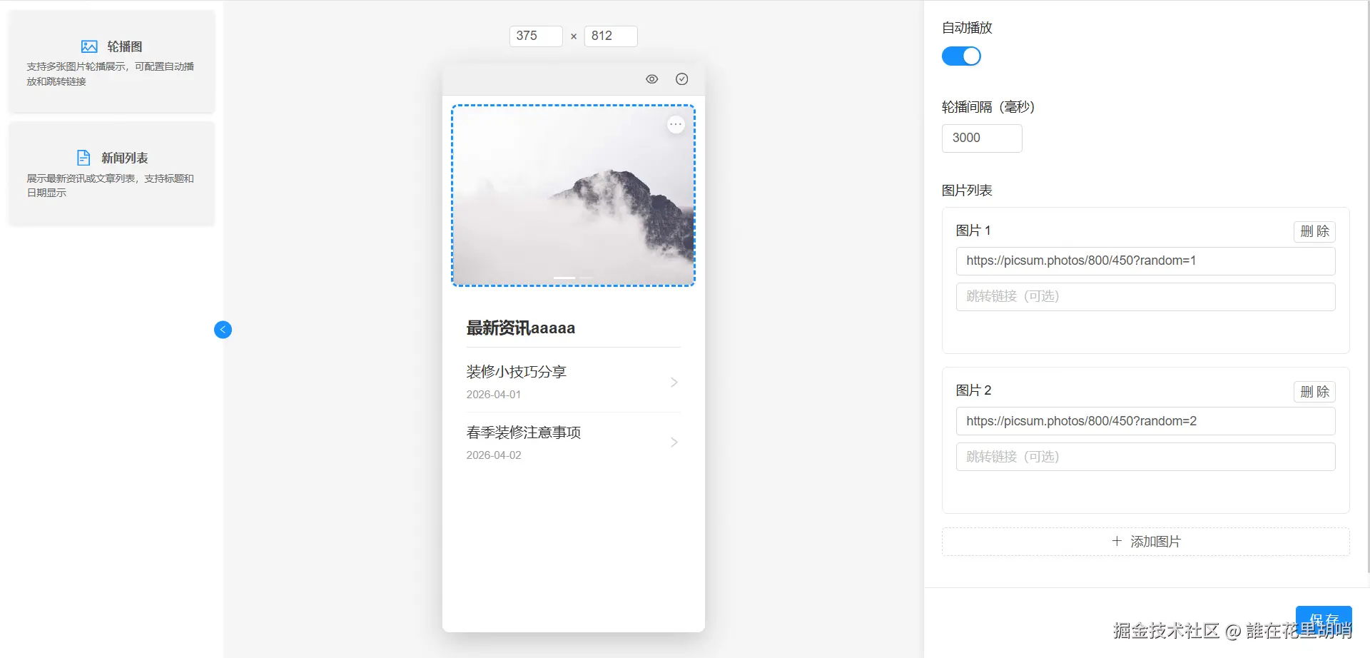
- 文件:
src/components/DecorationBuilder/bases/Selector/index.vue - 功能:展示所有可用组件,支持选择组件添加到预览区
配置文件说明
componentTypes.js
- 定义组件类型枚举和元数据
- 包含组件的显示名称、描述、图标等信息
javascript
export const COMPONENT_TYPES = {
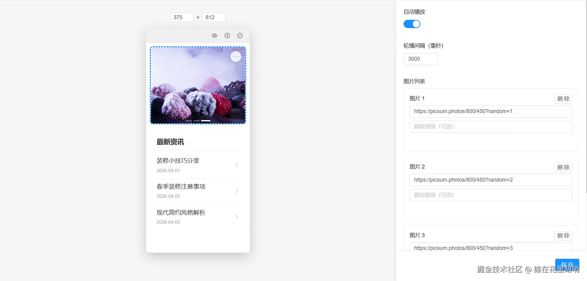
BANNER: 'banner', // 轮播图
NEWS_LIST: 'news-list' // 新闻列表
}
export const COMPONENT_METADATA = {
[COMPONENT_TYPES.BANNER]: {
name: '轮播图',
description: '支持多张图片轮播展示',
icon: 'picture',
category: '基础组件'
}
// ...
}settings.js
- 全局配置文件,包含预览设置等
javascript
export const PREVIEW_SETTINGS = {
  MOBILE_WIDTH: 375,         // 默认移动端宽度
  MOBILE_HEIGHT: 812         // 默认移动端高度
}
组件工具函数
文件:src/utils/componentUtils.js
主要功能:
getComponentMetadata():获取组件元数据getAllComponentTypes():获取所有组件类型getWidgetConfig():获取组件配置getWidgetDefaultProps():获取组件默认属性getWidgetPreview():获取预览组件getWidgetEditor():获取编辑组件
组件映射关系
| 组件类型 | 组件名称 | 预览组件 | 编辑组件 |
|---|---|---|---|
| banner | 轮播图 | BannerPreview | BannerEditor |
| news-list | 新闻列表 | NewsPreview | NewsEditor |
数据格式说明
标准组件数据格式
json
[
  {
    "id": "1234567890",
    "type": "banner",
    "props": {
      "images": [
        { "url": "https://example.com/image1.jpg", "link": "" },
        { "url": "https://example.com/image2.jpg", "link": "" }
      ],
      "autoPlay": true,
      "interval": 3000,
      "dots": true,
      "arrows": false
    }
  },
  {
    "id": "0987654321",
    "type": "news-list",
    "props": {
      "title": "最新资讯",
      "news": [
        { "id": 1, "title": "新闻标题1", "date": "2026-04-16", "link": "" },
        { "id": 2, "title": "新闻标题2", "date": "2026-04-17", "link": "" }
      ],
      "showDate": true,
      "showArrow": true,
      "maxItems": 5
    }
  }
]
字段说明
- id:组件唯一标识符,由系统自动生成
- type :组件类型,对应
COMPONENT_TYPES中的值 - props:组件属性,包含所有可配置的参数
数据来源
- 默认数据 :组件的初始默认属性来自各组件的
index.js文件中的defaultProps - 用户配置:用户在编辑器中修改的属性会覆盖默认属性
- 保存/发布:最终的组件数据会以标准JSON格式保存或发布
使用方式
- 前端渲染:通过组件类型动态加载对应的预览组件,并传入props进行渲染
- 后端存储:可以将JSON数据存储到后端数据库中
- 页面加载:从后端获取JSON数据后,可以直接传递给DecorationBuilder组件进行渲染
添加新组件指南
以添加一个"轮播的通知公告"组件为例:
1. 创建组件目录和文件
在 src/components/DecorationBuilder/widgets/ 下创建新组件目录:
bash
NotificationBanner/
├── index.js           # 组件配置文件
├── preview.vue        # 预览组件
└── editor.vue         # 编辑组件
2. 编写组件配置文件 (index.js)
javascript
import NotificationBannerPreview from './preview.vue'
import NotificationBannerEditor from './editor.vue'
import { COMPONENT_TYPES } from '../../config/componentTypes'

export default {
  type: COMPONENT_TYPES.NOTIFICATION_BANNER,  // 需要在componentTypes.js中定义
  Preview: NotificationBannerPreview,
  Editor: NotificationBannerEditor,
  defaultProps: {
    // 组件默认属性
    notifications: [
      { id: 1, content: '通知内容1' },
      { id: 2, content: '通知内容2' }
    ],
    autoPlay: true,
    interval: 2000
  }
}
3. 编写预览组件 (preview.vue)
vue
<template>
  <div class="notification-banner">
    <!-- 轮播的通知内容 -->
  </div>
</template>

<script>
export default {
  name: 'NotificationBannerPreview',
  props: {
    component: {
      type: Object,
      required: true
    }
  }
}
</script>

<style scoped>
/* 组件样式 */
</style>
4. 编写编辑组件 (editor.vue)
vue
<template>
  <div class="notification-banner-editor">
    <!-- 属性编辑表单 -->
  </div>
</template>

<script>
export default {
  name: 'NotificationBannerEditor',
  props: {
    component: {
      type: Object,
      required: true
    }
  }
}
</script>
5. 注册组件类型
在 src/components/DecorationBuilder/config/componentTypes.js 中添加组件类型:
javascript
export const COMPONENT_TYPES = {
  // ... 现有类型
  NOTIFICATION_BANNER: 'notification-banner'  // 新增通知公告类型
}

export const COMPONENT_METADATA = {
  // ... 现有元数据
  [COMPONENT_TYPES.NOTIFICATION_BANNER]: {
    name: '通知公告',
    description: '轮播展示通知内容',
    icon: 'bell',
    category: '基础组件'
  }
}
6. 注册组件
在 src/components/DecorationBuilder/widgets/index.js 中导入并注册新组件:
javascript
import BannerComponent from './Banner'
import NewsComponent from './News'
import NotificationBannerComponent from './NotificationBanner'  // 导入新组件

export const widgets = [
  BannerComponent,
  NewsComponent,
  NotificationBannerComponent  // 注册新组件
]
注意事项
- 所有组件必须遵循相同的命名和目录结构
- 新组件必须在
componentTypes.js中定义类型和元数据 - 预览组件和编辑组件必须正确导出
- 默认属性应该在组件的
index.js中定义