文章目录
共享元素转场实现搜索转场
场景描述
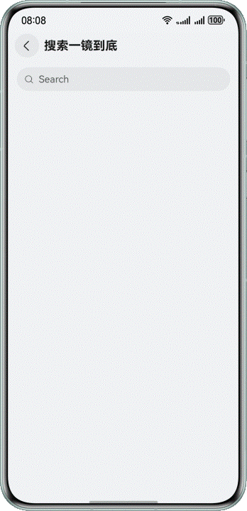
在日常的各类应用交互场景中,搜索转场是极为常见的页面转场。通过点击当前页面的搜索栏会跳转进入搜索输入页面,详细效果如下所示。
图11 共享元素转场实现搜索转场
实现原理
在本案例中,搜索框会在转场中持续存在,且在转场前后有位置上的变化,可以使用共享元素转场让搜索框在转场过程中进行丝滑的上下文过渡。其实现步骤如下所示。
- 在转场前的页面中,在搜索组件上设置geometryTransition属性和唯一ID。同时,需要配合显示动画animateTo才能实现动画效果。
- 在转场后的页面中,在搜索组件上设置geometryTransition属性,并绑定唯一ID。
开发步骤
在转场前页面的搜索组件Search上设置geometryTransition属性,并在Search的onTouch中设置显示动画animateTo,其中curve为动画曲线。
typescript
@Entry
@Component
struct SearchLongTakeTransitionPageOne {
  @State translateY: number = 0;
  @State transitionEffect: TransitionEffect = TransitionEffect.IDENTITY;
  private pageInfos: NavPathStack = new NavPathStack();

  build() {
    NavDestination() {
      Column({ space: 20 }) {
        Search({ placeholder: 'Search' })
          .height(40)
          .placeholderColor($r('sys.color.mask_secondary'))
          .width('100%')
          // set geometry transition
          .geometryTransition('SEARCH_ONE_SHOT_DEMO_TRANSITION_ID', { follow: true })
          .backgroundColor('#0D000000')
          .defaultFocus(false)
          .focusOnTouch(false)
          .focusable(false)
          .onTouch((event: TouchEvent) => {
            if (event.type === TouchType.Up) {
              // set search animation
              this.showSearchPage();
            }
          })
      }
      .size({
        width: '90%',
        height: '100%'
      })
    }
    .transition(TransitionEffect.OPACITY)
    .backgroundColor('#F1F3F5')
    .title(getResourceString(this.getUIContext(), $r('app.string.search_title'), this))
    .onReady((context: NavDestinationContext) => {
      this.pageInfos = context.pathStack;
    })
    .onBackPressed(() => {
      this.transitionEffect = TransitionEffect.IDENTITY;
      this.pageInfos.pop(true);
      return true;
    })
  }

  // Search animation
  private showSearchPage(): void {
    this.transitionEffect = TransitionEffect.OPACITY;
    this.getUIContext().animateTo({
      curve: curves.interpolatingSpring(0, 1, 342, 38)
    }, () => {
      this.pageInfos.pushPath({ name: 'SearchLongTakeTransitionPageTwo' }, false);
    })
  }
}
代码逻辑走读:
- 组件定义与状态初始化 :
- 使用
@Entry和@Component装饰器定义了一个名为SearchLongTakeTransitionPageOne的组件。 - 初始化了两个状态变量
translateY和transitionEffect,用于控制页面动画效果。 - 创建了一个
NavPathStack实例pageInfos,用于管理页面导航路径。
- 使用
- 页面构建 :
- 使用
NavDestination组件构建页面。 - 在
Column布局中嵌入了一个Search组件,设置了搜索框的高度、宽度、背景色等属性。 - 为搜索框添加了
geometryTransition效果,使其在导航时具有过渡动画。 - 设置了搜索框的触摸事件处理函数,当用户抬起手指时,调用
showSearchPage方法。
- 使用
- 页面过渡效果 :
- 使用
transition方法设置页面进入和退出的过渡效果为透明度变化。 - 设置了页面的背景色和标题。
- 使用
- 页面事件处理 :
- 在页面准备就绪时,获取当前的导航路径栈并存储在
pageInfos中。 - 处理返回按钮事件,当用户按下返回按钮时,将
transitionEffect设置为IDENTITY,并从导航路径栈中弹出当前页面。
- 在页面准备就绪时,获取当前的导航路径栈并存储在
- 搜索动画 :
- 定义了
showSearchPage方法,该方法在用户触摸搜索框时被调用。 - 该方法通过
animateTo方法实现页面透明度的动画变化,并在动画结束时将新的页面路径推入导航路径栈中。
- 定义了
在转场后的页面的搜索组件Search上绑定唯一ID。
typescript
@Component
export default struct SearchLongTakeTransitionPageTwo {
  @Prop param: SearchPageExtraInfo;
  private pageInfos: NavPathStack = new NavPathStack();

  build() {
    NavDestination() {
      Column() {
        Row({ space: 8 }) {
          Image($r('app.media.img'))
            .width(40)
            .height(40)
            .onClick(() => {
              this.onArrowClicked();
            })
            .transition(TransitionEffect.asymmetric(
              TransitionEffect.OPACITY
                .animation({ duration: 200, delay: 150, curve: curves.cubicBezierCurve(0.33, 0, 0.67, 1) }),
              TransitionEffect.OPACITY
                .animation({ duration: 200, curve: curves.cubicBezierCurve(0.33, 0, 0.67, 1) })
            ))

          Search({ placeholder: 'DevEco Studio' })
            .height(40)
            .placeholderColor($r('sys.color.mask_secondary'))
            .width('85%')
            .backgroundColor('#0D000000')
            .height(40)
            // bind geometry id
            .geometryTransition('SEARCH_ONE_SHOT_DEMO_TRANSITION_ID')
            .transition(TransitionEffect.opacity(0.99))
            .defaultFocus(true)
            .focusOnTouch(true)
        }
        .width('100%')
        .height(50)
        .alignItems(VerticalAlign.Center)
        .padding(16)
      }
      .size({
        width: '100%',
        height: '100%'
      })
      .margin({ top: 16 })
    }
    .transition(TransitionEffect.OPACITY)
    .hideTitleBar(true)
    .backgroundColor('#F1F3F5')
    .onReady((context: NavDestinationContext) => {
      this.pageInfos = context.pathStack;
    })
    .onBackPressed(() => {
      this.getUIContext().animateTo({
        curve: curves.interpolatingSpring(0, 1, 342, 38),
      }, () => {
        this.pageInfos.pop(false);
      })
      return true;
    })
  }

  private onArrowClicked(): void {
    this.getUIContext().animateTo({
      curve: curves.interpolatingSpring(0, 1, 342, 38)
    }, () => {
      this.pageInfos.pop(false);
    })
  }
}
代码逻辑走读:
- 组件定义与属性声明 :
- 使用
@Component和export default定义了一个结构体组件。 - 声明了一个属性
param,类型为SearchPageExtraInfo。 - 定义了一个私有变量
pageInfos,类型为NavPathStack,用于存储导航路径。
- 使用
- 构建UI结构 :
- 使用
NavDestination定义导航目的地。 - 在
NavDestination内部使用Column布局。 - 在
Column内部使用Row布局,包含一个Image和一个Search组件。
- 使用
- 图像组件配置 :
- 配置了
Image组件,设置宽度、高度,并绑定点击事件onArrowClicked。 - 使用过渡效果
TransitionEffect.asymmetric来处理图像的透明度变化。
- 配置了
- 搜索框组件配置 :
- 配置了
Search组件,设置高度、占位符颜色、背景颜色等。 - 绑定了几何过渡效果
geometryTransition。 - 使用过渡效果
TransitionEffect.opacity来处理透明度变化。
- 配置了
- 布局样式与事件处理 :
- 设置了
Row的宽度、高度、对齐方式和内边距。 - 设置了
Column的大小、外边距和背景颜色。 - 配置了导航目的地的过渡效果
TransitionEffect.OPACITY。 - 处理了返回按钮的点击事件,使用动画效果从当前页面返回上一页。
- 设置了
- 辅助功能方法 :
- 定义了私有方法
onArrowClicked,用于处理返回按钮的点击事件。 - 在
onBackPressed中,使用动画效果处理页面返回操作。
- 定义了私有方法
模态转场模板实现通用转场
场景描述
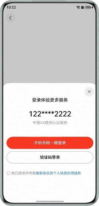
如图所示,在进入第一个页面时为半模态转场,通过半模态展现多种登录的方式。点击进入第二个页面时为全模态转场,展示了手机验证码登录页面。
图12 模态转场实现通用转场
实现原理
在半模态转场和全模态转场中,两者实现的步骤基本相同,具体调用的接口有差异,详细实现步骤如下所示。
- 定义模态展示界面,即提前准备需要展示的页面。
- 通过模态接口调起模态展示界面。半模态转场使用bindSheet接口,全模态转场使用bindContentCover接口。通过模态接口绑定模态展示界面。
- 设置接口参数,选择转场动画。
开发步骤
-
在半模态转场中,首先需要准备模态展示的页面,再通过bindSheet绑定模态展示界面。
typescript@Component export struct HalfModalWindow { @Consume('NavPathStack') pageInfos: NavPathStack; // Whether to display the half-screen modal page. @State isPresent: boolean = false; // half-mode height @State sheetHeight: number = Constants.FONT_WEIGHT; // Whether to display the control bar @State showDragBar: boolean = true; // Determine whether to agree with the agreement @State isConfirmed: boolean = false; // Controlling Full-Modal Presentation @State isPresentInLoginView: boolean = false; // Transparency of the button for sending a verification code @State op: number = Constants.HALF_OPACITY; // Specifies the transition type // The value is false when the component is redirected from the semi-modal component to the mobile verification code component // and the value is true when the component is redirected from the account password component to the mobile verification code component @State isShowTransition: boolean = false; @State isCenter: boolean = true; @State screenW: number = 0; // According to the mode attribute description of Navigation // if Auto is used and the window width is greater than or equal to 600 vp, the Split mode is used for display curFoldStatus: display.FoldStatus | undefined = undefined; // Folded state of the current screen (valid only for devices with folded screens) // When the window width is less than 600 vp, the window is displayed in stack mode private deviceSize: number = Constants.DEFAULT_DEVICE_SIZE; // ... @Builder defaultLogin() { Column() { // CheckBox to control, semi-modal, full-modal, and semi-modal confirmations in the login page CaptchaLogin({ isPresent: $isPresent, isPresentInLoginView: $isPresentInLoginView, isShowTransition: $isShowTransition }) } } @Builder halfModalLogin() { // semi-modal window page Column() { Text($r('app.string.multimodaltransion_after_login_more_service')) .fontColor(Color.Black) .fontSize($r('app.integer.font_size_normal')) .padding({ top: $r('app.integer.padding_top_large') }) Text($r('app.string.multimodaltransion_user_phone_number')) .fontColor(Color.Black) .fontSize($r('app.integer.font_size_large')) .fontWeight(Constants.FONT_WEIGHT_SM) .padding({ top: $r('app.integer.font_size_large'), bottom: $r('app.integer.multimodaltransion_margin_default') }) Text($r('app.string.multimodaltransion_get_service')) .fontColor($r('app.color.multimodaltransion_grey_9')) .fontSize($r('app.integer.multimodaltransion_row_text_font_size')) .padding({ bottom: $r('app.integer.multimodaltransion_height_fifty') }) Button($r('app.string.multimodaltransion_phone_start_login')) .fontColor(Color.White) .type(ButtonType.Normal) .backgroundColor($r('app.color.multimodaltransion_red')) .onClick(() => { try { if (this.isConfirmed) { this.getUIContext() .getPromptAction() .showToast({ message: $r('app.string.multimodaltransion_login_success') }); AppStorage.set('login', true); this.pageInfos.pop(); } else { this.getUIContext() .getPromptAction() .showToast({ message: $r('app.string.multimodaltransion_please_read_and_agree') }); } } catch (err) { let error = err as BusinessError; hilog.error(0x0000, 'HalfModalWindow', `login failed. error code=${error.code}, message=${error.message}`); } }) .width($r('app.string.multimodaltransion_size_ninety_percent')) .height($r('app.integer.multimodaltransion_height_fifty')) .margin({ left: $r('app.integer.main_page_padding2'), right: $r('app.integer.main_page_padding2'), bottom: $r('app.integer.multimodaltransion_row_padding_bottom') }) Button($r('app.string.multimodaltransion_captcha_login_text')) .fontColor(Color.Black) .borderRadius($r('app.integer.multimodaltransion_border_radius')) .type(ButtonType.Normal) .backgroundColor($r('app.color.multimodaltransion_btn_bgc')) .border({ color: $r('app.color.multimodaltransion_half_modal_btn_bgc'), width: Constants.DEFAULT_ONE }) .onClick(() => { if (this.isConfirmed) { this.isPresentInLoginView = true; this.isConfirmed = false; this.isShowTransition = false; } else { try { this.getUIContext() .getPromptAction() .showToast({ message: $r('app.string.multimodaltransion_please_read_and_agree') }); } catch (err) { let error = err as BusinessError; hilog.error(0x0000, 'HalfModalWindow', `code login failed. error code=${error.code}, message=${error.message}`); } } }) .width($r('app.string.multimodaltransion_size_ninety_percent')) .height($r('app.integer.multimodaltransion_height_fifty')) .margin({ bottom: $r('app.integer.font_size_large') }) Blank() Row() { Checkbox({ name: Constants.CHECK_BOX_NAME1 }) .select(this.isConfirmed) .width($r('app.integer.font_size_sm')) .onChange((value: boolean) => { this.isConfirmed = value; }) Text() { Span($r('app.string.multimodaltransion_read_and_agree')) .fontColor($r('app.color.multimodaltransion_grey_9')) Span($r('app.string.multimodaltransion_server_proxy_rule_detail')) .fontColor($r('app.color.multimodaltransion_note_color')) .onClick(() => { try { this.getUIContext() .getPromptAction() .showToast({ message: $r('app.string.multimodaltransion_only_show_ui') }); } catch (err) { let error = err as BusinessError; hilog.error(0x0000, 'HalfModalWindow', `rule detail. error code=${error.code}, message=${error.message}`); } }) }.fontSize($r('app.integer.font_size_sm')) } .margin({ left: $r('app.integer.multimodaltransion_other_ways_icon_height') }) .width($r('app.string.multimodaltransion_size_full')) } } build() { NavDestination() { Column() { //The Text component is bound for semi-modal display Text() .bindSheet($$this.isPresent, this.halfModalLogin(), { height: this.sheetHeight, dragBar: this.showDragBar, preferType: this.isCenter ? SheetType.CENTER : SheetType.POPUP, backgroundColor: $r('app.color.multimodaltransion_btn_bgc'), showClose: true, shouldDismiss: ((sheetDismiss: SheetDismiss) => { sheetDismiss.dismiss(); this.pageInfos.pop(); }) }) // ... } .expandSafeArea([SafeAreaType.SYSTEM], [SafeAreaEdge.TOP, SafeAreaEdge.BOTTOM]) .justifyContent(FlexAlign.Center) .size({ width: $r('app.string.multimodaltransion_size_full'), height: $r('app.string.multimodaltransion_size_full') }) .padding($r('app.integer.multimodaltransion_padding_default')) } } }代码逻辑走读:
- 组件定义与状态初始化 :
- 使用
@Component和@State装饰器定义组件及其状态变量,如isPresent、sheetHeight、showDragBar等,用于控制窗口的显示和属性。
- 使用
- 资源引用与布局构建 :
- 使用
$r函数引用应用中的字符串、颜色、尺寸等资源,用于设置文本、按钮等UI元素的属性。 - 使用
Column、Text、Button、Checkbox等组件构建UI布局,通过链式调用设置组件的样式和事件处理。
- 使用
- 事件处理与状态更新 :
- 在按钮点击事件中,根据
isConfirmed状态判断用户是否同意协议,并执行相应的逻辑,如显示提示信息或存储登录状态。 - 在
Checkbox的onChange事件中,更新isConfirmed状态,以反映用户是否选择了确认选项。
- 在按钮点击事件中,根据
- 模态窗口绑定与显示控制 :
- 使用
bindSheet方法将文本组件绑定到半屏模态窗口,通过状态变量控制窗口的显示和属性,如高度、控制栏显示类型等。 - 在模态窗口关闭时,通过
shouldDismiss回调函数处理窗口关闭后的逻辑,如返回上一级页面。
- 使用
- 设备状态适应与全屏处理 :
- 根据设备的屏幕状态(如是否为折叠屏)和当前窗口状态,调整窗口的显示模式和属性,以提供更好的用户体验。
- 组件定义与状态初始化 :
-
在全模态转场中,其实现步骤与半模态转场类似,代码如下所示。
typescript@Component export struct HalfModalWindow { @Consume('NavPathStack') pageInfos: NavPathStack; // Whether to display the half-screen modal page. @State isPresent: boolean = false; // half-mode height @State sheetHeight: number = Constants.FONT_WEIGHT; // Whether to display the control bar @State showDragBar: boolean = true; // Determine whether to agree with the agreement @State isConfirmed: boolean = false; // Controlling Full-Modal Presentation @State isPresentInLoginView: boolean = false; // Transparency of the button for sending a verification code @State op: number = Constants.HALF_OPACITY; // Specifies the transition type // The value is false when the component is redirected from the semi-modal component to the mobile verification code component // and the value is true when the component is redirected from the account password component to the mobile verification code component @State isShowTransition: boolean = false; @State isCenter: boolean = true; @State screenW: number = 0; // According to the mode attribute description of Navigation // if Auto is used and the window width is greater than or equal to 600 vp, the Split mode is used for display curFoldStatus: display.FoldStatus | undefined = undefined; // Folded state of the current screen (valid only for devices with folded screens) // When the window width is less than 600 vp, the window is displayed in stack mode private deviceSize: number = Constants.DEFAULT_DEVICE_SIZE; // ... @Builder defaultLogin() { Column() { // CheckBox to control, semi-modal, full-modal, and semi-modal confirmations in the login page CaptchaLogin({ isPresent: $isPresent, isPresentInLoginView: $isPresentInLoginView, isShowTransition: $isShowTransition }) } } // ... build() { NavDestination() { Column() { //The Text component is bound for semi-modal display // ... //The Text component is bound as the full-screen modal display of the mobile phone verification code component and the account and password component Text() .bindContentCover($$this.isPresentInLoginView, this.defaultLogin()) } .expandSafeArea([SafeAreaType.SYSTEM], [SafeAreaEdge.TOP, SafeAreaEdge.BOTTOM]) .justifyContent(FlexAlign.Center) .size({ width: $r('app.string.multimodaltransion_size_full'), height: $r('app.string.multimodaltransion_size_full') }) .padding($r('app.integer.multimodaltransion_padding_default')) } } }代码逻辑走读:
- 组件定义与状态初始化 :
- 使用
@Component装饰器定义了一个名为HalfModalWindow的组件。 - 通过
@State装饰器定义了一系列状态变量,如isPresent(是否显示半屏模态窗口)、sheetHeight(半屏模态窗口的高度)、showDragBar(是否显示控制栏)等。
- 使用
- 状态变量的用途 :
isPresent:控制半屏模态窗口的显示与隐藏。sheetHeight:设置半屏模态窗口的高度。showDragBar:决定是否显示控制栏。isConfirmed:在登录页面中控制是否确认协议。isPresentInLoginView:控制是否在登录视图中显示全屏模态窗口。op:控制按钮的透明度。isShowTransition:决定是否显示过渡效果。isCenter:控制窗口是否居中显示。screenW:存储屏幕宽度。curFoldStatus:存储当前设备的折叠状态。deviceSize:存储当前设备的尺寸。
- 方法定义 :
defaultLogin:定义了一个构建登录页面的方法,其中使用了CaptchaLogin组件来控制登录页面中的半屏、全屏模态窗口及确认操作。build:构建组件的UI结构,使用NavDestination和Column布局,并通过Text组件进行内容绑定。
- UI布局与状态绑定 :
- 在
build方法中,使用Column布局来组织UI元素。 - 使用
Text组件绑定半屏和全屏模态窗口的显示内容。 - 通过
$$语法将状态变量绑定到组件属性上,实现动态更新UI。
- 在
- 安全区域处理 :
- 使用
.expandSafeArea方法来扩展安全区域,确保UI元素不会被系统UI遮挡。
- 使用
- 布局属性设置 :
- 使用
.justifyContent(FlexAlign.Center)来设置布局的对齐方式为居中。
rFoldStatus`:存储当前设备的折叠状态。 deviceSize:存储当前设备的尺寸。
- 使用
- 组件定义与状态初始化 :