作者:前端开发工程师 | 更新时间:2026年5月
本文涵盖 CSS3 新增背景属性、边框圆角、外轮廓、文本样式、渐变、滤镜、Web 字体等核心知识,配合完整可运行示例、MDN 标准解析与真实网站案例,带你从原理到实践全面掌握。
目录
- 一、知识脉络总览
- [CSS3 已学知识回顾](#CSS3 已学知识回顾)
- [二、CSS3 新增背景属性](#二、CSS3 新增背景属性)
- [2.1 background-origin --- 背景定位原点](#2.1 background-origin — 背景定位原点)
- [2.2 background-clip --- 背景显示区域](#2.2 background-clip — 背景显示区域)
- [2.3 background-size --- 背景图像尺寸](#2.3 background-size — 背景图像尺寸)
- [2.4 background-attachment --- 背景固定方式](#2.4 background-attachment — 背景固定方式)
- [2.5 background 复合属性](#2.5 background 复合属性)
- [2.6 多背景图](#2.6 多背景图)
- [三、CSS3 新增边框属性](#三、CSS3 新增边框属性)
- [3.1 border-radius --- 边框圆角](#3.1 border-radius — 边框圆角)
- [3.2 outline --- 外轮廓](#3.2 outline — 外轮廓)
- [四、CSS3 新增文本属性](#四、CSS3 新增文本属性)
- [4.1 文本属性总表](#4.1 文本属性总表)
- [4.2 text-align-last --- 最后一行对齐](#4.2 text-align-last — 最后一行对齐)
- [4.3 word-wrap / overflow-wrap / word-break 区别详解](#4.3 word-wrap / overflow-wrap / word-break 区别详解)
- [4.4 white-space --- 文本显示格式](#4.4 white-space — 文本显示格式)
- [4.5 单行/多行文本省略号 ⭐](#4.5 单行/多行文本省略号 ⭐)
- [4.6 text-decoration --- 文本修饰线](#4.6 text-decoration — 文本修饰线)
- [4.7 text-shadow --- 文本阴影](#4.7 text-shadow — 文本阴影)
- [五、CSS3 渐变](#五、CSS3 渐变)
- [5.1 线性渐变 --- linear-gradient()](#5.1 线性渐变 — linear-gradient())
- [5.2 径向渐变 --- radial-gradient()](#5.2 径向渐变 — radial-gradient())
- [5.3 重复渐变 --- repeating-gradient()](#5.3 重复渐变 — repeating-gradient())
- [六、Filter 滤镜](#六、Filter 滤镜)
- 滤镜函数总表
- [drop-shadow() vs box-shadow 核心区别](#drop-shadow() vs box-shadow 核心区别)
- [七、Web 字体与字体图标](#七、Web 字体与字体图标)
- [7.1 字体格式与兼容性](#7.1 字体格式与兼容性)
- [7.2 字体子集化 --- unicode-range](#7.2 字体子集化 — unicode-range)
- [7.3 完整可运行示例 --- Web 字体](#7.3 完整可运行示例 — Web 字体)
- [7.4 字体图标(Icon Fonts)](#7.4 字体图标(Icon Fonts))
- 八、综合案例
- [8.1 渐变文字效果](#8.1 渐变文字效果)
- [8.2 发廊灯效果](#8.2 发廊灯效果)
- [8.3 CSS3 精品商城综合页](#8.3 CSS3 精品商城综合页)
- 九、知识点总结与速查表
- [9.1 背景属性速查](#9.1 背景属性速查)
- [9.2 圆角常用速查](#9.2 圆角常用速查)
- [9.3 文本处理速查](#9.3 文本处理速查)
- [9.4 渐变选择速查](#9.4 渐变选择速查)
- [9.5 filter 滤镜速查](#9.5 filter 滤镜速查)
- [9.6 @font-face 最佳实践](#9.6 @font-face 最佳实践)
- [9.7 知识体系总结](#9.7 知识体系总结)
- 附:本章案例文件索引
- 参考资料
一、知识脉络总览
CSS3 进阶
背景属性
background-origin
padding-box 默认
border-box
content-box
background-clip
border-box 默认
padding-box
content-box
text 渐变文字
background-size
contain
cover
具体数值
background-attachment
scroll 默认
fixed 视差
local
多背景图
边框属性
border-radius
圆角按钮
圆形头像
各种形状
outline 外轮廓
outline-offset 偏移
无障碍焦点
文本样式
text-align-last
text-decoration
word-wrap/overflow-wrap
word-break
white-space
text-overflow 省略号
text-shadow
渐变
线性渐变 linear-gradient
方向控制
颜色停止点
硬停止条纹
径向渐变 radial-gradient
圆心位置
size关键字
3D球体
重复渐变 repeating
发廊灯
稿纸横线
滤镜 filter
blur 模糊
grayscale 灰度
brightness 亮度
drop-shadow
backdrop-filter
Web字体
@font-face
字体格式优先级
unicode-range子集
字体图标 iconfont
CSS3背景增强
background-origin
定位原点
background-clip
显示区域
background-size
尺寸控制
background-attachment
固定方式
多背景图叠加
text → 渐变文字⭐
cover → 铺满容器⭐
fixed → 视差滚动⭐
CSS3 已学知识回顾
1. CSS3 选择器(共 6 大类)
   ├── 基本选择器(6个)
   ├── 层级选择器(4个):后代、子元素、相邻兄弟、通用兄弟
   ├── 属性选择器(5个):[attr] [attr="val"] [attr^="val"] [attr$="val"] [attr*="val"]
   ├── 伪类选择器(23个)
   │   ├── 动态伪类(5个)::link :visited :hover :active :focus
   │   ├── 目标伪类(1个)::target
   │   ├── 语言伪类(1个)::lang()
   │   ├── UI元素伪类(3个)::enabled :disabled :checked
   │   ├── 结构伪类(12个):child系列、of-type系列、:root、:empty
   │   └── 否定伪类(1个)::not(选择器)
   ├── 伪元素选择器:::first-letter ::first-line ::before ::after ::placeholder ::selection
   └── 权重:ID > 类/伪类/属性 > 标签名/伪元素

2. 新增盒子相关样式
   ├── display(弹性、网格等)
   ├── box-sizing:content-box / border-box
   ├── box-shadow(盒子阴影)
   ├── opacity(透明度)
   └── position: sticky(粘连定位)
二、CSS3 新增背景属性
🔤 名词解释
| 术语 | 解释 |
|---|---|
| background-origin | 背景图像定位原点 ,决定 background-position 从哪里开始计算坐标 |
| background-clip | 背景裁切区域,决定背景(颜色和图像)在哪个区域内显示 |
| background-size | 背景图像尺寸,控制背景图的缩放方式 |
| background-attachment | 背景图像固定方式,控制背景图随页面滚动的行为 |
| padding-box | 内边距盒子区域,从 border 内侧到 content 外侧 |
| border-box | 边框盒子区域,从 border 外侧开始 |
| content-box | 内容盒子区域,仅内容区域 |
| contain | 适配容器,保持图像完整,可能留白 |
| cover | 覆盖容器,保证铺满,可能裁剪图片 |
旧标准已有的背景属性(复习):
css
background-color        /* 背景颜色 */
background-image        /* 背景图像 */
background-repeat       /* 重复方式:repeat / no-repeat / repeat-x / repeat-y */
background-position     /* 定位位置 */
background-attachment   /* 固定方式:scroll / fixed / local */
2.1 background-origin --- 背景定位原点
语法:
css
background-origin: padding-box | border-box | content-box;盒模型三层结构
border 边框层
padding 内边距层
content 内容层
border-box
原点在边框左上角
padding-box
原点在padding左上角(默认)
content-box
原点在content左上角
三值对比规律:
| 属性值 | 背景图像 position 的原点 | 背景图是否在 padding/border 下显示 |
|---|---|---|
padding-box(默认) |
padding 区域左上角 | 显示在 padding + content |
border-box |
border 区域左上角 | 显示在 border + padding + content |
content-box |
content 区域左上角 | 仅显示在 content |
完整可运行示例:
html
<!DOCTYPE html>
<html lang="zh-CN">
<head>
  <meta charset="UTF-8">
  <title>background-origin 三值对比</title>
  <style>
    body { font-family: sans-serif; padding: 20px; background: #f0f0f0; }
    .container { display: flex; gap: 24px; flex-wrap: wrap; margin-top: 20px; }
    .box {
      width: 280px;
      height: 180px;
      padding: 30px;
      border: 15px dashed #e74c3c;
      background-image: url(课堂案例/images/bg03.jpg);
      background-repeat: no-repeat;
      background-position: 0 0;
      background-size: 100px auto;
      font-size: 12px;
      color: #fff;
      text-shadow: 1px 1px 3px #000;
      position: relative;
      box-sizing: content-box;
    }
    .box::before {
      content: attr(data-label);
      position: absolute;
      bottom: 6px; left: 6px;
      background: rgba(0,0,0,0.75);
      color: #fff;
      padding: 3px 8px;
      border-radius: 4px;
      font-size: 11px;
    }
    .box1 { background-origin: border-box; }
    .box2 { background-origin: padding-box; }
    .box3 { background-origin: content-box; }
  </style>
</head>
<body>
  <h2>background-origin 三种取值对比</h2>
  <p style="color:#666; font-size:14px">三个盒子均设置 background-position: 0 0,但原点位置不同,所以背景图起始位置不同。</p>
  <div class="container">
    <div class="box box1" data-label="border-box:从边框左上角开始"></div>
    <div class="box box2" data-label="padding-box(默认):从padding左上角开始"></div>
    <div class="box box3" data-label="content-box:从content左上角开始"></div>
  </div>
</body>
</html>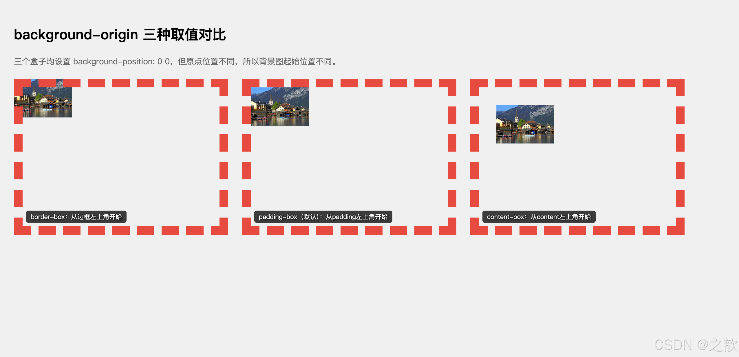
代码解说:
- 三个盒子的
background-position均为0 0,但由于background-origin不同,图片起始点完全不同。.box1设置border-box:图片从边框的左上角开始,因此会出现在虚线边框下方,背景图与边框重叠。.box2设置padding-box(默认值):图片从 padding 区域左上角开始,紧贴边框内侧。.box3设置content-box:图片从内容区左上角开始,被 padding 往内推了 30px,因此最靠内。- 用
::before伪元素配合attr(data-label)动态读取标签文字,是一种灵活的标注技巧。
💡 真实场景:
- 电商商品卡片 :
content-box确保背景图只在内容区显示,边框区域留空 - Banner 装饰 :
border-box让背景图与边框完全对齐,消除边框与背景之间的空隙
2.2 background-clip --- 背景显示区域
语法:
css
background-clip: border-box | padding-box | content-box | text;| 属性值 | 效果描述 | 应用场景 |
|---|---|---|
border-box(默认) |
背景延伸至边框区域 | 通用背景 |
padding-box |
背景延伸至内边距区域(边框下无背景) | 隐藏边框下方的背景 |
content-box |
背景仅显示在内容区域 | 强调内容区 |
text ⭐ |
背景仅显示在文字上 ,需配合 color: transparent |
渐变文字 |
⚠️
background-clip: text目前需要加-webkit-前缀:-webkit-background-clip: text
完整可运行示例 --- background-clip: text 渐变文字:
html
<!DOCTYPE html>
<html lang="zh-CN">
<head>
  <meta charset="UTF-8">
  <title>background-clip: text 渐变文字完全示例</title>
  <style>
    * { margin: 0; padding: 0; box-sizing: border-box; }
    body {
      background: #0d1117;
      display: flex;
      flex-direction: column;
      align-items: center;
      justify-content: center;
      min-height: 100vh;
      gap: 40px;
      padding: 40px;
    }
    /* 粉紫渐变 */
    .gt1 {
      font-size: 64px; font-weight: 900;
      color: transparent;
      background-image: linear-gradient(135deg, #f093fb 0%, #f5576c 100%);
      -webkit-background-clip: text;
      background-clip: text;
    }
    /* 科技蓝绿 */
    .gt2 {
      font-size: 64px; font-weight: 900;
      color: transparent;
      background-image: linear-gradient(90deg, #4facfe, #00f2fe, #43e97b);
      -webkit-background-clip: text;
      background-clip: text;
    }
    /* 图片纹理文字 */
    .gt3 {
      font-size: 64px; font-weight: 900;
      color: transparent;
      background-image: url(课堂案例/images/bg02.jpg);
      background-size: cover;
      -webkit-background-clip: text;
      background-clip: text;
    }
    /* 金属质感 */
    .gt4 {
      font-size: 64px; font-weight: 900;
      color: transparent;
      background-image: linear-gradient(180deg,
        #d4a843 0%, #f5d783 25%, #c8912f 50%, #f5d783 75%, #d4a843 100%);
      -webkit-background-clip: text;
      background-clip: text;
    }
    /* 彩虹渐变 */
    .gt5 {
      font-size: 48px; font-weight: 900;
      color: transparent;
      background-image: linear-gradient(90deg,
        #ff0000, #ff7700, #ffff00, #00ff00, #0000ff, #8b00ff);
      -webkit-background-clip: text;
      background-clip: text;
    }
  </style>
</head>
<body>
  <div class="gt1">CSS3 渐变文字</div>
  <div class="gt2">科技蓝绿渐变</div>
  <div class="gt3">图片纹理文字</div>
  <div class="gt4">金属质感标题</div>
  <div class="gt5">Rainbow Color</div>
</body>
</html>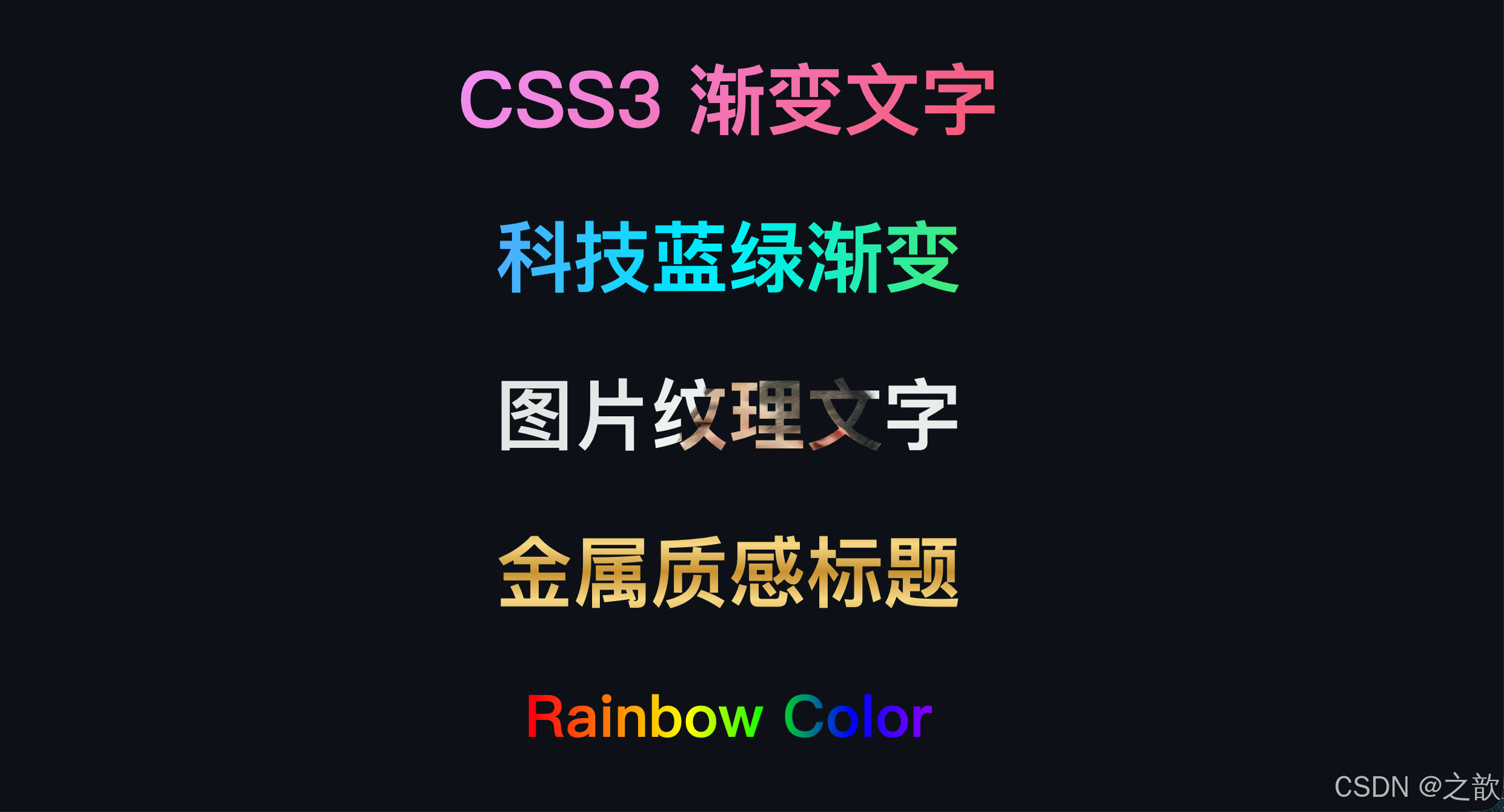
代码解说:
- 实现渐变文字的核心是两步:① 给文字设置
color: transparent让文字本身变透明;② 配合background-clip: text(需加-webkit-前缀)让背景图像只显示在文字形状内部。.gt1/.gt2演示线性渐变(linear-gradient)作为文字背景,方向不同产生不同视觉效果。.gt3使用真实图片(url())作为背景,文字会呈现出图片纹理的质感,适合标题创意设计。.gt4用180deg(竖向)渐变模拟金属反光高光:深金 → 浅金 → 深金的循环,制造金属质感。.gt5六色彩虹渐变,注意颜色停止点均匀分布,最后一个颜色不必写100%,会自动对齐。- 注意:
background-clip: text目前需要同时写-webkit-background-clip: text以兼容 Safari。
💡 真实场景:
- Apple 官网 :首页大标题使用
background-clip: text渐变效果 - 各类 SaaS 产品官网:产品名、Slogan 用彩色渐变增强视觉冲击力
- 电商促销页:限时折扣数字使用金色渐变,营造高档感
2.3 background-size --- 背景图像尺寸
语法:
css
background-size: auto | <length> | <percentage> | contain | cover;background-size
auto
原始尺寸
200px 100px
指定宽高(两值)
200px
指定宽,高度auto保持比例(一值)
contain
完整显示,可能留白⚠️
cover
铺满容器,可能裁剪⭐最常用
| 写法 | 含义 | 注意点 |
|---|---|---|
auto |
原始图片尺寸 | 小图会留白 |
200px 100px |
宽200px,高100px | 可能变形 |
200px |
宽200px,高等比缩放 | 不变形 |
50% 50% |
相对容器的百分比 | 随容器变化 |
contain |
完整显示,不裁剪 | 可能有留白 |
cover |
铺满容器 | 可能被裁剪 |
完整可运行示例:
html
<!DOCTYPE html>
<html lang="zh-CN">
<head>
  <meta charset="UTF-8">
  <title>background-size 完整对比</title>
  <style>
    body { padding: 20px; background: #f5f5f5; font-family: sans-serif; }
    .grid { display: grid; grid-template-columns: repeat(3, 1fr); gap: 16px; margin-top: 16px; }
    .box {
      height: 180px;
      border: 2px solid #3498db;
      background-image: url(课堂案例/images/bg03.jpg);
      background-repeat: no-repeat;
      background-position: center;
      background-color: #eaf4ff;
      position: relative;
      border-radius: 8px;
    }
    .label {
      position: absolute;
      bottom: 0; left: 0; right: 0;
      background: rgba(0,0,0,0.65);
      color: #fff;
      text-align: center;
      padding: 8px;
      font-size: 13px;
      border-radius: 0 0 6px 6px;
    }
    /* 六种尺寸写法 */
    .s1 { background-size: auto; }
    .s2 { background-size: 120px 60px; }
    .s3 { background-size: 120px; }
    .s4 { background-size: 50%; }
    .s5 { background-size: contain; }
    .s6 { background-size: cover; }
  </style>
</head>
<body>
  <h2>background-size 六种写法对比</h2>
  <div class="grid">
    <div class="box s1"><div class="label">auto:原始尺寸</div></div>
    <div class="box s2"><div class="label">120px 60px:指定宽高(可能变形)</div></div>
    <div class="box s3"><div class="label">120px:宽固定,高等比</div></div>
    <div class="box s4"><div class="label">50%:相对容器百分比</div></div>
    <div class="box s5"><div class="label">contain:完整显示,可能留白</div></div>
    <div class="box s6"><div class="label">cover:铺满容器 ⭐最常用</div></div>
  </div>
</body>
</html>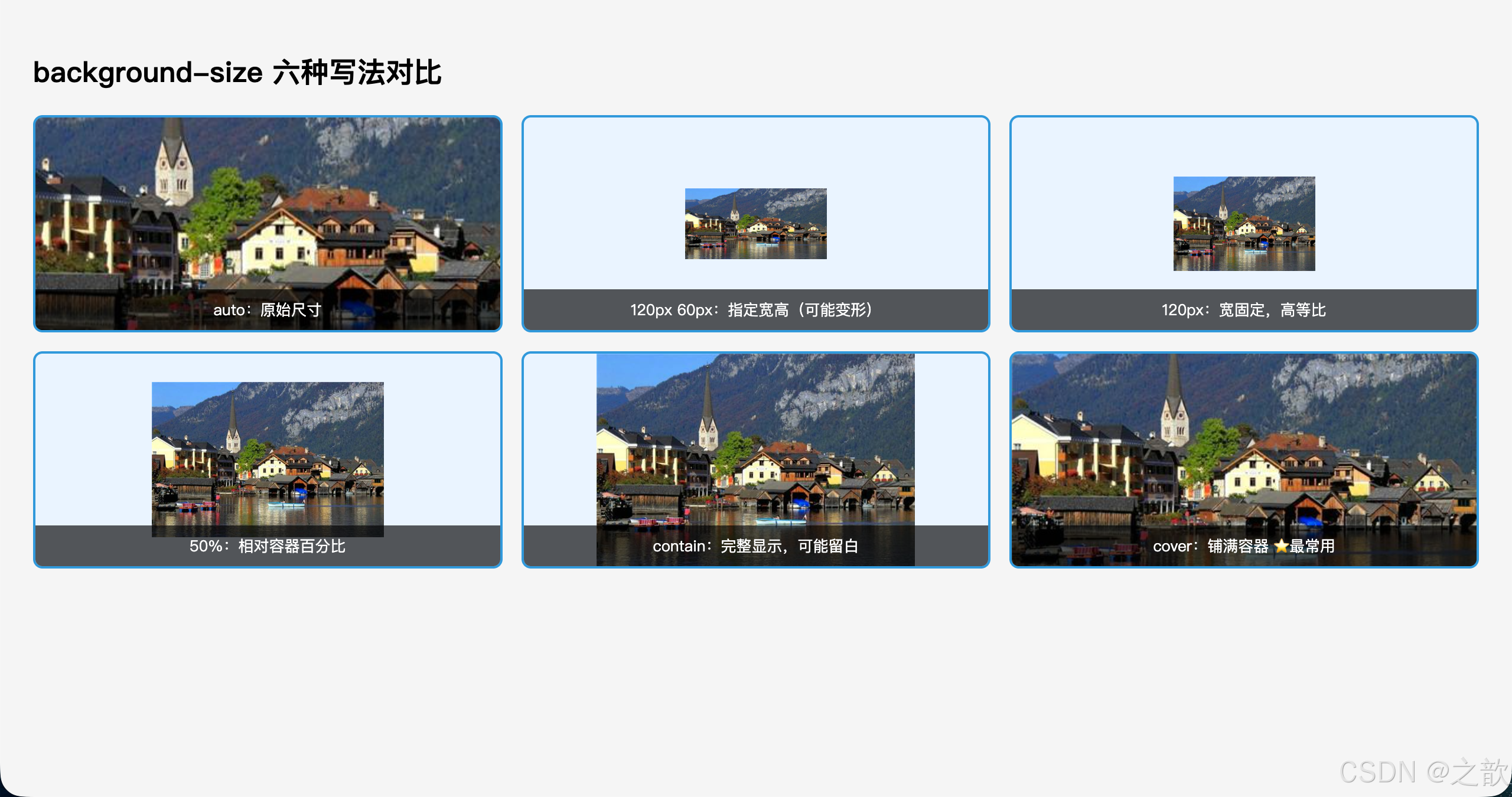
代码解说:
- 六个盒子使用同一张图片,通过
background-size的不同写法展现截然不同的显示效果。auto:图片以原始像素尺寸显示,如果图片比容器大会被裁剪,如果图片小则只占一角。120px 60px(两值写法):强制指定宽高,可能导致图片拉伸变形,一般不推荐用于照片。120px(单值写法):只指定宽度,高度自动按比例计算,不会变形,比两值写法更安全。50%:相对于容器宽度的百分比,响应式场景下图片会随容器缩放。contain:图片缩放到完整可见 为止,不裁剪,但容器剩余空间会露出背景色(#eaf4ff)。cover:图片缩放到铺满容器为止,超出容器的部分被裁剪,是首屏 Hero 背景的标准写法。
💡 真实场景:
- Hero 首屏背景 :
cover铺满全屏,是绝大多数网站首屏背景的标准写法 - 图片画廊/相册 :
contain确保缩略图完整显示不裁剪 - 品牌 Logo 背景 :
200px auto固定宽度,高度自适应比例
2.4 background-attachment --- 背景固定方式
这是一个容易被忽略但非常实用的属性,可以实现视差滚动效果。
语法:
css
background-attachment: scroll | fixed | local;background-attachment
scroll(默认)
背景相对元素固定
不随元素内容滚动
fixed
背景相对视口固定
页面滚动时背景不动
→ 视差效果⭐
local
背景随元素内容滚动
适合有滚动条的元素
| 值 | 背景固定参照 | 随页面滚动 | 随元素内容滚动 |
|---|---|---|---|
scroll(默认) |
元素本身 | ❌ 不动 | ❌ 不动 |
fixed |
视口(viewport) | ❌ 不动(视差!) | ❌ 不动 |
local |
元素内容 | ✅ 随页面 | ✅ 随内容 |
完整可运行示例 --- 视差滚动效果:
html
<!DOCTYPE html>
<html lang="zh-CN">
<head>
<meta charset="UTF-8">
<title>background-attachment 视差滚动</title>
<style>
* { margin: 0; padding: 0; box-sizing: border-box; }
body { font-family: 'Microsoft YaHei', sans-serif; }
/* 普通内容区 */
.content-block {
padding: 80px 40px;
text-align: center;
background: #fff;
}
.content-block h2 { font-size: 32px; color: #2c3e50; }
.content-block p { color: #666; margin-top: 16px; line-height: 1.8; max-width: 600px; margin-inline: auto; }
/* 视差背景区 - 核心 */
.parallax {
height: 400px;
background-image: url(课堂案例/images/bg04.jpg);
background-size: cover;
background-position: center;
/* ⭐ 关键:背景相对视口固定,页面滚动时背景不动 */
background-attachment: fixed;
display: flex;
align-items: center;
justify-content: center;
}
.parallax-text {
color: white;
font-size: 48px;
font-weight: 900;
text-shadow: 0 2px 8px rgba(0,0,0,0.6);
letter-spacing: 4px;
}
/* 对比:普通滚动背景 */
.normal-bg {
height: 400px;
background-image: url(课堂案例/images/bg05.jpg);
background-size: cover;
background-position: center;
background-attachment: scroll; /* 默认值,背景随页面滚动 */
display: flex;
align-items: center;
justify-content: center;
}
</style>
</head>
<body>
<div class="content-block">
<h2>普通内容区域</h2>
<p>向下滚动页面,观察两种背景的差异。fixed 背景会保持不动(产生视差),scroll 背景会随页面一起滚动。</p>
</div>
<div class="parallax">
<div class="parallax-text">视差滚动效果</div>
</div>
<div class="content-block">
<h2>中间内容区域</h2>
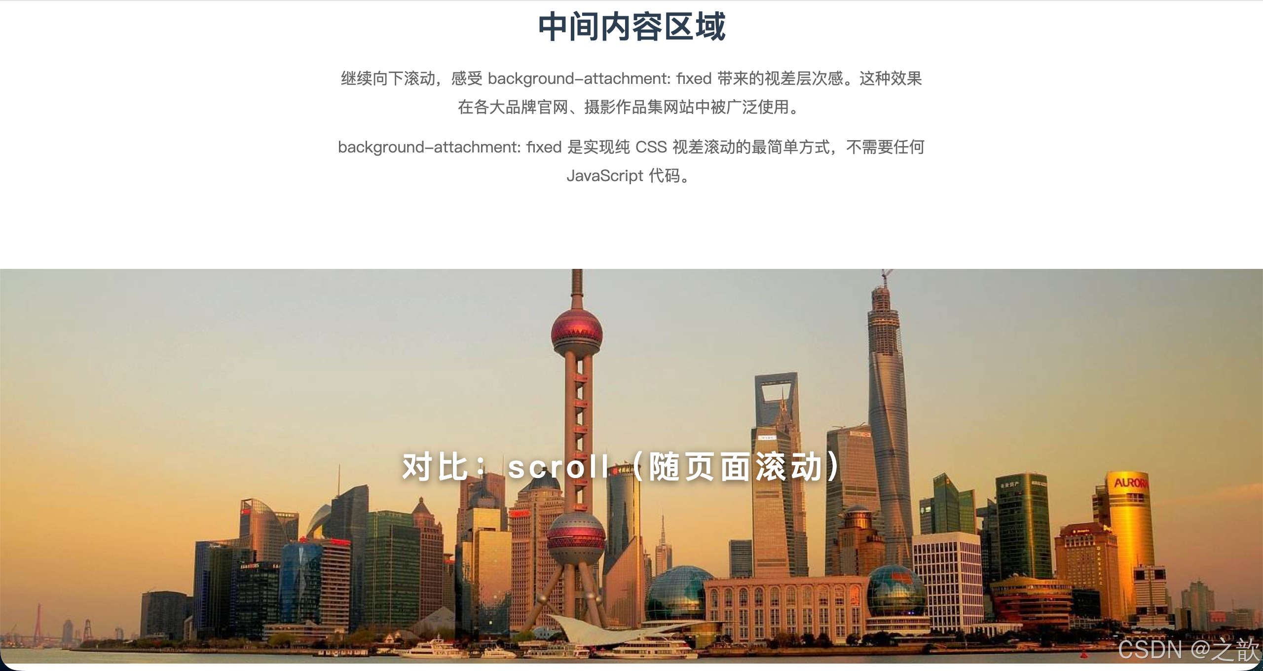
<p>继续向下滚动,感受 background-attachment: fixed 带来的视差层次感。这种效果在各大品牌官网、摄影作品集网站中被广泛使用。</p>
<p style="margin-top:12px">background-attachment: fixed 是实现纯 CSS 视差滚动的最简单方式,不需要任何 JavaScript 代码。</p>
</div>
<div class="normal-bg">
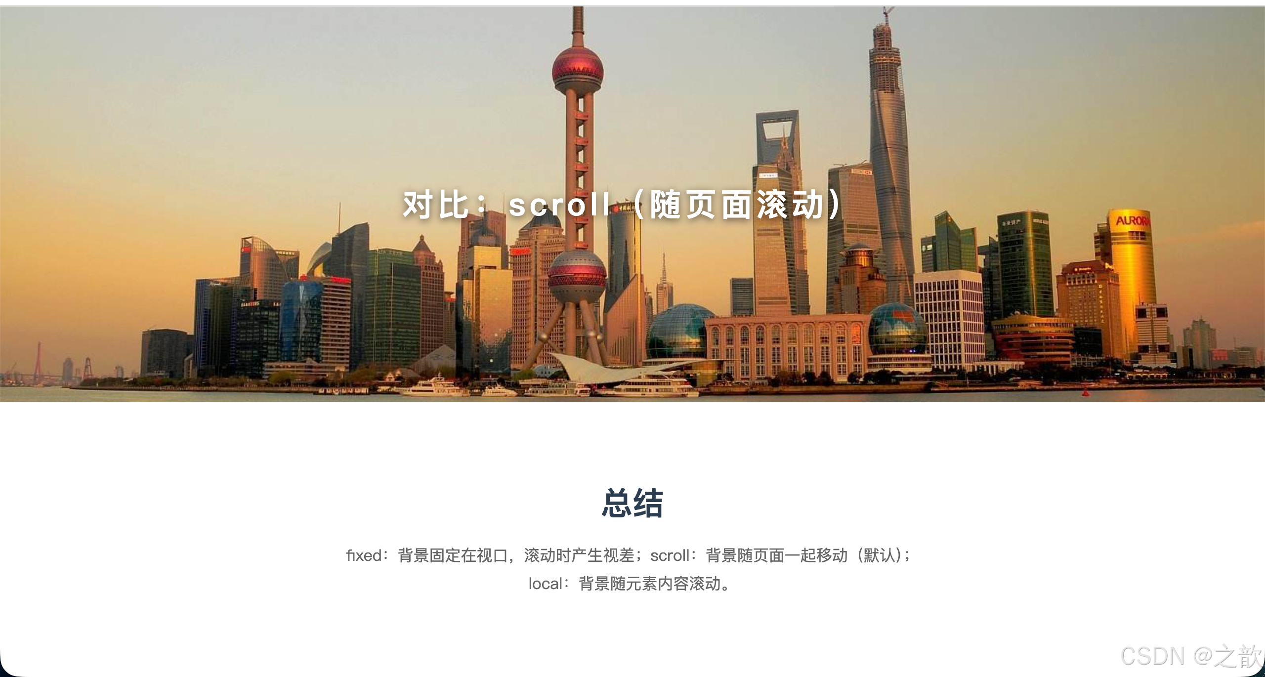
<div class="parallax-text" style="font-size:32px">对比:scroll(随页面滚动)</div>
</div>
<div class="content-block">
<h2>总结</h2>
<p>fixed:背景固定在视口,滚动时产生视差;scroll:背景随页面一起移动(默认);local:背景随元素内容滚动。</p>
</div>
</body>
</html>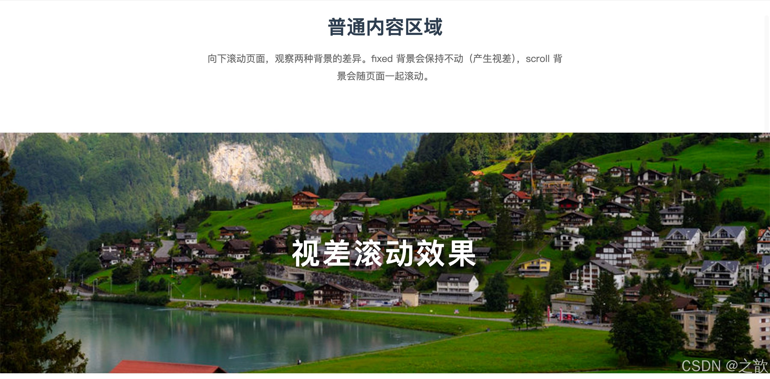
代码解说:
- 页面由「内容区 → 视差背景区 → 内容区 → 普通背景区 → 内容区」交替构成,这是品牌官网最常见的长页面布局结构。
.parallax设置了background-attachment: fixed:滚动页面时,背景图像始终以视口为参照保持固定,而 HTML 内容继续向上移动,两者速度不同,产生了层次错落的视差感。.normal-bg设置了background-attachment: scroll(默认值):背景图随页面一起滚动,没有视差,适合普通内容分区。- 视差滚动是纯 CSS 实现,不依赖 JavaScript,性能更好,但在部分移动端(iOS Safari)
fixed表现可能不稳定,实际项目中移动端可以用媒体查询将其降级为scroll。
💡 真实场景:
- 品牌官网首屏 :
fixed背景视差效果让页面层次感十足,Apple、耐克等大量使用 - 摄影作品集:视差滚动展示大图,视觉冲击力强
- 长页面分区展示 :不同分区用
fixed背景区隔,增加阅读节奏感
2.5 background 复合属性
background 复合属性写法
background:
url(img.jpg) ← 图片
no-repeat ← 重复方式
center top ← 位置
/ cover ← ⚠️尺寸必须接在位置后用/分隔
content-box ← 同时设 origin 和 clip
#fff ← 背景色
关键规则(容易写错):
css
/* ✅ 正确:size 必须紧跟 position,用 / 分隔 */
background: url(img.jpg) center top / cover no-repeat;

/* ❌ 错误:size 不能单独写,也不能在 position 前面 */
background: url(img.jpg) cover center top no-repeat;

/* ✅ 一个 box 值:同时设置 origin 和 clip */
background: url(img.jpg) content-box;

/* ✅ 两个 box 值:第一个是 origin,第二个是 clip */
background: url(img.jpg) content-box padding-box;

/* 注意:如果写两个 box 值,不同于写一个 */
/* content-box 一个值时:origin=content-box, clip=content-box */
/* content-box padding-box 两个值时:origin=content-box, clip=padding-box */
2.6 多背景图
CSS3 允许在一个元素上叠加多张背景图,实现复杂装饰效果。
语法:
css
background-image: url(图1), url(图2), url(图3);
/* 或者使用复合属性(每组用逗号分隔)*/
background: url(图1) 参数1, url(图2) 参数2, url(图3) 参数3;
⚠️ 层叠规则:先写的图层在上方(z轴更高)!
最上层 → 第1组: url(bg-tl.png)
第2层: url(bg-tr.png)
第3层: url(bg-bl.png)
第4层: url(bg-br.png)
最底层: url(bg05.jpg) cover
完整可运行示例 --- 四角装饰卡片:
html
<!DOCTYPE html>
<html lang="zh-CN">
<head>
  <meta charset="UTF-8">
  <title>多背景图叠加 --- 四角装饰</title>
  <style>
    body { display: flex; justify-content: center; padding: 60px 40px; background: #f0f0f0; }
    .card {
      width: 520px;
      min-height: 280px;
      padding: 50px 40px;
      box-sizing: border-box;

      /* 四角装饰图 + 底部大图,5层叠加 */
      background:
        url(课堂案例/images/bg-tl.png) no-repeat left top,
        url(课堂案例/images/bg-tr.png) no-repeat right top,
        url(课堂案例/images/bg-bl.png) no-repeat left bottom,
        url(课堂案例/images/bg-br.png) no-repeat right bottom,
        url(课堂案例/images/bg05.jpg) center / cover;

      border-radius: 10px;
      box-shadow: 0 12px 40px rgba(0,0,0,0.25);
      color: #fff;
      text-shadow: 1px 1px 4px rgba(0,0,0,0.8);
    }
    .card h2 { font-size: 26px; margin: 0 0 16px; }
    .card p  { line-height: 1.8; margin: 0; font-size: 15px; }
    .card .tip {
      margin-top: 20px;
      font-size: 12px;
      opacity: 0.8;
      border-top: 1px solid rgba(255,255,255,0.3);
      padding-top: 12px;
    }
  </style>
</head>
<body>
  <div class="card">
    <h2>多背景图叠加技术</h2>
    <p>CSS3 支持在一个元素上设置多个背景图层,彼此叠加显示。四个角落的装饰图案与底部大图背景,共 5 层背景无缝叠加。</p>
    <div class="tip">
      ⭐ 先写的背景图层级更高(显示在上方) --- 等同于 z-index 越大
    </div>
  </div>
</body>
</html>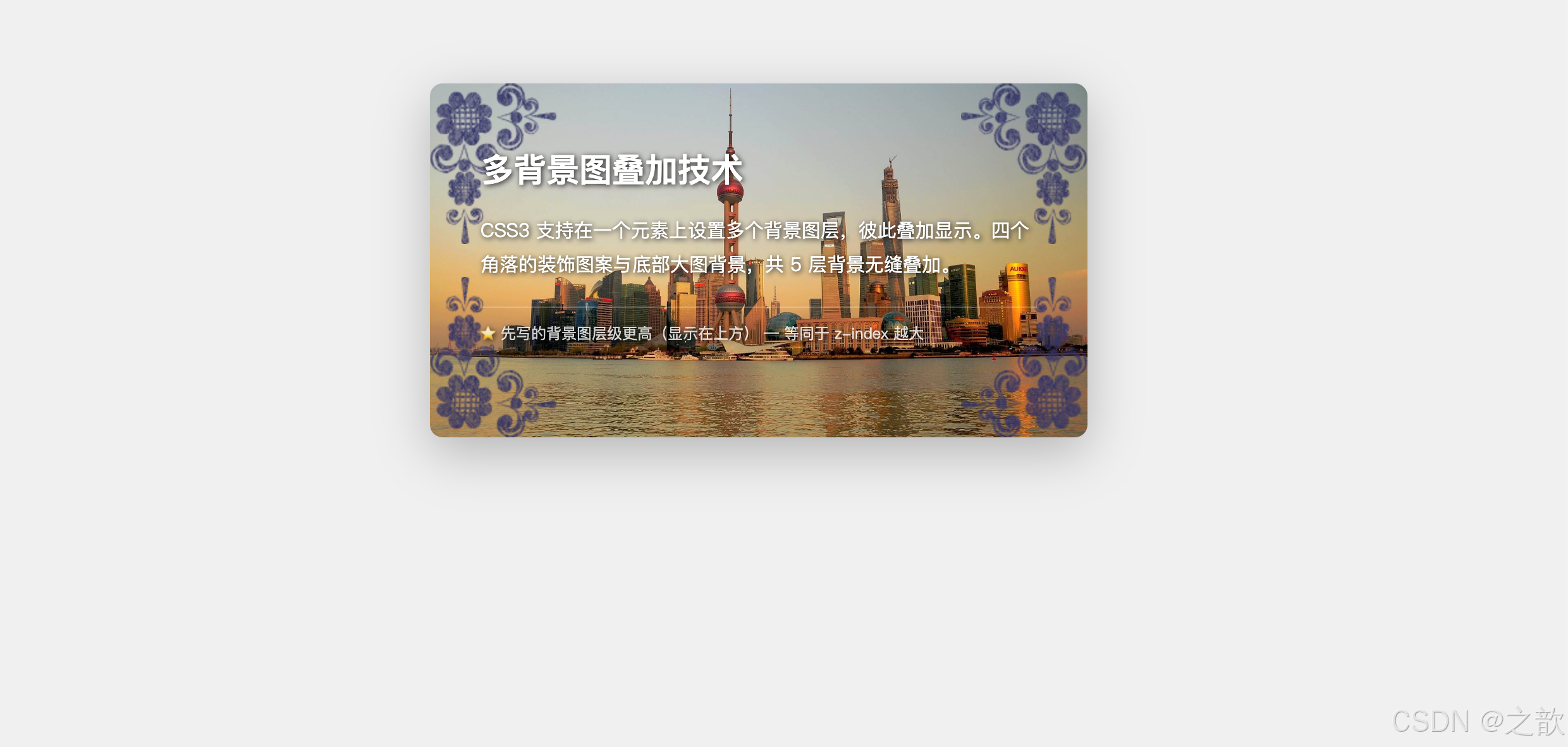
代码解说:
background属性值中用逗号 分隔每一层背景,浏览器按从上到下的顺序渲染,第一组在最顶层。- 前四层(
bg-tl/bg-tr/bg-bl/bg-br)分别定位在四个角落,使用no-repeat防止重复,位置关键字(left top等)精确指定角落。- 第五层(
bg05.jpg)作为整体背景,用center / cover铺满整个卡片,位于所有图层的最底部。box-sizing: border-box确保padding: 50px 40px不撑大卡片的实际宽度,让尺寸可控。- 多背景叠加时,每层
background-origin、background-repeat等属性也可以分别用逗号指定,彼此独立互不干扰。
💡 真实场景:
- 邀请函/贺卡:四角花纹装饰 + 底部纹理背景,多层叠加
- 游戏 UI:多层背景实现视差滚动、景深层次感
- 博客文章卡片:背景纹理 + 渐变遮罩叠加,增强可读性
三、CSS3 新增边框属性
🔤 名词解释
| 术语 | 解释 |
|---|---|
| border-radius | 边框圆角,每个角实际上是一个椭圆的四分之一弧,由 x 半径和 y 半径决定形状 |
| outline | 外轮廓,绘制在 border 之外,不占据布局空间,不影响元素尺寸 |
| outline-offset | 外轮廓与边框之间的距离,可以为负值(轮廓向内) |
| x 半径 | 圆角椭圆在水平方向的半径(/ 符号左侧的值) |
| y 半径 | 圆角椭圆在垂直方向的半径(/ 符号右侧的值) |
| Squircle | 超椭圆,border-radius: 28%~30% 的近似正方形,iOS 图标常用 |
3.1 border-radius --- 边框圆角
各角单独设置:
| CSS 属性名 | 含义 | 值(1~2个) |
|---|---|---|
border-top-left-radius |
左上角圆角 | 1个值:x=y半径;2个值:x半径 y半径 |
border-top-right-radius |
右上角圆角 | 同上 |
border-bottom-right-radius |
右下角圆角 | 同上 |
border-bottom-left-radius |
左下角圆角 | 同上 |
border-radius |
复合属性 | 1~4个长度 / 1~4个长度 |
圆角的本质 --- 椭圆四分之一弧:
border-radius 本质
每个角是一个椭圆的 1/4 弧
x半径决定水平弯曲程度
y半径决定垂直弯曲程度
当 x半径 = y半径 → 圆弧
当 x半径 ≠ y半径 → 椭圆弧
border-radius: 50% + 宽高相等 → 圆形
复合属性值规则(⭐ 超重要):
css
/*
 * 顺时针顺序:左上 → 右上 → 右下 → 左下
 * 类比 margin/padding 的规则
 */

border-radius: 20px;                     /* 4个角均为 20px */
border-radius: 10px 100px;              /* 左上&右下=10px / 右上&左下=100px */
border-radius: 10px 100px 50px;         /* 左上=10px / 右上&左下=100px / 右下=50px */
border-radius: 10px 30px 50px 80px;     /* 左上=10px / 右上=30px / 右下=50px / 左下=80px */

/* / 前是 x 半径,/ 后是 y 半径(各自独立计算 1~4 个值)*/
border-radius: 100px / 10px;            /* 所有角 x=100px,y=10px(椭圆弧)*/
border-radius: 100px 30px / 10px 40px 50px;
/* 展开后:
   左上: x=100px y=10px
   右上: x=30px  y=40px
   右下: x=100px y=50px
   左下: x=30px  y=40px
*/
完整可运行示例 --- 圆角形状大全:
html
<!DOCTYPE html>
<html lang="zh-CN">
<head>
  <meta charset="UTF-8">
  <title>border-radius 圆角形状大全</title>
  <style>
    * { box-sizing: border-box; margin: 0; padding: 0; }
    body { padding: 30px; background: #f8f9fa; font-family: 'Microsoft YaHei', sans-serif; }
    h2 { color: #2c3e50; margin: 24px 0 16px; }
    .grid {
      display: grid;
      grid-template-columns: repeat(4, 1fr);
      gap: 20px;
    }
    .item { display: flex; flex-direction: column; align-items: center; gap: 10px; }
    .shape {
      width: 100px; height: 100px;
      background: linear-gradient(135deg, #667eea, #764ba2);
      display: flex; align-items: center; justify-content: center;
      color: white; font-size: 10px; text-align: center;
      line-height: 1.4; padding: 8px;
    }
    .name { font-size: 12px; color: #666; text-align: center; }

    /* 各种形状 */
    .circle    { border-radius: 50%; }
    .pill      { width: 140px; height: 50px; border-radius: 25px; }
    .br-right  { border-radius: 20px 0 20px 20px; background: #25d366; }
    .br-left   { border-radius: 0 20px 20px 20px; background: #fff; color: #333;
                 box-shadow: 0 2px 6px rgba(0,0,0,0.15); }
    .squircle  { border-radius: 28%; }
    .leaf      { border-radius: 0 50%; transform: rotate(45deg);
                 background: linear-gradient(135deg, #43e97b, #38f9d7); }
    .drop      { border-radius: 50% 50% 50% 0; transform: rotate(-45deg);
                 background: linear-gradient(135deg, #4facfe, #00f2fe); }
    .stadium   { width: 160px; height: 60px; border-radius: 9999px;
                 background: linear-gradient(135deg, #f093fb, #f5576c); }
    .diamond   { border-radius: 50% 0; }
    .egg       { border-radius: 50% 50% 40% 60% / 60% 40% 50% 50%; }
    .tv-old    { border-radius: 30% / 20%; background: linear-gradient(135deg, #2c3e50, #4a6fa5); }
    .half-top  { border-radius: 50% 50% 0 0; }
  </style>
</head>
<body>
  <h2>border-radius 常用形状速查</h2>
  <div class="grid">
    <div class="item">
      <div class="shape circle">圆形<br>50%</div>
      <div class="name">border-radius: 50%<br>头像、图标</div>
    </div>
    <div class="item">
      <div class="shape pill" style="width:140px;height:50px">胶囊按钮</div>
      <div class="name">border-radius: 25px<br>按钮、标签</div>
    </div>
    <div class="item">
      <div class="shape br-right">右侧气泡</div>
      <div class="name">20px 0 20px 20px<br>聊天气泡-右</div>
    </div>
    <div class="item">
      <div class="shape br-left">左侧气泡</div>
      <div class="name">0 20px 20px 20px<br>聊天气泡-左</div>
    </div>
    <div class="item">
      <div class="shape squircle">Squircle</div>
      <div class="name">border-radius: 28%<br>iOS 图标风格</div>
    </div>
    <div class="item">
      <div class="shape leaf">叶形</div>
      <div class="name">border-radius: 0 50%<br>旋转45°叶子</div>
    </div>
    <div class="item">
      <div class="shape drop">水滴</div>
      <div class="name">50% 50% 50% 0<br>旋转-45°水滴</div>
    </div>
    <div class="item">
      <div class="shape diamond">菱形</div>
      <div class="name">border-radius: 50% 0<br>交替对角</div>
    </div>
    <div class="item">
      <div class="shape egg">蛋形</div>
      <div class="name">50% 50% 40% 60%<br>/ 60% 40% 50% 50%</div>
    </div>
    <div class="item">
      <div class="shape tv-old">复古屏幕</div>
      <div class="name">border-radius: 30% / 20%<br>x半径/y半径</div>
    </div>
    <div class="item">
      <div class="shape half-top">半圆</div>
      <div class="name">50% 50% 0 0<br>上半圆</div>
    </div>
    <div class="item">
      <div class="shape stadium" style="width:140px;height:50px">超胶囊</div>
      <div class="name">border-radius: 9999px<br>任意尺寸均胶囊</div>
    </div>
  </div>

  <h2>实战卡片组合</h2>
  <div style="display:flex; gap:20px; flex-wrap:wrap; margin-top:10px">
    <!-- 商品卡片 -->
    <div style="width:200px; border-radius:16px; overflow:hidden; box-shadow:0 8px 24px rgba(0,0,0,0.12); background:#fff">
      <div style="height:150px; background:url(课堂案例/images/jd001.jpg) center/cover"></div>
      <div style="padding:14px">
        <div style="font-weight:bold; font-size:14px; margin-bottom:8px">商品卡片标题</div>
        <div style="color:#e74c3c; font-size:18px; font-weight:bold">¥ 199</div>
        <button style="margin-top:10px; width:100%; padding:8px; background:linear-gradient(135deg,#667eea,#764ba2);
          color:#fff; border:none; border-radius:20px; cursor:pointer; font-size:14px">立即购买</button>
      </div>
    </div>
    <!-- 用户头像卡片 -->
    <div style="width:200px; padding:20px; text-align:center; border-radius:16px; background:#fff; box-shadow:0 8px 24px rgba(0,0,0,0.12)">
      <img src="课堂案例/images/00-小乐.jpg" alt="头像"
        style="width:80px; height:80px; border-radius:50%; object-fit:cover; border:3px solid #667eea">
      <div style="font-weight:bold; margin-top:10px">用户昵称</div>
      <div style="color:#888; font-size:12px; margin-top:4px">前端开发工程师</div>
      <button style="margin-top:12px; padding:6px 20px; background:#667eea; color:#fff;
        border:none; border-radius:20px; cursor:pointer">关注</button>
    </div>
    <!-- 标签组 -->
    <div style="display:flex; flex-direction:column; gap:8px; justify-content:center">
      <span style="padding:6px 16px; background:linear-gradient(135deg,#f093fb,#f5576c); color:#fff; border-radius:9999px; font-size:13px">热门标签</span>
      <span style="padding:6px 16px; background:linear-gradient(135deg,#4facfe,#00f2fe); color:#fff; border-radius:9999px; font-size:13px">技术前沿</span>
      <span style="padding:6px 16px; background:linear-gradient(135deg,#43e97b,#38f9d7); color:#fff; border-radius:9999px; font-size:13px">进阶技巧</span>
    </div>
  </div>
</body>
</html>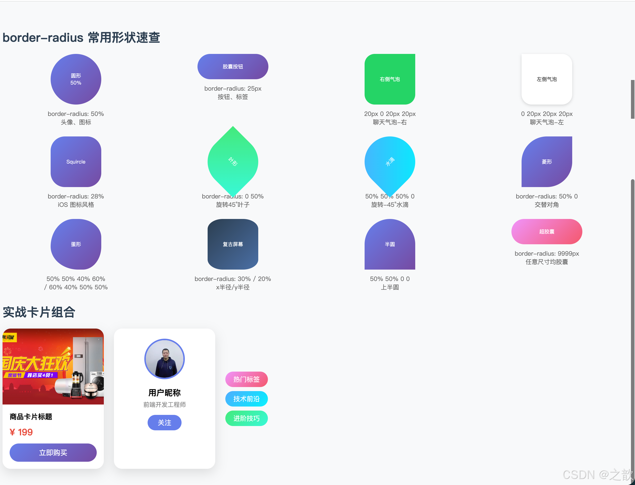
代码解说:
- 形状区 :12 种形状全部基于同一个
100×100px的正方形元素,仅通过改变border-radius的值(有时配合transform: rotate)就得到了完全不同的几何形状,说明border-radius的组合能力极强。border-radius: 50%(圆形):当宽高相等时,四个角的弧半径各为 50%,四段弧恰好首尾相接,形成完整圆形。border-radius: 9999px(超胶囊):数值远大于实际尺寸时浏览器自动截断到最大可用半径,无论元素有多宽多高都能得到完整胶囊形,比用50%更健壮(50%对非正方形元素会形成椭圆而非胶囊)。border-radius: 0 50%(叶子):展开后等同于「左上=0,右上=50%,右下=0,左下=50%」,配合rotate(45deg)旋转后得到叶子形状。border-radius: 50% 50% 40% 60% / 60% 40% 50% 50%(蛋形):斜杠前控制 x 半径,斜杠后控制 y 半径,四个角各不相同,产生不对称的有机形态。- 实战卡片区 :演示了三个真实 UI 组件的圆角运用------商品卡片用
16px大圆角,头像用50%圆形,渐变标签用9999px胶囊,三种写法分别对应不同的设计语义。
💡 真实场景:
| 场景 | 写法 | 代表产品 |
|---|---|---|
| 圆形用户头像 | 50% |
微博、抖音、Twitter |
| 圆角卡片 | 12~20px |
淘宝、苹果官网、Notion |
| 胶囊按钮 | 9999px |
GitHub、Stripe |
| 聊天气泡 | 18px 18px 18px 4px |
微信 |
| iOS 图标 | 22%~28% |
iOS App Store |
| 进度条 | 4~6px |
Dashboard 类应用 |
3.2 outline --- 外轮廓
属性列表:
| CSS 属性名 | 含义 | 值 |
|---|---|---|
outline-style |
外轮廓风格 | 与 border-style 相同 |
outline-width |
外轮廓宽度 | 长度值 |
outline-color |
外轮廓颜色 | 颜色值 |
outline |
复合属性 | 多值空格分隔 |
outline-offset |
与边框的距离(不是 outline 的子属性) | 长度,可为负值 |
⚠️ border 与 outline 的核心区别:
border 边框
✅ 是盒模型的一部分
影响元素尺寸
影响周围元素布局
占据空间
outline 外轮廓
❌ 不是盒模型的一部分
不影响元素尺寸
不影响文档流布局
不占据空间
offset 可为负值
完整可运行示例:
html
<!DOCTYPE html>
<html lang="zh-CN">
<head>
  <meta charset="UTF-8">
  <title>outline 外轮廓完全示例</title>
  <style>
    * { box-sizing: border-box; }
    body { padding: 40px; background: #f5f5f5; font-family: 'Microsoft YaHei', sans-serif; }
    section { margin-bottom: 36px; background: #fff; padding: 24px; border-radius: 12px; }
    h3 { color: #2c3e50; margin-bottom: 14px; font-size: 16px; }
    p.tip { font-size: 13px; color: #888; margin-top: 10px; line-height: 1.6; }

    /* 1. 基础外轮廓 */
    .basic-box {
      width: 300px; padding: 20px;
      background: #eaf4ff;
      border: 4px solid #3498db;
      outline: 3px dashed #e74c3c;
      outline-offset: 6px;
    }

    /* 2. 负值 outline-offset → 内嵌边框 */
    .inner-outline {
      width: 300px; padding: 40px 20px;
      background: linear-gradient(135deg, #667eea, #764ba2);
      color: white; text-align: center;
      border-radius: 12px;
      outline: 2px dashed rgba(255,255,255,0.7);
      outline-offset: -14px; /* 负值:轮廓向内收缩 */
      font-size: 15px;
    }

    /* 3. 去掉表单焦点框(正确做法)*/
    .form-input {
      width: 300px; padding: 12px 16px;
      border: 2px solid #ddd;
      border-radius: 8px; font-size: 15px;
      outline: none; /* 移除默认蓝框 */
      transition: border-color 0.3s, box-shadow 0.3s;
    }
    .form-input:focus {
      border-color: #667eea;
      box-shadow: 0 0 0 3px rgba(102,126,234,0.25);
    }

    /* 4. 可访问性:保留焦点样式但美化 */
    .a11y-btn {
      padding: 12px 28px;
      background: #2ecc71; color: white;
      border: none; border-radius: 8px;
      font-size: 15px; cursor: pointer;
    }
    .a11y-btn:focus {
      outline: 3px solid #27ae60;
      outline-offset: 3px;
    }
    .a11y-btn:focus:not(:focus-visible) { outline: none; } /* 仅键盘焦点显示 */

    /* 5. 高亮选中状态 */
    .card-selectable {
      width: 140px; padding: 16px;
      border: 2px solid #ddd;
      border-radius: 10px; text-align: center;
      cursor: pointer; transition: outline 0.2s;
      display: inline-block;
    }
    .card-selectable:hover,
    .card-selectable.selected {
      outline: 3px solid #667eea;
      outline-offset: 2px;
    }
  </style>
</head>
<body>
  <section>
    <h3>1. 基础外轮廓与 outline-offset(正值)</h3>
    <div class="basic-box">
      border: 4px solid 蓝色(占空间)<br>
      outline: 3px dashed 红色(不占空间)<br>
      outline-offset: 6px(与border间距6px)
    </div>
    <p class="tip">⭐ outline 不占据布局空间,加上或去掉 outline 不会影响其他元素的位置。</p>
  </section>

  <section>
    <h3>2. 负值 outline-offset → 内嵌虚线边框效果</h3>
    <div class="inner-outline">
      <strong>精美卡片标题</strong><br>
      outline-offset: -14px,轮廓向内收缩<br>形成内嵌边框装饰效果
    </div>
  </section>

  <section>
    <h3>3. 最常见用法:去掉表单输入框的浏览器默认焦点框</h3>
    <input class="form-input" type="text" placeholder="点击输入,查看自定义焦点样式">
    <p class="tip">使用 outline: none 移除默认蓝框,配合 border-color + box-shadow 实现更美观的焦点效果。</p>
  </section>

  <section>
    <h3>4. 无障碍访问(Accessibility)--- 保留键盘焦点样式</h3>
    <button class="a11y-btn">可访问按钮(Tab键聚焦可见轮廓)</button>
    <p class="tip">⚠️ 不建议直接 outline: none 移除所有焦点样式,这影响依靠键盘导航的用户。推荐使用 :focus-visible 仅对键盘焦点显示轮廓。</p>
  </section>

  <section>
    <h3>5. 选中卡片高亮(outline 比 border 更适合)</h3>
    <div style="display:flex; gap:12px">
      <div class="card-selectable selected">
        <div style="font-size:24px">🎨</div>
        <div style="font-size:13px; margin-top:8px">设计</div>
      </div>
      <div class="card-selectable">
        <div style="font-size:24px">💻</div>
        <div style="font-size:13px; margin-top:8px">开发</div>
      </div>
      <div class="card-selectable">
        <div style="font-size:24px">📱</div>
        <div style="font-size:13px; margin-top:8px">移动端</div>
      </div>
    </div>
    <p class="tip">选中卡片用 outline 而不用 border,因为 outline 不占空间,卡片尺寸不会因选中状态而改变。</p>
  </section>
</body>
</html>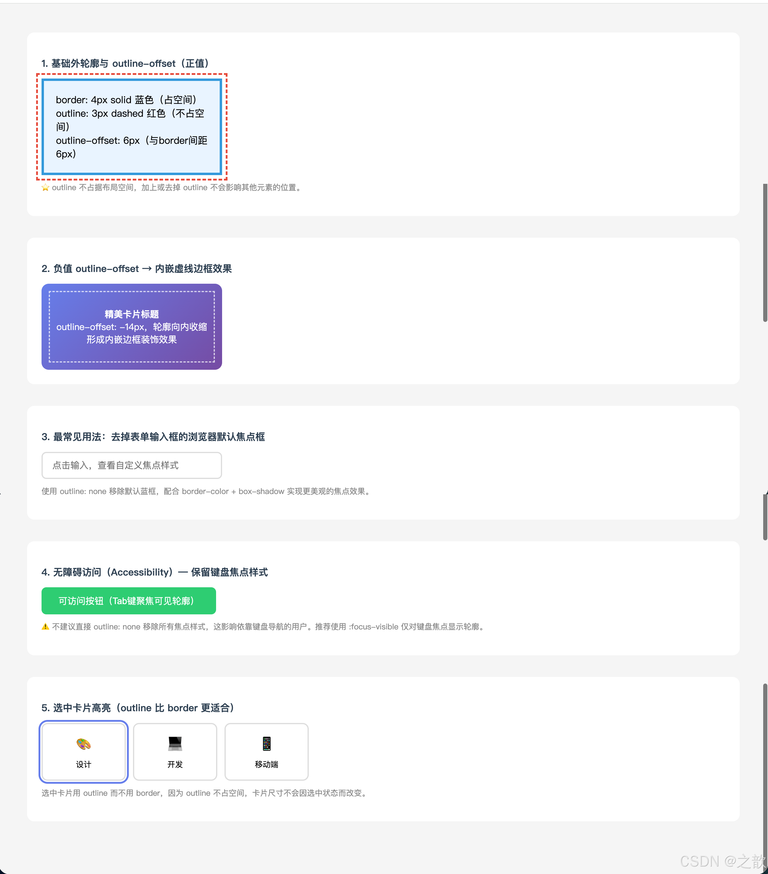
代码解说:
- 示例1(基础对比) :
.basic-box同时设置了border(蓝色实线)和outline(红色虚线),肉眼可见 outline 绘制在 border 外侧,且两者之间有outline-offset: 6px的空隙,但整个元素不会因 outline 而撑开空间。- 示例2(负值偏移) :
outline-offset: -14px让轮廓向内移动 14px,收缩到元素内部,形成「内嵌装饰边框」的视觉效果,这是只用 CSS 实现双层边框的常用技巧,无需额外嵌套元素。- 示例3(表单焦点) :
.form-input:focus先用outline: none清除浏览器默认蓝色焦点框,再用border-color改变边框颜色 +box-shadow模拟「光晕」效果,这是当前主流 UI 框架(Ant Design、Element Plus)的通用做法。- 示例4(无障碍) :
:focus-visible是现代 CSS 伪类,只在用户通过键盘(Tab 键)聚焦时才显示轮廓,鼠标点击时不显示,兼顾了视觉简洁和键盘可访问性。- 示例5(选中状态) :选中卡片时,用
outline而非改变border,是因为 outline 不占用布局空间,卡片不会因为「选中→未选中」状态切换而产生位移抖动。
outline: none 的正确使用原则:
css
/* ❌ 不推荐:完全移除焦点样式,损害无障碍访问 */
input  { outline: none; }
button { outline: none; }

/* ✅ 推荐:保留样式但美化 */
input:focus {
  outline: none;
  border-color: #007bff;
  box-shadow: 0 0 0 3px rgba(0,123,255,0.25);
}

/* ✅ 最佳实践:仅键盘导航时显示,鼠标点击不显示 */
button:focus-visible {
  outline: 3px solid #007bff;
  outline-offset: 2px;
}
四、CSS3 新增文本属性
🔤 名词解释
| 术语 | 解释 |
|---|---|
| text-align-last | 控制最后一行 文字的水平对齐方式(在 text-align: justify 下最后一行不对齐的问题解决方案) |
| text-decoration | 文本修饰线,包括下划线、上划线、删除线,CSS3 可控制线的样式和颜色 |
| word-wrap / overflow-wrap | 长单词或URL是否允许在任意位置断行(两者等价,overflow-wrap 是标准写法) |
| word-break | 控制非 CJK 文本的断行规则,break-all 允许在任意字母间断行 |
| white-space | 控制空白处理和换行方式,nowrap 强制单行是省略号三件套的关键 |
| text-overflow | 溢出文本的显示方式,ellipsis 显示省略号,需配合三件套使用 |
| text-shadow | 文本阴影,支持多层叠加实现霓虹灯、3D立体、描边等效果 |
| 省略号三件套 | white-space: nowrap + overflow: hidden + text-overflow: ellipsis |
| FOUT | Flash of Unstyled Text,字体未加载时短暂显示系统字体的闪烁现象 |
4.1 文本属性总表
| CSS 属性名 | 含义 | 常用值 |
|---|---|---|
text-align-last |
最后一行水平对齐 | start end left right center justify |
text-decoration-line |
修饰线类型 | none underline overline line-through |
text-decoration-style |
修饰线风格 | solid dashed dotted double wavy |
text-decoration-color |
修饰线颜色 | 任意颜色值 |
text-decoration |
修饰线复合属性 | 多值空格分隔 |
word-wrap / overflow-wrap |
是否允许单词内部断行 | normal break-word |
word-break |
字符间断行规则 | normal break-all keep-all |
white-space |
空白与换行处理 | normal pre pre-wrap pre-line nowrap |
text-overflow |
溢出文本显示 | clip ellipsis |
text-shadow |
文本阴影 | 偏移X 偏移Y 模糊值 颜色 |
4.2 text-align-last --- 最后一行对齐
应用背景: 当设置 text-align: justify 后,段落最后一行通常无法两端对齐(因为文字不够多),text-align-last 专门控制这最后一行的对齐方式。
浏览器兼容性:
- Chrome 47+ ✅ / Firefox 12+ ✅ / Safari 16+ ✅(2022年才支持)
完整可运行示例:
html
<!DOCTYPE html>
<html lang="zh-CN">
<head>
  <meta charset="UTF-8">
  <title>text-align-last 完整示例</title>
  <style>
    * { box-sizing: border-box; margin: 0; padding: 0; }
    body { padding: 30px; background: #f5f5f5; font-family: 'Microsoft YaHei', sans-serif; }
    .section { background: white; border-radius: 12px; padding: 24px; margin-bottom: 24px; }
    h3 { color: #2c3e50; margin-bottom: 16px; font-size: 15px; }

    /* 场景1:表单label两端对齐(经典高频用法)*/
    .form { width: 320px; }
    .form-row { display: flex; align-items: center; margin-bottom: 14px; gap: 12px; }
    .label-justify {
      width: 70px;
      text-align: justify;
      text-align-last: justify; /* ⭐ 核心 */
      font-size: 14px;
      color: #555;
    }
    .form-row input {
      flex: 1; padding: 8px 12px;
      border: 1px solid #ddd; border-radius: 6px;
      font-size: 14px; outline: none;
    }
    .form-row input:focus { border-color: #667eea; }

    /* 场景2:段落两端对齐,最后一行居中 */
    .justify-center {
      text-align: justify;
      text-align-last: center;
      line-height: 1.8; color: #555; font-size: 14px;
    }

    /* 场景3:导航菜单均匀分布 */
    .nav-justify {
      width: 300px;
      text-align: justify;
      text-align-last: justify;
      font-size: 15px; color: #333;
      border-bottom: 2px solid #667eea;
      padding-bottom: 10px;
    }
    .nav-justify::after {
      content: '';
      display: inline-block;
      width: 100%;
    }

    /* 场景4:对比 --- 无/有 text-align-last */
    .paragraph-box {
      width: 280px; border: 1px solid #eee; border-radius: 8px;
      padding: 16px; font-size: 14px; line-height: 1.8; color: #555;
    }
    .no-last { text-align: justify; }
    .with-last { text-align: justify; text-align-last: justify; }
  </style>
</head>
<body>
  <div class="section">
    <h3>⭐ 经典用法:表单 label 两端对齐(高频面试题)</h3>
    <div class="form">
      <div class="form-row">
        <label class="label-justify">用户名</label>
        <input type="text" placeholder="请输入用户名">
      </div>
      <div class="form-row">
        <label class="label-justify">电话号码</label>
        <input type="tel" placeholder="请输入电话号码">
      </div>
      <div class="form-row">
        <label class="label-justify">所在城市</label>
        <input type="text" placeholder="请输入所在城市">
      </div>
    </div>
    <p style="font-size:12px; color:#888; margin-top:12px">
      label 宽度固定,「用户名」「电话号码」「所在城市」字数不等,用 text-align-last: justify 实现完美两端对齐。
    </p>
  </div>

  <div class="section">
    <h3>导航菜单文字均匀分布</h3>
    <div class="nav-justify">首页 关于我们 产品服务 联系我们</div>
    <p style="font-size:12px; color:#888; margin-top:10px">
      单行文本可用 text-align-last: justify(配合 ::after 伪元素撑开)实现菜单项均匀分布。
    </p>
  </div>

  <div class="section">
    <h3>最后一行对比:无 text-align-last vs 有 text-align-last: justify</h3>
    <div style="display:flex; gap:20px">
      <div>
        <div style="font-size:12px; color:#888; margin-bottom:8px">❌ 无 text-align-last(最后一行靠左)</div>
        <div class="paragraph-box no-last">
          CSS3 是层叠样式表的升级版本,为网页带来了大量新特性。文本属性是其中非常重要的一部分内容,掌握好这些属性。
        </div>
      </div>
      <div>
        <div style="font-size:12px; color:#888; margin-bottom:8px">✅ text-align-last: justify(最后一行也两端对齐)</div>
        <div class="paragraph-box with-last">
          CSS3 是层叠样式表的升级版本,为网页带来了大量新特性。文本属性是其中非常重要的一部分内容,掌握好这些属性。
        </div>
      </div>
    </div>
  </div>
</body>
</html>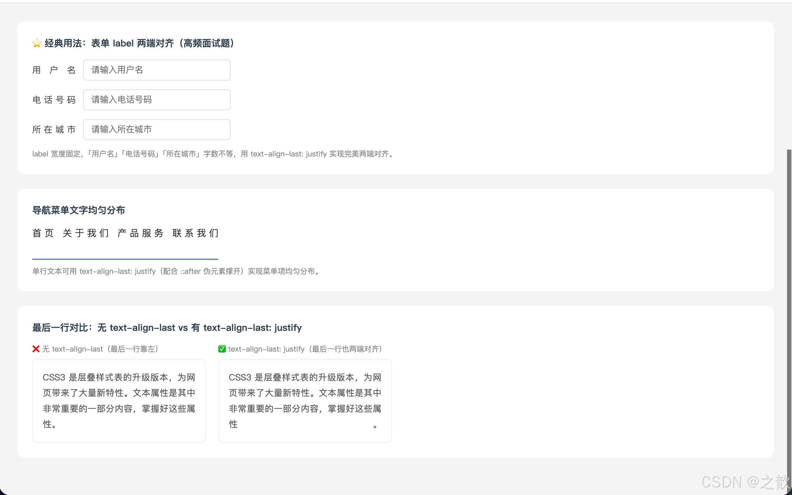
代码解说:
- 表单 label 对齐(最经典用法) :
.label-justify设置了固定宽度70px,里面的文字字数(2~4个字)不等,text-align: justify+text-align-last: justify让每个 label 的文字都撑满 70px 宽度,形成整齐的右对齐视觉效果,这是表单设计中最常被问到的对齐技巧。- 导航菜单均匀分布 :单行文本本质上只有「最后一行」,所以直接用
text-align-last: justify即可让菜单项均匀铺开。需要注意的是,还要用::after伪元素设置width: 100%; display: inline-block来「欺骗」浏览器认为这不是最后一行(否则 justify 不生效)。- 段落对比 :
.no-last只设置了text-align: justify,段落最后一行文字较少时会靠左对齐,看起来不整齐;.with-last额外加了text-align-last: justify,最后一行文字被强制两端对齐,整段文本更加规整。
4.3 word-wrap / overflow-wrap / word-break 区别详解
这三个属性经常被混淆,必须搞清楚!
长内容溢出问题
word-wrap / overflow-wrap
溢出时允许单词内部断行
优先保持单词完整
word-break
更激进:允许在任意字符间断行
break-all 会打断所有单词
white-space: nowrap
强制不换行,内容溢出容器
overflow-wrap: break-word
遇到超长单词先整体换行
换行后仍放不下再强制断字
word-break: break-all
每个字符都可以断行
英文文本密度高场景
word-break: keep-all
中日韩文本不自动断行
| 属性 | 值 | 作用 | 适用文本 |
|---|---|---|---|
overflow-wrap: break-word |
break-word | 超长单词整体换行,仍超出才断字 | 英文为主 |
word-break: break-all |
break-all | 任意字符间可断行(更激进) | 密集英文 |
word-break: keep-all |
keep-all | 仅空格处断行 | 中日韩文字 |
hyphens: auto |
auto | 断字并插入连字符 | 英文排版 |
word-wrap是旧写法,overflow-wrap是 CSS3 标准写法,两者功能完全相同,建议同时写以兼容旧浏览器。
完整可运行示例:
html
<!DOCTYPE html>
<html lang="zh-CN">
<head>
  <meta charset="UTF-8">
  <title>word-wrap vs word-break vs white-space</title>
  <style>
    * { box-sizing: border-box; margin: 0; padding: 0; }
    body { padding: 30px; background: #f5f5f5; font-family: sans-serif; }
    .grid { display: grid; grid-template-columns: repeat(3, 1fr); gap: 16px; margin-top: 16px; }
    .box {
      background: white; padding: 16px; border-radius: 10px;
      border: 1px solid #e0e0e0;
      width: 100%; overflow: hidden;
    }
    .box h4 { font-size: 12px; color: #667eea; margin-bottom: 10px; font-weight: bold; }
    .box p  { font-size: 13px; color: #444; line-height: 1.6; }
    .long-word { color: #e74c3c; }

    /* 各种断行模式 */
    .normal        { } /* 默认 */
    .owrap         { overflow-wrap: break-word; word-wrap: break-word; }
    .wbreak-all    { word-break: break-all; }
    .wbreak-keep   { word-break: keep-all; }
    .hyphens       { overflow-wrap: break-word; hyphens: auto; }
    .nowrap        { white-space: nowrap; overflow: hidden; text-overflow: ellipsis; }
  </style>
</head>
<body>
  <h2 style="color:#2c3e50; margin-bottom:8px">文本断行属性完全对比</h2>
  <p style="color:#666; font-size:14px; margin-bottom:16px">
    以下每个盒子宽度相同,观察超长 URL 和中文在不同断行设置下的表现。
  </p>
  <div class="grid">
    <div class="box">
      <h4>① 默认(normal)--- 超长词溢出</h4>
      <p class="normal">
        短文本正常显示,遇到超长URL:<br>
        <span class="long-word">https://www.example.com/very-long-path/to/some/resource</span><br>
        超出容器边界了!
      </p>
    </div>
    <div class="box">
      <h4>② overflow-wrap: break-word --- 单词内断行</h4>
      <p class="owrap">
        短文本正常显示,遇到超长URL:<br>
        <span class="long-word">https://www.example.com/very-long-path/to/some/resource</span><br>
        长词在容器边界处断行。
      </p>
    </div>
    <div class="box">
      <h4>③ word-break: break-all --- 任意字符断行</h4>
      <p class="wbreak-all">
        短文本正常显示,遇到超长URL:<br>
        <span class="long-word">https://www.example.com/very-long-path/to/some/resource</span><br>
        每行都会被填满后断行。
      </p>
    </div>
    <div class="box">
      <h4>④ word-break: keep-all --- 中文不断行</h4>
      <p class="wbreak-keep">这是一段较长的中文文字内容,keep-all会尽量不在中文字符间断行,只在空格处断行。</p>
    </div>
    <div class="box">
      <h4>⑤ hyphens: auto --- 断字加连字符</h4>
      <p class="hyphens" lang="en">
        Supercalifragilisticexpialidocious is a very long English word that will be broken with a hyphen.
      </p>
    </div>
    <div class="box">
      <h4>⑥ white-space: nowrap + 省略号三件套</h4>
      <p class="nowrap">这是一段很长的文字内容,强制不换行,溢出部分显示省略号,这在新闻列表等场景中非常常用。</p>
    </div>
  </div>

  <div style="background:white; border-radius:12px; padding:20px; margin-top:20px">
    <h3 style="color:#2c3e50; margin-bottom:12px; font-size:15px">选择哪个属性?决策流程</h3>
    <ul style="color:#555; font-size:14px; line-height:2; padding-left:20px">
      <li>需要<strong>强制不换行</strong>(配合省略号)→ <code>white-space: nowrap</code></li>
      <li>希望<strong>超长单词/URL 自动换行</strong>而不溢出 → <code>overflow-wrap: break-word</code>(推荐)</li>
      <li>英文内容<strong>最大密度排版</strong>(任意断字)→ <code>word-break: break-all</code></li>
      <li>中文内容<strong>不自动断词</strong> → <code>word-break: keep-all</code></li>
      <li>英文<strong>正式排版加连字符</strong> → <code>hyphens: auto</code>(需设置 lang 属性)</li>
    </ul>
  </div>
</body>
</html>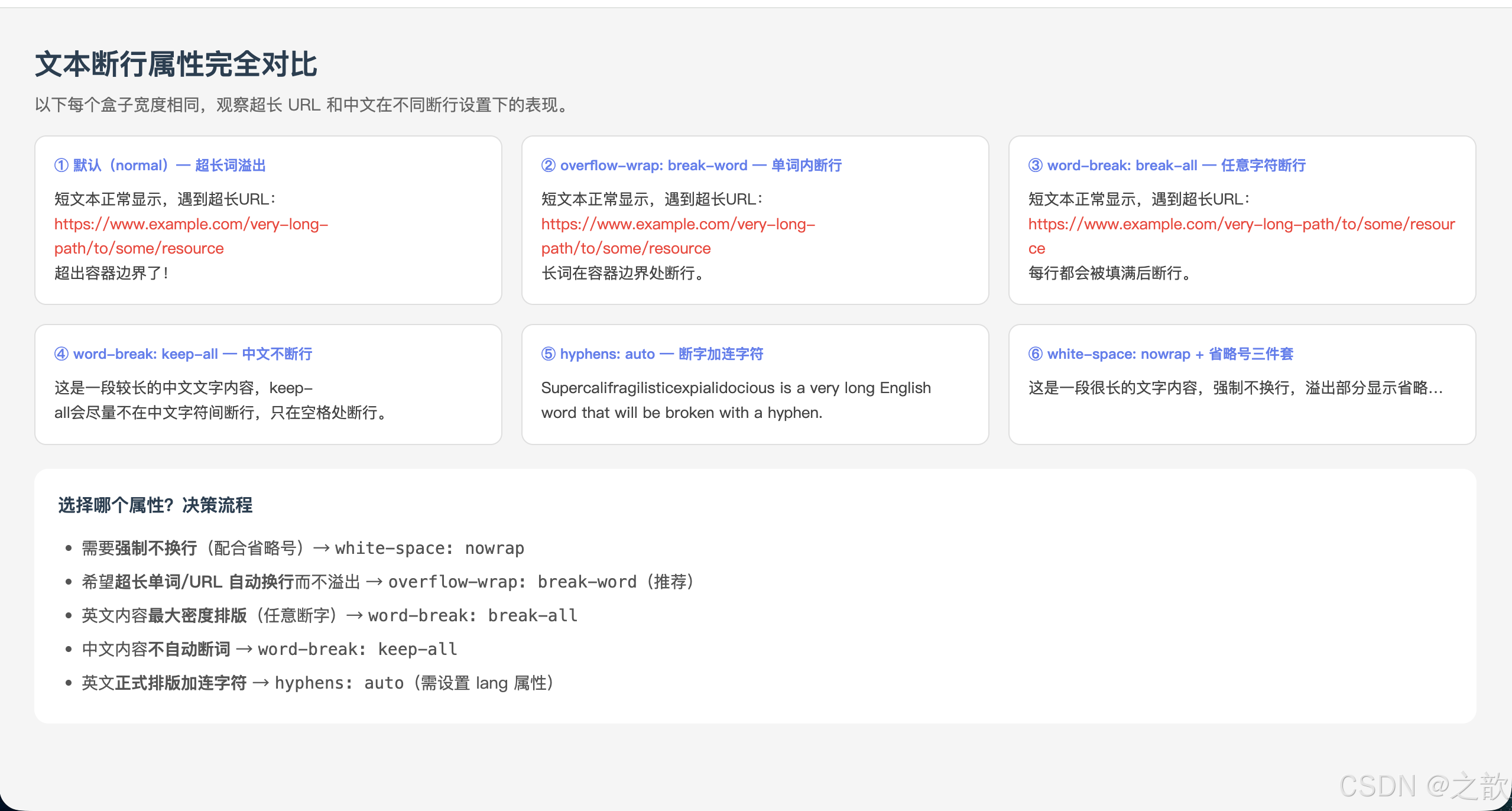
代码解说:
- 六个盒子宽度相同、内容相同,只有断行属性不同,通过视觉对比直观理解各属性的差异。
- ①默认:浏览器在有效断行机会(空格、连字符)处断行,超长 URL 整体不会折行,直接撑破容器。
- ②overflow-wrap: break-word :遇到超长词时,先尝试整词换到下一行;若下一行依然放不下整个词,才在词内部强制断行。这是最推荐的防溢出写法 ,同时写
word-wrap: break-word兼容旧浏览器。- ③word-break: break-all:每个字符位置都视为潜在断行点,英文字母可以被任意切断,行末会被文字填满。适合聊天气泡等密集英文场景,但可读性较差。
- ④word-break: keep-all:中日韩文字只在标点或空格处断行,禁止在汉字之间断行,适合需要「中文不拆词」的阅读体验。
- ⑤hyphens: auto :在断词处自动插入连字符(
-),这是英文印刷排版的专业做法,必须同时在元素或祖先元素上设置lang="en",否则浏览器不知道按哪种语言规则加连字符。- ⑥省略号三件套 :
nowrap阻止换行 +overflow: hidden裁剪溢出 +text-overflow: ellipsis显示省略号,三者缺一不可,共同实现单行截断效果。
4.4 white-space --- 文本显示格式
white-space 五种取值
normal(默认)
合并空白 | 忽略换行符 | 自动换行
pre
保留所有空白 | 保留换行符 | 不自动换行
pre-wrap
保留所有空白 | 保留换行符 | 自动换行
pre-line
合并空白 | 保留换行符 | 自动换行
nowrap ⭐
合并空白 | 忽略换行符 | 强制单行
| 值 | 合并多余空白 | 识别换行符\n |
超出容器自动换行 |
|---|---|---|---|
normal |
✅ | ❌ | ✅ |
pre |
❌ | ✅ | ❌ |
pre-wrap |
❌ | ✅ | ✅ |
pre-line |
✅ | ✅ | ✅ |
nowrap |
✅ | ❌ | ❌(强制单行) |
4.5 单行/多行文本省略号 ⭐
这是前端日常开发最高频的 CSS 技巧之一!
单行省略号三件套(必须背会):
css
.ellipsis {
  white-space: nowrap;        /* 第一步:强制不换行 */
  overflow: hidden;            /* 第二步:隐藏溢出内容 */
  text-overflow: ellipsis;     /* 第三步:显示省略号 */
}
口诀: "强制单行不换行,溢出内容要藏起,最后省略号收尾"
多行省略号(-webkit 方案):
css
.multi-ellipsis {
  overflow: hidden;
  display: -webkit-box;
  -webkit-box-orient: vertical;
  -webkit-line-clamp: 3;       /* 显示3行,超出省略 */
}
完整可运行示例 --- 新闻列表 + 商品卡片:
html
<!DOCTYPE html>
<html lang="zh-CN">
<head>
  <meta charset="UTF-8">
  <title>文本省略号实战示例</title>
  <style>
    * { box-sizing: border-box; margin: 0; padding: 0; }
    body { padding: 30px; background: #f5f5f5; font-family: 'Microsoft YaHei', sans-serif; }
    h2 { color: #2c3e50; margin: 20px 0 14px; }

    /* 新闻列表 */
    .news-list {
      width: 400px; background: white;
      border-radius: 12px; padding: 20px;
      box-shadow: 0 4px 16px rgba(0,0,0,0.08); margin-bottom: 24px;
    }
    .news-list h3 {
      font-size: 15px; color: #2c3e50;
      padding-bottom: 12px;
      border-bottom: 2px solid #667eea; margin-bottom: 12px;
    }
    .news-item {
      display: flex; align-items: center;
      gap: 10px; padding: 10px 0;
      border-bottom: 1px dashed #f0f0f0;
    }
    .news-item:last-child { border-bottom: none; }
    .news-dot {
      width: 6px; height: 6px;
      background: #e74c3c; border-radius: 50%; flex-shrink: 0;
    }
    .news-title {
      flex: 1; font-size: 14px; color: #333; line-height: 1.5;
      /* 单行省略三件套 */
      white-space: nowrap; overflow: hidden; text-overflow: ellipsis;
    }
    .news-date { font-size: 12px; color: #999; flex-shrink: 0; }

    /* 多行省略(文章摘要)*/
    .article-card {
      width: 400px; background: white;
      border-radius: 12px; padding: 20px;
      box-shadow: 0 4px 16px rgba(0,0,0,0.08); margin-bottom: 24px;
    }
    .multi-text {
      overflow: hidden;
      display: -webkit-box;
      -webkit-box-orient: vertical;
      -webkit-line-clamp: 3;
      line-height: 1.7; font-size: 14px; color: #666;
    }

    /* 商品卡片 */
    .products { display: flex; gap: 16px; flex-wrap: wrap; }
    .product-card {
      width: 180px; background: white;
      border-radius: 10px; overflow: hidden;
      box-shadow: 0 4px 12px rgba(0,0,0,0.08);
    }
    .p-img { width: 100%; height: 140px; object-fit: cover; display: block; }
    .p-info { padding: 12px; }
    .p-name {
      font-size: 14px; color: #333;
      overflow: hidden;
      display: -webkit-box;
      -webkit-box-orient: vertical;
      -webkit-line-clamp: 2;
      line-height: 1.5; height: 42px;
    }
    .p-price { font-size: 18px; font-weight: bold; color: #e74c3c; margin-top: 8px; }
  </style>
</head>
<body>
  <h2>单行省略:新闻列表</h2>
  <div class="news-list">
    <h3>最新资讯</h3>
    <div class="news-item">
      <div class="news-dot"></div>
      <span class="news-title">前端开发技术的最新趋势与发展动态深度解析完整版报告发布</span>
      <span class="news-date">05-03</span>
    </div>
    <div class="news-item">
      <div class="news-dot"></div>
      <span class="news-title">CSS3 新特性完整学习指南从入门到精通系统性全面教程</span>
      <span class="news-date">05-02</span>
    </div>
    <div class="news-item">
      <div class="news-dot"></div>
      <span class="news-title">JavaScript 最新特性详细介绍与完整代码示例演示</span>
      <span class="news-date">05-01</span>
    </div>
    <div class="news-item">
      <div class="news-dot"></div>
      <span class="news-title">响应式布局设计最佳实践与性能优化完整方案深度分析</span>
      <span class="news-date">04-30</span>
    </div>
  </div>

  <h2>多行省略(3行):文章摘要</h2>
  <div class="article-card">
    <div class="multi-text">
      CSS3 是层叠样式表技术的升级版本。CSS3 在 CSS2.1 的基础上增加了大量强大的新功能,包括选择器、盒模型增强、背景与边框、文字特效、2D/3D 转换、过渡、动画等模块。许多以前只能通过 JavaScript 才能实现的效果,现在用纯 CSS 就可以轻松实现,大大减少了开发工作量,提高了网页性能。掌握 CSS3 是现代前端开发的必备技能之一。
    </div>
  </div>

  <h2>两行省略:商品卡片</h2>
  <div class="products">
    <div class="product-card">
      <img class="p-img" src="课堂案例/images/jd001.jpg" alt="商品">
      <div class="p-info">
        <div class="p-name">AirPods Pro 第三代无线主动降噪耳机续航30小时</div>
        <div class="p-price">¥1,999</div>
      </div>
    </div>
    <div class="product-card">
      <img class="p-img" src="课堂案例/images/jd002.jpg" alt="商品">
      <div class="p-info">
        <div class="p-name">这是一个非常长的商品标题名称,用来演示两行省略效果</div>
        <div class="p-price">¥299</div>
      </div>
    </div>
    <div class="product-card">
      <img class="p-img" src="课堂案例/images/jd003.jpg" alt="商品">
      <div class="p-info">
        <div class="p-name">4K摄像头广角镜头</div>
        <div class="p-price">¥199</div>
      </div>
    </div>
  </div>
</body>
</html>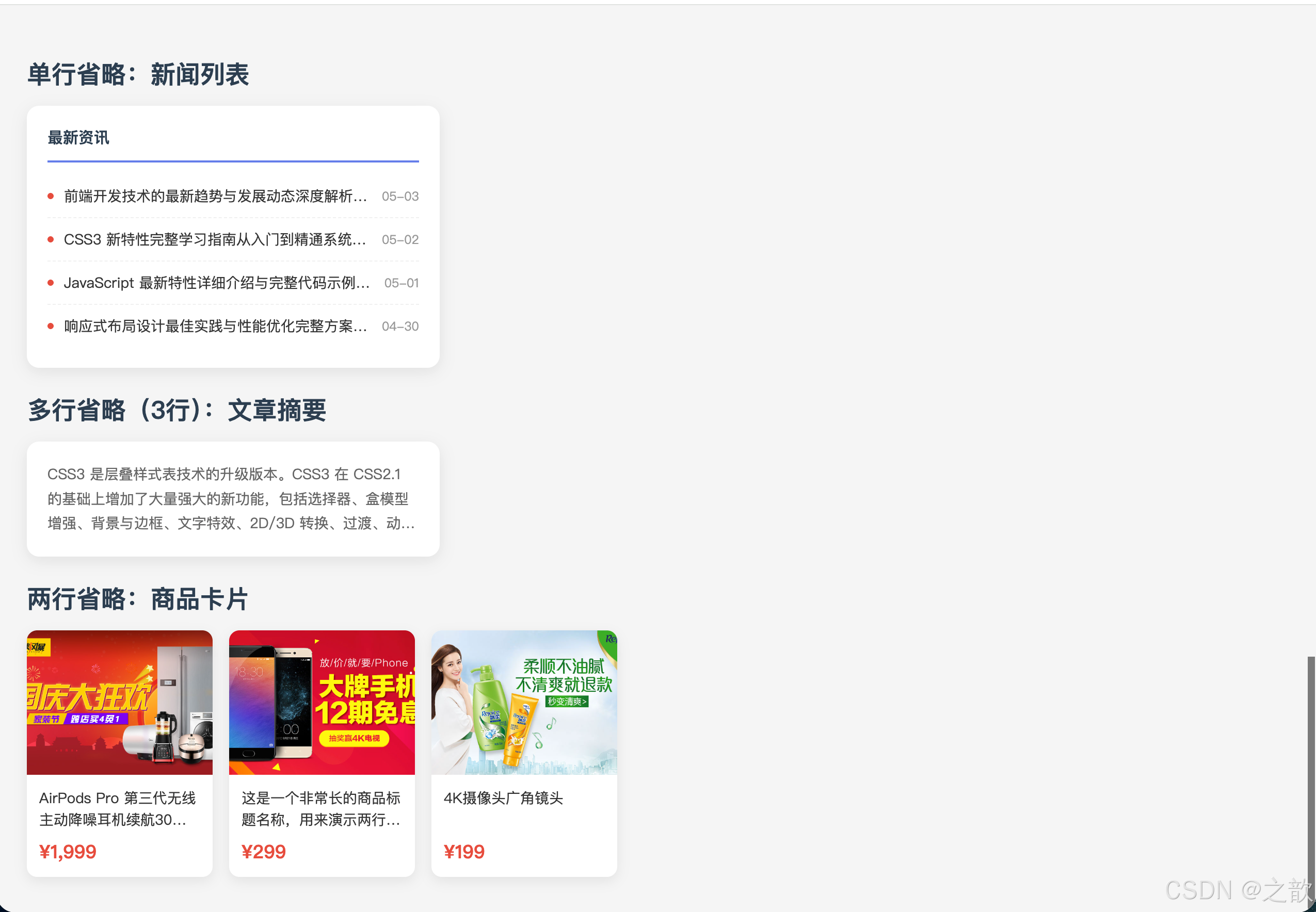
代码解说:
- 单行省略(新闻列表) :
.news-title采用经典三件套:white-space: nowrap强制不换行 →overflow: hidden裁切溢出内容 →text-overflow: ellipsis在截断处显示省略号。三者缺一不可:仅有overflow: hidden会静默裁剪但不显示省略号;仅有text-overflow: ellipsis而没有nowrap和overflow: hidden则完全不生效。- 新闻列表布局 :
display: flex+min-width: 0是关键------flex 子项默认不会收缩到内容以下,加了min-width: 0后才允许.news-title被压缩并触发省略号,否则标题会撑开父容器宽度。- 多行省略(文章摘要) :
display: -webkit-box+-webkit-box-orient: vertical+-webkit-line-clamp: 3+overflow: hidden是多行省略的固定写法。-webkit-line-clamp指定最大显示行数,超过部分自动省略。注意:此方案仍依赖-webkit-前缀,但现代浏览器均已支持,可以放心使用。- 商品卡片两行省略 :
-webkit-line-clamp: 2限制商品名最多显示两行,无论标题长短,卡片高度保持一致,页面整体更加规整,这是电商类页面最常见的文本截断场景。
4.6 text-decoration --- 文本修饰线
完整可运行示例:
html
<!DOCTYPE html>
<html lang="zh-CN">
<head>
  <meta charset="UTF-8">
  <title>text-decoration 文本修饰线完整示例</title>
  <style>
    * { box-sizing: border-box; margin: 0; padding: 0; }
    body { padding: 30px; background: #f9f9f9; font-family: 'Microsoft YaHei', sans-serif; }
    .card { background: white; border-radius: 10px; padding: 20px; margin-bottom: 20px; }
    h3 { font-size: 14px; color: #888; margin-bottom: 14px; }
    p { margin: 10px 0; font-size: 16px; }

    /* 电商划线价 */
    .price-old  { color: #999; text-decoration: line-through; font-size: 18px; }
    .price-new  { color: #e74c3c; font-weight: bold; font-size: 26px; }

    /* 各种线条风格 */
    .d-solid   { text-decoration: underline solid #3498db; }
    .d-dashed  { text-decoration: underline dashed #e74c3c; }
    .d-dotted  { text-decoration: underline dotted #2ecc71; }
    .d-double  { text-decoration: underline double 2px #9b59b6; }
    .d-wavy    { text-decoration: underline wavy #f39c12; }
    .d-over    { text-decoration: overline solid #3498db; }
    .d-through { text-decoration: line-through double red; }

    /* 链接处理 */
    a.reset       { text-decoration: none; color: #333; }
    a.reset:hover { color: #e74c3c; text-decoration: underline wavy #e74c3c; }
    a.fancy       { text-decoration: underline 2px solid #667eea;
                    text-underline-offset: 4px; color: #667eea; }

    /* 多重装饰线(CSS3 支持叠加)*/
    .multi-deco {
      text-decoration: underline overline;
      text-decoration-color: #f39c12;
    }
  </style>
</head>
<body>
  <div class="card">
    <h3>电商场景:划线原价 + 现价</h3>
    <p class="price-old">原价 ¥999</p>
    <p class="price-new">限时特价 ¥199 🔥</p>
  </div>

  <div class="card">
    <h3>各种修饰线风格</h3>
    <p class="d-solid">underline solid 实线下划线</p>
    <p class="d-dashed">underline dashed 虚线下划线</p>
    <p class="d-dotted">underline dotted 点线下划线</p>
    <p class="d-double">underline double 双实线下划线</p>
    <p class="d-wavy">underline wavy 波浪线下划线 ✨</p>
    <p class="d-over">overline solid 上划线</p>
    <p class="d-through">line-through double 双删除线</p>
    <p class="multi-deco">underline + overline 上下划线叠加</p>
  </div>

  <div class="card">
    <h3>链接样式处理</h3>
    <p>普通链接:<a href="#">默认蓝色下划线</a></p>
    <p>去掉下划线:<a class="reset" href="#">hover 时出现波浪下划线</a></p>
    <p>精美链接:<a class="fancy" href="#">自定义偏移距离的下划线</a></p>
  </div>
</body>
</html>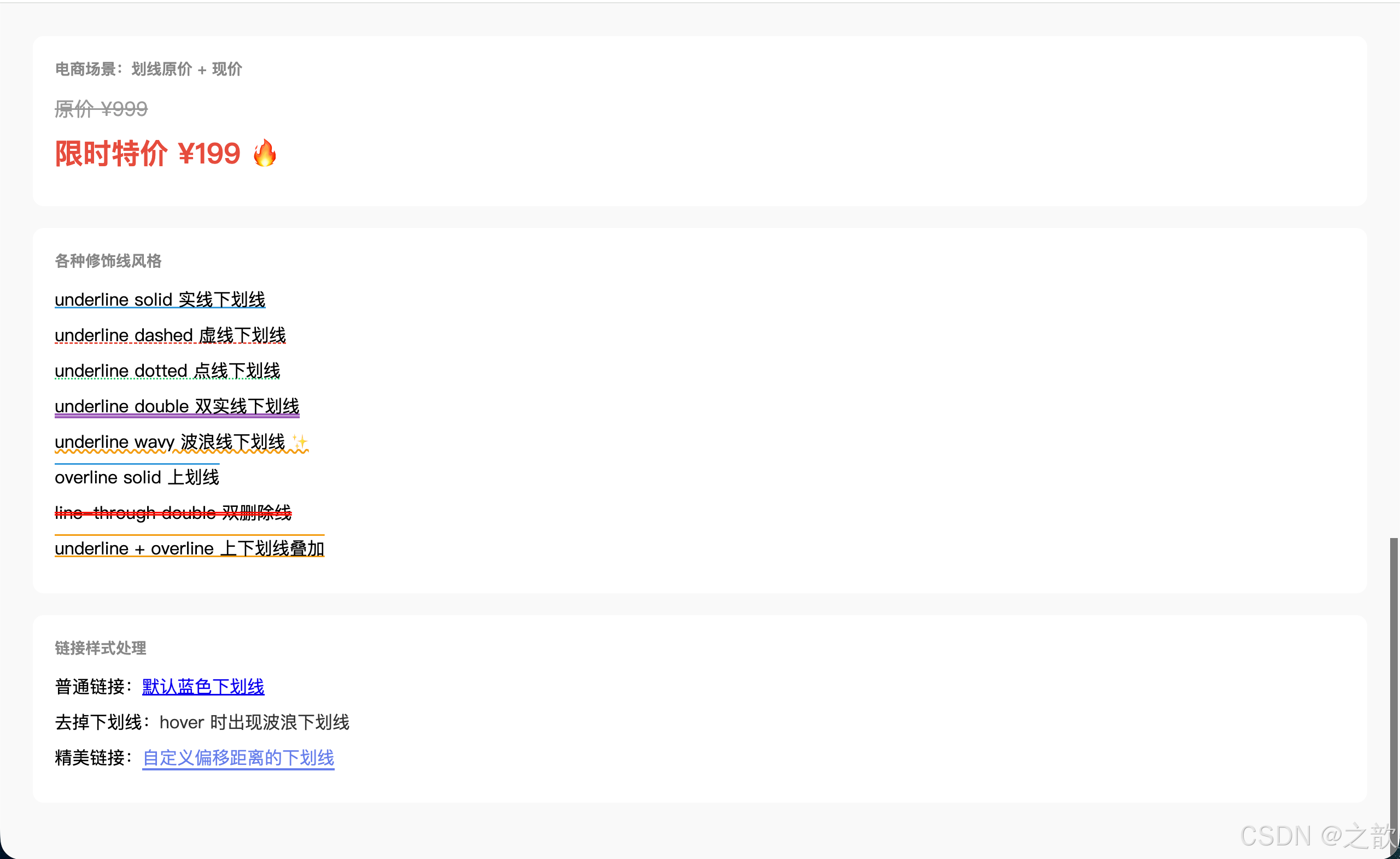
代码解说:
- 电商划线价 :
text-decoration: line-through是最简单的单个属性写法,CSS3 新增了text-decoration-style(线形)和text-decoration-color(颜色)子属性,也可以用复合写法text-decoration: 类型 风格 颜色合并书写。- wavy 波浪线 :
text-decoration: underline wavy #f39c12是 CSS3 新增的波浪线样式,常用于拼写检查提示(浏览器拼写错误就是红色波浪线)和页面装饰效果。text-underline-offset:a.fancy用了text-underline-offset: 4px,让下划线与文字底部保持 4px 距离,使链接更易读、更精致,这是 CSS3 新增的子属性,可以单独控制偏移量。- 多重装饰线 :CSS3 支持同时设置
underline overline,即文字上方和下方都有装饰线,配合相同颜色形成文字"包裹"的视觉效果。- 链接的 hover 交互 :
a.reset默认无下划线(text-decoration: none),hover 时才出现波浪线,这种「默认简洁,交互时提示」的设计模式在现代 UI 中非常普遍。
4.7 text-shadow --- 文本阴影
语法:
css
/* 单层阴影 */
text-shadow: x偏移 y偏移 模糊半径 颜色;

/* 多层阴影(用逗号分隔,先写的层在上方)*/
text-shadow: 阴影1, 阴影2, 阴影3;
text-shadow 多层叠加原理
第1层(最靠近文字)
第2层
第N层(最底层)
层层叠加 → 立体/发光/描边效果
完整可运行示例 --- 六种文字特效:
html
<!DOCTYPE html>
<html lang="zh-CN">
<head>
  <meta charset="UTF-8">
  <title>text-shadow 六种特效大全</title>
  <style>
    * { margin: 0; padding: 0; box-sizing: border-box; }
    body { background: #12121e; padding: 40px; font-family: 'Microsoft YaHei', sans-serif; }
    .grid { display: grid; grid-template-columns: repeat(3, 1fr); gap: 24px; }
    .effect-box {
      padding: 36px 20px; border-radius: 12px;
      text-align: center; background: rgba(255,255,255,0.04);
    }
    .effect-name { font-size: 12px; color: #666; margin-top: 14px; }
    code { background: rgba(255,255,255,0.1); color: #aaa; padding: 1px 4px; border-radius: 3px; font-size: 11px; }

    /* 1. 基础投影 */
    .e-basic {
      font-size: 48px; font-weight: bold; color: #fff;
      text-shadow: 4px 4px 8px rgba(0,0,0,0.8);
    }
    /* 2. 霓虹发光 */
    .e-neon {
      font-size: 48px; font-weight: bold; color: #fff;
      text-shadow: 0 0 5px #fff, 0 0 10px #fff, 0 0 20px #0ff, 0 0 40px #0ff, 0 0 80px #0ff;
      animation: neonFlicker 3s infinite alternate;
    }
    @keyframes neonFlicker {
      0%, 100% { text-shadow: 0 0 5px #fff, 0 0 10px #fff, 0 0 20px #0ff, 0 0 40px #0ff; }
      50%       { text-shadow: 0 0 2px #fff, 0 0 5px #0ff; opacity: 0.9; }
    }
    /* 3. 3D立体 */
    .e-3d {
      font-size: 48px; font-weight: 900; color: #e0e0e0;
      text-shadow: 1px 1px #bbb, 2px 2px #aaa, 3px 3px #999,
                   4px 4px #888, 5px 5px #777, 6px 6px #666;
    }
    /* 4. 浮雕效果 */
    .e-emboss {
      font-size: 48px; font-weight: bold; color: #888;
      background: #ccc; padding: 10px 20px; border-radius: 8px;
      text-shadow: -1px -1px 0 #fff, 1px 1px 0 #555;
    }
    /* 5. 文字描边 */
    .e-stroke {
      font-size: 48px; font-weight: bold; color: #f1c40f;
      text-shadow: -2px -2px 0 #000, 2px -2px 0 #000, -2px 2px 0 #000, 2px 2px 0 #000;
    }
    /* 6. 彩色3D */
    .e-color3d {
      font-size: 48px; font-weight: bold; color: #fff;
      text-shadow: 3px 3px 0 #e74c3c, 6px 6px 0 #e67e22, 9px 9px 0 #f1c40f;
    }
  </style>
</head>
<body>
  <div class="grid">
    <div class="effect-box">
      <div class="e-basic">投影</div>
      <div class="effect-name">基础投影<br><code>4px 4px 8px rgba(0,0,0,0.8)</code></div>
    </div>
    <div class="effect-box">
      <div class="e-neon">霓虹灯</div>
      <div class="effect-name">霓虹发光(带闪烁动画)<br><code>多层 blur 0 扩散</code></div>
    </div>
    <div class="effect-box">
      <div class="e-3d">立体字</div>
      <div class="effect-name">3D 立体效果<br><code>1~6px 逐层递进</code></div>
    </div>
    <div class="effect-box">
      <div class="e-emboss">浮雕字</div>
      <div class="effect-name">浮雕效果<br><code>白色高光 + 深色阴影</code></div>
    </div>
    <div class="effect-box">
      <div class="e-stroke">描边字</div>
      <div class="effect-name">文字描边<br><code>4个方向投射黑色无模糊</code></div>
    </div>
    <div class="effect-box">
      <div class="e-color3d">彩色3D</div>
      <div class="effect-name">彩色多重阴影<br><code>3/6/9px 三层彩色</code></div>
    </div>
  </div>
</body>
</html>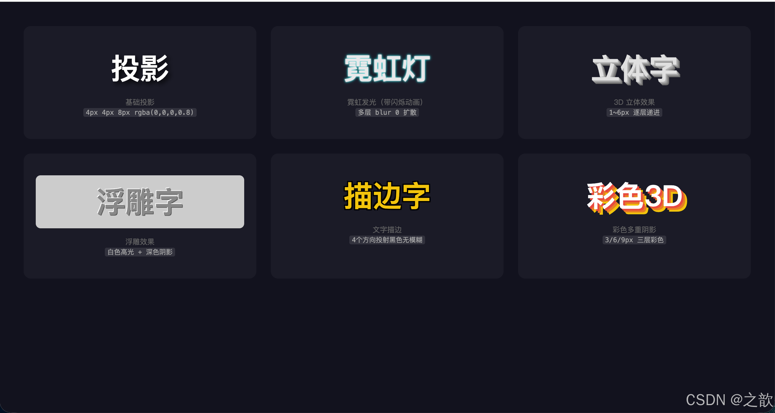
代码解说:
- 基础投影 :
4px 4px 8px rgba(0,0,0,0.8)--- x=4px(向右),y=4px(向下),模糊半径=8px,颜色为半透明黑色,是最经典的自然投影写法。- 霓虹发光 :关键是把 x、y 偏移都设为
0(光从文字中心向外均匀扩散),用多层不同模糊半径(5→10→20→40→80px)模拟光晕由强到弱的渐散效果;配合@keyframes在两种状态间循环切换,实现霓虹闪烁动画。- 3D立体 :连写 6 层阴影,每层 x、y 各递增 1px,颜色逐渐加深(
#bbb→#666),视觉上形成文字向右下方延伸的立体感,这是纯 CSS 实现 3D 字效的经典算法,层数越多立体感越强。- 浮雕效果:只需「左上白色高光 + 右下深色阴影」两层,模拟光从左上角照射的浮雕质感,偏移量很小(1px),模糊半径为 0(硬边缘),背景与文字颜色接近灰色时立体感最明显。
- 文字描边 :向 4 个对角方向各投射一层无模糊的纯黑阴影,四层互相交叠形成均匀描边效果,偏移量越大描边越粗;这是 CSS 描边的兼容性写法,比
-webkit-text-stroke兼容性更好。- 彩色3D:在 3D 效果基础上改用彩色阴影(红→橙→黄),三层以 3px 为步进叠加,形成彩虹立体字效果,适合活泼风格的设计场景。