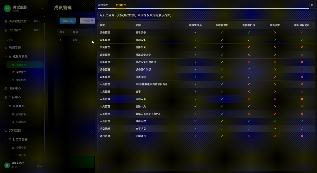
场景 :
我在上家公司曾参照百度、淘宝等网站的颜色配置方式,制定了主题色元素表,以元素类型、应用类型、备注、页面类型的方式存储色值,以特殊类名来深度修改element等组件颜色,使用body class,例如htmldata-theme="dark":root{}的方式向外抛出,挂载在浏览器上,并使用localStorage存储选择,所有页面元素内使用var()来取色,做到了一键切换所有风格颜色。
考虑到那时候大厂几乎不设切换主题色功能,网上流行案例只提供切换后台导航栏的颜色,逻辑简单,我也就满足于简单使用。现今,开源项目多如雨后春笋,我见识过很多有个性的项目,深感往期写法乏力、难以配色且维护艰难。
我总结经验,写成一套逻辑完善,写法简洁,易集成的主题色修改方法,源码放出供诸君品鉴。
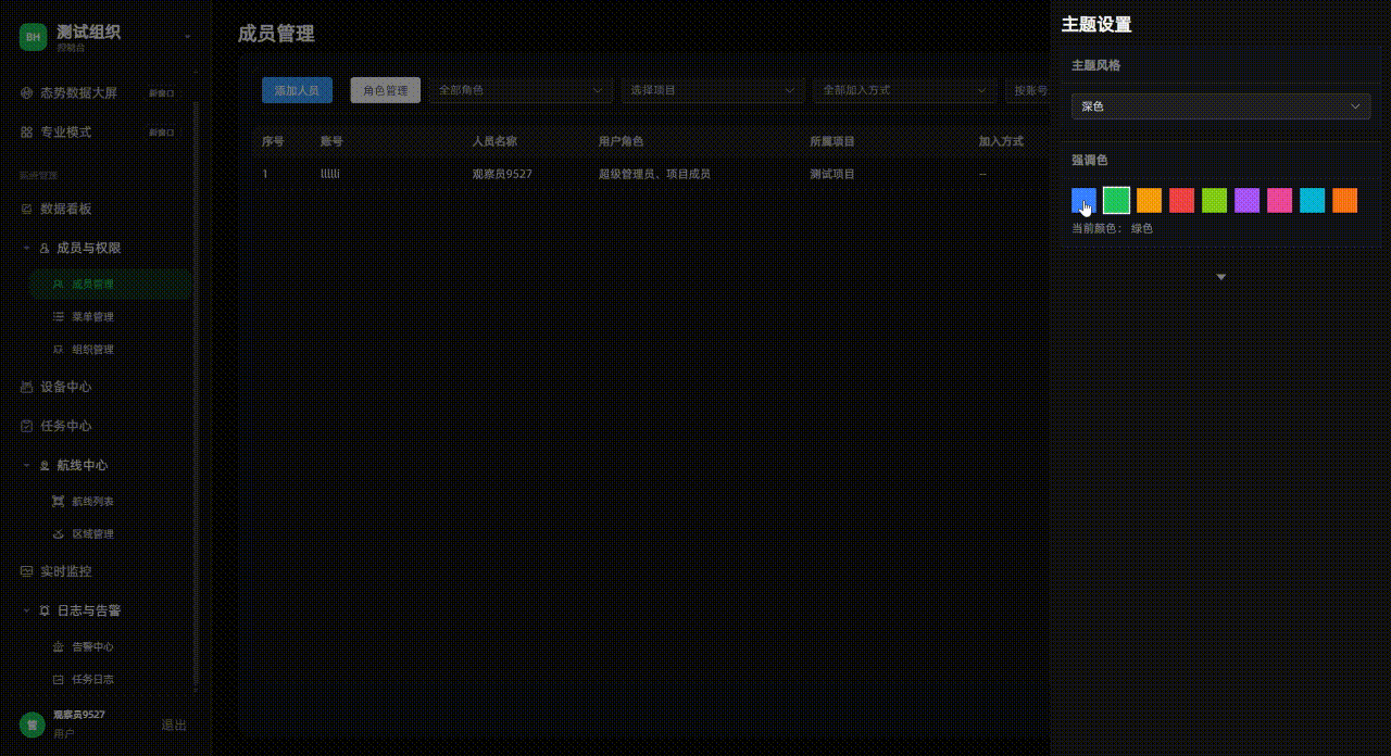
效果 :
实现:
index.scss style主配置文件,引入main.ts
css
@use './reset.scss';
@use './fonts.scss' as *;
@use './flex.style.scss' as *;
@use './scrollbar.scss';
@use './element.dark.scss' as element-dark;
@use './element.light.scss' as element-light;

:root {
  --app-font-family: #{$font-family-sans-serif};
  --bh-accent: #3a82ff;
  --bh-accent-rgb: 58, 130, 255;
  --bh-accent-soft: rgba(58, 130, 255, 0.14);

  --bh-theme-bg-app: #0b0b0b;
  --bh-theme-bg-main: #0b0b0b;
  --bh-theme-bg-aside: #171717;
  --bh-theme-panel-bg: #111317;
  --bh-theme-border: rgba(255, 255, 255, 0.08);
  --bh-theme-hover-bg: rgba(255, 255, 255, 0.06);
  --bh-theme-text-strong: rgba(255, 255, 255, 0.96);
  --bh-theme-text-normal: rgba(255, 255, 255, 0.72);
  --bh-theme-text-muted: rgba(255, 255, 255, 0.46);
  --bh-theme-text-subtle: rgba(255, 255, 255, 0.32);
  --bh-theme-ring: rgba(255, 255, 255, 0.9);
}

html[data-bh-theme='light'] {
  --bh-theme-bg-app: #edf1f7;
  --bh-theme-bg-main: #edf1f7;
  --bh-theme-bg-aside: #f8fafc;
  --bh-theme-panel-bg: #f3f6fb;
  --bh-theme-border: rgba(15, 23, 42, 0.12);
  --bh-theme-hover-bg: rgba(15, 23, 42, 0.06);
  --bh-theme-text-strong: rgba(15, 23, 42, 0.96);
  --bh-theme-text-normal: rgba(15, 23, 42, 0.78);
  --bh-theme-text-muted: rgba(15, 23, 42, 0.52);
  --bh-theme-text-subtle: rgba(15, 23, 42, 0.42);
  --bh-theme-ring: rgba(15, 23, 42, 0.9);
}

body {
  font-family: var(--app-font-family);
}
element.dark.scss element配置深色 写法借鉴我原本写法,多了一个父级类名约束,可以支持多种不同的表格类型
css
.bh-el-dark,
.bh-theme-dark .bh-el-theme {
  .el-input__wrapper,
  .el-select__wrapper,
  .el-input-number {
    background-color: #222 !important;
    box-shadow: 0 0 0 1px rgba(255, 255, 255, 0.12) inset !important;
  }

  .el-input__inner,
  .el-select__placeholder,
  .el-select__selected-item {
    color: rgba(255, 255, 255, 0.8);
  }

  .el-table {
    --el-table-bg-color: #171717;
    --el-table-tr-bg-color: #171717;
    --el-table-header-bg-color: #202020;
    --el-table-border-color: rgba(255, 255, 255, 0.08);
    --el-table-row-hover-bg-color: rgba(244, 199, 72, 0.08);
    --el-table-text-color: rgba(255, 255, 255, 0.86);
    --el-text-color-regular: rgba(255, 255, 255, 0.86);
    --el-table-header-text-color: rgba(255, 255, 255, 0.66);
  }

  .el-table__inner-wrapper::before {
    background-color: rgba(255, 255, 255, 0.08);
  }

  .el-table--striped .el-table__body tr.el-table__row--striped td.el-table__cell {
    background: #1d1d1d !important;
  }

  .el-table--striped .el-table__body tr.el-table__row td.el-table__cell {
    background: #171717;
  }

  .el-table .el-table__body td.el-table-fixed-column--right,
  .el-table .el-table__body td.el-table-fixed-column--left {
    background: #171717 !important;
  }

  .el-table--striped .el-table__body tr.el-table__row--striped td.el-table-fixed-column--right,
  .el-table--striped .el-table__body tr.el-table__row--striped td.el-table-fixed-column--left {
    background: #1d1d1d !important;
  }

  .el-table__body tr:hover > td.el-table__cell {
    background: rgba(186, 170, 125, 0.16) !important;
  }

  .el-table__body tr.hover-row > td.el-table-fixed-column--right,
  .el-table__body tr.hover-row > td.el-table-fixed-column--left,
  .el-table__body tr:hover > td.el-table-fixed-column--right,
  .el-table__body tr:hover > td.el-table-fixed-column--left {
    background: rgba(186, 170, 125, 0.16) !important;
  }

  .el-table--striped .el-table__body tr.el-table__row--striped:hover > td.el-table__cell {
    background: rgba(186, 170, 125, 0.2) !important;
  }

  .el-table--striped .el-table__body tr.el-table__row--striped.hover-row > td.el-table-fixed-column--right,
  .el-table--striped .el-table__body tr.el-table__row--striped.hover-row > td.el-table-fixed-column--left,
  .el-table--striped .el-table__body tr.el-table__row--striped:hover > td.el-table-fixed-column--right,
  .el-table--striped .el-table__body tr.el-table__row--striped:hover > td.el-table-fixed-column--left {
    background: rgba(186, 170, 125, 0.2) !important;
  }

  .el-pager li,
  .btn-prev,
  .btn-next {
    background: #222 !important;
    color: rgba(255, 255, 255, 0.78) !important;
  }

  .el-pager li.is-active {
    color: #f4c748 !important;
  }
}

.bh-dialog-dark,
.bh-theme-dark .bh-dialog-theme {
  &.el-dialog,
  .el-dialog {
    border-radius: 14px;
    overflow: hidden;
    background: #121212;
    border: 1px solid rgba(255, 255, 255, 0.08);
  }

  .el-dialog__header {
    margin-right: 0;
    padding: 18px 20px;
    border-bottom: 1px solid rgba(255, 255, 255, 0.08);
  }

  .el-dialog__title,
  .el-dialog__close {
    color: #f8fafc;
  }

  .el-dialog__body {
    padding: 18px 20px 10px;
    background: #121212;
  }

  .el-dialog__footer {
    padding: 10px 20px 18px;
    border-top: 1px solid rgba(255, 255, 255, 0.08);
    background: #121212;
  }

  .el-form-item__label {
    color: rgba(255, 255, 255, 0.76);
  }

  .el-input__inner::placeholder {
    color: rgba(255, 255, 255, 0.36);
  }

  .el-button--default {
    background: #222;
    border-color: rgba(255, 255, 255, 0.14);
    color: rgba(255, 255, 255, 0.82);
  }

  .el-button--default:hover {
    background: #2c2c2c;
    border-color: rgba(244, 199, 72, 0.48);
    color: #f4c748;
  }
}

.bh-switch-dark,
.bh-theme-dark .bh-switch-theme {
  --el-switch-on-color: #2f80ed;
  --el-switch-off-color: #3a3a3a;
  height: 22px;

  .el-switch__core {
    min-width: 50px;
    height: 22px;
    border-radius: 11px;
    border: 1px solid rgba(255, 255, 255, 0.14);
  }

  .el-switch__inner {
    color: #fff;
    font-size: 12px;
    font-weight: 500;
  }

  &:not(.is-checked) .el-switch__core {
    background-color: #333 !important;
    border-color: rgba(255, 255, 255, 0.16);
  }

  &.is-checked .el-switch__core {
    border-color: rgba(47, 128, 237, 0.72);
  }
}

.bh-select-dropdown-dark,
.bh-theme-dark .bh-select-dropdown-theme {
  background: #1a1a1a !important;
  border-color: rgba(255, 255, 255, 0.12) !important;

  .el-popper__arrow::before {
    background: #1a1a1a !important;
    border-color: rgba(255, 255, 255, 0.12) !important;
  }

  .el-select-dropdown__item {
    color: rgba(255, 255, 255, 0.78);
  }

  .el-select-dropdown__item.is-hovering {
    background: rgba(244, 199, 72, 0.1);
  }

  .el-select-dropdown__item.is-selected {
    color: #f4c748;
  }
}

.bh-drawer-dark,
.bh-theme-dark .bh-drawer-theme {
  .el-overlay {
    background-color: rgba(0, 0, 0, 0.45) !important;
  }

  .el-drawer__wrapper {
    background: transparent !important;
  }

  .el-drawer {
    background: #121212;
    border-left: 1px solid rgba(255, 255, 255, 0.08);
    box-shadow: -8px 0 24px rgba(0, 0, 0, 0.55) !important;
  }

  .el-drawer__body {
    height: 100%;
    padding: 0;
    background: #121212;
  }

  .el-drawer__header {
    margin-bottom: 0;
    padding: 0;
    background: #121212;
  }

  .el-tabs__item {
    color: rgba(255, 255, 255, 0.68);
  }

  .el-tabs__item.is-active {
    color: #f4c748;
  }

  .el-tabs__active-bar {
    background-color: #f4c748;
  }
}
element.light.scss 浅色主题配置
css
.bh-el-light,
.bh-theme-light .bh-el-theme,
.bh-theme-light .bh-el-dark {
  .el-input__wrapper,
  .el-select__wrapper,
  .el-input-number {
    background-color: #fff !important;
    box-shadow: 0 0 0 1px rgba(15, 23, 42, 0.12) inset !important;
  }

  .el-input__inner,
  .el-select__placeholder,
  .el-select__selected-item {
    color: rgba(15, 23, 42, 0.82);
  }

  .el-table {
    --el-table-bg-color: #fff;
    --el-table-tr-bg-color: #fff;
    --el-table-header-bg-color: #f5f7fa;
    --el-table-border-color: rgba(15, 23, 42, 0.08);
    --el-table-row-hover-bg-color: rgba(47, 128, 237, 0.08);
    --el-table-text-color: rgba(15, 23, 42, 0.86);
    --el-text-color-regular: rgba(15, 23, 42, 0.86);
    --el-table-header-text-color: rgba(15, 23, 42, 0.66);
  }

  .el-table__inner-wrapper::before {
    background-color: rgba(15, 23, 42, 0.08);
  }

  .el-table--striped .el-table__body tr.el-table__row--striped td.el-table__cell {
    background: #f8fafc !important;
  }

  .el-table--striped .el-table__body tr.el-table__row td.el-table__cell {
    background: #fff;
  }

  .el-table .el-table__body td.el-table-fixed-column--right,
  .el-table .el-table__body td.el-table-fixed-column--left {
    background: #fff !important;
  }

  .el-table--striped .el-table__body tr.el-table__row--striped td.el-table-fixed-column--right,
  .el-table--striped .el-table__body tr.el-table__row--striped td.el-table-fixed-column--left {
    background: #f8fafc !important;
  }

  .el-table__body tr:hover > td.el-table__cell {
    background: rgba(47, 128, 237, 0.08) !important;
  }

  .el-table__body tr.hover-row > td.el-table-fixed-column--right,
  .el-table__body tr.hover-row > td.el-table-fixed-column--left,
  .el-table__body tr:hover > td.el-table-fixed-column--right,
  .el-table__body tr:hover > td.el-table-fixed-column--left {
    background: rgba(47, 128, 237, 0.08) !important;
  }

  .el-table--striped .el-table__body tr.el-table__row--striped:hover > td.el-table__cell {
    background: rgba(47, 128, 237, 0.1) !important;
  }

  .el-table--striped .el-table__body tr.el-table__row--striped.hover-row > td.el-table-fixed-column--right,
  .el-table--striped .el-table__body tr.el-table__row--striped.hover-row > td.el-table-fixed-column--left,
  .el-table--striped .el-table__body tr.el-table__row--striped:hover > td.el-table-fixed-column--right,
  .el-table--striped .el-table__body tr.el-table__row--striped:hover > td.el-table-fixed-column--left {
    background: rgba(47, 128, 237, 0.1) !important;
  }

  .el-pager li,
  .btn-prev,
  .btn-next {
    background: #fff !important;
    color: rgba(15, 23, 42, 0.78) !important;
  }

  .el-pager li.is-active {
    color: #2f80ed !important;
  }
}

.bh-dialog-light,
.bh-theme-light .bh-dialog-theme,
.bh-theme-light .bh-dialog-dark {
  &.el-dialog,
  .el-dialog {
    border-radius: 14px;
    overflow: hidden;
    background: #fff;
    border: 1px solid rgba(15, 23, 42, 0.08);
  }

  .el-dialog__header {
    margin-right: 0;
    padding: 18px 20px;
    border-bottom: 1px solid rgba(15, 23, 42, 0.08);
  }

  .el-dialog__title,
  .el-dialog__close {
    color: #0f172a;
  }

  .el-dialog__body {
    padding: 18px 20px 10px;
    background: #fff;
  }

  .el-dialog__footer {
    padding: 10px 20px 18px;
    border-top: 1px solid rgba(15, 23, 42, 0.08);
    background: #fff;
  }

  .el-form-item__label {
    color: rgba(15, 23, 42, 0.76);
  }

  .el-input__inner::placeholder {
    color: rgba(15, 23, 42, 0.36);
  }

  .el-button--default {
    background: #fff;
    border-color: rgba(15, 23, 42, 0.14);
    color: rgba(15, 23, 42, 0.82);
  }

  .el-button--default:hover {
    background: #f8fafc;
    border-color: rgba(47, 128, 237, 0.42);
    color: #2f80ed;
  }
}

.bh-switch-light,
.bh-theme-light .bh-switch-theme,
.bh-theme-light .bh-switch-dark {
  --el-switch-on-color: #2f80ed;
  --el-switch-off-color: #d8dde6;
  height: 22px;

  .el-switch__core {
    min-width: 50px;
    height: 22px;
    border-radius: 11px;
    border: 1px solid rgba(15, 23, 42, 0.14);
  }

  .el-switch__inner {
    color: #fff;
    font-size: 12px;
    font-weight: 500;
  }

  &:not(.is-checked) .el-switch__core {
    background-color: #d8dde6 !important;
    border-color: rgba(15, 23, 42, 0.16);
  }

  &.is-checked .el-switch__core {
    border-color: rgba(47, 128, 237, 0.72);
  }
}

.bh-select-dropdown-light,
.bh-theme-light .bh-select-dropdown-theme,
.bh-theme-light .bh-select-dropdown-dark {
  background: #fff !important;
  border-color: rgba(15, 23, 42, 0.12) !important;

  .el-popper__arrow::before {
    background: #fff !important;
    border-color: rgba(15, 23, 42, 0.12) !important;
  }

  .el-select-dropdown__item {
    color: rgba(15, 23, 42, 0.78);
  }

  .el-select-dropdown__item.is-hovering {
    background: rgba(47, 128, 237, 0.08);
  }

  .el-select-dropdown__item.is-selected {
    color: #2f80ed;
  }
}

.bh-drawer-light,
.bh-theme-light .bh-drawer-theme,
.bh-theme-light .bh-drawer-dark {
  .el-overlay {
    background-color: rgba(15, 23, 42, 0.22) !important;
  }

  .el-drawer__wrapper {
    background: transparent !important;
  }

  .el-drawer {
    background: #fff;
    border-left: 1px solid rgba(15, 23, 42, 0.08);
    box-shadow: -8px 0 24px rgba(15, 23, 42, 0.12) !important;
  }

  .el-drawer__body {
    height: 100%;
    padding: 0;
    background: #fff;
  }

  .el-drawer__header {
    margin-bottom: 0;
    padding: 0;
    background: #fff;
  }

  .el-tabs__item {
    color: rgba(15, 23, 42, 0.68);
  }

  .el-tabs__item.is-active {
    color: #2f80ed;
  }

  .el-tabs__active-bar {
    background-color: #2f80ed;
  }
}
scrollbar.scss 滚动条配置
css
// 默认与当前控制台深色一致
:root {
  --bh-scrollbar-size: 6px;
  --bh-scrollbar-radius: 6px;
  --bh-scrollbar-track: transparent;
  --bh-scrollbar-thumb: rgba(255, 255, 255, 0.16);
  --bh-scrollbar-thumb-hover: rgba(244, 199, 72, 0.35);
  --bh-scrollbar-thumb-border-width: 2px;
  --bh-scrollbar-corner: transparent;
  --bh-scrollbar-track-margin-block: 4px;
}

html[data-bh-theme='light'] {
  --bh-scrollbar-thumb: rgba(15, 23, 42, 0.22);
  --bh-scrollbar-thumb-hover: rgba(47, 128, 237, 0.42);
}

@mixin bh-themed-scrollbar {
  scrollbar-width: thin;
  scrollbar-color: var(--bh-scrollbar-thumb) var(--bh-scrollbar-track);

  &::-webkit-scrollbar {
    width: var(--bh-scrollbar-size);
    height: var(--bh-scrollbar-size);
  }

  &::-webkit-scrollbar-track {
    margin: var(--bh-scrollbar-track-margin-block) 0;
    background: var(--bh-scrollbar-track);
    border-radius: var(--bh-scrollbar-radius);
  }

  &::-webkit-scrollbar-thumb {
    background: var(--bh-scrollbar-thumb);
    border-radius: var(--bh-scrollbar-radius);
    border: var(--bh-scrollbar-thumb-border-width) solid transparent;
    background-clip: padding-box;
  }

  &::-webkit-scrollbar-thumb:hover {
    background: var(--bh-scrollbar-thumb-hover);
    border: var(--bh-scrollbar-thumb-border-width) solid transparent;
    background-clip: padding-box;
  }

  &::-webkit-scrollbar-corner {
    background: var(--bh-scrollbar-corner);
  }
}

.bh-scrollbar {
  @include bh-themed-scrollbar;
}

// Element Plus:固定高度表格内部使用 ElScrollbar,实际滚动层为 .el-scrollbar__wrap。
.bh-el-dark .el-table .el-scrollbar__wrap,
.bh-el-light .el-table .el-scrollbar__wrap,
.bh-el-theme .el-table .el-scrollbar__wrap {
  @include bh-themed-scrollbar;
  overflow-x: hidden !important;
}

.bh-el-dark .el-table .el-scrollbar__bar.is-horizontal,
.bh-el-light .el-table .el-scrollbar__bar.is-horizontal,
.bh-el-theme .el-table .el-scrollbar__bar.is-horizontal {
  display: none !important;
}

.bh-table-x-scroll {
  .el-table .el-scrollbar__wrap {
    overflow-x: auto !important;
  }

  .el-table .el-scrollbar__bar.is-horizontal {
    display: block !important;
  }
}
consoleTheme.ts 后台主题色配置库
css
import { computed, ref } from 'vue'
import { defineStore } from 'pinia'

export type ConsoleThemeMode = 'dark' | 'light'

export interface AccentOption {
  id: string
  label: string
  hex: string
}

const STORAGE_KEY = 'bh-console-theme'

const DEFAULT_THEME: ConsoleThemeMode = 'dark'
const DEFAULT_ACCENT = '#3a82ff'

const ACCENT_OPTIONS: AccentOption[] = [
  { id: 'blue', label: '蓝色', hex: '#3a82ff' },
  { id: 'green', label: '绿色', hex: '#22c55e' },
  { id: 'amber', label: '琥珀色', hex: '#f59e0b' },
  { id: 'red', label: '红色', hex: '#ef4444' },
  { id: 'lime', label: '青柠色', hex: '#84cc16' },
  { id: 'purple', label: '紫色', hex: '#a855f7' },
  { id: 'pink', label: '粉色', hex: '#ec4899' },
  { id: 'cyan', label: '青色', hex: '#06b6d4' },
  { id: 'orange', label: '橙色', hex: '#f97316' },
]

function hexToRgb(hex: string): [number, number, number] {
  const normalized = hex.replace('#', '')
  const value = normalized.length === 3
    ? normalized.split('').map((item) => item + item).join('')
    : normalized
  const num = Number.parseInt(value, 16)
  return [(num >> 16) & 255, (num >> 8) & 255, num & 255]
}

function applyThemeVars(theme: ConsoleThemeMode, accentHex: string) {
  if (typeof document === 'undefined') return
  const root = document.documentElement
  const body = document.body
  const [r, g, b] = hexToRgb(accentHex)

  root.dataset.bhTheme = theme
  body.classList.remove('bh-theme-dark', 'bh-theme-light')
  body.classList.add(`bh-theme-${theme}`)

  root.style.setProperty('--bh-accent', accentHex)
  root.style.setProperty('--bh-accent-rgb', `${r}, ${g}, ${b}`)
  root.style.setProperty('--bh-accent-soft', `rgba(${r}, ${g}, ${b}, 0.14)`)
}

export const useConsoleThemeStore = defineStore('console-theme', () => {
  const theme = ref<ConsoleThemeMode>(DEFAULT_THEME)
  const accentHex = ref(DEFAULT_ACCENT)
  const ready = ref(false)

  const accentOptions = ACCENT_OPTIONS
  const selectedAccent = computed(() => accentOptions.find((item) => item.hex === accentHex.value) ?? accentOptions[0])

  function setTheme(nextTheme: ConsoleThemeMode) {
    theme.value = nextTheme
    applyThemeVars(theme.value, accentHex.value)
    persist()
  }

  function setAccent(nextAccent: string) {
    accentHex.value = nextAccent
    applyThemeVars(theme.value, accentHex.value)
    persist()
  }

  function persist() {
    if (typeof window === 'undefined') return
    const payload = JSON.stringify({
      theme: theme.value,
      accentHex: accentHex.value,
    })
    window.localStorage.setItem(STORAGE_KEY, payload)
  }

  function init() {
    if (ready.value) return
    if (typeof window !== 'undefined') {
      const raw = window.localStorage.getItem(STORAGE_KEY)
      if (raw) {
        const parsed = JSON.parse(raw) as { theme?: ConsoleThemeMode; accentHex?: string }
        if (parsed.theme === 'dark' || parsed.theme === 'light') {
          theme.value = parsed.theme
        }
        if (parsed.accentHex && ACCENT_OPTIONS.some((item) => item.hex === parsed.accentHex)) {
          accentHex.value = parsed.accentHex
        }
      }
    }
    applyThemeVars(theme.value, accentHex.value)
    ready.value = true
  }

  return {
    accentHex,
    accentOptions,
    init,
    selectedAccent,
    setAccent,
    setTheme,
    theme,
  }
})
ThemeDrawer.vue 颜色配置UI
javascript
<script setup lang="ts">
import { computed } from 'vue'
import { CaretBottom } from '@element-plus/icons-vue'
import type { AccentOption, ConsoleThemeMode } from '@/stores/consoleTheme'

const props = defineProps<{
  modelValue: boolean
  theme: ConsoleThemeMode
  accentHex: string
  accentOptions: AccentOption[]
}>()

const emit = defineEmits<{
  'update:modelValue': [value: boolean]
  'update:theme': [value: ConsoleThemeMode]
  'update:accentHex': [value: string]
}>()

const currentTheme = computed({
  get: () => props.theme,
  set: (value: ConsoleThemeMode) => emit('update:theme', value),
})

const selectedAccent = computed(() => props.accentOptions.find((item) => item.hex === props.accentHex))
const drawerClass = computed(() => `bh-drawer-${props.theme}`)

function closeDrawer() {
  emit('update:modelValue', false)
}

function onModelValueUpdate(value: boolean) {
  emit('update:modelValue', value)
}

function chooseAccent(hex: string) {
  emit('update:accentHex', hex)
}
</script>

<template>
  <el-drawer
    :model-value="modelValue"
    direction="rtl"
    size="420px"
    :with-header="false"
    append-to-body
    :class="['theme-drawer', drawerClass, 'bh-el-theme', `bh-theme-${theme}`]"
    @close="closeDrawer"
    @update:model-value="onModelValueUpdate"
  >
    <section class="theme-drawer__panel bh-scrollbar">
      <header class="theme-drawer__header">主题设置</header>

      <div class="theme-drawer__block">
        <h3 class="theme-drawer__label">主题风格</h3>
        <el-select v-model="currentTheme" class="theme-drawer__select" :popper-class="`bh-select-dropdown-${theme}`">
          <el-option label="深色" value="dark" />
          <el-option label="浅色" value="light" />
        </el-select>
      </div>

      <div class="theme-drawer__block">
        <h3 class="theme-drawer__label">强调色</h3>
        <div class="theme-drawer__colors">
          <button
            v-for="option in accentOptions"
            :key="option.id"
            type="button"
            class="theme-drawer__color-item"
            :class="{ 'is-active': option.hex === accentHex }"
            :style="{ '--swatch': option.hex }"
            :aria-label="`选择${option.label}`"
            @click="chooseAccent(option.hex)"
          />
        </div>
        <p class="theme-drawer__selected">
          当前颜色:
          <span>{{ selectedAccent?.label ?? '蓝色' }}</span>
        </p>
      </div>

      <button type="button" class="theme-drawer__collapse">
        <el-icon><CaretBottom /></el-icon>
      </button>
    </section>
  </el-drawer>
</template>

<style scoped lang="scss">
.theme-drawer {
  &__panel {
    height: 100%;
    padding: 18px 14px;
    overflow: auto;
  }

  &__header {
    margin: 0 0 14px;
    font-size: 22px;
    font-weight: 700;
    line-height: 1.2;
    color: var(--bh-theme-text-strong);
  }

  &__block {
    margin-bottom: 14px;
    border: 1px solid var(--bh-theme-border);
    background: var(--bh-theme-panel-bg);
  }

  &__label {
    margin: 0;
    padding: 10px 12px;
    font-size: 15px;
    font-weight: 600;
    letter-spacing: 0.02em;
    color: var(--bh-theme-text-muted);
    border-bottom: 1px solid var(--bh-theme-border);
  }

  &__select {
    width: calc(100% - 24px);
    margin: 12px;
  }

  &__colors {
    display: flex;
    flex-wrap: wrap;
    gap: 10px;
    padding: 12px 12px 8px;
  }

  &__color-item {
    width: 30px;
    height: 30px;
    border: 0;
    cursor: pointer;
    background: var(--swatch);
    position: relative;

    &::after {
      content: '';
      position: absolute;
      inset: -2px;
      border: 2px solid transparent;
    }

    &.is-active::after {
      border-color: var(--bh-theme-ring);
    }
  }

  &__selected {
    margin: 0;
    padding: 0 12px 12px;
    font-size: 14px;
    color: var(--bh-theme-text-muted);
  }

  &__collapse {
    margin-top: auto;
    width: 100%;
    height: 42px;
    border: 0;
    display: inline-flex;
    align-items: center;
    justify-content: center;
    background: transparent;
    color: var(--bh-theme-text-muted);
    cursor: pointer;
    font-size: 20px;
  }
}
</style>
页面调用处 (核心逻辑):
bash
<script setup lang="ts">
import { computed, onMounted, provide, ref, watch } from 'vue'
import { useRoute, useRouter } from 'vue-router'
import { useConsoleThemeStore } from '@/stores/consoleTheme'

const themeDrawerVisible = ref(false)
function openThemeDrawer() {
  themeDrawerVisible.value = true
}
const consoleThemeStore = useConsoleThemeStore()
consoleThemeStore.init()
const themeClass = computed(() => `bh-theme-${consoleThemeStore.theme}`)
const elementThemeClass = computed(() => `bh-el-${consoleThemeStore.theme}`)
</script>

<template>
  <div class="console-layout" :class="[themeClass, elementThemeClass]">
      <ThemeDrawer
      v-model="themeDrawerVisible"
      :theme="consoleThemeStore.theme"
      :accent-hex="consoleThemeStore.accentHex"
      :accent-options="consoleThemeStore.accentOptions"
      @update:theme="consoleThemeStore.setTheme"
      @update:accent-hex="consoleThemeStore.setAccent"
    />
  </div>
</template>
<style scoped lang="scss">
.console-layout {
  height: 100vh;
  max-height: 100dvh;
  box-sizing: border-box;
  display: grid;
  grid-template-columns: 260px minmax(0, 1fr);
  grid-template-rows: minmax(0, 1fr);
  overflow: hidden;
  background: var(--bh-theme-bg-app);
  }
</style>
页面引用处:
bash
<div class="org-page__panel bh-el-dark flex-column flex-1">
      <div class="org-page__filters">
        <el-input
          v-model="filters.orgName"
          placeholder="请输入组织名称"
          clearable
          @keyup.enter="doSearch"
        />

        <div class="org-page__filter-actions flex">
          <el-button type="primary" :icon="Search" @click="doSearch">筛选</el-button>
          <el-button :icon="Refresh" @click="resetFilters">重置</el-button>
          <el-button type="success" @click="openCreateDialog">新增组织</el-button>
        </div>
      </div>

      <div class="org-page__table-wrap flex-1">
        <el-table v-loading="loading" :data="pagedRows" row-key="id" height="100%" @row-click="handleRowClick">
          //...
        </el-table>
      </div>

      <footer class="org-page__pagination flex flex-justify-end flex-shrink-0">
        <el-pagination
          v-model:current-page="currentPage"
          v-model:page-size="pageSize"
          background
          layout="total, prev, pager, next, sizes"
          :total="total"
          :page-sizes="[10, 20, 50]"
          @size-change="handlePageSizeChange"
        />
      </footer>
    </div>