摘要: 网页的美,不仅在于静态的布局,更在于灵动的交互。本篇将带你走进CSS3最有趣的部分:过渡(transition)、变形(transform)、关键帧动画(animation)和响应式设计(媒体查询)。你将学会如何让按钮在悬停时平滑变色、如何让元素旋转缩放、如何设计出呼吸灯与入场动效,以及如何让同一个页面在手机、平板和电脑上都完美显示。
一、过渡(transition)------让变化变得平滑
1. 为什么需要过渡?
在CSS中,很多属性可以在不同状态之间切换,例如:hover、:focus、类名变化。如果没有过渡,变化是瞬间完成的,显得生硬。transition的作用就是给属性变化添加一个平滑的过渡过程,让用户感觉更自然。
举个例子,一个按钮在鼠标悬停时改变背景色:
css
.btn {
  background-color: #3498db;
  /* 无过渡:颜色瞬间变化 */
}
.btn:hover {
  background-color: #2980b9;
}
加上transition:
css
.btn {
  background-color: #3498db;
  transition: background-color 0.3s ease;
}
现在从蓝色到深蓝会有一个0.3秒的渐变,视觉上舒服很多。
2. transition语法拆解
transition是一个复合属性,可以一次性设置四个子属性,顺序为:
css
transition: property duration timing-function delay;也可以分开写:
-
transition-property:指定要过渡的CSS属性,默认为all(所有可过渡属性都会变化)。常用可过渡属性包括:width、height、background-color、color、opacity、transform、left、top、margin、padding、border-width等。但不能过渡display、background-image等。 -
transition-duration:过渡持续时间,单位s(秒)或ms(毫秒),如0.5s或500ms。 -
transition-timing-function:速度曲线,决定过渡过程的快慢变化。 -
transition-delay:延迟多久后开始过渡,单位同duration。
3. 速度曲线详解
transition-timing-function 支持以下值:
-
ease(默认):慢→快→慢,最常用。 -
linear:匀速。 -
ease-in:慢→快。 -
ease-out:快→慢。 -
ease-in-out:慢→快→慢(比ease更平滑)。 -
cubic-bezier(n,n,n,n):自定义贝塞尔曲线,可以精细控制速度变化。例如cubic-bezier(0.68, -0.55, 0.27, 1.55)会有一个回弹效果。
可以通过浏览器的开发者工具实时调整贝塞尔曲线,非常直观。
4. 过渡多个属性
用逗号分隔多个过渡设置:
css
.box {
  width: 100px;
  height: 100px;
  background: #e74c3c;
  transition: width 0.5s ease, background 0.8s linear, height 0.3s ease-out;
}
.box:hover {
  width: 200px;
  background: #9b59b6;
  height: 150px;
}
如果希望所有属性同时过渡且使用相同时间和缓动,可以直接写 transition: all 0.3s ease;,但性能略差,推荐明确指定属性。
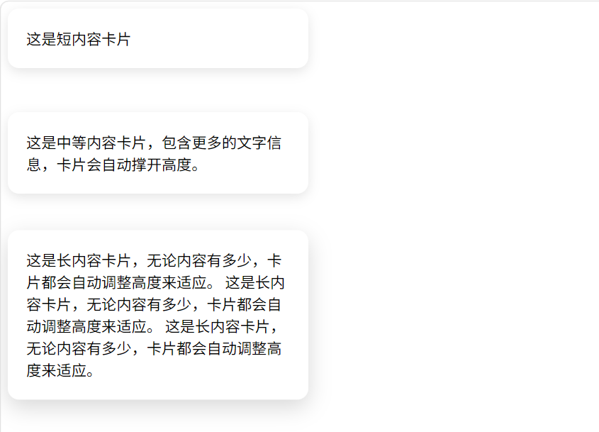
5. 实战:悬停放大卡片
卡片在鼠标划过时向上微微移动并加深阴影,这个效果非常流行。
html
<!DOCTYPE html>
<html lang="zh-CN">
<head>
  <meta charset="UTF-8">
  <title>纯原始卡片效果</title>
  <style>
.card {
  width: 280px;
  padding: 20px;
  background: white;
  border-radius: 12px;
  box-shadow: 0 4px 12px rgba(0,0,0,0.1);
  transition: transform 0.3s ease, box-shadow 0.3s ease;
}

.card:hover {
  transform: translateY(-8px);
  box-shadow: 0 8px 24px rgba(0,0,0,0.15);
}
  </style>
</head>
<body>
  <!-- 卡片1:短内容 -->
  <div class="card">
    这是短内容卡片
  </div>

  <br><br>

  <!-- 卡片2:中等内容 -->
  <div class="card">
    这是中等内容卡片,包含更多的文字信息,卡片会自动撑开高度。
  </div>

  <br><br>

  <!-- 卡片3:长内容(完全自适应) -->
  <div class="card">
    这是长内容卡片,无论内容有多少,卡片都会自动调整高度来适应。
    这是长内容卡片,无论内容有多少,卡片都会自动调整高度来适应。
    这是长内容卡片,无论内容有多少,卡片都会自动调整高度来适应。
  </div>
</body>
</html>
transform 属性我们很快就会学到,这里先用它实现位移。
二、变形(transform)------让元素随心所欲地改变
transform允许我们对元素进行旋转、缩放、倾斜、移动等操作,完全不影响文档流,其他元素不会移动,只是视觉效果变化。它常和transition、animation搭配使用,创造丰富动效。
1. 2D变形函数
① translate(平移) translate(x, y) 将元素沿X轴和Y轴移动。如果只写一个值,只移动X轴。
html
<!DOCTYPE html>
<html lang="zh-CN">
<head>
  <meta charset="UTF-8">
  <title>平移效果</title>
  <style>
    .box {
      width: 100px;
      height: 100px;
      background: #409eff;
      color: white;
      text-align: center;
      line-height: 100px;
      border-radius: 8px;
      margin: 20px;
      display: inline-block;
    }

    /* 平移变换:向右50px,向下20px */
    .translate {
      transform: translate(50px, 20px);
    }
  </style>
</head>
<body>
  <h3>平移 translate(x, y)</h3>
  <p>元素沿x轴和y轴平移,x正向右负向左,y正向下负向上</p>

  <div class="box">原始</div>
  <div class="box translate">平移后</div>
</body>
</html>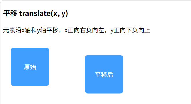
常用简化:translateX(50px)、translateY(20px)。
② scale(缩放) scale(sx, sy) 缩放元素,1为原始大小,0.5为一半,2为两倍。也可以单独设置X和Y。
html
<!DOCTYPE html>
<html lang="zh-CN">
<head>
  <meta charset="UTF-8">
  <title>缩放效果</title>
  <style>
    .box {
      width: 100px;
      height: 100px;
      background: #67c23a;
      color: white;
      text-align: center;
      line-height: 100px;
      border-radius: 8px;
      margin: 30px;
      display: inline-block;
    }

    /* 缩放变换:等比例放大1.5倍 */
    .scale {
      transform: scale(1.5);
    }

    /* 也可以分别设置x轴和y轴缩放:transform: scaleX(1.2) scaleY(0.8); */
  </style>
</head>
<body>
  <h3>缩放 scale(x, y)</h3>
  <p>元素沿x轴和y轴缩放,大于1放大,小于1缩小,只写一个参数表示等比例缩放</p>

  <div class="box">原始</div>
  <div class="box scale">放大1.5倍</div>
</body>
</html>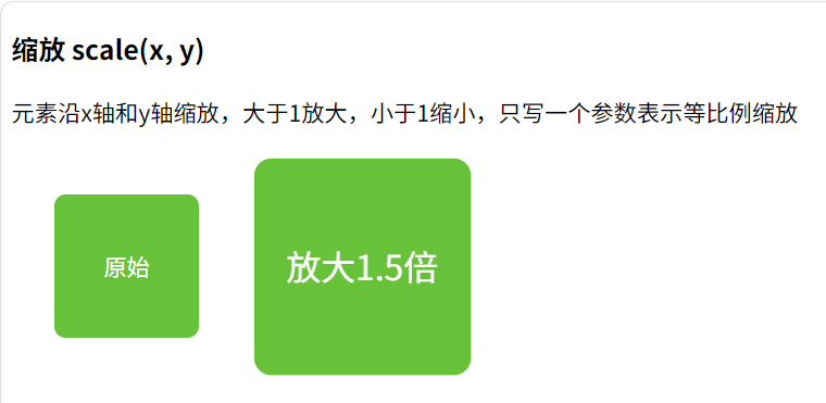
③ rotate(旋转) rotate(deg) 顺时针旋转,单位deg(度)。例如 rotate(45deg)。也可以写负值逆时针。
html
<!DOCTYPE html>
<html lang="zh-CN">
<head>
  <meta charset="UTF-8">
  <title>旋转效果</title>
  <style>
    .box {
      width: 100px;
      height: 100px;
      background: #e6a23c;
      color: white;
      text-align: center;
      line-height: 100px;
      border-radius: 8px;
      margin: 40px;
      display: inline-block;
    }

    /* 旋转变换:顺时针旋转45度 */
    .rotate {
      transform: rotate(45deg);
    }

    /* 逆时针旋转:transform: rotate(-30deg); */
    /* 旋转原点默认在中心,可通过 transform-origin 改变 */
  </style>
</head>
<body>
  <h3>旋转 rotate(angle)</h3>
  <p>元素绕中心顺时针旋转,单位为deg(角度),负数表示逆时针旋转</p>

  <div class="box">原始</div>
  <div class="box rotate">旋转45°</div>
</body>
</html>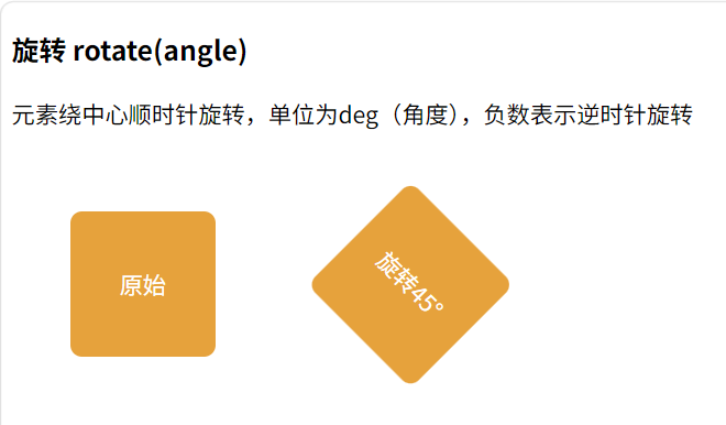
④ skew(倾斜) skew(ax, ay) 沿X轴或Y轴倾斜,单位deg。比如 skew(10deg, 5deg)。较少使用,但可以做平行四边形。
html
<!DOCTYPE html>
<html lang="zh-CN">
<head>
  <meta charset="UTF-8">
  <title>倾斜效果</title>
  <style>
    .box {
      width: 100px;
      height: 100px;
      background: #f56c6c;
      color: white;
      text-align: center;
      line-height: 100px;
      border-radius: 8px;
      margin: 30px;
      display: inline-block;
    }

    /* 倾斜变换:x轴倾斜15度,y轴倾斜5度 */
    .skew {
      transform: skew(15deg, 5deg);
    }

    /* 只倾斜x轴:transform: skewX(20deg); */
    /* 只倾斜y轴:transform: skewY(10deg); */
  </style>
</head>
<body>
  <h3>倾斜 skew(x-angle, y-angle)</h3>
  <p>元素沿x轴和y轴倾斜,单位为deg(角度),正数表示顺时针倾斜</p>

  <div class="box">原始</div>
  <div class="box skew">倾斜后</div>
</body>
</html>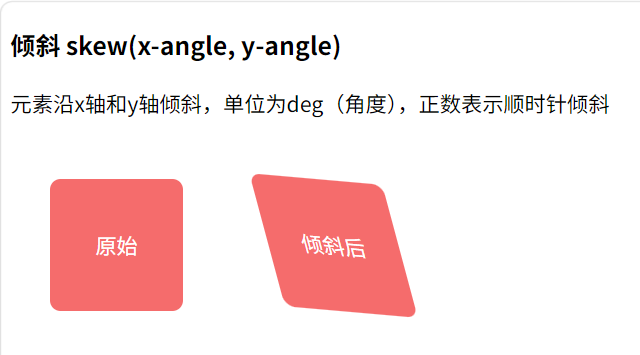
2. 组合变形
可以用空格分隔多个函数,顺序很重要,因为变形的顺序会影响最终效果。例如先移动再旋转与先旋转再移动完全不同。
html
<!DOCTYPE html>
<html lang="zh-CN">
<head>
  <meta charset="UTF-8">
  <title>组合变形过渡效果</title>
  <style>
    body {
      height: 100vh;
      display: flex;
      justify-content: center;
      align-items: center;
      background: #f5f7fa;
      margin: 0;
      font-family: 'Microsoft YaHei', sans-serif;
    }

    .box {
      width: 120px;
      height: 120px;
      background: linear-gradient(135deg, #409eff 0%, #66b1ff 100%);
      color: white;
      text-align: center;
      line-height: 120px;
      border-radius: 12px;
      box-shadow: 0 4px 12px rgba(64, 158, 255, 0.3);
      font-size: 16px;
      font-weight: 500;

      /* 所有 transform 变化都会在 2 秒内平滑完成 */
      transition: transform 2s ease-in-out;
    }

    /* 鼠标悬停时应用最终的组合变形 */
    .box:hover {
      /* 注意:transform 的顺序很重要!后面的变形会在前面的基础上叠加 */
      transform:
        translate(100px, 0)    /* 第1步:向右平移100px */
        rotate(45deg)          /* 第2步:顺时针旋转45度 */
        scale(1.5)             /* 第3步:放大1.5倍 */
        translate(100px, 100px) /* 第4步:再向右100px,向下100px */
        rotate(45deg)          /* 第5步:再旋转45度(总共90度) */
        skew(10deg, 5deg);     /* 第6步:最后添加倾斜效果 */
    }
  </style>
</head>
<body>
  <div class="box">悬停看效果</div>
</body>
</html>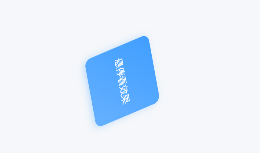
3. transform-origin 变形中心点
默认的变形中心点是元素的中心(50% 50%)。可以通过 transform-origin 改变,比如让旋转围绕左上角:
css
.box {
  transform-origin: top left;
  transform: rotate(45deg);
}
也可以使用具体像素或关键字组合(left、top、right、bottom)。
4. 3D变形简介
2D已经够用,但3D能带来更炫酷的效果。开启3D空间需要给父元素设置 perspective,给子元素进行 rotateX()、rotateY() 等操作。
html
<!DOCTYPE html>
<html lang="zh-CN">
<head>
  <meta charset="UTF-8">
  <title>3D卡片翻转效果</title>
  <style>
    .scene {
      perspective: 800px;
    }
    .card-3d {
      transition: transform 0.6s;
      transform-style: preserve-3d;
    }
    .card-3d:hover {
      transform: rotateY(180deg);
    }

    /* 场景容器样式 */
    .scene {
      width: 300px;
      height: 200px;
      margin: 150px auto;
    }

    /* 3D卡片容器样式 */
    .card-3d {
      width: 100%;
      height: 100%;
      position: relative;
    }

    /* 卡片正面和背面的通用样式 */
    .card-front, .card-back {
      position: absolute;
      width: 100%;
      height: 100%;
      backface-visibility: hidden; /* 隐藏元素背面 */
      display: flex;
      justify-content: center;
      align-items: center;
      border-radius: 12px;
      font-size: 24px;
      font-weight: bold;
      color: white;
    }

    /* 卡片正面样式 */
    .card-front {
      background: #409eff;
    }

    /* 卡片背面样式 */
    .card-back {
      background: #67c23a;
      transform: rotateY(180deg); /* 初始翻转180度,隐藏背面 */
    }
  </style>
</head>
<body>
  <div class="scene">
    <div class="card-3d">
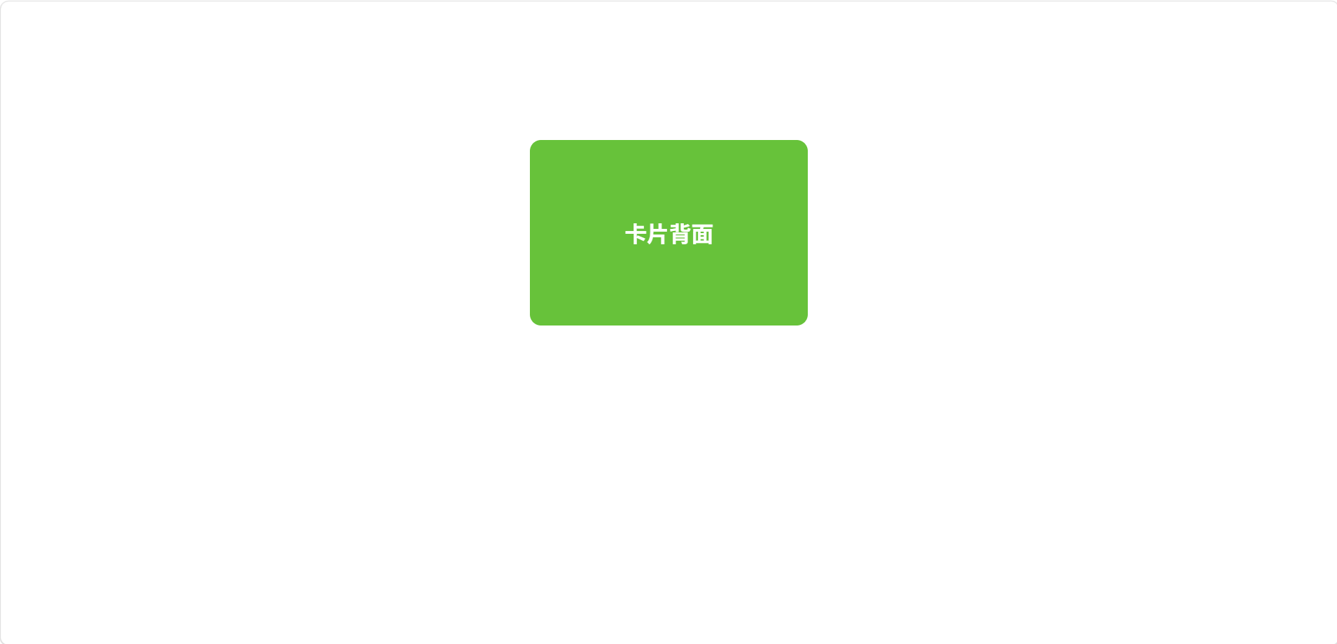
      <div class="card-front">卡片正面</div>
      <div class="card-back">卡片背面</div>
    </div>
  </div>
</body>
</html>
这可以制作卡片翻转效果,正面和背面各放内容。
三、动画(animation)------更丰富的关键帧动效
过渡只能实现从一种状态到另一种状态的简单动画,而animation能定义多个关键帧,实现循环播放、来回播放、延迟开始、暂停等控制,非常强大。
1. @keyframes 定义动画
首先用 @keyframes 规则定义动画的各个阶段(关键帧),格式如下:
css
@keyframes 动画名 {
  0% { /* 起始状态 */ }
  100% { /* 结束状态 */ }
}
也可以用 from 和 to 关键字代替0%和100%。中间可以添加任意百分比的帧。
示例:一个元素从透明淡入并从下方滑入
css
@keyframes fadeInUp {
  0% {
    opacity: 0;
    transform: translateY(30px);
  }
  100% {
    opacity: 1;
    transform: translateY(0);
  }
}
2. 将动画应用到元素
使用 animation 属性调用定义好的动画,可以分别设置多个子属性:
-
animation-name:动画名称(自定义的名字)。 -
animation-duration:动画持续时间,如2s。 -
animation-timing-function:速度曲线,和过渡类似。 -
animation-delay:延迟时间。 -
animation-iteration-count:播放次数,数字或infinite(无限循环)。 -
animation-direction:播放方向,normal(正向)、reverse(反向)、alternate(先正后反交替)、alternate-reverse。 -
animation-fill-mode:动画结束后保持在什么状态。forwards(保持结束状态)、backwards(保持开始状态)、both。 -
animation-play-state:运行状态,running(播放)或paused(暂停),配合交互可做暂停效果。
简写形式(推荐):
css
.box {
  animation: fadeInUp 0.6s ease-out 0s 1 forwards;
}
3. 实战案例:呼吸灯效果
制作一个红点,无限循环地放大缩小,模拟呼吸或脉冲。
html
<!DOCTYPE html>
<html lang="zh-CN">
<head>
  <meta charset="UTF-8">
  <title>脉冲呼吸红点</title>
  <style>
    /* 页面居中样式 */
    body {
      height: 100vh;
      display: flex;
      justify-content: center;
      align-items: center;
      background: #f5f7fa;
      margin: 0;
    }

    @keyframes pulse {
      0%, 100% {
        transform: scale(1);
        opacity: 1;
      }
      50% {
        transform: scale(1.4);
        opacity: 0.7;
      }
    }

    .dot {
      width: 20px;
      height: 20px;
      background: red;
      border-radius: 50%;
      animation: pulse 2s ease-in-out infinite;
    }

    /* 可选:添加阴影增强立体感 */
    .dot {
      box-shadow: 0 0 10px rgba(255, 0, 0, 0.5);
    }
  </style>
</head>
<body>
  <div class="dot"></div>
</body>
</html>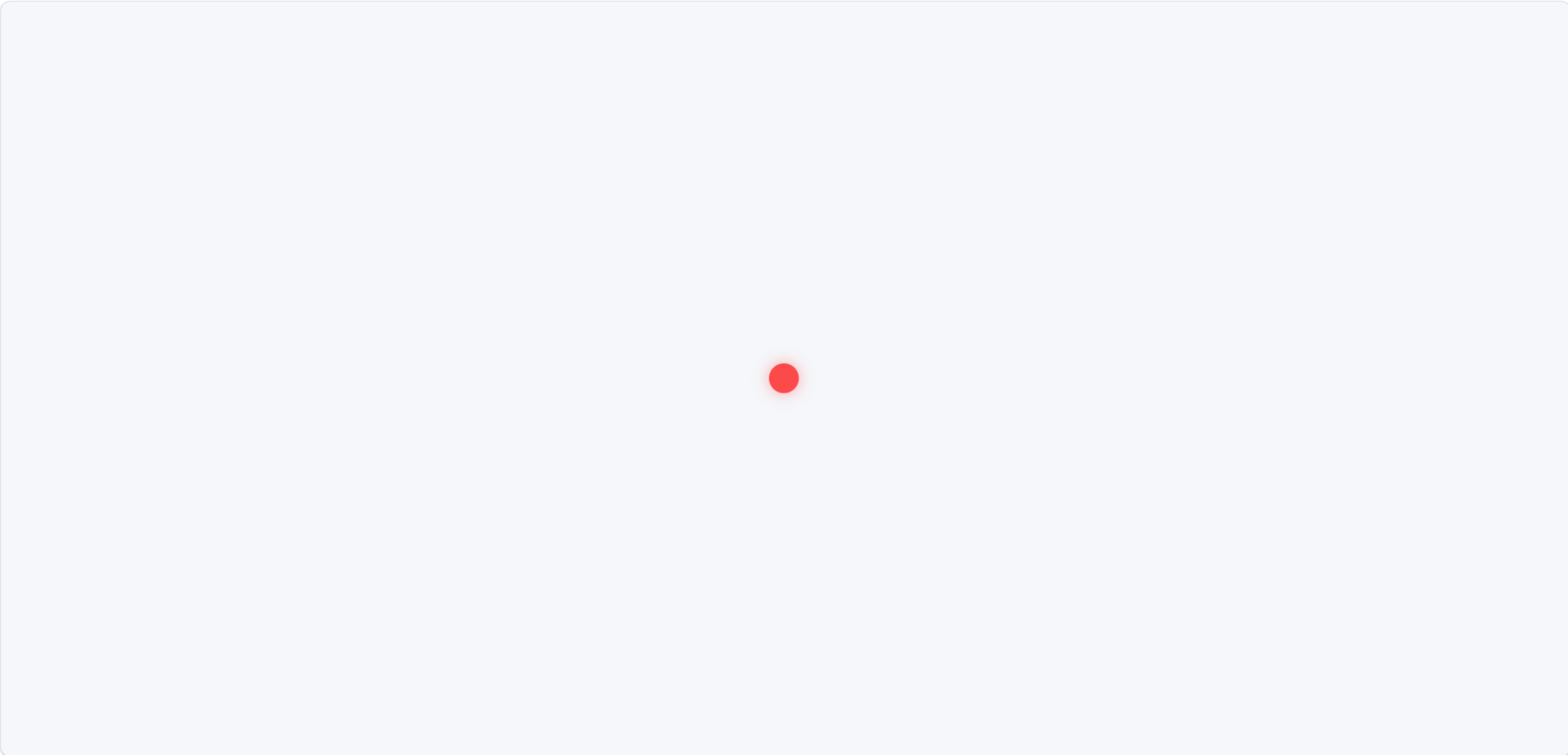
4. 实战案例:渐变背景流动
配合 background-position 动画,让渐变背景动起来,制作流光效果。
html
<!DOCTYPE html>
<html lang="zh-CN">
<head>
  <meta charset="UTF-8">
  <meta name="viewport" content="width=device-width, initial-scale=1.0">
  <title>渐变流光效果</title>
  <style>
    /* 全局基础样式 */
    * {
      margin: 0;
      padding: 0;
      box-sizing: border-box;
    }

    body {
      min-height: 100vh;
      display: flex;
      flex-direction: column;
      justify-content: center;
      align-items: center;
      gap: 40px;
      background: #f5f7fa;
      font-family: 'Microsoft YaHei', sans-serif;
    }

    .gradient-flow {
      background: linear-gradient(90deg, #ff7e5f, #feb47b, #86a8e7, #91eae4);
      background-size: 300% 300%;
      animation: flow 4s ease infinite;
    }

    @keyframes flow {
      0% { background-position: 0% 50%; }
      50% { background-position: 100% 50%; }
      100% { background-position: 0% 50%; }
    }

    /* 示例1:流光按钮 */
    .flow-button {
      padding: 12px 36px;
      border: none;
      border-radius: 8px;
      color: white;
      font-size: 18px;
      font-weight: 500;
      cursor: pointer;
      box-shadow: 0 4px 15px rgba(0,0,0,0.2);
    }

    /* 示例2:流光卡片 */
    .flow-card {
      width: 300px;
      padding: 40px;
      border-radius: 12px;
      color: white;
      text-align: center;
      font-size: 20px;
      box-shadow: 0 8px 25px rgba(0,0,0,0.15);
    }

    /* 示例3:流光文字(进阶效果) */
    .flow-text {
      font-size: 48px;
      font-weight: bold;
      background-clip: text;
      -webkit-background-clip: text;
      color: transparent;
    }
  </style>
</head>
<body>
  <!-- 示例1:流光按钮 -->
  <button class="gradient-flow flow-button">
    流光按钮
  </button>

  <!-- 示例2:流光卡片 -->
  <div class="gradient-flow flow-card">
    这是一个流光卡片
  </div>

  <!-- 示例3:流光文字 -->
  <h1 class="gradient-flow flow-text">
    流光文字效果
  </h1>
</body>
</html>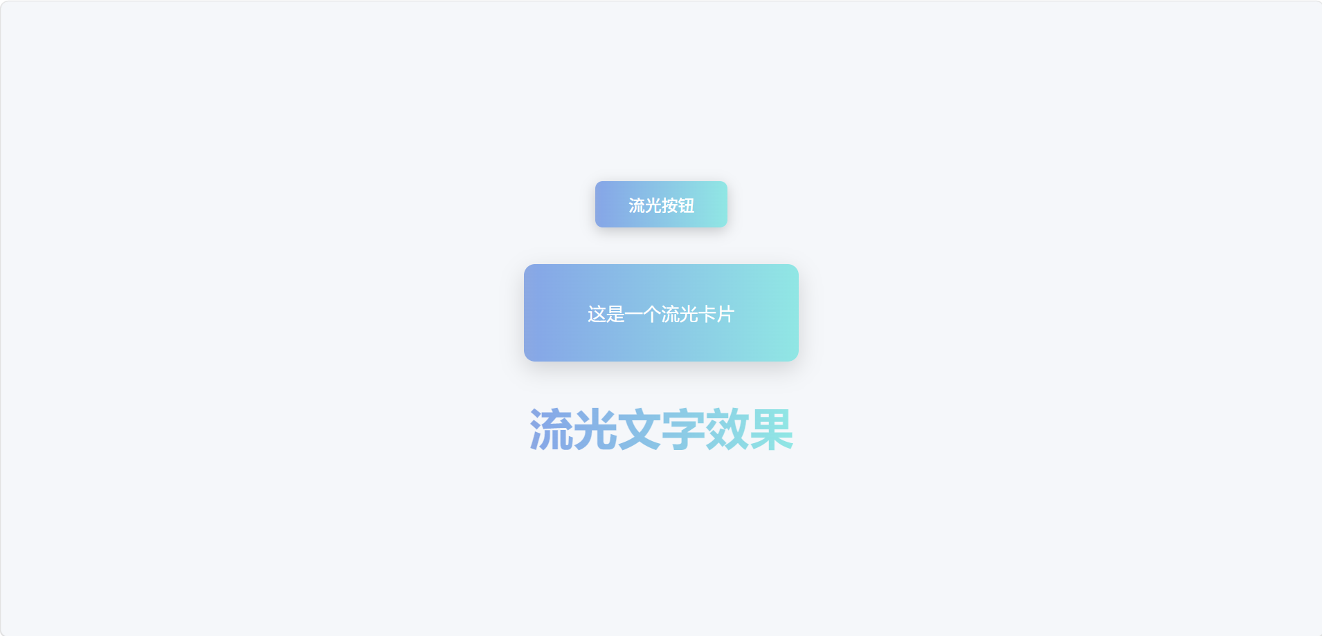
5. 控制动画的暂停与播放
可以利用 :hover 改变 animation-play-state 实现鼠标悬停暂停动画。
html
<!DOCTYPE html>
<html lang="zh-CN">
<head>
  <meta charset="UTF-8">
  <meta name="viewport" content="width=device-width, initial-scale=1.0">
  <title>跑马灯滚动字幕</title>
  <style>
    /* 全局基础样式 */
    * {
      margin: 0;
      padding: 0;
      box-sizing: border-box;
    }

    body {
      background: #f5f7fa;
      font-family: 'Microsoft YaHei', sans-serif;
      padding: 50px 0;
      display: flex;
      flex-direction: column;
      gap: 30px;
    }

    .container {
      max-width: 800px;
      margin: 0 auto;
      width: 100%;
      padding: 0 20px;
    }

    h2 {
      margin-bottom: 15px;
      color: #333;
      font-size: 18px;
    }

    .scroll-box {
      overflow: hidden;
      white-space: nowrap;
      animation: scroll-left 10s linear infinite;
    }

    .scroll-box:hover {
      animation-play-state: paused;
    }

    @keyframes scroll-left {
      0% { transform: translateX(100%); }
      100% { transform: translateX(-100%); }
    }

    /* 跑马灯容器样式 */
    .marquee-container {
      background: #409eff;
      color: white;
      padding: 12px 0;
      border-radius: 8px;
      overflow: hidden;
    }

    /* 跑马灯文字样式 */
    .scroll-text {
      display: inline-block;
      font-size: 16px;
    }

    /* 变体1:从左向右滚动 */
    .scroll-right {
      animation-name: scroll-right;
    }

    @keyframes scroll-right {
      0% { transform: translateX(-100%); }
      100% { transform: translateX(100%); }
    }

    /* 变体2:垂直向上滚动 */
    .scroll-up-container {
      height: 150px;
      background: #67c23a;
      color: white;
      border-radius: 8px;
      overflow: hidden;
    }

    .scroll-up {
      white-space: normal;
      animation: scroll-up 8s linear infinite;
    }

    @keyframes scroll-up {
      0% { transform: translateY(100%); }
      100% { transform: translateY(-100%); }
    }

    /* 变体3:无缝循环跑马灯(推荐) */
    .seamless-marquee {
      overflow: hidden;
      background: #e6a23c;
      color: white;
      padding: 12px 0;
      border-radius: 8px;
    }

    .seamless-scroll {
      display: inline-block;
      animation: seamless-scroll 15s linear infinite;
    }

    /* 复制一份内容实现无缝衔接 */
    .seamless-scroll span {
      display: inline-block;
      padding-right: 50px;
    }

    @keyframes seamless-scroll {
      0% { transform: translateX(0); }
      100% { transform: translateX(-50%); }
    }

    .seamless-marquee:hover .seamless-scroll {
      animation-play-state: paused;
    }
  </style>
</head>
<body>
  <div class="container">
    <!-- 基础版:从右向左滚动 -->
    <h2>1. 基础版(鼠标悬停暂停)</h2>
    <div class="marquee-container">
      <div class="scroll-box scroll-text">
        这是一条跑马灯滚动字幕,鼠标悬停时会暂停,移开后继续滚动。非常适合用于公告、通知、广告等场景。
      </div>
    </div>
  </div>

  <div class="container">
    <!-- 变体1:从左向右滚动 -->
    <h2>2. 从左向右滚动</h2>
    <div class="marquee-container">
      <div class="scroll-box scroll-text scroll-right">
        这是从左向右滚动的跑马灯,只需要修改动画的transform方向即可实现。
      </div>
    </div>
  </div>

  <div class="container">
    <!-- 变体2:垂直向上滚动 -->
    <h2>3. 垂直向上滚动</h2>
    <div class="scroll-up-container">
      <div class="scroll-box scroll-up" style="padding: 15px;">
        这是垂直向上滚动的跑马灯<br>
        可以用于展示多条通知信息<br>
        每条信息占一行<br>
        鼠标悬停同样可以暂停滚动
      </div>
    </div>
  </div>

  <div class="container">
    <!-- 变体3:无缝循环跑马灯(推荐) -->
    <h2>4. 无缝循环跑马灯(推荐)</h2>
    <div class="seamless-marquee">
      <div class="seamless-scroll">
        <span>这是无缝循环的跑马灯,通过复制一份内容实现真正的无缝衔接,不会出现空白间隔。</span>
        <span>这是无缝循环的跑马灯,通过复制一份内容实现真正的无缝衔接,不会出现空白间隔。</span>
      </div>
    </div>
  </div>
</body>
</html>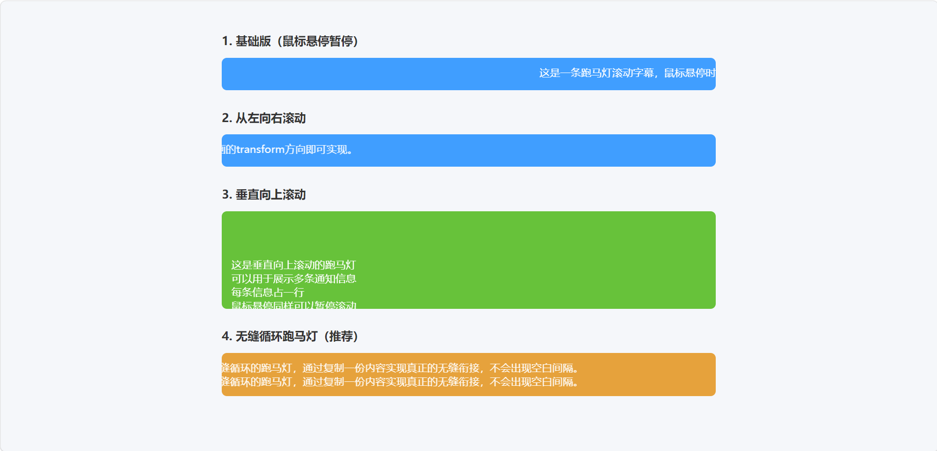
这在制作跑马灯或滚动字幕时很实用。
四、变形与过渡、动画的实战组合
让我们把三者融合,制作一些常见的UI动效。
1. 按钮波纹扩散(伪元素 + 过渡)
鼠标悬停时从按钮中心扩展出一个圆形波纹,常称为"水波纹"效果。这个实现相对复杂,但可以展示动画能力。
html
<!DOCTYPE html>
<html lang="zh-CN">
<head>
  <meta charset="UTF-8">
  <meta name="viewport" content="width=device-width, initial-scale=1.0">
  <title>按钮涟漪波纹效果</title>
  <style>
    body {
      height: 100vh;
      display: flex;
      justify-content: center;
      align-items: center;
      background: #f5f7fa;
      margin: 0;
      font-family: 'Microsoft YaHei', sans-serif;
    }

    .btn-ripple {
      position: relative;
      background: #6c5ce7;
      color: white;
      border: none;
      padding: 12px 28px;
      border-radius: 30px;
      cursor: pointer;
      transition: box-shadow 0.4s;
      overflow: hidden;/* 隐藏溢出的波纹 */
      font-size: 16px;
      font-weight: 500;
    }

    .btn-ripple:hover {
      box-shadow: 0 0 0 12px rgba(108,92,231,0.2);
    }

    /* 创建波纹元素 */
    .btn-ripple::after {
      content: '';
      position: absolute;
      top: 50%;
      left: 50%;
      width: 0;
      height: 0;
      background: rgba(255,255,255,0.3);
      border-radius: 50%;
      transform: translate(-50%, -50%);
      transition: all 0.6s ease-out;
      pointer-events: none; /* 让波纹不影响点击事件 */
    }

    /* 点击时触发波纹动画 */
    .btn-ripple:active::after {
      width: 200px;
      height: 200px;
      opacity: 0;
    }
  </style>
</head>
<body>
  <button class="btn-ripple">点击看涟漪效果</button>
</body>
</html>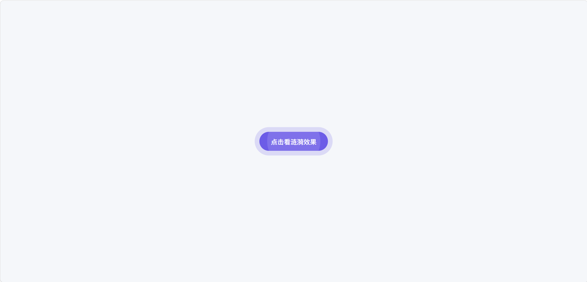
2. 加载动画
制作一个旋转的圆环加载器。
html
<!DOCTYPE html>
<html lang="zh-CN">
<head>
  <meta charset="UTF-8">
  <meta name="viewport" content="width=device-width, initial-scale=1.0">
  <title>旋转圆环加载器</title>
  <style>
    /* 全局基础样式:让加载器居中显示 */
    body {
      height: 100vh;
      display: flex;
      justify-content: center;
      align-items: center;
      background: #f5f7fa;
      margin: 0;
      gap: 60px;
      flex-wrap: wrap;
    }

    .loader-container {
      display: flex;
      flex-direction: column;
      align-items: center;
      gap: 15px;
    }

    .loader-text {
      color: #666;
      font-size: 14px;
      font-family: 'Microsoft YaHei', sans-serif;
    }

    .spinner {
      width: 40px;
      height: 40px;
      border: 4px solid #e0e0e0;
      border-top: 4px solid #3498db;
      border-radius: 50%;
      animation: spin 1s linear infinite;
    }

    @keyframes spin {
      to { transform: rotate(360deg); }
    }

    /* 变体1:小尺寸加载器 */
    .spinner-sm {
      width: 24px;
      height: 24px;
      border-width: 3px;
    }

    /* 变体2:大尺寸加载器 */
    .spinner-lg {
      width: 60px;
      height: 60px;
      border-width: 5px;
    }

    /* 变体3:绿色加载器 */
    .spinner-green {
      border-color: #e0e0e0;
      border-top-color: #2ecc71;
    }

    /* 变体4:红色加载器 */
    .spinner-red {
      border-color: #e0e0e0;
      border-top-color: #e74c3c;
    }

    /* 变体5:紫色加载器 */
    .spinner-purple {
      border-color: #e0e0e0;
      border-top-color: #9b59b6;
    }

    /* 变体6:双环加载器 */
    .spinner-double {
      position: relative;
      width: 40px;
      height: 40px;
    }

    .spinner-double::before,
    .spinner-double::after {
      content: '';
      position: absolute;
      border-radius: 50%;
      animation: spin 1s linear infinite;
    }

    .spinner-double::before {
      top: 0;
      left: 0;
      width: 100%;
      height: 100%;
      border: 4px solid #e0e0e0;
      border-top-color: #3498db;
    }

    .spinner-double::after {
      top: 8px;
      left: 8px;
      width: calc(100% - 16px);
      height: calc(100% - 16px);
      border: 4px solid #e0e0e0;
      border-top-color: #e74c3c;
      animation-direction: reverse;
      animation-duration: 0.8s;
    }
  </style>
</head>
<body>
  <!-- 基础版加载器 -->
  <div class="loader-container">
    <div class="spinner"></div>
    <div class="loader-text">基础加载器</div>
  </div>

  <!-- 小尺寸加载器 -->
  <div class="loader-container">
    <div class="spinner spinner-sm"></div>
    <div class="loader-text">小尺寸</div>
  </div>

  <!-- 大尺寸加载器 -->
  <div class="loader-container">
    <div class="spinner spinner-lg"></div>
    <div class="loader-text">大尺寸</div>
  </div>

  <!-- 绿色加载器 -->
  <div class="loader-container">
    <div class="spinner spinner-green"></div>
    <div class="loader-text">绿色</div>
  </div>

  <!-- 红色加载器 -->
  <div class="loader-container">
    <div class="spinner spinner-red"></div>
    <div class="loader-text">红色</div>
  </div>

  <!-- 双环加载器 -->
  <div class="loader-container">
    <div class="spinner-double"></div>
    <div class="loader-text">双环反向</div>
  </div>

  <!-- 带文字的加载器 -->
  <div class="loader-container">
    <div class="spinner"></div>
    <div class="loader-text">加载中...</div>
  </div>
</body>
</html>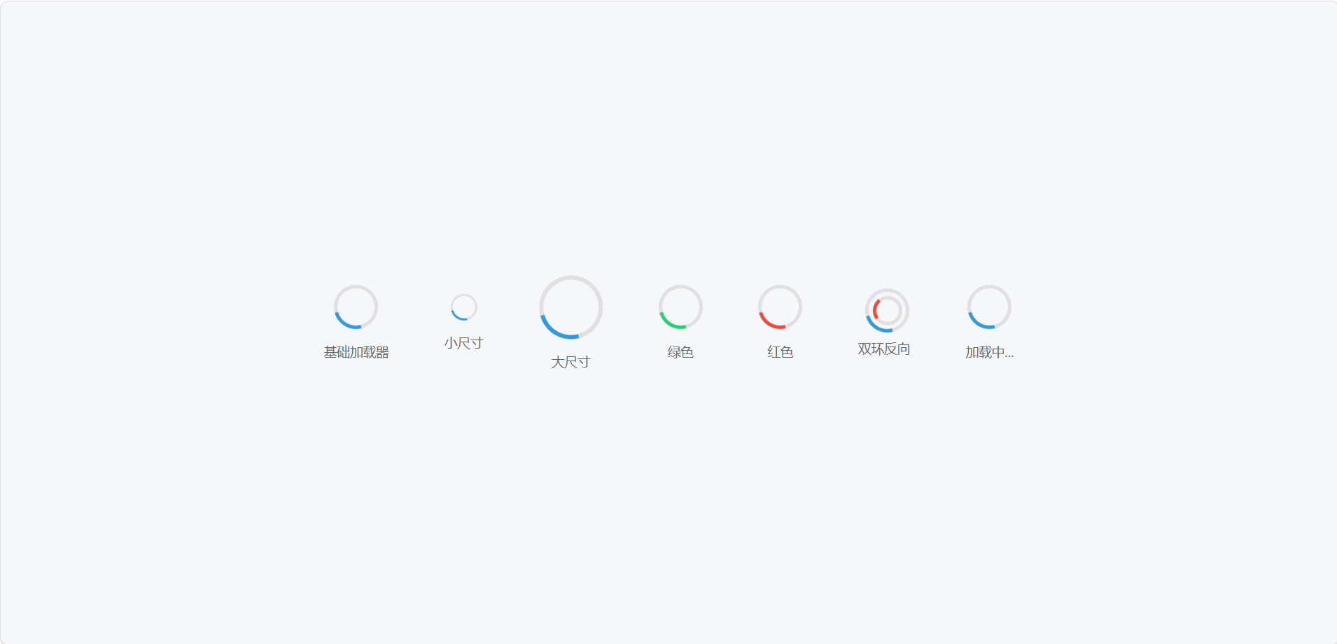
五、响应式设计------让页面适配所有设备
截止目前,我们的页面都只在桌面端看着不错。但在手机上可能横向拉伸、文字太小、布局混乱。响应式设计就是让同一个页面在不同尺寸屏幕上自动调整布局,提供最优体验。
1. 视口 meta 标签
在HTML <head> 中必须加上:
html
<meta name="viewport" content="width=device-width, initial-scale=1.0">它告诉移动浏览器,页面宽度等于设备宽度,初始缩放比例为1。不加的话,很多手机会把页面缩小成桌面宽度,导致字很小。
2. 媒体查询 @media
媒体查询可以根据设备特性(如屏幕宽度、高度、分辨率等)应用不同的CSS样式。最常用的是按宽度划分断点。
css
/* 当屏幕宽度 ≤ 768px 时(常见平板竖屏及手机) */
@media (max-width: 768px) {
  .container {
    flex-direction: column;
  }
}
也可以设置移动优先,从小屏幕写基础样式,用 min-width 为更大屏幕添加增强样式:
css
/* 基础样式用于手机 */
.container {
  display: flex;
  flex-direction: column;
}
/* 大于等于768px时 */
@media (min-width: 768px) {
  .container {
    flex-direction: row;
  }
}
3. 常见断点
没有绝对标准,但通常参考:
-
手机:< 576px
-
平板竖屏:576px ~ 768px
-
平板横屏 / 小桌面:768px ~ 992px
-
桌面:992px ~ 1200px
-
大桌面:≥ 1200px
实际开发按需取2~3个断点即可。
4. 响应式布局策略
① 弹性盒子和网格天然响应式 使用 flex-wrap: wrap 让弹性项目自动换行;使用 grid-template-columns: repeat(auto-fill, minmax(280px, 1fr)) 让网格列数根据容器自动变化。这些不需要媒体查询就能响应。
② 流式单位与限制 用百分比、vw、vh、fr等相对单位代替固定px。但要注意设置最大最小宽高(max-width、min-width),避免过宽或过窄。
③ 响应式图片 让图片不超出容器:
css
img {
  max-width: 100%;
  height: auto;
}
④ 响应式排版 可以结合媒体查询调整根字号,然后使用rem单位,或者直接在不同断点改变字号。
css
html { font-size: 16px; }
@media (max-width: 768px) {
  html { font-size: 15px; }
}
h1 { font-size: 2.5rem; } /* 随根字号变化 */
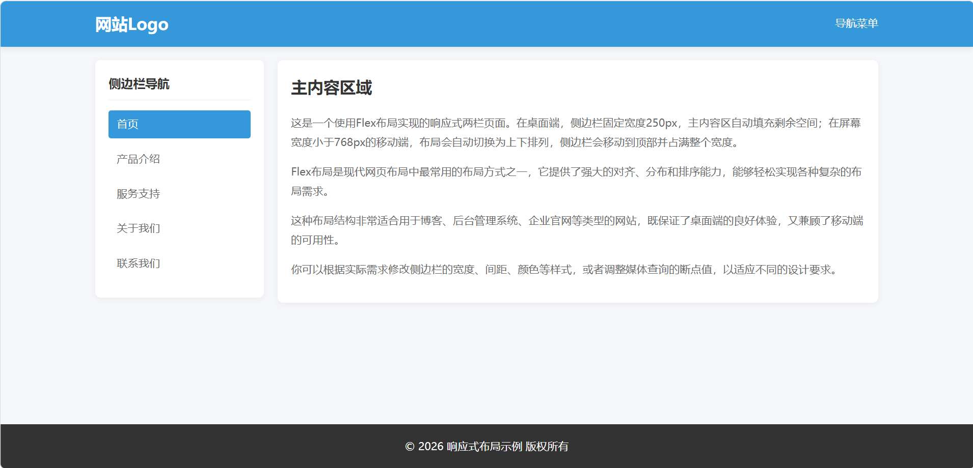
5. 实战:响应式布局
假设我们有一个包含侧边栏和主内容的两栏Flex布局:
html
<!DOCTYPE html>
<html lang="zh-CN">
<head>
  <meta charset="UTF-8">
  <meta name="viewport" content="width=device-width, initial-scale=1.0">
  <title>响应式两栏布局(优化版)</title>
  <style>
    /* ========================================
       全局基础样式与重置
       ======================================== */
    * {
      margin: 0;
      padding: 0;
      /* 统一盒模型:宽高包含内边距和边框 */
      box-sizing: border-box;
    }

    body {
      font-family: 'Microsoft YaHei', sans-serif;
      line-height: 1.6;
      color: #333;
      background-color: #f5f7fa;
      /* 最小高度占满视口,为页脚吸底做准备 */
      min-height: 100vh;
      /* 使body成为flex容器,实现页脚自动吸底 */
      display: flex;
      flex-direction: column;
    }

    /* 统一链接样式 */
    a {
      text-decoration: none;
      color: inherit;
      transition: all 0.3s ease;
    }

    /* 统一列表样式 */
    ul {
      list-style: none;
    }

    /* ========================================
       通用组件样式
       ======================================== */
    /* 容器类:统一页面宽度和内边距 */
    .container {
      max-width: 1200px;
      margin: 0 auto;
      padding: 0 20px;
      width: 100%;
    }

    /* 卡片类:统一白色背景、圆角和阴影效果 */
    .card {
      background-color: white;
      border-radius: 8px;
      padding: 20px;
      box-shadow: 0 2px 10px rgba(0,0,0,0.05);
      margin: 20px 0;
    }

    /* ========================================
       头部导航样式
       ======================================== */
    header {
      background-color: #3498db;
      color: white;
      padding: 15px 0;
      box-shadow: 0 2px 10px rgba(0,0,0,0.1);
      /* 头部固定在顶部 */
      position: sticky;
      top: 0;
      z-index: 100;
    }

    .header-content {
      display: flex;
      justify-content: space-between;
      align-items: center;
    }

    .logo {
      font-size: 24px;
      font-weight: bold;
    }

    /* ========================================
       核心布局样式(你提供的原始代码)
       ======================================== */
    .page {
      /* 启用flex布局,实现两栏并排 */
      display: flex;
      /* 两栏之间的间距 */
      gap: 20px;
    }

    .sidebar {
      /* flex简写:不放大(0)、不缩小(0)、基础宽度250px */
      flex: 0 0 250px;
    }

    .content {
      /* 主内容区自动填充剩余所有空间 */
      flex: 1;
    }

    /* ========================================
       响应式适配:768px以下屏幕(手机端)
       ======================================== */
    @media (max-width: 768px) {
      .page {
        /* 改为垂直排列 */
        flex-direction: column;
      }

      .sidebar {
        /* 取消固定宽度,自动占满容器 */
        flex: none;
        /* 调整顺序:让侧边栏显示在主内容上方 */
        order: -1;
      }
    }

    /* ========================================
       侧边栏内容样式
       ======================================== */
    .sidebar {
      /* 继承卡片样式 */
      background-color: white;
      border-radius: 8px;
      padding: 20px;
      box-shadow: 0 2px 10px rgba(0,0,0,0.05);
      margin: 20px 0;
      /* 高度适应内容 */
      height: fit-content;
      /* 粘性定位:滚动时固定在顶部 */
      position: sticky;
      top: 80px; /* 避开头部高度 */
    }

    .sidebar-title {
      font-size: 18px;
      font-weight: bold;
      margin-bottom: 15px;
      padding-bottom: 10px;
      border-bottom: 1px solid #eee;
    }

    .sidebar-nav li {
      margin-bottom: 10px;
    }

    .sidebar-nav a {
      display: block;
      padding: 8px 12px;
      color: #666;
      border-radius: 4px;
    }

    .sidebar-nav a:hover,
    .sidebar-nav a.active {
      background-color: #3498db;
      color: white;
    }

    /* ========================================
       主内容区样式
       ======================================== */
    .content {
      /* 继承卡片样式 */
      background-color: white;
      border-radius: 8px;
      padding: 20px;
      box-shadow: 0 2px 10px rgba(0,0,0,0.05);
      margin: 20px 0;
    }

    .content h1 {
      font-size: 24px;
      margin-bottom: 20px;
      color: #333;
    }

    .content p {
      margin-bottom: 15px;
      color: #666;
      line-height: 1.8;
    }

    /* ========================================
       页脚样式
       ======================================== */
    footer {
      background-color: #333;
      color: white;
      text-align: center;
      padding: 20px 0;
      /* 自动向上推,实现页脚吸底 */
      margin-top: auto;
    }
  </style>
</head>
<body>
  <!-- 页面头部:包含Logo和导航 -->
  <header>
    <div class="container header-content">
      <div class="logo">网站Logo</div>
      <div>导航菜单</div>
    </div>
  </header>

  <!-- 页面主体:包含侧边栏和主内容 -->
  <main class="container page">
    <!-- 侧边栏:导航菜单 -->
    <aside class="sidebar">
      <h3 class="sidebar-title">侧边栏导航</h3>
      <ul class="sidebar-nav">
        <li><a href="#" class="active">首页</a></li>
        <li><a href="#">产品介绍</a></li>
        <li><a href="#">服务支持</a></li>
        <li><a href="#">关于我们</a></li>
        <li><a href="#">联系我们</a></li>
      </ul>
    </aside>

    <!-- 主内容区:页面主要内容 -->
    <article class="content">
      <h1>主内容区域</h1>
      <p>这是一个使用Flex布局实现的响应式两栏页面。在桌面端,侧边栏固定宽度250px,主内容区自动填充剩余空间;在屏幕宽度小于768px的移动端,布局会自动切换为上下排列,侧边栏会移动到顶部并占满整个宽度。</p>
      <p>Flex布局是现代网页布局中最常用的布局方式之一,它提供了强大的对齐、分布和排序能力,能够轻松实现各种复杂的布局需求。</p>
      <p>这种布局结构非常适合用于博客、后台管理系统、企业官网等类型的网站,既保证了桌面端的良好体验,又兼顾了移动端的可用性。</p>
      <p>你可以根据实际需求修改侧边栏的宽度、间距、颜色等样式,或者调整媒体查询的断点值,以适应不同的设计要求。</p>
    </article>
  </main>

  <!-- 页面页脚:版权信息等 -->
  <footer>
    <div class="container">
      <p>© 2026 响应式布局示例 版权所有</p>
    </div>
  </footer>
</body>
</html>
这样在手机上侧边栏会跑到上面并占满宽度,主内容在下方。
6. 纯CSS汉堡菜单的思路
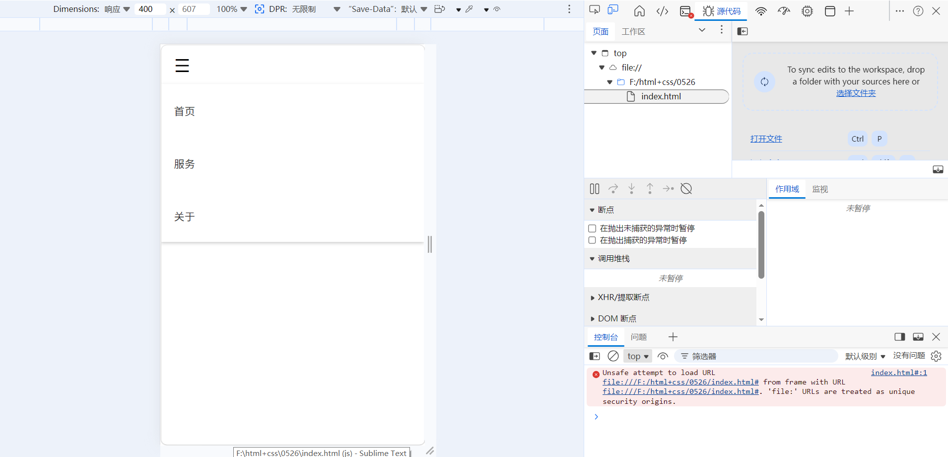
移动端导航栏通常需要隐藏菜单并用一个"汉堡"图标代替,点击展开。过去这需要JS,但可以利用 :checked 伪类配合隐藏的checkbox实现纯CSS的下拉或展开效果。
基本结构:
html
<!DOCTYPE html>
<html lang="zh-CN">
<head>
<meta charset="UTF-8">
<meta name="viewport" content="width=device-width, initial-scale=1.0">
<title>纯CSS汉堡菜单</title>
<style>
/* 核心基础样式 */
* {
margin: 0;
padding: 0;
box-sizing: border-box;
}
ul {
list-style: none;
}
a {
text-decoration: none;
color: #333;
}
.mobile-nav {
position: relative;
padding: 0 20px;
height: 60px;
line-height: 60px;
}
/* 隐藏复选框开关 */
.menu-toggle {
display: none;
}
/* 汉堡图标 */
.hamburger {
display: none;
font-size: 28px;
cursor: pointer;
}
/* 桌面端菜单 */
.menu {
display: flex;
gap: 20px;
}
/* 移动端适配 */
@media (max-width: 768px) {
.hamburger {
display: block;
}
.menu {
display: none;
flex-direction: column;
position: absolute;
top: 60px;
left: 0;
width: 100%;
background: #fff;
box-shadow: 0 2px 5px rgba(0,0,0,0.2);
padding: 10px 20px;
}
/* 复选框选中,展开菜单(核心:checked用法) */
.menu-toggle:checked ~ .menu {
display: flex;
}
}
</style>
</head>
<body>
<nav class="mobile-nav">
<input type="checkbox" id="menu-toggle" class="menu-toggle">
<label for="menu-toggle" class="hamburger">☰</label>
<ul class="menu">
<li><a href="#">首页</a></li>
<li><a href="#">服务</a></li>
<li><a href="#">关于</a></li>
</ul>
</nav>
</body>
</html>注意:这种方式在真实项目中有无障碍和焦点问题,但作为学习CSS能力已经足够惊艳。
六、综合练习:制作一个带有动效的响应式介绍区
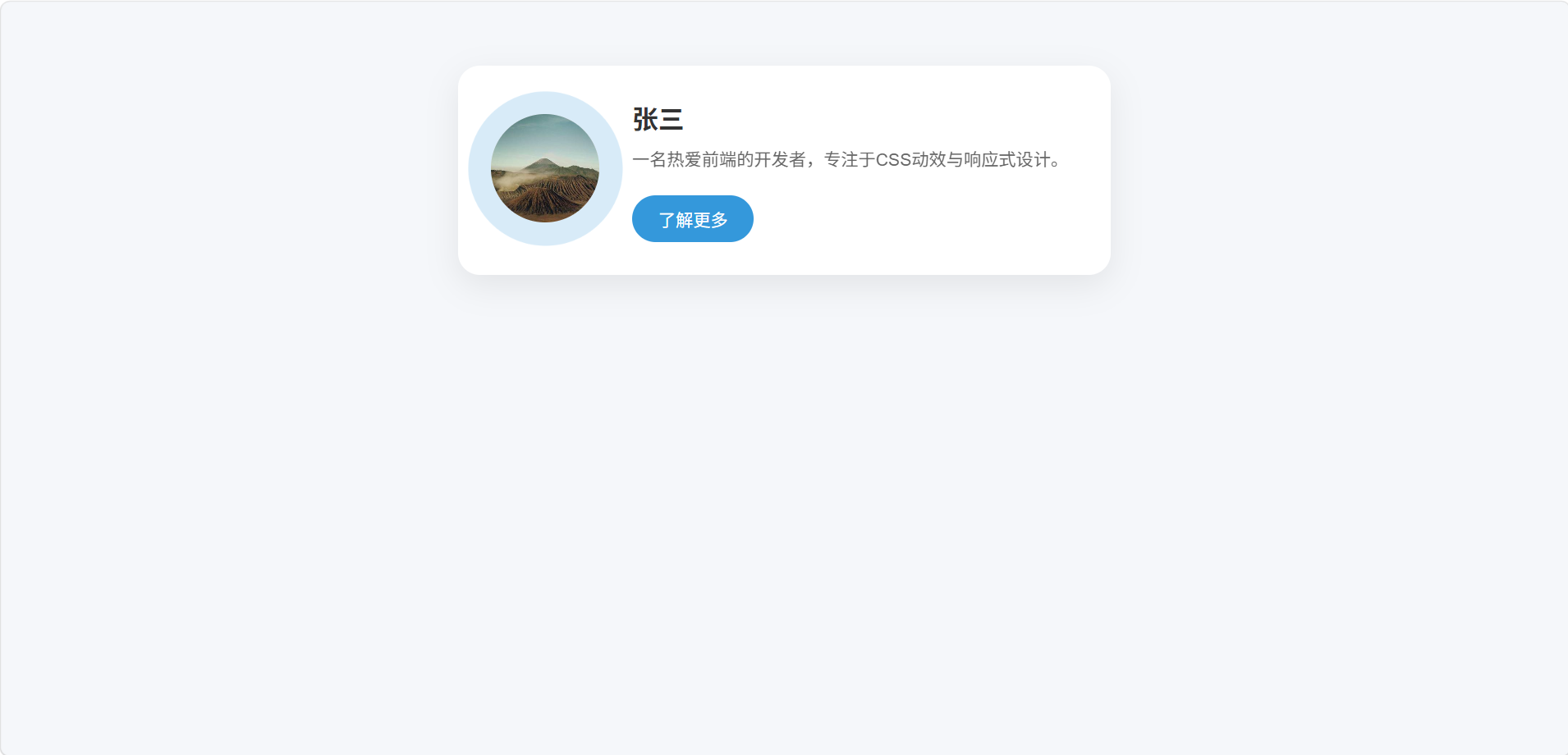
让我们把本篇学到的所有知识融合到一个组件中。需求:
-
一个居中的卡片区块,包含头像、名字、简短介绍和一个按钮。
-
头像有持续的柔光扩散动画,名字从下方淡入上滑。
-
按钮悬停时放大并改变背景色,有过渡。
-
卡片在桌面端采用横向布局(头像左,文字右),手机端纵向堆叠。
HTML结构:
html
<!DOCTYPE html>
<html lang="zh-CN">
<head>
  <meta charset="UTF-8">
  <meta name="viewport" content="width=device-width, initial-scale=1.0">
  <title>个人介绍卡片 · 综合案例</title>
</head>
<body>

<div class="intro-card">
  <div class="avatar-wrapper">
    <div class="avatar-pulse"></div>
    <img src="https://picsum.photos/400/300?random=3" class="avatar" alt="头像">
  </div>
  <div class="intro-text">
    <h2 class="name">张三</h2>
    <p class="bio">一名热爱前端的开发者,专注于CSS动效与响应式设计。</p>
    <a href="#" class="btn">了解更多</a>
  </div>
</div>

</body>
</html>
CSS(关键部分):
css
/* 基础重置 */
* {
  margin: 0;
  padding: 0;
  box-sizing: border-box;
  font-family: Arial, sans-serif;
}

body {
  background-color: #f5f7fa;
  padding: 20px;
}

/* 卡片主体 */
.intro-card {
  display: flex;
  align-items: center;
  gap: 30px;
  max-width: 600px;
  margin: 40px auto;
  padding: 30px;
  background: #fff;
  border-radius: 20px;
  box-shadow: 0 10px 30px rgba(0,0,0,0.08);
}

/* 头像容器 + 扩散光环 */
.avatar-wrapper {
  position: relative;
}

.avatar {
  width: 100px;
  height: 100px;
  border-radius: 50%;
  object-fit: cover;
  position: relative;
  z-index: 1;
  background: #ddd; /* 无图片时的占位色 */
}

/* 柔光扩散动画 */
.avatar-pulse {
  position: absolute;
  top: -10px;
  left: -10px;
  width: 120px;
  height: 120px;
  border-radius: 50%;
  background: rgba(52,152,219,0.3);
  animation: pulse-ring 2s ease-out infinite;
  z-index: 0;
}

@keyframes pulse-ring {
  0% {
    transform: scale(1);
    opacity: 1;
  }
  100% {
    transform: scale(1.5);
    opacity: 0;
  }
}

/* 文字区域 */
.intro-text {
  flex: 1;
}

/* 文字从下往上淡入动画 */
@keyframes fadeInUp {
  from {
    opacity: 0;
    transform: translateY(20px);
  }
  to {
    opacity: 1;
    transform: translateY(0);
  }
}

.intro-text .name {
  font-size: 24px;
  color: #333;
  animation: fadeInUp 0.8s ease-out;
}

.intro-text .bio {
  animation: fadeInUp 0.8s ease-out 0.2s both;
  color: #666;
  margin: 10px 0;
  line-height: 1.5;
}

/* 按钮样式 + 悬停过渡 */
.btn {
  display: inline-block;
  padding: 10px 24px;
  background: #3498db;
  color: white;
  border-radius: 30px;
  text-decoration: none;
  transition: background 0.3s, transform 0.3s;
  margin-top: 10px;
}

.btn:hover {
  background: #217dbb;
  transform: scale(1.05);
}

/* 移动端响应式:纵向堆叠 */
@media (max-width: 600px) {
  .intro-card {
    flex-direction: column;
    text-align: center;
  }
}
七、总结
我们一口气掌握了:
-
过渡 :让状态变化平滑,提升交互体验,核心属性
transition。 -
变形 :
transform进行平移、缩放、旋转、倾斜,可组合,可3D。 -
动画 :
@keyframes+animation实现复杂多阶段动效,支持循环、延迟、方向、暂停。 -
响应式设计:视口标签、媒体查询、弹性单位和Flex/Grid的配合,适配不同设备。
-
多个实战案例串联,从微交互到页面响应式结构。
如果这篇文章帮你解决了实操上的困惑,别忘记点击点赞、分享 ,也可以留言告诉我你遇到的其它问题,我会尽快回复。动手练习是掌握编程最快的方法,请务必亲手敲一遍本文的所有示例代码,并截图保存你的成果。你的关注是我坚持原创和细节共享的力量来源,谢谢大家。