目录
-
- 前言
- 一、项目背景与功能定位
-
- [1.1 功能概览](#1.1 功能概览)
- [1.2 技术关键词](#1.2 技术关键词)
- [1.3 状态切换流程](#1.3 状态切换流程)
- 二、项目目录结构分析
-
- [2.1 根目录结构](#2.1 根目录结构)
- [2.2 核心文件说明](#2.2 核心文件说明)
- [2.3 OpenHarmony 工程结构](#2.3 OpenHarmony 工程结构)
- 三、环境与依赖配置
-
- [3.1 pubspec 基础信息](#3.1 pubspec 基础信息)
- [3.2 依赖配置](#3.2 依赖配置)
- [3.3 常用命令](#3.3 常用命令)
- 四、应用入口源码拆解
-
- [4.1 main 函数](#4.1 main 函数)
- [4.2 FlashlightApp](#4.2 FlashlightApp)
- [4.3 Material 3 主题](#4.3 Material 3 主题)
- 五、页面状态设计
-
- [5.1 FlashlightHomePage](#5.1 FlashlightHomePage)
- [5.2 _isOn 状态字段](#5.2 _isOn 状态字段)
- [5.3 状态到 UI 的映射](#5.3 状态到 UI 的映射)
- 六、开关切换逻辑
-
- [6.1 _toggleFlashlight 方法](#6.1 _toggleFlashlight 方法)
- [6.2 setState 的作用](#6.2 setState 的作用)
- [6.3 交互状态变化](#6.3 交互状态变化)
- 七、页面骨架与点击区域
-
- [7.1 Scaffold 结构](#7.1 Scaffold 结构)
- [7.2 AppBar 颜色切换](#7.2 AppBar 颜色切换)
- [7.3 GestureDetector](#7.3 GestureDetector)
- 八、背景动画实现
-
- [8.1 外层 AnimatedContainer](#8.1 外层 AnimatedContainer)
- [8.2 动画参数](#8.2 动画参数)
- [8.3 为什么使用 AnimatedContainer](#8.3 为什么使用 AnimatedContainer)
- 九、中央灯光按钮实现
-
- [9.1 圆形灯光区域](#9.1 圆形灯光区域)
- [9.2 BoxDecoration 配置](#9.2 BoxDecoration 配置)
- [9.3 光晕效果](#9.3 光晕效果)
- 十、图标与状态文案
-
- [10.1 图标切换](#10.1 图标切换)
- [10.2 主操作文案](#10.2 主操作文案)
- [10.3 状态文案](#10.3 状态文案)
- [10.4 文案映射表](#10.4 文案映射表)
- 十一、硬件能力说明区域
-
- [11.1 条件展示](#11.1 条件展示)
- [11.2 文案含义](#11.2 文案含义)
- [11.3 容器样式](#11.3 容器样式)
- [十二、完整 UI 层级](#十二、完整 UI 层级)
-
- [12.1 页面结构](#12.1 页面结构)
- [12.2 状态驱动的属性](#12.2 状态驱动的属性)
- [12.3 声明式 UI 特征](#12.3 声明式 UI 特征)
- [十三、OpenHarmony 适配边界](#十三、OpenHarmony 适配边界)
-
- [13.1 Flutter 层职责](#13.1 Flutter 层职责)
- [13.2 当前实现的能力边界](#13.2 当前实现的能力边界)
- [13.3 平台侧文件作用](#13.3 平台侧文件作用)
- 十四、测试与验证
-
- [14.1 交互验证路径](#14.1 交互验证路径)
- [14.2 Widget 测试示例](#14.2 Widget 测试示例)
- [14.3 点击切换测试示例](#14.3 点击切换测试示例)
- [14.4 再次点击恢复关闭](#14.4 再次点击恢复关闭)
- 十五、常见问题与优化建议
-
- [15.1 当前项目是否控制真实闪光灯](#15.1 当前项目是否控制真实闪光灯)
- [15.2 为什么点击整个页面都能切换](#15.2 为什么点击整个页面都能切换)
- [15.3 为什么使用 AnimatedContainer](#15.3 为什么使用 AnimatedContainer)
- [15.4 为什么开启时隐藏说明区域](#15.4 为什么开启时隐藏说明区域)
- [15.5 为什么使用 BoxShadow 模拟光晕](#15.5 为什么使用 BoxShadow 模拟光晕)
- [15.6 如果要接入真实硬件能力,文章如何保持准确](#15.6 如果要接入真实硬件能力,文章如何保持准确)
- [15.7 UI Demo 的优化方向](#15.7 UI Demo 的优化方向)
- 十六、完整业务链路复盘
-
- [16.1 点击切换链路](#16.1 点击切换链路)
- [16.2 关闭状态渲染链路](#16.2 关闭状态渲染链路)
- [16.3 开启状态渲染链路](#16.3 开启状态渲染链路)
- 十七、核心源码总览
- 总结
前言
欢迎加入开源鸿蒙跨平台社区:https://openharmonycrossplatform.csdn.net
lashlight 是一个基于 Flutter 实现的 Flashlight 手电筒 UI Demo 。项目核心代码集中在 lib/main.dart,同时保留了 ohos OpenHarmony 平台工程目录,适合用来理解 Flutter 状态切换 、点击手势 、动画容器 、光晕模拟 和 OpenHarmony 平台工程承载。
需要先明确一点:当前源码没有调用设备真实闪光灯硬件能力,而是通过 UI 状态模拟手电筒开关效果。页面底部文案也写得很清楚:Flashlight feature requires device hardware support. This is a demo UI. 因此本文会严格基于真实代码,把它定位为 手电筒交互原型与 OpenHarmony 平台承载案例,不会把视觉模拟写成硬件控制。
本文围绕当前项目源码展开,重点拆解:
FlashlightApp如何配置应用入口和黄色主题。_isOn如何保存手电筒开关状态。_toggleFlashlight()如何通过setState切换 UI。GestureDetector如何让整个页面响应点击。AnimatedContainer如何完成背景和灯光过渡动画。BoxShadow如何模拟打开手电筒后的光晕。- OpenHarmony 工程在当前项目中的承载边界。
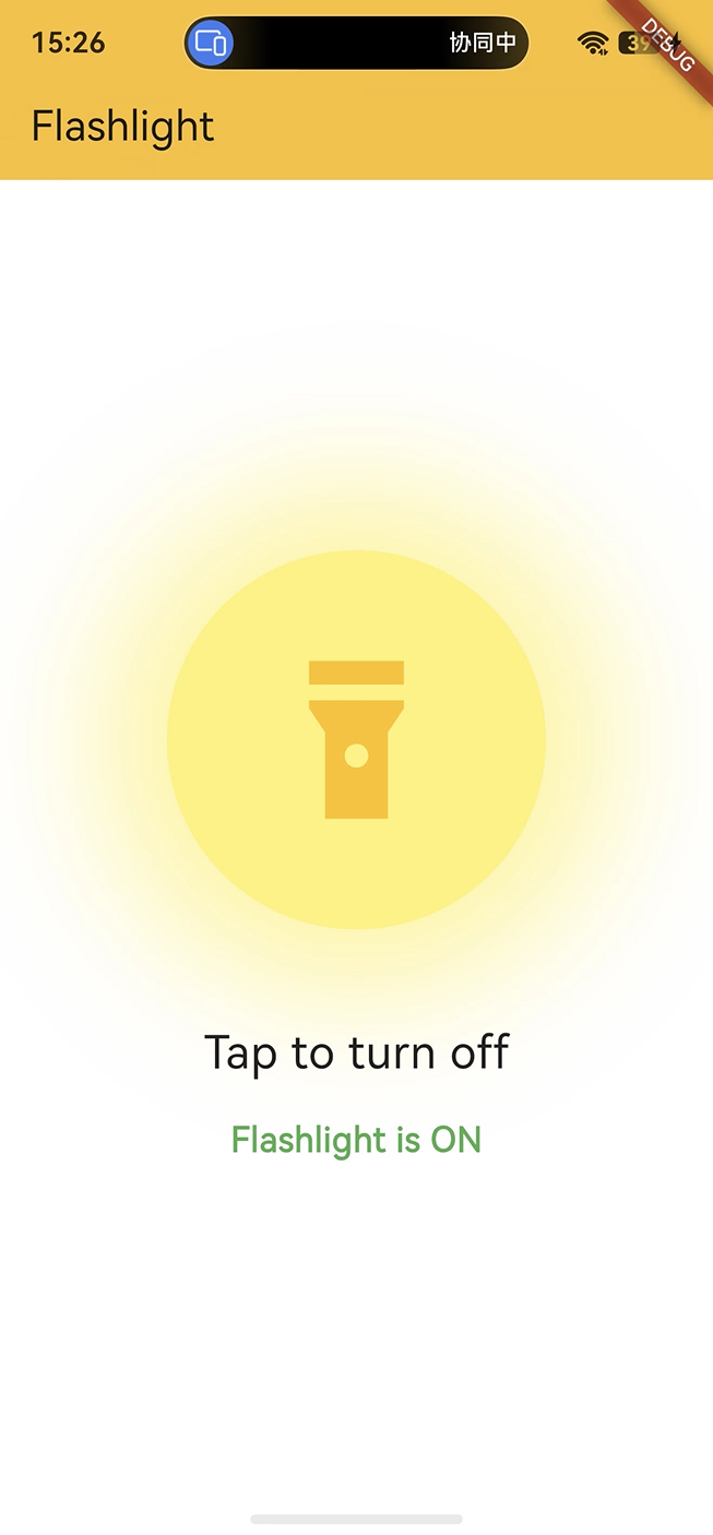
效果图如下:
一、项目背景与功能定位
1.1 功能概览
flashlight 是一个手电筒视觉交互 Demo。用户点击页面任意位置后,页面会在关闭和开启两种状态之间切换:关闭时背景为黑色,开启时背景变白,中间圆形区域变亮并出现黄色光晕。
当前项目支持以下功能:
- 点击页面任意位置切换开关状态。
- 关闭状态下页面背景为黑色。
- 开启状态下页面背景为白色。
- AppBar 在开启时变为黄色。
- 中央圆形区域通过颜色变化模拟灯光。
- 开启状态下使用
BoxShadow模拟光晕。 - 图标在
Icons.flashlight_off和Icons.flashlight_on之间切换。 - 主文案在
Tap to turn on和Tap to turn off之间切换。 - 状态文案在
Flashlight is OFF和Flashlight is ON之间切换。 - 关闭状态下展示硬件能力说明文案。
1.2 技术关键词
| 关键词 | 在项目中的作用 |
|---|---|
bool _isOn |
保存手电筒开关状态 |
setState |
触发页面根据新状态重建 |
GestureDetector |
捕获整页点击手势 |
AnimatedContainer |
实现背景和圆形灯光动画 |
BoxDecoration |
配置形状、颜色和阴影 |
BoxShape.circle |
构建圆形灯光区域 |
BoxShadow |
模拟开启后的光晕效果 |
Icons.flashlight_on |
开启状态图标 |
Icons.flashlight_off |
关闭状态图标 |
withValues(alpha: 0.5) |
控制阴影透明度 |
1.3 状态切换流程
#mermaid-svg-MjW3g3d27ytzVh5K{font-family:"trebuchet ms",verdana,arial,sans-serif;font-size:16px;fill:#333;}@keyframes edge-animation-frame{from{stroke-dashoffset:0;}}@keyframes dash{to{stroke-dashoffset:0;}}#mermaid-svg-MjW3g3d27ytzVh5K .edge-animation-slow{stroke-dasharray:9,5!important;stroke-dashoffset:900;animation:dash 50s linear infinite;stroke-linecap:round;}#mermaid-svg-MjW3g3d27ytzVh5K .edge-animation-fast{stroke-dasharray:9,5!important;stroke-dashoffset:900;animation:dash 20s linear infinite;stroke-linecap:round;}#mermaid-svg-MjW3g3d27ytzVh5K .error-icon{fill:#552222;}#mermaid-svg-MjW3g3d27ytzVh5K .error-text{fill:#552222;stroke:#552222;}#mermaid-svg-MjW3g3d27ytzVh5K .edge-thickness-normal{stroke-width:1px;}#mermaid-svg-MjW3g3d27ytzVh5K .edge-thickness-thick{stroke-width:3.5px;}#mermaid-svg-MjW3g3d27ytzVh5K .edge-pattern-solid{stroke-dasharray:0;}#mermaid-svg-MjW3g3d27ytzVh5K .edge-thickness-invisible{stroke-width:0;fill:none;}#mermaid-svg-MjW3g3d27ytzVh5K .edge-pattern-dashed{stroke-dasharray:3;}#mermaid-svg-MjW3g3d27ytzVh5K .edge-pattern-dotted{stroke-dasharray:2;}#mermaid-svg-MjW3g3d27ytzVh5K .marker{fill:#333333;stroke:#333333;}#mermaid-svg-MjW3g3d27ytzVh5K .marker.cross{stroke:#333333;}#mermaid-svg-MjW3g3d27ytzVh5K svg{font-family:"trebuchet ms",verdana,arial,sans-serif;font-size:16px;}#mermaid-svg-MjW3g3d27ytzVh5K p{margin:0;}#mermaid-svg-MjW3g3d27ytzVh5K .label{font-family:"trebuchet ms",verdana,arial,sans-serif;color:#333;}#mermaid-svg-MjW3g3d27ytzVh5K .cluster-label text{fill:#333;}#mermaid-svg-MjW3g3d27ytzVh5K .cluster-label span{color:#333;}#mermaid-svg-MjW3g3d27ytzVh5K .cluster-label span p{background-color:transparent;}#mermaid-svg-MjW3g3d27ytzVh5K .label text,#mermaid-svg-MjW3g3d27ytzVh5K span{fill:#333;color:#333;}#mermaid-svg-MjW3g3d27ytzVh5K .node rect,#mermaid-svg-MjW3g3d27ytzVh5K .node circle,#mermaid-svg-MjW3g3d27ytzVh5K .node ellipse,#mermaid-svg-MjW3g3d27ytzVh5K .node polygon,#mermaid-svg-MjW3g3d27ytzVh5K .node path{fill:#ECECFF;stroke:#9370DB;stroke-width:1px;}#mermaid-svg-MjW3g3d27ytzVh5K .rough-node .label text,#mermaid-svg-MjW3g3d27ytzVh5K .node .label text,#mermaid-svg-MjW3g3d27ytzVh5K .image-shape .label,#mermaid-svg-MjW3g3d27ytzVh5K .icon-shape .label{text-anchor:middle;}#mermaid-svg-MjW3g3d27ytzVh5K .node .katex path{fill:#000;stroke:#000;stroke-width:1px;}#mermaid-svg-MjW3g3d27ytzVh5K .rough-node .label,#mermaid-svg-MjW3g3d27ytzVh5K .node .label,#mermaid-svg-MjW3g3d27ytzVh5K .image-shape .label,#mermaid-svg-MjW3g3d27ytzVh5K .icon-shape .label{text-align:center;}#mermaid-svg-MjW3g3d27ytzVh5K .node.clickable{cursor:pointer;}#mermaid-svg-MjW3g3d27ytzVh5K .root .anchor path{fill:#333333!important;stroke-width:0;stroke:#333333;}#mermaid-svg-MjW3g3d27ytzVh5K .arrowheadPath{fill:#333333;}#mermaid-svg-MjW3g3d27ytzVh5K .edgePath .path{stroke:#333333;stroke-width:2.0px;}#mermaid-svg-MjW3g3d27ytzVh5K .flowchart-link{stroke:#333333;fill:none;}#mermaid-svg-MjW3g3d27ytzVh5K .edgeLabel{background-color:rgba(232,232,232, 0.8);text-align:center;}#mermaid-svg-MjW3g3d27ytzVh5K .edgeLabel p{background-color:rgba(232,232,232, 0.8);}#mermaid-svg-MjW3g3d27ytzVh5K .edgeLabel rect{opacity:0.5;background-color:rgba(232,232,232, 0.8);fill:rgba(232,232,232, 0.8);}#mermaid-svg-MjW3g3d27ytzVh5K .labelBkg{background-color:rgba(232, 232, 232, 0.5);}#mermaid-svg-MjW3g3d27ytzVh5K .cluster rect{fill:#ffffde;stroke:#aaaa33;stroke-width:1px;}#mermaid-svg-MjW3g3d27ytzVh5K .cluster text{fill:#333;}#mermaid-svg-MjW3g3d27ytzVh5K .cluster span{color:#333;}#mermaid-svg-MjW3g3d27ytzVh5K div.mermaidTooltip{position:absolute;text-align:center;max-width:200px;padding:2px;font-family:"trebuchet ms",verdana,arial,sans-serif;font-size:12px;background:hsl(80, 100%, 96.2745098039%);border:1px solid #aaaa33;border-radius:2px;pointer-events:none;z-index:100;}#mermaid-svg-MjW3g3d27ytzVh5K .flowchartTitleText{text-anchor:middle;font-size:18px;fill:#333;}#mermaid-svg-MjW3g3d27ytzVh5K rect.text{fill:none;stroke-width:0;}#mermaid-svg-MjW3g3d27ytzVh5K .icon-shape,#mermaid-svg-MjW3g3d27ytzVh5K .image-shape{background-color:rgba(232,232,232, 0.8);text-align:center;}#mermaid-svg-MjW3g3d27ytzVh5K .icon-shape p,#mermaid-svg-MjW3g3d27ytzVh5K .image-shape p{background-color:rgba(232,232,232, 0.8);padding:2px;}#mermaid-svg-MjW3g3d27ytzVh5K .icon-shape .label rect,#mermaid-svg-MjW3g3d27ytzVh5K .image-shape .label rect{opacity:0.5;background-color:rgba(232,232,232, 0.8);fill:rgba(232,232,232, 0.8);}#mermaid-svg-MjW3g3d27ytzVh5K .label-icon{display:inline-block;height:1em;overflow:visible;vertical-align:-0.125em;}#mermaid-svg-MjW3g3d27ytzVh5K .node .label-icon path{fill:currentColor;stroke:revert;stroke-width:revert;}#mermaid-svg-MjW3g3d27ytzVh5K :root{--mermaid-font-family:"trebuchet ms",verdana,arial,sans-serif;} 是
否
用户点击页面
GestureDetector.onTap
_toggleFlashlight()
_isOn = !_isOn
setState 触发重建
_isOn 是否为 true
白色背景 + 黄色灯光 + 光晕 + ON 文案
黑色背景 + 深灰圆形 + OFF 文案 + Demo 说明
这条流程说明,当前项目的核心是一个布尔状态驱动的 UI 切换。
关键点:当前项目是 UI Demo,不直接控制设备闪光灯。它的价值在于演示开关状态、动画过渡和视觉反馈如何组织。
二、项目目录结构分析
2.1 根目录结构
项目采用 Flutter 标准目录,同时包含 OpenHarmony 平台工程。
bash
flashlight/
├── lib/
│   └── main.dart
├── ohos/
│   ├── AppScope/
│   └── entry/
├── test/
│   └── widget_test.dart
├── pubspec.yaml
├── analysis_options.yaml
└── README.md
2.2 核心文件说明
| 文件或目录 | 作用 | 本文重点 |
|---|---|---|
lib/main.dart |
应用入口、开关状态、点击手势和动画 UI | 核心源码 |
pubspec.yaml |
项目名称、版本、依赖和 Flutter 配置 | 环境依赖 |
analysis_options.yaml |
Dart 静态分析规则 | 代码规范 |
test/ |
Flutter 测试目录 | 交互状态验证 |
ohos/ |
OpenHarmony 平台工程 | 平台承载 |
2.3 OpenHarmony 工程结构
ohos 目录通常包含应用级配置、模块级配置、Ability 入口、页面入口和资源文件。当前手电筒 Demo 的业务逻辑在 Flutter 层,OpenHarmony 层负责应用启动与页面承载。
| OpenHarmony 文件 | 作用 |
|---|---|
AppScope/app.json5 |
应用级配置 |
entry/src/main/module.json5 |
模块级配置 |
EntryAbility.ets |
Ability 生命周期入口 |
Index.ets |
页面承载入口 |
GeneratedPluginRegistrant.ets |
插件注册入口 |
resources/base/element/string.json |
字符串资源 |
resources/base/media/icon.png |
图标资源 |
三、环境与依赖配置
3.1 pubspec 基础信息
当前项目名称是 flashlight,版本是 1.0.0+1,Dart SDK 约束是 ^3.9.2。
yaml
name: flashlight
description: "A new Flutter project."
publish_to: 'none'
version: 1.0.0+1

environment:
  sdk: ^3.9.2
publish_to: 'none' 表示这是应用工程,不会被误发布到 pub.dev。
3.2 依赖配置
项目依赖非常轻量。
yaml
dependencies:
  flutter:
    sdk: flutter

  cupertino_icons: ^1.0.8

dev_dependencies:
  flutter_test:
    sdk: flutter

  flutter_lints: ^5.0.0
当前版本没有引入硬件插件,也没有平台通道代码。因此页面效果完全由 Flutter 组件实现。
3.3 常用命令
bash
flutter pub get
flutter analyze
flutter test
flutter run| 命令 | 作用 |
|---|---|
flutter pub get |
获取项目依赖 |
flutter analyze |
执行静态分析 |
flutter test |
运行测试 |
flutter run |
启动调试运行 |
flutter build hap |
构建 OpenHarmony HAP 包 |
四、应用入口源码拆解
4.1 main 函数
Flutter 应用从 main() 函数启动。
dart
import 'package:flutter/material.dart';

void main() {
  runApp(const FlashlightApp());
}
runApp(const FlashlightApp()) 将 FlashlightApp 放入 Flutter 渲染树根节点。
4.2 FlashlightApp
FlashlightApp 是应用根组件,负责配置标题、主题和首页。
dart
class FlashlightApp extends StatelessWidget {
  const FlashlightApp({super.key});

  @override
  Widget build(BuildContext context) {
    return MaterialApp(
      title: 'Flashlight',
      theme: ThemeData(
        colorScheme: ColorScheme.fromSeed(seedColor: Colors.yellow),
        useMaterial3: true,
      ),
      home: const FlashlightHomePage(title: 'Flashlight'),
    );
  }
}
这段代码包含三个关键信息:
- 应用标题是
Flashlight。 - 主题种子色使用
Colors.yellow,贴合手电筒的亮光语义。 - 首页是
FlashlightHomePage,开关状态从首页 State 中维护。
4.3 Material 3 主题
dart
theme: ThemeData(
  colorScheme: ColorScheme.fromSeed(seedColor: Colors.yellow),
  useMaterial3: true,
),
useMaterial3: true 会影响 AppBar、文本和基础控件风格。当前项目主要通过 _isOn 动态控制颜色,因此主题只提供应用整体基调。
五、页面状态设计
5.1 FlashlightHomePage
首页组件接收标题,并创建对应的状态对象。
dart
class FlashlightHomePage extends StatefulWidget {
  const FlashlightHomePage({super.key, required this.title});
  final String title;

  @override
  State<FlashlightHomePage> createState() => _FlashlightHomePageState();
}
手电筒开关状态会随着点击变化,因此页面使用 StatefulWidget。
5.2 _isOn 状态字段
dart
class _FlashlightHomePageState extends State<FlashlightHomePage> {
  bool _isOn = false;
}
_isOn 是整个页面的核心状态。背景、AppBar、圆形灯光、图标、文案和说明区域都由它控制。
5.3 状态到 UI 的映射
_isOn |
背景 | 圆形区域 | 图标 | 主文案 | 状态文案 | 说明区域 |
|---|---|---|---|---|---|---|
false |
黑色 | 深灰 | flashlight_off |
Tap to turn on | Flashlight is OFF | 显示 |
true |
白色 | 黄色 | flashlight_on |
Tap to turn off | Flashlight is ON | 隐藏 |
这种映射非常适合入门理解 Flutter 的声明式 UI:状态改变后,界面按条件重新描述。
六、开关切换逻辑
6.1 _toggleFlashlight 方法
点击页面时会调用 _toggleFlashlight()。
dart
void _toggleFlashlight() {
  setState(() {
    _isOn = !_isOn;
  });
}
这段代码使用布尔值取反,让页面在开启和关闭之间切换。
6.2 setState 的作用
setState 会通知 Flutter 当前 State 中的数据发生变化,需要重新执行 build()。
dart
setState(() {
  _isOn = !_isOn;
});
如果只修改 _isOn 而不调用 setState,变量值会改变,但界面不会立即更新。
6.3 交互状态变化
Flutter UI _isOn GestureDetector 用户 Flutter UI _isOn GestureDetector 用户 #mermaid-svg-9t6ftZBsCcR4hBd4{font-family:"trebuchet ms",verdana,arial,sans-serif;font-size:16px;fill:#333;}@keyframes edge-animation-frame{from{stroke-dashoffset:0;}}@keyframes dash{to{stroke-dashoffset:0;}}#mermaid-svg-9t6ftZBsCcR4hBd4 .edge-animation-slow{stroke-dasharray:9,5!important;stroke-dashoffset:900;animation:dash 50s linear infinite;stroke-linecap:round;}#mermaid-svg-9t6ftZBsCcR4hBd4 .edge-animation-fast{stroke-dasharray:9,5!important;stroke-dashoffset:900;animation:dash 20s linear infinite;stroke-linecap:round;}#mermaid-svg-9t6ftZBsCcR4hBd4 .error-icon{fill:#552222;}#mermaid-svg-9t6ftZBsCcR4hBd4 .error-text{fill:#552222;stroke:#552222;}#mermaid-svg-9t6ftZBsCcR4hBd4 .edge-thickness-normal{stroke-width:1px;}#mermaid-svg-9t6ftZBsCcR4hBd4 .edge-thickness-thick{stroke-width:3.5px;}#mermaid-svg-9t6ftZBsCcR4hBd4 .edge-pattern-solid{stroke-dasharray:0;}#mermaid-svg-9t6ftZBsCcR4hBd4 .edge-thickness-invisible{stroke-width:0;fill:none;}#mermaid-svg-9t6ftZBsCcR4hBd4 .edge-pattern-dashed{stroke-dasharray:3;}#mermaid-svg-9t6ftZBsCcR4hBd4 .edge-pattern-dotted{stroke-dasharray:2;}#mermaid-svg-9t6ftZBsCcR4hBd4 .marker{fill:#333333;stroke:#333333;}#mermaid-svg-9t6ftZBsCcR4hBd4 .marker.cross{stroke:#333333;}#mermaid-svg-9t6ftZBsCcR4hBd4 svg{font-family:"trebuchet ms",verdana,arial,sans-serif;font-size:16px;}#mermaid-svg-9t6ftZBsCcR4hBd4 p{margin:0;}#mermaid-svg-9t6ftZBsCcR4hBd4 .actor{stroke:hsl(259.6261682243, 59.7765363128%, 87.9019607843%);fill:#ECECFF;}#mermaid-svg-9t6ftZBsCcR4hBd4 text.actor>tspan{fill:black;stroke:none;}#mermaid-svg-9t6ftZBsCcR4hBd4 .actor-line{stroke:hsl(259.6261682243, 59.7765363128%, 87.9019607843%);}#mermaid-svg-9t6ftZBsCcR4hBd4 .innerArc{stroke-width:1.5;stroke-dasharray:none;}#mermaid-svg-9t6ftZBsCcR4hBd4 .messageLine0{stroke-width:1.5;stroke-dasharray:none;stroke:#333;}#mermaid-svg-9t6ftZBsCcR4hBd4 .messageLine1{stroke-width:1.5;stroke-dasharray:2,2;stroke:#333;}#mermaid-svg-9t6ftZBsCcR4hBd4 #arrowhead path{fill:#333;stroke:#333;}#mermaid-svg-9t6ftZBsCcR4hBd4 .sequenceNumber{fill:white;}#mermaid-svg-9t6ftZBsCcR4hBd4 #sequencenumber{fill:#333;}#mermaid-svg-9t6ftZBsCcR4hBd4 #crosshead path{fill:#333;stroke:#333;}#mermaid-svg-9t6ftZBsCcR4hBd4 .messageText{fill:#333;stroke:none;}#mermaid-svg-9t6ftZBsCcR4hBd4 .labelBox{stroke:hsl(259.6261682243, 59.7765363128%, 87.9019607843%);fill:#ECECFF;}#mermaid-svg-9t6ftZBsCcR4hBd4 .labelText,#mermaid-svg-9t6ftZBsCcR4hBd4 .labelText>tspan{fill:black;stroke:none;}#mermaid-svg-9t6ftZBsCcR4hBd4 .loopText,#mermaid-svg-9t6ftZBsCcR4hBd4 .loopText>tspan{fill:black;stroke:none;}#mermaid-svg-9t6ftZBsCcR4hBd4 .loopLine{stroke-width:2px;stroke-dasharray:2,2;stroke:hsl(259.6261682243, 59.7765363128%, 87.9019607843%);fill:hsl(259.6261682243, 59.7765363128%, 87.9019607843%);}#mermaid-svg-9t6ftZBsCcR4hBd4 .note{stroke:#aaaa33;fill:#fff5ad;}#mermaid-svg-9t6ftZBsCcR4hBd4 .noteText,#mermaid-svg-9t6ftZBsCcR4hBd4 .noteText>tspan{fill:black;stroke:none;}#mermaid-svg-9t6ftZBsCcR4hBd4 .activation0{fill:#f4f4f4;stroke:#666;}#mermaid-svg-9t6ftZBsCcR4hBd4 .activation1{fill:#f4f4f4;stroke:#666;}#mermaid-svg-9t6ftZBsCcR4hBd4 .activation2{fill:#f4f4f4;stroke:#666;}#mermaid-svg-9t6ftZBsCcR4hBd4 .actorPopupMenu{position:absolute;}#mermaid-svg-9t6ftZBsCcR4hBd4 .actorPopupMenuPanel{position:absolute;fill:#ECECFF;box-shadow:0px 8px 16px 0px rgba(0,0,0,0.2);filter:drop-shadow(3px 5px 2px rgb(0 0 0 / 0.4));}#mermaid-svg-9t6ftZBsCcR4hBd4 .actor-man line{stroke:hsl(259.6261682243, 59.7765363128%, 87.9019607843%);fill:#ECECFF;}#mermaid-svg-9t6ftZBsCcR4hBd4 .actor-man circle,#mermaid-svg-9t6ftZBsCcR4hBd4 line{stroke:hsl(259.6261682243, 59.7765363128%, 87.9019607843%);fill:#ECECFF;stroke-width:2px;}#mermaid-svg-9t6ftZBsCcR4hBd4 :root{--mermaid-font-family:"trebuchet ms",verdana,arial,sans-serif;} 点击页面 调用 _toggleFlashlight() _isOn 取反 setState 触发重建 展示新的开关状态
这个流程简单,但完整体现了 Flutter 点击事件到状态更新再到 UI 重建的路径。
七、页面骨架与点击区域
7.1 Scaffold 结构
页面主体使用 Scaffold。
dart
return Scaffold(
  appBar: AppBar(
    title: Text(widget.title),
    backgroundColor: _isOn
        ? Colors.yellow.shade700
        : Theme.of(context).colorScheme.inversePrimary,
  ),
  body: GestureDetector(...),
);
AppBar 的背景色也跟随 _isOn 变化。
7.2 AppBar 颜色切换
dart
backgroundColor: _isOn
    ? Colors.yellow.shade700
    : Theme.of(context).colorScheme.inversePrimary,
开启时 AppBar 变成黄色,关闭时回到主题反色。这样顶部区域也能响应手电筒状态。
7.3 GestureDetector
dart
body: GestureDetector(
  onTap: _toggleFlashlight,
  child: AnimatedContainer(...),
)
GestureDetector 包住整个 body,让用户点击页面任意位置都能切换开关,而不是只能点击中央按钮。
关键概念:
GestureDetector本身不负责视觉,它负责把用户手势转化为回调。当前项目的视觉变化由内部AnimatedContainer和_isOn共同完成。
八、背景动画实现
8.1 外层 AnimatedContainer
页面背景使用 AnimatedContainer。
dart
AnimatedContainer(
  duration: const Duration(milliseconds: 300),
  color: _isOn ? Colors.white : Colors.black,
  child: Center(...),
)
当 _isOn 改变时,背景会在 300ms 内从黑色过渡到白色,或从白色过渡到黑色。
8.2 动画参数
| 属性 | 当前值 | 作用 |
|---|---|---|
duration |
300ms |
控制动画时长 |
color |
_isOn ? white : black |
控制背景颜色 |
child |
Center |
承载中央内容 |
8.3 为什么使用 AnimatedContainer
AnimatedContainer 是 Flutter 中非常常用的隐式动画组件。开发者只需要改变属性值,Flutter 会自动计算过渡动画。
dart
color: _isOn ? Colors.white : Colors.black这行代码看起来是条件赋值,但配合 AnimatedContainer 后,它会变成平滑的颜色过渡。
九、中央灯光按钮实现
9.1 圆形灯光区域
中央圆形区域同样使用 AnimatedContainer。
dart
AnimatedContainer(
  duration: const Duration(milliseconds: 300),
  width: 200,
  height: 200,
  decoration: BoxDecoration(
    shape: BoxShape.circle,
    color: _isOn ? Colors.yellow.shade300 : Colors.grey.shade800,
    boxShadow: _isOn
        ? [
            BoxShadow(
              color: Colors.yellow.withValues(alpha: 0.5),
              blurRadius: 60,
              spreadRadius: 30,
            ),
          ]
        : null,
  ),
  child: Icon(...),
)
这个容器同时负责圆形形状、颜色变化、光晕效果和图标承载。
9.2 BoxDecoration 配置
| 属性 | 关闭状态 | 开启状态 |
|---|---|---|
shape |
BoxShape.circle |
BoxShape.circle |
color |
Colors.grey.shade800 |
Colors.yellow.shade300 |
boxShadow |
null |
黄色光晕 |
圆形区域的尺寸固定为 200 x 200,图标尺寸为 100,形成清晰的中心视觉。
9.3 光晕效果
dart
boxShadow: _isOn
    ? [
        BoxShadow(
          color: Colors.yellow.withValues(alpha: 0.5),
          blurRadius: 60,
          spreadRadius: 30,
        ),
      ]
    : null,
blurRadius 控制阴影模糊程度,spreadRadius 控制阴影扩散范围。开启时添加黄色阴影,关闭时移除阴影,从而模拟手电筒光晕。
十、图标与状态文案
10.1 图标切换
dart
Icon(
  _isOn ? Icons.flashlight_on : Icons.flashlight_off,
  size: 100,
  color: _isOn ? Colors.amber : Colors.grey.shade600,
)
图标根据 _isOn 在 flashlight_on 和 flashlight_off 之间切换,颜色也同步变化。
10.2 主操作文案
dart
Text(
  _isOn ? 'Tap to turn off' : 'Tap to turn on',
  style: TextStyle(
    fontSize: 24,
    color: _isOn ? Colors.black87 : Colors.white,
  ),
)
开启时提示点击关闭,关闭时提示点击开启。文字颜色也根据背景调整,保证可读性。
10.3 状态文案
dart
Text(
  _isOn ? 'Flashlight is ON' : 'Flashlight is OFF',
  style: TextStyle(
    fontSize: 18,
    fontWeight: FontWeight.bold,
    color: _isOn ? Colors.green : Colors.red,
  ),
)
状态文案使用绿色表示开启,红色表示关闭。颜色语义直观,能帮助用户快速判断当前状态。
10.4 文案映射表
| 状态 | 主操作文案 | 状态文案 | 状态颜色 |
|---|---|---|---|
| 开启 | Tap to turn off |
Flashlight is ON |
绿色 |
| 关闭 | Tap to turn on |
Flashlight is OFF |
红色 |
十一、硬件能力说明区域
11.1 条件展示
关闭状态下,页面底部会展示说明区域。
dart
if (!_isOn) ...[
  const SizedBox(height: 32),
  Container(
    padding: const EdgeInsets.all(16),
    margin: const EdgeInsets.symmetric(horizontal: 32),
    decoration: BoxDecoration(
      color: Colors.grey.shade900,
      borderRadius: BorderRadius.circular(12),
    ),
    child: const Text(
      'Note: Flashlight feature requires device hardware support.\nThis is a demo UI.',
      textAlign: TextAlign.center,
      style: TextStyle(color: Colors.grey),
    ),
  ),
],
if (!_isOn) 表示只有关闭时展示这段说明。开启后页面更像手电筒效果,说明区域会隐藏。
11.2 文案含义
text
Note: Flashlight feature requires device hardware support.
This is a demo UI.
这段文案明确告诉用户:当前页面是 Demo UI,真实手电筒功能需要设备硬件能力支持。
11.3 容器样式
| 属性 | 当前值 | 作用 |
|---|---|---|
padding |
16 |
保持文字内边距 |
margin |
水平 32 |
与屏幕边缘留出距离 |
color |
Colors.grey.shade900 |
与黑色背景接近 |
borderRadius |
12 |
形成圆角说明卡片 |
十二、完整 UI 层级
12.1 页面结构
#mermaid-svg-b2I6JfyvVTvsqtxl{font-family:"trebuchet ms",verdana,arial,sans-serif;font-size:16px;fill:#333;}@keyframes edge-animation-frame{from{stroke-dashoffset:0;}}@keyframes dash{to{stroke-dashoffset:0;}}#mermaid-svg-b2I6JfyvVTvsqtxl .edge-animation-slow{stroke-dasharray:9,5!important;stroke-dashoffset:900;animation:dash 50s linear infinite;stroke-linecap:round;}#mermaid-svg-b2I6JfyvVTvsqtxl .edge-animation-fast{stroke-dasharray:9,5!important;stroke-dashoffset:900;animation:dash 20s linear infinite;stroke-linecap:round;}#mermaid-svg-b2I6JfyvVTvsqtxl .error-icon{fill:#552222;}#mermaid-svg-b2I6JfyvVTvsqtxl .error-text{fill:#552222;stroke:#552222;}#mermaid-svg-b2I6JfyvVTvsqtxl .edge-thickness-normal{stroke-width:1px;}#mermaid-svg-b2I6JfyvVTvsqtxl .edge-thickness-thick{stroke-width:3.5px;}#mermaid-svg-b2I6JfyvVTvsqtxl .edge-pattern-solid{stroke-dasharray:0;}#mermaid-svg-b2I6JfyvVTvsqtxl .edge-thickness-invisible{stroke-width:0;fill:none;}#mermaid-svg-b2I6JfyvVTvsqtxl .edge-pattern-dashed{stroke-dasharray:3;}#mermaid-svg-b2I6JfyvVTvsqtxl .edge-pattern-dotted{stroke-dasharray:2;}#mermaid-svg-b2I6JfyvVTvsqtxl .marker{fill:#333333;stroke:#333333;}#mermaid-svg-b2I6JfyvVTvsqtxl .marker.cross{stroke:#333333;}#mermaid-svg-b2I6JfyvVTvsqtxl svg{font-family:"trebuchet ms",verdana,arial,sans-serif;font-size:16px;}#mermaid-svg-b2I6JfyvVTvsqtxl p{margin:0;}#mermaid-svg-b2I6JfyvVTvsqtxl .label{font-family:"trebuchet ms",verdana,arial,sans-serif;color:#333;}#mermaid-svg-b2I6JfyvVTvsqtxl .cluster-label text{fill:#333;}#mermaid-svg-b2I6JfyvVTvsqtxl .cluster-label span{color:#333;}#mermaid-svg-b2I6JfyvVTvsqtxl .cluster-label span p{background-color:transparent;}#mermaid-svg-b2I6JfyvVTvsqtxl .label text,#mermaid-svg-b2I6JfyvVTvsqtxl span{fill:#333;color:#333;}#mermaid-svg-b2I6JfyvVTvsqtxl .node rect,#mermaid-svg-b2I6JfyvVTvsqtxl .node circle,#mermaid-svg-b2I6JfyvVTvsqtxl .node ellipse,#mermaid-svg-b2I6JfyvVTvsqtxl .node polygon,#mermaid-svg-b2I6JfyvVTvsqtxl .node path{fill:#ECECFF;stroke:#9370DB;stroke-width:1px;}#mermaid-svg-b2I6JfyvVTvsqtxl .rough-node .label text,#mermaid-svg-b2I6JfyvVTvsqtxl .node .label text,#mermaid-svg-b2I6JfyvVTvsqtxl .image-shape .label,#mermaid-svg-b2I6JfyvVTvsqtxl .icon-shape .label{text-anchor:middle;}#mermaid-svg-b2I6JfyvVTvsqtxl .node .katex path{fill:#000;stroke:#000;stroke-width:1px;}#mermaid-svg-b2I6JfyvVTvsqtxl .rough-node .label,#mermaid-svg-b2I6JfyvVTvsqtxl .node .label,#mermaid-svg-b2I6JfyvVTvsqtxl .image-shape .label,#mermaid-svg-b2I6JfyvVTvsqtxl .icon-shape .label{text-align:center;}#mermaid-svg-b2I6JfyvVTvsqtxl .node.clickable{cursor:pointer;}#mermaid-svg-b2I6JfyvVTvsqtxl .root .anchor path{fill:#333333!important;stroke-width:0;stroke:#333333;}#mermaid-svg-b2I6JfyvVTvsqtxl .arrowheadPath{fill:#333333;}#mermaid-svg-b2I6JfyvVTvsqtxl .edgePath .path{stroke:#333333;stroke-width:2.0px;}#mermaid-svg-b2I6JfyvVTvsqtxl .flowchart-link{stroke:#333333;fill:none;}#mermaid-svg-b2I6JfyvVTvsqtxl .edgeLabel{background-color:rgba(232,232,232, 0.8);text-align:center;}#mermaid-svg-b2I6JfyvVTvsqtxl .edgeLabel p{background-color:rgba(232,232,232, 0.8);}#mermaid-svg-b2I6JfyvVTvsqtxl .edgeLabel rect{opacity:0.5;background-color:rgba(232,232,232, 0.8);fill:rgba(232,232,232, 0.8);}#mermaid-svg-b2I6JfyvVTvsqtxl .labelBkg{background-color:rgba(232, 232, 232, 0.5);}#mermaid-svg-b2I6JfyvVTvsqtxl .cluster rect{fill:#ffffde;stroke:#aaaa33;stroke-width:1px;}#mermaid-svg-b2I6JfyvVTvsqtxl .cluster text{fill:#333;}#mermaid-svg-b2I6JfyvVTvsqtxl .cluster span{color:#333;}#mermaid-svg-b2I6JfyvVTvsqtxl div.mermaidTooltip{position:absolute;text-align:center;max-width:200px;padding:2px;font-family:"trebuchet ms",verdana,arial,sans-serif;font-size:12px;background:hsl(80, 100%, 96.2745098039%);border:1px solid #aaaa33;border-radius:2px;pointer-events:none;z-index:100;}#mermaid-svg-b2I6JfyvVTvsqtxl .flowchartTitleText{text-anchor:middle;font-size:18px;fill:#333;}#mermaid-svg-b2I6JfyvVTvsqtxl rect.text{fill:none;stroke-width:0;}#mermaid-svg-b2I6JfyvVTvsqtxl .icon-shape,#mermaid-svg-b2I6JfyvVTvsqtxl .image-shape{background-color:rgba(232,232,232, 0.8);text-align:center;}#mermaid-svg-b2I6JfyvVTvsqtxl .icon-shape p,#mermaid-svg-b2I6JfyvVTvsqtxl .image-shape p{background-color:rgba(232,232,232, 0.8);padding:2px;}#mermaid-svg-b2I6JfyvVTvsqtxl .icon-shape .label rect,#mermaid-svg-b2I6JfyvVTvsqtxl .image-shape .label rect{opacity:0.5;background-color:rgba(232,232,232, 0.8);fill:rgba(232,232,232, 0.8);}#mermaid-svg-b2I6JfyvVTvsqtxl .label-icon{display:inline-block;height:1em;overflow:visible;vertical-align:-0.125em;}#mermaid-svg-b2I6JfyvVTvsqtxl .node .label-icon path{fill:currentColor;stroke:revert;stroke-width:revert;}#mermaid-svg-b2I6JfyvVTvsqtxl :root{--mermaid-font-family:"trebuchet ms",verdana,arial,sans-serif;} true
Scaffold
AppBar
GestureDetector
Outer AnimatedContainer
Center
Column
Light AnimatedContainer
Flashlight Icon
Tap text
Status text
!_isOn
Hardware note Container
这个结构可以帮助快速理解页面:最外层负责骨架,中间层负责手势和背景动画,中心层负责灯光、图标、文案和说明。
12.2 状态驱动的属性
| UI 区域 | 受 _isOn 影响的属性 |
|---|---|
| AppBar | 背景色 |
| 外层容器 | 背景色 |
| 中央圆形 | 颜色、阴影 |
| 图标 | 图标类型、颜色 |
| 主文案 | 文本、颜色 |
| 状态文案 | 文本、颜色 |
| 说明区域 | 是否展示 |
12.3 声明式 UI 特征
在 Flutter 中,页面不是手动一步步修改控件,而是根据状态重新描述界面。
dart
color: _isOn ? Colors.white : Colors.black这类条件表达式遍布当前项目。只要 _isOn 变化,所有依赖它的 UI 属性都会一起刷新。
十三、OpenHarmony 适配边界
13.1 Flutter 层职责
当前项目的交互和视觉效果全部在 Flutter 层完成。
text
Flutter 层:
FlashlightApp
FlashlightHomePage
_FlashlightHomePageState
GestureDetector
AnimatedContainer
BoxDecoration
BoxShadow
Icon
Text

OpenHarmony 层:
AppScope
entry
EntryAbility
Index
resources
Flutter 层负责状态切换、动画和页面渲染;OpenHarmony 层负责应用启动、模块配置和资源承载。
13.2 当前实现的能力边界
| 能力 | 当前是否实现 | 说明 |
|---|---|---|
| UI 开关状态 | 是 | _isOn 控制 |
| 背景亮暗切换 | 是 | AnimatedContainer |
| 光晕模拟 | 是 | BoxShadow |
| 图标状态变化 | 是 | Icons.flashlight_on/off |
| 真实闪光灯硬件控制 | 否 | 源码明确为 Demo UI |
| 硬件权限声明 | 否 | 当前没有硬件调用 |
13.3 平台侧文件作用
| 层级 | 文件 | 作用 |
|---|---|---|
| 应用级 | AppScope/app.json5 |
描述应用整体信息 |
| 模块级 | entry/src/main/module.json5 |
描述模块入口和页面 |
| Ability | EntryAbility.ets |
应用启动入口 |
| 页面 | Index.ets |
承载 Flutter 页面 |
| 资源 | resources/base |
图标、字符串和配置资源 |
| 插件 | GeneratedPluginRegistrant.ets |
插件注册入口 |
十四、测试与验证
14.1 交互验证路径
手电筒 UI Demo 的核心验证路径如下:
- 启动应用,页面标题显示
Flashlight。 - 初始状态背景为黑色。
- 初始状态显示
Tap to turn on。 - 初始状态显示
Flashlight is OFF。 - 初始状态展示硬件能力说明区域。
- 点击页面任意位置。
- 背景过渡为白色。
- 中央圆形变为黄色并出现光晕。
- 图标切换为
Icons.flashlight_on。 - 文案切换为
Tap to turn off和Flashlight is ON。 - 再次点击页面,回到关闭状态。
14.2 Widget 测试示例
下面的测试验证初始关闭状态。
dart
testWidgets('shows flashlight off state initially', (WidgetTester tester) async {
  await tester.pumpWidget(const FlashlightApp());

  expect(find.text('Flashlight'), findsOneWidget);
  expect(find.text('Tap to turn on'), findsOneWidget);
  expect(find.text('Flashlight is OFF'), findsOneWidget);
  expect(find.byIcon(Icons.flashlight_off), findsOneWidget);
});
14.3 点击切换测试示例
下面的测试模拟点击页面后进入开启状态。
dart
testWidgets('toggles flashlight state on tap', (WidgetTester tester) async {
  await tester.pumpWidget(const FlashlightApp());

  await tester.tap(find.byType(GestureDetector));
  await tester.pumpAndSettle();

  expect(find.text('Tap to turn off'), findsOneWidget);
  expect(find.text('Flashlight is ON'), findsOneWidget);
  expect(find.byIcon(Icons.flashlight_on), findsOneWidget);
});
14.4 再次点击恢复关闭
dart
testWidgets('toggles flashlight back to off', (WidgetTester tester) async {
  await tester.pumpWidget(const FlashlightApp());

  await tester.tap(find.byType(GestureDetector));
  await tester.pumpAndSettle();
  await tester.tap(find.byType(GestureDetector));
  await tester.pumpAndSettle();

  expect(find.text('Tap to turn on'), findsOneWidget);
  expect(find.text('Flashlight is OFF'), findsOneWidget);
  expect(find.byIcon(Icons.flashlight_off), findsOneWidget);
});
这些测试覆盖了初始状态、点击开启和再次关闭三条核心路径。
十五、常见问题与优化建议
15.1 当前项目是否控制真实闪光灯
不控制。当前项目是 Flutter UI Demo,没有调用相机或闪光灯硬件接口。源码中的说明文案也明确写着这是 Demo UI。
15.2 为什么点击整个页面都能切换
因为 GestureDetector 包住了整个 body 区域。
dart
body: GestureDetector(
  onTap: _toggleFlashlight,
  child: AnimatedContainer(...),
)
用户点击页面主体任意位置都会触发 onTap。
15.3 为什么使用 AnimatedContainer
AnimatedContainer 能在属性变化时自动生成过渡动画。当前项目背景色、中央圆形颜色和阴影变化都由它承载。
15.4 为什么开启时隐藏说明区域
开启状态下页面强调手电筒亮起的视觉效果。说明区域只在关闭状态展示,可以减少开启状态下的视觉干扰。
15.5 为什么使用 BoxShadow 模拟光晕
BoxShadow 能通过颜色、模糊半径和扩散半径形成柔和的发光效果。对于 UI Demo 来说,这比引入图片资源更轻量。
15.6 如果要接入真实硬件能力,文章如何保持准确
当前项目没有硬件控制代码,因此正文应始终把它描述为 UI Demo 。如果未来接入 OpenHarmony 真实闪光灯能力,文章可以新增平台通道、权限声明、异常处理和真机验证章节;在当前版本中,最准确的写法是说明它已经完成了 交互原型 、状态反馈 和 视觉模拟。
15.7 UI Demo 的优化方向
围绕现有源码,可以继续从体验层做轻量优化:
- 为开启和关闭状态增加语义化提示,方便无障碍工具读取。
- 在点击切换时增加震动或音效反馈。
- 将中央灯光按钮封装为独立 Widget。
- 将状态文案与颜色映射抽成小函数。
- 针对不同屏幕尺寸调整圆形灯光区域大小。
十六、完整业务链路复盘
16.1 点击切换链路
- 用户点击页面。
GestureDetector捕获点击。onTap调用_toggleFlashlight()。_isOn取反。setState触发页面重建。- 外层背景颜色变化。
- 中央圆形颜色和阴影变化。
- 图标和文案切换。
- 说明区域根据状态显示或隐藏。
16.2 关闭状态渲染链路
| 区域 | 渲染结果 |
|---|---|
| AppBar | 主题反色 |
| 背景 | 黑色 |
| 圆形灯光 | 深灰色 |
| 阴影 | 无 |
| 图标 | flashlight_off |
| 主文案 | Tap to turn on |
| 状态文案 | Flashlight is OFF |
| 说明区域 | 显示 |
16.3 开启状态渲染链路
| 区域 | 渲染结果 |
|---|---|
| AppBar | 黄色 |
| 背景 | 白色 |
| 圆形灯光 | 浅黄色 |
| 阴影 | 黄色光晕 |
| 图标 | flashlight_on |
| 主文案 | Tap to turn off |
| 状态文案 | Flashlight is ON |
| 说明区域 | 隐藏 |
十七、核心源码总览
下面集中展示当前项目中最关键的状态切换和 UI 代码。
dart
class _FlashlightHomePageState extends State<FlashlightHomePage> {
  bool _isOn = false;

  void _toggleFlashlight() {
    setState(() {
      _isOn = !_isOn;
    });
  }

  @override
  Widget build(BuildContext context) {
    return Scaffold(
      appBar: AppBar(
        title: Text(widget.title),
        backgroundColor: _isOn
            ? Colors.yellow.shade700
            : Theme.of(context).colorScheme.inversePrimary,
      ),
      body: GestureDetector(
        onTap: _toggleFlashlight,
        child: AnimatedContainer(
          duration: const Duration(milliseconds: 300),
          color: _isOn ? Colors.white : Colors.black,
          child: Center(
            child: Column(
              mainAxisAlignment: MainAxisAlignment.center,
              children: [
                AnimatedContainer(
                  duration: const Duration(milliseconds: 300),
                  width: 200,
                  height: 200,
                  decoration: BoxDecoration(
                    shape: BoxShape.circle,
                    color: _isOn ? Colors.yellow.shade300 : Colors.grey.shade800,
                    boxShadow: _isOn
                        ? [
                            BoxShadow(
                              color: Colors.yellow.withValues(alpha: 0.5),
                              blurRadius: 60,
                              spreadRadius: 30,
                            ),
                          ]
                        : null,
                  ),
                  child: Icon(
                    _isOn ? Icons.flashlight_on : Icons.flashlight_off,
                    size: 100,
                    color: _isOn ? Colors.amber : Colors.grey.shade600,
                  ),
                ),
              ],
            ),
          ),
        ),
      ),
    );
  }
}
这段代码体现了项目的主干:一个布尔状态驱动整个页面的颜色、动画、图标和文案变化。
总结
flashlight 是一个清晰的 Flutter 手电筒 UI Demo。它没有调用真实闪光灯硬件,而是通过 _isOn 状态、GestureDetector 点击事件、AnimatedContainer 动画容器、BoxDecoration 圆形装饰、BoxShadow 光晕和状态文案完成开关效果模拟。
从源码结构看,项目的核心非常集中:_isOn 是唯一业务状态,_toggleFlashlight() 负责状态取反,build() 根据状态描述开启和关闭两套视觉表现。这个项目很适合学习 Flutter 声明式 UI,因为它几乎所有界面变化都能追溯到同一个布尔值。
从 OpenHarmony 适配角度看,当前项目业务逻辑保持在 Flutter 层,ohos 目录负责平台工程承载。它适合验证 Flutter 页面在 OpenHarmony 容器中的点击响应、动画过渡、颜色切换和文本渲染效果。
如果这篇文章对你有帮助,欢迎点赞、收藏、关注。你的支持是我持续创作 Flutter 与 OpenHarmony 实战内容的动力!
相关资源:
- Flutter 官方文档:https://docs.flutter.dev/
- Dart 官方文档:https://dart.dev/guides
- Flutter 测试文档:https://docs.flutter.dev/testing
- OpenHarmony 官网:https://www.openharmony.cn/
- 开源鸿蒙跨平台社区:https://openharmonycrossplatform.csdn.net