1、前言
在掌握Widget的基本概念和有状态和无状态组件的区别后,接下来要面对的是任何一个APP都绕不开的问题:如何把各种组件按照设计稿摆在正确的位置上?
Flutter 的布局方案和其他平台不太一样,它不依赖XML或Storyboard,而是完全使用Widget组合来实现布局。也就是说,布局也是一种Widget。
这一篇我们集中学习几个最基础也最常用的布局组件,最后亲手搭建一个类似Instagram帕子卡片的简单界面。
2、核心布局组件速览
Flutter 提供了几十种布局组件,但80%的日常布局只需要下面这四个:
| 组件 | 作用 | 适用场景 |
|---|---|---|
Row |
水平方向排列子组件 | 导航栏图标 + 标题、按钮组 |
Column |
垂直方向排列子组件 | 表单、列表项、卡片内容区 |
Stack |
允许子组件重叠定位 | 头像上加徽章、图片上浮文字 |
Container |
集定位、尺寸、装饰于一体 | 设置宽高、背景色、圆角、边距 |
3、Row和Column - 线性布局的双子星
Row 和 Column 用法几乎一样,只是方向不同。它们的核心属性:
mainAxisAlignment : 主轴方向的对齐方式(Row的主轴是水平,Column的主轴是垂直)
crossAxisAlignment : 交叉轴方向的对齐方式
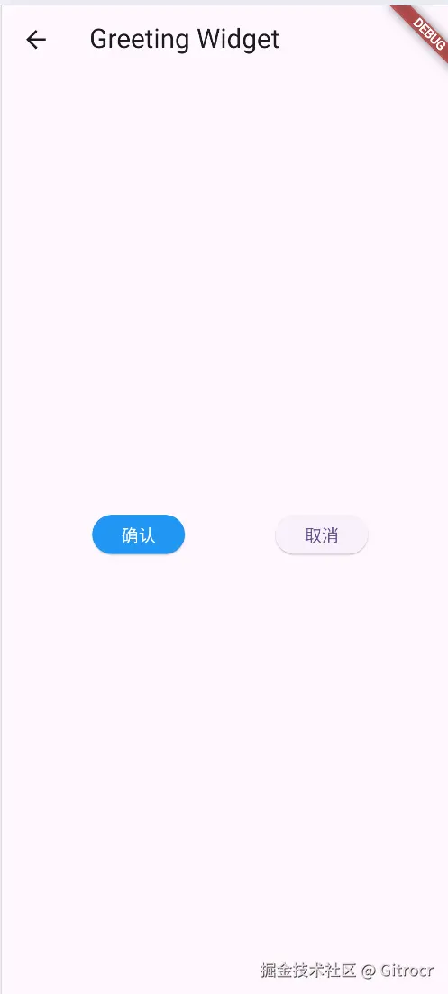
示例:一个简单的水平按钮组
less
@override
  Widget build(BuildContext context) {
    return Scaffold(
      appBar: AppBar(title: Text('Greeting Widget')),
      body: Center(
        child: Row(
          mainAxisAlignment: MainAxisAlignment.spaceEvenly,
          children: [
            ElevatedButton(
              onPressed: () {},
              style: ElevatedButton.styleFrom(
                backgroundColor: Colors.blue,
                foregroundColor: Colors.white,
                textStyle: TextStyle(color: Colors.white),
              ),
              child: Text('确认'),
            ),
            ElevatedButton(onPressed: () {}, child: Text('取消')),
          ],
        ),
      ),
    );
  }
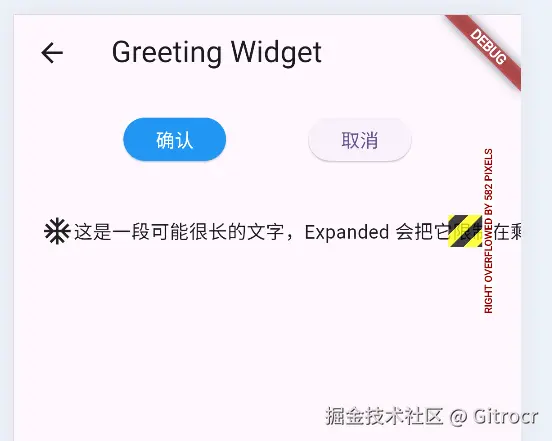
避免常见错误 :当Row 或 Column 的内容超出屏幕范围时,会报溢出错误(黄色条纹)。
解决方案:
- 用 Expanded 让子组件填充剩余空间。
- 用 SingleChildScrollView 包裹使其可滚动。
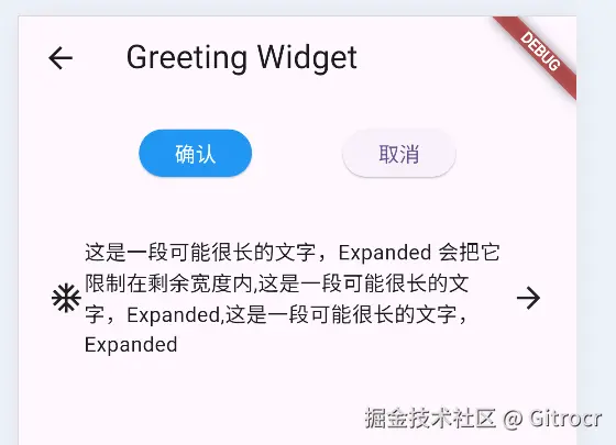
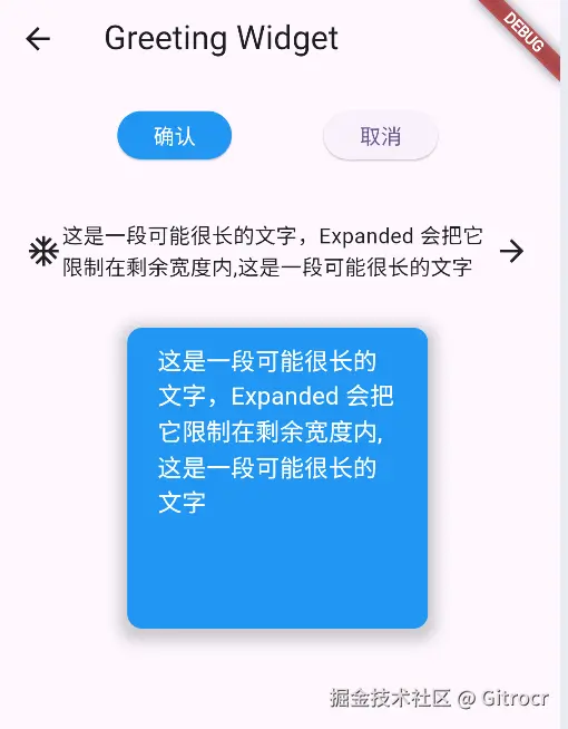
Expanded 使用示例:
less
Container(
    alignment: Alignment.center,
    padding: EdgeInsets.all(20),
    child: Row(
      children: [
        Icon(Icons.ac_unit),
        Expanded(
          child: Text('这是一段可能很长的文字,Expanded 会把它限制在剩余宽度内,这是一段可能很长的'),
        ),
        Icon(Icons.arrow_forward),
      ],
    ),
),
4、Container - 最灵活的"盒子"
Container 可以理解为一个多功能的矩形区域,它能同时做到:
- 设置宽度(width、height);
- 设置内边距(padding)和外边距(margin);
- 设置背景色(color)或背景图片(decoration)
- 设置边框、圆角、阴影(通过decoration的BoxDecoration)
- 限制子组件大小(alignment控制子组件在内部的位置)
示例:一个带圆角和阴影的卡片容器
less
 @override
  Widget build(BuildContext context) {
    return Container(
      width: 200,
      height: 200,
      margin: EdgeInsets.all(10),
      padding: EdgeInsets.symmetric(horizontal: 20, vertical: 10),
      decoration: BoxDecoration(
        color: Colors.blue,
        borderRadius: BorderRadius.circular(10),
        boxShadow: [
          BoxShadow(
            color: Colors.grey.withOpacity(0.5),
            spreadRadius: 5,
            blurRadius: 7,
            offset: Offset(0, 3),
          ),
        ],
      ),
      child: Text(content, style: TextStyle(color: Colors.white, fontSize: 16)),
    );
  }
提示 :如果同时设置了 color 和 decoration,会报错。因为 decoration 已经包含了颜色信息,应该把颜色写在 decoration 的 color 属性里。
5、Stack - 实现重叠效果
Stack 允许子组件按照 "后进先上"的原则层叠放置。通常配合 Positioned 组件精确定位。
示例:图片右下角加一个徽章
less
 @override
  Widget build(BuildContext context) {
    return Stack(
      children: [
        ClipRRect(
          borderRadius: BorderRadius.circular(5),
          child: Image.network(
            'https://picsum.photos/200/300',
            scale: 2.0,
            width: 150,
            height: 150,
            fit: BoxFit.cover,
          ),
        ),
        Positioned(
          bottom: 0,
          right: 0,
          child: Container(
            padding: EdgeInsets.all(5),
            decoration: BoxDecoration(
              color: Colors.white.withOpacity(0.8),
              borderRadius: BorderRadius.circular(5),
            ),
            child: Text('这是一张图片'),
          ),
        ),
      ],
    );
  }
6. 实战:搭建一个"个人名片"卡片
我们把学到的组件组合起来,做一个简单的名片卡片:头像、名字、职业、两个按钮、一行标签图标。
代码(完整的 StatelessWidget) :
less
import 'package:flutter/material.dart';

class BusinessCard extends StatelessWidget {
  const BusinessCard({super.key});

  @override
  Widget build(BuildContext context) {
    return Center(
      child: Container(
        width: 320,
        decoration: BoxDecoration(
          color: Colors.white,
          borderRadius: BorderRadius.circular(24),
          boxShadow: [
            BoxShadow(
              color: Colors.grey.shade200,
              blurRadius: 20,
              offset: Offset(0, 8),
            ),
          ],
        ),
        child: Column(
          mainAxisSize: MainAxisSize.min,
          children: [
            Container(
              margin: EdgeInsets.only(top: 24),
              decoration: BoxDecoration(
                shape: BoxShape.circle,
                boxShadow: [
                  BoxShadow(
                    color: Colors.grey.shade100,
                    blurRadius: 12,
                    spreadRadius: 2,
                  ),
                ],
              ),
              child: CircleAvatar(
                backgroundImage: NetworkImage(
                  'https://via.placeholder.com/100',
                ),
                radius: 55,
              ),
            ),
            SizedBox(height: 16),
            Text(
              'Flutter 开发者',
              style: TextStyle(
                fontSize: 22,
                fontWeight: FontWeight.w600,
                color: Colors.grey.shade800,
              ),
            ),
            SizedBox(height: 6),
            Text(
              'Gitrocr',
              style: TextStyle(
                fontSize: 16,
                fontWeight: FontWeight.w500,
                color: Colors.grey.shade600,
              ),
            ),
            SizedBox(height: 16),
            Column(
              children: [
                _buildContactRow(Icons.email, 'xiaoming@example.com'),
                SizedBox(height: 12),
                _buildContactRow(Icons.phone, '+86 123 4567'),
                SizedBox(height: 12),
                _buildContactRow(Icons.location_on, '中国 北京'),
              ],
            ),
            SizedBox(height: 24),
            Padding(
              padding: EdgeInsets.symmetric(horizontal: 24),
              child: Row(
                mainAxisAlignment: MainAxisAlignment.spaceEvenly,
                children: [
                  Expanded(
                    child: ElevatedButton.icon(
                      icon: Icon(Icons.message, size: 18),
                      onPressed: () {},
                      label: Text('私信', style: TextStyle(fontSize: 14)),
                      style: ElevatedButton.styleFrom(
                        backgroundColor: Colors.blueAccent,
                        foregroundColor: Colors.white,
                        shape: RoundedRectangleBorder(
                          borderRadius: BorderRadius.circular(30),
                        ),
                        padding: EdgeInsets.symmetric(vertical: 12),
                        textStyle: TextStyle(color: Colors.white, fontSize: 12),
                      ),
                    ),
                  ),
                  SizedBox(width: 12),
                  Expanded(
                    child: ElevatedButton.icon(
                      icon: Icon(Icons.add, size: 18),
                      onPressed: () {},
                      label: Text('关注', style: TextStyle(fontSize: 14)),
                      style: OutlinedButton.styleFrom(
                        foregroundColor: Colors.blueAccent,
                        side: BorderSide(color: Colors.blueAccent),
                        padding: EdgeInsets.symmetric(vertical: 12),
                        shape: RoundedRectangleBorder(
                          borderRadius: BorderRadius.circular(30),
                        ),
                      ),
                    ),
                  ),
                ],
              ),
            ),
            SizedBox(height: 16),
          ],
        ),
      ),
    );
  }
}

// 辅助方法:构建统一的联系人行
Widget _buildContactRow(IconData icon, String text) {
  return Row(
    mainAxisSize: MainAxisSize.min,
    children: [
      Icon(icon, size: 18, color: Colors.blueGrey.shade400),
      SizedBox(width: 8),
      Text(text, style: TextStyle(fontSize: 14, color: Colors.grey.shade700)),
    ],
  );
}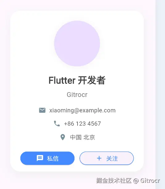
将上面的 BusinessCard 放到 MyApp 的 home 中运行,就能看到一个居中显示的精致名片卡片。你可以尝试修改头像图片、颜色,或者把按钮改成其他样式。
7. 布局调试技巧
当布局不是你想要的样子时,可以用这些方法快速定位问题:
- 给 Container 加上明显的背景色 :例如
color: Colors.red,看它实际占用的大小 - 使用
debugPaintSizeEnabled = true:在main()中加入下面代码,会显示出每个组件的边界
javascript
import 'package:flutter/rendering.dart';

void main() {
  debugPaintSizeEnabled = true;  // 仅用于调试,发布前记得删除
  runApp(MyApp());
}- 热重载 :调整布局参数后按
r键,秒看效果
8. 常见问题与避坑
| 问题现象 | 可能原因 | 解决办法 |
|---|---|---|
| Row / Column 里内容显示不全,边缘有黄黑条纹 | 内容总宽度/高度超出父容器 | 用 Expanded 或 Flexible,或者用 ListView 替代 |
| Container 设置了宽高但没效果 | 父容器限制了子组件的大小(例如 Scaffold 的 body 默认不限制) |
检查父组件或用 ConstrainedBox 包裹 |
| 想让 Container 中的文字居中但没居中 | 忘记设置 alignment |
添加 alignment: Alignment.center |
| Stack 里的内容位置不对 | 没有用 Positioned 或 Align |
给需要定位的子组件加上 Positioned |
9. 小结与作业
本篇我们学习了:
Row/Column实现线性布局Container实现装饰、尺寸、边距Stack+Positioned实现层叠- 组合以上组件完成了一张名片卡片
作业(巩固练习) :
- 把名片卡片改成暗色主题(背景黑色、文字白色、按钮样式调整)。
- 在名片卡片底部加一行社交图标(使用
Row+IconButton)。 - 尝试用
Stack在名片卡片的右上角加一个"认证徽章"(蓝色勾勾图标)。
完成了这些练习,你对 Flutter 布局的基本功就算打好了。
下一篇博客预告:我们将进入交互与数据层面 ------ 如何监听文本输入、管理表单,并介绍状态管理的经典方案 Provider。敬请期待!