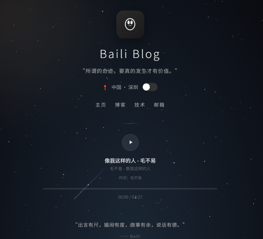
"黑夜流星"个人引导页 网页html
✨ 核心特性
表格
复制
功能 说明 🌙 黑夜模式 深邃星空背景 + 200颗闪烁星星 + 动态流星划过 ☀️ 白昼模式 高级拟物折纹质感背景 + 暖色调渐变 + 太阳光晕 🔄 一键切换 点击绿色开关按钮,平滑过渡1.2秒,所有元素同步变色 🎵 音乐播放器 完整的播放/暂停、进度条拖拽、时间显示(模拟) 🌠 流星动画 每3秒随机生成流星,带拖尾光效 🖱️ 鼠标视差 鼠标移动时星空产生轻微视差偏移 📱 响应式适配 完美适配手机端 🎨 设计细节
头像:手绘风格面具图标,带圆角阴影
导航栏:悬停下划线动画
进度条:渐变绿蓝色彩 + 悬停显示圆点手柄
社交图标:支付宝文字标 + WeChat/QQ 图标
入场动画:所有元素依次淡入上浮
html<!DOCTYPE html> <html lang="zh-CN"> <head> <meta charset="UTF-8"> <meta name="viewport" content="width=device-width, initial-scale=1.0"> <title>Baili Blog - 个人主页</title> <link href="https://fonts.googleapis.com/css2?family=Noto+Sans+SC:wght@300;400;500;700&display=swap" rel="stylesheet"> <style> * { margin: 0; padding: 0; box-sizing: border-box; } :root { --text-primary: #e8e8e8; --text-secondary: #a0a0a0; --text-muted: #666; --accent: #4ade80; --bg-overlay: rgba(0,0,0,0.3); } body { font-family: 'Noto Sans SC', sans-serif; overflow: hidden; min-height: 100vh; color: var(--text-primary); } /* ========== 星空背景 ========== */ .starfield { position: fixed; top: 0; left: 0; width: 100%; height: 100%; background: radial-gradient(ellipse at bottom, #1b2735 0%, #090a0f 100%); z-index: -2; transition: background 1.2s ease; } .starfield.day { background: linear-gradient(135deg, #f5f0e8 0%, #e8e0d0 50%, #ddd5c5 100%); } /* 星星 */ .stars { position: fixed; top: 0; left: 0; width: 100%; height: 100%; z-index: -1; pointer-events: none; } .star { position: absolute; background: white; border-radius: 50%; animation: twinkle var(--duration) ease-in-out infinite; opacity: var(--opacity); } @keyframes twinkle { 0%, 100% { opacity: var(--opacity); transform: scale(1); } 50% { opacity: 0.2; transform: scale(0.5); } } /* 流星 */ .meteor { position: absolute; width: 4px; height: 4px; background: #fff; border-radius: 50%; box-shadow: 0 0 0 4px rgba(255,255,255,0.1), 0 0 0 8px rgba(255,255,255,0.05); opacity: 0; animation: meteor-fall var(--speed) linear infinite; animation-delay: var(--delay); } .meteor::before { content: ''; position: absolute; top: 50%; transform: translateY(-50%); width: 150px; height: 1px; background: linear-gradient(90deg, rgba(255,255,255,0.8), transparent); right: 2px; } @keyframes meteor-fall { 0% { opacity: 1; transform: translateX(0) translateY(0) rotate(-45deg); } 100% { opacity: 0; transform: translateX(-500px) translateY(500px) rotate(-45deg); } } /* 大月亮/太阳 */ .celestial-body { position: fixed; top: -100px; left: -100px; width: 500px; height: 500px; border-radius: 50%; background: radial-gradient(circle at 30% 30%, rgba(200,180,140,0.15), transparent 70%); filter: blur(40px); z-index: -1; transition: all 1.5s ease; } .starfield.day .celestial-body { background: radial-gradient(circle at 30% 30%, rgba(255,200,100,0.3), transparent 70%); top: -150px; left: -150px; } /* 太阳光晕 */ .sun-glow { position: fixed; top: -80px; right: -80px; width: 400px; height: 400px; border-radius: 50%; background: radial-gradient(circle, rgba(255,180,80,0.08), transparent 70%); filter: blur(60px); z-index: -1; opacity: 0; transition: opacity 1.5s ease; } .starfield.day .sun-glow { opacity: 1; } /* ========== 白天模式折纹背景 ========== */ .day-texture { position: fixed; top: 0; left: 0; width: 100%; height: 100%; z-index: -1; opacity: 0; transition: opacity 1.2s ease; pointer-events: none; background: repeating-linear-gradient( 45deg, transparent, transparent 10px, rgba(0,0,0,0.02) 10px, rgba(0,0,0,0.02) 20px ), repeating-linear-gradient( -45deg, transparent, transparent 10px, rgba(0,0,0,0.015) 10px, rgba(0,0,0,0.015) 20px ); } .starfield.day .day-texture { opacity: 1; } /* ========== 主内容 ========== */ .container { display: flex; flex-direction: column; align-items: center; justify-content: center; min-height: 100vh; padding: 40px 20px; position: relative; z-index: 1; } /* 头像 */ .avatar-wrapper { position: relative; margin-bottom: 20px; } .avatar { width: 80px; height: 80px; border-radius: 20px; background: linear-gradient(145deg, #2a2a2a, #1a1a1a); display: flex; align-items: center; justify-content: center; overflow: hidden; box-shadow: 0 8px 32px rgba(0,0,0,0.4); transition: all 0.5s ease; } .starfield.day .avatar { background: linear-gradient(145deg, #f0ece4, #e0d8cc); box-shadow: 0 8px 32px rgba(0,0,0,0.1); } .avatar svg { width: 50px; height: 50px; fill: #e8e8e8; transition: fill 0.5s ease; } .starfield.day .avatar svg { fill: #5a5040; } /* 标题 */ .title { font-size: 32px; font-weight: 300; letter-spacing: 4px; margin-bottom: 16px; color: var(--text-primary); transition: color 0.8s ease; } .starfield.day .title { color: #3a3528; } /* 引言 */ .quote { font-size: 15px; color: var(--text-secondary); margin-bottom: 24px; letter-spacing: 1px; transition: color 0.8s ease; } .starfield.day .quote { color: #7a7060; } /* 位置信息 */ .location { display: flex; align-items: center; gap: 12px; margin-bottom: 24px; font-size: 14px; color: var(--text-secondary); transition: color 0.8s ease; } .starfield.day .location { color: #7a7060; } .location-icon { color: var(--accent); font-size: 16px; } /* 主题切换开关 */ .theme-toggle { position: relative; width: 44px; height: 24px; background: #333; border-radius: 12px; cursor: pointer; transition: background 0.5s ease; flex-shrink: 0; } .starfield.day .theme-toggle { background: #c8c0b0; } .theme-toggle::after { content: ''; position: absolute; top: 2px; left: 2px; width: 20px; height: 20px; border-radius: 50%; background: #fff; transition: transform 0.4s cubic-bezier(0.68, -0.55, 0.27, 1.55); box-shadow: 0 2px 6px rgba(0,0,0,0.3); } .theme-toggle.active::after { transform: translateX(20px); background: #ffcc00; } /* 导航 */ .nav { display: flex; gap: 24px; margin-bottom: 40px; } .nav a { color: var(--text-secondary); text-decoration: none; font-size: 14px; letter-spacing: 2px; position: relative; padding: 4px 0; transition: color 0.5s ease; } .starfield.day .nav a { color: #7a7060; } .nav a::after { content: ''; position: absolute; bottom: 0; left: 0; width: 0; height: 1px; background: var(--accent); transition: width 0.3s ease; } .nav a:hover::after { width: 100%; } .nav a:hover { color: var(--accent); } /* 分隔线 */ .divider { width: 60px; height: 1px; background: linear-gradient(90deg, transparent, var(--text-muted), transparent); margin-bottom: 30px; transition: background 0.8s ease; } .starfield.day .divider { background: linear-gradient(90deg, transparent, #b0a898, transparent); } /* ========== 音乐播放器 ========== */ .music-player { width: 100%; max-width: 500px; text-align: center; margin-bottom: 30px; } .play-btn { width: 48px; height: 48px; border-radius: 50%; background: rgba(255,255,255,0.08); border: 1px solid rgba(255,255,255,0.1); display: flex; align-items: center; justify-content: center; margin: 0 auto 16px; cursor: pointer; transition: all 0.3s ease; backdrop-filter: blur(10px); } .starfield.day .play-btn { background: rgba(0,0,0,0.05); border-color: rgba(0,0,0,0.1); } .play-btn:hover { background: rgba(255,255,255,0.15); transform: scale(1.1); } .play-btn svg { width: 18px; height: 18px; fill: var(--text-primary); margin-left: 3px; transition: fill 0.5s ease; } .starfield.day .play-btn svg { fill: #3a3528; } .play-btn.playing svg { margin-left: 0; } .song-title { font-size: 15px; color: var(--text-primary); margin-bottom: 4px; transition: color 0.8s ease; } .starfield.day .song-title { color: #3a3528; } .song-artist { font-size: 12px; color: var(--text-muted); margin-bottom: 8px; transition: color 0.8s ease; } .starfield.day .song-artist { color: #9a9080; } .song-meta { font-size: 11px; color: var(--text-muted); margin-bottom: 20px; line-height: 1.8; transition: color 0.8s ease; } .starfield.day .song-meta { color: #9a9080; } /* 进度条 */ .progress-container { width: 100%; height: 4px; background: rgba(255,255,255,0.1); border-radius: 2px; margin-bottom: 12px; cursor: pointer; position: relative; overflow: hidden; } .starfield.day .progress-container { background: rgba(0,0,0,0.08); } .progress-bar { height: 100%; background: linear-gradient(90deg, #4ade80, #22d3ee); border-radius: 2px; width: 0%; transition: width 0.1s linear; position: relative; } .progress-bar::after { content: ''; position: absolute; right: -6px; top: 50%; transform: translateY(-50%); width: 12px; height: 12px; background: #fff; border-radius: 50%; box-shadow: 0 0 10px rgba(74,222,128,0.5); opacity: 0; transition: opacity 0.3s ease; } .progress-container:hover .progress-bar::after { opacity: 1; } .time-display { font-size: 12px; color: var(--text-muted); margin-bottom: 30px; transition: color 0.8s ease; } .starfield.day .time-display { color: #9a9080; } /* ========== 底部引言 ========== */ .bottom-quote { text-align: center; margin-bottom: 8px; } .bottom-quote p { font-size: 14px; color: var(--text-secondary); line-height: 1.8; letter-spacing: 1px; transition: color 0.8s ease; } .starfield.day .bottom-quote p { color: #7a7060; } .bottom-quote .author { font-size: 12px; color: var(--text-muted); margin-top: 8px; transition: color 0.8s ease; } .starfield.day .bottom-quote .author { color: #9a9080; } /* ========== 社交图标 ========== */ .social-links { display: flex; gap: 40px; margin-top: 40px; align-items: center; } .social-link { display: flex; align-items: center; gap: 6px; color: var(--text-muted); text-decoration: none; font-size: 12px; transition: all 0.3s ease; opacity: 0.6; } .starfield.day .social-link { color: #8a8068; } .social-link:hover { opacity: 1; color: var(--text-primary); transform: translateY(-2px); } .starfield.day .social-link:hover { color: #3a3528; } .social-link svg { width: 20px; height: 20px; fill: currentColor; } /* 支付宝文字样式 */ .alipay-text { font-family: 'Noto Sans SC', sans-serif; font-weight: 700; font-size: 14px; letter-spacing: 2px; } /* ========== 粒子效果 ========== */ .particles { position: fixed; top: 0; left: 0; width: 100%; height: 100%; pointer-events: none; z-index: 0; } .particle { position: absolute; width: 2px; height: 2px; background: rgba(255,255,255,0.3); border-radius: 50%; animation: float-up var(--duration) linear infinite; animation-delay: var(--delay); } @keyframes float-up { 0% { transform: translateY(100vh) translateX(0); opacity: 0; } 10% { opacity: 1; } 90% { opacity: 1; } 100% { transform: translateY(-10vh) translateX(var(--drift)); opacity: 0; } } /* 响应式 */ @media (max-width: 600px) { .title { font-size: 24px; } .nav { gap: 16px; } .nav a { font-size: 13px; } .music-player { max-width: 90%; } } </style> <base target="_blank"> </head> <body> <!-- 星空背景 --> <div class="starfield" id="starfield"> <div class="celestial-body"></div> <div class="sun-glow"></div> <div class="day-texture"></div> <div class="stars" id="stars"></div> <div class="particles" id="particles"></div> </div> <!-- 主内容 --> <div class="container"> <!-- 头像 --> <div class="avatar-wrapper"> <div class="avatar"> <svg viewBox="0 0 100 100"> <path d="M50 15 C30 15, 20 35, 20 50 C20 70, 35 85, 50 85 C65 85, 80 70, 80 50 C80 35, 70 15, 50 15 Z M50 20 C65 20, 75 35, 75 50 C75 65, 65 80, 50 80 C35 80, 25 65, 25 50 C25 35, 35 20, 50 20 Z"/> <path d="M35 40 Q35 30, 42 30 Q48 30, 48 40 Q48 50, 42 50 Q35 50, 35 40 Z" fill="currentColor"/> <path d="M52 40 Q52 30, 58 30 Q65 30, 65 40 Q65 50, 58 50 Q52 50, 52 40 Z" fill="currentColor"/> <path d="M42 55 Q50 62, 58 55" fill="none" stroke="currentColor" stroke-width="2" stroke-linecap="round"/> <path d="M38 25 L42 28 M58 25 L62 28" stroke="currentColor" stroke-width="1.5" stroke-linecap="round"/> </svg> </div> </div> <!-- 标题 --> <h1 class="title">Baili Blog</h1> <!-- 引言 --> <p class="quote">"所谓的奇迹,要真的发生才有价值。"</p> <!-- 位置和主题切换 --> <div class="location"> <span class="location-icon">📍</span> <span>中国 · 深圳</span> <div class="theme-toggle" id="themeToggle"></div> </div> <!-- 导航 --> <nav class="nav"> <a href="#">主页</a> <a href="#">博客</a> <a href="#">技术</a> <a href="#">邮箱</a> </nav> <!-- 分隔线 --> <div class="divider"></div> <!-- 音乐播放器 --> <div class="music-player"> <div class="play-btn" id="playBtn"> <svg viewBox="0 0 24 24" id="playIcon"> <path d="M8 5v14l11-7z"/> </svg> <svg viewBox="0 0 24 24" id="pauseIcon" style="display:none"> <path d="M6 4h4v16H6V4zm8 0h4v16h-4V4z"/> </svg> </div> <div class="song-title">像我这样的人 - 毛不易</div> <div class="song-artist">毛不易 - 像我这样的人</div> <div class="song-meta"> 作词:毛不易 </div> <div class="progress-container" id="progressContainer"> <div class="progress-bar" id="progressBar"></div> </div> <div class="time-display" id="timeDisplay">00:00 / 03:27</div> </div> <!-- 底部引言 --> <div class="bottom-quote"> <p>"出言有尺,嬉闹有度,做事有余,说话有德。"</p> <p class="author">------ Baili</p> </div> <!-- 社交链接 --> <div class="social-links"> <a href="#" class="social-link"> <span class="alipay-text">支付宝</span> </a> <a href="#" class="social-link"> <svg viewBox="0 0 24 24"><path d="M8.5 13.5l2.5 2.5 5-5" fill="none" stroke="currentColor" stroke-width="2" stroke-linecap="round" stroke-linejoin="round"/><circle cx="12" cy="12" r="10" fill="none" stroke="currentColor" stroke-width="1.5"/></svg> <span>WeChat</span> </a> <a href="#" class="social-link"> <svg viewBox="0 0 24 24"><path d="M12 2C6.48 2 2 6.48 2 12s4.48 10 10 10 10-4.48 10-10S17.52 2 12 2zm-1 15h-2v-2h2v2zm0-4h-2V7h2v6zm4 4h-2v-2h2v2zm0-4h-2V7h2v6z" fill="currentColor"/></svg> <span>QQ</span> </a> </div> </div> <script> // ========== 生成星星 ========== const starsContainer = document.getElementById('stars'); const starCount = 200; for (let i = 0; i < starCount; i++) { const star = document.createElement('div'); star.className = 'star'; const size = Math.random() * 2 + 0.5; star.style.width = size + 'px'; star.style.height = size + 'px'; star.style.left = Math.random() * 100 + '%'; star.style.top = Math.random() * 100 + '%'; star.style.setProperty('--duration', (Math.random() * 3 + 2) + 's'); star.style.setProperty('--opacity', Math.random() * 0.7 + 0.3); star.style.animationDelay = Math.random() * 5 + 's'; starsContainer.appendChild(star); } // ========== 生成流星 ========== function createMeteor() { const meteor = document.createElement('div'); meteor.className = 'meteor'; meteor.style.left = (Math.random() * 80 + 20) + '%'; meteor.style.top = (Math.random() * 30) + '%'; meteor.style.setProperty('--speed', (Math.random() * 2 + 1.5) + 's'); meteor.style.setProperty('--delay', '0s'); starsContainer.appendChild(meteor); setTimeout(() => { meteor.remove(); }, 4000); } // 定期生成流星 setInterval(createMeteor, 3000); // 初始生成几个 setTimeout(createMeteor, 500); setTimeout(createMeteor, 1500); // ========== 生成浮动粒子 ========== const particlesContainer = document.getElementById('particles'); const particleCount = 30; for (let i = 0; i < particleCount; i++) { const particle = document.createElement('div'); particle.className = 'particle'; particle.style.left = Math.random() * 100 + '%'; particle.style.setProperty('--duration', (Math.random() * 15 + 10) + 's'); particle.style.setProperty('--delay', (Math.random() * 15) + 's'); particle.style.setProperty('--drift', (Math.random() * 100 - 50) + 'px'); particlesContainer.appendChild(particle); } // ========== 主题切换 ========== const themeToggle = document.getElementById('themeToggle'); const starfield = document.getElementById('starfield'); let isDay = false; themeToggle.addEventListener('click', () => { isDay = !isDay; themeToggle.classList.toggle('active', isDay); starfield.classList.toggle('day', isDay); }); // ========== 音乐播放器 ========== const playBtn = document.getElementById('playBtn'); const playIcon = document.getElementById('playIcon'); const pauseIcon = document.getElementById('pauseIcon'); const progressBar = document.getElementById('progressBar'); const progressContainer = document.getElementById('progressContainer'); const timeDisplay = document.getElementById('timeDisplay'); let isPlaying = false; let currentTime = 0; const totalTime = 207; // 3:27 in seconds let playbackInterval; function formatTime(seconds) { const m = Math.floor(seconds / 60); const s = Math.floor(seconds % 60); return `${m.toString().padStart(2, '0')}:${s.toString().padStart(2, '0')}`; } function updateProgress() { currentTime += 0.1; if (currentTime >= totalTime) { currentTime = 0; isPlaying = false; playIcon.style.display = 'block'; pauseIcon.style.display = 'none'; playBtn.classList.remove('playing'); clearInterval(playbackInterval); } const progress = (currentTime / totalTime) * 100; progressBar.style.width = progress + '%'; timeDisplay.textContent = `${formatTime(currentTime)} / 03:27`; } playBtn.addEventListener('click', () => { isPlaying = !isPlaying; if (isPlaying) { playIcon.style.display = 'none'; pauseIcon.style.display = 'block'; playBtn.classList.add('playing'); playbackInterval = setInterval(updateProgress, 100); } else { playIcon.style.display = 'block'; pauseIcon.style.display = 'none'; playBtn.classList.remove('playing'); clearInterval(playbackInterval); } }); // 点击进度条跳转 progressContainer.addEventListener('click', (e) => { const rect = progressContainer.getBoundingClientRect(); const clickX = e.clientX - rect.left; const percentage = clickX / rect.width; currentTime = percentage * totalTime; progressBar.style.width = (percentage * 100) + '%'; timeDisplay.textContent = `${formatTime(currentTime)} / 03:27`; }); // ========== 鼠标视差效果 ========== document.addEventListener('mousemove', (e) => { const x = (e.clientX / window.innerWidth - 0.5) * 20; const y = (e.clientY / window.innerHeight - 0.5) * 20; starsContainer.style.transform = `translate(${x * 0.5}px, ${y * 0.5}px)`; }); // ========== 入场动画 ========== document.addEventListener('DOMContentLoaded', () => { const elements = document.querySelectorAll('.avatar, .title, .quote, .location, .nav, .divider, .music-player, .bottom-quote, .social-links'); elements.forEach((el, index) => { el.style.opacity = '0'; el.style.transform = 'translateY(30px)'; el.style.transition = 'all 0.8s cubic-bezier(0.16, 1, 0.3, 1)'; setTimeout(() => { el.style.opacity = '1'; el.style.transform = 'translateY(0)'; }, 200 + index * 100); }); }); </script> </body> </html>