鸿蒙原生 ArkTS 布局之 Row 与 Scroll 联动:可横向滚动的标签栏
一、前言
在移动应用中,标签栏是最常见的导航组件。当标签数量超过屏幕宽度时,如何优雅展示是一个经典命题。鸿蒙 ArkTS 框架提供了 Row + Scroll 联动 这一布局模式来解决此问题。
本文从零拆解该模式的原理与实现,示例代码基于 HarmonyOS NEXT API 24,在 DevEco Studio 中编译验证通过。
二、方案对比
| 方案 | 效果 | 缺点 |
|---|---|---|
| 固定宽度+缩小 | 所有标签可见 | 文字过小,不可读 |
| 多行换行 | 全部完整显示 | 占两行高度,不美观 |
| 横向滚动 | 完整尺寸+滑动交互 | 需处理滚动联动逻辑 |
横向滚动是主流选择(淘宝、京东、知乎均采用)。它保留标签原始尺寸,不占额外高度,且符合用户「左右滑动」的操作直觉。
三、核心布局原理
3.1 Row 容器
Row 的子组件沿水平排列。当子组件总宽超出父容器时,Row 默认压缩子组件(flexShrink=1)。我们需要 禁止压缩 ,让 Row 的宽度由子组件自然撑开。
3.2 Scroll 容器
Scroll 可包裹一个子组件,当子组件超出视口时提供滚动交互。通过 scrollable() 设定方向,通过 Scroller 实现编程式滚动控制。
3.3 联动本质
- 布局 :
Scroll作为视口,Row作为内容 - 尺寸 :
flexShrink(0)禁止压缩,超出部分即为可滚动区域 - 交互 :手指滑动触发
Scroll驱动Row平移 - 联动 :点击标签时,
Scroller.scrollTo()将目标标签滚入视野
四、完整代码实现
4.1 标签数据类型
typescript
interface TabItem {
  id: number;
  title: string;
  badge?: string;  // 可选角标
}
4.2 页面结构与状态
typescript
@Entry
@Component
struct Index {
  @State private tabs: TabItem[] = [
    { id: 1, title: '首页' },
    { id: 2, title: '发现' },
    { id: 3, title: '社区' },
    { id: 4, title: '消息', badge: '99+' },
    { id: 5, title: '我的' },
    { id: 6, title: '购物车', badge: '3' },
    { id: 7, title: '订单' },
    { id: 8, title: '收藏', badge: '12' },
    { id: 9, title: '历史记录' },
    { id: 10, title: '设置' },
    { id: 11, title: '帮助与反馈' },
    { id: 12, title: '关于我们' },
  ];

  @State private activeTabId: number = 1;
  private tabScrollCtrl: Scroller = new Scroller();
  private readonly TAB_WIDTH: number = 88;
}
4.3 主布局
typescript
build() {
Column() {
this.buildTitleBar();
this.buildTabBar(); // ★ 核心
this.buildContentArea();
}
.width('100%').height('100%')
.backgroundColor('#F5F5F5')
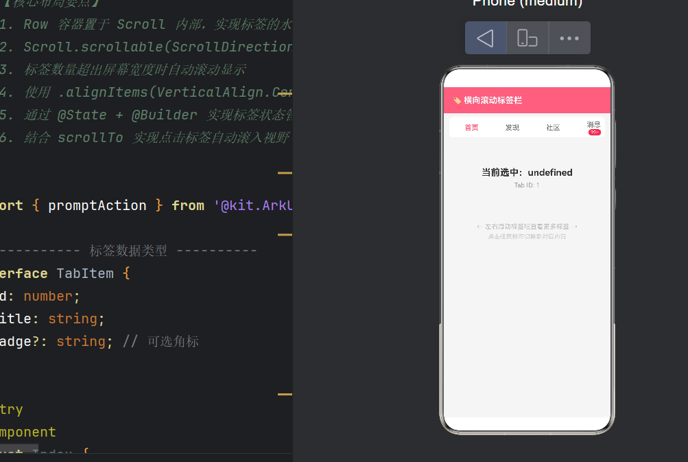
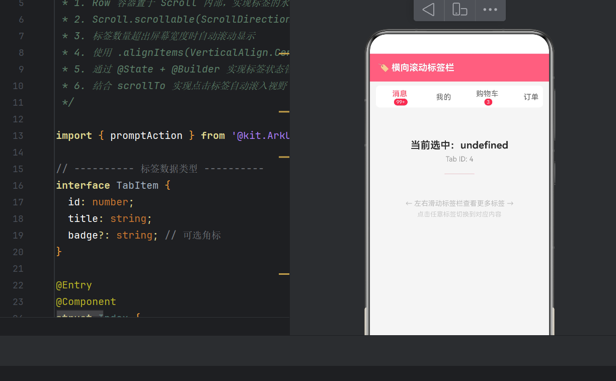
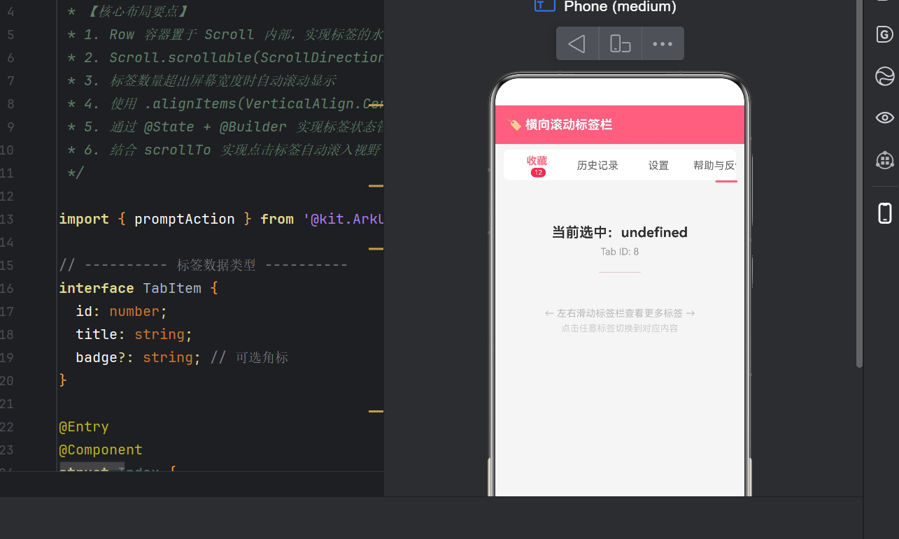
}4.4 ★ 核心:可横向滚动的标签栏
typescript
@Builder
buildTabBar() {
  Column() {
    Scroll(this.tabScrollCtrl) {
      Row() {
        ForEach(this.tabs, (item: TabItem) => {
          Column() {
            Text(item.title)
              .fontSize(15)
              .fontColor(item.id === this.activeTabId ? '#FF6B81' : '#666666')
              .fontWeight(item.id === this.activeTabId ? FontWeight.Bold : FontWeight.Normal)

            if (item.badge !== undefined) {
              Text(item.badge)
                .fontSize(10).fontColor('#FFFFFF')
                .backgroundColor('#FF4757').borderRadius(8)
                .padding({ left: 5, right: 5, top: 1, bottom: 1 })
                .margin({ left: 4 })
            }
          }
          .width(this.TAB_WIDTH).height(44)
          .justifyContent(FlexAlign.Center)
          .alignItems(HorizontalAlign.Center)
          .onClick(() => { this.onTabClick(item); })
        }, (item: TabItem) => item.id.toString())
      }
      /* ★★★ 关键点1:禁止 Row 压缩 ★★★ */
      .flexShrink(0)
      .alignItems(VerticalAlign.Center).height(44)
      .padding({ left: 4, right: 4 })
    }
    /* ★★★ 关键点2:开启水平滚动 ★★★ */
    .scrollable(ScrollDirection.Horizontal)
    .scrollBar(BarState.Off)
    .edgeEffect(EdgeEffect.Spring)
    .width('100%').height(44).backgroundColor('#FFFFFF')
    .borderRadius(8).margin({ left: 12, right: 12, top: 8 })
  }
}
4.5 标签点击联动
typescript
onTabClick(item: TabItem): void {
  this.activeTabId = item.id;

  const index = this.tabs.findIndex(t => t.id === item.id);
  if (index >= 0) {
    /* ★★★ 关键点3:编程式滚动联动 ★★★ */
    this.tabScrollCtrl.scrollTo({
      xOffset: index * this.TAB_WIDTH,
      yOffset: 0,
      animation: { duration: 250, curve: Curve.EaseInOut }
    });
  }

  promptAction.showToast({
    message: `切换到「${item.title}」`,
    duration: 1000
  });
}
4.6 标题栏与内容区
typescript
@Builder
buildTitleBar() {
  Row() {
    Text('🏷️ 横向滚动标签栏')
      .fontSize(18).fontWeight(FontWeight.Bold).fontColor('#FFFFFF')
  }
  .width('100%').height(56).padding({ left: 16, right: 16 })
  .backgroundColor('#FF6B81').alignItems(VerticalAlign.Center)
}

@Builder
buildContentArea() {
  Column() {
    Text(`当前选中:${this.activeTabTitle}`)
      .fontSize(20).fontWeight(FontWeight.Bold).fontColor('#333333')
      .margin({ top: 40 })

    Text(`Tab ID: ${this.activeTabId}`)
      .fontSize(14).fontColor('#999999').margin({ top: 8 })

    Divider().width(60).height(3).color('#FF6B81')
      .borderRadius(2).margin({ top: 20, bottom: 20 })

    Text('← 左右滑动标签栏查看更多标签 →')
      .fontSize(14).fontColor('#BBBBBB').margin({ top: 30 })

    Text('点击任意标签切换到对应内容')
      .fontSize(13).fontColor('#CCCCCC').margin({ top: 6 })
  }
  .width('100%').height('100%')
  .justifyContent(FlexAlign.Start).alignItems(HorizontalAlign.Center)
  .padding({ top: 20 })
}
五、三大关键要点
5.1 Row.flexShrink(0)
Row 默认 flexShrink=1,子组件总宽超出父容器时会被压缩。设置 .flexShrink(0) 禁止压缩,Row 的宽度由子组件撑开,超出部分变为可滚动区域。
typescript
Row() { /* 标签项 */ }
  .flexShrink(0)  // ★ 这一行决定布局成败
5.2 Scroll.scrollable(ScrollDirection.Horizontal)
不指定滚动方向时,Scroll 可能无法响应水平滑动手势。必须显式声明:
typescript
Scroll() { /* Row + 标签 */ }
.scrollable(ScrollDirection.Horizontal) // ★ 指定水平滚动其他方向选项:Vertical(默认)、Free(双向)。
5.3 Scroller.scrollTo 联动
仅改变 activeTabId 不足以让被遮挡的标签「露出来」。必须通过编程滚动将其推入视野:
typescript
this.tabScrollCtrl.scrollTo({
  xOffset: index * this.TAB_WIDTH,
  animation: { duration: 250, curve: Curve.EaseInOut }
});
如需居中显示,可用增强算法:
typescript
const viewWidth = 360; // 屏幕宽度
const centerOffset = Math.max(0, index * this.TAB_WIDTH - (viewWidth - this.TAB_WIDTH) / 2);
const maxScroll = this.tabs.length * this.TAB_WIDTH - viewWidth;
const clamped = Math.min(centerOffset, Math.max(0, maxScroll));
六、@Builder 编写规范
6.1 常见错误
ArkTS 的 @Builder 方法体内 只能包含 UI 组件语法 ,不能写 const、let、var 等:
typescript
// ❌ 错误:@Builder 内包含 const
@Builder
buildArea() {
  const activeTab = this.tabs.find(...);  // 编译错误!
  Column() { ... }
}错误信息:Only UI component syntax can be written here.
6.2 正确做法
将逻辑提取为计算属性(getter):
typescript
get activeTabTitle(): string {
  const tab = this.tabs.find(item => item.id === this.activeTabId);
  return tab ? tab.title : '未知';
}

@Builder
buildContentArea() {
  Column() {
    Text(`当前选中:${this.activeTabTitle}`)  // 直接在模板中引用
  }
}
6.3 设计原因
这一限制是为了让编译器能精准分析依赖关系,确定最小化更新范围,提升运行时性能------以开发者的少量约束换取运行时的流畅体验。
七、UI 增强选项
7.1 边缘回弹
typescript
Scroll() { }
.edgeEffect(EdgeEffect.Spring) // 弹性回弹| 模式 | 效果 |
|---|---|
None |
滑动到边界即停 |
Spring |
越界后松手弹回(推荐) |
Fade |
边缘渐隐 |
7.2 滚动条控制
typescript
.scrollBar(BarState.Off)    // 始终隐藏(推荐标签栏用)
.scrollBar(BarState.Auto)   // 滑动时自动显示
.scrollBarWidth(2)          // 滚动条宽度
7.3 切换动画
typescript
animateTo({ duration: 200, curve: Curve.EaseInOut }, () => {
  this.activeTabId = item.id;
});
八、性能与最佳实践
8.1 ForEach 的 key
key 必须为 唯一字符串,帮助框架高效识别增删改:
typescript
ForEach(this.tabs,
  (item) => { /* UI */ },
  (item) => item.id.toString()   // key
)
8.2 避免在 ForEach 内创建临时对象
typescript
// ❌ 低效:每次都创建新对象
ForEach(this.tabs, (item) => {
  const style = { color: '#FF6B81' };
  Text(item.title).fontColor(style.color)
})

// ✅ 高效:直接使用字面量
ForEach(this.tabs, (item) => {
  Text(item.title).fontColor('#FF6B81')
})
8.3 标签数量建议
建议 10~20 个。超过 20 个时建议分组、折叠或增加搜索功能。
8.4 深色模式适配
使用资源引用替代硬编码颜色:
typescript
Text(item.title)
  .fontColor($r('app.color.tab_active_color'))
在 resources/dark/element/color.json 中配置深色值,系统自动切换。
九、常见问题
9.1 标签无法滚动
检查:① .scrollable(ScrollDirection.Horizontal) ② .flexShrink(0) ③ Scroll 的 width 为 '100%' ④ 父容器高度足够。
9.2 文字被压缩
Row 上缺少 .flexShrink(0),添加即可修复。
9.3 scrollTo 无效
检查:① Scroller 对象是否传入 Scroll 构造函数 ② xOffset 是否为正数 ③ TAB_WIDTH 是否与实际一致。
9.4 @Builder 报错
确认 @Builder 内无 const/let/var,将逻辑移到 getter 或普通方法中。
9.5 缓存问题
bash
hvigorw clean # 清除构建缓存后重试十、拓展变体
10.1 垂直滚动
将 Row 换为 Column,Horizontal 换为 Vertical 即可。
10.2 与 Swiper 联动
typescript
@State currentIndex: number = 0;
private swiperCtrl: SwiperController = new SwiperController();

// 标签点击 → Swiper 滚动
this.swiperCtrl.showNext();

// Swiper 滑动 → 标签高亮
.onSelectedIndex((index: number) => {
  this.currentIndex = index;
})
10.3 自适应标签宽度
移除固定 width,改用 padding:
typescript
ForEach(this.tabs, (item) => {
  Text(item.title).padding({ left: 12, right: 12 })
})
注意:此时 scrollTo 偏移量需遍历累加各标签实际宽度。
十一、总结
11.1 核心三要素
| 要点 | 代码 | 作用 |
|---|---|---|
| 禁止 Row 压缩 | .flexShrink(0) |
标签完整撑开 |
| 水平滚动方向 | .scrollable(ScrollDirection.Horizontal) |
允许横向滑动 |
| 编程滚动联动 | Scroller.scrollTo() |
点击自动滚入视野 |
11.2 开发心法
- 理解默认值 :
Row的flexShrink=1等默认行为可能不是你想要的 - @Builder 只写 UI:所有逻辑提前提取为 getter 或方法
- @State 驱动:改变变量让框架自动重绘,不要手动操作组件
- Scroller 是桥梁 :
Scroll的高级能力都需要通过Scroller操作
11.3 源码
完整源码约 300 行,位于 entry/src/main/ets/pages/Index.ets,在 DevEco Studio 5.0+ 中编译通过,基于 HarmonyOS NEXT API 24。
参考资源
- HarmonyOS 开发者文档 - ArkTS 语法
- HarmonyOS 开发者文档 - Row 组件
- HarmonyOS 开发者文档 - Scroll 组件
- HarmonyOS 开发者文档 - @Builder 装饰器
本文由 AtomCode 撰写,基于 HarmonyOS NEXT API 24,示例代码已在 DevEco Studio 5.0+ 编译通过。