HarmonyOS NEXT 圣杯布局实战:Flex 弹性布局与 ArkTS 组件化
一、什么是圣杯布局?
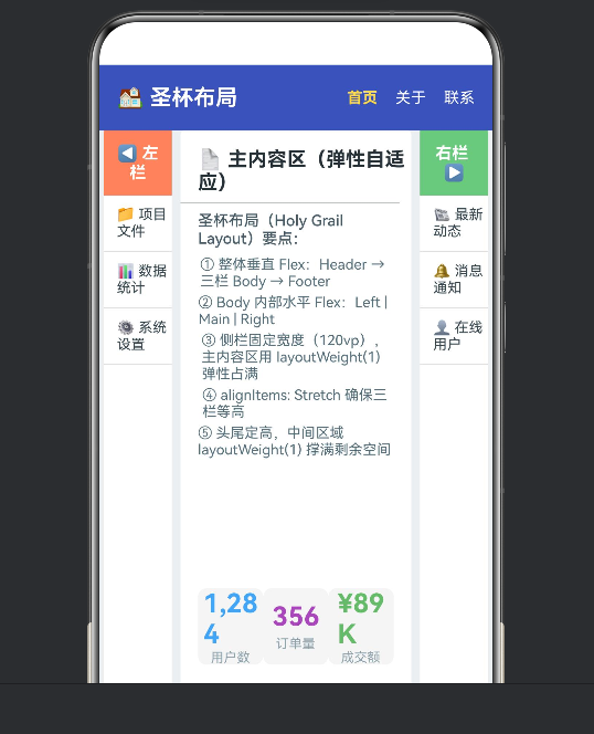
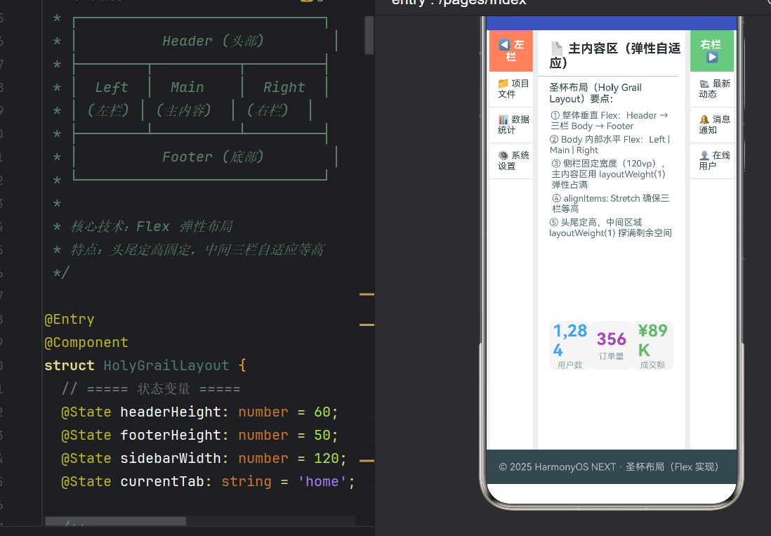
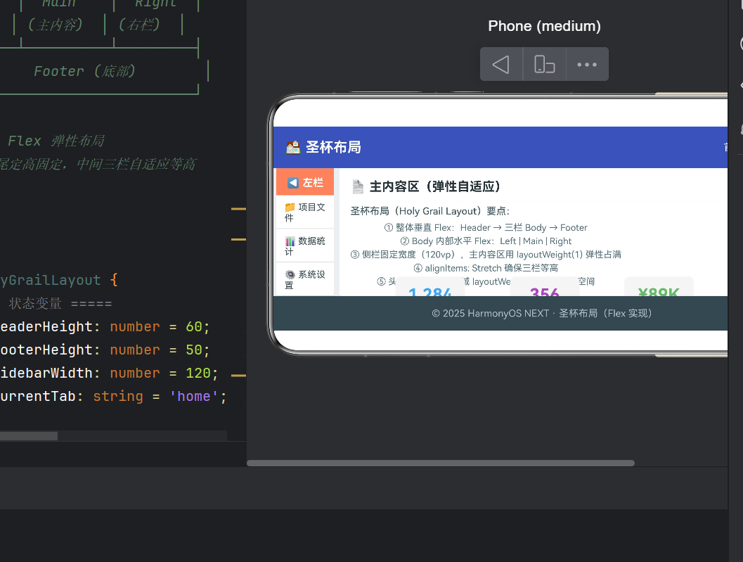
圣杯布局(Holy Grail Layout)是经典的 Web 布局模式,结构如下:
┌─────────────────────────────────┐
│           Header(头部)           │
├────────┬──────────────┬──────────┤
│  Left  │    Main      │  Right   │
│ (左栏)  │  (主内容区)    │  (右栏)   │
├────────┴──────────────┴──────────┤
│           Footer(底部)           │
└─────────────────────────────────┘
核心诉求:① 头尾固定高度;② 中间三栏等高;③ 主内容区弹性伸缩占满剩余空间;④ 侧栏宽度固定。
在 HarmonyOS NEXT ArkUI 中,由于框架基于声明式、响应式的 Flex/Column/Row 体系设计,实现圣杯布局比 Web 端更加简洁直观。本文从零搭建完整应用,深入理解 ArkTS 的 Flex 弹性布局、@Builder 组件化和状态管理。
二、项目结构概览
app6194/
├── AppScope/app.json5              # 应用配置(bundleName、版本号)
├── entry/src/main/ets/
│   ├── entryability/EntryAbility.ets  # Ability 生命周期
│   └── pages/Index.ets               ★ 核心页面(圣杯布局)
├── entry/src/main/resources/         # 多资源目录
├── build-profile.json5               # SDK 版本、签名配置
└── oh-package.json5 # 包依赖| 维度 | 选用方案 |
|---|---|
| 框架 | ArkUI 声明式 UI |
| 语言 | ArkTS |
| 布局核心 | Flex 弹性容器 |
| 组件复用 | @Builder 装饰器 |
| 状态管理 | @State 装饰器 |
| 最低 API | 24(HarmonyOS NEXT) |
三、核心代码逐层拆解
3.1 状态变量定义
typescript
@Entry
@Component
struct HolyGrailLayout {
  @State headerHeight: number = 60;   // 头部高度
  @State footerHeight: number = 50;   // 底部高度
  @State sidebarWidth: number = 120;  // 侧栏宽度
  @State currentTab: string = 'home'; // 导航选中项
@Entry 标记页面入口,@Component 声明 UI 组件,@State 装饰状态变量------其变化会触发 UI 自动重渲染,这是声明式 UI 的核心:数据驱动视图。
3.2 最外层:垂直 Flex 容器
typescript
build() {
  Flex({
    direction: FlexDirection.Column, // 垂直排列
    alignItems: ItemAlign.Stretch,   // 交叉轴拉伸(宽度填满)
    justifyContent: FlexAlign.Start
  }) {
    // Header → Body → Footer
  }
  .width('100%')
  .height('100%')
}
ItemAlign.Stretch 让所有子项在交叉轴(水平方向)拉伸填满宽度。.width('100%').height('100%') 撑满屏幕。
3.3 Header:水平导航栏
typescript
Flex({
  direction: FlexDirection.Row,
  alignItems: ItemAlign.Center,
  justifyContent: FlexAlign.SpaceBetween // 两端对齐
}) {
  Text('🏠 圣杯布局')
    .fontSize(20).fontWeight(FontWeight.Bold).fontColor(Color.White)
  Flex({ direction: FlexDirection.Row, alignItems: ItemAlign.Center }) {
    this.NavButton('首页', 'home')
    this.NavButton('关于', 'about')
    this.NavButton('联系', 'contact')
  }.width('auto')
}
.width('100%').height(this.headerHeight)
.backgroundColor('#3F51B5')
.padding({ left: 16, right: 16 })
.shadow({ radius: 4, color: '#00000040' })
左侧 Logo + 右侧导航按钮,通过 this.NavButton(...) 调用 @Builder 生成。.height() 使用状态变量 headerHeight,为后续动态调整预留接口。
3.4 Body:三栏等高布局(核心)
typescript
Flex({
  direction: FlexDirection.Row,
  alignItems: ItemAlign.Stretch,  // ★ 等高关键
  justifyContent: FlexAlign.Start
}) {
  // 左栏
  Stack() {
    this.SidePanel('◀ 左栏', '#FF8A65', ['📁 项目文件', '📊 数据统计', '⚙️ 系统设置'])
  }
  .width(this.sidebarWidth)

  // 主内容区
  this.MainContent()

  // 右栏
  Stack() {
    this.SidePanel('右栏 ▶', '#81C784', ['📰 最新动态', '🔔 消息通知', '👤 在线用户'])
  }
  .width(this.sidebarWidth)
}
.width('100%')
.layoutWeight(1)         // ★ 弹性占满 Header 和 Footer 之间的剩余空间
.backgroundColor('#ECEFF1')
三个关键设计
① ItemAlign.Stretch 实现等高 :子元素在垂直方向上拉伸至容器高度。外层 Flex 通过 .layoutWeight(1) 占满剩余空间后,三栏自然等高。
② Stack 包裹 @Builder :ArkTS 中 @Builder 方法返回 void,不能链式调用 .width()。因此用 Stack 包裹后在外层设置宽度。
③ layoutWeight(1) 弹性占满 :类比 CSS 的 flex: 1,按权重分配主轴上的剩余空间。Header 固定 60vp,Body 权重 1 占满中间,Footer 固定 50vp。
3.5 Footer:简洁收尾
typescript
Flex({
  direction: FlexDirection.Row,
  alignItems: ItemAlign.Center,
  justifyContent: FlexAlign.Center
}) {
  Text('© 2025 HarmonyOS NEXT · 圣杯布局(Flex 实现)')
    .fontSize(14).fontColor('#B0BEC5')
}
.width('100%').height(this.footerHeight).backgroundColor('#37474F')
水平垂直居中显示版权信息,固定 50vp 高度。
四、@Builder 组件化深度解析
4.1 导航按钮:有状态交互
typescript
@Builder
NavButton(label: string, tab: string) {
  Text(label)
    .fontSize(14)
    .fontColor(this.currentTab === tab ? '#FFD740' : Color.White)
    .fontWeight(this.currentTab === tab ? FontWeight.Bold : FontWeight.Normal)
    .margin({ left: 16 }).padding({ top: 4, bottom: 4 })
    .onClick(() => { this.currentTab = tab; })
}
通过闭包捕获父组件的 currentTab 状态,选中按钮高亮显示。这是「状态提升」模式的 ArkTS 实践。
4.2 侧栏面板:参数化 UI + ForEach 循环
typescript
@Builder
SidePanel(title: string, bgColor: string, items: string[]) {
  Flex({ direction: FlexDirection.Column, alignItems: ItemAlign.Start }) {
    Text(title).fontSize(15).fontWeight(FontWeight.Bold)
      .fontColor('#FFFFFF').width('100%').textAlign(TextAlign.Center)
      .padding(12).backgroundColor(bgColor)

    ForEach(items, (item: string) => {
      Text(item).fontSize(13).fontColor('#37474F').width('100%')
        .padding({ left: 12, top: 10, bottom: 10 })
        .borderWidth({ bottom: 1 })
        .borderColor({ bottom: '#E0E0E0' })
    })
  }
  .height('100%').backgroundColor('#FFFFFF')
  .borderRadius(4).margin({ left: 4, right: 4 })
}
三个参数(标题、颜色、列表项)让同一个 Builder 渲染出左栏和右栏两种不同的面板。ForEach 遍历数组生成列表项。.borderWidth({ bottom: 1 }) 只给底部添加边框。
4.3 主内容区:嵌套复用
typescript
@Builder
MainContent() {
  Flex({ direction: FlexDirection.Column, alignItems: ItemAlign.Start }) {
    Text('📄 主内容区(弹性自适应)').fontSize(18)
      .fontWeight(FontWeight.Bold).fontColor('#263238')
      .margin({ top: 16, left: 16 })

    Divider().width('95%').color('#B0BEC5')
      .margin({ top: 8, bottom: 8 }).align(Alignment.Center)

    Text('圣杯布局要点:').fontSize(14)
      .fontColor('#455A64').margin({ left: 16, bottom: 8 })

    Column() {
      Text('① 整体垂直 Flex:Header → 三栏 Body → Footer')
        .fontSize(13).fontColor('#546E7A').margin({ bottom: 4 })
      Text('② Body 内部水平 Flex:Left | Main | Right')
        .fontSize(13).fontColor('#546E7A').margin({ bottom: 4 })
      Text('③ 侧栏固定宽度,主内容区 layoutWeight(1) 弹性占满')
        .fontSize(13).fontColor('#546E7A').margin({ bottom: 4 })
      Text('④ alignItems: Stretch 确保三栏等高')
        .fontSize(13).fontColor('#546E7A').margin({ bottom: 4 })
      Text('⑤ 头尾定高,中间区域 layoutWeight(1) 撑满剩余空间')
        .fontSize(13).fontColor('#546E7A').margin({ bottom: 4 })
    }.margin({ left: 16, right: 16 })

    Flex({ direction: FlexDirection.Row, alignItems: ItemAlign.Center,
           justifyContent: FlexAlign.SpaceEvenly }) {
      this.StatCard('用户数', '1,284', '#42A5F5')
      this.StatCard('订单量', '356', '#AB47BC')
      this.StatCard('成交额', '¥89K', '#66BB6A')
    }.width('100%').padding(16).layoutWeight(1)
  }
  .width('100%').height('100%')
  .backgroundColor('#FFFFFF').borderRadius(4).margin({ left: 4, right: 4 })
}
Divider 分隔线、Column 要点列表、this.StatCard() 嵌套 Builder 调用。内部 .layoutWeight(1) 让卡片区域占满剩余空间,白色背景延伸到容器底部。
4.4 统计卡片:纯展示组件
typescript
@Builder
StatCard(label: string, value: string, color: string) {
  Flex({ direction: FlexDirection.Column, alignItems: ItemAlign.Center,
         justifyContent: FlexAlign.Center }) {
    Text(value).fontSize(24).fontWeight(FontWeight.Bold).fontColor(color)
    Text(label).fontSize(12).fontColor('#90A4AE').margin({ top: 4 })
  }
  .width(100).height(70).backgroundColor('#F5F5F5')
  .borderRadius(8).shadow({ radius: 2, color: '#0000001A' })
}
无内部状态的纯展示组件,适合在仪表盘、统计页面中大量复用。
五、弹性布局体系全景
5.1 Flex 核心属性
Flex(direction, alignItems, justifyContent)
  ├── .layoutWeight(n)    → 弹性权重
  ├── .width(w) / .height(h) → 固定尺寸
  └── .alignSelf(v)       → 覆盖父容器的 alignItems
5.2 策略组合
| 主轴方向 | alignItems | justifyContent | 典型场景 |
|---|---|---|---|
| Column | Stretch | Start | 全屏页面骨架 |
| Row | Stretch | Start | 三栏等高布局 |
| Row | Center | SpaceBetween | 导航栏头尾固定 |
| Row | Center | SpaceEvenly | 三个等距卡片 |
5.3 尺寸分配策略
| 策略 | 设置方式 | 示例 |
|---|---|---|
| 固定尺寸 | .width(n) / .height(n) |
侧栏 120vp |
| 弹性填充 | .layoutWeight(n) |
主内容区权重 1 |
| 自适应 | 不设尺寸 + ItemAlign.Stretch | 自动拉伸填满 |
六、常见问题与避坑
6.1 @Builder 链式调用
typescript
// ❌ 编译错误:Property 'width' does not exist on type 'void'
this.SidePanel('左栏', '#FF8A65', [...]).width(this.sidebarWidth)

// ✅ 包裹容器或传入参数
Stack() { this.SidePanel('左栏', '#FF8A65', [...]) }.width(this.sidebarWidth)
6.2 分线边框写法
typescript
// ❌ BorderOptions 不支持 bottom 作为直接属性
.border({ bottom: { width: 1, color: '#E0E0E0' } })

// ✅ 使用 borderWidth / borderColor 单独设置
.borderWidth({ bottom: 1 })
.borderColor({ bottom: '#E0E0E0' })
6.3 等高布局失效排查
① 外层容器是否设置 height('100%') 或 layoutWeight(1);
② alignItems 是否为 ItemAlign.Stretch(默认是 Start);
③ 子元素内是否有固定高度阻止拉伸。
七、性能优化与实践建议
7.1 @Builder vs @Component 选型
| 场景 | 推荐 | 理由 |
|---|---|---|
| 纯展示无状态 | @Builder | 轻量,无额外开销 |
| 有独立状态/生命周期 | @Component | 支持 aboutToAppear 等 |
| 大量循环复用 | @Builder | 避免实例化开销 |
7.2 状态变量粒度
将 headerHeight、footerHeight、sidebarWidth 拆分为独立 @State,而非合并为一个对象------ArkUI 的变更检测是变量级别的,粒度越细,重渲染范围越小。
7.3 颜色值最佳实践
大型项目建议将色值抽取到 resources/base/element/color.json,通过 $r('app.color.xxx') 引用,方便主题切换。
八、环境配置与构建
8.1 环境要求
| 工具 | 版本要求 |
|---|---|
| DevEco Studio | 5.0.3.800+ |
| HarmonyOS SDK | API 24 |
| Node.js | 18.x / 20.x LTS |
8.2 构建命令
bash
hvigor assembleHap --mode module -p product=default8.3 错误码速查
| 错误码 | 含义 |
|---|---|
| 10505001 | ArkTS 编译器错误(语法/类型) |
| 10505003 | 属性不存在(检查 API 版本) |
| 10505029 | 模块未安装(ohpm install) |
九、总结
通过圣杯布局这一经典场景,我们完整覆盖了 ArkUI 开发四大核心主题:
- Flex 弹性布局 :
FlexDirection、ItemAlign、layoutWeight组成的三维控制体系; - @Builder 组件化:四层嵌套 Builder 调用(NavButton → SidePanel/MainContent → StatCard),展示无状态组件复用;
- @State 状态管理:声明式数据驱动渲染,变量变化自动触发 UI 重绘;
- ArkTS 类型安全 :编译期发现
void链式调用和BorderOptions类型不匹配等错误。
核心思维方法:拆解结构 → 选择容器 → 分配尺寸 → 微调对齐。
下一步方向
- 添加
PanGesture拖拽调整侧栏宽度; - 使用
animateTo为布局变化添加过渡动画; - 结合
Router模块实现页面跳转; - 使用
Preferences持久化用户自定义布局参数。