自己做数据分析师多年,一直用powerbi或者Tableau进行一些数据可视化的展现,但是vibe coding的普及让html成为了趋势,我也在尝试用html做可展示的美观图表,因为第一章的内容已经学过了,所以这一节就尝试用echarts改写下原代码。
python
# ========== 导入本实验需要的库 ==========
import numpy as np              # 做数值计算(随机数、累乘价格等)
import pandas as pd             # 处理表格数据(像 Excel 一张表)
from pathlib import Path
from pyecharts import options as opts
from pyecharts.charts import Grid, Line

np.random.seed(7)                              # 固定随机种子:每次运行随机数相同,方便对照

# ========== 第1步:模拟三段行情(涨→跌→恢复)==========
n1, n2, n3 = 90, 40, 120                       # 三个阶段分别有多少个交易日
ret = np.r_[                                   # 把三段「日收益率」拼成一条长数组
    np.random.normal(0.0010, 0.010, n1),       # 阶段1:平均每天略涨,波动较小
    np.random.normal(-0.012, 0.015, n2),       # 阶段2:平均每天偏跌,波动更大
    np.random.normal(0.0012, 0.012, n3)        # 阶段3:震荡恢复
]
price = 100 * np.cumprod(1 + ret)              # 起点100元,每天按 (1+收益率) 连乘得到价格

# ========== 第2步:做成 DataFrame,并算每日涨跌比例 ==========
df = pd.DataFrame({"close": price})            # 把价格放进表格,列名叫 close
df["ret"] = df["close"].pct_change().fillna(0) # pct_change = 日收益率;第一天填 0

# ========== 第3步:量化规则------收盘价在20日均线上方就持有 ==========
df["ma20"] = df["close"].rolling(20).mean()    # rolling(20).mean() = 20日移动平均线
df["signal_quant"] = (df["close"] > df["ma20"]).astype(int)  # 高于均线记1,否则记0

# ========== 第4步:随机买卖策略(对照组,乱买乱卖)==========
rng = np.random.default_rng(7)                  # 随机数生成器(种子7)
df["signal_random"] = rng.integers(0, 2, size=len(df))  # 每天随机 0 或 1

# ========== 第5步:算各策略的日收益(信号用昨天的,避免偷看未来)==========
df["ret_quant"] = df["signal_quant"].shift(1).fillna(0) * df["ret"]    # 量化策略收益
df["ret_random"] = df["signal_random"].shift(1).fillna(0) * df["ret"]  # 随机策略收益
df["ret_buyhold"] = df["ret"]                                          # 买入并持有:天天在场

# ========== 第6步:把日收益连乘成「净值曲线」(起点相当于1块钱)==========
for col in ["ret_quant", "ret_random", "ret_buyhold"]:   # 遍历三种收益列
    df[f"nav_{col}"] = (1 + df[col]).cumprod()             # (1+r) 连乘 = 累计净值

# ========== 第7步:用 ECharts 画图------上图价格+均线,下图三种净值 ==========
x_axis = df.index.astype(str).tolist()                      # ECharts 的横轴标签用字符串更稳妥

price_line = (
    Line()
    .add_xaxis(x_axis)
    .add_yaxis(
        "Price",
        df["close"].round(2).tolist(),
        is_symbol_show=False,
        linestyle_opts=opts.LineStyleOpts(width=2, color="#222222"),
        label_opts=opts.LabelOpts(is_show=False),
    )
    .add_yaxis(
        "MA20",
        df["ma20"].round(2).where(df["ma20"].notna(), None).tolist(),
        is_symbol_show=False,
        linestyle_opts=opts.LineStyleOpts(width=2, color="#5470C6"),
        label_opts=opts.LabelOpts(is_show=False),
    )
    .set_global_opts(
        title_opts=opts.TitleOpts(title="模拟市场价格与均线", pos_left="center"),
        legend_opts=opts.LegendOpts(pos_top="8%"),
        tooltip_opts=opts.TooltipOpts(trigger="axis"),
        xaxis_opts=opts.AxisOpts(type_="category", boundary_gap=False),
        yaxis_opts=opts.AxisOpts(type_="value", name="价格"),
        datazoom_opts=[opts.DataZoomOpts(type_="inside"), opts.DataZoomOpts(pos_top="45%")],
    )
)

nav_line = (
    Line()
    .add_xaxis(x_axis)
    .add_yaxis(
        "买入并持有",
        df["nav_ret_buyhold"].round(4).tolist(),
        is_symbol_show=False,
        linestyle_opts=opts.LineStyleOpts(width=3, color="#91CC75"),
        label_opts=opts.LabelOpts(is_show=False),
    )
    .add_yaxis(
        "量化规则策略",
        df["nav_ret_quant"].round(4).tolist(),
        is_symbol_show=False,
        linestyle_opts=opts.LineStyleOpts(width=3, color="#EE6666"),
        label_opts=opts.LabelOpts(is_show=False),
    )
    .add_yaxis(
        "随机买卖",
        df["nav_ret_random"].round(4).tolist(),
        is_symbol_show=False,
        linestyle_opts=opts.LineStyleOpts(width=3, color="#FAC858"),
        label_opts=opts.LabelOpts(is_show=False),
    )
    .set_global_opts(
        title_opts=opts.TitleOpts(title="三种方法的净值对比", pos_left="center", pos_top="52%"),
        legend_opts=opts.LegendOpts(pos_top="60%"),
        tooltip_opts=opts.TooltipOpts(trigger="axis"),
        xaxis_opts=opts.AxisOpts(type_="category", boundary_gap=False),
        yaxis_opts=opts.AxisOpts(type_="value", name="净值"),
        datazoom_opts=[opts.DataZoomOpts(type_="inside"), opts.DataZoomOpts(pos_bottom="2%")],
    )
)

grid = (
    Grid(init_opts=opts.InitOpts(width="1100px", height="800px", page_title="量化策略对比"))
    .add(price_line, grid_opts=opts.GridOpts(pos_left="8%", pos_right="5%", pos_top="16%", height="30%"))
    .add(nav_line, grid_opts=opts.GridOpts(pos_left="8%", pos_right="5%", pos_top="66%", height="25%"))
)

output_path = Path(__file__).with_suffix(".html")
grid.render(str(output_path))                    # 生成 HTML 文件,用浏览器打开即可交互查看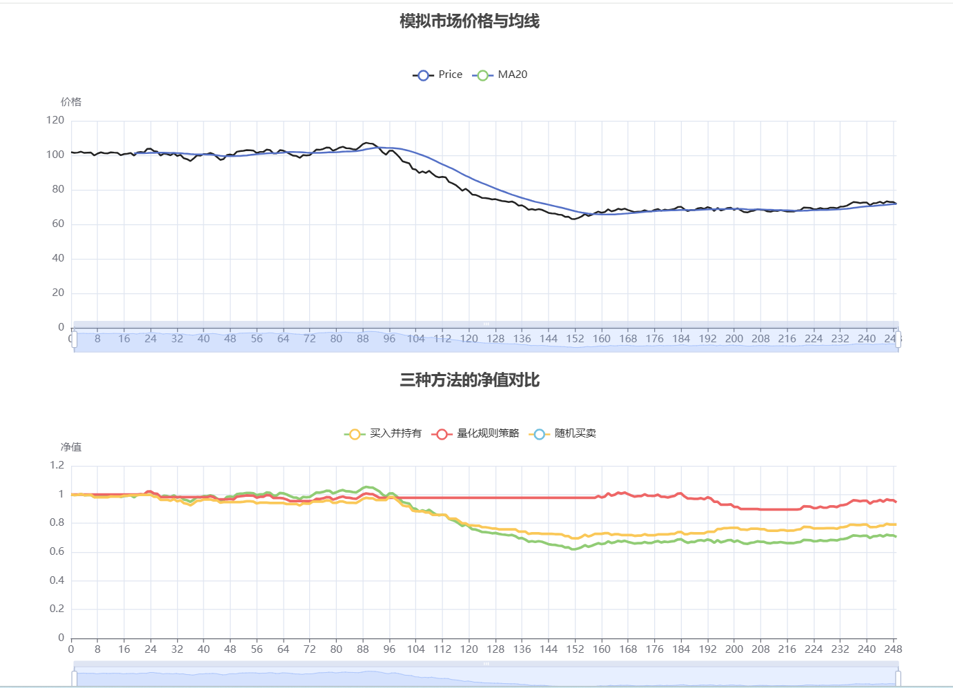
python
# ========== 导入库 ==========
from pathlib import Path

import numpy as np
import pandas as pd
from pyecharts import options as opts
from pyecharts.charts import Line

np.random.seed(42)          # 固定随机数,结果可复现
days = 120                  # 一共模拟 120 个交易日
daily_returns = np.random.normal(loc=0.0008, scale=0.02, size=days)  # 每天随机收益率
price = 100 * np.cumprod(1 + daily_returns)     # 从100元出发连乘成价格序列

df = pd.DataFrame({
    '收盘价': price,                              # 原始模拟收盘价
    '5日均线': pd.Series(price).rolling(5).mean(),   # 最近5天均价
    '20日均线': pd.Series(price).rolling(20).mean()  # 最近20天均价
})

# ========== 用 ECharts 画图 ==========
x_axis = list(range(days))
ma5 = df['5日均线'].round(2).where(df['5日均线'].notna(), None).tolist()
ma20 = df['20日均线'].round(2).where(df['20日均线'].notna(), None).tolist()

line = (
    Line(init_opts=opts.InitOpts(width="1200px", height="560px", page_title="模拟股价走势"))
    .add_xaxis(x_axis)
    .add_yaxis(
        '收盘价',
        df['收盘价'].round(2).tolist(),
        is_symbol_show=False,
        linestyle_opts=opts.LineStyleOpts(width=1.5, color="#5470C6", opacity=0.65),
        label_opts=opts.LabelOpts(is_show=False),
    )
    .add_yaxis(
        '5日均线 (MA5)',
        ma5,
        is_symbol_show=False,
        linestyle_opts=opts.LineStyleOpts(width=2.2, color="#EE6666"),
        label_opts=opts.LabelOpts(is_show=False),
    )
    .add_yaxis(
        '20日均线 (MA20)',
        ma20,
        is_symbol_show=False,
        linestyle_opts=opts.LineStyleOpts(width=2.2, color="#91CC75"),
        areastyle_opts=opts.AreaStyleOpts(opacity=0.12, color="#FAC858"),
        label_opts=opts.LabelOpts(is_show=False),
    )
    .set_global_opts(
        title_opts=opts.TitleOpts(title='Python 模拟股价走势 + 移动平均线', pos_left="center"),
        legend_opts=opts.LegendOpts(pos_top="8%"),
        tooltip_opts=opts.TooltipOpts(trigger="axis"),
        xaxis_opts=opts.AxisOpts(type_="category", name="交易日", boundary_gap=False),
        yaxis_opts=opts.AxisOpts(type_="value", name="价格", is_scale=True),
        datazoom_opts=[opts.DataZoomOpts(type_="inside"), opts.DataZoomOpts(pos_bottom="2%")],
    )
)

output_path = Path(__file__).with_suffix(".html")
line.render(str(output_path))

print(f"起始价格: CNY {price[0]:.2f}")           # 第一天价格
print(f"最终价格: CNY {price[-1]:.2f}")           # 最后一天价格
print(f"区间收益率: {(price[-1]/price[0] - 1)*100:.2f}%")  # 整段涨跌幅
print(f"最大回撤价格: CNY {price.min():.2f}")     # 期间最低价
print(f"最高价格: CNY {price.max():.2f}")         # 期间最高价
print(f"图表已生成: {output_path}")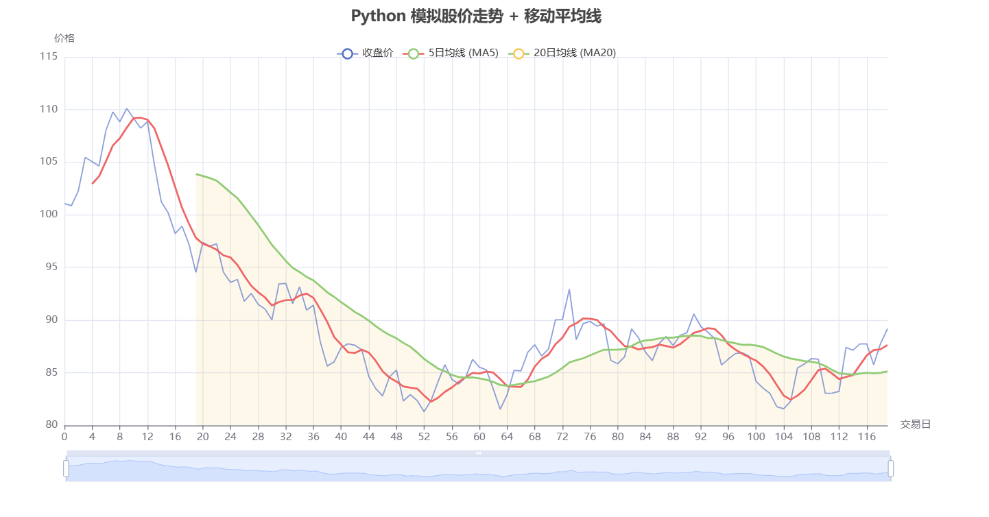
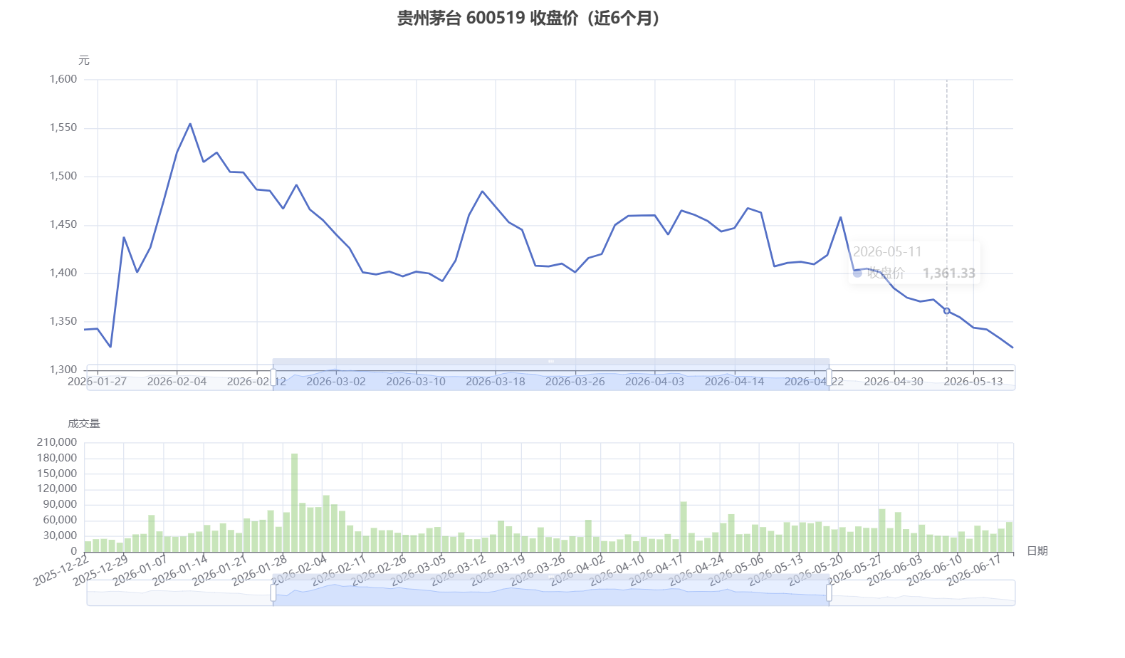
最后再补充一个帮组内同学改的代码:
python
# ========== 获取茅台(A股)数据 ==========
from pathlib import Path
import datetime
import time
import warnings

warnings.filterwarnings('ignore')

import akshare as ak
import pandas as pd
from pyecharts import options as opts
from pyecharts.charts import Bar, Grid, Line

# 日期格式(AKShare 的 A 股接口同样支持 YYYYMMDD 或 YYYY-MM-DD)
end_date = datetime.datetime.now()
start_date = end_date - datetime.timedelta(days=180)
start_str = start_date.strftime("%Y%m%d")  # 或 "%Y-%m-%d"
end_str = end_date.strftime("%Y%m%d")
print(f"数据范围:{start_str} 至 {end_str}")


def fetch_stock_hist_tx(symbol, start, end, adjust):
    """使用腾讯数据源获取 A 股日线,避免东方财富接口偶发断连。"""
    start_str_tx = start.strftime("%Y%m%d")
    end_str_tx = end.strftime("%Y%m%d")
    for attempt in range(3):
        try:
            return ak.stock_zh_a_hist_tx(symbol=symbol, start_date=start_str_tx, end_date=end_str_tx, adjust=adjust)
        except Exception:
            if attempt == 2:
                raise
            time.sleep(2)

# ----- 获取茅台日线数据(前复权) -----
try:
    # 600519 为贵州茅台,上海交易所
    moutai = fetch_stock_hist_tx("sh600519", start_date, end_date, "qfq")
except Exception as e:
    print(f"获取数据失败: {e}")
    raise

if moutai.empty:
    raise RuntimeError("无法获取茅台数据,请检查网络或股票代码。")

# ----- 标准化列名(与原代码保持一致) -----
moutai = moutai.rename(columns={
    '日期': 'Date',
    'date': 'Date',
    '开盘': 'Open',
    'open': 'Open',
    '收盘': 'Close',
    'close': 'Close',
    '最高': 'High',
    'high': 'High',
    '最低': 'Low',
    'low': 'Low',
    '成交量': 'Volume',
    'amount': 'Volume'
})
moutai['Date'] = pd.to_datetime(moutai['Date'])
moutai.set_index('Date', inplace=True)
moutai.sort_index(inplace=True)

print('茅台数据获取成功!')
print(f'   共 {len(moutai)} 个交易日')
print(f'   最新收盘价: {moutai["Close"].iloc[-1]:.2f} 元')
print(moutai.tail(5))

# ----- 用 ECharts 画图:上图收盘价、下图成交量 -----
x_axis = [idx.strftime('%Y-%m-%d') for idx in moutai.index]

close_line = (
    Line()
    .add_xaxis(x_axis)
    .add_yaxis(
        '收盘价',
        moutai['Close'].round(2).tolist(),
        is_symbol_show=False,
        linestyle_opts=opts.LineStyleOpts(width=2.2, color="#5470C6"),
        label_opts=opts.LabelOpts(is_show=False),
    )
    .set_global_opts(
        title_opts=opts.TitleOpts(title='贵州茅台 600519 收盘价(近6个月)', pos_left="center"),
        legend_opts=opts.LegendOpts(is_show=False),
        tooltip_opts=opts.TooltipOpts(trigger="axis"),
        xaxis_opts=opts.AxisOpts(type_="category", boundary_gap=False),
        yaxis_opts=opts.AxisOpts(type_="value", name="元", is_scale=True),
        datazoom_opts=[opts.DataZoomOpts(type_="inside"), opts.DataZoomOpts(pos_top="58%")],
    )
)

volume_bar = (
    Bar()
    .add_xaxis(x_axis)
    .add_yaxis(
        '成交量',
        moutai['Volume'].astype(int).tolist(),
        color="#888888",
        label_opts=opts.LabelOpts(is_show=False),
        itemstyle_opts=opts.ItemStyleOpts(opacity=0.5),
    )
    .set_global_opts(
        legend_opts=opts.LegendOpts(is_show=False),
        tooltip_opts=opts.TooltipOpts(trigger="axis"),
        xaxis_opts=opts.AxisOpts(type_="category", name="日期", axislabel_opts=opts.LabelOpts(rotate=25)),
        yaxis_opts=opts.AxisOpts(type_="value", name="成交量"),
        datazoom_opts=[opts.DataZoomOpts(type_="inside"), opts.DataZoomOpts(pos_bottom="2%")],
    )
)

grid = (
    Grid(init_opts=opts.InitOpts(width="1200px", height="680px", page_title="贵州茅台真实数据"))
    .add(close_line, grid_opts=opts.GridOpts(pos_left="8%", pos_right="5%", pos_top="12%", height="48%"))
    .add(volume_bar, grid_opts=opts.GridOpts(pos_left="8%", pos_right="5%", pos_top="72%", height="18%"))
)

output_path = Path(__file__).with_suffix(".html")
grid.render(str(output_path))
print(f"图表已生成: {output_path}")