摘要:本文是 React 学习之旅的第四日记录,我们将从理论学习转向实战演练,正式启动一个功能完整的待办清单应用项目。文章首先引入"用户故事"这一敏捷开发概念,帮助我们明确开发目标。接着,我们会进行项目清理工作,移除 create-react-app 生成的冗余文件,为编写纯净的项目代码做准备。核心部分在于导入并分析应用的基础 JSX 结构和全局 CSS 样式,一步步搭建起一个具备添加、筛选、任务列表等模块的静态原型。在此过程中,我们将深入学习无障碍访问(ARIA)属性在 JSX 中的应用、React 中特殊属性如 defaultChecked 和 htmlFor 的使用规范,以及如何通过模块化样式塑造清晰的 UI 界面。
一、用户故事:从用户视角定义应用功能
在正式编写任何代码之前,明确软件要实现的功能至关重要。在软件开发中,一种常用的实践方法是编写"用户故事",即从最终用户的角度出发,用简短、通俗的语言描述一个可操作的目标。定义用户故事能帮助我们集中精力,确保开发工作始终围绕用户的核心需求展开,避免过早陷入技术细节。
对于我们即将构建的 React 待办清单应用,其应满足以下用户故事:
- 作为一名用户,我可以读取任务清单。
- 作为一名用户,我可以使用鼠标或键盘添加一个任务。
- 作为一名用户,我可以使用鼠标或键盘将任何任务标记为已完成。
- 作为一名用户,我可以使用鼠标或键盘删除任何任务。
- 作为一名用户,我可以使用鼠标或键盘编辑任何任务。
- 作为一名用户,我可以查看特定的任务子集:所有任务、仅活动中的任务,或仅已完成的任务。
这些故事清晰地描绘了应用所需的全部交互功能:CRUD(创建、读取、更新、删除)操作、任务状态切换以及列表筛选。在接下来的学习中,我们将逐一攻克这些故事,最终将其转化为真实的、可交互的 React 组件。
二、开始前的清理:移除项目冗余文件
在上一篇文章中,我们使用 create-react-app 脚手架快速创建了一个名为 moz-todo-react 的项目。这个工具虽然极大地简化了初始配置,但它生成的一些文件对于我们当前的待办清单项目来说是完全用不到的。保留它们不仅会使项目结构显得臃肿,还可能引发不必要的维护问题。因此,我们的第一步就是进行项目清理。
首先,我们要从源码层面移除对这些文件的引用。打开 src/App.js 文件,在文件顶部找到以下两条导入语句,并将它们删除:
import './App.css';------ 我们不打算为每个组件编写独立的样式表,而是使用单一的全局样式文件。import logo from './logo.svg';------ 我们也不会使用这个默认的 React 徽标文件。
接下来,我们需要在终端中执行一系列命令,将这些不再需要的源文件从磁盘上物理删除。请确保你的终端当前位于项目根目录(即 moz-todo-react 文件夹),然后依次执行以下命令:
bash
# 进入项目的 src 源码目录
cd src

# 批量删除指定的无用文件
rm -- App.test.js App.css logo.svg serviceWorker.js setupTests.js

# 返回项目根目录
cd ..
执行完毕后,我们项目 src 目录下的文件结构将变得极其精简,只保留即将用到的核心文件,如 App.js、index.js 和 index.css。值得注意的是,我们删除了用于测试的文件(App.test.js 和 setupTests.js),因为本系列入门教程不会涉及自动化测试内容。如果你在清理文件前停止了开发服务器,请务必通过 npm start 命令重新启动它,以便随时预览我们的更改。
三、项目启动代码:搭建静态应用骨架
清理完项目后,我们将直接为应用提供一套精心设计的起步代码,包括用于描述 UI 结构的 JSX 标记和用于美化界面的 CSS 样式。这样做可以让我们跳过繁琐的静态页面编写阶段,快速进入 React 的核心逻辑开发。你需要做的就是将提供的代码片段复制并粘贴到项目对应的文件中。
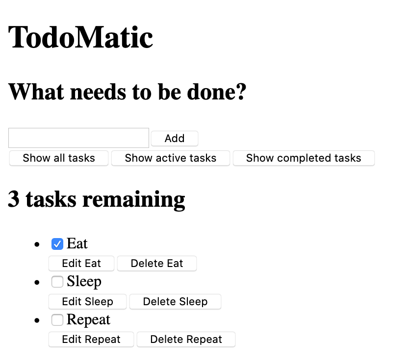
首先,打开 src/App.js 文件,将其中 App 函数的全部内容替换为以下 JSX 代码:
jsx
function App(props) {
  return (
    <div className="todoapp stack-large">
      <h1>TodoMatic</h1>
      <form>
        <h2 className="label-wrapper">
          <label htmlFor="new-todo-input" className="label__lg">
            What needs to be done?
          </label>
        </h2>
        <input
          type="text"
          id="new-todo-input"
          className="input input__lg"
          name="text"
          autoComplete="off"
        />
        <button type="submit" className="btn btn__primary btn__lg">
          Add
        </button>
      </form>
      <div className="filters btn-group stack-exception">
        <button type="button" className="btn toggle-btn" aria-pressed="true">
          <span className="visually-hidden">Show </span>
          <span>all</span>
          <span className="visually-hidden"> tasks</span>
        </button>
        <button type="button" className="btn toggle-btn" aria-pressed="false">
          <span className="visually-hidden">Show </span>
          <span>Active</span>
          <span className="visually-hidden"> tasks</span>
        </button>
        <button type="button" className="btn toggle-btn" aria-pressed="false">
          <span className="visually-hidden">Show </span>
          <span>Completed</span>
          <span className="visually-hidden"> tasks</span>
        </button>
      </div>
      <h2 id="list-heading">3 tasks remaining</h2>
      <ul
        role="list"
        className="todo-list stack-large stack-exception"
        aria-labelledby="list-heading">
        <li className="todo stack-small">
          <div className="c-cb">
            <input id="todo-0" type="checkbox" defaultChecked={true} />
            <label className="todo-label" htmlFor="todo-0">
              Eat
            </label>
          </div>
          <div className="btn-group">
            <button type="button" className="btn">
              Edit <span className="visually-hidden">Eat</span>
            </button>
            <button type="button" className="btn btn__danger">
              Delete <span className="visually-hidden">Eat</span>
            </button>
          </div>
        </li>
        <li className="todo stack-small">
          <div className="c-cb">
            <input id="todo-1" type="checkbox" />
            <label className="todo-label" htmlFor="todo-1">
              Sleep
            </label>
          </div>
          <div className="btn-group">
            <button type="button" className="btn">
              Edit <span className="visually-hidden">Sleep</span>
            </button>
            <button type="button" className="btn btn__danger">
              Delete <span className="visually-hidden">Sleep</span>
            </button>
          </div>
        </li>
        <li className="todo stack-small">
          <div className="c-cb">
            <input id="todo-2" type="checkbox" />
            <label className="todo-label" htmlFor="todo-2">
              Repeat
            </label>
          </div>
          <div className="btn-group">
            <button type="button" className="btn">
              Edit <span className="visually-hidden">Repeat</span>
            </button>
            <button type="button" className="btn btn__danger">
              Delete <span className="visually-hidden">Repeat</span>
            </button>
          </div>
        </li>
      </ul>
    </div>
  );
}
接着,打开 public/index.html 文件,找到 <title> 标签,将其内容修改为 "TodoMatic",使其与应用内的主标题相匹配:
html
<title>TodoMatic</title>完成以上两步后,保存文件并刷新浏览器。此时,你将看到一个杂乱无章但结构完整的待办清单界面。它看起来很简陋,且所有按钮都没有实际功能,但没关系,这正是我们下一步要进行样式设计的基础。
仔细观察这段 JSX 代码,你会发现它与我们之前定义的用户故事有着清晰的对应关系:
- 顶部的
<form>表单区域包含一个<input>输入框和一个提交按钮,对应"添加任务"的故事。 - 中部的三个筛选按钮(All、Active、Completed)对应"查看特定任务子集"的故事。
- 标题
<h2>显示了剩余任务数量,是"读取任务清单"故事的一部分。 - 底部的
<ul>无序列表渲染了三个示例任务,每个任务项(<li>)都包含一个复选框、一个编辑按钮和一个删除按钮,这直接对应了"标记完成"、"编辑"和"删除"的故事。
四、深入理解 JSX 中的无障碍与特殊属性
在这段 JSX 代码中,你可能已经注意到了一些不同于常规 HTML 的特殊属性,比如 aria-pressed、role、defaultChecked 和 htmlFor。这些属性主要服务于两个目的:提升应用的无障碍访问性,以及遵守 JSX 的语法规范。
无障碍属性
Web 无障碍(Accessibility,简称 A11Y)旨在让残障人士能够顺利使用 Web 应用。React 通过支持标准的 ARIA 属性,让我们能轻松构建无障碍的应用。
以筛选按钮为例:
jsx
<button type="button" className="btn toggle-btn" aria-pressed="true">
  <span className="visually-hidden">Show </span>
  <span>all</span>
  <span className="visually-hidden"> tasks</span>
</button>
这里的 aria-pressed 属性专门用于告知辅助技术(如屏幕阅读器),该按钮具有两种状态:按下(true)和未按下(false),类似于开关。当前值为 "true" 表示该按钮在默认情况下是激活状态。结合 visually-hidden 这个 CSS 类,我们可以为视力正常的用户隐藏掉 "Show" 和 "tasks" 这些冗余词汇,只显示 "all",而屏幕阅读器用户听到的则是完整的 "Show all tasks" 语句,从而获得了更清晰的上下文。
再来看任务列表 <ul> 的元素:
jsx
<ul
  role="list"
  className="todo-list stack-large stack-exception"
  aria-labelledby="list-heading">
这里添加了 role="list" 属性。尽管 <ul> 标签语义上就是一个列表,但后续我们通过 CSS 移除其默认列表样式(如项目符号)时,某些屏幕阅读器可能会因此无法正确识别它。显式地添加 role="list" 可以恢复其列表语义。aria-labelledby="list-heading" 属性则将这个列表与 ID 为 list-heading 的标题关联起来,告诉屏幕阅读器这个标题就是这个列表的标签,进一步增强了可理解性。
React 特有属性
在 JSX 中,我们无法直接使用 HTML 中的某些原生属性,因为它们与 JavaScript 的保留关键字冲突。React 通过别名的方式解决了这个问题。
例如,<input> 复选框元素的 defaultChecked 属性:
jsx
<input id="todo-0" type="checkbox" defaultChecked={true} />如果使用标准的 checked 属性,React 会认为它是一个受控组件,从而在没有提供 onChange 处理函数时发出警告。使用 defaultChecked 则表示这是一个非受控组件,我们只想设置其初始选中状态为 true,后续状态由浏览器自身管理。注意,这里的布尔值 {true} 必须用大括号包裹,以告诉 JSX 这是一个 JavaScript 表达式,而不是字符串 "true"。
另一个例子是 <label> 元素的 htmlFor 属性,它直接对应 HTML 中的 for 属性:
jsx
<label className="todo-label" htmlFor="todo-0">Eat</label>由于 for 在 JavaScript 中是循环语句的关键字,React 使用 htmlFor 作为替代。这个属性用于将标签与具有相同 ID 的表单元素(如此处的复选框)关联起来,从而提升可用性。
五、实现样式:赋予应用视觉生命力
有了坚实的结构骨架,下一步就是用 CSS 为其注入视觉生命力。我们将使用一套精心编写的全局样式,彻底改变应用的外观。请打开 src/index.css 文件,用以下 CSS 代码完全替换其当前内容:
css
/* RESETS */
*,
*::before,
*::after {
  box-sizing: border-box;
}
*:focus {
  outline: 3px dashed #228bec;
  outline-offset: 0;
}
html {
  font: 62.5% / 1.15 sans-serif;
}
h1,
h2 {
  margin-bottom: 0;
}
ul {
  list-style: none;
  padding: 0;
}
button {
  border: none;
  margin: 0;
  padding: 0;
  width: auto;
  overflow: visible;
  background: transparent;
  color: inherit;
  font: inherit;
  line-height: normal;
  -webkit-font-smoothing: inherit;
  -moz-osx-font-smoothing: inherit;
  -webkit-appearance: none;
}
button::-moz-focus-inner {
  border: 0;
}
button,
input,
optgroup,
select,
textarea {
  font-family: inherit;
  font-size: 100%;
  line-height: 1.15;
  margin: 0;
}
button,
input {
  overflow: visible;
}
input[type="text"] {
  border-radius: 0;
}
body {
  width: 100%;
  max-width: 68rem;
  margin: 0 auto;
  font:
    1.6rem/1.25 Arial,
    sans-serif;
  background-color: #f5f5f5;
  color: #4d4d4d;
}
@media screen and (min-width: 620px) {
  body {
    font-size: 1.9rem;
    line-height: 1.31579;
  }
}
/*END RESETS*/
/* GLOBAL STYLES */
.form-group > input[type="text"] {
  display: inline-block;
  margin-top: 0.4rem;
}
.btn {
  padding: 0.8rem 1rem 0.7rem;
  border: 0.2rem solid #4d4d4d;
  cursor: pointer;
  text-transform: capitalize;
}
.btn.toggle-btn {
  border-width: 1px;
  border-color: #d3d3d3;
}
.btn.toggle-btn[aria-pressed="true"] {
  text-decoration: underline;
  border-color: #4d4d4d;
}
.btn__danger {
  color: #fff;
  background-color: #ca3c3c;
  border-color: #bd2130;
}
.btn__filter {
  border-color: lightgrey;
}
.btn__primary {
  color: #fff;
  background-color: #000;
}
.btn-group {
  display: flex;
  justify-content: space-between;
}
.btn-group > * {
  flex: 1 1 49%;
}
.btn-group > * + * {
  margin-left: 0.8rem;
}
.label-wrapper {
  margin: 0;
  flex: 0 0 100%;
  text-align: center;
}
.visually-hidden {
  position: absolute !important;
  height: 1px;
  width: 1px;
  overflow: hidden;
  clip: rect(1px 1px 1px 1px);
  clip: rect(1px, 1px, 1px, 1px);
  white-space: nowrap;
}
[class*="stack"] > * {
  margin-top: 0;
  margin-bottom: 0;
}
.stack-small > * + * {
  margin-top: 1.25rem;
}
.stack-large > * + * {
  margin-top: 2.5rem;
}
@media screen and (min-width: 550px) {
  .stack-small > * + * {
    margin-top: 1.4rem;
  }
  .stack-large > * + * {
    margin-top: 2.8rem;
  }
}
.stack-exception {
  margin-top: 1.2rem;
}
/* END GLOBAL STYLES */
.todoapp {
  background: #fff;
  margin: 2rem 0 4rem 0;
  padding: 1rem;
  position: relative;
  box-shadow:
    0 2px 4px 0 rgba(0, 0, 0, 0.2),
    0 2.5rem 5rem 0 rgba(0, 0, 0, 0.1);
}
@media screen and (min-width: 550px) {
  .todoapp {
    padding: 4rem;
  }
}
.todoapp > * {
  max-width: 50rem;
  margin-left: auto;
  margin-right: auto;
}
.todoapp > form {
  max-width: 100%;
}
.todoapp > h1 {
  display: block;
  max-width: 100%;
  text-align: center;
  margin: 0;
  margin-bottom: 1rem;
}
.label__lg {
  line-height: 1.01567;
  font-weight: 300;
  padding: 0.8rem;
  margin-bottom: 1rem;
  text-align: center;
}
.input__lg {
  padding: 2rem;
  border: 2px solid #000;
}
.input__lg:focus {
  border-color: #4d4d4d;
  box-shadow: inset 0 0 0 2px;
}
[class*="__lg"] {
  display: inline-block;
  width: 100%;
  font-size: 1.9rem;
}
[class*="__lg"]:not(:last-child) {
  margin-bottom: 1rem;
}
@media screen and (min-width: 620px) {
  [class*="__lg"] {
    font-size: 2.4rem;
  }
}
.filters {
  width: 100%;
  margin: unset auto;
}
/* Todo item styles */
.todo {
  display: flex;
  flex-direction: row;
  flex-wrap: wrap;
}
.todo > * {
  flex: 0 0 100%;
}
.todo-text {
  width: 100%;
  min-height: 4.4rem;
  padding: 0.4rem 0.8rem;
  border: 2px solid #565656;
}
.todo-text:focus {
  box-shadow: inset 0 0 0 2px;
}
/* CHECKBOX STYLES */
.c-cb {
  box-sizing: border-box;
  font-family: Arial, sans-serif;
  -webkit-font-smoothing: antialiased;
  font-weight: 400;
  font-size: 1.6rem;
  line-height: 1.25;
  display: block;
  position: relative;
  min-height: 44px;
  padding-left: 40px;
  clear: left;
}
.c-cb > label::before,
.c-cb > input[type="checkbox"] {
  box-sizing: border-box;
  top: -2px;
  left: -2px;
  width: 44px;
  height: 44px;
}
.c-cb > input[type="checkbox"] {
  -webkit-font-smoothing: antialiased;
  cursor: pointer;
  position: absolute;
  z-index: 1;
  margin: 0;
  opacity: 0;
}
.c-cb > label {
  font-size: inherit;
  font-family: inherit;
  line-height: inherit;
  display: inline-block;
  margin-bottom: 0;
  padding: 8px 15px 5px;
  cursor: pointer;
  touch-action: manipulation;
}
.c-cb > label::before {
  content: "";
  position: absolute;
  border: 2px solid currentcolor;
  background: transparent;
}
.c-cb > input[type="checkbox"]:focus + label::before {
  border-width: 4px;
  outline: 3px dashed #228bec;
}
.c-cb > label::after {
  box-sizing: content-box;
  content: "";
  position: absolute;
  top: 11px;
  left: 9px;
  width: 18px;
  height: 7px;
  transform: rotate(-45deg);
  border: solid;
  border-width: 0 0 5px 5px;
  border-top-color: transparent;
  opacity: 0;
  background: transparent;
}
.c-cb > input[type="checkbox"]:checked + label::after {
  opacity: 1;
}
保存文件并刷新浏览器,你的待办清单应用将焕然一新。这套样式代码主要完成了以下几件事:
- CSS Reset :开头的重置代码消除了不同浏览器对
button、input、ul等元素的默认样式差异,为统一设计打下基础。 - 全局与布局样式 :定义了按钮(
.btn)、输入框(.input__lg)、布局组件(.btn-group、.stack-*)等全局可复用的样式,以及应用主体(.todoapp)的卡片式布局和投影效果。 - 无障碍视觉样式 :
.visually-hidden类通过绝对定位和裁剪,将元素的内容从正常视觉流中移除,但保留了其对屏幕阅读器的可访问性。 - 任务项与复选框样式 :精心设计了任务项(
.todo)的弹性布局和自定义复选框(.c-cb)的视觉样式,用伪元素::before和::after绘制了自定义的复选框和选中状态的对勾图标。
总结
至此,我们的 React 待办清单应用已经拥有了一个清晰、美观且结构完整的静态原型。本文从定义用户故事开始,明确了开发目标;随后清理了项目冗余文件,获得了干净的工作环境;接着引入了应用的核心 JSX 骨架,并将其每个部分与用户故事进行了映射,确保功能覆盖的完整性;同时,我们深入探讨了 JSX 中无障碍属性(aria-pressed、role、aria-labelledby、visually-hidden)的设计思想和 React 特殊属性(defaultChecked、htmlFor)的使用规范;最后,通过注入一套完整的 CSS 样式,让应用从一个混乱的线框图蜕变为一个功能分区清晰的现代化应用界面。
现在,我们的应用看起来像一个真正的待办清单了,但它仍然只是一个静态模型,所有按钮和交互功能都尚未实现。在下一篇文章中,我们将正式进入 React 的核心领域------状态管理与事件处理,让这个静态的应用"活"起来。