android compose Button 按钮 使用
|------|---------------|-----------------------------------------------------------|
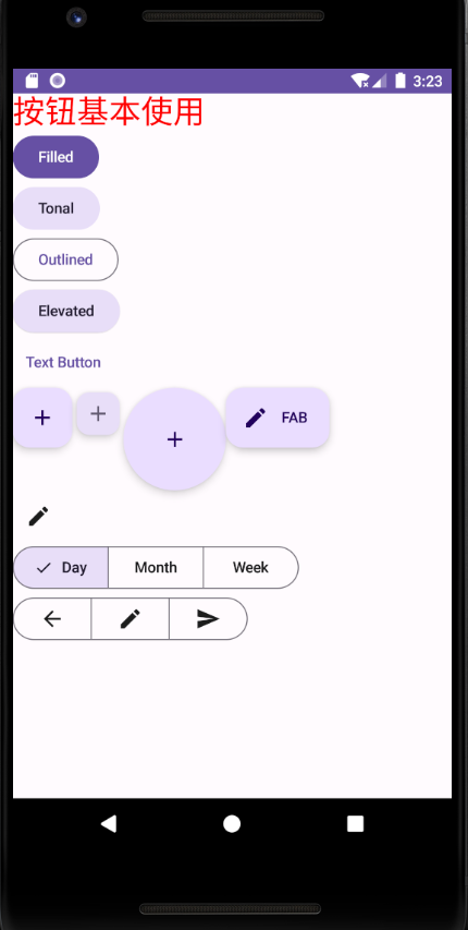
| 实心 | 纯色背景,对比鲜明的文字。 | 高强调度按钮。这些值适用于应用中的主要操作,例如"提交"和"保存"。阴影效果突出了按钮的重要性。 |
| 填充浊色 | 背景颜色会根据表面而变化。 | 也适用于主要操作或重要操作。填充色调按钮具有更强的视觉效果,适合"添加到购物车"和"登录"等功能。 |
| 过高 | 通过添加阴影来突出显示。 | 用途与色调按钮类似。增加高程,使按钮看起来更加突出。 |
| 加边框 | 具有无填充的边框。 | 中强调度按钮,包含重要但并非主要的操作。这类按钮可与其他按钮搭配使用,用于指示"取消"或"返回"等备选的次要操作。 |
| 文本 | 显示没有背景或边框的文字。 | 低强调按钮,非常适合不太重要的操作,例如导航链接或"了解详情"或"查看详情"等辅助功能。 |
Material Design 中,FAB 有四种类型:
- FAB:普通大小的悬浮操作按钮。
- 小型 FAB:较小的悬浮操作按钮。
- 大型 FAB:较大的悬浮操作按钮。
- 扩展型 FAB:包含图标以外的其他内容的悬浮操作按钮。
图标按钮有两种类型:
- 默认:这些按钮可以打开其他元素,例如菜单或搜索。
- 切换:这些按钮可以表示可开启或关闭的二进制操作,例如"收藏"或"书签"。
使用分段按钮可让用户从一组并排显示的选项中进行选择。 分段按钮有两种类型:
- 单选按钮:可让用户选择一个选项。
- 多选按钮:可让用户选择 2 到 5 个项目。对于更复杂的选择或超过 5 个选项
package com.wn.androidcomposedemo1.basegoogle

import android.os.Bundle
import androidx.activity.ComponentActivity
import androidx.activity.compose.setContent
import androidx.compose.foundation.layout.Column
import androidx.compose.foundation.layout.Row
import androidx.compose.foundation.layout.fillMaxSize
import androidx.compose.foundation.shape.CircleShape
import androidx.compose.material.icons.Icons
import androidx.compose.material.icons.automirrored.filled.ArrowBack
import androidx.compose.material.icons.automirrored.filled.Send
import androidx.compose.material.icons.filled.Add
import androidx.compose.material.icons.filled.Delete
import androidx.compose.material.icons.filled.Edit
import androidx.compose.material3.Button
import androidx.compose.material3.ElevatedButton
import androidx.compose.material3.ExperimentalMaterial3Api
import androidx.compose.material3.ExtendedFloatingActionButton
import androidx.compose.material3.FilledTonalButton
import androidx.compose.material3.FloatingActionButton
import androidx.compose.material3.Icon
import androidx.compose.material3.IconButton
import androidx.compose.material3.LargeFloatingActionButton
import androidx.compose.material3.MaterialTheme
import androidx.compose.material3.MultiChoiceSegmentedButtonRow
import androidx.compose.material3.OutlinedButton
import androidx.compose.material3.SmallFloatingActionButton
import androidx.compose.material3.Surface
import androidx.compose.material3.Text
import androidx.compose.material3.TextButton
import androidx.compose.runtime.Composable
import androidx.compose.ui.Modifier
import androidx.compose.ui.tooling.preview.Preview
import com.wn.androidcomposedemo1.ui.theme.AndroidComposeDemo1Theme
import androidx.compose.runtime.getValue
import androidx.compose.runtime.mutableStateOf
import androidx.compose.runtime.remember
import androidx.compose.runtime.saveable.rememberSaveable
import androidx.compose.runtime.setValue
import androidx.compose.material3.SegmentedButton
import androidx.compose.material3.SegmentedButtonDefaults
import androidx.compose.material3.SingleChoiceSegmentedButtonRow
import androidx.compose.runtime.mutableIntStateOf
import androidx.compose.runtime.mutableStateListOf
import androidx.compose.ui.graphics.Color
import androidx.compose.ui.unit.sp

/**
 * Author : wn
 * Email : maoning20080808@163.com
 * Date : 2026/6/21 22:04
 * Description : 按钮基本使用
 */
class ButtonActivity : ComponentActivity(){

    override fun onCreate(savedInstanceState: Bundle?) {
        super.onCreate(savedInstanceState)

        setContent {
            AndroidComposeDemo1Theme() {
                Surface(
                    modifier = Modifier.fillMaxSize(),
                    color = MaterialTheme.colorScheme.background
                ) {
                    ButtonExample()
                }
            }
        }
    }

    @Preview
    @Composable
    fun ButtonExample(){
        Column() {

            Text("按钮基本使用", fontSize = 30.sp, color = Color.Red)

            //填充按钮
            Button(onClick = {}) {
                Text("Filled")
            }

            //填充色调按钮
            FilledTonalButton(onClick = {}) {
                Text("Tonal")
            }

            //轮廓按钮
            OutlinedButton(onClick = {}) {
                Text("Outlined")
            }

            //凸起按钮
            ElevatedButton(onClick = {}) {
                Text("Elevated")
            }

            //文本按钮
            TextButton(onClick = {}) {
                Text("Text Button ")
            }

            Row() {
                //悬浮操作按钮
                FloatingActionButton(onClick = {}) {
                    Icon(Icons.Filled.Add, "悬浮操作按钮")
                }

                //小型悬浮操作按钮
                SmallFloatingActionButton(
                    onClick = {},
                    containerColor = MaterialTheme.colorScheme.secondaryContainer,
                    contentColor = MaterialTheme.colorScheme.secondary) {
                    Icon(Icons.Filled.Add, "小型悬浮按钮")
                }

                //大型悬浮按钮
                LargeFloatingActionButton(
                    onClick = {},
                    shape = CircleShape
                ) {
                    Icon(Icons.Filled.Add, "大型悬浮按钮")
                }

                //扩展按钮
                ExtendedFloatingActionButton(onClick = {},
                    icon = {Icon(Icons.Filled.Edit, "扩展按钮")},
                    text = {Text(text = "FAB")}
                )
            }

            //图标按钮
            ToggleIconButtonExample()

            //单选分段按钮
            SingleChoiceSegmentedButton()

            //多选分段按钮
            MultiChoiceSegmentedButton()
        }
    }

    //多选分段按钮
    @OptIn(ExperimentalMaterial3Api::class)
    @Preview
    @Composable
    fun MultiChoiceSegmentedButton(){
        val selectedOptions = remember { mutableStateListOf(false, false, false) }
        val options = listOf("Walk", "Ride", "Drive")

        MultiChoiceSegmentedButtonRow() {
            options.forEachIndexed { index, lable ->
                SegmentedButton(
                    shape = SegmentedButtonDefaults.itemShape(
                        index = index,
                        count = options.size
                    ),
                    checked = selectedOptions[index],
                    onCheckedChange = {
                        selectedOptions[index] = !selectedOptions[index]
                    },
                    icon = { SegmentedButtonDefaults.Icon(selectedOptions[index])},
                    label = {
                        when(lable){
                            "Walk" -> Icon(
                                imageVector = Icons.AutoMirrored.Filled.ArrowBack,
                                contentDescription = "跑步")
                            "Ride" -> Icon(
                                imageVector = Icons.Default.Edit,
                                contentDescription = "骑行"
                            )
                            "Drive" -> Icon(
                                imageVector = Icons.AutoMirrored.Filled.Send,
                                contentDescription = "汽车"
                            )
                        }
                    }
                )
            }
        }
    }

    //单选分段按钮
    @OptIn(ExperimentalMaterial3Api::class)
    @Preview
    @Composable
    fun SingleChoiceSegmentedButton(){
        var selectedIndex by remember { mutableIntStateOf(0) }
        val options = listOf("Day", "Month", "Week")
        SingleChoiceSegmentedButtonRow() {
            options.forEachIndexed { index, label ->
                SegmentedButton(
                    shape = SegmentedButtonDefaults.itemShape(
                        index = index,
                        count = options.size
                    ),
                    onClick = {
                        selectedIndex = index
                    },
                    selected = index == selectedIndex,
                    label = {Text(label)}
                )
            }
        }
    }

    @Preview
    @Composable
    fun ToggleIconButtonExample(){
        var isToggled by rememberSaveable { mutableStateOf(false) }

        IconButton(
            onClick = {isToggled = !isToggled}
        ) {
            Icon(
                imageVector = if(isToggled) Icons.Filled.Add else Icons.Filled.Edit,
                contentDescription = if(isToggled) "选中按钮" else "未选中按钮"
            )
        }
    }
}