微信小程序 ECharts 双重柱状图实现
场景: 目标 vs 实际完成的对比是常见的分析场景之一。最近遇到了这样一个需求:需要在一个柱状图中同时展示"目标值"和"实际完成值",并附上完成百分比;
分析: 单一柱状图只能展示一组数据,而我们的需求是:
- 展示每个品类的目标值(计划)
- 叠加展示实际完成值(执行)
实现思路: 通过双重柱状图(又称分组柱状图或重叠柱状图),同一坐标系下两组柱体并排的样式
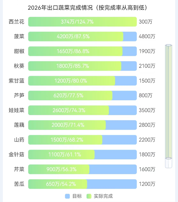
效果图
数据格式与结构
- 仅参考,我这里ratio结合其他方式计算得到的,如果你是通过
目标、实际完成计算比率的,直接formatter处理即可;
javascript
const mockData = [
    { name: '西兰花', target: 300, actual: 374, ratio: '124.7' },
    { name: '菠菜', target: 4800, actual: 4200, ratio: '87.5' },
]- 例:如果你的数据源不一样,你也可以提前组合好数据;能实现需求就行;最终echarts需要是这样的;
javascript
const categories = ['西兰花', '菠菜', ...];
const targetData = [300, 4800, ...];
const actualData = [374, 4200, ...];
const rateData = ['124.7%', '87.5%', ...];
关键配置项
javascript
// 百分比
const BAR_SLOT = 100;

const slot = BAR_SLOT;
const chartRows = mockData;
series: [
	{
		name: '目标',
		type: 'bar',
		barWidth: 20,
		barGap: '-100%',
		barCategoryGap: '35%',
		z: 1,
		itemStyle: {
			color: 'rgba(146, 197, 255, 0.9)',
			borderRadius: [4, 4, 4, 4],
		},
		data: chartRows.map((row) => (slot)),
	},
	{
		name: '实际完成',
		type: 'bar',
		barWidth: 20,
		barGap: '-100%',
		barCategoryGap: '35%',
		z: 10,
		itemStyle: {
            // 渐变色
			color: new echarts.graphic.LinearGradient(0, 0, 1, 0, [{
					offset: 0,
					color: '#96e6a1'
				},
				{
					offset: 1,
					color: '#d4fc79'
				},
			]),
			borderRadius: [4, 4, 4, 4],
		},
		data: chartRows.map((item) => (item.radio)
		)),
	},
],注意:
-
barGap控制不同系列柱子的间距,可以让两组柱子重叠; -
完成率标注在柱子上方,通过
formatter回调,结合传入的数据,利用dataIndex索引取对应百分比。javascriptformatter: ({ dataIndex }) => { const row = chartRows[dataIndex]; if (!row) return ''; return `${row.actual}万/${row.ratio}%`; },
微信小程序中的集成要点
这里作为组件使用的;可以自行修改
-
使用
ec-canvas组件我这里通过引入方式,你也可以通过npm方式
npm install echarts-for-weixin -
在页面
json中引用组件json{ "usingComponents": { "ec-canvas": "../../ec-canvas/ec-canvas" } } -
WXML 结构
html<view class="echartsBox"> <ec-canvas id="{{ chartId }}" canvas-id="{{ canvasId }}" ec="{{ ec }}"></ec-canvas> </view> -
完整配置
javascriptimport * as echarts from '../../ec-canvas/echarts'; const BAR_SLOT = 100; /** 超出用 dataZoom 在图表内滚动 */ const VISIBLE_ROW_COUNT = 12; let componentRef = null; // 初始化 function ecOnInit(canvas, width, height, dpr) { const chart = echarts.init(canvas, null, { width, height, devicePixelRatio: dpr, }); canvas.setChart(chart); if (componentRef) { componentRef.chartInstance = chart; const dataList = componentRef.getSortedChartData(); chart.setOption(componentRef.buildChartOption(dataList)); } return chart; } Component({ properties: { chartId: { type: String, value: 'chart-bar', }, canvasId: { type: String, value: 'canvas-bar', }, chartTitle: { type: String, value: '', }, chartData: { type: Array, value: [], observer(newVal) { this.applyChartData(newVal); }, } }, data: { dataList: [], ec: { onInit: ecOnInit, }, }, lifetimes: { attached() { componentRef = this; this.applyChartData(this.properties.chartData); }, detached() { if (componentRef === this) { componentRef = null; } this.chartInstance = null; }, }, methods: { // 加载数据 applyChartData(list) { const dataList = list || []; this.setData({ dataList }) this.refreshChart(); }, // 数据排序(不需要的去掉) getSortedChartData() { const list = this.data.dataList; return list.sort((a, b) => parseFloat(b.ratio) - parseFloat(a.ratio)); }, // 构建图表 buildChartOption(data) { const slot = BAR_SLOT; // 是否显示滑动条 const showZoom = data.length > VISIBLE_ROW_COUNT; const zoomEnd = showZoom ? (VISIBLE_ROW_COUNT / data.length) * 100 : 100; return { title: { text: this.properties.chartTitle, left: 'center', textStyle: { fontWeight: 'normal', fontSize: 13, color: '#474747', }, }, legend: { data: ['目标', '实际完成'], bottom: 12, itemWidth: 12, itemHeight: 12, textStyle: { fontSize: 11, color: '#666' }, }, grid: { left: 8, right: 48, bottom: 30, top: 30, containLabel: true, }, xAxis: { type: 'value', min: 0, max: slot, axisLabel: { show: false }, splitLine: { show: false }, }, yAxis: { type: 'category', inverse: true, axisLine: { show: false }, axisTick: { show: false }, axisLabel: { color: '#474747', fontSize: 11 }, data: data.map((item) => item.name), }, series: [{ name: '目标', type: 'bar', barWidth: 20, barGap: '-100%', barCategoryGap: '35%', z: 1, itemStyle: { color: 'rgba(190, 190, 190, 0.9)', borderRadius: [4, 4, 4, 4], }, label: { show: true, position: 'right', distance: 4, fontSize: 11, color: '#666', formatter: (params) => { const row = data[params.dataIndex]; return row ? `${row.target}万` : ''; }, }, data: data.map(() => slot), }, { name: '实际完成', type: 'bar', barWidth: 20, barGap: '-100%', barCategoryGap: '35%', z: 10, itemStyle: { color: new echarts.graphic.LinearGradient(0, 0, 1, 0, [{ offset: 0, color: '#FFA500' }, { offset: 1, color: '#FF4500' }, ]), borderRadius: [4, 4, 4, 4], }, label: { show: true, position: 'inside', align: 'center', verticalAlign: 'middle', formatter: ({ dataIndex }) => { const row = data[dataIndex]; return `${row.actual}万/${row.ratio}%`; }, fontSize: 11, color: '#fff', }, data: chartRows.map((item) => (item.radio) }, ], // 滑动条 dataZoom: [{ show: showZoom, type: 'slider', realtime: true, orient: 'vertical', yAxisIndex: 0, left: '96%', bottom: '12%', width: 6, height: '82%', start: 0, end: zoomEnd, minSpan: zoomEnd, maxSpan: zoomEnd, zoomOnMouseWheel: false, moveOnMouseWheel: true, moveOnMouseMove: true, zoomLock: true, brushSelect: false, showDetail: false, moveHandleStyle: { opacity: 0 }, }], }; }, refreshChart() { const dataList = this.getSortedChartData(); if (this.chartInstance) { this.chartInstance.setOption(this.buildChartOption(dataList), true); } }, }, });
使用组件
html
<diyEcBar
    chartTitle="2026年出口蔬菜完成情况(按完成率从高到低)"
    chartData="{{ chartData }}"
/>
json
{
  "component": true,
  "usingComponents": {
    "diyEcBar": "../../diyEcBar/index",
  }
}
希望这篇文章能帮到同样在移动端做数据可视化的你。如果遇到问题或想探讨更多图表类型,欢迎评论区交流!