·
一、前言
HarmonyOS NEXT 作为华为全场景智慧生态的操作系统基石,其原生开发语言 ArkTS 融合了 TypeScript 的类型安全与声明式 UI 的简洁高效。在 ArkTS 中,布局是构建用户界面的核心基础。一个精心设计的布局不仅决定了界面的美观程度,更直接影响用户的操作效率和信息获取体验。
本文从实际开发场景出发,系统梳理了七种最常用也最具代表性的原生 ArkTS 布局方式,涵盖轮播类布局(Swiper)、滚动类布局(Scroll)、相对定位布局(RelativeContainer)以及偏移布局(Offset)。每一种布局方式都配有完整的可运行代码示例、核心属性详解以及设计思路剖析,旨在为 HarmonyOS 开发者提供一份即查即用的布局实战手册。
二、开发环境与项目结构
2.1 环境配置与 SDK 说明
在开始编写布局代码之前,确认开发环境已正确配置是首要步骤。本文所有示例基于以下环境:
- 操作系统: Windows 10 / macOS / Linux(跨平台开发)
- 开发工具: DevEco Studio NEXT(建议使用最新稳定版)
- SDK 版本: HarmonyOS NEXT 6.1.1(API 24)
- 编程语言: ArkTS
- 项目模型: Stage 模型(apiType: stageMode)
项目的核心配置体现在根目录的 build-profile.json5 和模块目录下的 entry/build-profile.json5 中。其中 targetSdkVersion 和 compatibleSdkVersion 均设置为 6.1.1(24),这表明我们的应用运行在 HarmonyOS NEXT 系统之上,能够使用最新的 API 特性。
json5
// build-profile.json5(项目级配置)
{
  "app": {
    "products": [
      {
        "name": "default",
        "targetSdkVersion": "6.1.1(24)",
        "compatibleSdkVersion": "6.1.1(24)",
        "runtimeOS": "HarmonyOS",
      }
    ]
  }
}
SDK 版本号的含义需要特别说明:6.1.1 表示 HarmonyOS NEXT 的大版本号,(24) 表示 API 的版本标识。API 24 对应的是 HarmonyOS NEXT 的成熟版本,在 ArkUI 框架层面引入了大量的性能优化和新组件支持,包括本文即将介绍的 Swiper 的 customScale 属性、RelativeContainer 的 alignRules 增强语法等。
2.2 项目目录结构
一个典型的 HarmonyOS NEXT Stage 模型项目目录结构如下,清晰的目录组织有助于多人协作和后续维护:
MyApplication/
├── AppScope/                        # 应用全局配置
│   └── app.json5                    # 应用名称、图标、版本等描述
├── entry/                           # 应用主模块(HAP 包)
│   ├── src/main/ets/
│   │   ├── entryability/            # Ability 生命周期管理
│   │   │   └── EntryAbility.ets     # 应用入口 Ability
│   │   ├── pages/                   # 页面文件目录(核心)
│   │   │   ├── Index.ets                     # 主页入口
│   │   │   ├── SwiperCardDemo.ets            # Swiper + itemSpace
│   │   │   ├── SwiperDisplayCountDemo.ets    # Swiper + displayCount
│   │   │   ├── ScrollFrictionDemo.ets        # Scroll + flingFriction
│   │   │   ├── RelativeContainerDemo.ets     # RelativeContainer 左对齐
│   │   │   ├── RelativeContainerRightDemo.ets# RelativeContainer 右对齐
│   │   │   ├── RelativeContainerBarDemo.ets  # Bar 均分布局
│   │   │   └── OffsetDemo.ets                # Offset 偏移布局
│   │   └── model/                   # 数据模型
│   ├── build-profile.json5          # 模块级构建配置
│   └── oh-package.json5             # 模块级包依赖
├── build-profile.json5              # 项目级构建配置
├── oh-package.json5                 # 项目级包依赖
├── hvigor/                          # 构建工具配置
└── oh_modules/                      # 依赖缓存
2.3 页面路由与跳转机制
在各个示例页面中,我们统一使用 @kit.ArkUI 提供的 router 模块来实现页面间的导航。这是 HarmonyOS NEXT 推荐的页面路由方案。
typescript
import { router } from '@kit.ArkUI';

// 在某个按钮或列表项的点击事件中触发跳转
Button('查看 Swiper 卡片间距示例')
  .fontSize(14)
  .fontColor('#FFFFFF')
  .backgroundColor('#C9A84C')
  .borderRadius(20)
  .height(40)
  .width('80%')
  .onClick(() => {
    router.pushUrl({ url: 'pages/SwiperCardDemo' });
  })
在每个示例页面的标题栏中,我们也放置了返回按钮,通过 router.back() 回到上一页:
typescript
Row() {
  Image($r('app.media.app_icon'))
    .width(24).height(24)
    .margin({ right: 12 })
    .onClick(() => router.back())      // 返回上一页

  Text('示例页面标题')
    .fontSize(18)
    .fontWeight(FontWeight.Bold)
    .fontColor('#FFFFFF')
    .layoutWeight(1)
}
.width('100%').height(54)
.backgroundColor('#1A1A2E')
.padding({ left: 16, right: 16 })
.alignItems(VerticalAlign.Center)
这种组织方式使得多个独立示例可以共存于一个项目中,便于开发者集中学习和对比不同布局方式的效果差异。
三、Swiper 轮播类布局
Swiper 是 HarmonyOS 原生提供的滑动容器组件,广泛应用于 Banner 轮播、推荐卡片展示、图片画廊、产品展示等场景。它支持循环播放、自动播放、多卡同屏、自定义缩放动画、自定义透明度变化等多种高级特性。相比于第三方库实现的轮播组件,系统原生的 Swiper 在滚动性能、手势冲突处理上具有天然优势。
本文重点介绍两种最常用的 Swiper 布局变体:itemSpace 卡片间距布局和 displayCount 多卡片布局。
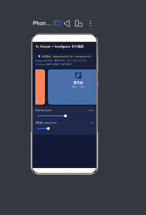
3.1 Swiper + itemSpace 卡片间距布局
3.1.1 布局场景
在移动应用中,"多卡片部分可见"的轮播设计非常流行。当前卡片完整展示在屏幕中央,而下一张卡片在右侧露出约百分之三十的区域,以此提示用户"还可以继续滑动"。这种设计最早由 iOS 的 App Store 推荐卡片流推广开来,如今已经成为移动 UI 设计的经典模式之一。
为什么这种设计如此有效?从认知心理学角度来看,人类对"不完整"的信息天然存在好奇心------看到右侧露出的卡片边缘,用户会自然产生"滑动一下看看完整内容"的冲动。这种微妙的设计技巧既提高了空间利用率,又增强了交互暗示,比单纯显示一个指示点或箭头更为直观。
3.1.2 核心技术点
该布局的核心在于以下 Swiper 属性的协同配合:
displayCount:控制一屏显示的卡片数量。设置为 1.3 表示当前卡片完整显示加下一张露出百分之三十。itemSpace:控制卡片与卡片之间的间距。正值使卡片分离,负值使卡片重叠。customScale:自定义缩放,当前卡片放大至百分之一百零五,非当前卡片缩小至百分之九十二。customOpacity:自定义透明度,当前卡片完全不透明,非当前卡片透明度降至百分之七十。indicator:自定义指示器样式,选中态使用品牌色并加宽。
3.1.3 完整代码
typescript
/**
 * Swiper + itemSpace 卡片间距布局
 * 场景:多卡片部分可见的轮播
 * 核心属性:itemSpace + displayCount + customScale
 */
import { router } from '@kit.ArkUI';

interface CardItem {
  id: number;
  title: string;
  subTitle: string;
  color: string;
  icon: string;
}

const CARD_DATA: CardItem[] = [
  { id: 1,  title: '日出·印象',  subTitle: '莫奈 · 1872', color: '#FF8C69', icon: '🌅' },
  { id: 2,  title: '星月夜',    subTitle: '梵高 · 1889', color: '#4A6FA5', icon: '🌌' },
  { id: 3,  title: '戴珍珠耳环的少女', subTitle: '维米尔 · 1665', color: '#2E8B57', icon: '👩' },
  { id: 4,  title: '记忆的永恒', subTitle: '达利 · 1931', color: '#DAA520', icon: '⏰' },
  { id: 5,  title: '呐喊',      subTitle: '蒙克 · 1893', color: '#B22222', icon: '😱' },
  { id: 6,  title: '维纳斯的诞生', subTitle: '波提切利 · 1486', color: '#6A5ACD', icon: '🏛️' },
];

@Entry
@Component
struct SwiperCardDemo {
  @State currentIndex: number = 0;
  @State autoPlayEnabled: boolean = true;
  @State cardGap: number = 12;
  @State showCount: number = 1.3;

  build() {
    Column() {
      // 标题栏
      Row() {
        Text('🎠 Swiper + itemSpace 卡片间距')
          .fontSize(18).fontWeight(FontWeight.Bold)
          .fontColor('#FFFFFF').layoutWeight(1)
      }
      .width('100%').height(54)
      .backgroundColor('#1A1A2E')
      .padding({ left: 16, right: 16 })
      .alignItems(VerticalAlign.Center)

      // 布局说明区域
      Column() {
        Text('💡 布局要点:displayCount(' + this.showCount.toFixed(1) + ') + itemSpace(' + this.cardGap + ')')
          .fontSize(13).fontWeight(FontWeight.Bold).fontColor('#C9A84C')
        Text(
          'displayCount 控制一屏显示的卡片数量(小数部分=部分可见)\n' +
          'itemSpace 控制卡片之间的间距(负值可产生重叠效果)'
        ).fontSize(12).fontColor('#8899AA').lineHeight(20).width('100%')
          .margin({ top: 4 })
      }
      .width('100%').backgroundColor('#16213E')
      .borderRadius(10).padding(14)
      .margin({ left: 16, right: 16, top: 8, bottom: 6 })

      // ★★★ 核心:Swiper + itemSpace + displayCount ★★★
      Swiper() {
        ForEach(CARD_DATA, (item: CardItem) => {
          this.buildCard(item)
        }, (item: CardItem): string => item.id.toString())
      }
      .loop(true)                           // 开启循环轮播
      .autoPlay(this.autoPlayEnabled)       // 自动播放
      .autoPlayInterval(3000)               // 切换间隔 3 秒
      .duration(400)                        // 动画时长 400ms
      .itemSpace(this.cardGap)              // ★ 卡片间距(核心属性)
      .displayCount(this.showCount)         // ★ 一屏显示卡片数(核心属性)
      .index(this.currentIndex)
      .onChange((index: number) => {
        this.currentIndex = index;
      })
      .customScale(true)                    // 启用自定义缩放
      .customScaleSelected(1.05)            // 当前卡片放大至 105%
      .customScaleUnselected(0.92)          // 非当前卡片缩小至 92%
      .customOpacity(true)                  // 启用透明度变化
      .customOpacitySelected(1.0)           // 当前卡片不透明
      .customOpacityUnselected(0.7)         // 非当前卡片半透明
      .indicator(
        new SwiperIndicator()               // 自定义点状指示器
          .bottom(12)
          .itemWidth(8).itemHeight(8)
          .selectedItemWidth(20)            // 选中项加宽
          .color(Color.Gray)
          .selectedColor('#C9A84C')
      )
      .width('100%')
      .height(200)
      .padding({ left: 16 })
    }
    .width('100%').height('100%').backgroundColor('#0F1A36')
  }

  @Builder
  buildCard(item: CardItem): void {
    Column() {
      Text(item.icon).fontSize(32).lineHeight(38).margin({ bottom: 8 })
      Text(item.title).fontSize(18).fontWeight(FontWeight.Bold)
        .fontColor('#FFFFFF').lineHeight(26)
      Text(item.subTitle).fontSize(13)
        .fontColor('rgba(255,255,255,0.7)').margin({ top: 4 })
      Blank().layoutWeight(1)
      Text('向左滑动 →').fontSize(12)
        .fontColor('rgba(255,255,255,0.4)')
        .width('100%').textAlign(TextAlign.End)
    }
    .width('100%').height('100%').padding(16)
    .backgroundColor(item.color).borderRadius(16)
  }
}
3.1.4 布局要点深入解析
1. displayCount(1.3) 的设计意图
当 displayCount 设为 1.0 时,Swiper 表现为传统的单卡片全屏轮播,用户只能看到当前一张卡片,需要通过指示器上的圆点来判断还有其他内容。设为 1.3 后,当前卡片完整显示(占用 100% 宽度),下一张卡片在右侧露出百分之三十的宽度。这个"露出部分"起到两个作用:一是视觉提示"还有更多内容",二是提供滑动操作的"抓手区域"------用户可以直接在露出的部分上开始滑动。
2. itemSpace 参数的正负效果
当 itemSpace 设为 12(正值)时,卡片之间保留 12vp 的间隙,视觉上每张卡片独立分明,适合需要清晰区分不同内容项的场景。当设为 -20(负值)时,卡片之间产生重叠效果,形成类似一叠卡片的视觉层次感。负间距配合透明度渐变效果,可以创造出精致的"卡片堆叠"视觉风格。
3. 缩放与透明度的协同作用
customScale 和 customOpacity 共同建立视觉优先级系统。当前卡片放大至 105% 加透明度 100%,而非当前卡片缩小至 92% 加透明度 70%,形成三层对比:大小对比(105% vs 92%)、透明度对比(1.0 vs 0.7)、以及位置对比(中央 vs 两侧)。这三种对比叠加在一起,用户的注意力被牢固地吸引在当前卡片上。
3.2 Swiper + displayCount 多卡片布局
3.2.1 布局场景
与"部分可见"轮播不同,"多卡片同屏"布局追求的是信息密度最大化。在一屏内同时展示多张完整的卡片,用户通过横向滑动浏览更多内容。这种设计常见于:
- 应用商店的"今日推荐"和"热门应用"列表
- 短视频平台的内容分类入口面板
- 电商 App 的商品分类导航
- 照片编辑应用的滤镜选择和模板预览
多卡片同屏布局的核心优势在于"一览性"------用户无需滑动就能看到多条内容,可以快速扫描并决定下一步操作,信息获取效率远高于单卡片全屏轮播。
3.2.2 核心技术点
与 3.1 节相比,本节的核心区别在于 displayCount 的使用方式:
- 整数 displayCount(如 2、3、4):一屏显示多张完整卡片,Swiper 自动将容器宽度均分给每张卡片。
- 小数 displayCount(如 1.5、2.5):显示整数张完整卡片加半张预览,既有信息密度又有滑动暗示。
- itemSpace 与 displayCount 的比例关系:当 displayCount 增大时,itemSpace 应该相应减小(卡片多时间距小),反之亦然。
3.2.3 完整代码
typescript
/**
 * Swiper + displayCount 多卡片布局
 * 场景:一屏显示多个卡片的轮播
 * 核心属性:displayCount + itemSpace
 */
import { router } from '@kit.ArkUI';

interface AppCard {
  id: number;
  name: string;
  icon: string;
  desc: string;
  color: string;
}

const APP_DATA: AppCard[] = [
  { id: 1,  name: '星图漫步',  icon: '🌌', desc: '天文探索', color: '#1A73E8' },
  { id: 2,  name: '森林电台',  icon: '🌲', desc: '白噪音', color: '#2E7D32' },
  { id: 3,  name: '像素画板',  icon: '🎨', desc: '创意工具', color: '#E65100' },
  { id: 4,  name: '时光日记',  icon: '📔', desc: '效率笔记', color: '#4A148C' },
  { id: 5,  name: '海风瑜伽',  icon: '🧘', desc: '健康生活', color: '#00695C' },
  { id: 6,  name: '猫咪图鉴',  icon: '🐱', desc: '宠物百科', color: '#BF360C' },
  { id: 7,  name: '编程闯关',  icon: '💻', desc: '编程学习', color: '#1A237E' },
  { id: 8,  name: '胶片相机',  icon: '📷', desc: '摄影滤镜', color: '#3E2723' },
];

@Entry
@Component
struct SwiperDisplayCountDemo {
  @State currentIndex: number = 0;
  @State cardDisplayCount: number = 2.2;
  @State cardSpacing: number = 10;

  build() {
    Column() {
      // 标题栏
      Row() {
        Text('📱 Swiper + displayCount 多卡片')
          .fontSize(18).fontWeight(FontWeight.Bold)
          .fontColor('#FFFFFF').layoutWeight(1)
      }
      .width('100%').height(54)
      .backgroundColor('#1A1A2E').padding({ left: 16, right: 16 })
      .alignItems(VerticalAlign.Center)

      // 布局说明
      Column() {
        Text('💡 当前 displayCount = ' + this.cardDisplayCount.toFixed(1))
          .fontSize(13).fontWeight(FontWeight.Bold).fontColor('#C9A84C')
        Text(
          'displayCount=' + this.cardDisplayCount.toFixed(1) + ' → ' +
          (this.cardDisplayCount < 2 ? '当前卡片+右侧预览' : '一屏多张完整卡片')
        ).fontSize(12).fontColor('#8899AA').lineHeight(20).margin({ top: 4 })
      }
      .width('100%').backgroundColor('#16213E')
      .borderRadius(10).padding(14)
      .margin({ left: 16, right: 16, top: 8, bottom: 6 })

      // ★★★ 核心:Swiper ★★★
      Swiper() {
        ForEach(APP_DATA, (item: AppCard) => {
          this.buildAppCard(item)
        }, (item: AppCard): string => item.id.toString())
      }
      .displayCount(this.cardDisplayCount)     // ★ 一屏显示的卡片数量
      .itemSpace(this.cardSpacing)             // 卡片间距
      .loop(true)
      .autoPlay(true)
      .autoPlayInterval(3500)
      .duration(400)
      .index(this.currentIndex)
      .onChange((index: number) => { this.currentIndex = index })
      .customScale(true)
      .customScaleSelected(1.02)
      .customScaleUnselected(0.92)
      .customOpacity(true)
      .customOpacitySelected(1.0)
      .customOpacityUnselected(0.8)
      .indicator(new SwiperIndicator().bottom(8).itemWidth(6).itemHeight(6)
        .selectedItemWidth(16).color(Color.Gray).selectedColor('#C9A84C'))
      .width('100%').height(230).padding({ left: 12, right: 12 })
    }
    .width('100%').height('100%').backgroundColor('#0F1A36')
  }

  @Builder
  buildAppCard(item: AppCard): void {
    Column() {
      Text(item.icon).fontSize(32).lineHeight(38).margin({ bottom: 10 })
      Text(item.name).fontSize(18).fontWeight(FontWeight.Bold)
        .fontColor('#FFFFFF')
      Text(item.desc).fontSize(12).fontColor('rgba(255,255,255,0.7)').margin({ top: 4 })
      Blank().layoutWeight(1)
      Text('查看 →').fontSize(12).fontColor('#C9A84C')
        .width('100%').textAlign(TextAlign.End)
    }
    .width('100%').height('100%').padding(14)
    .backgroundColor(item.color).borderRadius(14)
  }
}
3.2.4 displayCount 取值的决策矩阵
| displayCount 值 | 视觉表现 | 卡片数量 | 信息密度 | 适用场景 | 推荐 itemSpace |
|---|---|---|---|---|---|
| 1.0 | 单卡全屏,两侧无露出 | 1 张完整 | 低 | Banner 广告、超大图展示 | 0 |
| 1.3 ~ 1.5 | 当前卡完整 + 右侧部分露出 | 1 张完整+预览 | 中低 | 推荐卡片、头条新闻 | 8~16 |
| 2.0 | 一屏两张完整卡片 | 2 张完整 | 中 | 双列图片、AB 对比 | 8~12 |
| 2.2 ~ 2.5 | 两张完整 + 右侧预览 | 2 张完整+预览 | 中高 | 内容流、半瀑布流 | 6~10 |
| 3.0 | 一屏三张完整卡片 | 3 张完整 | 高 | 密集信息展示、应用推荐 | 4~8 |
| 4.0 | 一屏四张完整卡片 | 4 张完整 | 极高 | 图标网格、小卡片集合 | 4~6 |
当 displayCount 为非整数时,小数部分代表"额外露出的卡片比例"。例如 2.3 表示两张完整卡片加百分之三十的第三张卡片。这种设计在保证至少有两张完整卡片可读的前提下,提供了明确的滑动暗示。
实践建议:大多数场景推荐使用 1.3 ~ 2.5 之间的值。小于 1.2 会让预览部分太小而不易察觉,大于 3.0 则卡片过于密集,单张卡片的信息容量受到限制。
3.2.5 Swiper 布局最佳实践
-
数据量控制:Swiper 的卡片数量建议控制在 4~15 张。过少(少于 3 张)会显得内容匮乏,开启 loop 循环后用户会在很小的集合中反复循环;过多(超过 15 张)则用户容易在长列表中迷失。
-
循环策略:当卡片数量较多(大于 5 张)且开启了自动播放时,可以关闭 loop 循环,让用户从一端滑到另一端自然结束。当卡片较少(小于等于 5 张)时,开启循环避免用户频繁遇到边界。
-
自动播放间隔:autoPlayInterval 建议设置在 3000~4000ms。太短(小于 2000ms)用户来不及阅读当前卡片的内容;太长(大于 5000ms)等待感明显,用户可能误以为页面卡死。
-
indicator 样式调优:SwiperIndicator 支持丰富的自定义选项。选中态使用品牌色并适当加宽(例如 selectedItemWidth 设为 20),非选中态使用灰色缩小圆点(例如 itemWidth 设为 8)。这种"一大一小"的对比,让用户一目了然地知道当前位置和总页数。
-
padding 协调:当使用 displayCount 小数时,Swiper 容器本身的 padding 会影响露出的计算。如果希望右侧露出更多,可以减少 padding.right;如果希望卡片居中且两侧对称露出,则设置左右 padding 相等。
四、Scroll 滚动类布局 ------ flingFriction 惯性滑动
4.1 布局场景与设计理念
在长列表或长内容页面中,用户快速滑动手指后内容会依靠惯性继续滚动一段距离------这个物理模拟的过程称为"fling"(甩动)。惯性效应的强弱由摩擦系数决定,它直接影响用户对应用"手感"和"流畅度"的感知。
HarmonyOS NEXT 通过 flingFriction 属性让开发者能够自定义这个摩擦系数。这是一个非常细腻的体验优化点:过大的摩擦系数会让滚动显得生硬,失去流畅感;过小的摩擦系数会让滚动显得失控,用户难以准确定位到想要的内容。找到恰到好处的摩擦系数值,是优化滚动体验的关键。
摩擦系数的概念来源于物理学的摩擦模型。当手指在屏幕上快速滑动时,系统给内容施加了一个初速度,之后内容在摩擦力的作用下逐渐减速直到停止。flingFriction 的值就是这个减速过程的"摩擦系数"------值越小,相当于"冰面",减速慢、滚得远;值越大,相当于"沙地",减速快、滚得近。
4.2 核心技术点
typescript
Scroll(this.scroller) {
  // 滚动内容
}
.flingFriction(value: number)     // ★ 惯性摩擦系数(核心)
.friction(value: number)          // 触摸滑动时的摩擦阻力(一般保持默认)
.edgeEffect(effect: EdgeEffect)   // 边缘效果:Spring | Fade | None
各属性的详细说明:
flingFriction:手指离开屏幕后,内容惯性滑动的摩擦系数。值越小,惯性越大,滑得越远;值越大,惯性越小,减速越快。默认值约 0.6。friction(注意与 flingFriction 区分):手指触摸屏幕并拖动时,内容跟随手指移动的摩擦阻力。这个值一般不需要修改,保持默认即可。edgeEffect:内容滚动到边界时的视觉效果。支持三种模式:Spring(弹簧回弹)、Fade(渐隐阴影)、None(无效果)。
4.3 完整代码
typescript
/**
 * Scroll + flingFriction 惯性滑动布局
 * 场景:手指滑动后惯性继续滚动
 * 核心属性:flingFriction + edgeEffect
 */
import { router } from '@kit.ArkUI';

interface ContentItem {
  id: number;
  title: string;
  preview: string;
  icon: string;
  color: string;
}

// 15 条模拟内容数据
const CONTENT_LIST: ContentItem[] = [
  { id: 1,  title: '量子纠缠与意识之谜',    preview: '当两个粒子在量子层面产生纠缠,无论相隔多远...', icon: '⚛️', color: '#0D1B2A' },
  { id: 2,  title: '园林里的东方美学',      preview: '苏州园林不仅是建筑,更是一种自然哲学...', icon: '🎋', color: '#1B2A0D' },
  { id: 3,  title: '深海热泉生态系统',      preview: '深海热泉口附近生机勃勃,改变了我们对生命的认知...', icon: '🐙', color: '#0A1C2E' },
  { id: 4,  title: '咖啡烘焙的化学艺术',    preview: '美拉德反应和焦糖化反应决定了咖啡风味走向...', icon: '☕', color: '#2E1A0A' },
  { id: 5,  title: '巴洛克音乐中的数学结构', preview: '巴赫的复调作品中隐藏着精妙的数学对称性...', icon: '🎵', color: '#1A0D2E' },
  { id: 6,  title: '火星殖民的技术路线图',   preview: '从星舰到 Artemis 计划,登陆火星时间表逐步清晰...', icon: '🚀', color: '#0D1B2A' },
  { id: 7,  title: '发酵食物的微生物世界',   preview: '泡菜、酸奶、酱油------发酵是微生物的代谢工程...', icon: '🥬', color: '#1A2E0D' },
  { id: 8,  title: '极简主义与断舍离',       preview: '不是拥有的太少,而是需要的刚刚好...', icon: '🧘', color: '#1A1A1A' },
  { id: 9,  title: '章鱼的分布式智能',       preview: '章鱼的神经元大部分分布在触手中...', icon: '🐙', color: '#0A1A2E' },
  { id: 10, title: '字体排印中的视觉韵律',   preview: '字距、行距、对比度------好排版如音乐般有节奏...', icon: '🔤', color: '#1A1A2E' },
  { id: 11, title: '无服务器架构实战',       preview: 'Serverless 让开发者只需关注业务代码...', icon: '⚡', color: '#0D2A1B' },
  { id: 12, title: '情绪记忆的神经机制',     preview: '杏仁核和海马体如何协作编码情绪记忆...', icon: '🧠', color: '#2A1A0D' },
  { id: 13, title: '混凝土建筑的诗意表达',   preview: '安藤忠雄用清水混凝土创造了光的教堂...', icon: '🏛️', color: '#1A1A1A' },
  { id: 14, title: '汉字设计的空间美学',     preview: '中宫收紧、重心平稳、布白均匀...', icon: '🀄', color: '#1A0D1B' },
  { id: 15, title: '萤火虫的同步闪光之谜',   preview: '成千上万只萤火虫同步闪烁的集体行为...', icon: '✨', color: '#0D1B1B' },
];

@Entry
@Component
struct ScrollFrictionDemo {
  @State frictionValue: number = 0.6;
  @State currentEffect: EdgeEffect = EdgeEffect.Spring;
  @State effectLabel: string = '弹簧回弹';

  private scroller: Scroller = new Scroller();

  build() {
    Column() {
      // 标题栏
      Row() {
        Text('↕️ Scroll + flingFriction 惯性滑动')
          .fontSize(18).fontWeight(FontWeight.Bold).fontColor('#FFFFFF').layoutWeight(1)
      }
      .width('100%').height(54)
      .backgroundColor('#1A1A2E').padding({ left: 16, right: 16 })
      .alignItems(VerticalAlign.Center)

      // 布局说明
      Column() {
        Text('💡 flingFriction = ' + this.frictionValue.toFixed(2))
          .fontSize(13).fontWeight(FontWeight.Bold).fontColor('#C9A84C')
        Text(
          '快速滑动后惯性继续滚动,摩擦系数决定减速快慢\n' +
          '值越小 → 惯性越大 → 滑得越远 | 值越大 → 惯性越小 → 减速越快'
        ).fontSize(12).fontColor('#8899AA').lineHeight(20).margin({ top: 4 })
      }
      .width('100%').backgroundColor('#16213E')
      .borderRadius(10).padding(14)
      .margin({ left: 16, right: 16, top: 8, bottom: 6 })

      // ★★★ 核心:Scroll + flingFriction ★★★
      Scroll(this.scroller) {
        Column() {
          ForEach(CONTENT_LIST, (item: ContentItem) => {
            Row() {
              Text(item.icon).fontSize(26).width(40).textAlign(TextAlign.Center).margin({ right: 10 })
              Column() {
                Text(item.title).fontSize(15).fontWeight(FontWeight.Bold).fontColor('#E0E0E0')
                Text(item.preview).fontSize(12).fontColor('#8899AA').lineHeight(18)
                  .maxLines(2).textOverflow({ overflow: TextOverflow.Ellipsis }).margin({ top: 2 })
              }.layoutWeight(1).alignItems(HorizontalAlign.Start).height(60)
            }
            .width('100%').height(72).padding(12)
            .backgroundColor(item.color).borderRadius(10)
            .margin({ left: 14, right: 14, top: 6, bottom: 6 })
          }, (item: ContentItem): string => item.id.toString())
          Blank().height(12)
        }.width('100%')
      }
      .width('100%')
      .layoutWeight(1)
      .backgroundColor('#0F1A36')
      .flingFriction(this.frictionValue)          // ★ 核心:惯性摩擦系数
      .edgeEffect(this.currentEffect)             // 边缘效果
      .onScrollStop(() => { /* 滚动停止回调 */ })

      // 控制面板
      Column() {
        Text('⚙️ flingFriction 调节')
          .fontSize(14).fontWeight(FontWeight.Bold).fontColor('#C9A84C').margin({ bottom: 8 })

        // 预设值按钮
        Row() {
          this.buildPreset('🪩 顺滑', 0.2, '极致顺滑')
          this.buildPreset('🍃 轻柔', 0.4, '轻柔慢滑')
          this.buildPreset('⚙️ 默认', 0.6, '系统默认')
          this.buildPreset('🛞 阻力', 0.8, '中等阻力')
          this.buildPreset('🪨 极强', 1.2, '极强摩擦')
        }.width('100%').justifyContent(FlexAlign.SpaceBetween).margin({ bottom: 8 })

        Row() {
          Text('0.1').fontSize(11).fontColor('#667788')
          Slider({ value: this.frictionValue, min: 0.1, max: 1.5, step: 0.05 })
            .showTips(true)
            .onChange((v: number) => { this.frictionValue = v })
            .layoutWeight(1).margin({ left: 6, right: 6 })
          Text('1.5').fontSize(11).fontColor('#667788')
        }.width('100%').alignItems(VerticalAlign.Center)
      }
      .width('100%').backgroundColor('#1E2A4A')
      .borderRadius(12).padding(16)
      .margin({ left: 16, right: 16, top: 4, bottom: 10 })
    }
    .width('100%').height('100%').backgroundColor('#0F1A36')
  }

  @Builder
  buildPreset(label: string, value: number, desc: string): void {
    Column() {
      Text(label).fontSize(11).margin({ bottom: 2 })
      Text(value.toFixed(1)).fontSize(10)
        .fontColor(this.frictionValue === value ? '#C9A84C' : '#667788')
    }
    .padding(4).borderRadius(8)
    .backgroundColor(this.frictionValue === value ? '#2A3A5A' : 'transparent')
    .border({ width: this.frictionValue === value ? 1 : 0, color: '#C9A84C', style: BorderStyle.Solid })
    .onClick(() => { this.frictionValue = value })
  }
}
4.4 flingFriction 值域与感官映射
| flingFriction 值 | 体验描述 | 物理类比 | 推荐应用场景 |
|---|---|---|---|
| 0.1 ~ 0.2 | 极度顺滑,轻轻一划滚动很远 | 冰面上推冰块 | 图片画廊、作品集浏览 |
| 0.3 ~ 0.4 | 轻柔惯性,滑动感丝滑流畅 | 玻璃桌面上推纸牌 | 新闻阅读、文章列表 |
| 0.5 ~ 0.7 | 系统默认,手感适中可靠 | 桌面上推笔记本 | 通用场景、列表页面 |
| 0.8 ~ 1.0 | 明显阻力,快速减速 | 地毯上推行李箱 | 设置页面、表单填写 |
| 1.1 ~ 1.5 | 极强摩擦,几乎指停即止 | 沙地上推木板 | 精确选择列表、日期选择器 |
工程建议:
- 新闻阅读和内容消费类应用推荐使用 0.4~0.5,让文章列表的滚动带有"呼吸感",用户快速滑动时可以轻松浏览大量条目。
- 图片浏览和作品集推荐使用 0.2~0.3,极低的摩擦系数让翻页动作非常轻盈,符合视觉内容"流动感"的体验调性。
- 设置页面和表单页面推荐使用 0.8~1.0,高摩擦系数确保用户能够精确停止在想要的位置,不会因为惯性过度而错过选项。
4.5 edgeEffect 三种模式的深度对比
typescript
edgeEffect: EdgeEffect.Spring  // 弹簧回弹:拉到边界后弹性回弹
edgeEffect: EdgeEffect.Fade    // 渐隐阴影:拉到边界时边界渐隐
edgeEffect: EdgeEffect.None    // 无效果:拉到边界即停止
**Spring 模式(弹簧回弹)**是最自然、最推荐的选项。当用户将内容拉到超出边界时,会产生类似弹簧的拉伸效果,超出越多阻力越大,松手后弹性回弹到正常位置。这种效果给用户强烈的"物理反馈",明确告知"已经到顶了"或"已经到底了"。
**Fade 模式(渐隐阴影)**更加安静和内敛。拉到边界时,边界处出现渐变的阴影效果,暗示用户"前方没有更多内容了"。这种方式不会打断用户的阅读流,适合沉浸式的内容消费场景。
**None 模式(无效果)**最为简单直接------拉到边界即停止,没有任何视觉反馈。虽然实现简单,但从体验角度看显得生硬,用户可能无法区分"内容加载中"和"已经到顶"两种状态,一般不建议在生产环境中使用。
五、RelativeContainer 相对布局
RelativeContainer 是 HarmonyOS 提供的一种强大的相对定位容器,与传统的线性布局(Column/Row)有本质区别。在线性布局中,子组件按照水平或垂直方向依次排列;而在 RelativeContainer 中,每个子组件通过 alignRules 自由地相对于容器或其他兄弟组件进行定位,组件之间可以有重叠,可以任意排列在容器的任何位置。
RelativeContainer 尤其适合以下复杂布局场景:
- 仪表盘和看板:多个信息卡片分布在屏幕不同角落
- 底部导航栏:Tab 按钮等分均匀分布在底部
- 右上角操作菜单:设置、通知、个人中心等入口
- 右下角浮动按钮:固定在右下角的 FAB
- 叠加式信息面板:主内容上的浮动标签和指示器
5.1 RelativeContainer 基本语法
typescript
RelativeContainer() {
  // 子组件通过 id() 设置唯一标识
  // 通过 alignRules 设置定位规则
  Column() {
    Text('示例内容').fontSize(14).fontColor('#FFFFFF')
  }
  .width(100).height(60)
  .backgroundColor('#FF6B6B')
  .borderRadius(8)
  .id('myElement')                            // ★ 设置唯一标识
  .alignRules({
    anchor: 'container',                       // ★ 锚点:相对于容器
    horizontal: HorizontalAlign.Start,         // ★ 水平对齐方向
    vertical: VerticalAlign.Top,               // ★ 垂直对齐方向
  })
}
alignRules 参数详解:
| alignRules 属性 | 类型 | 可选值 | 说明 |
|---|---|---|---|
| anchor | string | 任意子组件的 id 或 'container' | 定位的参考点,'container' 表示父容器 |
| horizontal | HorizontalAlign | Start、Center、End | 水平方向的对齐方式 |
| vertical | VerticalAlign | Top、Center、Bottom | 垂直方向的对齐方式 |
⚠️ 关键注意事项:horizontal 和 vertical 必须写在同一 alignRules 调用内!
这是 RelativeContainer 使用中最容易犯的错误。由于 ArkTS 的链式语法特性,后续的 alignRules 调用会覆盖前一次的设置,而不是合并。因此以下写法是错误的:
typescript
// ❌ 错误:两次链式调用,第二次覆盖第一次
.alignRules({ anchor: 'container', horizontal: HorizontalAlign.Start })
.alignRules({ anchor: 'container', vertical: VerticalAlign.Top })  // 覆盖了上一行!
正确的写法是将 horizontal 和 vertical 放在同一个调用的对象中:
typescript
// ✅ 正确:一次调用同时指定 horizontal 和 vertical
.alignRules({
  anchor: 'container',
  horizontal: HorizontalAlign.Start,
  vertical: VerticalAlign.Top,
})
5.2 左对齐相对布局
"左对齐"是 RelativeContainer 最基础的定位模式。当 horizontal 设为 HorizontalAlign.Start 时,子组件的左侧边缘与容器的左侧边缘对齐(在 LTR 布局方向下)。
三种左对齐变体
typescript
RelativeContainer() {
  // 背景容器
  Column().width('100%').height('100%')
    .backgroundColor('#0A0A1A').borderRadius(12)
    .border({ width: 1, color: '#334466', style: BorderStyle.Solid })

  // ① 左上:Start + Top
  Column() { Text('左上').fontSize(14).fontColor('#FFF') }
    .width(150).height(60).backgroundColor('#FF6B6B')
    .borderRadius(8).opacity(0.85)
    .id('leftTop').margin({ left: 8, top: 8 })
    .alignRules({
      anchor: 'container',
      horizontal: HorizontalAlign.Start,
      vertical: VerticalAlign.Top,
    })

  // ② 左中:Start + Center
  Column() { Text('左中').fontSize(14).fontColor('#FFF') }
    .width(150).height(60).backgroundColor('#4ECDC4')
    .borderRadius(8).opacity(0.85)
    .id('leftCenter').margin({ left: 8 })
    .alignRules({
      anchor: 'container',
      horizontal: HorizontalAlign.Start,
      vertical: VerticalAlign.Center,
    })

  // ③ 左下:Start + Bottom
  Column() { Text('左下').fontSize(14).fontColor('#FFF') }
    .width(150).height(60).backgroundColor('#45B7D1')
    .borderRadius(8).opacity(0.85)
    .id('leftBottom').margin({ left: 8, bottom: 8 })
    .alignRules({
      anchor: 'container',
      horizontal: HorizontalAlign.Start,
      vertical: VerticalAlign.Bottom,
    })
}
完整的八方位定位
当 horizontal 取 Start、Center、End,vertical 取 Top、Center、Bottom 时,可以得到 3×3=9 种组合(减去中心点自身,实际为 8 种定位 + 1 种居中定位):
| 水平 \ 垂直 | Top | Center | Bottom |
|---|---|---|---|
| Start(左) | 左上 | 左中 | 左下 |
| Center(中) | 中上 | 🔴中心 | 中下 |
| End(右) | 右上 | 右中 | 右下 |
这种八方位定位系统几乎覆盖了所有常见的组件定位需求。实际开发中,你可以将不同的信息模块放置在不同的方位,构建出复杂的仪表盘布局。
5.3 右对齐相对布局
右对齐与左对齐在原理上完全对称------只需将 horizontal 从 Start 改为 End。但在实际应用场景中,右对齐有其独特的使用模式。
经典场景一:右上角操作菜单
移动应用中,右上角通常放置设置、通知、搜索等操作入口。通过从右向左排列按钮,可以实现右上角的按钮组。
typescript
// 按钮 1:最右侧(设置)
Column() { Text('⚙️').fontSize(18) }
  .width(42).height(42).backgroundColor('#4A6FA5').borderRadius(21)
  .id('btn1').margin({ right: 14, top: 26 })
  .alignRules({
    anchor: 'container',
    horizontal: HorizontalAlign.End,   // 右对齐
    vertical: VerticalAlign.Top,
  })

// 按钮 2:左移 54vp(通知)
Column() { Text('🔔').fontSize(18) }
  .width(42).height(42).backgroundColor('#C9A84C').borderRadius(21)
  .id('btn2').margin({ right: 68, top: 26 })
  .alignRules({
    anchor: 'container',
    horizontal: HorizontalAlign.End,
    vertical: VerticalAlign.Top,
  })
经典场景二:右下角 FAB 按钮
浮动操作按钮(Floating Action Button)固定在右下角,通过 End + Bottom 组合实现。FAB 按钮通常用于触发当前页面的核心操作,如新建、分享、添加等。
typescript
Column() { Text('➕').fontSize(20) }
  .width(44).height(44).backgroundColor('#FF6B6B').borderRadius(22)
  .id('fab').margin({ right: 14, bottom: 14 })
  .alignRules({
    anchor: 'container',
    horizontal: HorizontalAlign.End,
    vertical: VerticalAlign.Bottom,
  })
经典场景三:右侧信息面板
右侧信息面板常用于展示文件详情、用户资料、辅助信息等。面板本身使用 End + Center 定位在容器右侧居中,面板内部的条目则通过相对于面板的定位来排列。
typescript
// 右侧信息面板
Column() {
  Text('📋 文件信息').fontSize(13).fontWeight(FontWeight.Bold).fontColor('#C9A84C')
  Text('📄 文件名: report_v3.pdf').fontSize(12).fontColor('#E0E0E0')
  Text('💾 大小: 2.4 MB').fontSize(12).fontColor('#E0E0E0')
  Text('📅 修改: 2025-06-24').fontSize(12).fontColor('#E0E0E0')
  Text('✅ 状态: 已审核').fontSize(12).fontColor('#66BB6A')
}
.width(170).height(170)
.backgroundColor('#1E2A4A').borderRadius(12)
.id('panel')
.alignRules({
  anchor: 'container',
  horizontal: HorizontalAlign.End,
  vertical: VerticalAlign.Center,
})
.margin({ right: 14 })
5.4 Bar 均分布局(三等分导航栏)
底部导航栏是移动应用中最常见的 UI 组件之一,承载着应用的一级页面切换功能。使用 RelativeContainer 实现三等分布局的核心思路是:三个子组件分别左对齐、居中、右对齐,每个组件宽度设为容器宽度的百分之三十三。
5.4.1 布局示意图
┌──────────────────────────────────────────────────┐
│  ┌──────────────┐  ┌──────────────┐  ┌──────────┐│
│  │     🏠       │  │     🔍       │  │    👤     ││
│  │    首页       │  │    发现       │  │   我的    ││
│  │   33.33%     │  │   33.33%     │  │  33.33%  ││
│  └──────────────┘  └──────────────┘  └──────────┘│
│   Horizontal:       Horizontal:       Horizontal: │
│     Start              Center             End    │
└──────────────────────────────────────────────────┘
5.4.2 核心实现代码
typescript
// ★ 底部导航栏 ★
RelativeContainer() {
  // 导航栏背景
  Column().width('100%').height('100%')
    .backgroundColor('#1A1A2E')
    .id('barBg')

  // 顶部细分割线
  Column().width('100%').height(1)
    .backgroundColor('#334466')
    .id('dividerLine')
    .alignRules({
      anchor: 'barBg',
      horizontal: HorizontalAlign.Start,
      vertical: VerticalAlign.Top,
    })

  // ===== Tab 1:左对齐 + 33% 宽度 =====
  Column() {
    Text('🏠').fontSize(22).lineHeight(26).margin({ bottom: 2 })
    Text('首页').fontSize(12)
  }
  .width('33%')                                   // ★ 三等分
  .height('100%')
  .justifyContent(FlexAlign.Center)
  .alignItems(HorizontalAlign.Center)
  .id('tabHome')
  .alignRules({
    anchor: 'barBg',
    horizontal: HorizontalAlign.Start,            // ★ 左对齐
    vertical: VerticalAlign.Center,
  })
  .onClick(() => { /* 切换到首页 */ })

  // ===== Tab 2:居中 + 33% 宽度 =====
  Column() {
    Text('🔍').fontSize(22).lineHeight(26).margin({ bottom: 2 })
    Text('发现').fontSize(12)
  }
  .width('33%')
  .height('100%')
  .justifyContent(FlexAlign.Center)
  .alignItems(HorizontalAlign.Center)
  .id('tabDiscover')
  .alignRules({
    anchor: 'barBg',
    horizontal: HorizontalAlign.Center,           // ★ 居中
    vertical: VerticalAlign.Center,
  })
  .onClick(() => { /* 切换到发现 */ })

  // ===== Tab 3:右对齐 + 33% 宽度 =====
  Column() {
    Text('👤').fontSize(22).lineHeight(26).margin({ bottom: 2 })
    Text('我的').fontSize(12)
  }
  .width('33%')
  .height('100%')
  .justifyContent(FlexAlign.Center)
  .alignItems(HorizontalAlign.Center)
  .id('tabProfile')
  .alignRules({
    anchor: 'barBg',
    horizontal: HorizontalAlign.End,              // ★ 右对齐
    vertical: VerticalAlign.Center,
  })
  .onClick(() => { /* 切换到我的 */ })
}
.width('100%').height(64)
.borderRadius({ topLeft: 16, topRight: 16 })
5.4.3 扩展:四等分和五等分
对于三等分,我们恰好可以利用 Start、Center、End 三个预设锚点。对于四等分或五等分,则需要更灵活的方案:
typescript
// 思路一:使用 alignRules 配合 margin.left 百分比(不推荐,精度受限)
.width('25%')  // 四等分
.alignRules({ anchor: 'container', horizontal: HorizontalAlign.Start, vertical: VerticalAlign.Center })
.margin({ left: '25%' })  // 偏移一个卡片的宽度

// 思路二:改用 Flex 布局(推荐,更适合等分场景)
Flex() {
  ForEach(TAB_DATA, (tab) => {
    Column() { Text(tab.icon) Text(tab.label) }
      .layoutWeight(1)  // ★ 自动均分剩余空间
      .height('100%')
      .justifyContent(FlexAlign.Center)
      .alignItems(HorizontalAlign.Center)
  })
}
.width('100%').height(64)
因此,RelativeContainer 最擅长的是三等分的场景。对于超过三等分的情况,建议使用 Flex 布局配合 layoutWeight 属性来实现等分效果,代码更加简洁且可扩展。
六、Offset 偏移布局
6.1 布局场景与设计理念
offset 属性允许组件在自身原始布局位置的基础上进行视觉偏移。与 margin 和 padding 不同,offset 不改变组件的布局占位------其他组件不会感知到偏移的存在。这种"只改视觉不改布局"的特性,使得 offset 成为微交互动效和层叠视觉效果的理想选择。
offset 的典型应用场景包括:
- 微交互动效:按钮按压下沉(向下偏移 3vp)、悬浮上浮(向上偏移 5vp)
- 层叠卡片效果:多张卡片逐层偏移,形成立体堆叠感
- 视觉纠偏:微调某个组件的位置而不影响周围布局
- 阴影投影:配合 shadow 属性,偏移后投影跟随视觉位置
6.2 核心技术点
typescript
// 语法一:同时设置 x 和 y 偏移量
.offset({ x: 数值, y: 数值 })

// 语法二:x 和 y 设为相同值(对称偏移)
.offset(数值)
偏移量规则:
| 参数 | 正值 | 负值 |
|---|---|---|
| x | 向右偏移 | 向左偏移 |
| y | 向下偏移 | 向上偏移 |
偏移量的单位是 vp(virtual pixel,虚拟像素),与屏幕密度无关。建议偏移量控制在 -100 到 100 vp 之间,过大则组件偏离逻辑位置太远,容易造成用户困惑。
6.3 offset 与 margin 的本质区别
这是理解 offset 最重要的概念。下面用一个并排对比的示例来说明:
typescript
Row() {
  // ===== 左侧:margin 影响布局 =====
  Column() {
    Text('margin 推挤').fontSize(12).fontWeight(FontWeight.Bold).fontColor('#C9A84C')
    Column() { Text('A').fontSize(16).fontColor('#FFF') }
      .width(80).height(50).backgroundColor('#FF6B6B').borderRadius(8)
      .textAlign(TextAlign.Center)
      .margin({ left: 30, top: 30 })       // ★ margin:B 被推开

    Column() { Text('B').fontSize(16).fontColor('#FFF') }
      .width(80).height(50).backgroundColor('#4ECDC4').borderRadius(8)
      .textAlign(TextAlign.Center)
  }
  .layoutWeight(1).alignItems(HorizontalAlign.Center).padding(8)

  // ===== 右侧:offset 不影响布局 =====
  Column() {
    Text('offset 不推挤').fontSize(12).fontWeight(FontWeight.Bold).fontColor('#C9A84C')
    Column() { Text('A').fontSize(16).fontColor('#FFF') }
      .width(80).height(50).backgroundColor('#45B7D1').borderRadius(8)
      .textAlign(TextAlign.Center)
      .offset({ x: 30, y: 30 })            // ★ offset:B 保持原位

    Column() { Text('B').fontSize(16).fontColor('#FFF') }
      .width(80).height(50).backgroundColor('#96CEB4').borderRadius(8)
      .textAlign(TextAlign.Center)
  }
  .layoutWeight(1).alignItems(HorizontalAlign.Center).padding(8)
}
结果对比:
- 左侧(margin):组件 A 向右下偏移 30vp,组件 B 被 A 推开,整体布局发生改变。B 不再紧跟在 A 之后,而是被挤到了更远的位置。
- 右侧(offset):组件 A 视觉上向右下偏移 30vp,但组件 B 保持原位,仿佛 A 的原始位置没有变化。A 的视觉位置和布局位置分离了。
这个差异在实现浮动提示、消息徽章、按压动画、拖拽效果时尤为重要------我们通常希望组件"浮"起来但不影响周围内容的排列,此时 offset 就是唯一正确的选择。
6.4 三大典型应用场景
场景一:单卡片偏移演示(视觉漂移)
在 Stack 容器中,一张卡片相对于原位进行偏移,同时显示半透明的原位参考框。这是理解 offset 工作原理的最直观方式。
typescript
Stack() {
  // 原位参考(半透明虚线边框)
  if (this.showOriginal) {
    Column() { Text('原位').fontSize(14).fontColor('#667788') }
      .width(160).height(100)
      .backgroundColor('rgba(255,255,255,0.1)')
      .border({ width: 1, color: '#667788', style: BorderStyle.Dashed })
      .borderRadius(12)
  }

  // 偏移后的卡片
  Column() {
    Text('偏移后').fontSize(14).fontWeight(FontWeight.Bold).fontColor('#FFF')
    Text('offset(' + this.offsetX + ', ' + this.offsetY + ')').fontSize(10).fontColor('#FFF').opacity(0.8)
  }
  .width(160).height(100)
  .backgroundColor('#FF6B6B').borderRadius(12)
  .justifyContent(FlexAlign.Center)
  .alignItems(HorizontalAlign.Center)
  .offset({ x: this.offsetX, y: this.offsetY })  // ★ 核心
}
.alignContent(Alignment.Center)
.width('100%').height(240)
.backgroundColor('#0A0A1A').borderRadius(12)
当 offsetX = 0, offsetY = 0 时,偏移卡片与原位卡片完全重合,用户看到的是一个实色方块叠加在虚线方块上。拖动滑块改变偏移值后,实色方块逐渐"漂离"原位,虚线方块则始终停留在原始位置------这个视觉对比直观地展示了"保留原位空间,只移动视觉位置"的核心特性。
场景二:多卡片层叠效果
层叠卡片是 offset 最经典的视觉应用。通过逐层偏移,可以创造出"一叠文件"的立体视觉效果。实现方式非常简单:每张卡片的 offset 值递增相同的增量。
typescript
Stack() {
  // 第 1 层(底层)
  this.buildStackCard('#96CEB4', '卡片 C', 0, 0)
  // 第 2 层(中层):右下偏移 24vp
  this.buildStackCard('#45B7D1', '卡片 B', 24, 24)
  // 第 3 层(顶层):右下偏移 48vp
  this.buildStackCard('#FF6B6B', '卡片 A', 48, 48)
}
.alignContent(Alignment.Center)
.padding(6)

// 层叠卡片 Builder
@Builder
buildStackCard(color: string, label: string, x: number, y: number): void {
  Column() {
    Text(label).fontSize(16).fontWeight(FontWeight.Bold).fontColor('#FFF')
    Text('x:' + x + ' y:' + y).fontSize(11).fontColor('rgba(255,255,255,0.7)')
  }
  .width(160).height(100)
  .backgroundColor(color).borderRadius(12)
  .justifyContent(FlexAlign.Center)
  .alignItems(HorizontalAlign.Center)
  .offset({ x: x, y: y })                    // ★ 每层偏移叠加
  .shadow({ radius: 4, color: 'rgba(0,0,0,0.3)', offsetY: 2 })
}
当偏移增量为 24vp、层数为 3 时,总偏移范围为 0~48vp。偏移增量的计算公式为:
偏移增量 = 总偏移范围 / (层数 - 1)例如:总偏移范围为 48vp,3 层卡片,则增量 = 48 / 2 = 24vp。
场景三:按压微动效
虽然本文聚焦于静态布局,但 offset 在动态交互中同样大放异彩。通过 @State 和 animateTo 的结合,可以实现按钮按压下沉的微动效:
typescript
@State pressed: boolean = false;

Column() {
  Text('点击按钮').fontSize(16).fontColor('#FFF')
}
.width(140).height(48)
.backgroundColor('#C9A84C').borderRadius(24)
.justifyContent(FlexAlign.Center)
.alignItems(HorizontalAlign.Center)
.offset({ y: this.pressed ? 3 : 0 })         // 按压时下沉 3vp
.shadow({
  radius: this.pressed ? 2 : 6,
  color: 'rgba(0,0,0,0.3)',
  offsetY: this.pressed ? 1 : 3,
})
.onTouch((event: TouchEvent) => {
  if (event.type === TouchType.Down) {
    animateTo({ duration: 80 }, () => { this.pressed = true })
  } else if (event.type === TouchType.Up || event.type === TouchType.Cancel) {
    animateTo({ duration: 80 }, () => { this.pressed = false })
  }
})
按压时按钮向下偏移 3vp 同时阴影缩小,模拟出物理按钮被按下的效果。松开后自动回弹到原位(y 偏移归零)。这种微交互虽然只有几十毫秒的动画时长,却能显著提升应用的品质感和响应感。
6.5 offset 最佳实践总结
-
微调为主:offset 的值建议控制在 -100~100 vp 的范围内。过大的偏移会使组件脱离其逻辑位置太远,用户会难以将视觉位置和操作目标对应起来。
-
配合动画使用:offset 最常见的用途是作为 animateTo 动画的终态值。从 offset(0,0) 到 offset(x,y) 的平滑过渡是微交互动效的基础模式。
-
与 Stack 搭配:在 Stack 容器中使用 offset 效果最为清晰可控。在 Column 或 Row 中使用 offset 时,虽然视觉上偏移了,但原始占位空间不会变化,可能导致意料之外的重叠或空隙。
-
不要用 offset 替代 margin:offset 用于视觉微调,margin 用于布局间距。两者有本质区别,不能互相替代。在需要"改变布局"时使用 margin,在需要"不改变布局只改变视觉"时使用 offset。
七、布局方式对比与选型指南
7.1 七大布局方式速查表
| 布局方式 | 核心技术属性 | 布局方向 | 典型应用场景 | 学习难度 |
|---|---|---|---|---|
| Swiper + itemSpace | Swiper + itemSpace + displayCount | 横向滑动 | 多卡片部分可见轮播 | ⭐⭐ |
| Swiper + displayCount | Swiper + displayCount | 横向滑动 | 一屏多卡同屏展示 | ⭐⭐ |
| Scroll + flingFriction | Scroll + flingFriction + edgeEffect | 纵向/横向滚动 | 长列表惯性滚动 | ⭐⭐⭐ |
| RelativeContainer 左对齐 | RelativeContainer + alignRules(Start) | 自由定位 | 信息面板、表单布局 | ⭐⭐⭐ |
| RelativeContainer 右对齐 | RelativeContainer + alignRules(End) | 自由定位 | 右上菜单、FAB | ⭐⭐⭐ |
| RelativeContainer Bar | RelativeContainer + alignRules + 33% | 等分布局 | 底部导航栏 | ⭐⭐⭐ |
| Offset 偏移 | offset({ x, y }) | 视觉偏移 | 层叠卡片、按压动效 | ⭐ |
7.2 选型决策树
面对具体的布局需求时,可以使用以下决策树快速选择合适的技术方案:
需要轮播展示多个卡片?
├── 是 → 需要一屏展示多张完整卡片?
│   ├── 是 → 卡片数 2~3 → Swiper + displayCount(2.0/3.0)
│   ├── 是 → 卡片数 4+ → 考虑 Grid 或 LazyForEach
│   └── 否 → 需要右侧预览 → Swiper + displayCount(1.3) + itemSpace
│
└── 否 → 需要长列表滚动?
    ├── 是 → 数据量少于 100 条?
    │   ├── 是 → Scroll + flingFriction + ForEach
    │   └── 否 → Scroll + flingFriction + LazyForEach
    │
    └── 否 → 需要组件精确定位?
        ├── 是 → 子组件 3~5 个 → RelativeContainer + alignRules
        ├── 是 → 子组件 6+ 个 → 考虑拆分为多个容器
        │
        └── 否 → 需要视觉微调或层叠?
            ├── 是 → offset({ x, y })
            └── 否 → 标准线性布局 Column/Row
7.3 性能考量
-
Swiper 性能:Swiper 适合卡片数量在 3~15 张的场景。如果卡片数量极大(超过 50 张),建议使用 LazyForEach 懒加载模式,Swiper 本身也支持按需渲染,避免一次性创建大量组件。
-
Scroll 性能:配合 ForEach 时,如果数据量超过 100 条,强烈建议改用 LazyForEach 实现虚拟列表。LazyForEach 只渲染可视区域内的组件,滚动时动态创建和回收组件,内存占用大幅降低。
-
RelativeContainer 性能:每个子组件都需要计算 alignRules 定位规则,复杂度与子组件数量成正比。当子组件超过 20 个时,计算开销显著增加,建议拆分为多个嵌套的 RelativeContainer 或改用性能更好的 Flex/Grid 布局。
-
offset 性能:offset 是纯视觉属性,不触发布局重排(reflow),性能开销极小。它只改变了组件的绘制位置,不影响布局树的结构,因此非常适合高频动画场景。
八、常见问题与注意事项
8.1 Swiper 常见问题
Q:Swiper 的卡片为什么不显示?
A:检查是否设置了足够的高度。Swiper 需要明确的宽度和高度,如果父容器没有约束尺寸,Swiper 可能渲染为 0×0 不可见。
Q:displayCount 设为小数后,右侧预览部分显示不全?
A:检查 Swiper 的 padding 设置。padding.left 和 padding.right 会占据容器宽度,影响 displayCount 的计算。建议左右 padding 不超过 20vp。
Q:自定义缩放后卡片边缘模糊?
A:customScale 值不宜超过 1.1(110%),过大缩放会导致像素插值模糊。建议 customScaleSelected 不超过 1.05。
8.2 RelativeContainer 常见问题
Q:alignRules 设置了但组件没有出现在预期位置?
A:大概率是 horizontal 和 vertical 写在了两次 alignRules 调用中。检查代码是否出现了两个连续的 .alignRules(),确认它们合并为一次调用。
Q:子组件 id 重复会怎样?
A:同一个 RelativeContainer 内不允许出现重复的 id,否则定位行为未定义。建议 id 命名采用"前缀_功能"的格式(如 tab_home、panel_info),确保唯一性。
Q:margin 和 alignRules 的交互关系是什么?
A:alignRules 决定组件相对于锚点的初始位置,margin 在此位置上做进一步偏移。例如 alignRules 将组件定位在容器左上角后,margin({ left: 16, top: 16 }) 会让组件再向右下各偏移 16vp。
8.3 Scroll 常见问题
Q:flingFriction 设置为极小值(0.1)后惯性太大怎么办?
A:flingFriction 为 0.1 时惯性确实很大,适合图片画廊等场景。如果觉得惯性过大,可以逐步增加到 0.3~0.4 找到平衡点。
九、总结
本文通过七个完整的实战案例,系统地介绍了 HarmonyOS NEXT 中原生 ArkTS 的七大布局方式。从横向滑动的 Swiper,到纵向滚动的 Scroll,再到精确定位的 RelativeContainer,最后到视觉偏移的 Offset,每一种布局方式都有其独特的应用场景和技术要点。
回顾全文,我们可以提炼出以下核心原则:
-
选择合适的布局容器是构建良好 UI 的第一步。Swiper 负责轮播、Scroll 负责滚动、RelativeContainer 负责精确定位、offset 负责微调,各司其职才能高效协作。
-
alignRules 的正确写法是 RelativeContainer 的关键。horizontal 和 vertical 必须在一个调用内同时指定,避免链式调用的覆盖问题。
-
flingFriction 调节的是滚动"手感"。0.2~1.5 的值域覆盖了从"冰面"到"沙地"的完整体验谱系,建议根据应用类型谨慎选择。
-
offset 与 margin 的本质区别在于是否影响布局流。offset 仅做视觉偏移,是实现微交互和层叠效果的最佳工具,性能开销也最低。
-
百分比宽度配合 RelativeContainer 的 alignRules 锚点可以轻松实现等分布局。33% + Start/Center/End 正好覆盖三等分场景,四等分以上建议改用 Flex 布局。
HarmonyOS NEXT 的 ArkTS 布局体系正在快速发展,掌握这些原生布局方式能够帮助开发者以最小的成本构建出高性能、高表现力的用户界面。希望本文能够成为读者探索 HarmonyOS 原生开发的实用参考手册和案头工具书。