flex布局时,内容宽度自适应,flex:1,最长为1,不换行超出显示...,内容较短时按内容长度占位
bash
	//css主要代码
  flex: 0 1 auto;
  max-width: 100%;
  min-width: 0;
  white-space: nowrap;
  overflow: hidden;
  text-overflow: ellipsis;
效果展示
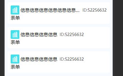
该效果完整代码
bash
<view class="headBox">
	<image class="headImg" src="/static/tag/crm_company.png" mode="widthFix"></image>
	<view class="titText">
		信息信息信息信息信息信息信息信息信息信息信息信息信息信息信息信息
	</view>
	<view class="icCode">
		<span style="color: #666666;">ID:</span>
		<span>52256632</span>
	</view>
</view>
bash
.headBox{
	display: flex;
	align-items: center;
	.headImg{
		width: 60rpx;
		height: 60rpx;
		flex-shrink: 0;//图片不变型
		flex-grow: 0;//图片不变型
		margin-right: 8rpx;
	}
	.titText{
		  flex: 0 1 auto;
		  max-width: 100%;
		  min-width: 0;
		  white-space: nowrap;
		  overflow: hidden;
		  text-overflow: ellipsis;
	}
	.icCode{
		font-weight: 500;
		font-size: 28rpx;
		color: #333333;
		margin-left: 16rpx;
	}
}