鸿蒙原生 ArkTS 布局实战:Scroll + Row 实现水平滚动导航菜单
一、引言
在移动端应用中,导航菜单是最常见的交互组件之一。新闻客户端的分类栏、电商应用的商品品类切换器、社交应用的顶部 Tab ------ "超出屏幕宽度时可左右滑动浏览"已经成为用户的默认预期体验。
在 HarmonyOS NEXT 的 ArkTS 生态中,实现这一需求的官方推荐方案是 Scroll + Row 组合布局。本文通过一个完整的可运行示例,深入剖析这一布局模式的核心原理、实现步骤与最佳实践。
1.1 为什么是 Scroll + Row?
在 ArkTS 的布局体系中:
Column:垂直排列子组件,溢出时通过外部 Scroll 实现垂直滚动。Row:水平排列子组件,默认不会滚动 ------ 子项超出父容器宽度时按布局规则压缩或截断。Scroll:通用滚动容器,包裹单个子组件并赋予滚动能力。
Scroll + Row 的方案逻辑清晰:Row 做水平排列,Scroll 赋予水平滚动能力,各司其职。
对比
List+ListItem方案,Scroll+Row更轻量灵活,适合菜单项数量适中(几十个以内)的场景。
二、项目准备
2.1 开发环境
| 项目 | 说明 |
|---|---|
| IDE | DevEco Studio(hvigor 6.23.5) |
| 目标 API | 24(HarmonyOS NEXT / SDK 6.1.0) |
| 语言 | ArkTS(基于 TypeScript) |
| 构建工具 | hvigorw |
2.2 新建工程
在 DevEco Studio 中:File → New → Create Project → Empty Ability ,选择兼容 SDK 6.1.0(23) 及以上。工程创建后主要关注 entry/src/main/ets/pages/Index.ets 文件。
三、需求分析与页面结构设计
3.1 需求
- 顶部导航菜单栏 ------ 一行水平排列的菜单项,总宽超出屏幕时可左右滑动浏览。
- 下方内容展示区 ------ 显示当前选中的菜单项信息。
3.2 交互要求
- 手指左右滑动时菜单栏平滑滚动
- 滚动到边缘有弹簧回弹效果
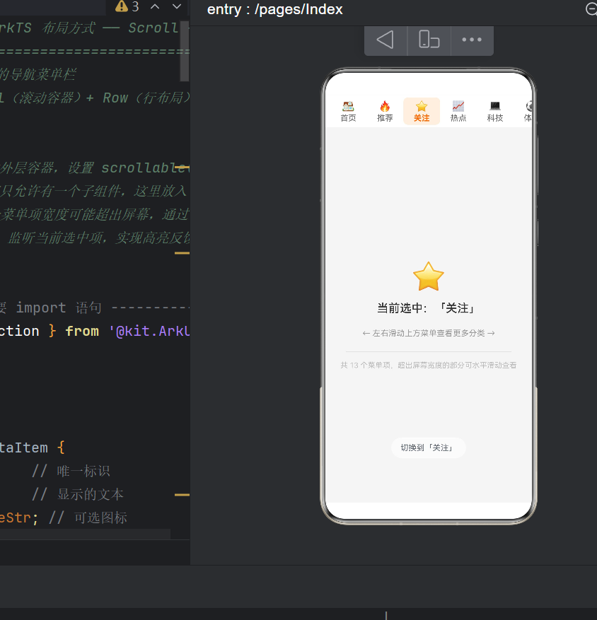
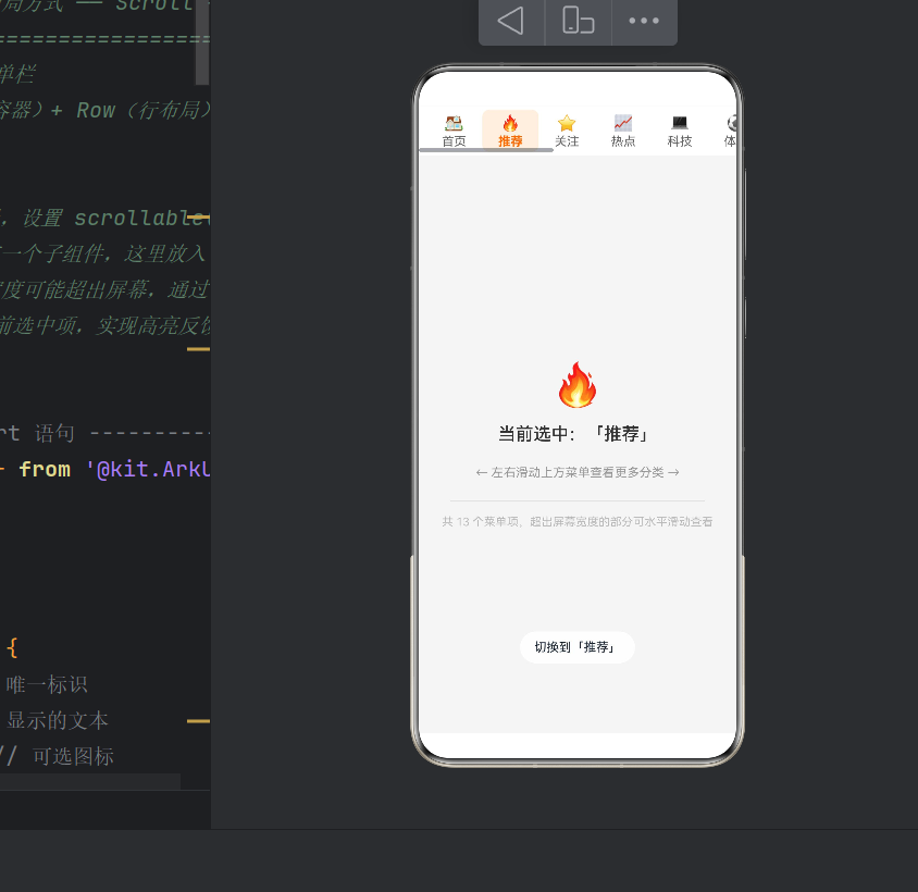
- 点击菜单项 → 橙色高亮 + Toast 提示
- 鼠标悬停有 Hover 效果
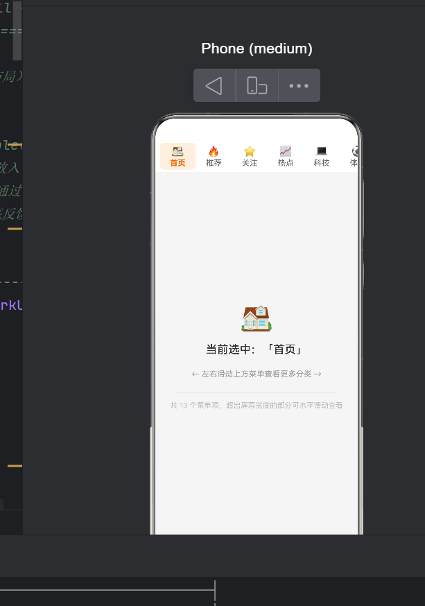
3.3 页面布局树
Column(全屏)
├── Scroll(水平滚动,高度 56vp)          ← 核心容器
│   └── Row(width: auto,子项撑开宽度)    ← 唯一子节点
│       ├── MenuItem(首页, 64vp)
│       ├── MenuItem(推荐, 64vp)
│       ├── ...... 共 13 项 × 64vp = 832vp ......
│       └── MenuItem(游戏, 64vp)
│       (总宽度 >> 屏幕宽度 ~360vp → 可滚动)
└── Column(内容区,layoutWeight=1 填充)
    └── 选中项图标 + 文字 + 提示
四、核心代码实现
4.1 数据模型
typescript
interface MenuDataItem {
  id: number;          // 唯一标识
  label: string;       // 显示的文本
  icon?: ResourceStr;  // 可选图标
}
使用 interface 而非 class,更轻量且编译期无开销。
4.2 页面组件与状态管理
typescript
@Entry
@Component
struct Index {
  @State private menuItems: MenuDataItem[] = [
    { id: 1,  label: '首页', icon: '🏠' },
    { id: 2,  label: '推荐', icon: '🔥' },
    // ... 共 13 项
    { id: 13, label: '游戏', icon: '🎮' },
  ];

  @State private selectedId: number = 1;
}
状态提升原则
选中状态放在父组件 Index 中,通过数据驱动统一控制所有菜单项的选中态。子组件通过条件判断决定自身样式:
橙色文字 + 浅橙背景  ← 当 selectedId === item.id
灰色文字 + 透明背景   ← 其他情况
这是 ArkTS / React / Vue 等声明式 UI 框架中"状态提升"的典型应用。
4.3 主布局:Scroll + Row
typescript
build() {
  Column() {
    // ========= 核心:水平滚动菜单栏 =========
    Scroll() {
      Row() {
        ForEach(this.menuItems, (item: MenuDataItem) => {
          this.MenuDataItemView(item)
        }, (item: MenuDataItem) => item.id.toString())
      }
      .width('auto')           // ★ 关键:宽度由子项撑开
      .height('100%')
      .alignItems(VerticalAlign.Center)
      .padding({ left: 8, right: 8 })
    }
    .scrollable(ScrollDirection.Horizontal)  // ★ 关键:开启水平滚动
    .scrollBar(BarState.Auto)                 // 滚动条自动显隐
    .edgeEffect(EdgeEffect.Spring)            // 边缘回弹
    .width('100%')
    .height(56)
    .backgroundColor('#FFFFFF')
    .shadow({ radius: 4, color: '#1A000000', offsetX: 0, offsetY: 2 })

    // ========= 下方内容展示区 =========
    Column() { /* 展示选中项信息 */ }
      .width('100%').layoutWeight(1)
      .justifyContent(FlexAlign.Center)
      .alignItems(HorizontalAlign.Center)
      .backgroundColor('#F5F5F5')
  }
  .width('100%').height('100%')
}
布局要点拆解
① 必须指定滚动方向
typescript
.scrollable(ScrollDirection.Horizontal)Scroll 默认不滚动,遗漏 .scrollable() 是初学者最容易踩的坑。
② Scroll 内只能有一个根子组件
ArkTS 硬性约束:Scroll > Row > (子项)。不能写两个平级的 Row。
③ Row 必须设 width('auto')
这是可滚动的关键。若设 width('100%'),Row 宽度被锁定在 Scroll 宽度内,不会溢出,从而无法滚动。
④ 边缘回弹提升手感
typescript
.edgeEffect(EdgeEffect.Spring)Spring 模式类似 iOS 的 rubber-band 效果,比 Fade 或硬边界更符合移动端用户预期。
4.4 自定义菜单项:@Builder
typescript
@Builder
private MenuDataItemView(item: MenuDataItem) {
  Column() {
    Text(item.icon).fontSize(18).lineHeight(22)
    Text(item.label)
      .fontSize(14)
      .fontColor(this.selectedId === item.id ? '#FF6B00' : '#666666')
      .fontWeight(this.selectedId === item.id ? FontWeight.Bold : FontWeight.Regular)
      .margin({ top: 2 })
  }
  .width(64)
  .height(48)
  .justifyContent(FlexAlign.Center)
  .alignItems(HorizontalAlign.Center)
  .padding({ top: 4, bottom: 4 }).borderRadius(8)
  .backgroundColor(this.selectedId === item.id ? '#FFF0E0' : Color.Transparent)
  .onClick(() => {
    this.selectedId = item.id;
    promptAction.showToast({
      message: `切换到「${item.label}」`,
      duration: 1000
    });
  })
  .responseRegion({ x: 0, y: 0, width: 64, height: 48 })
  .hoverEffect(HoverEffect.Auto)
}
为什么用 @Builder?
- 代码复用:一处定义,ForEach 每次循环复用
- 自动绑定 this :天然访问
this.selectedId - 性能优化:ArkUI 框架会缓存优化 Builder 生成的节点
选中态样式
未选中: #666666 灰色 + 透明背景
选中态: #FF6B00 橙色 + #FFF0E0 浅橙背景
橙色是 HarmonyOS Design 推荐主色之一,生产项目可替换为 $r('app.color.xxx') 实现全局换肤。
宽度选择:为何 64vp?
- 64vp × 13 项 + padding = 848vp,超出手机屏幕 ~360vp 约 2.3 倍
- 用户明显感知"需要滑动" → 滚动效果得到验证
- 若需弹性伸缩,可改为
.constraintSize({ minWidth: 64 })
五、编译验证
在项目根目录执行:
bash
hvigorw assembleApp输出解读:
Finished ::PreBuildApp...              # 预构建通过
Finished :entry:default@CompileArkTS... # ArkTS 编译成功
WARN: 'onScrollEnd' deprecated         # 仅弃用警告,不影响运行
WARN: 'showToast' deprecated           # 同上
Finished :entry:default@PackageHap...   # HAP 打包成功
BUILD SUCCESSFUL in 2 s 254 ms         # ✅ 构建成功
弃用 API 在 API 24 中仍完全可用,仅提示迁移到新接口。
运行效果验证
| 操作 | 预期行为 |
|---|---|
| 页面加载 | 菜单栏白色背景,前约 5 项可见,其余隐藏 |
| 左滑菜单栏 | 隐藏项依次出现:美食→旅行→健康→教育→游戏 |
| 滑到最左/右 | 弹簧回弹动画(Spring) |
| 点击「科技」 | 橙色高亮 + Toast「切换到「科技」」,下方同步更新 |
六、进阶扩展
6.1 动态下划线指示器
typescript
@State private indicatorOffset: number = 0;

// 点击时计算偏移
.onClick(() => {
  this.selectedId = item.id;
  this.indicatorOffset = (item.id - 1) * 64;
})

// Row 底部叠加下划线
.overlay({
  builder: () => {
    Row()
      .width(32).height(3)
      .backgroundColor('#FF6B00').borderRadius(2)
      .position({ x: this.indicatorOffset + 16, y: 48 })
      .animation({ duration: 300, curve: Curve.FastOutSlowIn })
  }
})
.animation() 让下划线平滑过渡,大幅提升视觉质感。
6.2 大数据量:LazyForEach
菜单项达上百个时,使用 LazyForEach 按需创建/销毁节点:
typescript
import { LazyForEach } from '@kit.ArkUI';

Scroll() {
  Row() {
    LazyForEach(this.dataSource, (item: MenuDataItem) => {
      this.MenuDataItemView(item)
    }, (item: MenuDataItem) => item.id)
  }
  .width('auto')
}
内存占用从 O(总项数) 降为 O(可见项数)。
6.3 大屏幕响应式适配
折叠屏展开态下菜单全部可见时,可禁用滚动:
typescript
@State private isCompact: boolean = true;

aboutToAppear() {
  this.isCompact = DisplayUtil.isCompact(); // 伪代码,需实现检测逻辑
}

build() {
  if (this.isCompact) {
    Scroll() { Row() { /* 菜单项 */ } }
  } else {
    Row() { /* 菜单项,无需Scroll */ }
  }
}
七、常见问题
Q1:设置了 Scroll 但无法滚动?
排查清单:
- 调用了
.scrollable(ScrollDirection.Horizontal)? -
Row宽度为'auto'而非'100%'? - 子项总宽是否确实超出
Scroll宽度? -
Scroll设置了固定width: '100%'?
Q2:滚动卡顿?
- 确保
ForEach的 key 生成器返回唯一稳定值(如item.id.toString()) - 避免在滚动回调中做数组
find()等高开销操作 - 图片资源做尺寸适配和缓存
Q3:点击区域不灵敏?
使用 responseRegion 扩大热区。示例中已设为 { x:0, y:0, width:64, height:48 },覆盖整个菜单项。
八、完整源码
typescript
/**
 * Scroll + Row 实现水平滚动菜单
 * 场景:可水平滚动的导航菜单栏
 * 核心技术:Scroll + Row + @Builder
 */
import { promptAction } from '@kit.ArkUI';

interface MenuDataItem {
  id: number;
  label: string;
  icon?: ResourceStr;
}

@Entry
@Component
struct Index {
  @State private menuItems: MenuDataItem[] = [
    { id: 1,  label: '首页', icon: '🏠' }, { id: 2,  label: '推荐', icon: '🔥' },
    { id: 3,  label: '关注', icon: '⭐' }, { id: 4,  label: '热点', icon: '📈' },
    { id: 5,  label: '科技', icon: '💻' }, { id: 6,  label: '体育', icon: '⚽' },
    { id: 7,  label: '娱乐', icon: '🎬' }, { id: 8,  label: '财经', icon: '💰' },
    { id: 9,  label: '美食', icon: '🍜' }, { id: 10, label: '旅行', icon: '✈️' },
    { id: 11, label: '健康', icon: '💪' }, { id: 12, label: '教育', icon: '📚' },
    { id: 13, label: '游戏', icon: '🎮' },
  ];
  @State private selectedId: number = 1;

  build() {
    Column() {
      // ========= 水平滚动菜单栏 =========
      Scroll() {
        Row() {
          ForEach(this.menuItems, (item: MenuDataItem) => {
            this.MenuDataItemView(item)
          }, (item: MenuDataItem) => item.id.toString())
        }
        .width('auto').height('100%')
        .alignItems(VerticalAlign.Center)
        .padding({ left: 8, right: 8 })
      }
      .scrollable(ScrollDirection.Horizontal)
      .scrollBar(BarState.Auto)
      .edgeEffect(EdgeEffect.Spring)
      .width('100%').height(56)
      .backgroundColor('#FFFFFF')
      .shadow({ radius: 4, color: '#1A000000', offsetX: 0, offsetY: 2 })

      // ========= 内容展示区 =========
      Column() {
        Text(this.menuItems.find(i => i.id === this.selectedId)?.icon ?? '')
          .fontSize(48).margin({ bottom: 16 })
        Text(`当前选中:「${this.menuItems.find(i => i.id === this.selectedId)?.label ?? ''}」`)
          .fontSize(20).fontColor('#333333').fontWeight(FontWeight.Medium)
        Text('← 左右滑动上方菜单查看更多分类 →')
          .fontSize(14).fontColor('#999999').margin({ top: 24 })
        Divider().width('80%').margin({ top: 24, bottom: 16 })
        Text(`共 ${this.menuItems.length} 个菜单项,超出屏幕宽度的部分可水平滑动查看`)
          .fontSize(13).fontColor('#BBBBBB').textAlign(TextAlign.Center)
      }
      .width('100%').layoutWeight(1)
      .justifyContent(FlexAlign.Center)
      .alignItems(HorizontalAlign.Center)
      .backgroundColor('#F5F5F5')
    }
    .width('100%').height('100%')
  }

  @Builder
  private MenuDataItemView(item: MenuDataItem) {
    Column() {
      Text(item.icon).fontSize(18).lineHeight(22)
      Text(item.label)
        .fontSize(14)
        .fontColor(this.selectedId === item.id ? '#FF6B00' : '#666666')
        .fontWeight(this.selectedId === item.id ? FontWeight.Bold : FontWeight.Regular)
        .margin({ top: 2 })
    }
    .width(64).height(48)
    .justifyContent(FlexAlign.Center)
    .alignItems(HorizontalAlign.Center)
    .padding({ top: 4, bottom: 4 }).borderRadius(8)
    .backgroundColor(this.selectedId === item.id ? '#FFF0E0' : Color.Transparent)
    .onClick(() => {
      this.selectedId = item.id;
      promptAction.showToast({ message: `切换到「${item.label}」`, duration: 1000 });
    })
    .responseRegion({ x: 0, y: 0, width: 64, height: 48 })
    .hoverEffect(HoverEffect.Auto)
  }
}
九、总结
本文围绕 HarmonyOS NEXT(API 24)的 Scroll + Row 水平滚动菜单布局,从零到一构建了完整应用。核心知识点总结:
| 领域 | 内容 |
|---|---|
| 布局组件 | Scroll 的 scrollable/edgeEffect/scrollBar |
| 行布局 | Row 的 width('auto') 子项撑开 |
| 状态管理 | @State + 状态提升控制选中态 |
| 代码复用 | @Builder 定义菜单项模板 |
| 交互反馈 | onClick + showToast + responseRegion |
| 滚动体验 | EdgeEffect.Spring 边缘回弹 |
| 布局技巧 | layoutWeight 填充剩余空间 |
| 构建验证 | hvigorw assembleApp |
Scroll + Row 组合是 ArkTS 最实用也最基础的布局模式之一。掌握它,相当于拿到了构建导航菜单栏、分类筛选器、标签面板等常见 UI 的通用钥匙。建议读者将示例代码在 DevEco Studio 中运行体验,然后尝试调整样式、添加下划线指示器或改为 LazyForEach 处理大数据量 ------ 每一次改动都是对 ArkTS 布局能力的深化理解。
参考资料
版权声明: 本文为 HarmonyOS 技术分享用途,文中代码可用于任何开源或商业项目。