1. 引言:间距的艺术
在用户界面设计中,间距(Spacing)是决定视觉质量的关键因素之一。优秀的间距设计能让界面看起来呼吸感十足、层次分明;糟糕的间距设计则会让界面显得拥挤杂乱、难以阅读。
HarmonyOS NEXT 的 ArkTS 框架为开发者提供了两种间距控制机制:
- margin(外边距):组件边框外侧的间距,控制组件与外部环境的关系
- padding(内边距):组件边框内侧的间距,控制组件内容与边界的关系
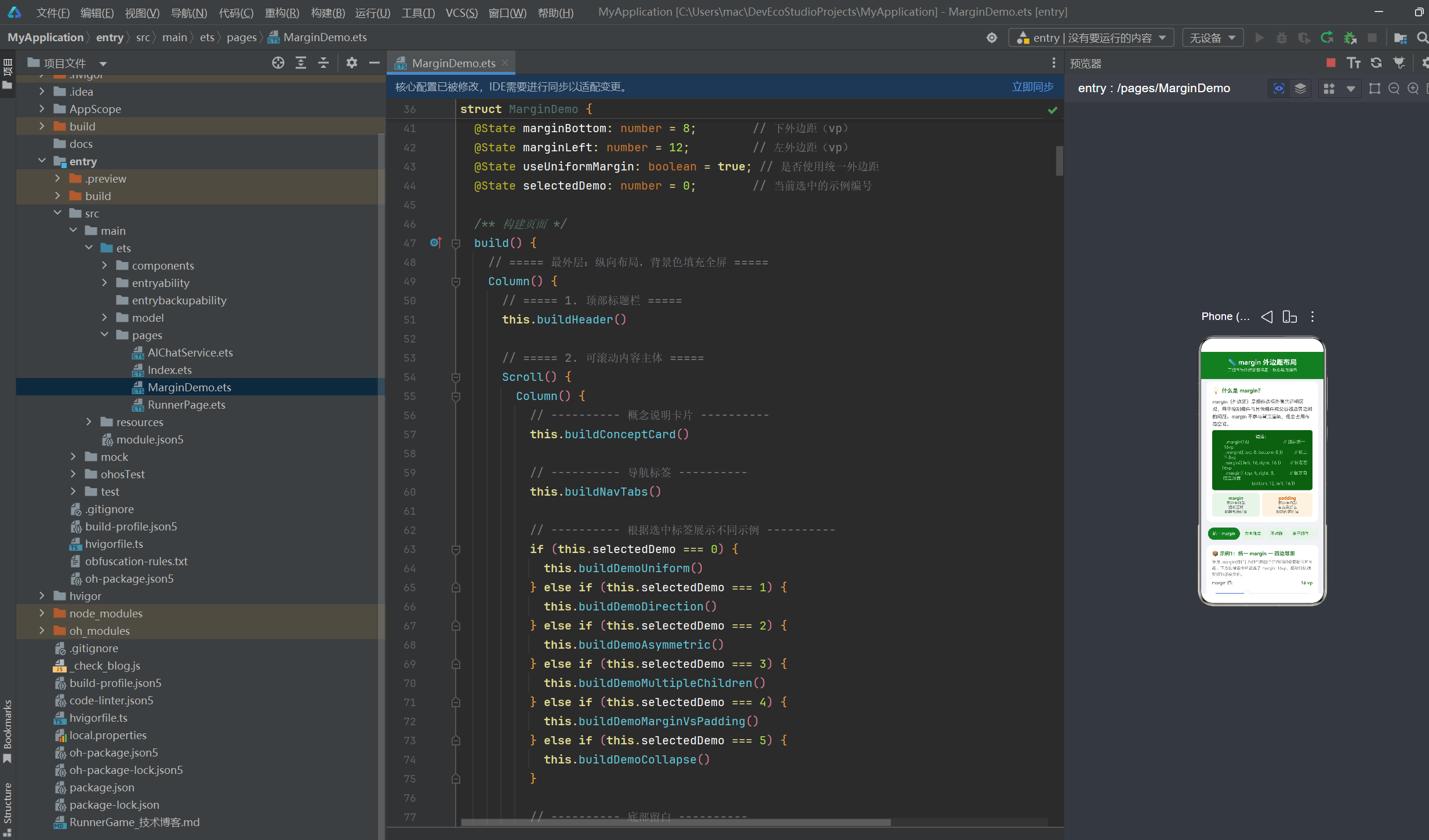
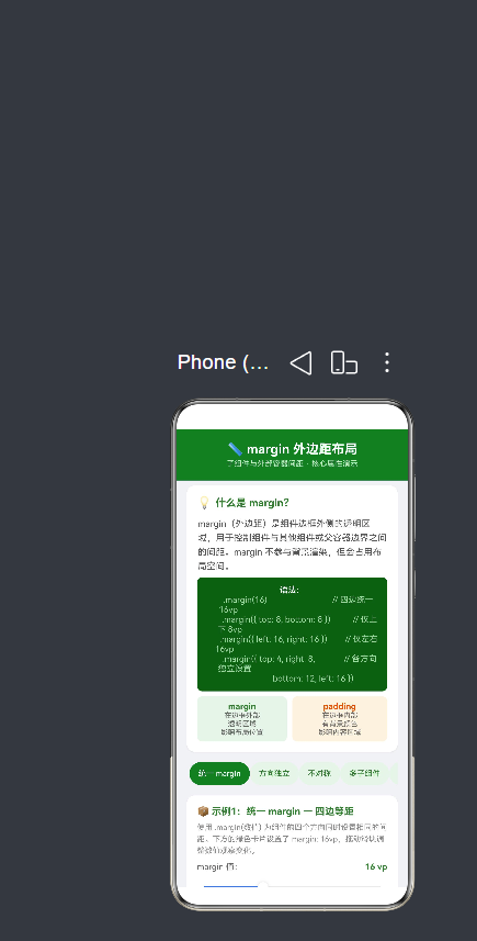
其中,margin 是布局系统中「定位」与「呼吸」的核心工具。本文将通过一个完整的可运行示例应用,从六个维度深入剖析 margin 的方方面面:统一设置、方向独立、不对称偏移、多子组件间距、与 padding 的对比、以及垂直 margin 折叠现象。
2. margin 在 ArkTS 布局体系中的位置
2.1 盒模型回顾
要理解 margin,必须先理解 ArkTS 的盒模型(Box Model)。每个组件在渲染时,从内到外由四层构成:
┌──────────────────────────────────────┐
│           Margin(外边距)             │  ← 透明,控制组件间距
│  ┌────────────────────────────────┐  │
│  │        Border(边框)           │  │  ← 可见边框线
│  │  ┌──────────────────────────┐  │  │
│  │  │     Padding(内边距)      │  │  │  ← 有背景色,控制内容缩进
│  │  │  ┌────────────────────┐  │  │  │
│  │  │  │   Content(内容)    │  │  │  │  ← 文本/图片/子组件
│  │  │  └────────────────────┘  │  │  │
│  │  └──────────────────────────┘  │  │
│  └────────────────────────────────┘  │
└──────────────────────────────────────┘
盒模型总宽度公式:
组件总宽度 = content.width + padding.left + padding.right
            + border.left + border.right + margin.left + margin.right
2.2 margin 在布局计算中的作用阶段
ArkTS 的布局引擎在渲染每一帧时,margin 在两个阶段起作用:
阶段一:测量(Measure)
父容器将可用空间传递给子组件。子组件的 margin 会从父容器的可用空间中「扣除」。如果一个父容器宽度是 300vp,子组件的 margin.left = 20 且 margin.right = 20,那么子组件的内容区域最大只有 260vp 可用。
阶段二:布局(Layout)
在确定了所有组件的内容尺寸后,布局引擎根据 margin 值确定每个组件的最终位置。margin 大的组件会被「推离」相邻组件或父容器边界。
2.3 margin 与百分比单位
在 API 24 中,margin 支持数值(vp)和百分比字符串:
typescript
// 固定值
.margin(16)

// 百分比(相对于父容器尺寸)
.margin('5%')
百分比的计算基准:
top和bottom的百分比基于父容器的高度left和right的百分比基于父容器的宽度
3. margin 核心概念与语法
3.1 基本语法
typescript
// 形式一:统一值 ------ 四个方向使用相同的间距
Component()
  .margin(16)               // top=right=bottom=left=16vp

// 形式二:对象语法 ------ 分别指定各方向
Component()
  .margin({
    top: 8,                  // 上边距 8vp
    right: 12,               // 右边距 12vp
    bottom: 8,               // 下边距 8vp
    left: 12                 // 左边距 12vp
  })

// 形式三:部分指定 ------ 仅设置需要的方向
Component()
  .margin({ left: 16, right: 16 })   // 仅水平方向
Component()
  .margin({ top: 8, bottom: 8 })     // 仅垂直方向
3.2 参数类型说明
| 参数 | 类型 | 示例 | 说明 |
|---|---|---|---|
| 单个数值 | number |
.margin(16) |
四边统一间距,单位 vp |
| 百分比字符串 | string |
.margin('5%') |
基于父容器尺寸的百分比 |
| 对象 | Margin |
.margin({ top: 8 }) |
分别指定各方向 |
| 对象中的单个值 | `number | string` | top: '2%' |
3.3 六条核心规则
规则一:margin 在边框外侧,不参与背景渲染
无论组件的 backgroundColor 是什么颜色,margin 区域始终是透明的。这是 margin 与 padding 最直观的区别。
规则二:margin 占用布局空间
虽然 margin 是透明的,但布局引擎会为其预留空间。这意味着 margin 越大,组件在布局中占据的总空间越大,相邻组件被推得越远。
规则三:margin 可以取负值
负 margin 会使组件向相反方向移动,甚至重叠到相邻组件上。这是一个高级技巧,可用于实现特殊布局效果。
规则四:未设置的 margin 方向默认为 0
使用对象语法时,只设置需要的方向即可,未设置的方向不会产生间距。
规则五:垂直 margin 会折叠(取最大值),水平 margin 叠加
这是 CSS 和 ArkTS 共有的特性,稍后在示例六中详细讲解。
规则六:margin 继承父容器的布局方向
在 Row 中,left/right margin 控制水平间距;在 Column 中,top/bottom margin 控制垂直间距。
4. margin vs padding 核心区别
在深入代码示例之前,有必要先彻底厘清 margin 和 padding 的区别。这是 ArkTS 初学者最容易混淆的概念。
| 对比维度 | margin | padding |
|---|---|---|
| 空间位置 | 边框外侧 | 边框内侧 |
| 背景颜色 | ✅ 透明,不参与渲染 | ❌ 有背景色,参与渲染 |
| 背景图 | 不覆盖 margin 区域 | 覆盖 padding 区域 |
| 影响布局 | 影响组件总尺寸 和位置 | 影响组件内容区域 |
| 点击事件 | 点击 margin 区域不触发组件事件 | 点击 padding 区域触发组件事件 |
| 负值 | 支持(使组件重叠) | 不支持 |
| 折叠 | 垂直方向会折叠 | 不会折叠 |
| 典型用途 | 组件之间的间距 | 内容与边框的间距 |
记忆口诀
margin 是「社交距离」 ------ 我和别人的距离,不关我的事(透明)。
padding 是「私人空间」------ 我家里的布置,由我做主(有背景)。
5. 示例一:统一 margin --- 四边等距
5.1 场景描述
最常见的 margin 用法是统一设置四个方向的间距。适用于卡片与容器边界之间的留白、按钮组与周围元素的间距等。
5.2 完整代码
typescript
/**
 * 示例1:统一 margin --- 四边等距
 * 核心:.margin(数值) 为组件四个方向同时设置相同间距
 */
@Builder
buildDemoUniform(): void {
  Column() {
    Text('📦 示例1:统一 margin --- 四边等距')
      .fontSize(15)
      .fontWeight(FontWeight.Bold)
      .fontColor('#2E7D32')
      .width('100%')
      .margin({ bottom: 6 })

    Text(
      '使用 .margin(数值) 为组件的四个方向同时设置相同的间距。' +
      '下方的绿色卡片设置了 margin: 16vp,拖动滑块调整数值观察变化。'
    )
      .fontSize(12)
      .fontColor('#888888')
      .lineHeight(18)
      .width('100%')
      .margin({ bottom: 10 })

    // 控制滑块
    Row() {
      Text('margin 值:')
        .fontSize(13)
        .fontColor('#666666')
      Text(this.marginAll.toFixed(0) + ' vp')
        .fontSize(13)
        .fontColor('#2E7D32')
        .fontWeight(FontWeight.Bold)
    }
    .width('100%')
    .justifyContent(FlexAlign.SpaceBetween)
    .margin({ bottom: 4 })

    Slider({
      value: this.marginAll,
      min: 0,
      max: 48,
      step: 4,
      style: SliderStyle.OutSet
    })
      .width('100%')
      .onChange((value: number) => {
        this.marginAll = value;
      })
      .margin({ bottom: 10 })

    // 可视化展示
    Column() {
      // 子组件
      Column() {
        Text('子组件')
          .fontSize(14)
          .fontWeight(FontWeight.Bold)
          .fontColor('#FFFFFF')
        Text('margin=' + this.marginAll.toFixed(0) + 'vp')
          .fontSize(11)
          .fontColor('#C8E6C9')
          .margin({ top: 4 })
        Text('↑ ' + this.marginAll.toFixed(0) + 'vp')
          .fontSize(10)
          .fontColor('#A5D6A7')
          .margin({ top: 8 })
      }
      .width(140)
      .height(80)
      .backgroundColor('#388E3C')
      .borderRadius(8)
      .justifyContent(FlexAlign.Center)
      .alignItems(HorizontalAlign.Center)
      // ★ 核心:统一 margin,四边间距相同
      .margin(this.marginAll)
    }
    .width('100%')
    .height(180)
    .backgroundColor('#E8F5E9')
    .borderRadius(12)
    .justifyContent(FlexAlign.Center)
    .alignItems(HorizontalAlign.Center)
    .margin({ bottom: 8 })

    // 标注说明
    Column() {
      Text(
        '← ' + this.marginAll.toFixed(0) + 'vp →    ↑ "子组件" ↑    ← ' +
        this.marginAll.toFixed(0) + 'vp →'
      )
        .fontSize(11)
        .fontColor('#388E3C')
        .textAlign(TextAlign.Center)
      Text('↓ ' + this.marginAll.toFixed(0) + 'vp')
        .fontSize(11)
        .fontColor('#388E3C')
        .width('100%')
        .textAlign(TextAlign.Center)
        .margin({ top: 2 })
    }
    .width('100%')
    .margin({ bottom: 4 })

    Text(
      '父容器(浅绿色背景)与子组件(深绿色)之间的空白区域就是 margin。' +
      'margin 值越大,子组件距父容器边界越远。'
    )
      .fontSize(11)
      .fontColor('#888888')
      .lineHeight(16)
      .width('100%')
      .textAlign(TextAlign.Center)
  }
  .width('100%')
  .backgroundColor('#FFFFFF')
  .borderRadius(12)
  .padding(16)
  .margin({ bottom: 12 })
  .shadow({ radius: 4, color: '#1A000000', offsetX: 0, offsetY: 2 })
}
5.3 关键解读
Column外层容器(backgroundColor: '#E8F5E9')模拟父容器边界- 内层
Column(backgroundColor: '#388E3C')是实际的子组件 .margin(this.marginAll)通过状态变量动态控制间距- Slider 从 0 到 48vp 步进 4vp,用户可以直观地逐级观察间距变化
- 当 margin 为 0 时,深绿色卡片紧贴浅绿色容器边缘
- 当 margin 增大到 48vp 时,卡片四周出现明显的透明间距
5.4 运行效果
| margin 值 | 视觉效果 | 说明 |
|---|---|---|
| 0vp | 卡片紧贴容器边缘 | 无呼吸空间,视觉拥挤 |
| 8vp | 卡片与容器有细微间隙 | 最小可接受间距 |
| 16vp | 明显的白色间距区域 | 推荐默认值,舒适 |
| 24vp | 间距占容器宽度 1/3 左右 | 适合强调卡片独立性的设计 |
| 32vp+ | 卡片显著缩小,间距占主导 | 用于特殊强调或嵌套布局 |
5.5 实际应用场景
统一 margin 最常见的用法是卡片组件的容器间距:
typescript
@Component
struct Card {
  build() {
    Column() {
      // 卡片内容
    }
    .width('100%')
    .backgroundColor('#FFFFFF')
    .borderRadius(16)
    .margin(16)  // 卡片与屏幕边缘保持 16vp 间距
  }
}
6. 示例二:方向独立 margin --- 分别控制各边
6.1 场景描述
在实际 UI 开发中,很少情况下四个方向的间距完全相同。更多的场景是:顶部间距需要小一点、底部间距需要大一点、左右不对称等。margin({ top, right, bottom, left }) 对象语法就是为了解决这类问题。
6.2 完整代码
typescript
/**
 * 示例2:方向独立 margin --- 分别控制各边
 * 核心:.margin({ top, right, bottom, left }) 对象语法
 */
@Builder
buildDemoDirection(): void {
  Column() {
    Text('📦 示例2:方向独立 margin --- 分别控制各边')
      .fontSize(15)
      .fontWeight(FontWeight.Bold)
      .fontColor('#2E7D32')
      .width('100%')
      .margin({ bottom: 6 })

    Text(
      '使用 .margin({ top, right, bottom, left }) 对象语法,' +
      '为每个方向独立设置外边距。下方的橙色卡片各方向间距不同。'
    )
      .fontSize(12)
      .fontColor('#888888')
      .lineHeight(18)
      .width('100%')
      .margin({ bottom: 10 })

    // 四个方向独立滑块(省略重复代码,详见完整源码)
    // ... top / right / bottom / left 各一个 Slider ...

    Column() {
      Column() {
        Text('子组件')
          .fontSize(14)
          .fontWeight(FontWeight.Bold)
          .fontColor('#FFFFFF')
        Text(
          'T:' + this.marginTop.toFixed(0) +
          ' R:' + this.marginRight.toFixed(0) +
          ' B:' + this.marginBottom.toFixed(0) +
          ' L:' + this.marginLeft.toFixed(0)
        )
          .fontSize(10)
          .fontColor('#FFE0B2')
          .margin({ top: 4 })
      }
      .width(120)
      .height(70)
      .backgroundColor('#E65100')
      .borderRadius(8)
      .justifyContent(FlexAlign.Center)
      .alignItems(HorizontalAlign.Center)
      // ★ 核心:各方向独立 margin
      .margin({
        top: this.marginTop,
        right: this.marginRight,
        bottom: this.marginBottom,
        left: this.marginLeft
      })
    }
    .width('100%')
    .height(180)
    .backgroundColor('#FFF3E0')
    .borderRadius(12)
    .justifyContent(FlexAlign.Center)
    .alignItems(HorizontalAlign.Center)
    .margin({ bottom: 8 })

    Text(
      '四个方向的 margin 完全独立,橙色卡片与浅橙色父容器边界的距离' +
      '在各方向上各不相同。这在实际布局中非常灵活实用。'
    )
      .fontSize(11)
      .fontColor('#888888')
      .lineHeight(16)
      .width('100%')
      .textAlign(TextAlign.Center)
  }
  .width('100%')
  .backgroundColor('#FFFFFF')
  .borderRadius(12)
  .padding(16)
  .margin({ bottom: 12 })
  .shadow({ radius: 4, color: '#1A000000', offsetX: 0, offsetY: 2 })
}
6.3 关键解读
- 四个方向各有独立的
@State变量:marginTop、marginRight、marginBottom、marginLeft - 每个方向独立 Slider 控制,互不干扰
- 子组件的
.margin()传入包含四个属性的对象 - 橙色卡片周围可以看到各方向间距不同的效果
6.4 实际应用场景
typescript
// 表单布局:表单项上下间距小,左右间距大
Column() {
  ForEach(formItems, (item: FormItem) => {
    Text(item.label)
      .margin({ top: 4, bottom: 4, left: 16, right: 16 })
  })
}

// 底部操作栏:左右有边距,底部无边距(贴边)
Row() {
  Button('取消')
  Button('确认')
}
.margin({ left: 16, right: 16, bottom: 0 })
7. 示例三:不对称 margin --- 视觉偏移与对齐
7.1 场景描述
不对称 margin 是实现「靠左对齐」、「居中对齐」、「靠右对齐」等视觉效果的利器。通过为组件设置不对称的左右或上下 margin,可以让组件在布局中产生视觉偏移。
7.2 完整代码
typescript
/**
 * 示例3:不对称 margin --- 利用 margin 实现视觉偏移
 * 核心:通过不对称的 left/right margin 控制组件对齐
 */
@Builder
buildDemoAsymmetric(): void {
  Column() {
    // ... 标题与说明 ...

    Row() {
      // 卡片:"靠左" --- 右 margin 大,把右侧组件推远
      Column() {
        Text('靠左')
          .fontSize(12)
          .fontWeight(FontWeight.Medium)
          .fontColor('#FFFFFF')
      }
      .width(60)
      .height(60)
      .backgroundColor('#1565C0')
      .borderRadius(8)
      .justifyContent(FlexAlign.Center)
      .alignItems(HorizontalAlign.Center)
      // ★ 核心:右 margin 40vp,把后面的组件向右推
      .margin({ right: 40 })
      .border({ width: 1, color: '#1565C0' })

      // 卡片:"居中" --- 左右对称 margin
      Column() {
        Text('居中')
          .fontSize(12)
          .fontWeight(FontWeight.Medium)
          .fontColor('#FFFFFF')
      }
      .width(60)
      .height(60)
      .backgroundColor('#1976D2')
      .borderRadius(8)
      .justifyContent(FlexAlign.Center)
      .alignItems(HorizontalAlign.Center)
      // ★ 核心:左右对称 margin 10vp
      .margin({ left: 10, right: 10 })
      .border({ width: 1, color: '#1976D2' })

      // 卡片:"靠右" --- 左 margin 大,把自己向右推
      Column() {
        Text('靠右')
          .fontSize(12)
          .fontWeight(FontWeight.Medium)
          .fontColor('#FFFFFF')
      }
      .width(60)
      .height(60)
      .backgroundColor('#1E88E5')
      .borderRadius(8)
      .justifyContent(FlexAlign.Center)
      .alignItems(HorizontalAlign.Center)
      // ★ 核心:左 margin 40vp,把自己向右推
      .margin({ left: 40 })
      .border({ width: 1, color: '#1E88E5' })
    }
    .width('100%')
    .justifyContent(FlexAlign.Center)
    .padding(12)
    .backgroundColor('#E3F2FD')
    .borderRadius(10)
    .margin({ bottom: 8 })

    // ... 说明文字 ...
  }
  // ...
}
7.3 不对称 margin 的原理
三个蓝色卡片尺寸完全相同(60vp × 60vp),但通过不同的 margin 策略实现了不同的对齐效果:
靠左卡片:margin-right: 40
  ┌──────┐← 40vp →┌──────┐← 10vp →┌──────┐
  │ 靠左  │        │ 居中  │         │ 靠右  │
  └──────┘        └──────┘         └──────┘
                          ← 40vp →│
                                   └── 左 margin 把自己向右推
靠左 :margin-right: 40 → 卡片本身靠左排列,但右侧的 40vp 间距将「居中」卡片推离。
居中 :margin-left: 10, margin-right: 10 → 左右对称的 margin 使卡片在水平方向上处于相对居中的位置。
靠右 :margin-left: 40 → 卡片左侧的 40vp 间距将其自身向右推,视觉上靠右排列。
7.4 实际应用:按钮组间距控制
typescript
// 对话框底部按钮组 ------ 取消靠左,确认靠右
Row() {
  Button('取消')
    .margin({ right: 60 })   // 将确认按钮向右推

  Button('确认')
    .type(ButtonType.Capsule)
    .backgroundColor('#2E7D32')
    .fontColor(Color.White)
}
.width('100%')
.justifyContent(FlexAlign.Center)
8. 示例四:多子组件间的 margin --- 列表间距控制
8.1 场景描述
在列表布局(Column / List)中,每个列表项之间的间距是 UI 设计的核心考量之一。间距太小则视觉拥挤,间距太大则信息密度过低。通过 margin-bottom 控制列表项间距是一种标准做法。
8.2 完整代码核心片段
typescript
/**
 * 示例4:多子组件间的 margin --- 垂直列表中控制间距
 * 核心:每个子项使用 margin-bottom 控制与下一项的间距
 */
@Builder
buildDemoMultipleChildren(): void {
  Column() {
    // ... 标题与滑块 ...

    // 卡片 1:margin-bottom 由滑块控制
    Row() {
      // 圆形索引
      Column() {
        Text('1')
          .fontSize(18)
          .fontWeight(FontWeight.Bold)
          .fontColor('#FFFFFF')
      }
      .width(40)
      .height(40)
      .backgroundColor('#43A047')
      .borderRadius(20)
      .justifyContent(FlexAlign.Center)
      .margin({ right: 12 })

      // 文字内容
      Column() {
        Text('第一项')
          .fontSize(14)
          .fontWeight(FontWeight.Medium)
          .fontColor('#333333')
        Text('每个子项通过 margin-bottom 控制间距')
          .fontSize(11)
          .fontColor('#888888')
          .margin({ top: 2 })
      }
      .alignItems(HorizontalAlign.Start)
    }
    .width('100%')
    .padding(12)
    .backgroundColor('#F1F8E9')
    .borderRadius(8)
    .border({ width: 1, color: '#C5E1A5' })
    // ★ 核心:子项之间的间距
    .margin({ bottom: this.marginBottom })

    // 卡片 2, 3, 4 结构相同,省略...

    // 卡片 4(最后一项 margin-bottom: 0)
    Row() {
      // ...
    }
    .width('100%')
    .padding(12)
    .backgroundColor('#F1F8E9')
    .borderRadius(8)
    .border({ width: 1, color: '#C5E1A5' })
    .margin({ bottom: 0 })   // 最后一项不需要底部间距

    // ... 说明文字 ...
  }
  // ...
}
8.3 列表间距设计原则
原则一:最后一项 margin-bottom 应为 0
列表的最后一项与父容器底部之间不应再有多余的间距,否则会造成底部视觉空洞。
原则二:间距一致性
同一个列表中的所有项之间的间距应保持一致。在上面的示例中,所有卡片通过同一个 this.marginBottom 状态变量控制间距。
原则三:间距的数值选择
| 间距值 | 效果 | 适用场景 |
|---|---|---|
| 0~4vp | 几乎无间距,紧凑排列 | 表格、数据密集列表 |
| 8vp | 微弱的呼吸感 | 设置项、表单行 |
| 12~16vp | 明显的分组感 | 新闻列表、商品列表 |
| 20vp+ | 强烈的区块感 | 卡片流、瀑布流 |
8.4 真实项目中的应用
typescript
@Component
struct NewsList {
  @State items: NewsItem[] = [];

  build() {
    Column() {
      List() {
        ForEach(this.items, (item: NewsItem, index: number) => {
          ListItem() {
            NewsCard({ data: item })
          }
          // 列表项之间的间距
          .margin({ bottom: index === this.items.length - 1 ? 0 : 12 })
        })
      }
      .width('100%')
    }
  }
}
9. 示例五:margin vs padding 对比演示
9.1 场景描述
margin 和 padding 是最容易被混淆的两个属性。为了直观展示它们的区别,我们并排展示两个组件------一个使用 margin 控制间距,另一个使用 padding 控制间距------并通过相同的数字值进行对比。
9.2 完整代码
typescript
/**
 * 示例5:margin vs padding --- 对比演示
 * 核心:margin 在边框外透明,padding 在边框内有背景
 */
@Builder
buildDemoMarginVsPadding(): void {
  Column() {
    Text('📦 示例5:margin vs padding --- 对比演示')
      .fontSize(15)
      .fontWeight(FontWeight.Bold)
      .fontColor('#2E7D32')
      .width('100%')
      .margin({ bottom: 6 })

    Text(
      'margin 和 padding 是 ArkTS 布局中两个最易混淆的属性。' +
      'margin 在边框外部(透明,不参与背景),padding 在边框内部(参与背景)。' +
      '下方左右对比一目了然。'
    )
      .fontSize(12)
      .fontColor('#888888')
      .lineHeight(18)
      .width('100%')
      .margin({ bottom: 10 })

    // 间距控制滑块
    Row() {
      Text('间距值:')
        .fontSize(13)
        .fontColor('#666666')
      Blank()
      Text(this.marginAll.toFixed(0) + ' vp')
        .fontSize(13)
        .fontColor('#2E7D32')
        .fontWeight(FontWeight.Bold)
    }
    .width('100%')
    .margin({ bottom: 2 })

    Slider({
      value: this.marginAll, min: 0, max: 40, step: 2,
      style: SliderStyle.OutSet
    })
      .width('100%')
      .onChange((value: number) => { this.marginAll = value; })
      .margin({ bottom: 10 })

    // 左右对比 Row
    Row() {
      // ===== 左侧:margin 示例 =====
      Column() {
        Column() {
          Text('margin')
            .fontSize(14).fontWeight(FontWeight.Bold)
            .fontColor('#FFFFFF')
          Text('位于边框外部').fontSize(10)
            .fontColor('#C8E6C9').margin({ top: 4 })
          Text('背景不延伸过去').fontSize(10)
            .fontColor('#A5D6A7')
          Text('值=' + this.marginAll.toFixed(0) + 'vp')
            .fontSize(10).fontColor('#A5D6A7')
            .margin({ top: 2 })
        }
        .width('100%').height(80)
        .backgroundColor('#388E3C')
        .borderRadius(6)
        .justifyContent(FlexAlign.Center)
        .alignItems(HorizontalAlign.Center)
        // ★ 核心:margin → 背景在边框内部
        .margin(this.marginAll)
        .border({ width: 2, color: '#FFEB3B' })
      }
      .layoutWeight(1)
      .backgroundColor('#E8F5E9')
      .borderRadius(10)
      .justifyContent(FlexAlign.Center)
      .alignItems(HorizontalAlign.Center)
      .padding(8)
      .margin({ right: 8 })

      // ===== 右侧:padding 示例 =====
      Column() {
        Column() {
          Text('padding')
            .fontSize(14).fontWeight(FontWeight.Bold)
            .fontColor('#FFFFFF')
          Text('位于边框内部').fontSize(10)
            .fontColor('#FFE0B2').margin({ top: 4 })
          Text('背景一起延伸').fontSize(10)
            .fontColor('#FFE0B2')
          Text('值=' + this.marginAll.toFixed(0) + 'vp')
            .fontSize(10).fontColor('#FFE0B2')
            .margin({ top: 2 })
        }
        .width('100%').height(80)
        .backgroundColor('#E65100')
        .borderRadius(6)
        .justifyContent(FlexAlign.Center)
        .alignItems(HorizontalAlign.Center)
        // ★ 核心:padding → 背景延伸到间距区域
        .padding(this.marginAll)
        .border({ width: 2, color: '#FFEB3B' })
      }
      .layoutWeight(1)
      .backgroundColor('#FFF3E0')
      .borderRadius(10)
      .justifyContent(FlexAlign.Center)
      .alignItems(HorizontalAlign.Center)
      .padding(8)
    }
    .width('100%')
    .margin({ bottom: 8 })

    // 解释说明
    // ...
  }
  // ...
}
9.3 关键观察
在这个对比实验中,拖动滑块同步调整两边的间距值:
左侧 margin 组(绿色卡片):
- 黄色边框 = 组件边界
- 深绿色背景 只覆盖到黄色边框内侧
- 黄色边框外侧的浅绿色区域 = margin 区域(透明,深绿色背景不延伸过去)
- 随着
marginAll增大,黄色边框向内「收缩」,卡片(深绿色区域)缩小
右侧 padding 组(橙色卡片):
- 黄色边框 = 组件边界
- 深橙色背景 覆盖到黄色边框内侧,包括 padding 区域
- 黄色边框外侧的半透明橙色区域 = 父容器的背景色
- 随着
marginAll增大,黄色边框向外「扩张」,卡片(橙色区域)不变,但内容区域缩水
9.4 一句话区分
margin 让组件「变小、靠边」,padding 让内容「缩水、靠里」。
10. 示例六:margin 折叠现象详解
10.1 什么是 margin 折叠?
margin 折叠(Collapse)是指:在垂直布局中,两个相邻兄弟组件之间的垂直 margin 不会累加,而是取两者中的较大值作为最终间距。
这是一个非常容易踩坑的特性,也是许多初学者感到困惑的地方。
10.2 完整代码
typescript
/**
 * 示例6:margin 折叠现象 --- 垂直间距取最大值
 * 核心:margin-bottom + margin-top = max(bottom, top),非两者之和
 */
@Builder
buildDemoCollapse(): void {
  Column() {
    Text('📦 示例6:margin 折叠现象 --- 垂直间距取最大值')
      .fontSize(15)
      .fontWeight(FontWeight.Bold)
      .fontColor('#2E7D32')
      .width('100%')
      .margin({ bottom: 6 })

    Text(
      '在垂直布局中,两个相邻兄弟组件的垂直 margin 会发生折叠(collapse),' +
      '最终间距取两者中的较大值,而非两者之和。' +
      '水平方向上 margin 不会折叠,而是叠加。'
    )
      .fontSize(12)
      .fontColor('#888888')
      .lineHeight(18)
      .width('100%')
      .margin({ bottom: 10 })

    // 折叠演示
    Column() {
      // 上方卡片:margin-bottom: 20
      Column() {
        Text('上方卡片')
          .fontSize(13)
          .fontWeight(FontWeight.Medium)
          .fontColor('#FFFFFF')
        Text('margin-bottom = 20vp')
          .fontSize(10)
          .fontColor('#BBDEFB')
          .margin({ top: 4 })
      }
      .width('100%')
      .height(50)
      .backgroundColor('#1565C0')
      .borderRadius(6)
      .justifyContent(FlexAlign.Center)
      .alignItems(HorizontalAlign.Center)
      // ★ 下 margin 20vp
      .margin({ bottom: 20 })

      // 下方卡片:margin-top: 30
      Column() {
        Text('下方卡片')
          .fontSize(13)
          .fontWeight(FontWeight.Medium)
          .fontColor('#FFFFFF')
        Text('margin-top = 30vp')
          .fontSize(10)
          .fontColor('#FFE0B2')
          .margin({ top: 4 })
      }
      .width('100%')
      .height(50)
      .backgroundColor('#E65100')
      .borderRadius(6)
      .justifyContent(FlexAlign.Center)
      .alignItems(HorizontalAlign.Center)
      // ★ 上 margin 30vp
      .margin({ top: 30 })
    }
    .width('100%')
    .padding(12)
    .backgroundColor('#F5F5F5')
    .borderRadius(10)
    .margin({ bottom: 8 })

    // 标注说明
    Column() {
      Text(
        '蓝色卡片 margin-bottom: 20vp  +  橙色卡片 margin-top: 30vp' +
        '\n→ 实际间距 = max(20, 30) = 30vp(并非 20+30=50vp)'
      )
        .fontSize(11)
        .fontColor('#333333')
        .lineHeight(18)

      Text('')
        .fontSize(4)

      Text('这就是 margin 折叠:垂直方向取较大值,不累加。')
        .fontSize(11)
        .fontColor('#D32F2F')
        .fontWeight(FontWeight.Bold)
    }
    .width('100%')
    .padding(10)
    .backgroundColor('#FFF8E1')
    .borderRadius(8)
    .border({ width: 1, color: '#FFE082' })
  }
  // ...
}
10.3 折叠规则详解
规则:垂直方向 margin 折叠,水平方向不折叠
垂直方向(Column 中):
  ┌─────────────┐
  │  组件 A      │
  │  margin-bottom: 20  │
  └─────────────┘
        ↓            实际间距 = max(20, 30) = 30
        ↓            (不是 20 + 30 = 50)
  ┌─────────────┐
  │  margin-top: 30    │
  │  组件 B      │
  └─────────────┘

水平方向(Row 中):
  ┌──────┐          ┌──────┐
  │  A   │ margin-right: 20  │  B   │
  └──────┘          └──────┘
        ←------ 20 + 30 = 50 ------→   实际间距 = 两者之和
        ← margin-right → ← margin-left →
10.4 哪些情况下会发生折叠?
| 场景 | 是否折叠 | 说明 |
|---|---|---|
| 相邻兄弟组件 | ✅ 折叠 | Column 中两个子组件相邻时 |
| 父容器与第一个/最后一个子组件 | ✅ 折叠 | 父容器无 padding/border 时 |
| 空元素(无内容、无 padding、无 height) | ✅ 折叠 | 高度为 0 的元素上下 margin 会折叠 |
| 浮动元素 | ❌ 不折叠 | 不在普通文档流中 |
| 有 padding 或 border 的父容器 | ❌ 不折叠 | padding/border 阻止了折叠传递 |
| 水平方向(Row) | ❌ 不折叠 | 水平 margin 总是叠加 |
10.5 如何避免 margin 折叠?
在实际开发中,margin 折叠有时会导致意料之外的布局。以下方法可以阻止折叠:
typescript
// 方法1:给父容器加 padding
Column() {
  // 子组件
}
.padding(1)  // 哪怕 1vp padding 也可以阻止折叠

// 方法2:给父容器加 border
Column() {
  // 子组件
}
.border({ width: 1, color: '#00000000' })  // 透明边框也可以

// 方法3:只使用 margin-bottom,不使用 margin-top
// 所有子组件统一用 margin-bottom 控制间距,最后一项设为 0
11. margin 布局最佳实践
11.1 最佳实践一:统一使用 margin-bottom 控制列表间距
typescript
// ✅ 推荐:所有子项统一使用 margin-bottom
Column() {
  ForEach(items, (item: Item, index: number) => {
    ItemCard({ data: item })
      .margin({ bottom: index === items.length - 1 ? 0 : 12 })
  })
}
这样可以避免 margin 折叠带来的不确定行为,而且代码简洁明了。
11.2 最佳实践二:使用 margin 实现组件之间的视觉分组
typescript
// 表单分区
Column() {
  // 个人信息区
  Column() {
    TextInput({ placeholder: '姓名' })
    TextInput({ placeholder: '年龄' })
  }
  .margin({ bottom: 24 })  // 与下一区间隔更大

  // 账户信息区
  Column() {
    TextInput({ placeholder: '用户名' })
    TextInput({ placeholder: '密码' })
  }
  .margin({ bottom: 24 })
}分区内部的间距(812vp)应小于分区之间的间距(2032vp),形成清晰的视觉层次。
11.3 最佳实践三:避免在弹性布局中过度使用 margin
在 Flex 或 Row 的弹性布局中,如果使用了 layoutWeight 进行空间分配,再使用大 margin 可能导致布局异常:
typescript
// ❌ 不推荐:layoutWeight + margin 混用可能导致计算异常
Row() {
  Text('A').layoutWeight(1)
    .margin({ right: 40 })   // 40vp 的 margin 会从弹性空间外扣除
  Text('B').layoutWeight(1)
}

// ✅ 推荐:使用 padding 代替,或调整权重
Row() {
  Text('A').layoutWeight(1)
  Text('B').layoutWeight(1)
}
.padding({ left: 16, right: 16 })
11.4 最佳实践四:margin 与布局容器的配合
typescript
// 水平居中:结合父容器的 alignItems
Row() {
  Button('确定')
    .margin({ left: 16, right: 16 })
}
.width('100%')
.justifyContent(FlexAlign.Center)  // 配合 justifyContent 实现居中

// 垂直居中
Column() {
  Button('确定')
    .margin({ top: 16, bottom: 16 })
}
.width('100%')
.height(200)
.justifyContent(FlexAlign.Center)
11.5 最佳实践五:使用负 margin 实现特殊效果
typescript
// 负 margin 实现叠加效果(使用需谨慎)
Row() {
  Column() {
    // 头像 1
  }
  .width(40).height(40)
  .borderRadius(20)
  .backgroundColor('#1976D2')
  .margin({ right: -10 })  // 负 margin 让下一个头像重叠过来

  Column() {
    // 头像 2
  }
  .width(40).height(40)
  .borderRadius(20)
  .backgroundColor('#388E3C')
  .margin({ right: -10 })

  Column() {
    // 头像 3
  }
  .width(40).height(40)
  .borderRadius(20)
  .backgroundColor('#D32F2F')
}
11.6 常见错误汇总
| 错误 | 后果 | 正确做法 |
|---|---|---|
| 所有子项同时用 margin-bottom 和 margin-top | 间距变成预期的两倍 | 统一使用 margin-bottom |
| 忘记最后一项设 margin-bottom: 0 | 底部多出一块空白 | 最后一项设 0 或由父容器 padding 控制 |
| 在固定宽度的组件上设大 margin | 组件可能溢出父容器 | 使用 constraintSize 限制最大尺寸 |
| margin 和 padding 混淆使用 | 间距颜色不对、点击区域异常 | 牢记「margin 透明,padding 有背景」 |
12. 总结与速查表
12.1 margin API 速查表
| 调用方式 | 效果 | 典型场景 |
|---|---|---|
.margin(16) |
四边统一 16vp | 卡片容器、按钮组 |
.margin({ top: 8 }) |
仅上方 8vp | 标题与内容的间距 |
.margin({ left: 16, right: 16 }) |
仅左右 16vp | 水平列表项、表单 |
.margin({ top: 4, bottom: 4 }) |
仅上下 4vp | 紧凑列表、标签行 |
.margin({ top: 8, left: 16 }) |
上 8vp + 左 16vp | 不对称布局 |
.margin(-8) |
四边负 8vp(重叠) | 头像叠加、特殊效果 |
12.2 六条黄金法则
- margin 透明,padding 有背景 ------ 区分两者的根本标准
- 垂直 margin 折叠 ------ 取最大值,不求和,切记
- 最后一项 margin-bottom: 0 ------ 列表布局的基本修养
- 统一方向 ------ 要么全用 margin-bottom,要么全用 margin-top,不要混用
- 不对称 margin 实现偏移 ------
margin-left: x靠右,margin-right: x靠左 - 负 margin 谨慎使用 ------ 强大但容易失控
12.3 一句话记住 margin
margin 是组件之间的「社交距离」------ 透明、占用空间、垂直方向会相互谦让(折叠取最大值)。
12.4 完整示例项目入口
typescript
// entryability/EntryAbility.ets
import { AbilityConstant, UIAbility, Want } from '@kit.AbilityKit';
import { window } from '@kit.ArkUI';

export default class EntryAbility extends UIAbility {
  onWindowStageCreate(windowStage: window.WindowStage): void {
    windowStage.loadContent('pages/MarginDemo', (err) => {
      if (err.code) {
        console.error('Failed to load content: ' + JSON.stringify(err));
        return;
      }
    });
  }
}
将此 EntryAbility 指向 pages/MarginDemo.ets,运行应用即可交互体验全部六个示例。
12.5 延伸思考
margin 是 ArkTS 布局系统中「间距控制」的基石。掌握了 margin 之后,可以进一步学习与之配合的布局方式:
- padding --- 内边距,控制内容与组件边界的间距
- constraintSize --- 尺寸约束,与 margin 配合控制组件不越界
- layoutWeight --- 弹性权重,与 margin 配合实现自适应间距
- flexBasis --- Flex 项目的基础尺寸
在 ArkTS 的布局体系中,margin、padding、border 三者共同构成了盒模型的完整间距控制能力。理解了三者的协作关系,就能应对绝大多数 UI 布局需求。