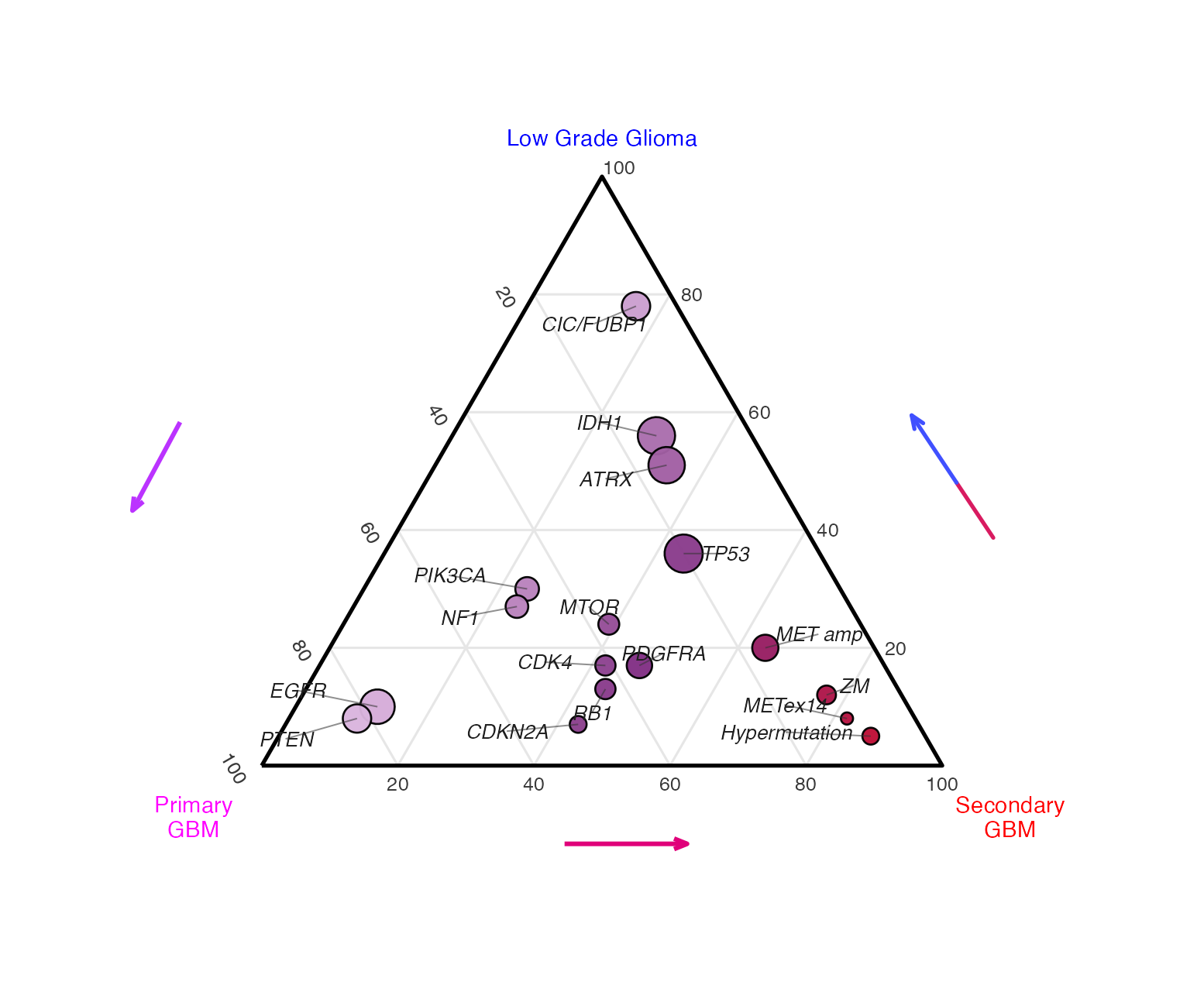
三元图适合展示一个事件在三个类别之间的组成倾向。这里每个点代表一个基因或突变事件,位置由 Low Grade Glioma、Primary GBM 和 Secondary GBM 三组比例共同决定。
图片来源
| 项目 | 内容 |
|---|---|
| 文章 | Mutational Landscape of Secondary Glioblastoma Guides MET-Targeted Trial in Brain Tumor |
| 期刊/年份 | Cell, 2018 |
| 图号 | Figure 1B |
| DOI/链接 | https://doi.org/10.1016/j.cell.2018.09.038 |
这张图用三元坐标把不同基因改变在低级别胶质瘤、原发 GBM、继发 GBM 中的相对富集方向放到同一个三角形里,非常适合做"三组组成比例"的可视化复现。
图片解读
这是一张 ternary plot,三元比例图。
三角形三个顶点分别代表三个类别:
| 顶点 | 含义 |
|---|---|
| 顶部 | Low Grade Glioma |
| 左下角 | Primary GBM |
| 右下角 | Secondary GBM |
每个点代表一个基因改变或分子事件。点越靠近某个顶点,说明它在该类别中的比例越高。点的大小可以映射事件强度、频率或重要性;点的颜色可以映射其中一个类别的比例,例如 Secondary GBM 占比。
输入数据
输入数据需要是长表,每一行代表一个基因或事件,三组比例相加最好为 100。
| 列名 | 含义 |
|---|---|
alteration |
基因或事件名称 |
low_grade_glioma |
Low Grade Glioma 中的比例 |
primary_gbm |
Primary GBM 中的比例 |
secondary_gbm |
Secondary GBM 中的比例 |
score |
点大小映射值 |
label_dx |
标签横向微调 |
label_dy |
标签纵向微调 |
r
library(tidyverse)

dat <- read_csv("input_data.csv", show_col_types = FALSE)
需要示例数据的后台 添加小编 领取,调整好数据结构,以下代码可以直接复制粘贴运行。
第一步:把三组比例转换成三角坐标
三元图本质上是把三个比例映射到一个等边三角形中。这里不依赖额外三元图包,直接用坐标变换完成。
r
tri_h <- sqrt(3) / 2

to_xy <- function(low_grade_glioma, primary_gbm, secondary_gbm) {
  total <- low_grade_glioma + primary_gbm + secondary_gbm

  tibble(
    x = (secondary_gbm + 0.5 * low_grade_glioma) / total,
    y = tri_h * low_grade_glioma / total
  )
}

point_df <- bind_cols(
  dat,
  to_xy(dat$low_grade_glioma, dat$primary_gbm, dat$secondary_gbm)
) |>
  mutate(
    lab_x = x + label_dx,
    lab_y = y + label_dy
  )
第二步:绘制三角边框和内部网格
三元图的阅读依赖网格线。这里分别绘制三个方向的 20、40、60、80 辅助线。
r
triangle <- tibble(
  x = c(0, 1, 0.5, 0),
  y = c(0, 0, tri_h, 0)
)

make_seg <- function(type, value, start, end) {
  tibble(
    type = type,
    value = value,
    x = start$x,
    y = start$y,
    xend = end$x,
    yend = end$y
  )
}

grid_df <- purrr::map_dfr(seq(20, 80, by = 20), function(v) {
  bind_rows(
    make_seg("low", v, to_xy(v, 100 - v, 0), to_xy(v, 0, 100 - v)),
    make_seg("primary", v, to_xy(100 - v, v, 0), to_xy(0, v, 100 - v)),
    make_seg("secondary", v, to_xy(100 - v, 0, v), to_xy(0, 100 - v, v))
  )
})
第三步:添加刻度、顶点标签和方向箭头
顶点标签用不同颜色强调三个类别,方向箭头用于提示三组比例变化趋势。
r
tick_low <- tibble(value = seq(20, 80, by = 20))
tick_low <- bind_cols(tick_low, to_xy(tick_low$value, 100 - tick_low$value, 0)) |>
  mutate(label = as.character(value), angle = -60, x = x - 0.045, y = y)

tick_primary <- tibble(value = seq(20, 100, by = 20))
tick_primary <- bind_cols(tick_primary, to_xy(0, tick_primary$value, 100 - tick_primary$value)) |>
  mutate(label = as.character(value), angle = 55, x = x - 0.018, y = y - 0.040)

tick_secondary <- tibble(value = seq(20, 100, by = 20))
tick_secondary <- bind_cols(tick_secondary, to_xy(0, 100 - tick_secondary$value, tick_secondary$value)) |>
  mutate(label = as.character(value), angle = 0, x = x, y = y - 0.043)

axis_lab <- tribble(
  ~label,             ~x,    ~y,       ~col,       ~hjust,
  "Low Grade Glioma", 0.50,  tri_h + .045, "blue",     0.5,
  "Primary\nGBM",    -0.085, -0.055,   "magenta",  0.5,
  "Secondary\nGBM",   1.085, -0.055,   "red",      0.5
)

arrow_df <- tribble(
  ~x,    ~y,    ~xend, ~yend, ~col,
  -0.11, 0.46, -0.23, 0.30,  "#bb33ff",
   0.50,-0.11,  0.72,-0.11,  "#e0007a",
   1.10, 0.30,  0.94, 0.47,  "#4050ff",
   1.10, 0.30,  1.21, 0.17,  "#d81b60"
)
第四步:叠加突变点和基因标签
点的位置由三组比例决定,点大小用 score 控制,颜色用 secondary_gbm 控制。标签可以通过 label_dx 和 label_dy 做局部微调。
r
p <- ggplot() +
  geom_segment(
    data = grid_df,
    aes(x, y, xend = xend, yend = yend),
    color = "#e6e6e6",
    linewidth = 0.25
  ) +
  geom_path(data = triangle, aes(x, y), linewidth = 0.42, color = "black") +
  geom_text(
    data = bind_rows(tick_low, tick_primary, tick_secondary),
    aes(x, y, label = label, angle = angle),
    size = 1.80,
    color = "#3a3a3a"
  ) +
  geom_curve(
    data = arrow_df,
    aes(x, y, xend = xend, yend = yend, color = col),
    curvature = 0,
    linewidth = 0.60,
    arrow = arrow(length = unit(0.055, "inches")),
    show.legend = FALSE
  ) +
  geom_point(
    data = point_df,
    aes(x, y, size = score, fill = secondary_gbm),
    shape = 21,
    color = "black",
    stroke = 0.32,
    alpha = 0.96
  ) +
  geom_segment(
    data = point_df,
    aes(x, y, xend = lab_x, yend = lab_y),
    color = "#333333",
    linewidth = 0.16,
    alpha = 0.55
  ) +
  geom_text(
    data = point_df,
    aes(lab_x, lab_y, label = alteration),
    size = 2.05,
    fontface = "italic",
    color = "#202020"
  ) +
  geom_text(
    data = axis_lab,
    aes(x, y, label = label, color = col, hjust = hjust),
    size = 2.15,
    lineheight = 0.90,
    show.legend = FALSE
  ) +
  scale_fill_gradientn(
    colours = c("#f1d8f8", "#7a237d", "#cf0017"),
    limits = c(0, 100)
  ) +
  scale_size(range = c(1.30, 4.55), guide = "none") +
  scale_color_identity() +
  coord_equal(xlim = c(-0.23, 1.23), ylim = c(-0.13, tri_h + 0.08), clip = "off") +
  theme_void() +
  theme(
    legend.position = "none",
    plot.background = element_rect(fill = "white", color = NA),
    plot.margin = margin(10, 14, 12, 14)
  )
第五步:导出图片
r
ggsave("ternary_glioma_alteration.png", p, width = 3.7, height = 3.05, dpi = 420, bg = "white")
ggsave("ternary_glioma_alteration.pdf", p, width = 3.7, height = 3.05, bg = "white")
完整代码
r
library(tidyverse)
library(scales)

dat <- read_csv("input_data.csv", show_col_types = FALSE)

tri_h <- sqrt(3) / 2

to_xy <- function(low_grade_glioma, primary_gbm, secondary_gbm) {
  total <- low_grade_glioma + primary_gbm + secondary_gbm

  tibble(
    x = (secondary_gbm + 0.5 * low_grade_glioma) / total,
    y = tri_h * low_grade_glioma / total
  )
}

point_df <- bind_cols(
  dat,
  to_xy(dat$low_grade_glioma, dat$primary_gbm, dat$secondary_gbm)
) |>
  mutate(
    lab_x = x + label_dx,
    lab_y = y + label_dy
  )

triangle <- tibble(
  x = c(0, 1, 0.5, 0),
  y = c(0, 0, tri_h, 0)
)

make_seg <- function(type, value, start, end) {
  tibble(
    type = type,
    value = value,
    x = start$x,
    y = start$y,
    xend = end$x,
    yend = end$y
  )
}

grid_df <- purrr::map_dfr(seq(20, 80, by = 20), function(v) {
  bind_rows(
    make_seg("low", v, to_xy(v, 100 - v, 0), to_xy(v, 0, 100 - v)),
    make_seg("primary", v, to_xy(100 - v, v, 0), to_xy(0, v, 100 - v)),
    make_seg("secondary", v, to_xy(100 - v, 0, v), to_xy(0, 100 - v, v))
  )
})

tick_low <- tibble(value = seq(20, 80, by = 20))
tick_low <- bind_cols(tick_low, to_xy(tick_low$value, 100 - tick_low$value, 0)) |>
  mutate(label = as.character(value), angle = -60, x = x - 0.045, y = y)

tick_primary <- tibble(value = seq(20, 100, by = 20))
tick_primary <- bind_cols(tick_primary, to_xy(0, tick_primary$value, 100 - tick_primary$value)) |>
  mutate(label = as.character(value), angle = 55, x = x - 0.018, y = y - 0.040)

tick_secondary <- tibble(value = seq(20, 100, by = 20))
tick_secondary <- bind_cols(tick_secondary, to_xy(0, 100 - tick_secondary$value, tick_secondary$value)) |>
  mutate(label = as.character(value), angle = 0, x = x, y = y - 0.043)

axis_lab <- tribble(
  ~label,             ~x,    ~y,       ~col,       ~hjust,
  "Low Grade Glioma", 0.50,  tri_h + .045, "blue",     0.5,
  "Primary\nGBM",    -0.085, -0.055,   "magenta",  0.5,
  "Secondary\nGBM",   1.085, -0.055,   "red",      0.5
)

arrow_df <- tribble(
  ~x,    ~y,    ~xend, ~yend, ~col,
  -0.11, 0.46, -0.23, 0.30,  "#bb33ff",
   0.50,-0.11,  0.72,-0.11,  "#e0007a",
   1.10, 0.30,  0.94, 0.47,  "#4050ff",
   1.10, 0.30,  1.21, 0.17,  "#d81b60"
)

p <- ggplot() +
  geom_segment(
    data = grid_df,
    aes(x, y, xend = xend, yend = yend),
    color = "#e6e6e6",
    linewidth = 0.25
  ) +
  geom_path(data = triangle, aes(x, y), linewidth = 0.42, color = "black") +
  geom_text(
    data = bind_rows(tick_low, tick_primary, tick_secondary),
    aes(x, y, label = label, angle = angle),
    size = 1.80,
    color = "#3a3a3a"
  ) +
  geom_curve(
    data = arrow_df,
    aes(x, y, xend = xend, yend = yend, color = col),
    curvature = 0,
    linewidth = 0.60,
    arrow = arrow(length = unit(0.055, "inches")),
    show.legend = FALSE
  ) +
  geom_point(
    data = point_df,
    aes(x, y, size = score, fill = secondary_gbm),
    shape = 21,
    color = "black",
    stroke = 0.32,
    alpha = 0.96
  ) +
  geom_segment(
    data = point_df,
    aes(x, y, xend = lab_x, yend = lab_y),
    color = "#333333",
    linewidth = 0.16,
    alpha = 0.55
  ) +
  geom_text(
    data = point_df,
    aes(lab_x, lab_y, label = alteration),
    size = 2.05,
    fontface = "italic",
    color = "#202020"
  ) +
  geom_text(
    data = axis_lab,
    aes(x, y, label = label, color = col, hjust = hjust),
    size = 2.15,
    lineheight = 0.90,
    show.legend = FALSE
  ) +
  scale_fill_gradientn(
    colours = c("#f1d8f8", "#7a237d", "#cf0017"),
    limits = c(0, 100)
  ) +
  scale_size(range = c(1.30, 4.55), guide = "none") +
  scale_color_identity() +
  coord_equal(xlim = c(-0.23, 1.23), ylim = c(-0.13, tri_h + 0.08), clip = "off") +
  theme_void() +
  theme(
    legend.position = "none",
    plot.background = element_rect(fill = "white", color = NA),
    plot.margin = margin(10, 14, 12, 14)
  )

ggsave("ternary_glioma_alteration.png", p, width = 3.7, height = 3.05, dpi = 420, bg = "white")
ggsave("ternary_glioma_alteration.pdf", p, width = 3.7, height = 3.05, bg = "white")
复现结果