客户要求实现以下需求:
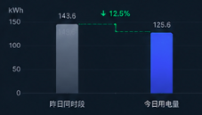
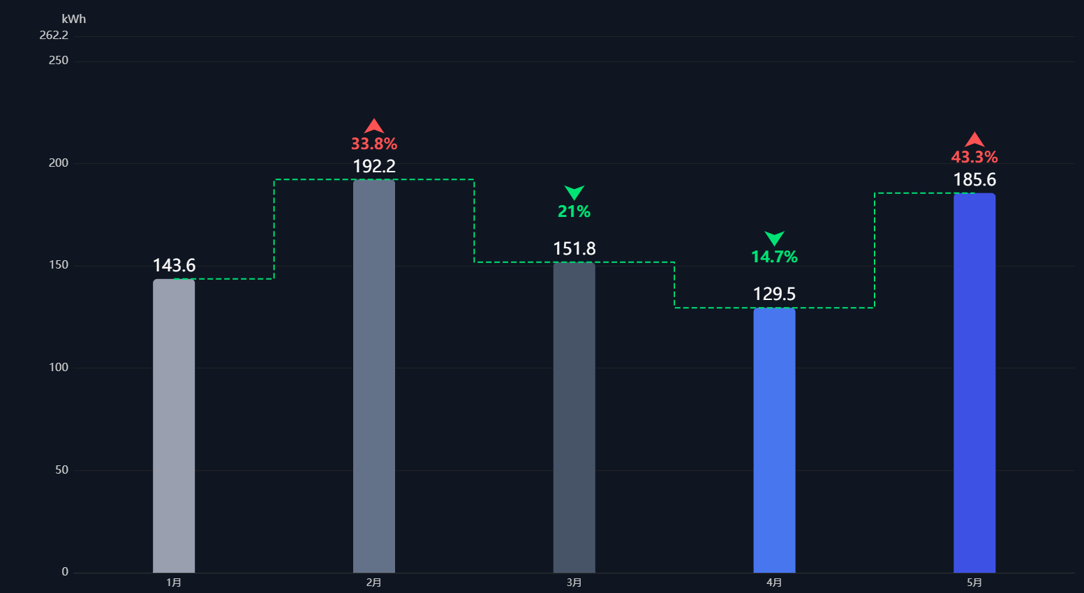
以柱状图的形式展示用电趋势,同时将X轴上每个月份的用电变化直观表示出来,想到可以用阶梯柱状图实现,并标记百分比和上升下降趋势,设计图与实现效果如下:
实现原理如下:
- 柱状图:x 轴使用 bar 系列生成正常柱状图,柱子顶部显示数值。
- 阶梯虚线连接线(横竖折线) :新增一条
line系列,开启step: 'middle'阶梯模式,线条设为绿色虚线,数据点对应每根柱子顶部数值,自动生成「横 - 竖 - 横」折线,完美匹配图中样式。 - 上升下降百分比 + 箭头标注 :使用
markPoint标记点,放在阶梯线中间位置,自定义箭头图标 + 调整高度绿色文字;通过计算两个数值的环比变化自动生成百分比。变化率计算:(今日-昨日)/昨日 *100,负数代表下降;markPoint.symbol: 'arrow'内置箭头图形;symbolRotate: 180将箭头旋转 180° 朝下,匹配图中绿色向下箭头;
代码如下:
html
<!DOCTYPE html>
<html lang="zh-CN">
<head>
  <meta charset="UTF-8">
  <title>阶梯柱状图-标记点跟随右侧柱子高度</title>
<script src="https://cdn.jsdelivr.net/npm/echarts/dist/echarts.min.js"></script>
<style>
html, body {
  margin: 0;
  padding: 0;
  height: 100%;
  background: #0f1723;
}
#chart {
  width: 100%;
  height: 100%;
  min-height: 600px;
}
</style>
</head>
<body>
<div id="chart"></div>
<script>
const myChart = echarts.init(document.getElementById('chart'));

// 业务数据(5根柱子)
const categoryList = ['时段1', '时段2', '时段3', '时段4', '时段5'];
const valueList = [143.6, 192.2, 151.8, 129.5, 185.6];
const barColorList = ['#99a0b0', '#64748b', '#475569', '#3b82f6', '#2563eb'];

// 统一上浮距离,每组距离阶梯拐点留白完全一致
const gapOffset = 30;
const markPointData = [];

for (let i = 0; i < valueList.length - 1; i++) {
  const leftVal = valueList[i];
  const rightVal = valueList[i + 1]; // 后面/右侧柱子高度
  const changeRate = ((rightVal - leftVal) / leftVal * 100).toFixed(1);
  const absRate = Math.abs(changeRate);
  const isDrop = changeRate < 0;

  // 按要求:直接使用【后面右侧柱子】高度 + 统一上浮,不取双柱最大值
  const markPosY = rightVal + gapOffset;

  markPointData.push({
    coord: [i + 0.5, markPosY],
    value: `${absRate}%`,
    symbol: 'arrow',
    symbolSize: 18,
    //symbolSize: 0, // 文字自带升降箭头,隐藏自带箭头
    symbolRotate: isDrop ? 180 : 0,
    itemStyle: {
      color: isDrop ? '#22e066' : '#ff4d4f'
    },
    label: {
      show: true,
      color: isDrop ? '#22e066' : '#ff4d4f',
      fontSize: 18,
      fontWeight: 'bold',
      //formatter: isDrop ? '↓{c}' : '↑{c}', // 文字自带升降箭头,隐藏自带箭头
      formatter: '{c}',
      // 文字固定在箭头正下方,层级:箭头在上,百分比在下
      offset: [0, 28],
      backgroundColor: 'transparent'
    }
  })
}

// 自动计算y轴最大边界,防止顶部文字被截断
const allMarkY = markPointData.map(item => item.coord[1]);
const yAxisMax = Math.max(...allMarkY) + 40;

const option = {
  backgroundColor: '#0f1723',
  tooltip: {
    trigger: 'axis',
    axisPointer: { type: 'shadow' }
  },
  xAxis: {
    type: 'category',
    data: categoryList,
    axisLine: { lineStyle: { color: '#333' } },
    axisLabel: { color: '#ccc', fontSize: 14 },
    axisTick: { show: false }
  },
  yAxis: {
    type: 'value',
    name: 'kWh',
    nameTextStyle: { color: '#ccc', fontSize: 16 },
    splitLine: { lineStyle: { color: '#222' } },
    axisLine: { show: false },
    axisTick: { show: false },
    axisLabel: { color: '#ccc', fontSize: 16 },
    max: yAxisMax
  },
  series: [
    // 柱状图
    {
      name: '用电量',
      type: 'bar',
      barWidth: 60,
      data: valueList.map((val, idx) => ({
        value: val,
        itemStyle: {
          color: barColorList[idx],
          borderRadius: [6, 6, 0, 0]
        }
      })),
      label: {
        show: true,
        position: 'top',
        color: '#fff',
        fontSize: 24
      }
    },
    // 绿色虚线阶梯连线 step:middle 横竖折线
    {
      name: '趋势连线',
      type: 'line',
      data: valueList,
      step: 'middle',
      lineStyle: {
        color: '#22e066',
        type: 'dashed',
        width: 2
      },
      symbol: 'none',
      markPoint: {
        symbol: 'arrow',
        symbolSize: 22,
        data: markPointData
      }
    }
  ],
  legend: { show: false }
};

myChart.setOption(option);
window.addEventListener('resize', () => myChart.resize());
</script>
</body>
</html>