常见于单细胞状态、CNV 信号、克隆结构或模块相似性分析。核心不是单纯画热图,而是把矩阵信号、模块分块、功能标签和 marker gene 注释整合到同一张图里,让读者一眼看到哪些细胞程序之间更接近。
图片来源
| 项目 | 内容 |
|---|---|
| 文章 | Single-cell omics analysis reveals tumor microenvironment rewiring after arsenic trioxide therapy in acute promyelocytic leukemia |
| 期刊/年份 | Science Bulletin,2025 |
| 图号 | 原文截图面板 i |
| DOI/链接 | https://doi.org/10.1016/j.scib.2025.09.014 |
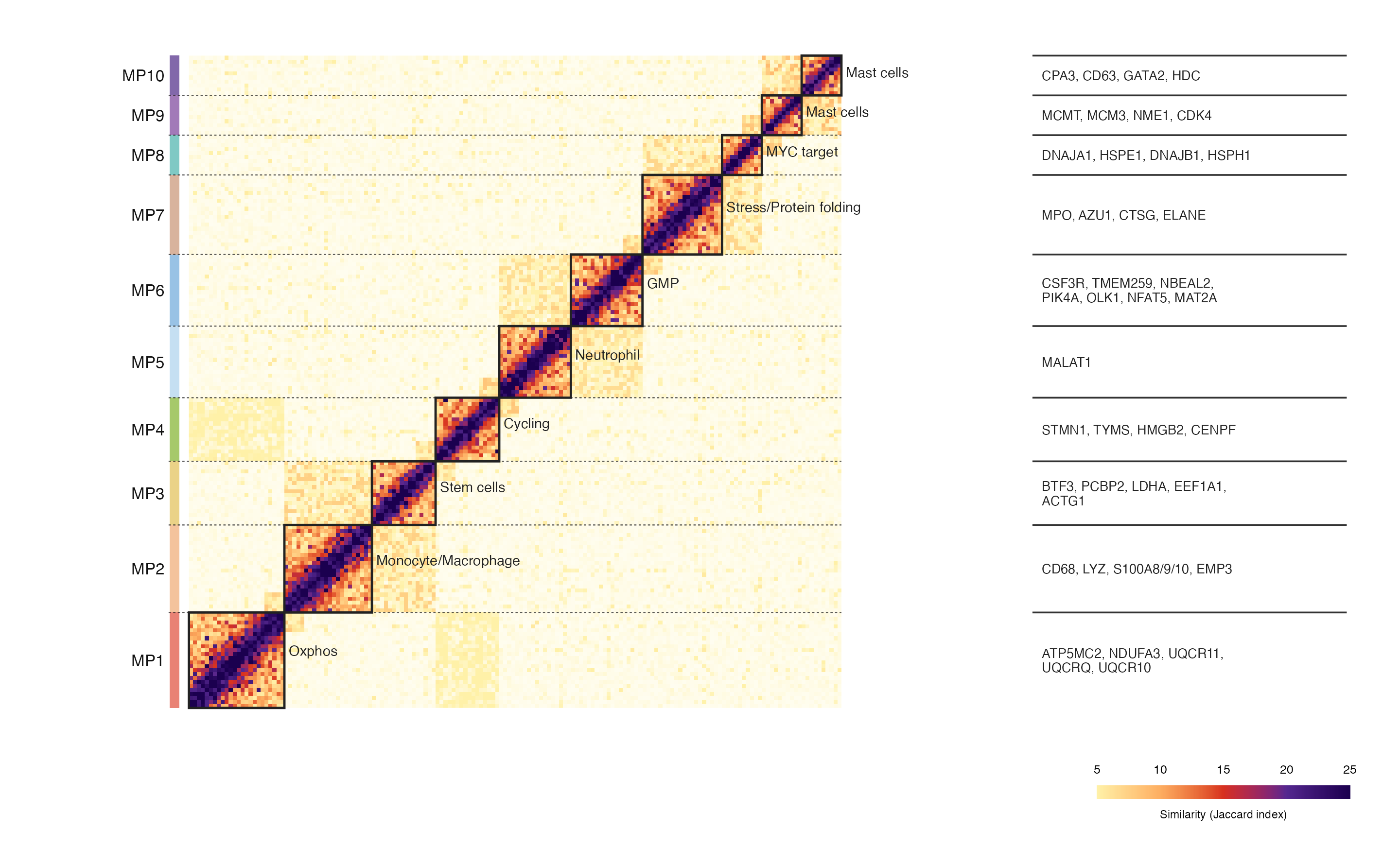
这张图来自一篇急性早幼粒细胞白血病治疗前后肿瘤微环境单细胞组学研究。截图中展示的是一种模块相似性热图:左侧是 MP1-MP10 不同模块,主体是模块内/模块间相似性矩阵,右侧补充每个模块对应的代表性基因。
图片解读
这张图可以拆成四个视觉层次:
- 主体热图:每个小格表示两个细胞/模块单元之间的相似性,颜色越深表示相似性越高。
- 对角线分块:MP1-MP10 沿对角线排列,每个黑色边框对应一个模块。
- 左侧模块条:用不同颜色标记每个 MP 模块,便于快速定位。
- 右侧 marker gene:列出每个模块对应的代表性基因,增强图的生物学解释性。
这种图适合展示 CNV 后处理结果、细胞状态相似性、模块识别结果、Jaccard index、共现关系矩阵等数据。
输入数据
这里建议准备 3 个输入文件。
1. 相似性矩阵:similarity_matrix.csv
第一列是细胞/窗口/模块单元 ID,后面每一列对应一个相同顺序的单元。
| 列名 | 含义 |
|---|---|
cell |
行 ID |
cell_001 至 cell_xxx |
与每个单元之间的相似性数值 |
2. 模块信息:module_info.csv
| 列名 | 含义 |
|---|---|
module |
模块编号,例如 MP1、MP2 |
state |
模块对应的状态或功能名称 |
module_color |
左侧模块条颜色 |
size |
该模块包含的矩阵单元数量 |
3. marker gene 注释:marker_genes.csv
| 列名 | 含义 |
|---|---|
module |
模块编号 |
genes |
该模块代表性基因,多个基因用逗号连接 |
r
library(tidyverse)
library(patchwork)

sim_mat <- read_csv("similarity_matrix.csv", show_col_types = FALSE)
module_info <- read_csv("module_info.csv", show_col_types = FALSE)
marker_genes <- read_csv("marker_genes.csv", show_col_types = FALSE)
需要示例数据的后台 添加小编 领取,调整好数据结构,以下代码可以直接复制粘贴运行。
第一步:整理模块位置
先根据每个模块的 size 计算模块在矩阵中的起点、终点和中心位置。后面画分块边框、模块标签、右侧基因注释都要用到这些坐标。
r
cell_order <- sim_mat$cell
n <- length(cell_order)

module_ranges <- module_info |>
  mutate(
    start = lag(cumsum(size), default = 0) + 1,
    end = cumsum(size),
    mid = (start + end) / 2,
    module = factor(module, levels = module_info$module)
  )
第二步:把矩阵转成长格式
ggplot2 画热图更适合使用长格式数据,所以需要把宽矩阵转换为 x-y-value 结构。
r
heat_df <- sim_mat |>
  pivot_longer(-cell, names_to = "cell2", values_to = "similarity") |>
  mutate(
    x = match(cell2, cell_order),
    y = match(cell, cell_order)
  )
第三步:准备分块、标签和基因注释
这一部分主要用于还原原图中的几个关键元素:左侧色条、虚线分隔、对角模块边框、模块名称以及右侧 gene list。
r
cell_module <- module_ranges |>
  rowwise() |>
  reframe(
    y = start:end,
    module = module,
    module_color = module_color
  ) |>
  ungroup()

block_df <- module_ranges |>
  transmute(
    module, state, size,
    xmin = start - 0.5,
    xmax = end + 0.5,
    ymin = start - 0.5,
    ymax = end + 0.5,
    xmid = mid,
    ymid = mid
  )

sep_df <- module_ranges |>
  filter(row_number() < n()) |>
  transmute(y = end + 0.5)

marker_df <- marker_genes |>
  left_join(module_ranges, by = "module") |>
  mutate(y = mid, yline = end + 0.5)

state_label_df <- block_df |>
  mutate(
    label_x = xmax + 1.1,
    label_y = ymid + if_else(size <= 12, 0.9, size / 10)
  )
第四步:绘制主体热图
主体图层用 geom_raster() 画矩阵。这里用黄-橙-红-紫的渐变色,比较接近原图中低相似性到高相似性的过渡效果。
r
heat_panel <- ggplot() +
  geom_raster(
    data = heat_df,
    aes(x, y, fill = similarity),
    interpolate = FALSE
  ) +
  geom_tile(
    data = cell_module,
    aes(x = -3.1, y = y),
    fill = cell_module$module_color,
    width = 2.4,
    height = 1
  ) +
  geom_rect(
    data = block_df,
    aes(xmin = xmin, xmax = xmax, ymin = ymin, ymax = ymax),
    fill = NA,
    color = "#222222",
    linewidth = 0.45
  ) +
  geom_segment(
    data = sep_df,
    aes(x = -4.6, xend = n + 0.5, y = y, yend = y),
    linetype = "22",
    linewidth = 0.22,
    color = "#222222",
    alpha = 0.75
  ) +
  geom_text(
    data = state_label_df,
    aes(x = label_x, y = label_y, label = state),
    hjust = 0,
    size = 2.05,
    color = "#222222"
  ) +
  geom_text(
    data = module_ranges,
    aes(x = -5.6, y = mid, label = module),
    hjust = 1,
    size = 2.35,
    color = "#111111"
  ) +
  scale_fill_gradientn(
    colours = c("#fffdf0", "#fff1a8", "#fdae61", "#d7301f", "#54278f", "#1b004f"),
    values = scales::rescale(c(0, 5, 10, 15, 20, 25)),
    limits = c(0, 25),
    guide = "none"
  ) +
  coord_equal(
    xlim = c(-6.2, n + 12),
    ylim = c(0.5, n + 0.5),
    clip = "off"
  ) +
  theme_void() +
  theme(plot.margin = margin(4, 0, 4, 8))
第五步:添加右侧 marker gene 注释
右侧 gene list 其实也是一个独立 panel。这样做比直接在主图上硬写文字更稳定,也更容易控制对齐和留白。
r
gene_panel <- ggplot(marker_df) +
  geom_segment(
    aes(x = 0, xend = 1, y = yline, yend = yline),
    linewidth = 0.34,
    color = "#333333"
  ) +
  geom_text(
    aes(x = 0.03, y = y, label = genes),
    hjust = 0,
    size = 1.9,
    lineheight = 0.92,
    color = "#222222"
  ) +
  coord_cartesian(
    xlim = c(0, 1),
    ylim = c(0.5, n + 0.5),
    clip = "off"
  ) +
  theme_void() +
  theme(plot.margin = margin(4, 8, 4, 0))
第六步:添加色标并组合图形
最后用 patchwork 把主体热图、右侧基因注释和底部色标拼在一起。
r
legend_df <- tibble(
  x = seq(5, 25, length.out = 220),
  y = 1,
  similarity = x
)

legend_panel <- ggplot(legend_df, aes(x, y, fill = similarity)) +
  geom_tile(width = 0.12, height = 0.16) +
  scale_fill_gradientn(
    colours = c("#fffdf0", "#fff1a8", "#fdae61", "#d7301f", "#54278f", "#1b004f"),
    values = scales::rescale(c(0, 5, 10, 15, 20, 25)),
    limits = c(0, 25),
    guide = "none"
  ) +
  scale_x_continuous(
    breaks = c(5, 10, 15, 20, 25),
    position = "top"
  ) +
  annotate(
    "text",
    x = 15,
    y = 0.74,
    label = "Similarity (Jaccard index)",
    size = 1.65
  ) +
  coord_cartesian(
    xlim = c(5, 25),
    ylim = c(0.68, 1.18),
    clip = "off"
  ) +
  theme_void() +
  theme(
    axis.text.x = element_text(size = 5, color = "black"),
    plot.margin = margin(0, 10, 0, 0)
  )

top_panel <- heat_panel + gene_panel + plot_layout(widths = c(3.7, 1.3))

p <- top_panel / (plot_spacer() + legend_panel + plot_layout(widths = c(4.3, 1.15))) +
  plot_layout(heights = c(1, 0.065))

ggsave("module_similarity_heatmap.png", p, width = 8.0, height = 4.85, dpi = 360, bg = "white")
ggsave("module_similarity_heatmap.pdf", p, width = 8.0, height = 4.85, bg = "white")
完整代码
r
library(tidyverse)
library(patchwork)

sim_mat <- read_csv("similarity_matrix.csv", show_col_types = FALSE)
module_info <- read_csv("module_info.csv", show_col_types = FALSE)
marker_genes <- read_csv("marker_genes.csv", show_col_types = FALSE)

cell_order <- sim_mat$cell
n <- length(cell_order)

module_ranges <- module_info |>
  mutate(
    start = lag(cumsum(size), default = 0) + 1,
    end = cumsum(size),
    mid = (start + end) / 2,
    module = factor(module, levels = module_info$module)
  )

heat_df <- sim_mat |>
  pivot_longer(-cell, names_to = "cell2", values_to = "similarity") |>
  mutate(
    x = match(cell2, cell_order),
    y = match(cell, cell_order)
  )

cell_module <- module_ranges |>
  rowwise() |>
  reframe(
    y = start:end,
    module = module,
    module_color = module_color
  ) |>
  ungroup()

block_df <- module_ranges |>
  transmute(
    module, state, size,
    xmin = start - 0.5,
    xmax = end + 0.5,
    ymin = start - 0.5,
    ymax = end + 0.5,
    xmid = mid,
    ymid = mid
  )

sep_df <- module_ranges |>
  filter(row_number() < n()) |>
  transmute(y = end + 0.5)

marker_df <- marker_genes |>
  left_join(module_ranges, by = "module") |>
  mutate(y = mid, yline = end + 0.5)

state_label_df <- block_df |>
  mutate(
    label_x = xmax + 1.1,
    label_y = ymid + if_else(size <= 12, 0.9, size / 10)
  )

heat_panel <- ggplot() +
  geom_raster(
    data = heat_df,
    aes(x, y, fill = similarity),
    interpolate = FALSE
  ) +
  geom_tile(
    data = cell_module,
    aes(x = -3.1, y = y),
    fill = cell_module$module_color,
    width = 2.4,
    height = 1
  ) +
  geom_rect(
    data = block_df,
    aes(xmin = xmin, xmax = xmax, ymin = ymin, ymax = ymax),
    fill = NA,
    color = "#222222",
    linewidth = 0.45
  ) +
  geom_segment(
    data = sep_df,
    aes(x = -4.6, xend = n + 0.5, y = y, yend = y),
    linetype = "22",
    linewidth = 0.22,
    color = "#222222",
    alpha = 0.75
  ) +
  geom_text(
    data = state_label_df,
    aes(x = label_x, y = label_y, label = state),
    hjust = 0,
    size = 2.05,
    color = "#222222"
  ) +
  geom_text(
    data = module_ranges,
    aes(x = -5.6, y = mid, label = module),
    hjust = 1,
    size = 2.35,
    color = "#111111"
  ) +
  scale_fill_gradientn(
    colours = c("#fffdf0", "#fff1a8", "#fdae61", "#d7301f", "#54278f", "#1b004f"),
    values = scales::rescale(c(0, 5, 10, 15, 20, 25)),
    limits = c(0, 25),
    guide = "none"
  ) +
  coord_equal(
    xlim = c(-6.2, n + 12),
    ylim = c(0.5, n + 0.5),
    clip = "off"
  ) +
  theme_void() +
  theme(plot.margin = margin(4, 0, 4, 8))

gene_panel <- ggplot(marker_df) +
  geom_segment(
    aes(x = 0, xend = 1, y = yline, yend = yline),
    linewidth = 0.34,
    color = "#333333"
  ) +
  geom_text(
    aes(x = 0.03, y = y, label = genes),
    hjust = 0,
    size = 1.9,
    lineheight = 0.92,
    color = "#222222"
  ) +
  coord_cartesian(
    xlim = c(0, 1),
    ylim = c(0.5, n + 0.5),
    clip = "off"
  ) +
  theme_void() +
  theme(plot.margin = margin(4, 8, 4, 0))

legend_df <- tibble(
  x = seq(5, 25, length.out = 220),
  y = 1,
  similarity = x
)

legend_panel <- ggplot(legend_df, aes(x, y, fill = similarity)) +
  geom_tile(width = 0.12, height = 0.16) +
  scale_fill_gradientn(
    colours = c("#fffdf0", "#fff1a8", "#fdae61", "#d7301f", "#54278f", "#1b004f"),
    values = scales::rescale(c(0, 5, 10, 15, 20, 25)),
    limits = c(0, 25),
    guide = "none"
  ) +
  scale_x_continuous(
    breaks = c(5, 10, 15, 20, 25),
    position = "top"
  ) +
  annotate(
    "text",
    x = 15,
    y = 0.74,
    label = "Similarity (Jaccard index)",
    size = 1.65
  ) +
  coord_cartesian(
    xlim = c(5, 25),
    ylim = c(0.68, 1.18),
    clip = "off"
  ) +
  theme_void() +
  theme(
    axis.text.x = element_text(size = 5, color = "black"),
    plot.margin = margin(0, 10, 0, 0)
  )

top_panel <- heat_panel + gene_panel + plot_layout(widths = c(3.7, 1.3))

p <- top_panel / (plot_spacer() + legend_panel + plot_layout(widths = c(4.3, 1.15))) +
  plot_layout(heights = c(1, 0.065))

ggsave("module_similarity_heatmap.png", p, width = 8.0, height = 4.85, dpi = 360, bg = "white")
ggsave("module_similarity_heatmap.pdf", p, width = 8.0, height = 4.85, bg = "white")
复现结果