目录
前言
Swiper 嵌套场景设计理论
2.1 为什么需要嵌套轮播
2.2 displayCount 的作用
2.3 嵌套层级设计原则
Swiper 组件详解
3.1 Swiper 基础语法
3.2 核心属性速查
3.3 displayCount 详解
项目数据模型
4.1 ItemData 与 Category 接口
4.2 分类与卡片数据设计
Index.ets 完整代码逐段解析
5.1 数据层:四类主题 + 卡片列表
5.2 状态层:内外索引同步管理
5.3 标题区与分类标签
5.4 外层 Swiper------全屏翻页切换分类
5.5 内层 Swiper------多卡片并列滚动
5.6 displayCount 对比说明区
5.7 @Builder 卡片构建方法
嵌套 Swiper 的交互机制
6.1 内外滑动手势的分发
6.2 索引同步策略
6.3 不同 displayCount 的视觉对比
性能分析
效果展示与交互流程
扩展方向
总结
- 前言
轮播(Swiper / Carousel)是移动应用中最常用的内容展示形式之一。但大多数应用只使用了单层轮播------水平滑动切换页面。当内容具有「分类 → 条目」两层结构时(如:电商分类 → 商品、音乐分类 → 专辑、旅游分类 → 目的地),单层轮播就难以同时展示这两个层次的信息。
嵌套 Swiper 为此而生:
外层 Swiper 展示分类(主题/类别),全屏翻页
内层 Swiper 展示分类下的具体条目,多卡片并列
displayCount 控制每屏显示的卡片数量
在 HarmonyOS NEXT 的 ArkUI 框架中,Swiper 组件原生支持嵌套,并且通过 displayCount 属性可以轻松控制每屏显示的元素数量------从 1 个(全屏)到 N 个(多卡片并列)。
- Swiper 嵌套场景设计理论
2.1 为什么需要嵌套轮播
场景 数据结构 外层 内层
音乐 App 曲风 → 专辑 曲风横向切换 专辑横向滚动
电商 App 品类 → 商品 品类滑动 商品多列展示
旅游 App 目的地 → 景点 国家/城市切换 景点卡片浏览
学习 App 学科 → 课程 学科横向翻页 课程卡片并列
嵌套轮播的核心价值在于:用户可以在一个"二维浏览空间"中自由探索------横向切换分类,纵向浏览条目,信息结构清晰,交互流畅。
2.2 displayCount 的作用
displayCount 是 Swiper 最灵活的参数之一。它决定了一次滑动操作后,屏幕上展示的元素数量:
displayCount 效果 适用场景
1 全屏显示一个元素 封面故事、全页广告
2 两个元素并列 宽幅卡片、双栏展示
3 三个元素并列 标准卡片、主流推荐流
4 四个元素紧凑排列 图标、小卡片、快捷入口
本项目中的 displayCount 分布:
外层 Swiper 内层各种 Swiper
displayCount(1) displayCount(2/3)
全屏翻页 多卡片并列
2.3 嵌套层级设计原则
屏幕(物理设备)
└── 外层 Swiper (displayCount=1, 全屏翻页)
├── 分类 1 → 内层 Swiper (displayCount=3, 三列)
├── 分类 2 → 内层 Swiper (displayCount=2, 双列)
└── 分类 3 → 内层 Swiper (displayCount=3, 三列)
核心原则:
外层控制分类,内层控制条目
外层 displayCount = 1,内层根据内容密度调整 displayCount
触摸事件由 Swiper 框架自动分发,嵌套无需额外代码处理
- Swiper 组件详解
3.1 Swiper 基础语法
Swiper() {
// 子组件列表(直接子组件即为轮播页面)
Text('页面 1')
Text('页面 2')
Text('页面 3')
}
.displayCount(1) // 每屏显示数量
.autoPlay(true) // 自动播放
.loop(true) // 循环播放
.indicator(true) // 显示指示器
.index(currentIndex) // 当前索引
.onChange((index) => {}) // 索引变化回调
3.2 核心属性速查
属性 类型 默认值 说明
displayCount number 1 每屏显示的子组件数量
autoPlay boolean false 是否自动播放
loop boolean false 是否循环播放
indicator boolean true 是否显示导航点
indicatorStyle IndicatorStyle --- 导航点样式配置
interval number 3000 自动播放间隔 (ms)
duration number 400 滑动动画时长 (ms)
index number 0 当前显示的页面索引
onChange (index) => void --- 页面切换完成回调
3.3 displayCount 详解
displayCount 是 Swiper 区别于其他轮播组件的关键特性。
工作原理:
displayCount = 1 (默认)
┌──────────────────────┐
│ 页面 1 │
│ (全宽) │
└──────────────────────┘
displayCount = 3
┌──────┬──────┬──────┐
│ 页1 │ 页2 │ 页3 │
│ 33% │ 33% │ 33% │
└──────┴──────┴──────┘
displayCount = 4
┌─────┬─────┬─────┬─────┐
│ 页1 │ 页2 │ 页3 │ 页4 │
│ 25% │ 25% │ 25% │ 25% │
└─────┴─────┴─────┴─────┘
宽度计算: 每个子组件的宽度 = 100% / displayCount。
- 项目数据模型
4.1 ItemData 与 Category 接口
interface ItemData {
title: string; // 卡片标题
desc: string; // 卡片描述
color: string; // 卡片背景色
}
interface Category {
name: string; // 分类名称
color: string; // 分类背景色
items: ItemData\[\]; // 该分类下的卡片列表
displayCount: number; // 内层 Swiper 的 displayCount
innerLoop: boolean; // 内层 Swiper 是否循环
}
4.2 分类与卡片数据设计
分类 items 数量 displayCount 循环
🏛️ 经典名著 5 3 ✅
🎬 热门影视 3 2 ❌
🎵 音乐专辑 4 3 ✅
🌍 旅行目的地 5 3 ✅
每个分类的 displayCount 不同,目的是让用户直观对比不同值对布局的影响。
- Index.ets 完整代码逐段解析
5.1 数据层:四类主题 + 卡片列表
private readonly categories: Category\[\] = { name: '🏛️ 经典名著', color: '#E8EAF6', items: \[ { title: '红楼梦', desc: '曹雪芹 · 中国古典四大名著之首', color: '#EF5350' }, { title: '百年孤独', desc: '马尔克斯 · 魔幻现实主义经典', color: '#42A5F5' }, { title: '活着', desc: '余华 · 生命的力量与韧性', color: '#66BB6A' }, { title: '三体', desc: '刘慈欣 · 中国科幻里程碑', color: '#FFA726' }, { title: '围城', desc: '钱钟书 · 幽默睿智的世情小说', color: '#AB47BC' }, ,
displayCount: 3,
innerLoop: true,
},
// ... 更多分类
];
设计意图: 4 个分类共 17 张卡片,覆盖了不同的 displayCount 值和 items 数量,让嵌套轮播的效果充分展现。
5.2 状态层:内外索引同步管理
@State outerIndex: number = 0;
@State innerIndices: number\[\] = 0, 0, 0, 0;
outerIndex: 外层 Swiper 当前显示的分类索引。
innerIndices: 4 个分类各自内层 Swiper 的当前索引。innerIndices0 对应第一个分类的内层索引,以此类推。
索引同步逻辑:
// 外层切换时更新 outerIndex
Swiper()
.index(this.outerIndex)
.onChange((idx: number) => {
this.outerIndex = idx;
});
// 内层切换时更新对应分类的 innerIndices
Swiper()
.index(this.innerIndicescatIndex)
.onChange((idx: number) => {
const newIndices = ...this.innerIndices;
newIndicescatIndex = idx;
this.innerIndices = newIndices;
});
5.3 标题区与分类标签
// 分类标签行
Row() {
ForEach(this.categories, (cat: Category, idx: number) => {
Text(cat.name.split(' ').slice(1).join(' ') || cat.name)
.fontSize(12)
.fontColor(this.outerIndex === idx ? '#1A237E' : '#9FA8DA')
.fontWeight(this.outerIndex === idx ? FontWeight.Bold : FontWeight.Regular)
.padding({ left: 8, right: 8, top: 4, bottom: 4 })
.backgroundColor(this.outerIndex === idx ? 'rgba(26,35,126,0.08)' : 'transparent')
.borderRadius(12)
.onClick(() => { this.outerIndex = idx; });
});
}
分类标签通过 outerIndex 高亮当前选中项。点击标签直接跳转到对应的外层页面。
5.4 外层 Swiper------全屏翻页切换分类
Swiper() {
ForEach(this.categories, (cat: Category, catIndex: number) => {
Column() {
// 分类名称
Text(cat.name).fontSize(18).fontWeight(FontWeight.Bold).fontColor('#37474F');
  // 内层 Swiper
  Swiper() { /* 见 5.5 */ }
    .displayCount(cat.displayCount)
    .loop(cat.innerLoop)
    .indicator(false)
    .index(this.innerIndices[catIndex])
    .onChange((idx: number) => { /* 更新 innerIndices */ });

  Text(`← 左右滑动浏览更多 · 共 ${cat.items.length} 项 →`);
}
.width('100%')
.height(260)
.backgroundColor('#F5F5F5');
});
}
.displayCount(1) // 外层每次显示一个分类
.loop(true) // 循环切换分类
.indicator(true) // 显示底部导航点
.indicatorStyle({ // 导航点颜色
selectedColor: '#5C6BC0',
color: '#C5CAE9',
})
.index(this.outerIndex)
.onChange((idx: number) => { this.outerIndex = idx; });
外层 Swiper 的参数:
参数 值 作用
displayCount(1) 1 全屏翻页,每次显示一个分类
loop(true) true 在四个分类间循环切换
indicator(true) true 底部显示导航点
autoPlay(false) false 不自动播放,由用户手动滑动
5.5 内层 Swiper------多卡片并列滚动
Swiper() {
ForEach(cat.items, (item: ItemData) => {
this.buildItemCard(item, cat.color);
});
}
.width('95%')
.height(140)
.displayCount(cat.displayCount) // ★ 核心:每屏显示的卡片数
.autoPlay(false)
.loop(cat.innerLoop)
.indicator(false) // 内层不显示指示器
.index(this.innerIndicescatIndex)
.onChange((idx: number) => {
const newIndices = ...this.innerIndices;
newIndicescatIndex = idx;
this.innerIndices = newIndices;
});
内层 Swiper 的参数:
参数 值 作用
displayCount 2/3(按分类) 控制每屏卡片数量
loop 按分类配置 部分分类循环,部分不循环
indicator(false) false 内层不显示导航点(避免视觉杂乱)
5.6 displayCount 对比说明区
Row() {
// displayCount=2
Column() { Text('2 列'); Text('宽幅卡片'); }.layoutWeight(1)
// displayCount=3
Column() { Text('3 列'); Text('标准卡片'); }.layoutWeight(1)
// displayCount=4
Column() { Text('4 列'); Text('紧凑卡片'); }.layoutWeight(1)
}
页面底部有一个对比说明区,用三列并排展示 displayCount 取 2/3/4 时的视觉特征。
5.7 @Builder 卡片构建方法
@Builder
private buildItemCard(item: ItemData, categoryColor: string) {
Column() {
Text(item.title)
.fontSize(16)
.fontWeight(FontWeight.Bold)
.fontColor('#FFFFFF');
Text(item.desc)
  .fontSize(11)
  .fontColor('rgba(255,255,255,0.85)')
  .textAlign(TextAlign.Center)
  .lineHeight(16)
  .margin({ top: 6 });
}
.width('100%')
.height(120)
.padding(12)
.backgroundColor(item.color)
.borderRadius(12)
.justifyContent(FlexAlign.Center)
.alignItems(HorizontalAlign.Center);
}
每个卡片是一个带有标题 + 描述的色块,背景色使用数据预设的 13 种不同颜色。
- 嵌套 Swiper 的交互机制
6.1 内外滑动手势的分发
嵌套 Swiper 的触摸事件由 ArkUI 框架自动分发:
用户触摸屏幕
↓
Swiper 框架判断触摸方向
↓
├── 水平滑动 → 当前层 Swiper 处理
│ ├── 手指在外层区域 → 外层翻页
│ └── 手指在内层区域 → 内层滚动
│
└── 垂直滑动 → 穿透到父容器
为什么不需要手动处理事件冲突? Swiper 框架内置了手势冲突解决机制:
当用户触摸内层 Swiper 区域时,优先处理内层 Swiper 的滑动
当内层 Swiper 滑动到边界(最左/最右),且 loop=false 时,触摸传递到外层
当内层 Swiper loop=true 时,触摸始终由内层处理
6.2 索引同步策略
外层索引同步:
// 外层 Swiper 的 onChange 更新 outerIndex
.onChange((idx: number) => { this.outerIndex = idx; })
// 分类标签的 onClick 也更新 outerIndex
.onClick(() => { this.outerIndex = idx; })
// → Swiper.index(this.outerIndex) 自动跳转到对应页面
内层索引同步(独立管理):
// 每个分类的内层索引独立存储
@State innerIndices: number\[\] = 0, 0, 0, 0;
// 切换分类时,当前分类的内层索引保持不变
.onChange((idx: number) => {
const newIndices = ...this.innerIndices;
newIndicescatIndex = idx; // 只更新当前分类的索引
this.innerIndices = newIndices;
});
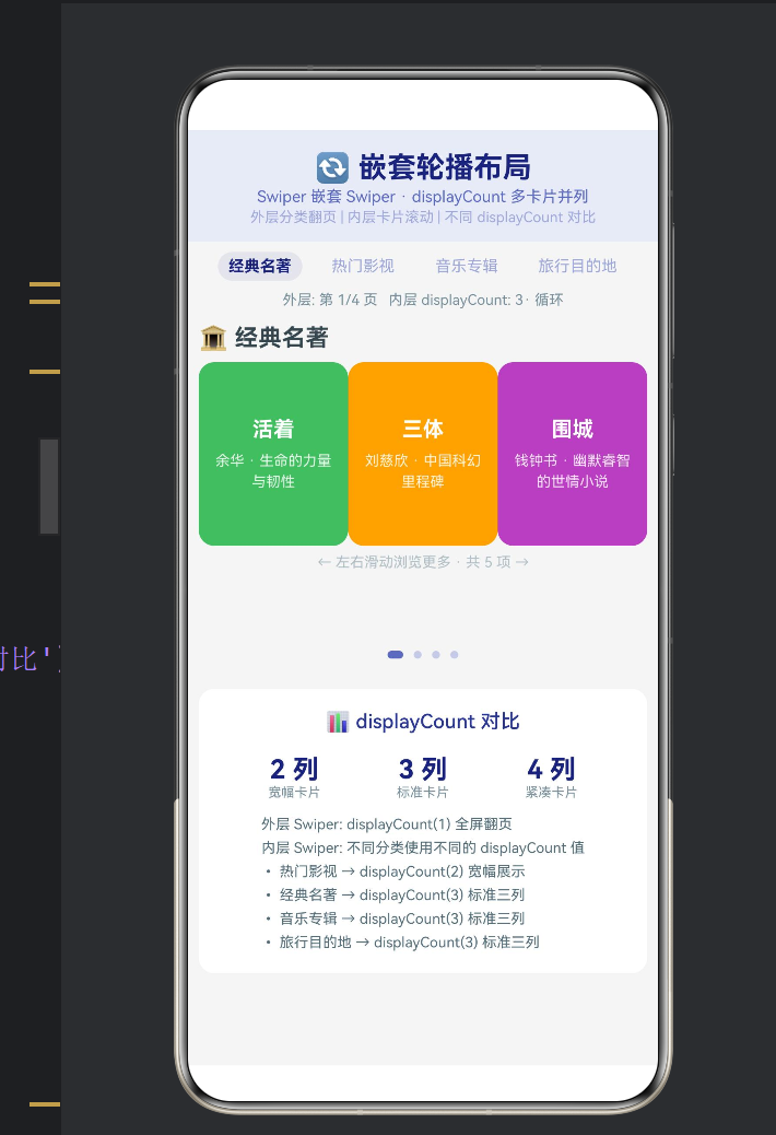
这种设计的好处:用户切换到"经典名著"浏览到第 3 张卡片,再切换到"热门影视"再切回来------"经典名著"的内层索引仍然保持在 3,不会丢失位置。
6.3 不同 displayCount 的视觉对比
displayCount 卡片宽度 可见卡片 展示风格
1 100% 1 张 全屏沉浸式
2 50% 2 张 宽幅信息展示
3 33.3% 3 张 标准卡片流
4 25% 4 张 紧凑网格
- 性能分析
嵌套 Swiper 对性能的影响主要集中在渲染和动画两个层面。
指标 值
外层页面数 4
内层页面总数 17 张卡片
同时渲染的卡片 约 (2~4) × 外层可见区域
Swiper 实例数 1 外层 + 4 内层 = 5 个
动画帧率 60fps(GPU 加速)
Swiper 组件内部采用了按需渲染策略------只有当前可见的页面和临近页面会被渲染,离屏页面被回收。因此即使总共有 17 张卡片,实际渲染的卡片数量不会超过 displayCount + 2 张。
- 效果展示与交互流程
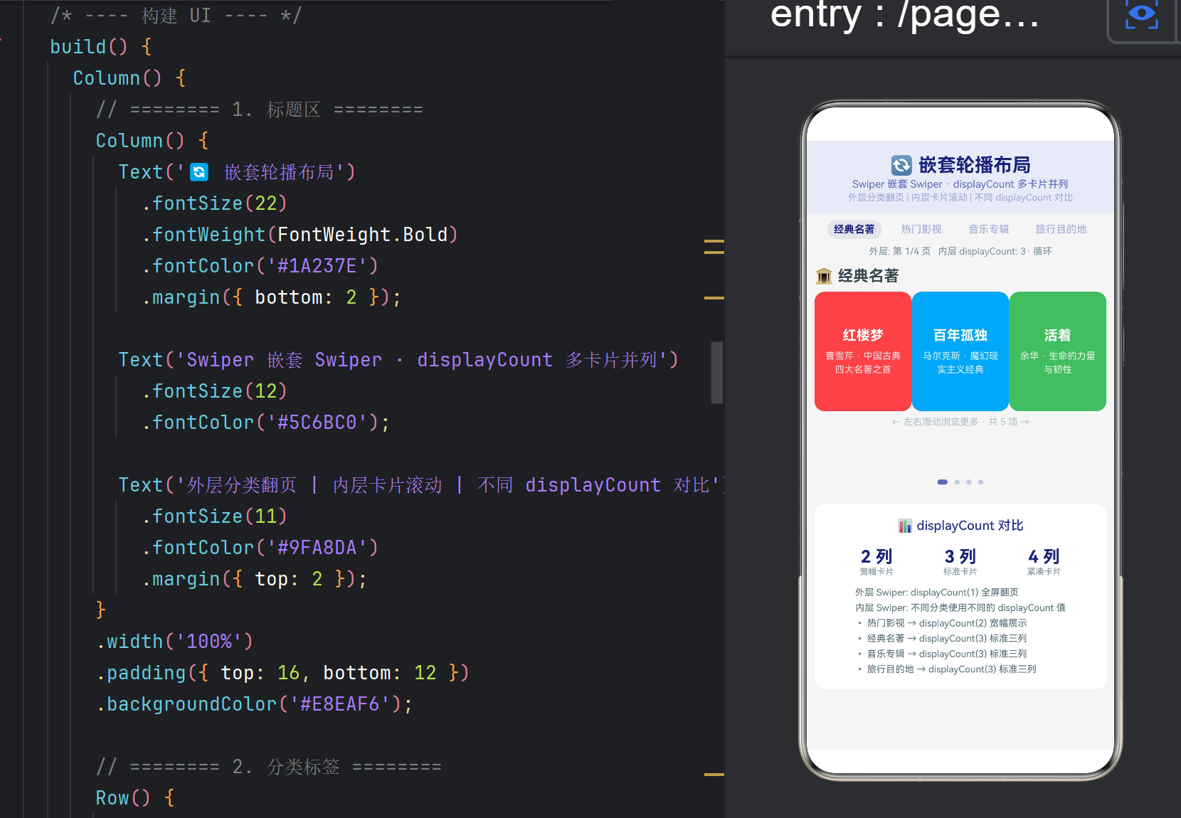
页面整体布局
┌──────────────────────────────────────────────┐
│ 🔄 嵌套轮播布局 │
│ Swiper 嵌套 Swiper · displayCount 多卡片并列 │
├──────────────────────────────────────────────┤
│ 🏛️经典名著 🎬热门影视 🎵音乐专辑 🌍旅行 │ ← 分类标签
│ 外层: 第1/4页 内层 displayCount: 3 │
├──────────────────────────────────────────────┤
│ ┌─ 🏛️ 经典名著 ─────────────────────────┐ │
│ │ │ │
│ │ ┌──────┬──────┬──────┐ │ │ ← 内层 Swiper
│ │ │红楼梦│百年孤独│活着 │ │ │ displayCount=3
│ │ │曹雪芹│马尔克斯│余华 │ │ │
│ │ └──────┴──────┴──────┘ │ │
│ │ ← 左右滑动浏览更多 · 共 5 项 → │ │
│ └─────────────────────────────────────────┘ │
│ ●○○○│ ← 外层指示器
├──────────────────────────────────────────────┤
│ 📊 displayCount 对比 │
│ 2列 3列 4列 │
│ 宽幅卡片 标准卡片 紧凑卡片 │
│ • 热门影视 → displayCount(2) 宽幅展示 │
│ • 经典名著 → displayCount(3) 标准三列 │
└──────────────────────────────────────────────┘
典型交互流程
启动应用 → 显示"🏛️ 经典名著"分类,内层 Swiper 展示 3 张卡片(红楼梦、百年孤独、活着)
左右滑动内层 Swiper → 切换到围城、三体等更多卡片
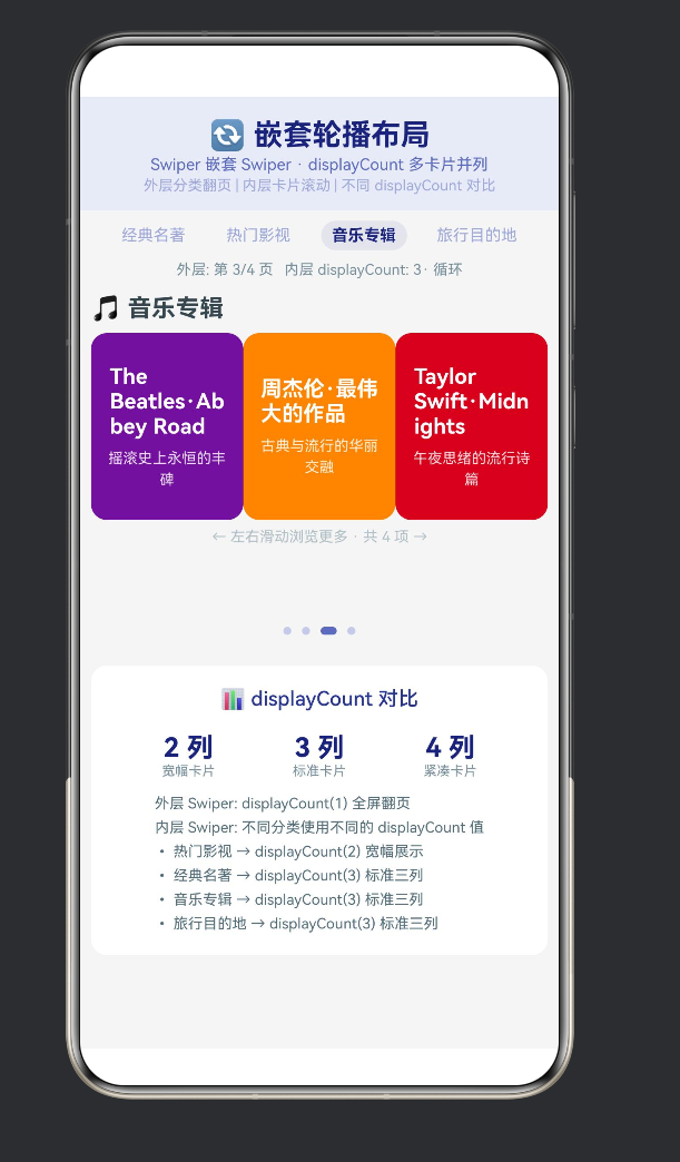
滑动外层 Swiper → 切换到"🎬 热门影视"分类,内层变为 displayCount(2) 宽幅卡片
继续滑动外层 → 依次经过"🎵 音乐专辑"(displayCount=3)、"🌍 旅行目的地"(displayCount=3)
点击分类标签 → 直接跳转到对应分类,快速导航
浏览底部说明区 → 对比不同 displayCount 值的视觉差异 - 扩展方向
9.1 自动播放 + 循环嵌套
// 外层自动播放,内层手动浏览
Swiper()
.autoPlay(true)
.interval(5000) // 5 秒自动切换分类
.loop(true);
9.2 纵向 Swiper 嵌套
Swiper 也支持垂直方向:
// 外层垂直 Swiper,内层水平 Swiper
Swiper()
.direction(Axis.Vertical) // 垂直翻页
.displayCount(1);
// 内层水平 Swiper(与垂直外层形成「十字交互」)
Swiper()
.direction(Axis.Horizontal) // 水平滚动
.displayCount(3);
9.3 数据动态加载
为内层 Swiper 添加分页加载:
Swiper()
.onChange((idx: number) => {
// 当滑到最后一页时加载更多
if (idx >= cat.items.length - cat.displayCount) {
this.loadMoreItems(catIndex);
}
});
- 总结
本文通过一个完整的鸿蒙 ArkTS 嵌套轮播项目,深入解析了 Swiper 嵌套 Swiper + displayCount 实现多级内容浏览的完整方案。
知识点 核心内容
Swiper 嵌套 外层展示分类,内层展示条目,触摸事件自动分发
displayCount 控制每屏显示的元素数量,取值 1/2/3/4
外层 Swiper displayCount(1) 全屏翻页,loop(true) 循环切换
内层 Swiper displayCount(2/3) 多卡片并列,indicator(false) 隐藏指示器
索引同步 outerIndex 控制外层,innerIndices\[\] 独立管理每个内层
数据驱动 4 个分类 × 17 张卡片,不同 displayCount 值直观对比
嵌套 Swiper 的核心设计原则:
外层控制"看哪个分类",内层控制"看分类里的什么"------两层各有分工,互不干扰。
希望本文能帮助你在鸿蒙原生应用开发中充分利用 Swiper 的嵌套能力,构建出结构清晰、交互流畅的多级内容浏览体验。
参考资料:
HarmonyOS NEXT 开发者文档 --- Swiper 组件参考
HarmonyOS NEXT 开发者文档 --- displayCount 属性
Material Design 3 --- 轮播组件设计规范
Carousel UI 设计模式 --- Niels Bohr 交互设计原则