项目演示
第一章 概述
1.1 背景与意义
在移动应用开发中,列表是最常见的UI组件之一,广泛应用于消息列表、商品展示、新闻资讯等场景。HarmonyOS作为新一代分布式操作系统,提供了强大的ArkUI声明式UI框架,其中List组件是实现列表布局的核心组件。
随着HarmonyOS NEXT的发布,基于ArkTS的声明式开发模式成为主流。List组件的垂直列表布局是最基础也是最常用的布局方式,掌握其使用方法对于构建高质量的鸿蒙应用至关重要。
1.2 List组件定位
List是ArkUI框架中的滚动容器组件,专门用于展示大量数据项。它具有以下核心优势:
- 性能优化:采用虚拟化渲染机制,只渲染可视区域内的列表项,大幅提升长列表性能
- 内置滚动:自动处理滚动逻辑,支持惯性滚动、回弹效果
- 灵活布局:支持垂直和水平两种方向,可配置间距、分割线等
- 交互丰富:支持点击、长按、滑动等多种交互方式
1.3 垂直列表布局的应用场景
垂直列表布局适用于以下典型场景:
- 消息列表(微信、短信)
- 商品列表(电商应用)
- 新闻资讯列表
- 设置页面选项
- 联系人列表
- 搜索结果展示
1.4 本文结构
本文将从以下几个方面深入剖析List垂直列表布局:
- 核心概念与基础用法
- API 24特性详解
- 完整代码示例
- 性能优化策略
- 高级应用技巧
- 常见问题与解决方案
第二章 核心概念与基础用法
2.1 List组件基础结构
2.1.1 List组件定义
typescript
List(value?: { initialIndex?: number; space?: number | string; scroller?: Scroller })构造参数说明:
| 参数 | 类型 | 说明 |
|---|---|---|
| initialIndex | number | 设置列表初始滚动位置的索引值,默认值为0 |
| space | number | string | 列表项之间的间距,支持数字和字符串 |
| scroller | Scroller | 滚动控制器,用于控制列表滚动行为 |
2.1.2 ListItem组件
ListItem是List的子组件,用于定义列表项的内容。每个列表项必须包裹在ListItem中。
typescript
ListItem()注意事项:
ListItem必须作为List的直接子组件使用- 一个
List可以包含多个ListItem ListItem支持点击事件和状态变化
2.2 垂直列表方向设置
2.2.1 listDirection属性
listDirection属性用于设置列表的滚动方向:
typescript
List({ space: 8 }) {
  // 列表内容
}
.listDirection(Axis.Vertical)  // 垂直方向
Axis枚举值:
| 枚举值 | 说明 |
|---|---|
| Axis.Vertical | 垂直方向(默认) |
| Axis.Horizontal | 水平方向 |
2.2.2 默认行为
在HarmonyOS API 24中,List组件默认方向为垂直方向,因此以下两种写法等价:
typescript
// 写法1:显式设置垂直方向
List({ space: 8 }) { ... }.listDirection(Axis.Vertical)

// 写法2:使用默认方向
List({ space: 8 }) { ... }
2.3 ForEach数据绑定
2.3.1 基本用法
使用ForEach组件遍历数据并生成列表项:
typescript
@Entry
@Component
struct VerticalListExample {
  @State listData: string[] = ['Item 1', 'Item 2', 'Item 3']

  build() {
    List({ space: 8 }) {
      ForEach(
        this.listData,           // 数据源
        (item: string) => {      // 迭代函数
          ListItem() {
            Text(item)
          }
        },
        (item: string) => item   // 唯一标识生成函数
      )
    }
  }
}
2.3.2 唯一标识的重要性
第三个参数keyGenerator用于为每个列表项生成唯一标识,这对于列表项的更新和性能优化至关重要:
- 避免重复渲染:当数据变化时,框架根据唯一标识判断哪些项需要更新
- 保持列表状态:确保列表项的滚动位置、选中状态等正确保持
2.3.3 复杂数据类型
对于复杂数据类型,建议使用唯一字段作为标识:
typescript
interface User {
  id: number
  name: string
  avatar: string
}

@State users: User[] = [
  { id: 1, name: '张三', avatar: 'avatar1.png' },
  { id: 2, name: '李四', avatar: 'avatar2.png' }
]

ForEach(
  this.users,
  (user: User) => {
    ListItem() {
      // 用户卡片内容
    }
  },
  (user: User) => `${user.id}`  // 使用id作为唯一标识
)
2.4 列表项布局设计
2.4.1 基础布局结构
一个典型的列表项通常包含以下元素:
typescript
ListItem() {
  Row() {
    // 左侧图标/图片区域
    Image($rawfile('icon.png'))
      .width(48)
      .height(48)
      .margin({ right: 12 })

    // 右侧内容区域
    Column({ space: 4 }) {
      Text('标题')
        .fontSize(16)
        .fontWeight(FontWeight.Medium)

      Text('描述信息')
        .fontSize(12)
        .fontColor('#999999')
    }
    .flexGrow(1)

    // 右侧辅助区域
    Text('箭头')
      .fontSize(14)
      .fontColor('#CCCCCC')
  }
  .width('100%')
  .padding(16)
}
2.4.2 布局要点
- Row容器:横向排列列表项内容
- flexGrow(1):让内容区域自动填充剩余空间
- margin/padding:控制元素间距
- 图片宽高比:保持图标一致性
第三章 API 24特性详解
3.1 API 24概述
HarmonyOS NEXT SDK API 24带来了多项重要更新,特别是在List组件方面进行了性能优化和功能增强。
3.2 List组件新增属性
3.2.1 listDirection增强
在API 24中,listDirection属性支持更精细的配置:
typescript
List({ space: 8 }) {
  // 列表内容
}
.listDirection(Axis.Vertical)
垂直列表特性:
- 从上到下依次排列列表项
- 支持垂直方向滚动
- 滚动条显示在右侧(默认)
3.2.2 divider属性
用于设置列表项之间的分割线:
typescript
List({ space: 8 }) {
  // 列表内容
}
.divider({
  strokeWidth: 1,           // 分割线宽度
  color: '#F0F0F0',         // 分割线颜色
  startMargin: 16,          // 左侧边距
  endMargin: 16             // 右侧边距
})
divider参数说明:
| 参数 | 类型 | 说明 |
|---|---|---|
| strokeWidth | number | 分割线宽度,默认值为1 |
| color | ResourceColor | 分割线颜色 |
| startMargin | number | 分割线起始边距(左侧/顶部) |
| endMargin | number | 分割线结束边距(右侧/底部) |
3.2.3 edgeEffect属性
控制滚动到边缘时的效果:
typescript
List({ space: 8 }) {
  // 列表内容
}
.edgeEffect(EdgeEffect.Spring)  // 弹簧效果
EdgeEffect枚举值:
| 枚举值 | 说明 |
|---|---|
| EdgeEffect.Spring | 弹簧回弹效果(默认) |
| EdgeEffect.None | 无效果 |
| EdgeEffect.Fade | 渐变淡出效果 |
3.2.4 scroller属性
通过Scroller控制器实现滚动控制:
typescript
@State scroller: Scroller = new Scroller()

build() {
  List({ scroller: this.scroller, space: 8 }) {
    // 列表内容
  }
}

// 在事件中调用
this.scroller.scrollToIndex(5)           // 滚动到指定索引
this.scroller.scrollEdge(Edge.Top)       // 滚动到顶部
this.scroller.scrollToOffset(100)        // 滚动到指定偏移量
Scroller常用方法:
| 方法 | 说明 |
|---|---|
| scrollToIndex(index: number) | 滚动到指定索引位置 |
| scrollEdge(edge: Edge) | 滚动到列表边缘(顶部/底部) |
| scrollToOffset(offset: number) | 滚动到指定偏移量 |
| scrollBy(offset: number) | 相对当前位置滚动指定距离 |
| currentOffset() | 获取当前滚动偏移量 |
| scrollPage(next: boolean) | 向上或向下滚动一页 |
3.3 ListItem组件特性
3.3.1 onClick事件
为列表项添加点击事件:
typescript
ListItem() {
  // 列表项内容
}
.onClick(() => {
  console.info('列表项被点击')
})
3.3.2 onHover事件
支持鼠标悬停效果:
typescript
ListItem() {
  // 列表项内容
}
.onHover((isHover: boolean) => {
  if (isHover) {
    console.info('鼠标悬停')
  } else {
    console.info('鼠标离开')
  }
})
3.3.3 selected属性
控制列表项选中状态:
typescript
@State selectedIndex: number = -1

ListItem() {
  // 列表项内容
}
.selected(this.selectedIndex === index)
.onClick(() => {
  this.selectedIndex = index
})
3.4 性能优化特性
3.4.1 虚拟化渲染
API 24进一步优化了虚拟化渲染机制:
typescript
List({ space: 8 }) {
  ForEach(
    this.largeDataList,  // 即使包含10000条数据也能流畅运行
    (item) => {
      ListItem() {
        // 列表项内容
      }
    },
    (item) => item.id
  )
}
虚拟化原理:
- 只渲染可视区域内的列表项
- 滚动时动态回收和复用列表项组件
- 减少内存占用,提升滚动流畅度
3.4.2 懒加载支持
配合LazyForEach实现数据懒加载:
typescript
class MyDataSource implements IDataSource {
  private dataArray: string[] = []

  totalCount(): number {
    return this.dataArray.length
  }

  getData(index: number): string {
    return this.dataArray[index]
  }

  registerDataChangeListener(listener: DataChangeListener): void {
    // 注册监听器
  }

  unregisterDataChangeListener(listener: DataChangeListener): void {
    // 取消注册
  }
}

@State dataSource: MyDataSource = new MyDataSource()

build() {
  List({ space: 8 }) {
    LazyForEach(
      this.dataSource,
      (item: string) => {
        ListItem() {
          Text(item)
        }
      },
      (item: string) => item
    )
  }
}
第四章 完整代码示例
4.1 基础垂直列表示例
4.1.1 需求分析
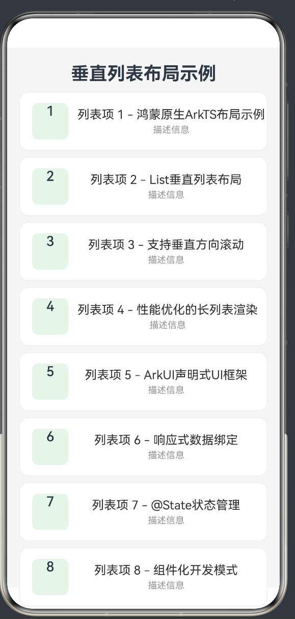
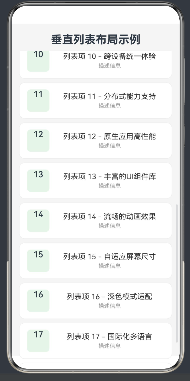
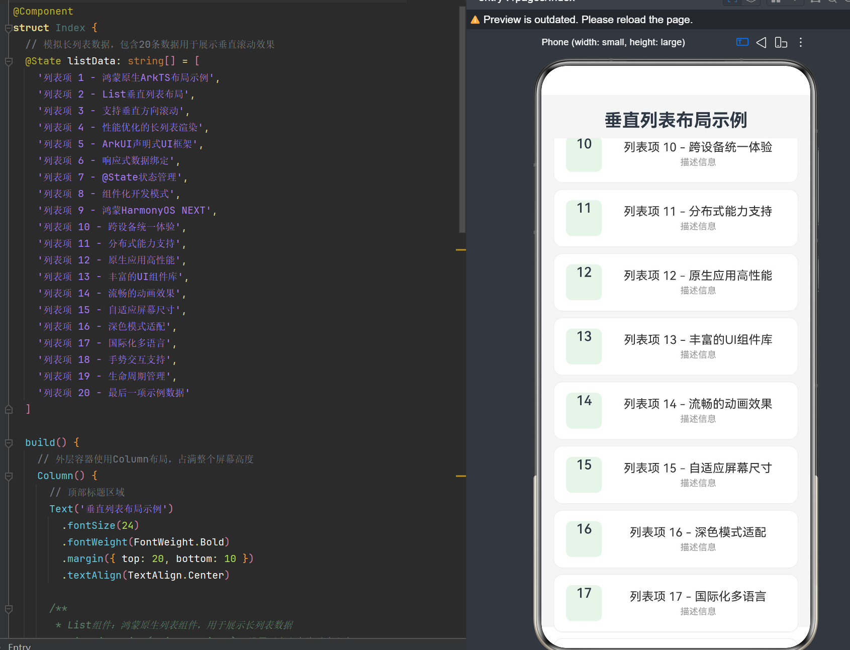
创建一个展示20条数据的垂直列表,包含序号、标题和描述信息,支持点击交互。
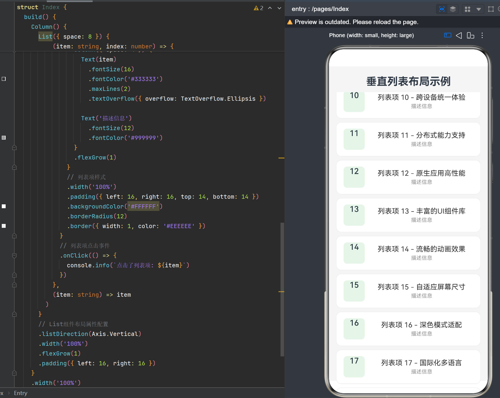
4.1.2 完整代码
typescript
@Entry
@Component
struct BasicVerticalList {
  @State listData: string[] = [
    '列表项 1 - 鸿蒙原生ArkTS布局示例',
    '列表项 2 - List垂直列表布局',
    '列表项 3 - 支持垂直方向滚动',
    '列表项 4 - 性能优化的长列表渲染',
    '列表项 5 - ArkUI声明式UI框架',
    '列表项 6 - 响应式数据绑定',
    '列表项 7 - @State状态管理',
    '列表项 8 - 组件化开发模式',
    '列表项 9 - 鸿蒙HarmonyOS NEXT',
    '列表项 10 - 跨设备统一体验',
    '列表项 11 - 分布式能力支持',
    '列表项 12 - 原生应用高性能',
    '列表项 13 - 丰富的UI组件库',
    '列表项 14 - 流畅的动画效果',
    '列表项 15 - 自适应屏幕尺寸',
    '列表项 16 - 深色模式适配',
    '列表项 17 - 国际化多语言',
    '列表项 18 - 手势交互支持',
    '列表项 19 - 生命周期管理',
    '列表项 20 - 最后一项示例数据'
  ]

  @State selectedIndex: number = -1

  build() {
    Column() {
      Text('垂直列表布局示例')
        .fontSize(24)
        .fontWeight(FontWeight.Bold)
        .margin({ top: 20, bottom: 10 })
        .textAlign(TextAlign.Center)

      List({ space: 8 }) {
        ForEach(
          this.listData,
          (item: string, index: number) => {
            ListItem() {
              Row() {
                Column() {
                  Text(`${index + 1}`)
                    .fontSize(18)
                    .fontWeight(FontWeight.Medium)
                    .textAlign(TextAlign.Center)
                }
                .width(48)
                .height(48)
                .backgroundColor(this.selectedIndex === index ? '#10B981' : '#E8F5E9')
                .fontColor(this.selectedIndex === index ? '#FFFFFF' : '#333333')
                .borderRadius(8)
                .margin({ right: 12 })

                Column({ space: 4 }) {
                  Text(item)
                    .fontSize(16)
                    .fontColor('#333333')
                    .maxLines(2)
                    .textOverflow({ overflow: TextOverflow.Ellipsis })

                  Text('描述信息')
                    .fontSize(12)
                    .fontColor('#999999')
                }
                .flexGrow(1)

                Text('>')
                  .fontSize(18)
                  .fontColor('#CCCCCC')
              }
              .width('100%')
              .padding({ left: 16, right: 16, top: 14, bottom: 14 })
              .backgroundColor('#FFFFFF')
              .borderRadius(12)
              .border({ width: 1, color: '#EEEEEE' })
            }
            .onClick(() => {
              this.selectedIndex = index
              console.info(`点击了列表项: ${item}`)
            })
          },
          (item: string) => item
        )
      }
      .listDirection(Axis.Vertical)
      .width('100%')
      .flexGrow(1)
      .padding({ left: 16, right: 16 })
      .divider({ strokeWidth: 1, color: '#F5F5F5', startMargin: 16, endMargin: 16 })
      .edgeEffect(EdgeEffect.Spring)
    }
    .width('100%')
    .height('100%')
    .backgroundColor('#F5F5F5')
  }
}
4.1.3 代码解析
布局结构:
Column (全屏容器)
├── Text (标题)
└── List (垂直列表)
    └── ForEach (数据遍历)
        └── ListItem (列表项)
            └── Row (横向布局)
                ├── Column (序号区域)
                │   └── Text (序号)
                ├── Column (内容区域)
                │   ├── Text (标题)
                │   └── Text (描述)
                └── Text (箭头)
关键技术点:
- 状态管理 :使用
@State装饰器管理列表数据和选中状态 - 动态样式:根据选中状态动态切换序号区域的背景色和文字颜色
- 文本溢出处理 :使用
maxLines和textOverflow处理长文本 - 分割线配置 :通过
divider属性设置列表项分割线
4.2 复杂列表项示例
4.2.1 需求分析
创建一个商品列表,包含商品图片、名称、价格和评分等信息。
4.2.2 数据模型定义
typescript
interface Product {
  id: number
  name: string
  price: number
  originalPrice: number
  rating: number
  sales: number
  image: string
}
4.2.3 完整代码
typescript
@Entry
@Component
struct ProductList {
  @State products: Product[] = [
    {
      id: 1,
      name: '鸿蒙智能手表 Pro 旗舰版',
      price: 1999,
      originalPrice: 2499,
      rating: 4.8,
      sales: 12580,
      image: 'https://trae-api-cn.mchost.guru/api/ide/v1/text_to_image?prompt=smart%20watch%20product%20photo%20white%20background&image_size=square'
    },
    {
      id: 2,
      name: '华为MatePad Pro 12.6英寸',
      price: 3999,
      originalPrice: 4499,
      rating: 4.9,
      sales: 8920,
      image: 'https://trae-api-cn.mchost.guru/api/ide/v1/text_to_image?prompt=tablet%20computer%20product%20photo%20white%20background&image_size=square'
    },
    {
      id: 3,
      name: 'FreeBuds Pro 3 无线蓝牙耳机',
      price: 1299,
      originalPrice: 1499,
      rating: 4.7,
      sales: 25680,
      image: 'https://trae-api-cn.mchost.guru/api/ide/v1/text_to_image?prompt=wireless%20earbuds%20product%20photo%20white%20background&image_size=square'
    },
    {
      id: 4,
      name: '智慧屏V55 量子点电视',
      price: 4999,
      originalPrice: 5999,
      rating: 4.8,
      sales: 5620,
      image: 'https://trae-api-cn.mchost.guru/api/ide/v1/text_to_image?prompt=smart%20tv%20product%20photo%20white%20background&image_size=square'
    },
    {
      id: 5,
      name: 'MateBook 14s 轻薄笔记本',
      price: 6999,
      originalPrice: 7999,
      rating: 4.9,
      sales: 4280,
      image: 'https://trae-api-cn.mchost.guru/api/ide/v1/text_to_image?prompt=laptop%20computer%20product%20photo%20white%20background&image_size=square'
    },
    {
      id: 6,
      name: 'Sound X 智能音箱',
      price: 1899,
      originalPrice: 2199,
      rating: 4.6,
      sales: 9860,
      image: 'https://trae-api-cn.mchost.guru/api/ide/v1/text_to_image?prompt=smart%20speaker%20product%20photo%20white%20background&image_size=square'
    }
  ]

  build() {
    Column() {
      Text('商品列表')
        .fontSize(24)
        .fontWeight(FontWeight.Bold)
        .margin({ top: 20, bottom: 16 })
        .textAlign(TextAlign.Center)

      List({ space: 12 }) {
        ForEach(
          this.products,
          (product: Product) => {
            ListItem() {
              Row() {
                Image(product.image)
                  .width(100)
                  .height(100)
                  .borderRadius(8)
                  .margin({ right: 12 })
                  .objectFit(ImageFit.Cover)

                Column({ space: 6 }) {
                  Text(product.name)
                    .fontSize(15)
                    .fontColor('#333333')
                    .maxLines(2)
                    .textOverflow({ overflow: TextOverflow.Ellipsis })

                  Row({ space: 12 }) {
                    Row({ space: 2 }) {
                      Text(`${product.rating}`)
                        .fontSize(12)
                        .fontColor('#FF6B35')

                      Text('★')
                        .fontSize(12)
                        .fontColor('#FF6B35')
                    }

                    Text(`已售 ${product.sales}`)
                      .fontSize(12)
                      .fontColor('#999999')
                  }

                  Row({ space: 8 }) {
                    Text(`¥${product.price}`)
                      .fontSize(18)
                      .fontWeight(FontWeight.Bold)
                      .fontColor('#FF4D4F')

                    Text(`¥${product.originalPrice}`)
                      .fontSize(12)
                      .fontColor('#999999')
                      .decoration({ type: TextDecorationType.LineThrough })
                  }
                }
                .flexGrow(1)

                Button('加入')
                  .width(60)
                  .height(32)
                  .fontSize(12)
                  .backgroundColor('#10B981')
                  .fontColor('#FFFFFF')
                  .borderRadius(16)
              }
              .width('100%')
              .padding(12)
              .backgroundColor('#FFFFFF')
              .borderRadius(12)
            }
            .onClick(() => {
              console.info(`点击商品: ${product.name}`)
            })
          },
          (product: Product) => `${product.id}`
        )
      }
      .listDirection(Axis.Vertical)
      .width('100%')
      .flexGrow(1)
      .padding({ left: 16, right: 16 })
    }
    .width('100%')
    .height('100%')
    .backgroundColor('#F5F5F5')
  }
}
4.2.4 代码解析
列表项布局特点:
- 图片展示 :使用
Image组件展示商品图片,设置固定宽高和圆角 - 多层文本:包含商品名称、评分销量、价格信息
- 价格样式:现价加粗红色,原价删除线灰色
- 按钮交互:右侧加入购物车按钮
4.3 分组列表示例
4.3.1 需求分析
创建一个分组列表,按字母顺序分组展示联系人。
4.3.2 数据模型
typescript
interface Contact {
  id: number
  name: string
  phone: string
}

interface ContactGroup {
  letter: string
  contacts: Contact[]
}
4.3.3 完整代码
typescript
@Entry
@Component
struct ContactList {
  @State groups: ContactGroup[] = [
    {
      letter: 'A',
      contacts: [
        { id: 1, name: '阿杰', phone: '138****1234' },
        { id: 2, name: '阿丽', phone: '139****5678' },
        { id: 3, name: '安安', phone: '137****9012' }
      ]
    },
    {
      letter: 'B',
      contacts: [
        { id: 4, name: '贝贝', phone: '136****3456' },
        { id: 5, name: '彬彬', phone: '135****7890' }
      ]
    },
    {
      letter: 'C',
      contacts: [
        { id: 6, name: '晨曦', phone: '134****2345' },
        { id: 7, name: '陈晨', phone: '133****6789' },
        { id: 8, name: '楚楚', phone: '132****0123' },
        { id: 9, name: '春春', phone: '131****4567' }
      ]
    },
    {
      letter: 'D',
      contacts: [
        { id: 10, name: '大伟', phone: '130****8901' },
        { id: 11, name: '丹丹', phone: '129****2345' }
      ]
    },
    {
      letter: 'L',
      contacts: [
        { id: 12, name: '李明', phone: '128****6789' },
        { id: 13, name: '李娜', phone: '127****0123' },
        { id: 14, name: '刘伟', phone: '126****4567' },
        { id: 15, name: '刘芳', phone: '125****8901' },
        { id: 16, name: '刘洋', phone: '124****2345' }
      ]
    },
    {
      letter: 'W',
      contacts: [
        { id: 17, name: '王强', phone: '123****6789' },
        { id: 18, name: '王敏', phone: '122****0123' },
        { id: 19, name: '王伟', phone: '121****4567' }
      ]
    },
    {
      letter: 'Z',
      contacts: [
        { id: 20, name: '张伟', phone: '120****8901' },
        { id: 21, name: '张丽', phone: '119****2345' },
        { id: 22, name: '赵云', phone: '118****6789' }
      ]
    }
  ]

  build() {
    Column() {
      Text('联系人列表')
        .fontSize(24)
        .fontWeight(FontWeight.Bold)
        .margin({ top: 20, bottom: 16 })
        .textAlign(TextAlign.Center)

      List({ space: 0 }) {
        ForEach(
          this.groups,
          (group: ContactGroup) => {
            ListItem() {
              Text(group.letter)
                .fontSize(14)
                .fontWeight(FontWeight.Bold)
                .fontColor('#666666')
                .padding({ left: 16, top: 12, bottom: 8 })
            }
            .backgroundColor('#F5F5F5')

            ForEach(
              group.contacts,
              (contact: Contact) => {
                ListItem() {
                  Row() {
                    Column() {
                      Text(contact.name.charAt(0))
                        .fontSize(20)
                        .fontWeight(FontWeight.Medium)
                        .fontColor('#FFFFFF')
                        .textAlign(TextAlign.Center)
                    }
                    .width(44)
                    .height(44)
                    .backgroundColor('#6366F1')
                    .borderRadius(22)
                    .margin({ right: 12 })

                    Column({ space: 2 }) {
                      Text(contact.name)
                        .fontSize(16)
                        .fontColor('#333333')

                      Text(contact.phone)
                        .fontSize(12)
                        .fontColor('#999999')
                    }
                    .flexGrow(1)

                    Text('>')
                      .fontSize(16)
                      .fontColor('#CCCCCC')
                  }
                  .width('100%')
                  .padding({ left: 16, right: 16, top: 12, bottom: 12 })
                  .backgroundColor('#FFFFFF')
                }
                .onClick(() => {
                  console.info(`点击联系人: ${contact.name}`)
                })
              },
              (contact: Contact) => `${contact.id}`
            )
          },
          (group: ContactGroup) => group.letter
        )
      }
      .listDirection(Axis.Vertical)
      .width('100%')
      .flexGrow(1)
      .divider({ strokeWidth: 0.5, color: '#F0F0F0', startMargin: 72 })
    }
    .width('100%')
    .height('100%')
    .backgroundColor('#F5F5F5')
  }
}
4.3.4 代码解析
分组列表特点:
- 双层ForEach:外层遍历分组,内层遍历联系人
- 分组标题:使用灰色背景区分分组
- 自定义头像:使用联系人首字母作为头像
- 分割线偏移 :通过
startMargin让分割线避开头像区域
第五章 性能优化策略
5.1 虚拟化渲染原理
5.1.1 渲染机制
List组件采用虚拟化渲染技术,核心原理是:
- 可视区域检测:只渲染当前屏幕可见的列表项
- 组件复用:滚动时回收离开可视区域的组件,重新用于新进入的列表项
- 按需加载:只加载当前需要的数据,减少内存占用
5.1.2 性能对比
| 指标 | 普通渲染 | 虚拟化渲染 |
|---|---|---|
| 内存占用 | O(n) | O(visible) |
| 首屏渲染时间 | 长 | 短 |
| 滚动流畅度 | 差 | 好 |
| 适用场景 | 短列表 | 长列表 |
5.2 数据加载优化
5.2.1 懒加载实现
使用LazyForEach实现数据懒加载:
typescript
class LazyDataSource implements IDataSource {
  private data: string[] = []

  constructor(initialData: string[] = []) {
    this.data = initialData
  }

  totalCount(): number {
    return this.data.length
  }

  getData(index: number): string {
    return this.data[index]
  }

  registerDataChangeListener(listener: DataChangeListener): void {
    // 实现监听器注册逻辑
  }

  unregisterDataChangeListener(listener: DataChangeListener): void {
    // 实现监听器取消注册逻辑
  }

  addData(newData: string[]): void {
    this.data = [...this.data, ...newData]
  }
}
5.2.2 分页加载示例
typescript
@Entry
@Component
struct PagedList {
  @State dataSource: LazyDataSource = new LazyDataSource()
  @State isLoading: boolean = false
  @State currentPage: number = 1

  aboutToAppear() {
    this.loadData(this.currentPage)
  }

  async loadData(page: number) {
    if (this.isLoading) return

    this.isLoading = true

    await new Promise(resolve => setTimeout(resolve, 1000))

    const newData: string[] = []
    const start = (page - 1) * 20
    for (let i = 0; i < 20; i++) {
      newData.push(`列表项 ${start + i + 1}`)
    }

    this.dataSource.addData(newData)
    this.isLoading = false
  }

  build() {
    Column() {
      Text('分页加载列表')
        .fontSize(24)
        .fontWeight(FontWeight.Bold)
        .margin({ top: 20, bottom: 16 })
        .textAlign(TextAlign.Center)

      List({ space: 8 }) {
        LazyForEach(
          this.dataSource,
          (item: string) => {
            ListItem() {
              Text(item)
                .fontSize(16)
                .padding(16)
                .backgroundColor('#FFFFFF')
                .borderRadius(8)
                .width('100%')
            }
          },
          (item: string) => item
        )

        if (this.isLoading) {
          ListItem() {
            Text('加载中...')
              .fontSize(14)
              .fontColor('#999999')
              .padding(16)
              .textAlign(TextAlign.Center)
          }
        }
      }
      .listDirection(Axis.Vertical)
      .width('100%')
      .flexGrow(1)
      .padding({ left: 16, right: 16 })
      .onReachEnd(() => {
        this.currentPage++
        this.loadData(this.currentPage)
      })
    }
    .width('100%')
    .height('100%')
    .backgroundColor('#F5F5F5')
  }
}
5.3 图片加载优化
5.3.1 图片缓存策略
typescript
Image(product.image)
  .width(100)
  .height(100)
  .borderRadius(8)
  .objectFit(ImageFit.Cover)
  .interpolation(ImageInterpolation.High)
图片优化要点:
- 设置固定尺寸:避免图片自适应导致的布局抖动
- 使用objectFit:控制图片填充方式
- 设置interpolation:优化图片缩放质量
5.3.2 占位图和加载失败处理
typescript
Image(product.image)
  .width(100)
  .height(100)
  .borderRadius(8)
  .placeholder($rawfile('placeholder.png'))
  .alt($rawfile('error.png'))
5.4 列表项复杂度控制
5.4.1 减少组件嵌套
反例:
typescript
ListItem() {
  Column() {
    Row() {
      Column() {
        Text('标题')
      }
    }
  }
}
正例:
typescript
ListItem() {
  Row() {
    Text('标题')
  }
}
5.4.2 使用@Builder复用布局
typescript
@Entry
@Component
struct OptimizedList {
  @State items: string[] = ['Item 1', 'Item 2', 'Item 3']

  @Builder
  ListItemBuilder(item: string) {
    Row() {
      Text(item)
        .fontSize(16)
        .flexGrow(1)
      Text('>')
        .fontColor('#CCCCCC')
    }
    .padding(16)
    .backgroundColor('#FFFFFF')
  }

  build() {
    List({ space: 8 }) {
      ForEach(
        this.items,
        (item) => {
          ListItem() {
            this.ListItemBuilder(item)
          }
        },
        (item) => item
      )
    }
  }
}
5.5 状态管理优化
5.5.1 避免不必要的状态更新
typescript
@State selectedId: number = -1

.onClick(() => {
  this.selectedId = item.id
})

@Builder
buildItem(item: Item) {
  const isSelected = item.id === this.selectedId
}
5.5.2 使用@Watch监听变化
typescript
@State searchKeyword: string = ''
@Watch('onSearchKeywordChange')
filteredItems: string[] = []

onSearchKeywordChange() {
  this.filteredItems = this.allItems.filter(item =>
    item.includes(this.searchKeyword)
  )
}
第六章 高级应用技巧
6.1 侧滑菜单
6.1.1 实现代码
typescript
@Entry
@Component
struct SwipeMenuList {
  @State items: string[] = ['列表项 1', '列表项 2', '列表项 3', '列表项 4', '列表项 5']

  build() {
    Column() {
      Text('侧滑菜单示例')
        .fontSize(24)
        .fontWeight(FontWeight.Bold)
        .margin({ top: 20, bottom: 16 })
        .textAlign(TextAlign.Center)

      List({ space: 8 }) {
        ForEach(
          this.items,
          (item: string, index: number) => {
            ListItem() {
              SwipeGesture({})
                .onAction((event: GestureEvent) => {
                  if (event.offsetX < -100) {
                    console.info(`侧滑删除: ${item}`)
                  }
                })

              Row() {
                Text(item)
                  .fontSize(16)
                  .flexGrow(1)

                Row() {
                  Button('编辑')
                    .width(60)
                    .height(48)
                    .backgroundColor('#10B981')
                    .fontColor('#FFFFFF')
                    .borderRadius(0)

                  Button('删除')
                    .width(60)
                    .height(48)
                    .backgroundColor('#FF4D4F')
                    .fontColor('#FFFFFF')
                    .borderRadius(0)
                    .onClick(() => {
                      this.items.splice(index, 1)
                    })
                }
              }
              .width('100%')
              .padding(16)
              .backgroundColor('#FFFFFF')
              .borderRadius(8)
            }
          },
          (item: string) => item
        )
      }
      .listDirection(Axis.Vertical)
      .width('100%')
      .flexGrow(1)
      .padding({ left: 16, right: 16 })
    }
    .width('100%')
    .height('100%')
    .backgroundColor('#F5F5F5')
  }
}
6.2 下拉刷新
6.2.1 实现代码
typescript
@Entry
@Component
struct PullRefreshList {
  @State items: string[] = ['列表项 1', '列表项 2', '列表项 3']
  @State isRefreshing: boolean = false
  @State scroller: Scroller = new Scroller()

  async onRefresh() {
    if (this.isRefreshing) return

    this.isRefreshing = true

    await new Promise(resolve => setTimeout(resolve, 2000))

    const newItems = ['新列表项 1', '新列表项 2', ...this.items]
    this.items = newItems
    this.isRefreshing = false
  }

  build() {
    Column() {
      Text('下拉刷新示例')
        .fontSize(24)
        .fontWeight(FontWeight.Bold)
        .margin({ top: 20, bottom: 16 })
        .textAlign(TextAlign.Center)

      List({ scroller: this.scroller, space: 8 }) {
        ForEach(
          this.items,
          (item: string) => {
            ListItem() {
              Text(item)
                .fontSize(16)
                .padding(16)
                .backgroundColor('#FFFFFF')
                .borderRadius(8)
                .width('100%')
            }
          },
          (item: string) => item
        )
      }
      .listDirection(Axis.Vertical)
      .width('100%')
      .flexGrow(1)
      .padding({ left: 16, right: 16 })
      .onScrollIndex((start: number) => {
        if (start === 0 && !this.isRefreshing) {
          // 到达顶部,可以触发下拉刷新
        }
      })
    }
    .width('100%')
    .height('100%')
    .backgroundColor('#F5F5F5')
  }
}
6.3 粘性标题
6.3.1 实现原理
使用sticky属性实现分组标题粘性效果:
typescript
ListItem() {
  Text(group.letter)
    .fontSize(14)
    .fontWeight(FontWeight.Bold)
    .padding({ left: 16, top: 12, bottom: 8 })
}
.sticky(StickyStyle.Normal)
6.3.2 完整示例
typescript
@Entry
@Component
struct StickyHeaderList {
  @State groups: ContactGroup[] = [
    { letter: 'A', contacts: [{ id: 1, name: '阿杰' }] },
    { letter: 'B', contacts: [{ id: 2, name: '贝贝' }] },
    { letter: 'C', contacts: [{ id: 3, name: '晨曦' }] }
  ]

  build() {
    List({ space: 0 }) {
      ForEach(
        this.groups,
        (group) => {
          ListItem() {
            Text(group.letter)
              .fontSize(14)
              .fontWeight(FontWeight.Bold)
              .padding({ left: 16, top: 12, bottom: 8 })
          }
          .backgroundColor('#F5F5F5')
          .sticky(StickyStyle.Normal)

          ForEach(
            group.contacts,
            (contact) => {
              ListItem() {
                Text(contact.name)
                  .padding(16)
                  .backgroundColor('#FFFFFF')
              }
            },
            (contact) => `${contact.id}`
          )
        },
        (group) => group.letter
      )
    }
    .listDirection(Axis.Vertical)
    .width('100%')
    .height('100%')
  }
}
6.4 列表动画
6.4.1 进入动画
typescript
@Entry
@Component
struct AnimatedList {
  @State items: string[] = ['Item 1', 'Item 2', 'Item 3']
  @State visibleItems: boolean[] = [true, false, false]

  aboutToAppear() {
    this.items.forEach((_, index) => {
      setTimeout(() => {
        this.visibleItems[index] = true
      }, index * 200)
    })
  }

  build() {
    List({ space: 8 }) {
      ForEach(
        this.items,
        (item: string, index: number) => {
          ListItem() {
            Text(item)
              .fontSize(16)
              .padding(16)
              .backgroundColor('#FFFFFF')
              .borderRadius(8)
              .width('100%')
              .opacity(this.visibleItems[index] ? 1 : 0)
              .translate({ y: this.visibleItems[index] ? 0 : 20 })
              .animation({ duration: 300, curve: Curve.EaseOut })
          }
        },
        (item: string) => item
      )
    }
  }
}
6.4.2 删除动画
typescript
@State items: string[] = ['Item 1', 'Item 2', 'Item 3']
@State deletingIndex: number = -1

.deleteItem(index: number) {
  this.deletingIndex = index

  setTimeout(() => {
    this.items.splice(index, 1)
    this.deletingIndex = -1
  }, 300)
}

ListItem() {
  Text(item)
    .padding(16)
    .backgroundColor('#FFFFFF')
    .opacity(this.deletingIndex === index ? 0 : 1)
    .scale({ x: this.deletingIndex === index ? 0.9 : 1 })
    .animation({ duration: 300 })
}
第七章 常见问题与解决方案
7.1 编译错误
7.1.1 Module has no exported member
问题描述:
Error Message: Module '"@kit.AbilityKit"' has no exported member 'CommonConstants'解决方案:
在HarmonyOS NEXT中,基础UI组件是全局内置的,不需要显式导入。删除错误的import语句。
7.1.2 Property does not exist
问题描述:
Error Message: Property 'shadow' does not exist on type 'RowAttribute'解决方案:
shadow方法可能在某些API版本中不被支持,改用border实现视觉效果。
7.2 运行时问题
7.2.1 列表不滚动
问题描述:
列表内容超出屏幕但无法滚动。
解决方案:
确保List组件有明确的高度约束:
typescript
List({ space: 8 }) {
  // 列表内容
}
.width('100%')
.flexGrow(1)
7.2.2 列表项点击无响应
问题描述:
点击列表项没有触发onClick事件。
解决方案:
确保ListItem设置了正确的事件绑定:
typescript
ListItem() {
  // 列表项内容
}
.onClick(() => {
  console.info('点击事件触发')
})
7.2.3 数据更新后列表不刷新
问题描述:
修改数据源后,列表显示没有更新。
解决方案:
确保数据引用发生了变化:
typescript
this.listData = [...this.listData, 'new item']7.3 性能问题
7.3.1 长列表卡顿
问题描述:
列表包含大量数据时,滚动不流畅。
解决方案:
- 使用虚拟化渲染
- 减少列表项复杂度
- 优化图片加载
- 使用LazyForEach实现懒加载
7.3.2 内存占用过高
问题描述:
长时间使用后内存占用持续增加。
解决方案:
- 及时释放不再使用的资源
- 使用图片缓存机制
- 避免在列表项中创建大量对象
7.4 布局问题
7.4.1 列表项高度不一致
问题描述:
列表项高度随内容变化,导致布局错乱。
解决方案:
设置固定高度或使用flex布局自适应。
7.4.2 分割线显示异常
问题描述:
分割线没有显示或显示位置不正确。
解决方案:
检查divider属性配置,确保宽度和颜色正确。
第八章 总结与展望
8.1 核心要点回顾
- List组件:鸿蒙原生列表组件,支持垂直和水平方向
- 垂直列表 :默认方向,使用
listDirection(Axis.Vertical)显式设置 - ListItem:列表项容器,必须在List内部使用
- ForEach:数据遍历组件,用于动态生成列表项
- 虚拟化渲染:自动优化长列表性能
- 状态管理 :使用
@State管理列表数据和状态
8.2 最佳实践
- 保持列表项简洁:减少嵌套层级和组件数量
- 使用唯一标识:为ForEach提供稳定的keyGenerator
- 优化图片加载:设置固定尺寸和占位图
- 合理使用状态:避免不必要的状态更新
- 考虑性能优化:长列表使用LazyForEach
8.3 未来发展
随着HarmonyOS的不断演进,List组件将继续优化:
- 性能提升:进一步优化虚拟化渲染算法
- 功能增强:支持更多交互模式和动画效果
- 跨设备适配:更好地支持不同屏幕尺寸和设备类型
- 开发体验:提供更丰富的开发工具和调试能力
8.4 学习建议
- 官方文档:深入阅读HarmonyOS官方文档中关于List组件的说明
- 示例代码:参考官方示例项目中的列表实现
- 实践项目:在实际项目中应用和探索List组件的各种用法
- 性能测试:学习如何进行性能分析和优化
附录:API 24 List组件完整属性参考
A.1 List构造参数
| 参数 | 类型 | 默认值 | 说明 |
|---|---|---|---|
| initialIndex | number | 0 | 初始滚动位置索引 |
| space | number | string | 0 | 列表项间距 |
| scroller | Scroller | - | 滚动控制器 |
A.2 List属性方法
| 方法 | 类型 | 说明 |
|---|---|---|
| listDirection | Axis | 设置列表方向 |
| divider | DividerInfo | 设置分割线 |
| edgeEffect | EdgeEffect | 设置边缘滚动效果 |
| onScrollIndex | (start: number, end: number) => void | 滚动索引变化回调 |
| onReachStart | () => void | 滚动到顶部回调 |
| onReachEnd | () => void | 滚动到底部回调 |
A.3 ListItem属性方法
| 方法 | 类型 | 说明 |
|---|---|---|
| selected | boolean | 设置选中状态 |
| sticky | StickyStyle | 设置粘性效果 |
| onClick | () => void | 点击事件 |
| onHover | (isHover: boolean) => void | 悬停事件 |
A.4 Axis枚举
| 枚举值 | 说明 |
|---|---|
| Axis.Vertical | 垂直方向 |
| Axis.Horizontal | 水平方向 |
A.5 EdgeEffect枚举
| 枚举值 | 说明 |
|---|---|
| EdgeEffect.Spring | 弹簧效果 |
| EdgeEffect.None | 无效果 |
| EdgeEffect.Fade | 渐变效果 |
A.6 StickyStyle枚举
| 枚举值 | 说明 |
|---|---|
| StickyStyle.Normal | 普通粘性效果 |
| StickyStyle.None | 无粘性效果 |