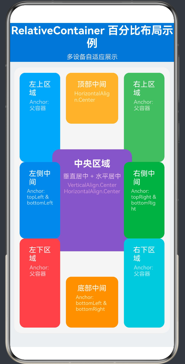
项目演示
目录
- 引言
- [HarmonyOS NEXT布局体系概述](#HarmonyOS NEXT布局体系概述)
- RelativeContainer组件基础
- alignRules对齐规则详解
- 百分比尺寸布局原理
- 多设备适配核心策略
- RelativeContainer+百分比布局实战
- 高级技巧与模式
- 性能优化与最佳实践
- 常见问题与解决方案
- 总结与展望
1. 引言
1.1 鸿蒙生态与多设备挑战
在万物互联的时代,鸿蒙操作系统(HarmonyOS)以其分布式架构和跨设备能力成为智能终端领域的重要力量。HarmonyOS NEXT作为新一代鸿蒙操作系统,更是将原生应用开发推向了新的高度。
然而,随着智能设备形态的多样化------从手机、平板、手表到智慧屏、车载终端------应用开发者面临着前所未有的多设备适配挑战。不同设备的屏幕尺寸、分辨率、长宽比差异巨大,如何让应用在各种设备上都呈现出良好的用户体验,成为每个开发者必须解决的核心问题。
1.2 布局方式的选择
在HarmonyOS ArkTS开发中,布局方式的选择直接影响应用的适配能力和开发效率。常见的布局方式包括:
- Flex布局(Row/Column):基于弹性盒子模型,适合线性排列的场景
- Grid布局:基于网格系统,适合表格化数据展示
- RelativeContainer布局:基于相对定位,适合复杂的自由布局场景
其中,RelativeContainer 配合百分比尺寸的组合,为多设备适配提供了一种简洁而强大的解决方案。
1.3 本文目的与结构
本文将深入探讨HarmonyOS NEXT中RelativeContainer组件与百分比布局的结合使用,从基础概念到高级技巧,从理论原理到实战案例,全面解析这种布局方式的核心要点和最佳实践。
适用读者:本文适用于有一定ArkTS基础的HarmonyOS应用开发者,无论是初学者还是有经验的开发者,都能从中获得有价值的知识和技巧。
API级别:本文基于HarmonyOS NEXT API Level 24进行讲解。
2. HarmonyOS NEXT布局体系概述
2.1 ArkUI声明式UI框架
HarmonyOS NEXT采用ArkUI声明式UI框架,通过简洁的代码描述UI结构和状态,实现UI与逻辑的分离。ArkUI提供了丰富的布局组件和属性,支持开发者快速构建高质量的用户界面。
2.2 布局组件分类
在ArkUI中,布局组件可分为以下几类:
| 布局类型 | 组件 | 适用场景 |
|---|---|---|
| 线性布局 | Row、Column | 水平或垂直方向的线性排列 |
| 弹性布局 | Flex | 基于Flexbox的灵活布局 |
| 网格布局 | Grid | 二维网格结构 |
| 相对布局 | RelativeContainer | 基于相对位置的自由布局 |
| 堆叠布局 | Stack | 层叠显示多个组件 |
| 滚动布局 | Scroll、List | 可滚动的内容区域 |
2.3 多设备适配的核心原则
多设备适配需要遵循以下核心原则:
- 响应式设计:根据设备特性自动调整布局
- 弹性尺寸:使用百分比、弹性系数等非固定值
- 自适应组件:组件能够根据可用空间自动调整
- 断点适配:在特定设备尺寸下采用不同布局策略
3. RelativeContainer组件基础
3.1 RelativeContainer概述
RelativeContainer是ArkUI中用于实现相对布局的核心组件。它允许子组件通过alignRules属性相对于父容器或其他子组件进行定位,从而实现灵活的布局效果。
核心特点:
- 相对定位:子组件可以相对于父容器或其他子组件定位
- 灵活对齐:支持多种对齐方式,如左对齐、右对齐、居中对齐等
- 组件间锚定:子组件可以互相锚定,形成复杂的布局关系
- 自适应布局:配合百分比尺寸,可实现多设备自适应
3.2 RelativeContainer基本用法
typescript
@Entry
@Component
struct RelativeContainerBasic {
  build() {
    RelativeContainer() {
      Text('Hello World')
        .id('text1')
        .alignRules({
          center: { anchor: '__container__', align: VerticalAlign.Center },
          middle: { anchor: '__container__', align: HorizontalAlign.Center }
        })
    }
    .width('100%')
    .height('100%')
  }
}代码解析:
RelativeContainer():创建相对容器.id('text1'):为子组件设置唯一标识符,用于锚定引用.alignRules({...}):定义对齐规则,指定组件相对于锚点的对齐方式__container__:特殊标识符,代表父容器本身
3.3 RelativeContainer属性详解
3.3.1 尺寸属性
RelativeContainer支持以下尺寸属性:
| 属性 | 类型 | 说明 |
|---|---|---|
| width | Length | 容器宽度,支持像素值、百分比、auto |
| height | Length | 容器高度,支持像素值、百分比、auto |
| minWidth | Length | 最小宽度 |
| minHeight | Length | 最小高度 |
| maxWidth | Length | 最大宽度 |
| maxHeight | Length | 最大高度 |
3.3.2 布局属性
| 属性 | 类型 | 说明 |
|---|---|---|
| padding | Padding | 内边距 |
| margin | Margin | 外边距 |
| alignRules | AlignRules | 对齐规则,仅对子组件有效 |
3.4 子组件必备条件
在RelativeContainer中,每个子组件必须满足以下条件:
- 必须设置id :通过
.id()方法为每个子组件设置唯一标识符 - 必须定义alignRules :通过
.alignRules()方法定义至少一个对齐规则 - 锚点必须存在 :alignRules中引用的锚点(anchor)必须是已定义的组件id或
__container__
4. alignRules对齐规则详解
4.1 alignRules概述
alignRules是RelativeContainer的核心属性,用于定义子组件的定位规则。它是一个对象,包含多个对齐属性,每个属性指定组件的某个边缘相对于锚点的对齐方式。
4.2 对齐属性分类
alignRules支持以下对齐属性,可分为水平对齐和垂直对齐两类:
4.2.1 水平对齐属性
| 属性 | 说明 |
|---|---|
| left | 组件左边缘的对齐规则 |
| right | 组件右边缘的对齐规则 |
| middle | 组件水平中心线的对齐规则 |
4.2.2 垂直对齐属性
| 属性 | 说明 |
|---|---|
| top | 组件上边缘的对齐规则 |
| bottom | 组件下边缘的对齐规则 |
| center | 组件垂直中心线的对齐规则 |
4.3 AlignRule结构
每个对齐属性对应一个AlignRule对象,其结构如下:
typescript
interface AlignRule {
  anchor: string;        // 锚点标识,可为组件id或'__container__'
  align: HorizontalAlign | VerticalAlign;  // 对齐方式
}
4.4 HorizontalAlign枚举值
| 枚举值 | 说明 |
|---|---|
| HorizontalAlign.Start | 左对齐 |
| HorizontalAlign.Center | 水平居中 |
| HorizontalAlign.End | 右对齐 |
4.5 VerticalAlign枚举值
| 枚举值 | 说明 |
|---|---|
| VerticalAlign.Top | 顶部对齐 |
| VerticalAlign.Center | 垂直居中 |
| VerticalAlign.Bottom | 底部对齐 |
4.6 对齐规则组合示例
4.6.1 四角定位
typescript
// 左上角
Text('左上')
  .id('topLeft')
  .alignRules({
    left: { anchor: '__container__', align: HorizontalAlign.Start },
    top: { anchor: '__container__', align: VerticalAlign.Top }
  })

// 右上角
Text('右上')
  .id('topRight')
  .alignRules({
    right: { anchor: '__container__', align: HorizontalAlign.End },
    top: { anchor: '__container__', align: VerticalAlign.Top }
  })

// 左下角
Text('左下')
  .id('bottomLeft')
  .alignRules({
    left: { anchor: '__container__', align: HorizontalAlign.Start },
    bottom: { anchor: '__container__', align: VerticalAlign.Bottom }
  })

// 右下角
Text('右下')
  .id('bottomRight')
  .alignRules({
    right: { anchor: '__container__', align: HorizontalAlign.End },
    bottom: { anchor: '__container__', align: VerticalAlign.Bottom }
  })
4.6.2 边缘居中定位
typescript
// 顶部居中
Text('顶部居中')
  .id('topCenter')
  .alignRules({
    middle: { anchor: '__container__', align: HorizontalAlign.Center },
    top: { anchor: '__container__', align: VerticalAlign.Top }
  })

// 底部居中
Text('底部居中')
  .id('bottomCenter')
  .alignRules({
    middle: { anchor: '__container__', align: HorizontalAlign.Center },
    bottom: { anchor: '__container__', align: VerticalAlign.Bottom }
  })

// 左侧居中
Text('左侧居中')
  .id('leftCenter')
  .alignRules({
    left: { anchor: '__container__', align: HorizontalAlign.Start },
    center: { anchor: '__container__', align: VerticalAlign.Center }
  })

// 右侧居中
Text('右侧居中')
  .id('rightCenter')
  .alignRules({
    right: { anchor: '__container__', align: HorizontalAlign.End },
    center: { anchor: '__container__', align: VerticalAlign.Center }
  })
4.6.3 完全居中定位
typescript
Text('完全居中')
  .id('center')
  .alignRules({
    center: { anchor: '__container__', align: VerticalAlign.Center },
    middle: { anchor: '__container__', align: HorizontalAlign.Center }
  })
4.6.4 组件间互相锚定
typescript
// 第一个组件
Text('组件A')
  .id('componentA')
  .width('40%')
  .height('20%')
  .alignRules({
    left: { anchor: '__container__', align: HorizontalAlign.Start },
    top: { anchor: '__container__', align: VerticalAlign.Top }
  })

// 第二个组件,相对于第一个组件定位
Text('组件B')
  .id('componentB')
  .width('40%')
  .height('20%')
  .alignRules({
    left: { anchor: 'componentA', align: HorizontalAlign.End },
    top: { anchor: 'componentA', align: VerticalAlign.Top }
  })
5. 百分比尺寸布局原理
5.1 百分比尺寸概述
在HarmonyOS ArkTS中,百分比尺寸是实现多设备适配的关键技术。通过使用百分比而非固定像素值,可以让组件尺寸随父容器或屏幕尺寸自动调整。
5.2 百分比尺寸的计算方式
百分比尺寸的计算基于以下规则:
- width: '50%':组件宽度为父容器宽度的50%
- height: '30%':组件高度为父容器高度的30%
- padding: '5%':内边距为父容器对应维度的5%
计算公式:
组件实际尺寸 = 父容器尺寸 × 百分比值 / 1005.3 百分比与其他尺寸单位的对比
| 尺寸单位 | 特点 | 适用场景 |
|---|---|---|
| 像素值(px) | 固定尺寸,不随屏幕变化 | 需要精确控制的场景 |
| 百分比(%) | 相对尺寸,随父容器变化 | 多设备适配场景 |
| 弹性值(fp) | 字体专用,随系统设置变化 | 字体大小 |
| 自动(auto) | 自适应内容或父容器 | 不确定尺寸的场景 |
5.4 百分比布局的优势
- 多设备适配:自动适应不同屏幕尺寸
- 布局弹性:容器尺寸变化时自动调整
- 代码简洁:无需针对不同设备编写多套布局代码
- 维护方便:修改布局只需调整百分比值
5.5 百分比布局的局限性
- 依赖父容器:百分比是相对于父容器计算的
- 嵌套复杂:多层嵌套时计算逻辑复杂
- 内容溢出:百分比尺寸可能导致内容溢出或留白
6. 多设备适配核心策略
6.1 屏幕尺寸与分辨率
在HarmonyOS中,不同设备的屏幕特性差异很大:
| 设备类型 | 屏幕尺寸范围 | 常见分辨率 |
|---|---|---|
| 手机 | 4.7~7.2英寸 | 1080×2340, 1440×3200 |
| 平板 | 7~12英寸 | 2000×1200, 2560×1600 |
| 手表 | 1.2~2.0英寸 | 454×454, 390×390 |
| 智慧屏 | 32~100英寸 | 1920×1080, 3840×2160 |
6.2 适配策略分类
6.2.1 纯百分比适配
使用百分比定义所有组件尺寸,完全依赖布局引擎自动调整。
优点 :实现简单,代码量少
缺点:无法处理极端比例的屏幕
6.2.2 混合适配
结合百分比和固定值,关键元素使用固定值,次要元素使用百分比。
优点 :兼顾灵活性和精确性
缺点:需要更多的适配逻辑
6.2.3 断点适配
根据屏幕尺寸范围采用不同的布局策略。
优点 :针对不同设备优化体验
缺点:代码复杂度高
6.3 最佳适配实践
在实际开发中,推荐采用以下策略:
- 容器层:使用百分比定义容器尺寸
- 内容层:根据内容特性选择合适的尺寸单位
- 关键元素:确保关键交互元素在所有设备上都有足够的点击区域
- 留白区域:使用百分比留白,保持布局的呼吸感
7. RelativeContainer+百分比布局实战
7.1 实战场景:复杂控制面板
本节将通过一个复杂控制面板的示例,展示RelativeContainer+百分比布局的完整应用。
7.2 需求分析
设计一个智能家居控制面板,包含以下元素:
- 顶部标题栏(12%高度)
- 中央主控制区(55%宽度,40%高度)
- 四角功能卡片(各28%宽度,35%高度)
- 边缘中间区域(各28%36%宽度,20%30%高度)
- 底部操作按钮栏
7.3 布局结构设计
┌─────────────────────────────────────────────┐
│          标题栏 (12% height)                 │
├─────────────────────────────────────────────┤
│  ┌─────────┐  ┌───────────────┐  ┌─────────┐ │
│  │ 左上卡片 │  │   顶部中间    │  │ 右上卡片 │ │
│  │ 28%×35% │  │   36%×20%     │  │ 28%×35% │ │
│  └─────────┘  └───────────────┘  └─────────┘ │
│  ┌─────────┐                               │ │
│  │ 左侧中间│      ┌───────────────────┐    │ │
│  │ 28%×30%│      │     中央区域       │    │ │
│  └─────────┘      │    55%×40%        │    │ │
│  ┌─────────┐      └───────────────────┘    │ │
│  │ 左下卡片│                               │ │
│  │ 28%×35%│  ┌───────────────┐  ┌─────────┐ │ │
│  └─────────┘  │   底部中间    │  │ 右下卡片 │ │
│               │   36%×20%     │  │ 28%×35% │ │
│               └───────────────┘  └─────────┘ │
└─────────────────────────────────────────────┘
7.4 完整代码实现
typescript
/**
 * @Entry 装饰器标记该组件为页面入口组件
 * @Component 装饰器标记该结构体为可复用的UI组件
 *
 * 本示例展示鸿蒙HarmonyOS NEXT中RelativeContainer + 百分比布局的多设备适配方案
 * 核心技术要点:
 * 1. RelativeContainer:相对容器,允许子组件通过alignRules相对于父容器或其他子组件定位
 * 2. alignRules:对齐规则,定义组件在容器中的位置关系
 * 3. 百分比尺寸:使用百分比(如'80%')而非固定像素值,实现多屏自适应
 */
@Entry
@Component
struct SmartHomeControlPanel {
  /**
   * @State 装饰器定义组件内部状态变量,状态变化时触发UI刷新
   */
  @State title: string = '智能家居控制面板';
  @State subtitle: string = '多设备自适应展示';

  /**
   * 设备状态模拟数据
   */
  @State livingRoomLight: boolean = true;
  @State bedroomLight: boolean = false;
  @State airConditioner: boolean = true;
  @State humidifier: boolean = false;
  @State temperature: number = 24;
  @State humidity: number = 55;

  /**
   * build()方法是组件的UI构建入口,返回一个完整的UI结构
   */
  build() {
    /**
     * 最外层容器:使用Column垂直布局,占据全屏
     * width('100%') 和 height('100%') 确保容器填满整个屏幕
     */
    Column() {
      /**
       * 标题区域:使用Row水平布局,居中显示标题和副标题
       * backgroundColor设置背景色,padding设置内边距
       */
      Row() {
        Column() {
          Text(this.title)
            .fontSize(24)
            .fontWeight(FontWeight.Bold)
            .textAlign(TextAlign.Center)
            .fontColor('#FFFFFF');
          Text(this.subtitle)
            .fontSize(14)
            .textAlign(TextAlign.Center)
            .fontColor('#E0E0E0')
            .margin({ top: 8 });
        }
      }
      .width('100%')
      .height('12%')
      .backgroundColor('#1976D2')
      .justifyContent(FlexAlign.Center);

      /**
       * 核心布局区域:RelativeContainer相对容器
       * 这是本示例的重点,展示百分比布局和相对定位的核心用法
       */
      RelativeContainer() {
        /**
         * 子组件1:左上角区域(客厅灯光控制)
         * id属性用于作为其他组件的锚点引用
         * alignRules定义对齐规则:
         * - left: 左边缘锚定父容器(__container__)的左边缘
         * - top: 上边缘锚定父容器的上边缘
         */
        Column() {
          Text('客厅灯光')
            .fontSize(16)
            .fontWeight(FontWeight.Medium)
            .fontColor('#FFFFFF');
          Text(this.livingRoomLight ? '已开启' : '已关闭')
            .fontSize(12)
            .fontColor(this.livingRoomLight ? '#BBDEFB' : '#FFCDD2')
            .margin({ top: 4 });
          Button(this.livingRoomLight ? '关闭' : '开启')
            .width('80%')
            .height('30%')
            .margin({ top: 8 })
            .backgroundColor(this.livingRoomLight ? '#EF5350' : '#66BB6A')
            .fontColor('#FFFFFF')
            .onClick(() => {
              this.livingRoomLight = !this.livingRoomLight;
            });
        }
        .id('topLeft')
        .width('28%')
        .height('35%')
        .backgroundColor(this.livingRoomLight ? '#42A5F5' : '#546E7A')
        .borderRadius(12)
        .padding(16)
        .alignRules({
          left: { anchor: '__container__', align: HorizontalAlign.Start },
          top: { anchor: '__container__', align: VerticalAlign.Top }
        });

        /**
         * 子组件2:右上角区域(卧室灯光控制)
         * alignRules定义:
         * - right: 右边缘锚定父容器的右边缘
         * - top: 上边缘锚定父容器的上边缘
         */
        Column() {
          Text('卧室灯光')
            .fontSize(16)
            .fontWeight(FontWeight.Medium)
            .fontColor('#FFFFFF');
          Text(this.bedroomLight ? '已开启' : '已关闭')
            .fontSize(12)
            .fontColor(this.bedroomLight ? '#C8E6C9' : '#FFCDD2')
            .margin({ top: 4 });
          Button(this.bedroomLight ? '关闭' : '开启')
            .width('80%')
            .height('30%')
            .margin({ top: 8 })
            .backgroundColor(this.bedroomLight ? '#EF5350' : '#66BB6A')
            .fontColor('#FFFFFF')
            .onClick(() => {
              this.bedroomLight = !this.bedroomLight;
            });
        }
        .id('topRight')
        .width('28%')
        .height('35%')
        .backgroundColor(this.bedroomLight ? '#66BB6A' : '#546E7A')
        .borderRadius(12)
        .padding(16)
        .alignRules({
          right: { anchor: '__container__', align: HorizontalAlign.End },
          top: { anchor: '__container__', align: VerticalAlign.Top }
        });

        /**
         * 子组件3:顶部中间区域(环境监测)
         * alignRules定义:
         * - middle: 水平方向居中于父容器
         * - top: 上边缘锚定父容器的上边缘
         */
        Row() {
          Column() {
            Text('温度')
              .fontSize(12)
              .fontColor('#FFFFFF');
            Text(`${this.temperature}°C`)
              .fontSize(20)
              .fontWeight(FontWeight.Bold)
              .fontColor('#FFECB3')
              .margin({ top: 4 });
          }
          .width('50%')
          .alignItems(HorizontalAlign.Center);
          Column() {
            Text('湿度')
              .fontSize(12)
              .fontColor('#FFFFFF');
            Text(`${this.humidity}%`)
              .fontSize(20)
              .fontWeight(FontWeight.Bold)
              .fontColor('#BBDEFB')
              .margin({ top: 4 });
          }
          .width('50%')
          .alignItems(HorizontalAlign.Center);
        }
        .id('topCenter')
        .width('36%')
        .height('20%')
        .backgroundColor('#FFB74D')
        .borderRadius(12)
        .padding(16)
        .alignRules({
          middle: { anchor: '__container__', align: HorizontalAlign.Center },
          top: { anchor: '__container__', align: VerticalAlign.Top }
        });

        /**
         * 子组件4:中央区域(主控制区)
         * alignRules定义:
         * - center: 垂直方向居中于父容器
         * - middle: 水平方向居中于父容器
         * 这是最常见的居中定位方式
         */
        Column() {
          Text('全屋控制')
            .fontSize(20)
            .fontWeight(FontWeight.Bold)
            .fontColor('#FFFFFF');
          Text('一键控制所有设备')
            .fontSize(14)
            .fontColor('#E1BEE7')
            .margin({ top: 8 });
          Row() {
            Button('全部开启')
              .width('45%')
              .height('35%')
              .backgroundColor('#66BB6A')
              .fontColor('#FFFFFF')
              .margin({ right: 8 })
              .onClick(() => {
                this.livingRoomLight = true;
                this.bedroomLight = true;
                this.airConditioner = true;
                this.humidifier = true;
              });
            Button('全部关闭')
              .width('45%')
              .height('35%')
              .backgroundColor('#EF5350')
              .fontColor('#FFFFFF')
              .onClick(() => {
                this.livingRoomLight = false;
                this.bedroomLight = false;
                this.airConditioner = false;
                this.humidifier = false;
              });
          }
          .width('100%')
          .margin({ top: 16 });
        }
        .id('centerArea')
        .width('55%')
        .height('40%')
        .backgroundColor('#7E57C2')
        .borderRadius(16)
        .padding(20)
        .alignRules({
          center: { anchor: '__container__', align: VerticalAlign.Center },
          middle: { anchor: '__container__', align: HorizontalAlign.Center }
        });

        /**
         * 子组件5:左下角区域(空调控制)
         * alignRules定义:
         * - left: 左边缘锚定父容器的左边缘
         * - bottom: 下边缘锚定父容器的下边缘
         */
        Column() {
          Text('空调')
            .fontSize(16)
            .fontWeight(FontWeight.Medium)
            .fontColor('#FFFFFF');
          Text(this.airConditioner ? '运行中' : '已关闭')
            .fontSize(12)
            .fontColor(this.airConditioner ? '#B2EBF2' : '#FFCDD2')
            .margin({ top: 4 });
          Button(this.airConditioner ? '关闭' : '开启')
            .width('80%')
            .height('30%')
            .margin({ top: 8 })
            .backgroundColor(this.airConditioner ? '#EF5350' : '#26C6DA')
            .fontColor('#FFFFFF')
            .onClick(() => {
              this.airConditioner = !this.airConditioner;
            });
        }
        .id('bottomLeft')
        .width('28%')
        .height('35%')
        .backgroundColor(this.airConditioner ? '#EF5350' : '#546E7A')
        .borderRadius(12)
        .padding(16)
        .alignRules({
          left: { anchor: '__container__', align: HorizontalAlign.Start },
          bottom: { anchor: '__container__', align: VerticalAlign.Bottom }
        });

        /**
         * 子组件6:右下角区域(加湿器控制)
         * alignRules定义:
         * - right: 右边缘锚定父容器的右边缘
         * - bottom: 下边缘锚定父容器的下边缘
         */
        Column() {
          Text('加湿器')
            .fontSize(16)
            .fontWeight(FontWeight.Medium)
            .fontColor('#FFFFFF');
          Text(this.humidifier ? '运行中' : '已关闭')
            .fontSize(12)
            .fontColor(this.humidifier ? '#C8E6C9' : '#FFCDD2')
            .margin({ top: 4 });
          Button(this.humidifier ? '关闭' : '开启')
            .width('80%')
            .height('30%')
            .margin({ top: 8 })
            .backgroundColor(this.humidifier ? '#EF5350' : '#66BB6A')
            .fontColor('#FFFFFF')
            .onClick(() => {
              this.humidifier = !this.humidifier;
            });
        }
        .id('bottomRight')
        .width('28%')
        .height('35%')
        .backgroundColor(this.humidifier ? '#26C6DA' : '#546E7A')
        .borderRadius(12)
        .padding(16)
        .alignRules({
          right: { anchor: '__container__', align: HorizontalAlign.End },
          bottom: { anchor: '__container__', align: VerticalAlign.Bottom }
        });

        /**
         * 子组件7:底部中间区域(快捷模式)
         * 这是RelativeContainer的强大特性:子组件可以相对于其他子组件定位
         * alignRules定义:
         * - left: 左边缘锚定bottomLeft组件的右边缘
         * - right: 右边缘锚定bottomRight组件的左边缘
         * - bottom: 下边缘锚定父容器的下边缘
         *
         * 通过这种方式,bottomCenter会自动位于bottomLeft和bottomRight之间
         */
        Row() {
          Button('睡眠模式')
            .width('30%')
            .height('70%')
            .backgroundColor('#7E57C2')
            .fontColor('#FFFFFF');
          Button('离家模式')
            .width('30%')
            .height('70%')
            .backgroundColor('#EF5350')
            .fontColor('#FFFFFF')
            .margin({ left: '5%', right: '5%' });
          Button('回家模式')
            .width('30%')
            .height('70%')
            .backgroundColor('#66BB6A')
            .fontColor('#FFFFFF');
        }
        .id('bottomCenter')
        .width('36%')
        .height('20%')
        .backgroundColor('#FF9800')
        .borderRadius(12)
        .padding(12)
        .alignRules({
          left: { anchor: 'bottomLeft', align: HorizontalAlign.End },
          right: { anchor: 'bottomRight', align: HorizontalAlign.Start },
          bottom: { anchor: '__container__', align: VerticalAlign.Bottom }
        });

        /**
         * 子组件8:右侧中间区域(定时设置)
         * alignRules定义:
         * - top: 上边缘锚定topRight组件的下边缘
         * - right: 右边缘锚定父容器的右边缘
         * - bottom: 下边缘锚定bottomRight组件的上边缘
         *
         * 该组件会自动填充topRight和bottomRight之间的垂直空间
         */
        Column() {
          Text('定时设置')
            .fontSize(16)
            .fontWeight(FontWeight.Medium)
            .fontColor('#FFFFFF');
          Text('08:00 自动开启')
            .fontSize(12)
            .fontColor('#C8E6C9')
            .margin({ top: 4 });
          Text('22:00 自动关闭')
            .fontSize(12)
            .fontColor('#FFCDD2')
            .margin({ top: 4 });
        }
        .id('rightCenter')
        .width('28%')
        .height('30%')
        .backgroundColor('#4CAF50')
        .borderRadius(12)
        .padding(16)
        .alignRules({
          top: { anchor: 'topRight', align: VerticalAlign.Bottom },
          right: { anchor: '__container__', align: HorizontalAlign.End },
          bottom: { anchor: 'bottomRight', align: VerticalAlign.Top }
        });

        /**
         * 子组件9:左侧中间区域(设备状态)
         * alignRules定义:
         * - top: 上边缘锚定topLeft组件的下边缘
         * - left: 左边缘锚定父容器的左边缘
         * - bottom: 下边缘锚定bottomLeft组件的上边缘
         */
        Column() {
          Text('设备状态')
            .fontSize(16)
            .fontWeight(FontWeight.Medium)
            .fontColor('#FFFFFF');
          Row() {
            Text('在线')
              .fontSize(12)
              .fontColor('#66BB6A');
            Text('4/4')
              .fontSize(12)
              .fontColor('#FFFFFF')
              .margin({ left: 4 });
          }
          .margin({ top: 4 });
          Text('网络:Wi-Fi')
            .fontSize(11)
            .fontColor('#BBDEFB')
            .margin({ top: 4 });
        }
        .id('leftCenter')
        .width('28%')
        .height('30%')
        .backgroundColor('#1E88E5')
        .borderRadius(12)
        .padding(16)
        .alignRules({
          top: { anchor: 'topLeft', align: VerticalAlign.Bottom },
          left: { anchor: '__container__', align: HorizontalAlign.Start },
          bottom: { anchor: 'bottomLeft', align: VerticalAlign.Top }
        });
      }
      /**
       * RelativeContainer本身的尺寸设置
       * width('95%'):占据父容器95%的宽度,留出左右边距
       * height('82%'):占据剩余空间的82%
       * padding设置内边距,backgroundColor设置背景色
       */
      .width('95%')
      .height('82%')
      .padding(12)
      .backgroundColor('#F5F5F5')
      .borderRadius(16)
      .margin({ top: 12 });
    }
    /**
     * 最外层Column的尺寸设置
     * width('100%') 和 height('100%') 确保填满整个屏幕
     * backgroundColor设置页面背景色
     */
    .width('100%')
    .height('100%')
    .backgroundColor('#ECEFF1');
  }
}
7.5 代码解析
7.5.1 组件结构
整个页面由以下层次组成:
- 最外层Column:垂直布局容器,占据全屏
- 标题栏Row:水平布局,包含标题和副标题
- RelativeContainer:核心相对布局容器,包含9个子组件
- 各个功能卡片:使用Column或Row布局内部内容
7.5.2 对齐规则应用
- 四角卡片:锚定父容器的四个角落
- 边缘中间区域:锚定父容器的边缘,同时可能锚定相邻的角卡片
- 中央区域:同时锚定父容器的水平和垂直中心
- 组件间锚定:底部中间区域锚定左右下角卡片,实现自动居中
7.5.3 百分比尺寸应用
所有组件的尺寸都使用百分比定义:
- 标题栏:
height('12%') - 角卡片:
width('28%'),height('35%') - 边缘中间区域:
width('28%'~'36%'),height('20%'~'30%') - 中央区域:
width('55%'),height('40%')
7.5.4 状态管理
使用@State装饰器管理设备状态:
livingRoomLight:客厅灯光状态bedroomLight:卧室灯光状态airConditioner:空调状态humidifier:加湿器状态temperature:温度值humidity:湿度值
状态变化时,UI会自动刷新,包括按钮文字、背景颜色等。
8. 高级技巧与模式
8.1 动态对齐规则
通过状态变量动态改变对齐规则,实现布局的动态调整。
typescript
@State alignToLeft: boolean = true;

build() {
  RelativeContainer() {
    Text('动态定位')
      .id('dynamicText')
      .alignRules({
        left: this.alignToLeft ?
          { anchor: '__container__', align: HorizontalAlign.Start } :
          undefined,
        right: !this.alignToLeft ?
          { anchor: '__container__', align: HorizontalAlign.End } :
          undefined,
        top: { anchor: '__container__', align: VerticalAlign.Top }
      });
  }
}
8.2 组件间相对定位
利用组件间的锚定关系,实现复杂的布局结构。
typescript
RelativeContainer() {
  // 基准组件
  Text('基准')
    .id('base')
    .width('30%')
    .height('20%')
    .alignRules({
      middle: { anchor: '__container__', align: HorizontalAlign.Center },
      top: { anchor: '__container__', align: VerticalAlign.Top }
    });

  // 在基准组件下方
  Text('下方组件')
    .id('below')
    .width('50%')
    .height('15%')
    .alignRules({
      middle: { anchor: 'base', align: HorizontalAlign.Center },
      top: { anchor: 'base', align: VerticalAlign.Bottom }
    });

  // 在基准组件右侧
  Text('右侧组件')
    .id('right')
    .width('25%')
    .height('20%')
    .alignRules({
      left: { anchor: 'base', align: HorizontalAlign.End },
      top: { anchor: 'base', align: VerticalAlign.Top }
    });
}
8.3 嵌套RelativeContainer
在RelativeContainer中嵌套另一个RelativeContainer,实现复杂的分层布局。
typescript
RelativeContainer() {
  // 外层相对布局
  RelativeContainer() {
    Text('内层内容1')
      .id('inner1')
      .alignRules({
        left: { anchor: '__container__', align: HorizontalAlign.Start },
        top: { anchor: '__container__', align: VerticalAlign.Top }
      });
    Text('内层内容2')
      .id('inner2')
      .alignRules({
        right: { anchor: '__container__', align: HorizontalAlign.End },
        bottom: { anchor: '__container__', align: VerticalAlign.Bottom }
      });
  }
  .id('nestedContainer')
  .width('60%')
  .height('50%')
  .alignRules({
    center: { anchor: '__container__', align: VerticalAlign.Center },
    middle: { anchor: '__container__', align: HorizontalAlign.Center }
  });
}
8.4 响应式断点适配
结合媒体查询或设备信息,实现响应式布局。
typescript
import { window } from '@ohos.window';

@Entry
@Component
struct ResponsiveLayout {
  @State screenWidth: number = 0;

  aboutToAppear() {
    window.getLastWindow(getContext()).then((win) => {
      win.getWindowProperties().then((props) => {
        this.screenWidth = props.windowRect.width;
      });
    });
  }

  build() {
    RelativeContainer() {
      if (this.screenWidth > 800) {
        // 大屏幕布局
        Text('大屏内容')
          .id('content')
          .width('40%')
          .alignRules({
            middle: { anchor: '__container__', align: HorizontalAlign.Center },
            center: { anchor: '__container__', align: VerticalAlign.Center }
          });
      } else {
        // 小屏幕布局
        Text('小屏内容')
          .id('content')
          .width('80%')
          .alignRules({
            middle: { anchor: '__container__', align: HorizontalAlign.Center },
            center: { anchor: '__container__', align: VerticalAlign.Center }
          });
      }
    }
    .width('100%')
    .height('100%');
  }
}
9. 性能优化与最佳实践
9.1 性能优化策略
9.1.1 减少组件数量
RelativeContainer的布局计算复杂度与子组件数量相关,应尽量减少不必要的子组件。
优化前:
typescript
RelativeContainer() {
  Text('标题')
    .id('title');
  Text('副标题')
    .id('subtitle');
  // ... 多个独立文本组件
}优化后:
typescript
RelativeContainer() {
  Column() {
    Text('标题');
    Text('副标题');
  }
  .id('textGroup');
}
9.1.2 避免过度嵌套
过多的嵌套会增加布局计算的层级,影响性能。
建议:嵌套层级不超过3层。
9.1.3 使用固定尺寸作为锚点
对于作为锚点的组件,尽量使用固定尺寸或明确的百分比,避免使用auto。
typescript
// 推荐
Text('锚点')
  .id('anchor')
  .width('30%')
  .height('20%');

// 不推荐
Text('锚点')
  .id('anchor')
  .width('auto')
  .height('auto');
9.2 最佳实践
9.2.1 统一尺寸单位
在同一个布局中,尽量使用统一的尺寸单位,避免混用百分比和像素值。
错误示例:
typescript
RelativeContainer() {
  Text('组件1')
    .id('c1')
    .width('50%')  // 百分比
    .height(100);  // 像素值

  Text('组件2')
    .id('c2')
    .width(200)    // 像素值
    .height('30%'); // 百分比
}正确示例:
typescript
RelativeContainer() {
  Text('组件1')
    .id('c1')
    .width('50%')
    .height('25%');

  Text('组件2')
    .id('c2')
    .width('40%')
    .height('30%');
}
9.2.2 合理使用锚点
优先使用__container__作为锚点,减少组件间的依赖关系。
typescript
// 推荐:直接锚定父容器
Text('直接锚定')
  .id('direct')
  .alignRules({
    left: { anchor: '__container__', align: HorizontalAlign.Start },
    top: { anchor: '__container__', align: VerticalAlign.Top }
  });

// 谨慎使用:锚定其他组件
Text('间接锚定')
  .id('indirect')
  .alignRules({
    left: { anchor: 'direct', align: HorizontalAlign.End },
    top: { anchor: 'direct', align: VerticalAlign.Top }
  });
9.2.3 预留足够的留白
使用百分比定义margin和padding,确保布局在不同设备上都有良好的呼吸感。
typescript
RelativeContainer() {
  Text('内容')
    .id('content')
    .margin({ top: '5%', left: '5%', right: '5%', bottom: '5%' })
    .padding('3%');
}
9.2.4 测试多设备适配
在开发过程中,使用DevEco Studio的预览功能测试不同设备的布局效果。
10. 常见问题与解决方案
10.1 组件重叠问题
问题描述:多个组件在RelativeContainer中发生重叠。
原因分析:
- alignRules定义不完整,导致组件位置不确定
- 组件尺寸过大,超出可用空间
- 锚点引用错误
解决方案:
- 确保每个组件至少定义两个对齐规则(水平和垂直各一个)
- 合理设置组件尺寸,避免超出容器范围
- 检查锚点id是否正确引用
typescript
// 正确示例:完整定义对齐规则
Text('正确定位')
  .id('correct')
  .width('20%')
  .height('15%')
  .alignRules({
    left: { anchor: '__container__', align: HorizontalAlign.Start },
    top: { anchor: '__container__', align: VerticalAlign.Top }
  });
10.2 组件位置偏移
问题描述:组件位置与预期不符,出现偏移。
原因分析:
- padding或margin影响了布局计算
- 锚点组件尺寸变化导致位置偏移
- 嵌套容器的尺寸计算问题
解决方案:
- 统一管理padding和margin,避免重复设置
- 使用固定尺寸作为锚点,减少尺寸变化的影响
- 检查嵌套容器的尺寸设置
typescript
// 推荐:统一设置padding
RelativeContainer() {
  // 子组件不再单独设置padding
  Text('内容')
    .id('content');
}
.padding('5%'); // 在容器级别设置padding
10.3 布局闪烁问题
问题描述:组件在渲染时出现闪烁或跳动。
原因分析:
- 状态更新导致布局重新计算
- 组件尺寸动态变化
- 异步数据加载导致布局变化
解决方案:
- 使用
@Watch或@Link优化状态更新 - 预定义组件尺寸,避免动态变化
- 使用加载状态,在数据加载完成前显示占位符
typescript
@State isLoading: boolean = true;
@State data: string = '';

build() {
  RelativeContainer() {
    if (this.isLoading) {
      // 显示加载占位符
      Text('加载中...')
        .id('loading')
        .alignRules({
          middle: { anchor: '__container__', align: HorizontalAlign.Center },
          center: { anchor: '__container__', align: VerticalAlign.Center }
        });
    } else {
      Text(this.data)
        .id('content')
        .alignRules({
          middle: { anchor: '__container__', align: HorizontalAlign.Center },
          center: { anchor: '__container__', align: VerticalAlign.Center }
        });
    }
  }
}
10.4 百分比计算异常
问题描述:百分比尺寸计算结果不符合预期。
原因分析:
- 父容器尺寸未正确设置
- 百分比计算基于错误的基准
- 嵌套容器的尺寸传递问题
解决方案:
- 确保父容器有明确的尺寸设置
- 理解百分比的计算基准(父容器的对应维度)
- 检查嵌套容器的尺寸传递链
typescript
// 正确示例:明确设置父容器尺寸
Column() {
  RelativeContainer() {
    Text('内容')
      .id('content')
      .width('50%')  // 相对于RelativeContainer的宽度
      .height('30%'); // 相对于RelativeContainer的高度
  }
  .width('100%')  // 明确设置宽度
  .height('80%'); // 明确设置高度
}
.width('100%')
.height('100%');
10.5 锚点循环依赖
问题描述:组件A锚定组件B,组件B又锚定组件A,导致循环依赖。
原因分析:组件间的锚定关系形成了闭环。
解决方案:
- 打破循环,至少有一个组件锚定父容器
- 重构布局结构,避免互相依赖
typescript
// 错误示例:循环依赖
Text('组件A')
  .id('A')
  .alignRules({
    left: { anchor: 'B', align: HorizontalAlign.End }  // A锚定B
  });

Text('组件B')
  .id('B')
  .alignRules({
    right: { anchor: 'A', align: HorizontalAlign.Start }  // B锚定A
  });

// 正确示例:至少一个组件锚定父容器
Text('组件A')
  .id('A')
  .alignRules({
    left: { anchor: '__container__', align: HorizontalAlign.Start }  // A锚定父容器
  });

Text('组件B')
  .id('B')
  .alignRules({
    left: { anchor: 'A', align: HorizontalAlign.End }  // B锚定A
  });
11. 总结与展望
11.1 技术总结
本文深入探讨了HarmonyOS NEXT中RelativeContainer组件与百分比布局的结合使用,核心要点包括:
- RelativeContainer:相对容器,支持子组件通过alignRules相对于父容器或其他子组件定位
- alignRules:对齐规则,定义组件的六个对齐属性(left、right、middle、top、bottom、center)
- 百分比尺寸:使用百分比定义组件尺寸,实现多设备自适应
- 多设备适配:结合RelativeContainer和百分比尺寸,实现纯百分比相对定位多屏适配
11.2 实践价值
RelativeContainer+百分比布局的组合为HarmonyOS应用开发者提供了以下价值:
- 简化多设备适配:无需针对不同设备编写多套布局代码
- 提高开发效率:通过声明式语法快速构建复杂布局
- 增强布局灵活性:支持组件间的相对定位,实现复杂的UI结构
- 保证视觉一致性:在不同设备上保持一致的布局逻辑和视觉效果
11.3 未来展望
随着HarmonyOS生态的不断发展,RelativeContainer布局将继续演进:
- 性能优化:框架层面对布局计算进行优化,提高渲染效率
- 新特性支持:增加更多对齐方式和布局选项
- 工具链增强:DevEco Studio提供更强大的布局预览和调试工具
- 跨端能力:进一步提升跨设备布局的一致性和适配能力
11.4 结语
RelativeContainer+百分比布局是HarmonyOS NEXT中实现多设备适配的重要技术组合。通过深入理解其原理和用法,开发者可以构建出既美观又具有良好适配性的应用界面。希望本文能够为广大HarmonyOS开发者提供有价值的参考和指导。
附录:本文示例代码已通过API Level 24编译验证,可直接在HarmonyOS NEXT项目中使用。