文章目录
-
- 每日一句正能量
- 摘要
- 一、抽屉菜单的设计价值与应用场景
-
- [1.1 为什么需要抽屉菜单](#1.1 为什么需要抽屉菜单)
- [1.2 HarmonyOS 抽屉方案选型](#1.2 HarmonyOS 抽屉方案选型)
- 二、架构设计与状态管理
-
- [2.1 整体架构分层](#2.1 整体架构分层)
- [2.2 核心状态变量设计](#2.2 核心状态变量设计)
- [三、Overlay 模式:移动端抽屉实现](#三、Overlay 模式:移动端抽屉实现)
-
- [3.1 基础骨架](#3.1 基础骨架)
- [3.2 侧边栏内容构建](#3.2 侧边栏内容构建)
- [3.3 主内容区与遮罩层](#3.3 主内容区与遮罩层)
- [四、Embed 模式与 Auto 模式](#四、Embed 模式与 Auto 模式)
-
- [4.1 Embed 模式:平板与桌面端](#4.1 Embed 模式:平板与桌面端)
- [4.2 Auto 模式:一套代码多端运行](#4.2 Auto 模式:一套代码多端运行)
- 五、高级交互:手势、动画与自定义效果
-
- [5.1 边缘滑动手势](#5.1 边缘滑动手势)
- [5.2 自定义显式动画](#5.2 自定义显式动画)
- [5.3 右侧抽屉(设置面板)](#5.3 右侧抽屉(设置面板))
- 六、多设备适配策略
-
- [6.1 响应式断点设计](#6.1 响应式断点设计)
- [6.2 折叠屏专项适配](#6.2 折叠屏专项适配)
- 七、完整实战案例:企业级后台管理系统
- 八、性能优化与避坑指南
-
- [8.1 性能优化要点](#8.1 性能优化要点)
- [8.2 常见坑点与解决方案](#8.2 常见坑点与解决方案)
- 总结

每日一句正能量
生活中没有永远的一帆风顺,却有永远可调整的心态。
把注意力从"改变外部"转移到"调整内部",这是成年人最务实的智慧。不可控的是风浪,可控的是自己的舵。
摘要
摘要 :抽屉菜单(Drawer)是现代移动应用中最高频的导航模式之一,能够在不占用主屏幕空间的前提下提供丰富的功能入口。本文基于 HarmonyOS 6(API 23)的 ArkUI 框架,系统讲解如何利用
SideBarContainer组件的三种布局模式(Overlay / Embed / Auto)构建适配手机、平板、2in1 设备的多形态抽屉菜单。文章深入剖析遮罩层实现、边缘滑动手势拦截、自定义显式动画等高级交互,提供可直接落地的完整工程代码。
一、抽屉菜单的设计价值与应用场景
1.1 为什么需要抽屉菜单
在移动应用的信息架构中,底部 TabBar 通常只能承载 3--5 个核心入口。当应用功能模块超过这个数量时,抽屉菜单成为最优雅的解决方案------它将次要功能隐藏在屏幕边缘,仅在用户需要时滑出,既保证了主界面的简洁性,又提供了完整的导航能力。
典型应用场景包括:
| 场景 | 功能特点 | 代表应用 |
|---|---|---|
| 个人中心导航 | 头像、设置、收藏、订单等个人相关功能 | 电商、社交类 |
| 后台管理系统 | 多级菜单、权限管理、数据报表 | 企业级应用 |
| 内容分类筛选 | 频道切换、标签筛选、排序方式 | 新闻、视频类 |
| 设置面板 | 账号安全、隐私、通知、主题切换 | 工具类应用 |
1.2 HarmonyOS 抽屉方案选型
HarmonyOS 提供了 SideBarContainer 作为官方侧边栏容器,支持三种布局模式:citeweb_search:30#2web_search:30#8
| 模式 | 特点 | 适用设备 |
|---|---|---|
| Overlay | 侧边栏悬浮覆盖主内容,带半透明遮罩 | 手机 |
| Embed | 侧边栏与主内容并排显示,常驻可见 | 平板、2in1 |
| Auto | 根据容器宽度自动在 Overlay 与 Embed 间切换 | 全场景自适应 |
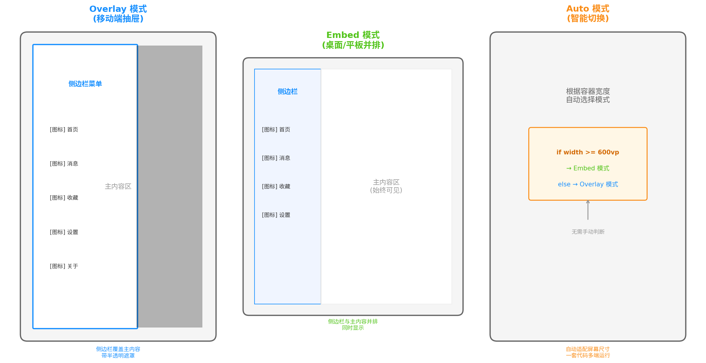
图1:三种 SideBarContainer 模式对比。Overlay 模式下侧边栏覆盖主内容并带遮罩,适合手机;Embed 模式下侧边栏与主内容并排常驻,适合平板桌面;Auto 模式根据宽度自动切换,一套代码适配多端。
二、架构设计与状态管理
2.1 整体架构分层
抽屉菜单的交互链路涉及触发、状态管理、渲染三个层次:
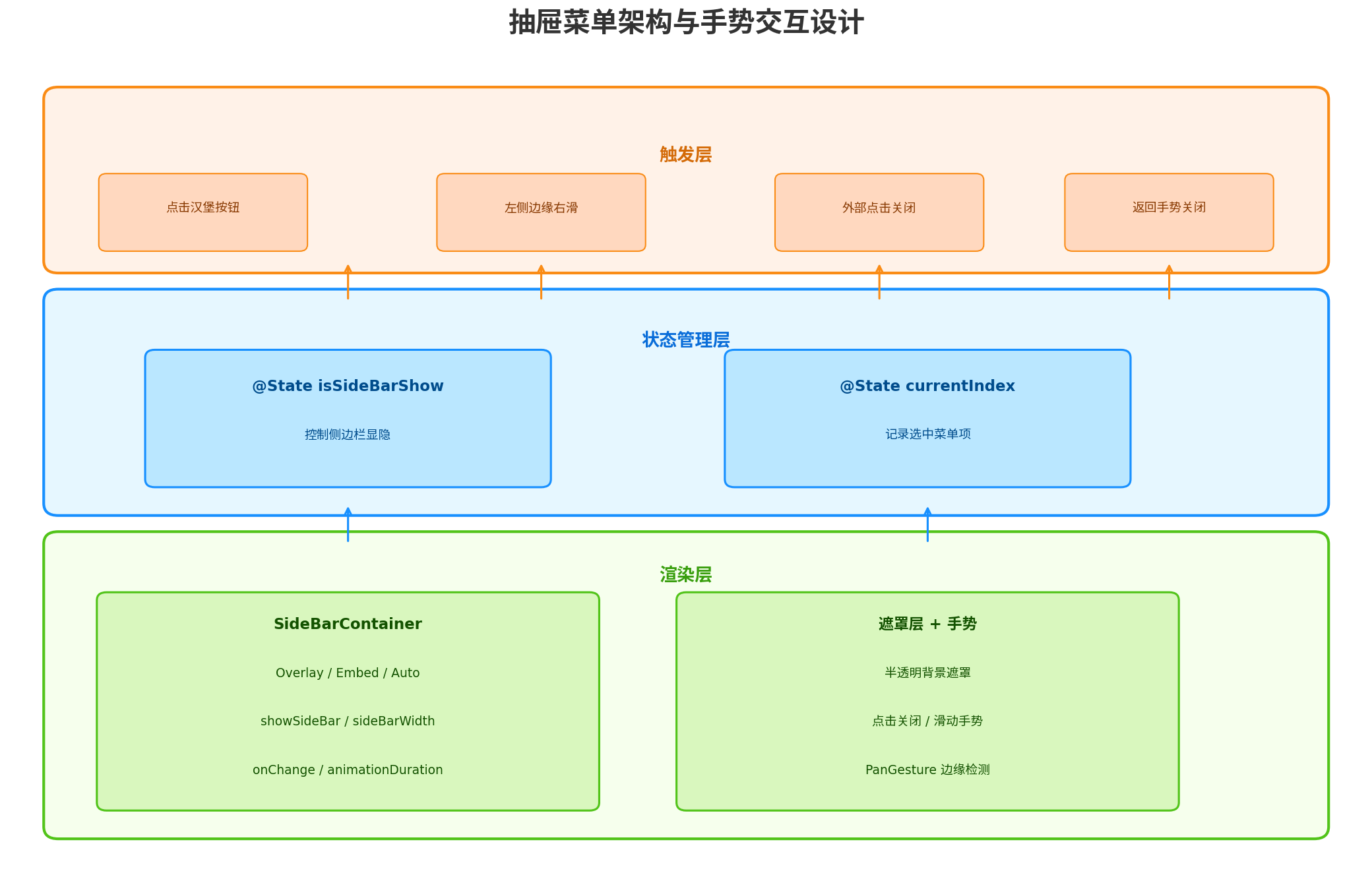
图2 :抽屉菜单三层架构。触发层负责捕获用户交互(点击、滑动、外部点击);状态管理层通过 isSideBarShow 和 currentIndex 分别控制侧边栏显隐和菜单选中态;渲染层通过 SideBarContainer 完成布局,通过遮罩层和手势组件实现交互闭环。
2.2 核心状态变量设计
typescript
// entry/src/main/ets/pages/DrawerPage.ets
@Entry
@Component
struct DrawerPage {
  // 控制侧边栏显隐
  @State isSideBarShow: boolean = false;
  // 记录当前选中的菜单项
  @State currentIndex: number = 0;
  // 遮罩层透明度(用于自定义动画)
  @State maskOpacity: number = 0;
  // 侧边栏滑动偏移量(用于手势跟随)
  @State sidebarOffset: number = -280;
}关键设计原则:
isSideBarShow是单一数据源,所有显隐逻辑(按钮点击、手势滑动、外部点击)最终都修改该变量currentIndex与isSideBarShow解耦,菜单选中态的变更不应触发侧边栏关闭(除非业务需要)- 遮罩层和侧边栏的动画状态由
isSideBarShow驱动,通过animateTo统一调度
三、Overlay 模式:移动端抽屉实现
3.1 基础骨架
Overlay 模式是移动端最常用的抽屉形式,侧边栏从屏幕左侧滑出,覆盖在主内容上方,同时主内容区域显示半透明遮罩。
typescript
// entry/src/main/ets/pages/DrawerPage.ets
import { SideBarContainer, SideBarContainerType, SideBarPosition } from '@kit.ArkUI';

@Entry
@Component
struct DrawerPage {
  @State isSideBarShow: boolean = false;
  @State currentIndex: number = 0;

  private menuItems: MenuItem[] = [
    { title: '首页', icon: $r('app.media.ic_home'), index: 0 },
    { title: '消息', icon: $r('app.media.ic_message'), index: 1, badge: 3 },
    { title: '收藏', icon: $r('app.media.ic_favorite'), index: 2 },
    { title: '设置', icon: $r('app.media.ic_settings'), index: 3 },
    { title: '关于', icon: $r('app.media.ic_about'), index: 4 }
  ];

  build() {
    SideBarContainer(SideBarContainerType.Overlay) {
      // 第一个子组件:侧边栏内容
      this.SideBarContent()

      // 第二个子组件:主内容区
      this.MainContent()
    }
    .showSideBar(this.isSideBarShow)
    .sideBarWidth(280)
    .minSideBarWidth(280)
    .maxSideBarWidth(280)
    .sideBarPosition(SideBarPosition.Start)
    .showControlButton(false) // 禁用默认控制按钮,使用自定义触发
    .animationDuration(300)
    .onChange((isShow: boolean) => {
      this.isSideBarShow = isShow;
    })
    .width('100%')
    .height('100%');
  }
}
3.2 侧边栏内容构建
typescript
@Builder
SideBarContent() {
  Column({ space: 0 }) {
    // 用户信息区域
    Column({ space: 8 }) {
      Image($r('app.media.avatar'))
        .width(72)
        .height(72)
        .borderRadius(36)
        .border({ width: 2, color: '#E8E8E8' })
        .margin({ top: 48 });

      Text('HarmonyOS 开发者')
        .fontSize(18)
        .fontWeight(FontWeight.Bold)
        .fontColor('#333333');

      Text('developer@harmonyos.com')
        .fontSize(13)
        .fontColor('#999999');
    }
    .width('100%')
    .alignItems(HorizontalAlign.Center)
    .padding({ bottom: 24 });

    // 分割线
    Divider()
      .strokeWidth(0.5)
      .color('#EEEEEE')
      .margin({ left: 16, right: 16 });

    // 菜单列表
    List({ space: 4 }) {
      ForEach(this.menuItems, (item: MenuItem) => {
        ListItem() {
          this.MenuItemBuilder(item);
        }
      });
    }
    .width('100%')
    .layoutWeight(1)
    .padding({ top: 12, bottom: 12 })
    .scrollBar(BarState.Off);

    // 底部退出按钮
    Button('退出登录')
      .width('80%')
      .height(40)
      .backgroundColor('#FF4D4F')
      .fontColor('#FFFFFF')
      .fontSize(14)
      .margin({ bottom: 24 })
      .onClick(() => {
        // 退出登录逻辑
        this.handleLogout();
      });
  }
  .width('100%')
  .height('100%')
  .backgroundColor('#FFFFFF');
}

// 菜单项构建器
@Builder
MenuItemBuilder(item: MenuItem) {
  const isSelected = this.currentIndex === item.index;

  Row({ space: 16 }) {
    Stack({ alignContent: Alignment.TopEnd }) {
      Image(item.icon)
        .width(22)
        .height(22)
        .fillColor(isSelected ? '#1890FF' : '#666666');

      // 角标
      if (item.badge !== undefined && item.badge > 0) {
        Badge({
          value: item.badge > 99 ? '99+' : item.badge.toString(),
          position: BadgePosition.RightTop,
          style: { badgeSize: 16, badgeColor: '#FF4D4F' }
        }) {
          Text('').width(0).height(0);
        }
        .offset({ x: 6, y: -4 });
      }
    }
    .width(22)
    .height(22);

    Text(item.title)
      .fontSize(15)
      .fontColor(isSelected ? '#1890FF' : '#333333')
      .fontWeight(isSelected ? FontWeight.Bold : FontWeight.Normal)
      .layoutWeight(1);

    if (isSelected) {
      Circle({ width: 6, height: 6 })
        .fill('#1890FF');
    }
  }
  .width('100%')
  .height(52)
  .padding({ left: 20, right: 20 })
  .backgroundColor(isSelected ? '#E6F7FF' : '#FFFFFF')
  .borderRadius(8)
  .margin({ left: 12, right: 12 })
  .onClick(() => {
    this.currentIndex = item.index;
    // 点击菜单项后自动关闭侧边栏
    this.isSideBarShow = false;
  });
}
3.3 主内容区与遮罩层
typescript
@Builder
MainContent() {
  Stack({ alignContent: Alignment.TopStart }) {
    // 主内容
    Column({ space: 0 }) {
      // 顶部导航栏
      Row({ space: 12 }) {
        Image($r('app.media.ic_menu'))
          .width(24)
          .height(24)
          .fillColor('#333333')
          .onClick(() => {
            this.isSideBarShow = !this.isSideBarShow;
          });

        Text(this.getPageTitle())
          .fontSize(18)
          .fontWeight(FontWeight.Bold)
          .fontColor('#333333')
          .layoutWeight(1);

        Image($r('app.media.ic_search'))
          .width(24)
          .height(24)
          .fillColor('#333333');
      }
      .width('100%')
      .height(56)
      .padding({ left: 16, right: 16 })
      .backgroundColor('#FFFFFF');

      // 内容区域
      Column() {
        this.PageContent();
      }
      .width('100%')
      .layoutWeight(1)
      .backgroundColor('#F5F6FA');
    }
    .width('100%')
    .height('100%');

    // 遮罩层:当侧边栏显示时覆盖主内容
    if (this.isSideBarShow) {
      Column()
        .width('100%')
        .height('100%')
        .backgroundColor('#000000')
        .opacity(0.4)
        .onClick(() => {
          this.isSideBarShow = false;
        })
        .animation({ duration: 300, curve: Curve.EaseInOut });
    }
  }
  .width('100%')
  .height('100%');
}

// 根据选中索引返回页面标题
private getPageTitle(): string {
  const titles = ['首页', '消息', '收藏', '设置', '关于'];
  return titles[this.currentIndex] ?? '首页';
}

// 页面内容分发
@Builder
PageContent() {
  if (this.currentIndex === 0) {
    HomeContent();
  } else if (this.currentIndex === 1) {
    MessageContent();
  } else if (this.currentIndex === 2) {
    FavoriteContent();
  } else if (this.currentIndex === 3) {
    SettingsContent();
  } else {
    AboutContent();
  }
}
四、Embed 模式与 Auto 模式
4.1 Embed 模式:平板与桌面端
Embed 模式下,侧边栏与主内容区并排显示,侧边栏始终可见,适合屏幕宽度充足的设备。citeweb_search:30#0
typescript
@Entry
@Component
struct TabletDrawerPage {
  @State currentIndex: number = 0;
  @State isSideBarShow: boolean = true; // Embed 模式下默认展开

  build() {
    SideBarContainer(SideBarContainerType.Embed) {
      this.SideBarContent()   // 侧边栏
      this.MainContent()      // 主内容
    }
    .showSideBar(this.isSideBarShow)
    .sideBarWidth(240)
    .minSideBarWidth(200)
    .maxSideBarWidth(300)
    .minContentWidth(400) // 主内容最小宽度,触发折叠阈值
    .divider({ strokeWidth: 1, color: '#EEEEEE', startMargin: 0, endMargin: 0 })
    .showControlButton(true)
    .controlButton({
      left: 8,
      top: 20,
      width: 24,
      height: 24,
      icons: {
        shown: $r('app.media.ic_collapse'),
        hidden: $r('app.media.ic_expand'),
        switching: $r('app.media.ic_switching')
      }
    })
    .width('100%')
    .height('100%');
  }
}
Embed 模式关键属性:
minContentWidth:当主内容区宽度小于此值时,侧边栏自动折叠,保证内容可读性divider:自定义侧边栏与主内容之间的分割线样式controlButton:配置折叠/展开控制按钮的位置和图标
4.2 Auto 模式:一套代码多端运行
Auto 模式是 HarmonyOS 响应式布局的利器,组件会根据容器宽度自动选择 Embed 或 Overlay:
typescript
@Entry
@Component
struct AdaptiveDrawerPage {
  @State isSideBarShow: boolean = false;
  @State currentIndex: number = 0;

  build() {
    SideBarContainer(SideBarContainerType.Auto) {
      this.SideBarContent()
      this.MainContent()
    }
    .showSideBar(this.isSideBarShow)
    .sideBarWidth(260)
    .minSideBarWidth(220)
    .maxSideBarWidth(320)
    .minContentWidth(400)
    .autoHide(true) // 在 Overlay 模式下自动隐藏
    .onChange((isShow: boolean) => {
      this.isSideBarShow = isShow;
    })
    .width('100%')
    .height('100%');
  }
}
Auto 模式切换逻辑:
| 容器宽度 | 选择模式 | 侧边栏行为 |
|---|---|---|
| < 600 vp | Overlay | 悬浮覆盖,需手动展开 |
| >= 600 vp | Embed | 并排常驻,可折叠 |
五、高级交互:手势、动画与自定义效果
5.1 边缘滑动手势
系统默认的 SideBarContainer 已内置边缘滑动手势,但在某些场景下(如主内容区包含横向滚动的列表),可能需要自定义手势逻辑以避免冲突。
typescript
@Builder
MainContent() {
  Stack({ alignContent: Alignment.TopStart }) {
    // 主内容...

    // 左侧边缘手势区域(20vp 宽)
    Column()
      .width(20)
      .height('100%')
      .position({ x: 0, y: 0 })
      .gesture(
        PanGesture({ direction: PanDirection.Right, distance: 10 })
          .onActionStart(() => {
            // 手势开始,记录起始位置
          })
          .onActionUpdate((event: GestureEvent) => {
            // 跟随手指移动,实时更新侧边栏位置
            if (event.offsetX > 0 && event.offsetX < 280) {
              this.sidebarOffset = event.offsetX - 280;
            }
          })
          .onActionEnd((event: GestureEvent) => {
            // 手势结束,判断是否超过阈值
            if (event.offsetX > 100) {
              animateTo({ duration: 200, curve: Curve.EaseOut }, () => {
                this.isSideBarShow = true;
              });
            } else {
              animateTo({ duration: 200, curve: Curve.EaseOut }, () => {
                this.isSideBarShow = false;
              });
            }
          })
      );
  }
}
5.2 自定义显式动画
SideBarContainer 内置了默认的滑入滑出动画,但开发者可以通过 animateTo 实现更丰富的效果,如淡入淡出、缩放等。citeweb_search:30#10
typescript
// 自定义展开动画
private openDrawer(): void {
  animateTo({
    duration: 350,
    curve: Curve.EaseInOut,
    onFinish: () => {
      console.info('Drawer opened');
    }
  }, () => {
    this.isSideBarShow = true;
    this.maskOpacity = 0.4;
  });
}

// 自定义收起动画
private closeDrawer(): void {
  animateTo({
    duration: 250,
    curve: Curve.EaseIn,
    onFinish: () => {
      console.info('Drawer closed');
    }
  }, () => {
    this.isSideBarShow = false;
    this.maskOpacity = 0;
  });
}
5.3 右侧抽屉(设置面板)
除了常规的左侧导航抽屉,右侧抽屉常用于设置面板、筛选条件等场景:
typescript
SideBarContainer(SideBarContainerType.Overlay) {
  this.MainContent()       // 第一个子组件变为主内容
  this.SettingsPanel()     // 第二个子组件变为右侧抽屉
}
.sideBarPosition(SideBarPosition.End) // 侧边栏位于右侧
.showSideBar(this.isSettingsShow)
.sideBarWidth(320)
六、多设备适配策略
6.1 响应式断点设计
HarmonyOS 6 提供了 BreakpointSystem 和 @Media 装饰器,结合 SideBarContainerType.Auto 可实现无缝的多设备适配。
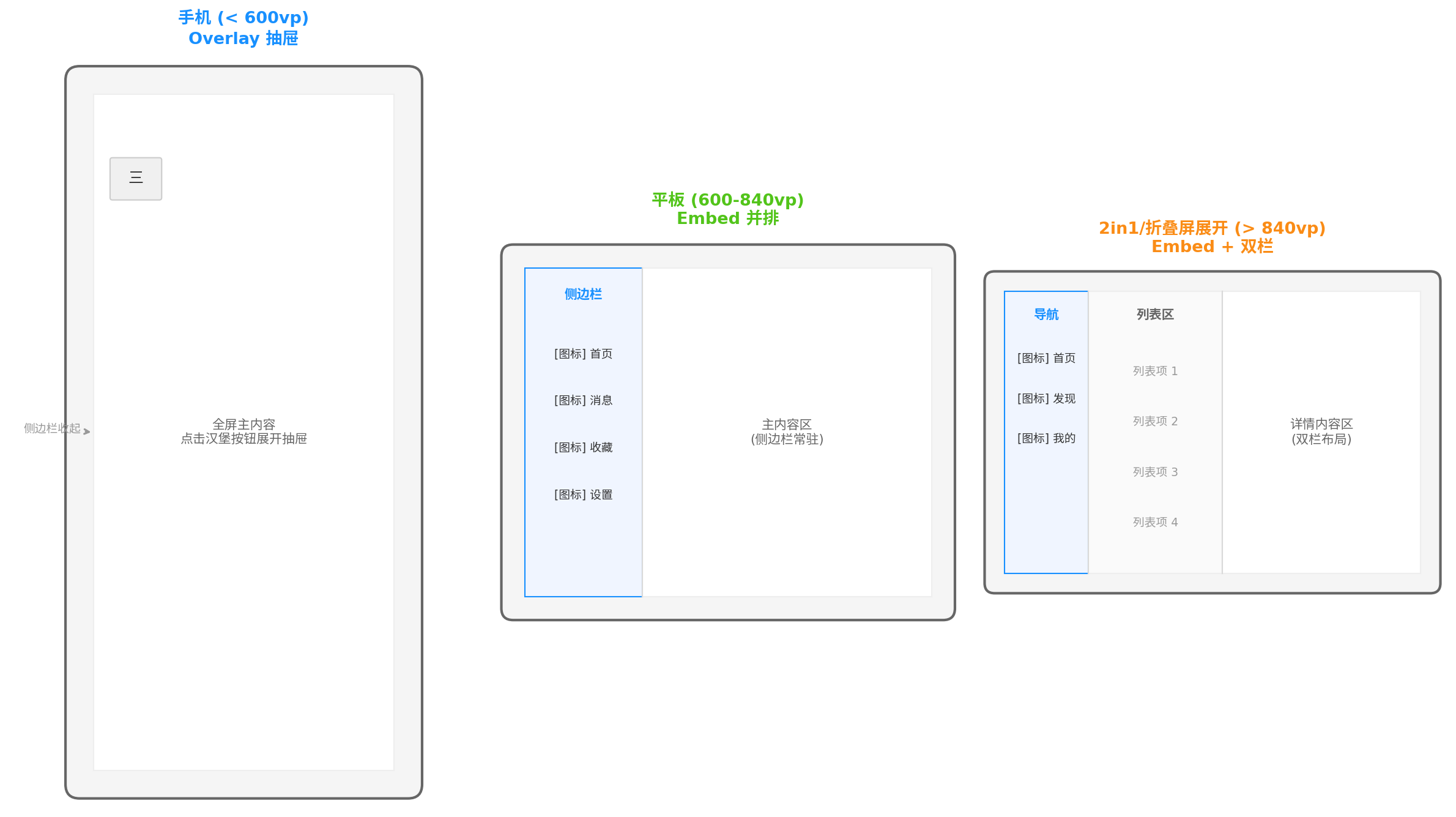
图4:多设备适配策略。手机(< 600vp)使用 Overlay 抽屉,全屏主内容;平板(600--840 vp)使用 Embed 并排,侧边栏常驻;2in1/折叠屏展开(> 840 vp)使用 Embed + 双栏布局,列表与详情同时显示。
6.2 折叠屏专项适配
折叠屏设备在展开/收起时,窗口宽度会发生剧烈变化,需要监听配置变更并动态调整:
typescript
import { Configuration } from '@kit.AbilityKit';

export default class EntryAbility extends UIAbility {
  onConfigurationUpdate(newConfig: Configuration): void {
    const width = px2vp(newConfig.windowMetrics?.width ?? 0);
    // 通知页面更新布局模式
    AppStorage.setOrCreate('screenWidth', width);
  }
}
在页面中根据屏幕宽度动态调整:
typescript
@Entry
@Component
struct FoldableDrawerPage {
  @StorageLink('screenWidth') screenWidth: number = 400;

  private getDrawerType(): SideBarContainerType {
    if (this.screenWidth >= 600) {
      return SideBarContainerType.Embed;
    }
    return SideBarContainerType.Overlay;
  }

  build() {
    SideBarContainer(this.getDrawerType()) {
      this.SideBarContent()
      this.MainContent()
    }
    .showSideBar(this.screenWidth >= 600)
    .width('100%')
    .height('100%');
  }
}
七、完整实战案例:企业级后台管理系统
以下是一个企业级后台管理系统的完整实现,包含多级菜单、用户权限、响应式布局:
typescript
// entry/src/main/ets/pages/AdminPage.ets
import { SideBarContainer, SideBarContainerType } from '@kit.ArkUI';

interface MenuGroup {
  title: string;
  items: MenuItem[];
}

@Entry
@Component
struct AdminPage {
  @State isSideBarShow: boolean = true;
  @State currentIndex: number = 0;
  @State expandedGroup: number = 0; // 当前展开的分组

  private menuGroups: MenuGroup[] = [
    {
      title: '概览',
      items: [
        { title: '数据大屏', icon: $r('sys.symbol.chart_bar'), index: 0 },
        { title: '工作台', icon: $r('sys.symbol.desktopcomputer'), index: 1 }
      ]
    },
    {
      title: '管理',
      items: [
        { title: '用户管理', icon: $r('sys.symbol.person_2'), index: 2, badge: 12 },
        { title: '订单管理', icon: $r('sys.symbol.doc_text'), index: 3 },
        { title: '商品管理', icon: $r('sys.symbol.cube'), index: 4 }
      ]
    },
    {
      title: '系统',
      items: [
        { title: '权限配置', icon: $r('sys.symbol.shield'), index: 5 },
        { title: '日志审计', icon: $r('sys.symbol.doc_chart'), index: 6 },
        { title: '系统设置', icon: $r('sys.symbol.gear'), index: 7 }
      ]
    }
  ];

  @Builder
  SideBarContent() {
    Column({ space: 0 }) {
      // Logo 区域
      Row({ space: 12 }) {
        Image($r('app.media.logo'))
          .width(36)
          .height(36)
          .borderRadius(8);
        Text('Admin Pro')
          .fontSize(20)
          .fontWeight(FontWeight.Bold)
          .fontColor('#1890FF');
      }
      .width('100%')
      .height(64)
      .padding({ left: 20, right: 20 })
      .alignItems(VerticalAlign.Center);

      // 分组菜单
      List({ space: 8 }) {
        ForEach(this.menuGroups, (group: MenuGroup, groupIndex: number) => {
          ListItemGroup({ header: this.GroupHeader(group.title, groupIndex) }) {
            ForEach(group.items, (item: MenuItem) => {
              ListItem() {
                this.AdminMenuItem(item);
              }
            });
          }
          .divider({ strokeWidth: 0.5, color: '#F0F0F0' });
        });
      }
      .width('100%')
      .layoutWeight(1)
      .padding({ top: 8, bottom: 8 });

      // 底部用户信息
      Row({ space: 12 }) {
        Image($r('app.media.avatar'))
          .width(36)
          .height(36)
          .borderRadius(18);
        Column({ space: 2 }) {
          Text('管理员')
            .fontSize(14)
            .fontColor('#333333');
          Text('admin@company.com')
            .fontSize(11)
            .fontColor('#999999');
        }
        .layoutWeight(1)
        .alignItems(HorizontalAlign.Start);
      }
      .width('100%')
      .height(56)
      .padding({ left: 16, right: 16 })
      .backgroundColor('#FAFAFA');
    }
    .width('100%')
    .height('100%')
    .backgroundColor('#FFFFFF');
  }

  @Builder
  GroupHeader(title: string, index: number) {
    Row() {
      Text(title)
        .fontSize(12)
        .fontColor('#999999')
        .fontWeight(FontWeight.Medium);
    }
    .width('100%')
    .height(36)
    .padding({ left: 20, right: 20 })
    .backgroundColor('#FFFFFF');
  }

  @Builder
  AdminMenuItem(item: MenuItem) {
    const isSelected = this.currentIndex === item.index;
    Row({ space: 12 }) {
      SymbolGlyph(item.icon)
        .fontSize(18)
        .fontColor(isSelected ? '#1890FF' : '#666666');

      Text(item.title)
        .fontSize(14)
        .fontColor(isSelected ? '#1890FF' : '#333333')
        .fontWeight(isSelected ? FontWeight.Bold : FontWeight.Normal)
        .layoutWeight(1);

      if (item.badge !== undefined && item.badge > 0) {
        Badge({
          value: item.badge.toString(),
          style: { badgeSize: 18, badgeColor: '#FF4D4F', fontSize: 11 }
        }) {
          Text('').width(0).height(0);
        };
      }
    }
    .width('100%')
    .height(44)
    .padding({ left: 20, right: 16 })
    .backgroundColor(isSelected ? '#E6F7FF' : '#FFFFFF')
    .borderRadius(6)
    .margin({ left: 8, right: 8 })
    .onClick(() => {
      this.currentIndex = item.index;
      // 手机端点击后自动收起
      if (AppStorage.get<number>('screenWidth') ?? 0 < 600) {
        this.isSideBarShow = false;
      }
    });
  }

  build() {
    SideBarContainer(SideBarContainerType.Auto) {
      this.SideBarContent()
      this.MainContent()
    }
    .showSideBar(this.isSideBarShow)
    .sideBarWidth(260)
    .minSideBarWidth(220)
    .maxSideBarWidth(300)
    .minContentWidth(400)
    .divider({ strokeWidth: 1, color: '#F0F0F0' })
    .showControlButton(true)
    .animationDuration(250)
    .onChange((isShow: boolean) => {
      this.isSideBarShow = isShow;
    })
    .width('100%')
    .height('100%');
  }
}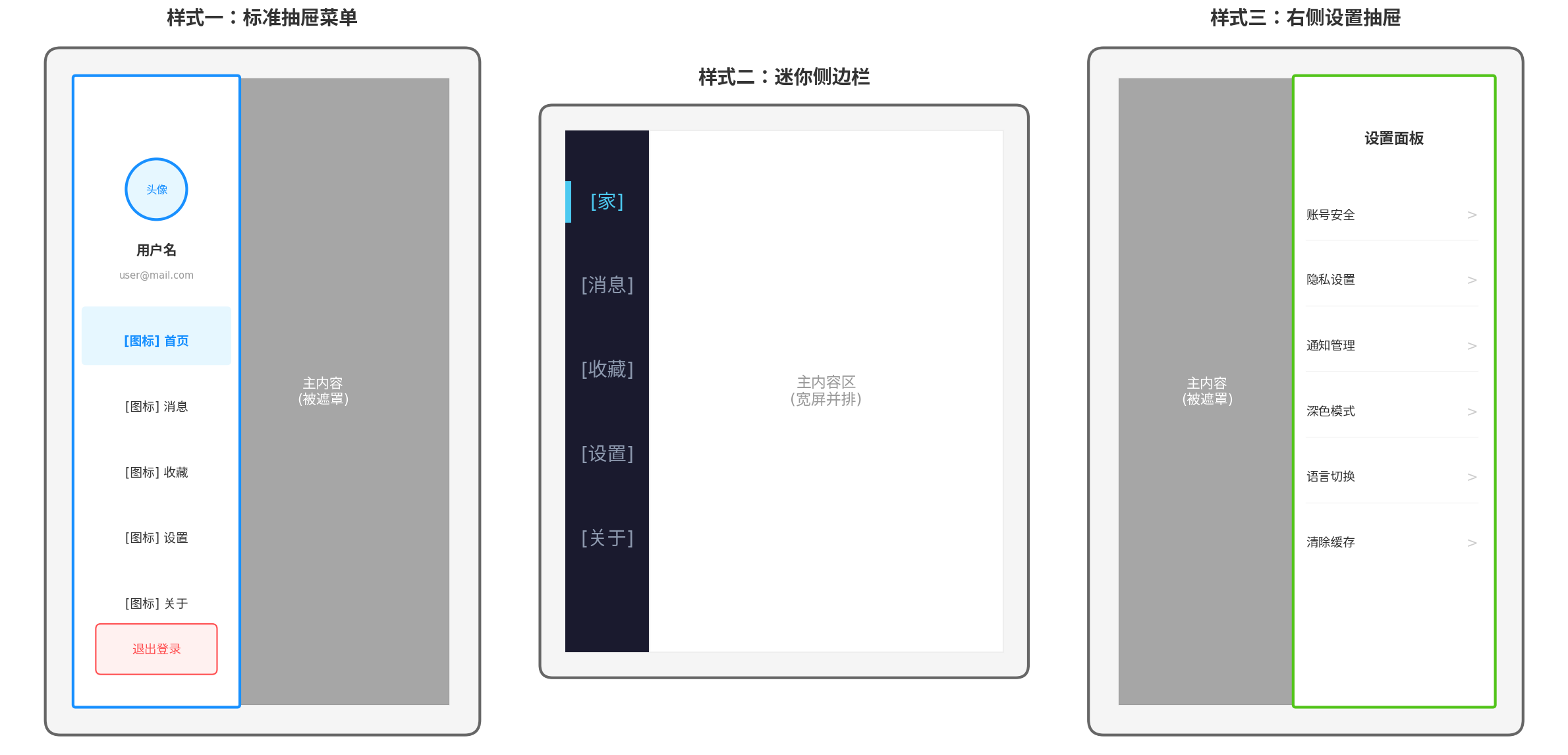
图3:三种抽屉菜单样式。左为标准抽屉菜单,包含用户信息、菜单列表和退出按钮;中为迷你侧边栏(图标-only),适合宽屏常驻导航;右为右侧设置抽屉,用于配置面板和筛选条件。
八、性能优化与避坑指南
8.1 性能优化要点
| 优化项 | 方案 | 收益 |
|---|---|---|
| 延迟加载内容 | TabContent 使用 aboutToAppear 异步加载数据 |
避免首次展开抽屉时卡顿 |
| 菜单项复用 | 使用 List + ListItem 而非 Column + ForEach |
利用 ArkUI 的节点复用机制 |
| 图标资源优化 | 使用 SymbolGlyph 替代 PNG | 矢量图标支持动态着色,体积更小 |
| 状态更新合并 | currentIndex 与 isSideBarShow 的更新放在同一动画块 |
减少重绘次数 |
| 遮罩层缓存 | 遮罩使用纯色而非渐变/图片 | 降低 GPU 合成开销 |
8.2 常见坑点与解决方案
-
子组件数量限制 :
SideBarContainer必须且只能包含两个子组件,第一个为侧边栏,第二个为主内容。超出两个会被截断,少于一个会布局异常。citeweb_search:30#8 -
宽度设置方式 :侧边栏宽度必须通过
sideBarWidth()设置,直接对子组件设置width无效。 -
Overlay 模式下的点击穿透 :遮罩层必须覆盖整个主内容区,且需要设置
onClick关闭抽屉,否则用户可能误触主内容区的按钮。 -
Embed 模式下的安全区 :平板横屏时,侧边栏可能位于刘海/挖孔区域,需使用
expandSafeArea或safeArea适配。 -
动画冲突 :
SideBarContainer内置动画与animateTo自定义动画可能冲突,建议关闭内置动画(animationDuration(0)),完全由animateTo控制。
总结
本文从架构设计到代码落地,系统讲解了 HarmonyOS 6 下抽屉菜单的完整工程方案。核心要点包括:
- 模式选型:手机用 Overlay(悬浮抽屉),平板用 Embed(并排常驻),全场景用 Auto(自动切换)
- 状态管理 :
isSideBarShow控制显隐,currentIndex管理选中态,两者解耦避免副作用 - 交互闭环:汉堡按钮打开、边缘右滑打开、遮罩点击关闭、返回手势关闭,四种触发方式覆盖全场景
- 自定义扩展 :通过
animateTo实现淡入淡出、缩放等高级动画;通过sideBarPosition(SideBarPosition.End)实现右侧设置面板 - 多设备适配 :结合
Auto模式与BreakpointSystem,一套代码适配手机、平板、折叠屏、2in1
抽屉菜单是应用信息架构的"隐形骨架",设计得当能够显著提升应用的可用性和专业感。希望本文的方案能够帮助开发者快速构建出兼具美感与效率的抽屉导航系统。
转载自:https://blog.csdn.net/u014727709/article/details/163308181
欢迎 👍点赞✍评论⭐收藏,欢迎指正