注:本文为 "字体排印" 相关译文。
英文引文,机翻未校。
如有内容异常,请看原文。
The Evolution of Typography: A Journey Through History
字体排印的演变:一场跨越历史的旅程
Saniuddin Khan (Assistant Professor) D/o Design & Innovation, JMI.
E-Mail: saniuddin.khan.ac@gmail.com
Typography, the art and technique of arranging type, has a rich and fascinating history that dates back thousands of years. From the earliest Egyptian hieroglyphs to modern digital fonts, the development of typography has played a critical role in the communication of ideas and the spread of knowledge.
字体排印是文字排布的艺术与技法,拥有一段源远流长、引人入胜的发展史,其源头可追溯至数千年前。从最古老的埃及象形文字到现代数字字体,字体排印的发展在思想传播与知识普及进程中起到了至关重要的作用。
What is Typography?
何为字体排印?
The word typography comes from the combination of two Greek words: "Typos," meaning 'a dent, an impression, or a mark,' and "graphy," meaning 'writing.' The word originally referred to writing by making impressions. Over the years, a broader definition of typography has been derived. It can hence be stated as:
"typography(字体排印)"一词由两个希腊词根组合而成:"Typos"意为"凹痕、印记、符号","graphy"意为"书写"。该词最初指代通过压印完成的书写形式。历经漫长岁月,人们为字体排印延伸出更宽泛的定义,可概括为:
"Typography is the process of setting and arranging text for a combination of aesthetic and functional goals."
"字体排印是为兼顾美学与实用双重目标,对文字进行排版、排布的整套工序。"
The Birth of Written Communication: Egyptian Hieroglyphics
文字传播的起源:埃及象形文字
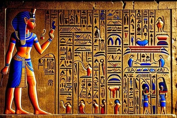
The period of Egyptian art, spanning from around 3000 BC to 30 BC, saw the emergence of one of the earliest known forms of written communication: hieroglyphics. Hieroglyphics, a system of picture writing, used a combination of symbols and images to convey ideas and information. The characters were often carved into stone or written on papyrus using reed brushes and ink.
埃及艺术存续于公元前 3000 年至公元前 30 年,这一时期诞生了人类已知最早的文字交流体系之一------象形文字。象形文字属于图画文字体系,依靠符号与图像的组合传递思想与信息,字符常被刻凿在石材上,或是用芦苇笔蘸墨书写于莎草纸。
The earliest forms of hieroglyphics were simple images representing objects or ideas. For example, a picture of a bird might represent the word "bird" or the sound of the bird's name. Over time, the system evolved to include more complex images representing multiple words or ideas. Hieroglyphics recorded everything from religious beliefs and myths to everyday transactions and historical events.
早期象形文字只是用以指代事物或概念的简易图画,例如一幅鸟类图案,既可代表"鸟"这个名词,也可代表该鸟类名称的发音。随着发展,这套文字体系衍生出更复杂的图像符号,可对应多个词汇与含义。象形文字记录了包罗万象的内容,涵盖宗教信仰、神话传说、日常交易与历史纪事。
The development of hieroglyphics had a profound impact on the development of typography. The system introduced the concept of using images to represent words, which later evolved into using letters to represent sounds. Hieroglyphics also introduced the idea of arranging symbols in a particular order to convey meaning, a fundamental principle of typography.
象形文字的发展深刻影响了字体排印的演进。它首创了以图像表意的思路,后世逐步演变为以字母表音;同时确立了符号按固定顺序排布以传递语义的规则,这也是字体排印的底层逻辑。
Calligraphy in Ancient India
古印度书法

Before the discovery of paper, various surfaces such as burnt clay, copper, and dried leaves were used for calligraphy. Birch bark, also known as bhojpatra, and palm leaves were common writing materials. Palm leaves were widely used in Southern India, primarily for religious texts, while birch bark was prevalent in the Northern part.
纸张发明之前,古人会在烧陶、铜片、干树叶等各类载体上书写。桦树皮(又称薄桦皮书写纸)与棕榈叶是当时主流书写材料:南印度普遍使用棕榈叶誊写宗教典籍,北印度则盛行桦树皮文书。
Ink was made with charcoal mixed with gum, sugar, and water. Permanent inks were prepared from borax and lamp black made from sesame oil. Red dyes were made from alaktaka or hingula, known as cinnabar in English. Gold and silver inks were used in illuminated manuscripts.
基础墨汁由木炭混合树胶、蔗糖与清水调制;耐褪色的长效墨则以硼砂、芝麻油灯烟为原料。红色颜料取自胭脂树或辰砂;金银墨专供带彩绘装饰的手抄经卷使用。
Writing instruments included pens made of reed or wood and brushes made of fiber and hairs. The reed pen was known as 'kalama.' In the south, a stylus was used to write on palm leaves, with characters subsequently blackened with charcoal or black soot.
书写工具包含芦苇笔、木杆笔,以及纤维动物毛制成的毛笔;芦苇笔在当地被称作"kalama"。南印度会先用金属尖笔在棕榈叶刻出字迹,再涂抹木炭烟灰,让文字清晰显黑。
The Diversity of Indian Scripts
印度文字的多元体系
India is known for its linguistic diversity, with multiple scripts used across the country. Each script has a unique history and characteristics. Devanagari is one such Indian script, used to write over a hundred languages, including Sanskrit, Hindi, Marathi, Bhojpuri, Nepali, Konkani, Marwadi, Rajasthani, and Prakrit.
印度语言体系丰富多元,全境流通多种文字,每一种都拥有独特的发展脉络与字形特征。天城文便是其中代表,可书写上百种语言,包含梵语、印地语、马拉地语、博杰普尔语、尼泊尔语、孔卡尼语、马尔瓦迪语、拉贾斯坦语与普拉克利特语。
The name 'Devanagari' is derived from the Sanskrit words 'dev' (God) and 'nagari' (city), meaning 'script from the city of Gods.' Devanagari has roots in the ancient Brahmi script, one of the earliest writing systems developed in India. All modern Indian scripts and several scripts in Southeast and East Asia are derived from Brahmi.
"Devanagari(天城文)"源自梵语词根:"dev"意为神明,"nagari"意为城池,合译即"众神之城的文字"。天城文脱胎于古婆罗米文------印度最古老的文字体系之一;如今全印度现代文字,以及东南亚、东亚多国文字,均由婆罗米文演变而来。
Devanagari is written from left to right in a horizontal way and is an abugida, divided into vowels and consonants. Each letter represents a consonant with an inherent vowel 'a.' The Devanagari alphabet comprises thirty-four consonants and fourteen vowels, according to Bapurao Naik's 'Typography of Devanagari.'
天城文横向从左至右书写,属于元音附标文字,字符分为元音、辅音两类;每个辅音字符自带默认元音"a"。依据巴普拉奥·奈克所著《天城文字体排印》记载,天城文字母体系包含 34 个辅音、14 个元音。
Pre-Computer Typography: Movable type press
计算机时代前的字体排印:活字印刷机
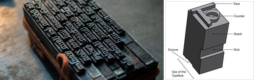
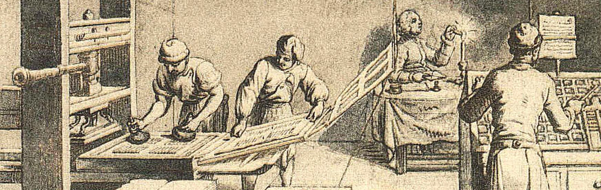
In the early days of typography, letters were printed using blocks of wood or metal. These blocks were known as movable type since they could be moved around and joined to create words, lines, and paragraphs. This process of printing is technically called letterpress printing---where raised, reversed blocks of letters were smeared with ink and then pressed against paper to produce an impression of the text. The advantage that letterpress printing had over traditionally handwritten calligraphic manuscripts was that texts could be mass-produced, and the blocks of metal could be reused over and over again for different books.
字体排印发展早期,人们依靠木、金属字块完成文字印刷。这类可自由挪动、拼接组词、成行、成段的字块被称作活字,整套印刷工艺专业名称为凸版印刷:将凸起、反向的金属字块蘸墨,再压印在纸张上,转印出正向文字。对比纯手工誊抄的书法手稿,凸版印刷最大优势在于可批量复刻文本,金属活字块还能反复拆解重组,印制不同书籍。
Xylography
木刻版印刷
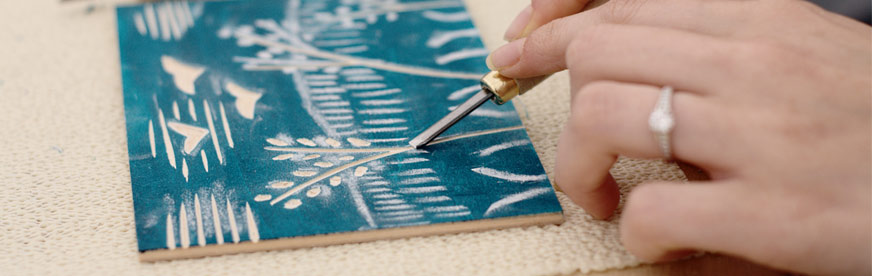
Printing texts or illustrations with wooden blocks is called xylography. The word comes from the combination of the Greek words "xylon," which means 'wood,' and "graphy," which means writing. Another word with similar roots is calligraphy; "callis" in Greek means 'beautiful,' so calligraphy means beautiful writing.
以木刻印版印制文字、插图的工艺称作木刻版画印刷。该词汇由两个希腊词根构成:"xylon"代表木材,"graphy"代表书写。书法(calligraphy)拥有同源构词逻辑:希腊词根"callis"意为优美,因此 calligraphy 本义为"优美的书写"。
Movable Type and Its Components
活字及其构件
These metal blocks contain a raised portion with an inverted image of the letter to be printed. The vertical height of the metal block determined the size of the typeface, which meant large blocks of metal were used for large text and smaller blocks for smaller text. These blocks of letters were kept in wooden boxes called type cases. The terms upper-case for capital letters and lower-case for smaller letters are derived from the positions where these letters were placed in the type cases. These solid metal letters have specialized terminology to describe various parts:
金属活字块带有凸起的反向字符印面;活字的垂直高度决定字号大小,大号文字搭配高活字块,小字则使用矮活字块。活字统一收纳在木质活字盘内,英文里大写字母"upper-case"、小写字母"lower-case"的叫法,正源于二者在活字盘中的摆放分层位置。实心金属活字各部位拥有专属专业术语:
Face: The printing surface of the letter.
印面(Face):活字承载印刷字符的凸起表面。
Body: The main block of the letter which includes the face and the shank.
活字本体(Body):活字主体,包含印面与字身柄。
Shank: The portion of the letter that provides the height.
字身柄(Shank):决定活字整体高度的基座部分。
Typesetting Machines
铸字排版机
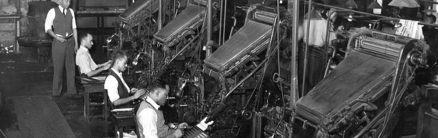
Impact of Hot Metal Typesetting
热金属铸排工艺带来的变革
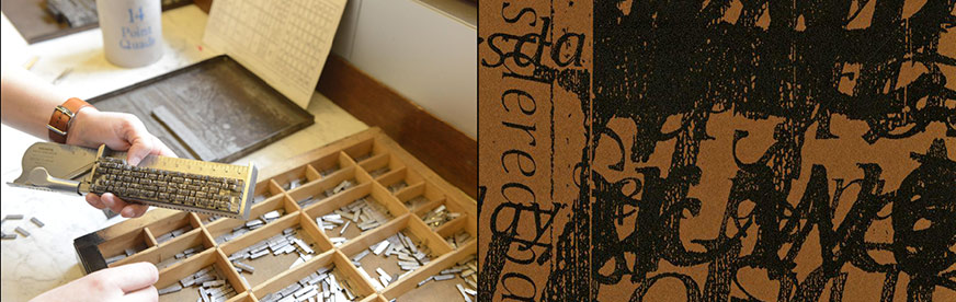
The process of combining (composing) words, lines, and pages for letterpress was initially done manually. The compositor had to place each and every block on a 'composing stick.' Setting books, which contained thousands of words and hundreds of pages, was found to be cumbersome and extremely time-consuming. In the early portion of the nineteenth century, several individuals tried to solve this problem by inventing typesetting machines that would reduce the time and effort taken for composing metal types. This process of printing was called mechanical typesetting or hot metal typesetting since hot molten metal was poured into letter molds to create sorts or slugs of words or lines, which were then used for printing.
早期凸版印刷的组字、成行、拼版全靠人工操作,排版工人需将每一块活字逐个摆放在"手盘"内。一本包含数千词汇、数百页面的书籍,纯人工排版繁琐且极度耗费工时。19 世纪初期,多位匠人着手研发自动化铸排设备,以此缩减金属活字排版的人力与时间成本。这套工艺被称作机械排版,也叫热金属铸排:将熔融高温金属灌入字符模具,一次性铸出单字活字或是整行铅条,直接用于印刷。
Hot metal printing drastically changed the way printing was done. The speed and effort required to print were considerably reduced, which was especially beneficial for the newspaper industry. These typesetting machines, such as the Linotype and the Monotype, allowed for faster composition and more consistent results. The Linotype machine, for instance, could produce an entire line of text (a "line-o'-type") at once, which significantly sped up the typesetting process.
热金属铸排彻底革新了印刷作业模式,大幅压缩印刷工时、降低人力消耗,对报业发展起到极大推动作用。整行铸排机(Linotype)、单字铸排机(Monotype)等设备,大幅提升排版速度,输出文字排版效果也更统一稳定。以整行铸排机为例,设备可一次性铸出一整行文字铅条,极大加快排版效率。
The advent of mechanical typesetting and hot metal typesetting marked a significant milestone in the history of typography. It not only increased the efficiency of printing but also expanded the accessibility of printed materials to a broader audience. This era laid the groundwork for the later developments in digital typography, bridging the gap between the manual craftsmanship of early letterpress printing and the precision and versatility of modern digital type.
机械铸排与热金属工艺的出现,是字体排印史上一座关键里程碑。它不仅提升印刷产能,还让印刷读物得以普及,触达更多普通读者。该时期为后世数字字体排印奠定基础,衔接起早期凸版手工工艺,与现代数字字体精准、灵活的技术体系。
Typography in the Digital Age
数字时代的字体排印
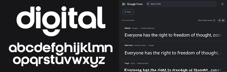
Web-based designs differ significantly from traditional print-based designs, primarily in the certainty of output. Traditional print designs result in a physical copy with predictable outcomes, while web designs are viewed on various devices with different screen sizes and operating systems. This variability can affect the rendering of fonts used in web designs, introducing a level of uncertainty.
网页端设计与传统印刷设计存在巨大差异,区别在于成品呈现效果的可控性。传统印刷最终产出实体纸质成品,视觉效果完全可预判;而网页设计会在尺寸、系统各不相同的设备屏幕上展示,设备差异会改变网页字体的渲染效果,视觉呈现存在不可控变量。
In traditional print design, the designer has control over every aspect of the final product. The choice of paper, the type of ink, and the printing process all contribute to the certainty of the final output. This control ensures that the typography appears exactly as intended, with consistent font sizes, colors, and layouts. The designer can be confident that the printed material will look the same to every viewer.
传统印刷设计中,设计师能够把控成品所有细节:纸张材质、油墨种类、印刷工艺均可自主选定,以此锁定最终视觉效果,保证字号、色彩、版面布局完全贴合设计稿,所有读者看到的印刷成品视觉统一。
However, the situation is quite different with web-based designs. When a design is uploaded to a web server, it can be accessed on a wide variety of devices, each with its own screen size, resolution, and color settings. A design that looks perfect on a large desktop monitor might not translate well to a small smartphone screen. Furthermore, the operating systems and browsers used by different devices can interpret and render fonts in varying ways, leading to inconsistencies in the appearance of the text.
网页设计则截然相反:设计稿上传至网页服务器后,会被各类设备访问,每台设备的屏幕尺寸、分辨率、色彩参数均不相同。在大屏电脑显示器上效果完美的排版,适配到小型手机屏幕时极易崩坏;同时不同设备的操作系统、浏览器对字体的解析渲染逻辑存在差异,最终造成文字显示效果参差不齐。
Another significant challenge in web typography is the availability of fonts. In traditional print design, the designer can choose any font and be assured that it will be used in the final printed product. In web design, however, the fonts must be available on the viewer's device, or they must be embedded within the website itself. This limitation often forces designers to use websafe fonts, which are guaranteed to be available on most devices but may not offer the same aesthetic appeal as more specialized typefaces.
网页字体排印的另一大难点是字体适配性。传统印刷中,设计师选用任意字体,都能保证最终印刷成品正常显示;网页端则不同,字体要么提前预装在访问者设备内,要么内嵌至网页文件。该限制迫使设计师常选用网页安全字体------这类字体虽能在绝大多数设备正常加载,但视觉表现力远不如专业定制字体。
To address these challenges, web designers employ several techniques to ensure their typography remains consistent and visually appealing across different devices and platforms. One common approach is the use of responsive design principles. This involves creating flexible layouts that adjust automatically to fit the screen size of the device being used. By using relative units like percentages rather than fixed units like pixels, designers can create fluid designs that scale appropriately on any device.
为解决上述难题,网页设计师会运用多种技术,保障字体排版在全设备、全平台统一美观。响应式设计是主流方案:搭建弹性版面,页面会随设备屏幕尺寸自动适配;摒弃像素这类固定尺寸单位,改用百分比等相对单位,打造可流畅缩放、适配所有屏幕的动态版式。
Another technique is the use of web fonts. Services like Google Fonts and Adobe Fonts allow designers to embed a wide variety of typefaces directly into their websites. These fonts are downloaded by the viewer's browser as needed, ensuring that the text appears as intended regardless of the fonts installed on the viewer's device. Web fonts greatly expand the typographic possibilities for web designers, enabling them to use unique and creative typefaces without worrying about compatibility issues.
网页字体是另一项技术。Google Fonts、Adobe Fonts 等平台支持设计师将海量字体直接内嵌至网页;访问时浏览器按需下载对应字体,无论用户本地设备预装哪些字体,文字都能严格按照设计稿渲染。网页字体极大拓宽网页排版创作边界,设计师可自由选用特色创意字体,无需担忧设备兼容问题。
Additionally, designers must consider the readability and accessibility of their text. Web typography must be legible on a wide range of devices, including those with small screens and high resolutions. Designers often use larger font sizes and increased line spacing to improve readability on mobile devices. Accessibility features, such as adjustable font sizes and highcontrast text options, ensure that the content is accessible to all users, including those with visual impairments.
除此之外,设计师必须兼顾文字易读性与无障碍访问需求。网页字体需在小屏、高分辨率等各类设备上清晰可辨;设计师通常放大移动端字号、增加行间距,优化手机端阅读体验。字号调节、高对比度文字等无障碍功能,能保障包含视障群体在内的所有用户顺畅读取内容。
结语
Typography in the digital age presents unique challenges and opportunities. While the variability of devices and platforms can introduce uncertainty in the final rendering of designs, modern techniques like responsive design and web fonts enable designers to create flexible and consistent typographic experiences. As the digital landscape continues to evolve, so too will the tools and strategies available to web designers, allowing them to push the boundaries of typographic innovation. The rich history of typography has had a profound impact on modern design, influencing how we approach and appreciate the art of arranging text. From the earliest forms of writing, such as Egyptian hieroglyphs, to the invention of movable type and letterpress printing, each historical milestone has contributed to the evolution of typography. These developments have laid the foundation for contemporary practices, demonstrating a continuum of innovation and adaptation.
数字时代的字体排印,机遇与独有挑战并存。尽管设备、平台的差异性会造成设计渲染效果不可控,但响应式设计、网页字体等现代技术,帮助设计师打造适配全终端、视觉统一的文字体验。数字生态持续迭代,网页设计工具与排版策略也会同步更新,不断拓宽字体排印的创新边界。厚重悠久的字体排印发展史深刻影响现代设计,重塑人们对文字排布艺术的创作思路与审美认知。从埃及象形文字这类原始书写体系,到活字与凸版印刷的诞生,每一座历史里程碑都推动字体排印向前演进;历代技术革新为当代排版工艺筑牢根基,形成一条持续创新、不断适配时代的发展脉络。
The advent of movable type in the 15th century by Johannes Gutenberg revolutionized the production of written materials, making books and documents more accessible and affordable. This breakthrough not only democratized knowledge but also set the stage for future typographic advancements. The precision and efficiency of letterpress printing allowed for the mass production of text, which was a significant leap from the laborious process of hand-copying manuscripts. In the digital age, we see the echoes of these historical innovations in modern typography. Digital fonts and responsive design principles owe much to the groundwork laid by earlier typographers. The flexibility and scalability of web fonts, for instance, mirror the adaptability of movable type, while responsive design addresses the challenges of variable screen sizes and resolutions, ensuring readability across different devices.
15 世纪约翰内斯·古腾堡发明活字印刷,彻底革新文字载体的生产模式,书籍、文书的获取门槛与成本大幅降低。这项突破不仅实现知识大众化普及,更为后世字体排印技术迭代铺平道路。凸版印刷兼具精度与产能,可批量印制文字,对比耗费巨大人力的手抄稿,是一次跨越式变革。步入数字时代,现代字体排印处处可见古代技术革新的影子:数字字体、响应式设计,均建立在历代排印匠人的积累之上。例如网页字体的灵活缩放特性,复刻了活字自由重组的适配优势;响应式设计则解决各类屏幕尺寸、分辨率差异带来的阅读难题,保障全设备文字可读性。
I argue that an understanding of this historical context is essential for modern designers. By appreciating the origins and evolution of typography, designers can make more informed choices and create more effective and aesthetically pleasing work. The principles established by early typographers continue to resonate today, guiding the development of new typographic technologies and techniques.
本文提出观点:当代设计师必须通晓字体排印的发展脉络。读懂字体排印的起源与演变,设计师才能做出更合理的创作决策,产出实用性、美观度兼备的作品。早期排印匠人确立的底层准则至今仍具备指导价值,引领新一代字体排印技术与工艺的研发。
Furthermore, the legacy of historical typography fosters a deeper respect for the craft and encourages innovation. As we build upon the achievements of the past, we are better equipped to push the boundaries of what is possible in modern design. This historical perspective not only enriches our appreciation of typography but also inspires us to continue evolving the field, blending tradition with cutting-edge technology.
除此之外,字体排印的历史积淀能让从业者发自内心敬畏这门工艺,同时激发创新思维。站在前人成果之上,我们才有能力突破现代设计的创作边界。以历史视角审视字体排印,不仅能加深审美理解,更能推动行业持续发展,实现传统工艺与前沿数字技术的融合共生。
In summary, the impact of typography's history on modern design is immense and undeniable. The journey from ancient scripts to digital fonts highlights the enduring significance of typography in human communication. By acknowledging and understanding this history, we can better appreciate the sophistication of current typographic practices and continue to drive the evolution of this vital art form.
总而言之,字体排印发展史对现代设计的影响深远且无可否认。从古文字到数字字体的完整发展脉络,印证了字体排印在人类信息交流中恒久不变的价值。正视、读懂这段历史,我们才能充分领会当代排版工艺的精妙,持续推动这门重要视觉艺术不断向前发展。
参考文献
Drucker, J. (1994). The alphabetic labyrinth: The letters in history and imagination. Thames & Hudson.
德鲁克,J.(1994).《字母迷宫:历史与想象中的文字》.泰晤士与哈德逊出版社
Butt, Aaqib. (2024). JOURNAL OF CRITICAL REVIEWS Nomo phobia: Review on Smartphone Addiction in Indian Perspective. 2020.
巴特·阿齐布(2024).《批判性评论期刊:无手机恐惧症------印度视角下智能手机成瘾综述》,2020
Richard Howard. (2016-04-25). ARTS 222: Typography/Book Arts Class. https://jstor.org/stable/community.19115842
理查德·霍华德(2016-04-25).艺术 222:字体排印/书籍艺术课程. https://jstor.org/stable/community.19115842
Mavreas, Billy. (2010-2014). untitled Cardboard, ink, staples. OCAD University: Dorothy H. Hoover Library: Learning Zone, Toronto, Canada; On the Shelf. https://jstor.org/stable/community.16231863
马夫雷亚斯·比利(2010-2014).无题作品(硬纸板、油墨、订书钉材质).加拿大多伦多,安省艺术设计大学,桃乐丝·胡佛图书馆学习区馆藏,上架中. https://jstor.org/stable/community.16231863
Hochuli, J. (2008). Detail in typography. Hyphen Press.
霍楚利,J.(2008).《字体排印细节》.连字符出版社
"Moveable Type: A Print Revolution." Colour Print Blog, 3 Aug. 2018, https://www.col-print.co.uk/blog/moveable-type-a-print-revolution
Dalvi, Girish. "Digital Typography - 1: Letterpress." Dsource, IIT Bombay, n.d., https://dsource.in/course/digital-typography-1/letterpress
"Digital font search asset 281320144." Adobe Stock, n.d., https://stock.adobe.com/in/search?k=digital+font&asset_id=281320144
Google Fonts. Google, n.d., https://fonts.google.com/
"Woodcut." Wikipedia, Wikimedia Foundation, n.d., https://en.wikipedia.org/wiki/Woodcut
turbo4gproxy. "Unveiling the secrets of ancient egyptian hieroglyphics." Medium, n.d., https://medium.com/@turbo4gproxy/unveiling-the-secrets-of-ancient-egyptian-hieroglyphics30c4d8b1a102
History of Typography: The Evolution of Written Forms
字体排印史:书写形态的演变
Bogdan Sandu
9 March 2026
The history of typography stretches back over 5,000 years, from carved inscriptions on stone to variable fonts rendered on smartwatch screens. Every typeface you read today carries the DNA of punch cutters, printing press operators, and digital designers who came before.
字体排印的历史绵延五千余年,从石刻铭文,到智能手表屏幕上渲染的可变字体。你如今阅读的每一款字体,都传承着前代刻字师、印刷机操作工与数字设计师留下的脉络。
This article traces that full arc. From Bi Sheng's ceramic movable type in 11th-century China through Johannes Gutenberg's metal press, the rise of serif and sans-serif classifications, phototypesetting, desktop publishing, and the web font systems shaping modern screen design.
本文完整梳理这条发展脉络:从 11 世纪中国毕昇的陶活字,到约翰内斯·古腾堡的金属印刷机;从衬线字体与无衬线字体体系的兴起,照相排版、桌面出版,再到塑造现代屏幕设计的网页字体系统。
You'll walk away understanding how letterforms evolved, why specific type classifications exist, and what forces (cultural, technical, commercial) pushed typography into the form we use right now.
读完本文,你将了解字形如何演变、各类字体分类因何诞生,以及哪些力量(文化、技术、商业)推动字体排印发展为我们当下使用的形态。
What Is Typography?
何为字体排印?
Typography is the practice of arranging type to make written language readable, clear, and visually interesting. It covers everything from choosing a typeface to adjusting spacing between characters and lines.
字体排印是排布文字,让书面语言具备可读性、清晰度与视觉美感的实践。范畴涵盖从字体选择,到字符间距、行间距调整的所有环节。
People often mix it up with lettering or calligraphy, but these are different disciplines. Calligraphy and typography sit at opposite ends of the production spectrum. Calligraphy is hand-drawn, one-of-a-kind. Typography deals with repeatable, systematized letterforms.
人们常将其与手绘字体、书法混淆,但三者属于不同领域。书法与字体排印处在制作谱系的两端:书法为手工绘制,独一无二;字体排印面向可重复使用、体系化的字形。
Core Building Blocks
基础术语
A few terms show up constantly when discussing type, and getting them straight helps everything else make sense.
讨论字体时会反复出现若干术语,厘清这些概念有助于理解其余内容。
Typeface vs. font: A typeface is the design itself (like Garamond). A font is a specific weight, style, or size within that design (Garamond Bold Italic, 12pt).
字体家族(Typeface)与字体(Font):字体家族指字形设计本身(例如加拉蒙体);字体是该家族下特定字重、样式、字号的变体(12pt 加拉蒙粗斜体)。
Kerning: The adjustment of space between individual letter pairs. Bad kerning turns "click" into something unfortunate.
字距微调(Kerning):单独调整一对字符之间的间距。糟糕的字距微调会让"click"产生违和、不雅的视觉效果。
Leading: Vertical space between lines of text. Named after the strips of lead that typesetters physically placed between rows of metal type.
行间距(Leading):文本各行之间的垂直距离。名称源自排字工人垫在金属活字行间的铅条。
Tracking: Uniform spacing applied across an entire word or block of text, unlike kerning which targets specific pairs.
全局字距(Tracking):对整个单词或文本块统一增减间距,区别于针对特定字符对的字距微调。
The global font and typeface market was valued at 1.14 billion in 2024, according to Global Growth Insights. That number is projected to reach 1.66 billion by 2034.
根据全球增长洞察机构的数据,2024 年全球字体市场规模达 11.4 亿,预计 2034 年将增长至 16.6 亿。
Monotype's 2024 Font Use & Forecasting Survey found that 83% of designers consider typography a critical factor in branding and communication. It's not decoration. It's structure.
蒙纳字体 2024 年字体使用与趋势调研显示,83% 的设计师认为字体排印是品牌塑造与信息传递的重要要素。字体并非装饰,而是信息架构。
How Writing Systems Led to Early Typographic Thinking
书写系统如何催生早期字体排印理念
Typography didn't appear from nowhere in 15th-century Germany. Thousands of years of experimentation with writing systems laid the groundwork.
字体排印并非凭空诞生于 15 世纪的德国。数千年来人类对各类书写系统的探索,完成前期铺垫。
Mesopotamian cuneiform tablets from around 3400 BC used wedge-shaped marks pressed into clay. Egyptian hieroglyphs carved into temple walls introduced the idea that letterforms could carry both meaning and visual weight simultaneously.
公元前 3400 年左右,美索不达米亚泥板楔形文字依靠压刻在黏土上的楔形符号记录信息。刻在神庙墙壁上的埃及象形文字,展现字形可以同时承载语义与视觉张力。
Roman square capitals (known as Capitalis Monumentalis) on Trajan's Column in 113 AD still influence typeface design today. If you've used Times New Roman or any traditional serif font, you're looking at letterforms descended from those inscriptions.
公元 113 年图拉真纪功柱上的罗马方形大写字母(碑铭大写体),至今仍影响字体设计。如果你使用过泰晤士新罗马体或其他传统衬线字体,所见字形都源自这类石刻铭文。
By the medieval period, European monasteries had developed blackletter script. Scribes spent months copying a single book by hand, and the price reflected it. One hand-copied book in the 14th century cost roughly as much as a house, according to historian Ada Palmer at the University of Chicago.
中世纪时期,欧洲修道院发展出哥特黑体。抄写员耗费数月手工誊写一本书,成本极高。芝加哥大学历史学家艾达·帕尔默的研究表明,14 世纪一册手抄本的价格大约等同于一栋房屋。
East Asian Block Printing and Bi Sheng's Movable Type
东亚雕版印刷与毕昇活字
The oldest known printed book, the Diamond Sutra, was produced in China during the Tang Dynasty around 868 AD using woodblock printing. That's nearly 600 years before Gutenberg.
现存最早印刷书籍《金刚经》,于公元 868 年唐代以雕版印刷制成,比古腾堡印刷术早近 600 年。
Bi Sheng invented ceramic movable type in China around 1040 AD during the Song Dynasty. Each character was molded from baked clay and arranged in an iron frame.
毕昇于北宋庆历年间(约公元 1040 年)发明陶活字。每个字由烧制黏土成型,可排布在铁框内排版。
Korean printers took it further. The Jikji, printed with metal movable type in 1377, predates Gutenberg's Bible by about 78 years.
朝鲜印刷者进一步发展活字技术。1377 年以金属活字印制的《直指》,比古腾堡圣经早约 78 年。
So why didn't these systems spread the way Gutenberg's did? The Chinese writing system uses tens of thousands of characters. Storing and organizing that many individual pieces made the process far less practical than working with a 26-letter Latin alphabet. The materials played a role too. Clay type was fragile, and while Korean metal type was more durable, the scale of character sets still created a bottleneck.
为何这些印刷体系没有像古腾堡技术那样广泛传播?汉语书写体系拥有数万汉字,储存、整理海量单字远不如仅有 26 个字母的拉丁字母体系便捷。材料同样构成制约:陶活字易破损;尽管朝鲜金属活字更加耐用,但庞大的字符集依旧形成发展瓶颈。
Gutenberg and the Invention of the Printing Press
古腾堡与印刷机的诞生
Johannes Gutenberg built his metal movable type system in Mainz, Germany, around 1440. He was a trained goldsmith, and that metalworking skill turned out to be exactly what the technology needed.
约翰内斯·古腾堡约 1440 年在德国美因茨搭建金属活字印刷系统。他本身是金匠,这套金属加工技艺恰好匹配这项技术的需求。
His contributions went beyond just movable type. He developed an alloy of lead, tin, and antimony that produced durable, consistent characters. He created a hand mould for rapid type casting. He adapted the agricultural screw press (used for wine and olive oil) into a printing press. And he introduced oil-based ink, which stuck to metal type far better than the water-based inks used before.
他带来的革新不止活字本身:研制铅、锡、锑合金,铸造耐用、规格统一的字模;发明手动铸字模具实现快速活字铸造;将压榨葡萄酒、橄榄油的螺旋压榨机改造为印刷机;推出油性油墨,相比以往的水性油墨,能更好附着在金属活字表面。
The Gutenberg Bible and Its Reach
《古腾堡圣经》及其影响力
The first major project was the 42-line Bible, completed around 1455. About 180 copies were printed, three quarters on paper and the rest on vellum.
他首个大型印刷项目是《四十二行圣经》,约 1455 年完工,总计印刷约 180 册,其中四分之三印在纸张上,其余使用兽皮纸。
According to Wikipedia's aggregation of historical data, a single Renaissance printing press could produce up to 3,600 pages per workday . Hand-printing managed about forty. Hand-copying, just a few.
维基百科汇总史料显示,一台文艺复兴时期印刷机单日最高可印制 3600 页;手工印刷仅约 40 页;手工誊写只能完成寥寥数页。
Book prices fell by 2.4% per year for over a hundred years after Gutenberg, according to research by Dittmar and Seabold at the London School of Economics. When an additional printing firm entered a city market, prices dropped by 25%.
伦敦政治经济学院迪特马尔与西博尔德的研究表明,古腾堡之后百余年间,书籍价格每年下降 2.4%;一座城市新增一家印刷工坊,当地书价便会下跌 25%。
By 1500, presses had spread to over 200 cities across a dozen European countries, and historians estimate between 15 to 20 million books were already in circulation. For context, before 1450, there were perhaps a few tens of thousands of books in all of Europe.
至 1500 年,印刷机扩散至十余个欧洲国家的 200 多座城市。历史学家估算,流通书籍数量达到 1500 万至 2000 万册。作为参照:1450 年之前,全欧洲书籍总量仅有数万册。
Why It Worked This Time
这套技术得以普及的原因
Gutenberg didn't succeed just because the technology was good. The timing mattered.
古腾堡取得成功不只依托成熟技术,时代机遇同样发挥作用。
Universities had been multiplying since the 12th century, driving demand for books. The urban middle class was growing through trade and commerce. Venice became the first real distribution hub, with German printers fleeing Mainz and setting up shop near the Mediterranean's central shipping routes. Print 200 copies of a book in Venice, and you could sell five to the captain of each ship leaving port.
12 世纪起欧洲大学数量持续增长,催生书籍需求;商贸发展壮大城市中产阶层。威尼斯成为首个图书集散中心,不少德国印刷工匠离开美因茨,在地中海航运要道开设工坊。在威尼斯印刷 200 册图书,便可向每艘离港船只的船长出售 5 册。
Gutenberg himself died broke. His presses were seized by creditors. But the technology was already unstoppable.
古腾堡离世时穷困潦倒,印刷设备被债权人没收,但这项技术的传播已然无法阻挡。
The First Typeface Designers and the Birth of Roman Type
初代字体设计师与罗马体的诞生
The shift from blackletter to Roman letterforms changed how most of Europe reads. It didn't happen overnight, but it happened faster than you'd expect.
欧洲字体从哥特黑体转向罗马体,改变了绝大多数人的阅读方式。这场变革并非一蹴而就,但推进速度超出预期。
Nicolas Jenson, a French printer working in Venice, cut his Roman type around 1470. His letterforms drew from humanist manuscripts and Capitalis Monumentalis inscriptions. Jenson's type was so refined that it became the model for hundreds of typefaces that followed, and its proportions are still referenced in modern typographic elements.
法国印刷师尼古拉斯·詹森在威尼斯工作,约 1470 年刻制罗马活字。字形参考人文主义手抄本与碑铭大写字母。詹森字体形制精致,成为后世数百款字体的范本,其比例至今仍被现代字体设计借鉴。
Aldus Manutius, also in Venice, hired punch cutter Francesco Griffo to create the first italic type in 1501. The original purpose wasn't emphasis. It was space-saving. Italic letters were narrower, which meant you could fit more text per page, which meant cheaper books.
同样定居威尼斯的阿尔杜斯·马努蒂乌斯聘请刻字师弗朗西斯科·格里福,于 1501 年设计出第一款斜体。斜体最初并非用于强调文本,而是节省版面:斜体字形更窄,单页容纳更多文字,降低书籍印制成本。
Claude Garamond and the Standardized Font
克劳德·加拉蒙与标准化字体
Claude Garamond working in 16th-century France created what many consider the first widely adopted standard typeface. His designs were sold as matrices to other printers, which made them the first commercially distributed fonts.
16 世纪法国设计师克劳德·加拉蒙打造出公认首款大规模普及的标准字体。他将字模出售给各地印刷商,这也是最早商业化流通的字体。
Garamond's typefaces reflected Renaissance humanism. Clean proportions, moderate contrast between thick and thin strokes, and an elegance that moved decisively away from the dense blackletter tradition.
加拉蒙字体体现文艺复兴人文主义特征:比例匀称,笔画粗细反差适中,风格雅致,彻底摆脱厚重拥挤的哥特黑体传统。
Germany held onto blackletter far longer than the rest of Europe. That persistence would carry political significance centuries later.
相比欧洲其他地区,德国沿用哥特黑体的时间长得多,这一文字选择在数百年后具备政治层面的意义。
The Punch Cutters Who Shaped Modern Type
塑造现代字体的刻字师
Punch cutting was the actual craft behind every typeface for about 500 years. A craftsman would carve a letter in reverse on a steel rod, hammer it into a copper bar to create a matrix, then use that matrix to cast identical metal characters.
近五百年间,所有字体都依靠刻字工艺制作:工匠在钢棒上反向雕刻字形,捶打入铜坯得到字模,再利用字模批量铸造一模一样的金属活字。
| PUNCH CUTTER / 刻字师 | PERIOD / 时代 | KEY CONTRIBUTION / 主要贡献 |
|---|---|---|
| William Caslon 威廉·卡斯隆 | Early 18th century 18 世纪早期 | Established the dominant English typeface tradition 奠定主流英式字体体系 |
| John Baskerville 约翰·巴斯克维尔 | Mid 18th century 18 世纪中期 | Transitional type with sharper contrast and wider spacing 过渡体字体,笔画反差更强、字符间距更开阔 |
| Giambattista Bodoni 詹巴蒂斯塔·博多尼 | Late 18th century 18 世纪晚期 | High-contrast Modern type with extreme thick--thin variation 现代体字体,笔画粗细对比极致 |
| Firmin Didot 菲尔曼·迪多 | Late 18th century 18 世纪晚期 | Developed the Didone classification alongside Bodoni 与博多尼一同确立迪多尼字体分类 |
Baskerville's work was controversial at the time. Critics said his thin strokes would "blind readers." He didn't care. His Transitional typefaces bridged the gap between Caslon's Old Style and the extreme contrast of Bodoni and Didot's Modern faces.
巴斯克维尔的设计在当时充满争议。批评者声称纤细笔画会"损伤读者视力",但他并未妥协。他设计的过渡体字体,衔接了卡斯隆老式体与博多尼、迪多尼极致反差的现代体。
Around 70% of Fortune 500 companies now use sans-serif fonts in their logos, according to Linearity. But the serif tradition these punch cutters built still dominates book publishing and long-form reading.
根据 Linearity 数据,约 70% 财富五百强企业在品牌标识中使用无衬线字体。但这批刻字师建立的衬线字体体系,依旧主导图书出版与长篇文本阅读场景。
The Industrial Revolution and the Explosion of Display Type
工业革命与展示字体的爆发
Before the 1800s, type design was mostly about books. The Industrial Revolution turned it into a mass-communication tool practically overnight.
19 世纪之前,字体设计主要服务书籍印刷。工业革命几乎在一夜之间,让字体成为大众传播工具。
Steam-powered presses made newspapers cheap. Advertising became a real industry. And suddenly, printers needed type that could scream from a poster across the street, not just sit politely on a page.
蒸汽印刷机降低报纸印制成本,广告行业正式成型。印刷商开始需要适合海报远距离观看、视觉冲击力强的字体,而非仅仅适配书页阅读的文字。
The Birth of Display Typefaces
展示字体的诞生
Wood type solved the size problem. Metal type was too heavy and expensive to cast at large sizes, but wood could be carved with a pantograph router into display faces several inches tall.
木活字解决大尺寸印刷难题。金属活字放大后笨重且造价高昂,而木材可借助缩放雕刻机,制作数英寸高的展示字体。
This period gave us an explosion of new type classifications:
这一时期诞生大量全新字体分类:
- Slab serif typefaces (also called Egyptian) with their thick, blocky serifs built for impact
粗衬线字体(又称埃及体):厚重块状衬线,视觉冲击力强 - Fat faces with exaggerated thick strokes and extreme visual weight
粗变体字体:笔画极度加粗,视觉重量感突出 - Decorative Victorian lettering that crammed ornament into every available surface
维多利亚装饰字体:字形各处布满繁复纹饰
The first sans-serif typeface is often credited to William Caslon IV in 1816. When it debuted, it was called "grotesque" because it looked so strange without serifs. The name stuck as a classification.
公认首款无衬线字体由威廉·卡斯隆四世于 1816 年推出。问世时被称作"怪诞体",因为缺少衬线的形态在当时显得怪异,该名称随后沿用为字体分类名。
Mechanized Typesetting Machines
机械化排字设备
Hand-setting individual metal characters was painfully slow. Two inventions changed that.
手工拾取单个金属活字排版效率极低,两项发明改变这一现状。
Ottmar Mergenthaler's Linotype machine (1886) cast entire lines of type from molten metal. A single operator could set type about five times faster than by hand. Newspapers adopted it almost immediately.
奥特马尔·默根特勒的整行铸排机(Linotype)(1886 年):以熔融金属一次性铸造整行文字。单人排版速度约为手工排版的五倍,迅速被报社采用。
Tolbert Lanston's Monotype machine (1887) cast individual characters instead of whole lines, which made corrections easier. Book publishers preferred it because you could fix a single letter without resetting an entire line.
托尔伯特·兰斯顿的单字铸排机(Monotype)(1887 年):逐字铸造活字,修改文本更加便捷,深受图书出版商青睐------只需更换出错单字,无需重排整行。
These machines shaped newspaper and book production for nearly a century. They also locked typeface design into the physical constraints of hot metal casting, which affected letterform proportions, spacing between characters, and the relationship between type sizes.
这类设备主导报刊与图书生产近百年。同时,热金属铸造的物理限制约束字体设计,影响字形比例、字符间距以及不同字号之间的适配关系。
Modernist Typography and the Swiss Style
现代主义字体排印与瑞士风格
The 20th century brought something new. Designers stopped treating type as just a carrier for words and started treating it as a design element with its own visual logic.
20 世纪迎来全新变革:设计师不再仅将字体视作文字载体,而是将其作为具备独立视觉逻辑的设计元素。
Bauhaus and Die Neue Typographie
包豪斯与《新字体排印》
The Bauhaus school in 1920s Germany rejected ornament. Herbert Bayer pushed for universal letterforms. László Moholy-Nagy argued that typography should function like architecture: structured, efficient, stripped down to purpose.
20 世纪 20 年代德国包豪斯学派摒弃装饰元素。赫伯特·拜尔倡导通用字形;拉兹洛·莫霍利-纳吉提出,字体排印应当效仿建筑:结构清晰、高效、去除多余修饰,只为功能服务。
Jan Tschichold's 1928 manifesto "Die Neue Typographie" took this further. He demanded asymmetric layouts, sans-serif typefaces, and clear visual hierarchy based on function rather than tradition.
扬·奇肖尔德 1928 年发表宣言《新字体排印》,将这套理念推进到底:提倡非对称版式、无衬线字体,依据功能建立清晰视觉层级,而非盲从传统。
Tschichold later softened his position. He actually returned to classical type design. But the ideas he launched changed the field permanently.
奇肖尔德后期观点有所缓和,重新回归古典字体设计,但他提出的理念永久重塑这个领域。
The International Typographic Style
国际字体风格(瑞士风格)
The Swiss design movement (also called the International Typographic Style) came out of Zurich and Basel in the 1950s. It took Bauhaus principles and gave them a system.
瑞士设计运动(又称国际字体风格)20 世纪 50 年代兴起于苏黎世与巴塞尔,将包豪斯理念整理成一套系统化设计准则。
Grid systems became the structural backbone of page layout. Objective photography replaced illustration. And two typefaces released in 1957 defined the movement's look:
网格系统成为版面布局框架,写实摄影取代手绘插画。1957 年发布的两款字体奠定该运动视觉基调:
| TYPEFACE / 字体名称 | DESIGNER / 设计师 | APPROACH / 设计思路 |
|---|---|---|
| Helvetica 海尔维卡 | Max Miedinger & Eduard Hoffmann 马克斯·米丁格、爱德华·霍夫曼 | Neutral, clean, no intrinsic meaning 中性简洁,不附带固有情感含义 |
| Univers 尤尼维斯 | Adrian Frutiger 艾德里安·弗鲁提格 | Systematic family with 21 coordinated weights and widths 系统化字体家族,包含 21 套协调的字重与字宽变体 |
Helvetica was originally called Neue Haas Grotesk. It was renamed in 1960, drawing from "Helvetia," the Latin name for Switzerland, to make it easier to market internationally.
海尔维卡最初名为"新哈斯怪诞体",1960 年更名。名称取自瑞士拉丁古称"赫尔维蒂亚",方便全球推广。
Helvetica became one of the most widely used typefaces in corporate logo design. BMW, NASA, Nestlé, Panasonic, Target, American Airlines. The list keeps going. It was ranked number one among the top 100 typefaces of all time.
海尔维卡成为企业标识使用广泛的字体之一,宝马、美国国家航空航天局、雀巢、松下、塔吉特百货、美国航空等品牌均有使用,它也被评选为史上百大字体榜首。
Monotype's 2024 survey found that 76% of designers prioritize readability and accessibility in their font choices, which helps explain why clean sans-serif designs from this era remain so heavily used.
蒙纳字体 2024 年调研显示,76% 的设计师选择字体时优先考量可读性与无障碍适配,这也解释为何这一时期简洁的无衬线字体至今仍被大量使用。
Adrian Frutiger took a different approach with Univers. Instead of expanding one weight at a time (like most type families), he designed the entire system at once, with a numbering scheme that mapped weight and width on a grid. It was the first truly systematic font family, and his thinking influenced how variable fonts work today.
艾德里安·弗鲁提格设计尤尼维斯时采用全新思路:不同于多数字体家族逐个扩充字重,他一次性完成整套体系设计,通过编号系统在网格中定义字重与字宽。这是首款真正意义上系统化的字体家族,其设计思路影响如今可变字体的开发逻辑。
Phototypesetting and the Transition Away from Metal
照相排版:告别金属活字时代
Most people skip this era. They jump straight from hot metal to digital. But phototypesetting dominated type production from the 1960s through the mid-1980s, and it changed how designers thought about letterforms.
很多人会忽略这段历史,直接从热金属活字跳到数字字体。但照相排版在 20 世纪 60 年代至 80 年代中期主导文字生产,改变设计师对字形的思考方式。
The technology worked by projecting light through film negatives of characters onto photographic paper or film. No molten metal. No physical type blocks. Just light, lenses, and chemistry.
这项技术原理:光线透过印有字形的胶片负片,投射到相纸或胶片上完成曝光。无需熔融金属,不存在实体活字块,依靠光线、镜头与感光化学工艺完成排版。
How Phototype Changed Design
照相排版带来的设计变革
The Lumitype/Photon machine, introduced in the 1950s, was among the first commercially viable phototypesetting systems. It freed designers from the physical constraints of metal type in ways they hadn't imagined.
20 世纪 50 年代推出的 Lumitype/Photon 设备,是最早实现商用的照相排版系统之一。它让设计师摆脱金属活字带来的物理限制,释放大量创作空间。
Tight letterspacing became possible for the first time. Metal type had physical boundaries. You couldn't overlap two pieces of lead. But with phototype, characters could be set so close together that they touched or even overlapped.
紧凑字距首次成为可行方案。金属活字存在实体边界,两块铅字无法重叠;而照相排版能够把字符排布至相互接触,甚至彼此交叠。
Herb Lubalin and Tom Carnase took this to its logical extreme with ITC Avant Garde in 1970. The logo and its accompanying display font featured tight, interlocking ligatures that would have been physically impossible in metal.
赫伯·卢巴林与汤姆·卡纳斯在 1970 年设计的 ITC 先锋体,将这一特性发挥到极致。配套标识与展示字体拥有紧密咬合的连字,在金属活字时代无法实现。
The International Typeface Corporation
国际字体公司(ITC)
ITC was founded in New York in 1970 by Aaron Burns, Herb Lubalin, and Edward Rondthaler. It was one of the first type foundries with no history in metal type production at all.
国际字体公司 1970 年于纽约创立,创始人包括艾伦·伯恩斯、赫伯·卢巴林、爱德华·龙塔勒。它是最早一批完全没有金属活字生产背景的字体厂商。
The company's business model was new, too. ITC designed and licensed typefaces to manufacturers of phototypesetting equipment rather than making its own hardware. Gene Gable put it well: ITC designs put a face on the '70s and '80s.
商业模式同样创新:公司只负责字体设计,向照相排版设备厂商授权字体,不自主生产硬件。吉恩·盖布尔曾评价:ITC 的字体定义了七八十年代的视觉面貌。
By 1980, the ITC catalog had grown to over 100 typeface families, including revivals of classic faces like ITC Bookman and ITC Garamond, both re-cut with larger x-heights for better performance in phototype reproduction.
至 1980 年,ITC 字体目录收录超过 100 个字体家族,其中包含复刻经典字体:ITC 布克曼体、ITC 加拉蒙体。两款字体均调高 x 高度,适配照相排版的印刷效果。
Desktop Publishing and the Digital Type Revolution
桌面出版与数字字体革命
1985 changed everything. Three products arrived within months of each other, and together they wiped out the old typesetting industry.
1985 年成为转折点。三款产品在短短数月内相继问世,联手瓦解传统排版行业。
| PRODUCT / 产品名称 | YEAR / 年份 | ROLE / 作用 |
|---|---|---|
| Apple Macintosh 苹果麦金塔电脑 | 1984 1984 | GUI-based personal computer 搭载图形界面的个人电脑 |
| Apple LaserWriter 苹果激光打印机 | Jan 1985 1985 年1月 | First desktop PostScript laser printer 首款支持 PostScript 的桌面激光打印机 |
| Aldus PageMaker 阿尔杜斯专业排版软件 PageMaker | Jul 1985 1985 年7月 | First desktop publishing software 首款桌面出版软件 |
Paul Brainerd, Aldus Corporation's founder, coined the term "desktop publishing." He named his company after Aldus Manutius, the 15th-century Venetian printer. That was a deliberate link between old and new.
Aldus 公司创始人保罗·布雷纳德创造"桌面出版"一词。他以 15 世纪威尼斯印刷商阿尔杜斯·马努蒂乌斯命名企业,刻意建立新旧印刷时代的联结。
Adobe's PostScript page description language was the glue holding it all together. PostScript gave desktop printers the ability to render scalable vector graphics and type at any size, a capability that had previously required equipment costing tens of thousands of dollars.
奥多比 PostScript 页面描述语言串联整套工作流。它让桌面打印机能够渲染任意尺寸的矢量图形与字体,而这项能力此前只能依靠造价数万美金的专业设备实现。
Susan Kare and the Mac's Visual Language
苏珊·凯尔与麦金塔视觉体系
Susan Kare designed the bitmap fonts for the original Macintosh interface. Chicago, Geneva, Monaco. Each one hand-drawn on graph paper, pixel by pixel.
苏珊·凯尔为初代麦金塔系统界面设计点阵字体,包括芝加哥体、日内瓦体、摩纳哥体。每一款字体都在方格纸上逐像素手绘完成。
These weren't just functional. They established an aesthetic that made the Macintosh feel approachable and human in ways that other computers didn't. Kare is now recognized among the most influential graphic designers of the digital era.
这些字体不只具备实用价值,构建一套亲和、富有温度的视觉风格,区别于同期其他计算机系统。如今,凯尔被公认为数字时代具备影响力的平面设计师之一。
Emigre and the Experimental Digital Type Movement
Emigre 与实验性数字字体浪潮
Zuzana Licko and Rudy VanderLans launched Emigre magazine in 1984. Licko designed typefaces that worked with the Macintosh's low resolution rather than fighting against it.
祖扎娜·利科与鲁迪·范德兰斯于 1984 年创办《Emigre》杂志。利科顺应初代麦金塔低分辨率特性设计字体,而非强行复刻印刷字体形态。
Her early bitmap fonts (Oakland, Emigre, Emperor) didn't try to imitate traditional type. They accepted the pixel grid as a design constraint and worked within it. The results looked nothing like anything from the phototypesetting era.
她早期点阵字体(奥克兰体、Emigre 体、帝王体)没有模仿传统印刷字体,主动将像素网格视作设计限制并在此基础上创作,成品视觉风格与照相排版时代字体截然不同。
Emigre became the testing ground for a generation of digital type designers who questioned every assumption about what a glyph should look like.
Emigre 成为一代数字字体设计师的试验场,他们重新审视人们对于字形形态的固有认知。
OpenType and Font Format Standardization
OpenType 与字体格式标准化
Before OpenType, the font world was split between TrueType and PostScript Type 1. Adobe controlled Type 1. Apple developed TrueType in the late 1980s and licensed it to Microsoft. Designers had to pick sides.
OpenType 诞生前,字体格式分为两大阵营:TrueType 与 PostScript Type 1。Type 1 由奥多比掌控;苹果于 20 世纪 80 年代末开发 TrueType,并授权微软使用,设计师只能二选一。
In 1996, Adobe and Microsoft announced they would jointly develop OpenType. The first public specification shipped in April 1997.
1996 年,奥多比与微软宣布联合开发 OpenType,首版公开规范于 1997 年 4 月发布。
What OpenType solved:
OpenType 解决的问题:
- Cross-platform compatibility (same file on Mac and Windows)
跨平台兼容:同一字体文件可在 Mac、Windows 系统使用 - Support for over 65,000 glyphs per font (vs. 256 for older formats)
单款字体支持超过 65000 个字形(旧格式上限仅 256 个) - Advanced layout features like ligatures, small caps, and contextual alternates
支持连字、小型大写字母、上下文变体等高级排版特性 - Full Unicode support for multilingual type design
完整支持 Unicode,适配多语种字体设计
By 2007, an estimated 85 to 90% of all fonts sold were in OpenType format, according to Prepressure. Adobe completed converting its entire font library to OpenType around 2003 and stopped shipping new Type 1 fonts from 1999 onward.
Prepressure 数据显示,至 2007 年市场流通字体中,约 85%~90% 采用 OpenType 格式。奥多比大约 2003 年完成全部字体库格式转换,并自 1999 年起不再推出全新 Type 1 字体。
Web Typography and Screen-First Design
网页字体排印与屏幕优先设计
For the first decade of the web, type was barely a design decision. You got Times New Roman, Arial, Verdana, Georgia, and whatever else was installed on the user's computer. That was it.
互联网发展最初十年,字体几乎没有设计空间。页面只能调用用户电脑预装字体:泰晤士新罗马体、Arial、Verdana、Georgia,仅此而已。
The @font-face Breakthrough
@font-face:关键性突破
CSS2 introduced the @font-face rule back in 1998, and Internet Explorer 4 was the first browser to implement it. But with no licensing protection and slow dial-up connections, it went nowhere for over a decade.
CSS2 在 1998 年加入 @font-face 规则,IE4 是首款实现该特性的浏览器。但缺少字体版权保护、拨号网络网速缓慢,这项技术沉寂十余年。
Everything changed in 2009. Safari and Firefox added @font-face support. Jeffrey Veen launched Typekit in May 2009, providing a licensed hosting service for web fonts. The WOFF format, developed by Mozilla's Jonathan Kew and type designers Erik van Blokland and Tal Leming, gave the industry a compressed, web-friendly font format.
2009 年局面彻底改变:Safari、火狐浏览器相继支持 @font-face;杰弗里·维恩同年 5 月推出 Typekit,提供授权网页字体托管服务;由火狐工程师乔纳森·丘与字体设计师埃里克·范布洛克兰、塔尔·莱明开发的 WOFF 格式,提供适配网络传输的压缩字体方案。
Google Fonts launched in 2010 and made hundreds of open-source typefaces available for free. HTTP Archive's 2025 Web Almanac reports that web fonts now appear on roughly 88% of websites .
谷歌字体平台 2010 年上线,免费开放数百款开源字体。HTTP Archive《2025 网页年鉴》统计,目前约 88% 的网站使用网页字体。
Variable Fonts and Performance
可变字体与网页性能
On September 14, 2016, Adobe, Apple, Google, and Microsoft jointly announced OpenType 1.8 at the ATypI conference in Warsaw. The big feature: variable fonts.
2016 年 9 月 14 日,奥多比、苹果、谷歌、微软在华沙国际字体协会会议上共同发布 OpenType 1.8,新增可变字体特性。
A single variable font file can contain an entire family's worth of weights, widths, and optical sizes. Instead of loading six separate files for Regular, Italic, Bold, Bold Italic, Light, and Light Italic, you load one.
单个可变字体文件可容纳整套家族全部字重、字宽、光学字号变体。无需分别加载常规、斜体、粗体、粗斜体、细体、细斜体六份独立文件,仅加载一份文件即可。
HTTP Archive's 2024 data shows variable fonts are now used on 33% of websites , up from about 11% in 2020. Google Fonts serves 92% of all variable fonts on the web.
HTTP Archive 2024 年数据显示,33% 的网站已经使用可变字体,相较 2020 年 11% 大幅增长;全网 92% 的可变字体流量由谷歌字体平台提供。
Typography on Mobile Devices
移动设备上的字体排印
Smaller screens forced real changes in how type works. Line lengths shorten. Touch targets need space. Readability at arms-length viewing distance matters more than it does on a desktop monitor.
更小的屏幕倒逼字体设计做出调整:文本行宽缩短;交互触控区域预留空间;手臂观看距离下的可读性,优先级高于桌面显示器场景。
Apple built San Francisco specifically as a system typeface for screens. Google developed Roboto for Android. Both are designed with generous x-heights and open counters for readability at small sizes.
苹果专门为屏幕设计系统字体旧金山体;谷歌为安卓打造 Roboto。两款字体都拥有更高的 x 高度、开阔字腔,保障小号文字清晰易读。
Toner Buzz data shows that 85% of websites now prefer sans-serif fonts, partly because of their performance on mobile screens where every pixel of legibility counts.
Toner Buzz 数据显示,85% 的网站优先选用无衬线字体,部分原因在于移动屏幕像素资源有限,无衬线字体更容易保证辨识性。
Key Typeface Classifications and How They Developed
主要字体分类及其演变脉络
Every typeface classification maps to a specific historical period and cultural moment. The names can feel arbitrary if you don't know the backstory, so here's the quick version.
每一类字体都对应特定历史阶段与文化环境。不了解背后脉络,分类名称会显得毫无依据,以下为简要梳理。
| CLASSIFICATION 字体分类 | PERIOD 时代 | KEY TRAITS 特征 | EXAMPLE 代表字体 |
|---|---|---|---|
| Old Style 老式衬线体 | 15th--17th century 15--17 世纪 | Low contrast, angled stress, bracketed serifs 笔画反差小、倾斜应力、带托架衬线 | Garamond, Caslon 加拉蒙体、卡斯隆体 |
| Transitional 过渡衬线体 | 18th century 18 世纪 | Higher contrast, vertical stress 笔画反差提升、应力垂直 | Baskerville, Times New Roman 巴斯克维尔体、泰晤士新罗马体 |
| Modern / Didone 现代体 / 迪多尼体 | Late 18th century 18 世纪晚期 | Extreme contrast, hairline serifs 笔画反差极强、细线衬线 | Bodoni, Didot 博多尼体、迪多体 |
| Slab Serif 粗衬线体 | 19th century 19 世纪 | Heavy, block-like serifs 厚重块状衬线 | Rockwell, Clarendon 罗克韦尔体、克拉伦登体 |
Sans-Serif Sub-Groups
无衬线字体细分类别
Sans-serif is not one category. It's at least four, and they behave differently.
无衬线字体并非单一分类,至少分为四大子类,视觉特性各不相同。
Grotesque: The earliest sans-serifs, dating from the 1800s. Slightly irregular in stroke width. Akzidenz-Grotesk (1898) is the reference point.
怪诞体:最早诞生的无衬线字体,起源于 19 世纪,笔画粗细略有不均。参考范本:1898 年《阿克登茨怪诞体》。
Neo-Grotesque: Cleaned-up grotesques with more uniform strokes. Helvetica and Univers both fall here.
新怪诞体:改良版怪诞体,笔画粗细更加均匀。海尔维卡、尤尼维斯都属于此类。
Geometric: Built from circles, squares, and straight lines. Paul Renner's Futura (1927) is the benchmark. The "o" is a near-perfect circle.
几何无衬线体:基于圆形、方形、直线构建。保罗·伦纳 1927 年设计的未来体是标杆,字母 o 接近标准正圆。
Humanist: Based on the proportions of Roman inscriptions and handwriting. Eric Gill's Gill Sans (1928) and Hermann Zapf's Optima (1958) blend sans-serif simplicity with organic, calligraphic warmth.
人文无衬线体:参考罗马碑铭与手写比例。埃里克·吉尔 1928 年吉尔无衬线体、赫尔曼·察普夫 1958 年奥普蒂玛体,融合无衬线简洁形态与手写书法的自然质感。
Understanding these distinctions matters for pairing fonts effectively. A geometric sans next to a Didone serif creates a specific tension. A humanist sans with an old-style serif feels cohesive. The psychology behind font choices goes back to these structural differences.
理解这些分类差异有助于合理搭配字体。几何无衬线搭配迪多尼衬线体,会形成强烈视觉冲突;人文无衬线搭配老式衬线体,风格更加协调。字体选择背后的视觉心理,根源都在于字形结构差异。
Typography as a Cultural and Political Force
字体排印承载的文化与政治力量
Type choices carry meaning beyond aesthetics. They always have. Some of the most interesting moments in typographic history have nothing to do with design and everything to do with power.
字体选择承载超越美学的含义,自古皆是如此。字体史上许多标志性事件无关设计本身,而是关乎权力博弈。
Blackletter and National Identity
哥特黑体与民族认同
Germany used blackletter (specifically Fraktur) as its standard printing script well into the 20th century, long after the rest of Europe had moved to Roman type.
欧洲其他地区早已普及罗马体,但德国直至 20 世纪仍将哥特黑体(特指德文尖角体)作为标准印刷字体。
The Nazi regime initially promoted blackletter as authentically German. Then, in January 1941, Martin Bormann issued a decree banning Fraktur from all official documents. The stated reason was that Fraktur was supposedly based on "Jewish letters." The actual reason was likely more practical: Roman type was easier to read in the occupied territories.
纳粹政权初期宣扬哥特黑体是纯正德意志文字;1941 年 1 月,马丁·鲍曼颁布法令,官方文件禁用尖角体。官方说辞宣称尖角体源自"犹太人文字",实际原因偏向实用:罗马体方便占领区民众阅读。
After the war, Germany didn't go back to blackletter. That political break became permanent.
二战结束后,德国没有恢复哥特黑体的主流地位,这次政治层面的文字割裂永久延续。
Corporate Typography and Visual Identity
企业字体与视觉识别体系
Edward Johnston's typeface for the London Underground in 1916 was one of the first examples of a typeface built specifically for a corporate identity. Every sign, poster, and map in the system used the same lettering.
爱德华·约翰斯顿 1916 年为伦敦地铁设计专用字体,是早期专为品牌识别打造字体的范例。地铁系统内所有标识、海报、地图统一使用这套字形。
That idea (one typeface across all touchpoints) became the foundation of modern brand typography. Companies today spend significant resources developing custom typefaces. Apple, Google, Netflix, IBM all commission proprietary fonts.
"全触点统一字体"这一理念,搭建现代品牌字体体系。如今大量企业投入资源开发定制字体,苹果、谷歌、网飞、IBM 均委托设计师打造专属字体。
Consistent font usage can increase brand recognition by up to 80%, according to Linearity's analysis of effective logo and brand design practices.
Linearity 对品牌标识设计的分析表明,统一字体使用最高可将品牌识别度提升 80%。
Accessibility and Inclusive Type Design
无障碍设计与包容性字体
Readability research has pushed type design in new directions. Dyslexia-friendly fonts like OpenDyslexic use weighted bottoms on letterforms to reduce visual confusion between similar characters like "b" and "d."
可读性相关研究推动字体设计走向新方向。OpenDyslexic 等适配读写障碍人群的字体,加重字形底部笔画,减少 b、d 这类相似字母带来的辨识混淆。
Monotype's 2024 survey found that 76% of designers now prioritize readability and accessibility when selecting fonts. That's a shift from even a decade ago when aesthetics drove most decisions.
蒙纳字体 2024 年调研显示,76% 的设计师挑选字体时优先考量可读性与无障碍适配。这与十年前设计师优先追求视觉效果的倾向形成明显转变。
The W3C's Web Content Accessibility Guidelines (WCAG) now include specific guidance on text rendering, color contrast ratios, and minimum type sizes. Typography and accessibility aren't separate conversations anymore.
万维网联盟网页无障碍规范(WCAG)针对文字渲染、色彩对比度、最小字号制定明确标准。字体排印与无障碍设计不再是两个相互独立的议题。
FAQ on History Of Typography
字体排印史常见问答
When did typography begin?
字体排印起源于何时?
Typography's roots go back to ancient writing systems like cuneiform and hieroglyphs. But movable type started around 1040 AD when Bi Sheng created ceramic characters in China during the Song Dynasty, centuries before Gutenberg's press.
字体排印的源头可以追溯至楔形文字、象形文字等古老书写系统。而活字印刷诞生于公元 1040 年前后,北宋毕昇发明陶活字,比古腾堡印刷术早数百年。
Who invented the printing press?
谁发明了印刷机?
Johannes Gutenberg built the first metal movable type printing press in Mainz, Germany, around 1440. His system combined a hand mould, oil-based ink, and a screw press adapted from wine production.
约翰内斯·古腾堡约 1440 年在德国美因茨打造首台金属活字印刷机。整套系统整合手动铸字模具、油性油墨,以及改造自酿酒工艺的螺旋压榨机。
What is the difference between a typeface and a font?
Typeface 与 font 有什么区别?
A typeface is the overall design (like Garamond). A font is a specific variation within that design, such as Garamond Bold 12pt. One typeface can contain dozens of individual fonts.
Typeface(字体家族)指整套字形设计(例如加拉蒙体);**font(字体)**是家族内特定变体,例如 12pt 加拉蒙粗体。一个字体家族可以包含数十款独立字体。
What was the first sans-serif typeface?
第一款无衬线字体是什么?
The first recorded sans-serif appeared around 1816, often credited to William Caslon IV . It was initially called "grotesque" because readers found the absence of serifs strange and unsettling at the time.
有记载的首款无衬线字体诞生于 1816 年,公认设计者为威廉·卡斯隆四世。最初命名为"怪诞体",因为当时读者难以适应缺少衬线的字形。
How did the Bauhaus movement influence typography?
包豪斯运动如何影响字体排印?
The Bauhaus school in 1920s Germany pushed for functional, stripped-down letterforms. Herbert Bayer and Jan Tschichold promoted asymmetric layouts and sans-serif type, ideas that shaped modernist design for the rest of the century.
20 世纪 20 年代德国包豪斯学派倡导简约、功能性字形。赫伯特·拜尔、扬·奇肖尔德推广非对称版式与无衬线字体,这套理念塑造之后整个世纪的现代主义设计。
Why is Helvetica so widely used?
海尔维卡为何应用广泛?
Max Miedinger and Eduard Hoffmann designed Helvetica in 1957 as a neutral, highly legible typeface. Its lack of personality made it adaptable across industries. BMW, NASA, and Target all use it in their branding.
马克斯·米丁格与爱德华·霍夫曼 1957 年设计海尔维卡,目标打造一款中性、高可读性字体。不带强烈风格特质的特性使其适配各行各业,宝马、美国国家航空航天局、塔吉特百货均将其用于品牌视觉。
What is OpenType?
什么是 OpenType?
OpenType is a font format developed jointly by Adobe and Microsoft in 1996. It unified TrueType and PostScript Type 1, supporting over 65,000 glyphs and cross-platform compatibility in a single file.
OpenType 是 奥多比与微软1996 年联合开发的字体格式,整合 TrueType 与 PostScript Type 1 两大体系;单文件支持超过 65000 个字形,同时实现跨平台兼容。
When did web fonts become possible?
网页字体何时正式落地?
CSS2 proposed the @font-face rule in 1998, but reliable browser support didn't arrive until 2009 . Typekit launched that year, and Google Fonts followed in 2010, giving designers free access to hundreds of typefaces.
CSS2 在 1998 年提出 @font-face 规则,但浏览器稳定支持直到 2009 年才实现。同年 Typekit 上线,2010 年谷歌字体平台推出,设计师得以免费使用数百款字体。
What are variable fonts?
什么是可变字体?
Variable fonts use OpenType 1.8 technology (announced 2016) to pack multiple weights, widths, and styles into a single file. They reduce page load times and give designers fluid control over type rendering on screens.
可变字体依托 OpenType 1.8 技术(2016 年发布),将多种字重、字宽、字形收纳在单个文件内。能够缩短网页加载时间,让设计师流畅调控屏幕文字渲染效果。
How does typography affect branding?
字体排印如何影响品牌塑造?
Consistent font usage can increase brand recognition by up to 80%. Companies like Apple and Google commission custom typefaces to build distinct visual identities across every product and platform they touch.
统一的字体运用最高可将品牌辨识度提升80%。苹果、谷歌等企业定制专属字体,借此在旗下所有产品与平台上打造独一无二的视觉形象。
Conclusion
结语
The history of typography is a record of problem-solving. Each breakthrough, from Gutenberg's hand mould to OpenType variable fonts, answered a specific technical or cultural need.
字体排印发展史记录着持续解决各类问题的历程。从古腾堡的手工字模到OpenType可变字体,每一次技术突破,都回应特定的技术需求或文化诉求。
Punch cutters like Garamond and Bodoni shaped letterform evolution by hand. The Linotype machine made daily newspapers possible. Desktop publishing put typesetting power on every desk. And Google Fonts made quality type free for anyone building a website.
加拉蒙、博多尼等刻字师以手工雕琢推动字形演变;莱诺铸排机让日报大规模刊印成为现实;桌面出版系统将排版能力送至每个人的桌面;谷歌字体库则让所有网站开发者能够免费使用优质字体。
What ties it all together is function. Type exists to be read. The best typographic decisions, whether choosing a geometric sans-serif for a mobile interface or a transitional serif for a printed book, start with that.
功能串联起全部发展脉络。字体诞生的意义承载可读文本。无论是为移动端界面选用几何无衬线字体,还是为印刷书籍选择过渡衬线字体,成熟的排版决策,都以此作为出发点。
Understanding where typeface design came from gives you better judgment about where to take it next. The tools keep changing. The principles behind readable, well-structured typographic hierarchy don't.
了解字体设计的发展脉络,有助于理性判断字体后续应用方向。工具持续迭代,保障可读性、构建清晰排版层级的准则保持稳定。
Reference
- (PDF) The Evolution of Typography: A Journey Through History
https://www.researchgate.net/publication/381260133_The_Evolution_of_Typography_A_Journey_Through_History - History of Typography: The Evolution of Written Forms
https://www.designyourway.net/blog/history-of-typography/ - Design+Encyclopedia
https://design-encyclopedia.com/